Seasons are changing, economies are reopening, vaccines are being delivered – despite hurdles, and investors are seeking yield in risk assets. Alex Cole and Tyler Wood have written extensively on the relative strength of various S&P sectors and provided a weight of the evidence approach to changing allocations over the past six months. Is it possible now that both cyclical stocks and large-cap growth names will catch the bid pushing indices higher through April? Welcome to your weekly Flight Path market review from GoNoGo Research.
"If you're always contrarian that makes you a cynic.
If you're always a cynic, that pretty much means you're an asshole."
- Jeff deGraaf, CMT, CFA via Fill the Gap Podcast
Cross Asset Comparison | GoNoGo HeatMap
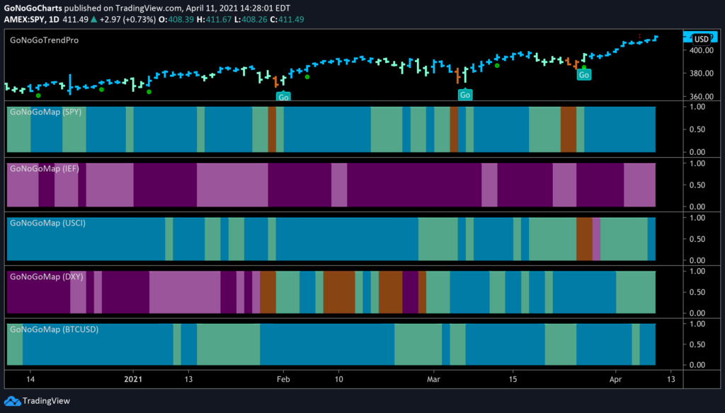
In a top-down approach to market analysis, investors need to compare across asset classes. Below is a GoNoGo Heat Map® which highlights the trend conditions of equities, fixed income, commodities, currencies, and digital assets. Note below that all but US Treasuries ($IEF) are in “Go” trends. This is a risk-on environment. Bullish.
Equity Sectors Relative Strength | GoNoGo RelMap
As the second quarter began, the S&P 500 topped 4000 for the first time ever. Last week, the index decisively carried that “Go” trend higher. This does not mean all securities are moving uniformly… Energy stocks ($XLE) and oil, in particular, are consolidating recent gains as investors lock in profits. And, last week offered a significant rebound in technology ($XLF) and discretionary ($XLY) names as rates ($TLT) settled.
See the GoNoGo RelMap® below of the S&P sectors relative performance against the broader index:
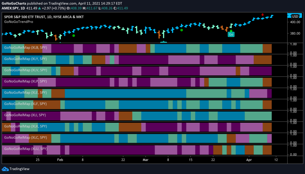
- Only 1 sector’s relative trend remained a “Go” against the broad S&P 500 Index: Industrials $XLI held an aqua band through the week
- Energy’s ($XLE) trend reversal to “NoGo” strengthened to purple relative to S&P to close the week
- Materials ($XLB), Staples ($XLP), Financials ($XLF), & Utilities ($XLU) Go trends fell to neutral amber bands as the index soared
- The Communications ($XLC) sector’s trend reversal shifted to pink bands relative to the broad index to close this week
And perhaps most importantly, the information technology sector $XLK and consumer discretionary sector $XLY which have both underperformed the past month during the rotation to cyclical stocks had the strongest absolute returns last week and rose out of a NoGo trend into an amber neutral environment. Will this be the beginning of uniform “Go” trends for cyclical sectors and the growth names that led the recovery rally through 2020?
Tech Sector $XLK Breakout to All-Time Highs
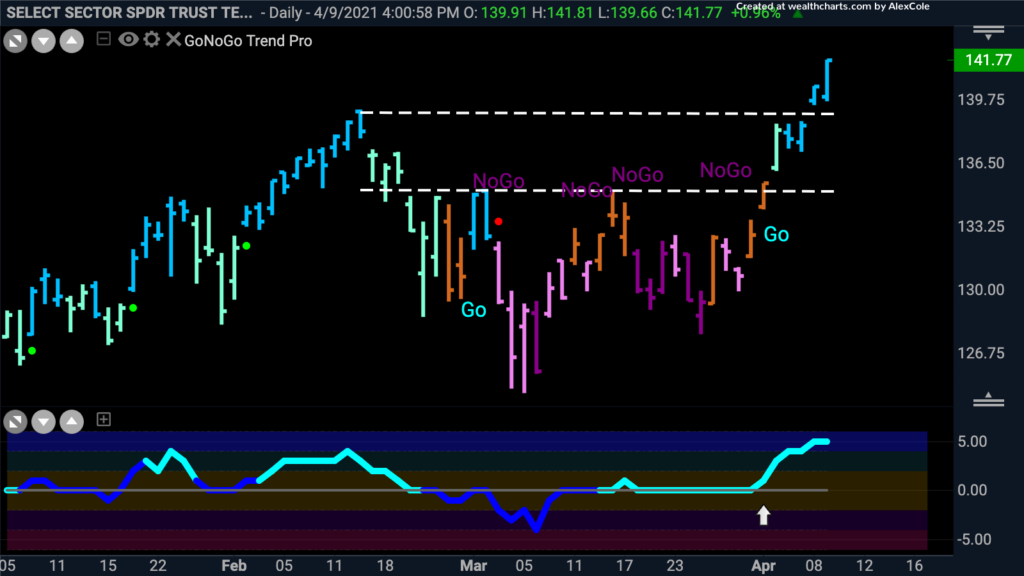
Below is the daily GoNoGo Trend® chart of the $XLK technology sector ETF. Notably, semiconductors are leading this sector higher as price broke out above overhead supply at prior highs. $XLK closed at all-time highs Friday while GoNoGo Oscillator® held overbought extremes on light volume. There is obvious potential for consolidation of these recent gains early this week.
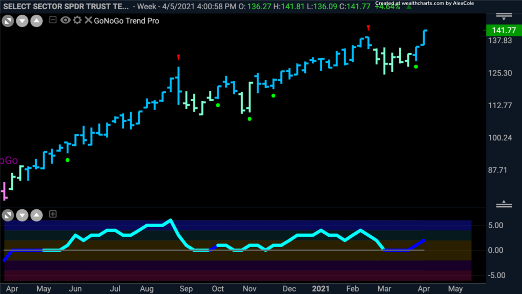
Zooming out to a weekly chart of the $XLK we can see that consolidations have resumed in the direction of the primary trend on each resurgence of momentum. GoNoGo Oscillator bounces off the zero line with each momentum rally and that corresponds or leads price gains and the strengthening of the technical conditions from aqua to blue.
Tech Names to Watch: Apple Inc
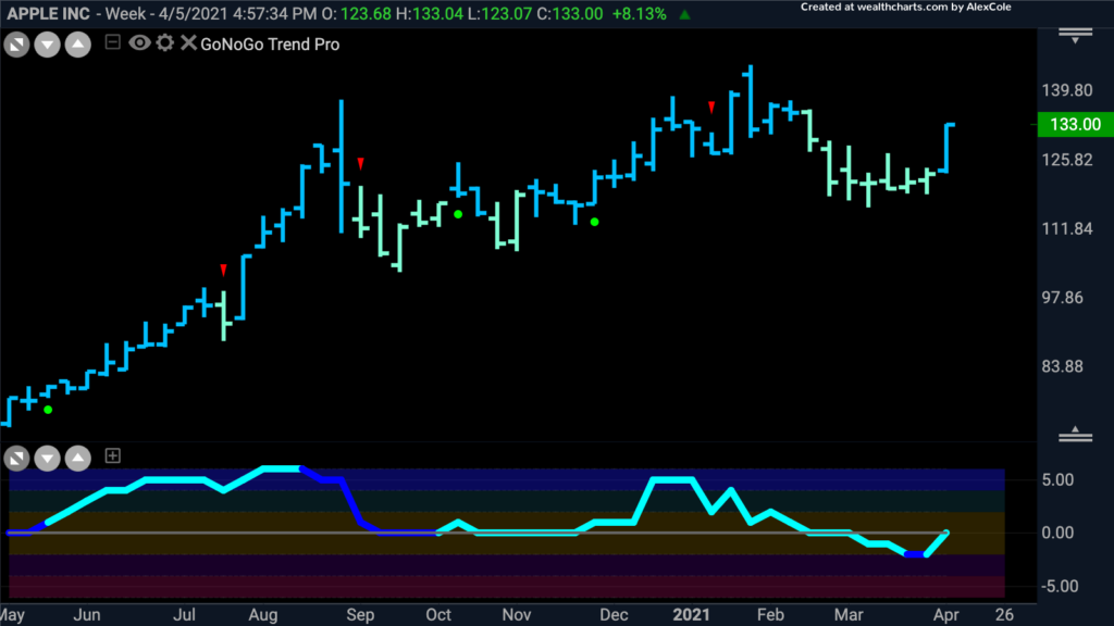
Apple Inc. is the largest holding in the $XLK, comprising 21% of the sector. posted strong gains last week, but if we start with the longer-term view of a GoNoGo Weekly chart, we can see that countertrend move through March 2021 pulling GoNoGo Oscillator into negative territory. On the weekly basis, $AAPL appears set up for another trend continuation.
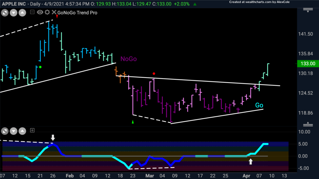
Using multiple time-frames will help investors gain better entry and exit points. Looking at $AAPL on the Daily GoNoGo Trend chart we can see that price broke out of a downward sloping trendline last week as the “Go” flag was triggered. GoNoGo Oscillator rallied off zero into positive territory for the first time since January giving a slight leading indication of the subsequent rally in price.
Consumer Discretionary Sector
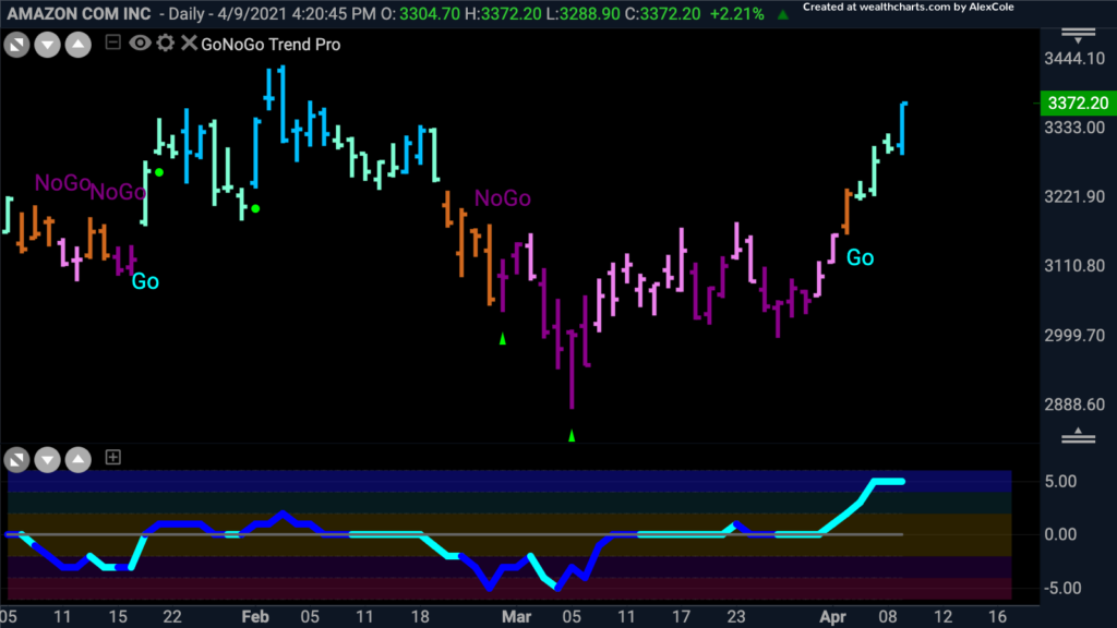
The largest holding of the $XLY consumer discretionary sector is Amazon.com Inc – representing 23.44% of the entire sector. See the incredible rally in $AMZN last week as the conditions strengthened from amber to aqua and finally the strongest “Go” conditions on Friday’s blue bar. GoNoGo Oscillator has rallied to overbought extremes on light volume.
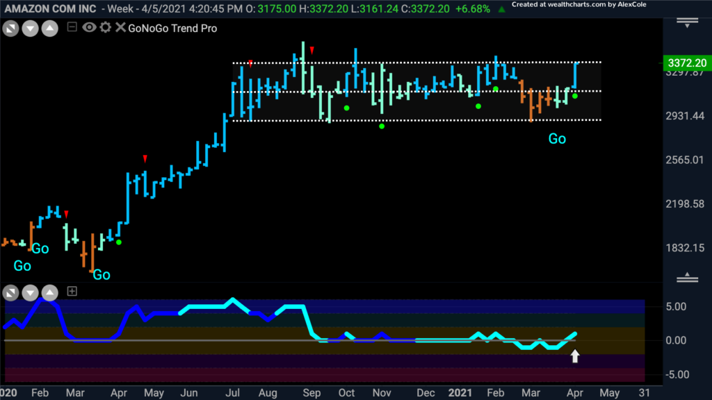
On a weekly chart, however, there has been repeated resistance at this level. In fact, $AMZN has done nothing productive for those holding their positions since August of last year. The consumer discretionary sector $XLY closed at weekly all-time highs last week. If the momentum of buyers as indicated by GoNoGo Oscillator is enough to help $AMZN break out above resistance, a trend continuation of the “Go” trend could bring this mega-cap growth company to all-time highs as well. President Kennedy is famous for saying “A rising tide lifts all boats.” That holds true for fund flows into sector ETFs from large asset allocators as well.
New to the S&P 500 index and another massive constituent of the $XLY is Tesla Inc. $TSLA counts for 13.44% of the consumer discretionary sector by market cap. The amber bar on Friday tells us that the trend direction is neutral. GoNoGo Oscillator has been hovering around the zero line for weeks. The Daily GoNoGo Squeeze® chart below adds another element to our analysis of potential breakouts. You will notice the rising grid on the oscillator which highlights prolonged periods of neutral momentum readings at the zero line. The longer volatility is reduced the more likely a subsequent break (in either direction) will be volatile. GoNoGo Squeeze highlights periods when there is no clear control by buyers or sellers of a given security. The higher lows and lower highs highlighted by the dashed trendlines show that the trading range for $TSLA is narrowing. Watch this week for a break out of momentum and a decisive directional move for $TSLA.
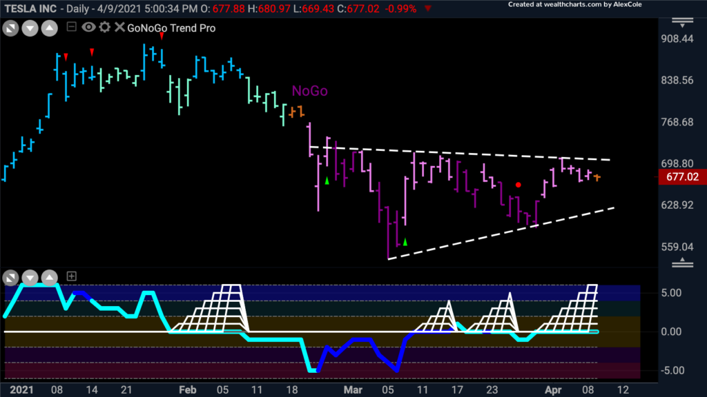
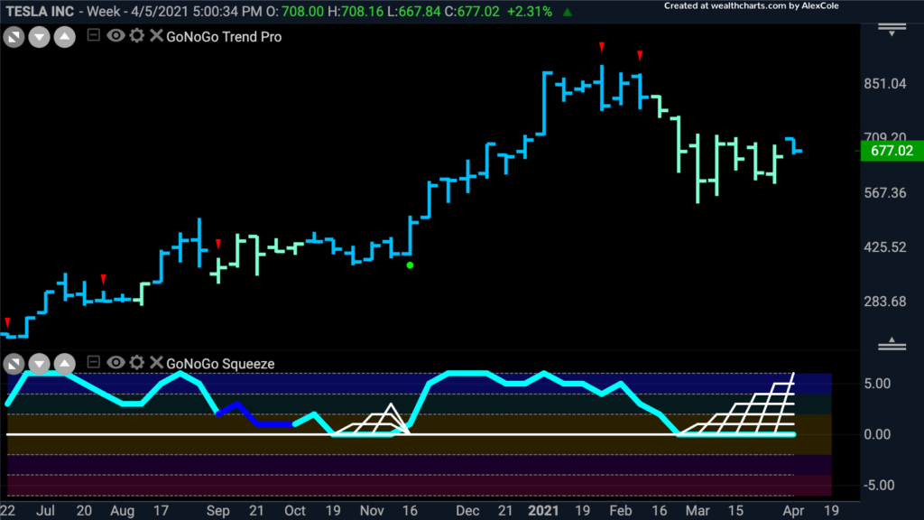
Investing is not a matter of predicting market moves, but rather managing positions according to the highest probability outcomes with clearly defined risk. We want to know quickly if we are wrong to cut losses short. Adding to the weight of the evidence for $TSLA to break to the upside is the weekly chart below. Trend continuation to the upside in the direction of the dominant long-term trend is the path of least resistance. Notice that the GoNoGo Squeeze has been building for more than a month on the weekly chart below:
As noted above, the industrial sector $XLI was the only sector to hold its relative trend to the S&P 500 index, but last week was very constructive for the long-term trends of $XLK and $XLY. If cyclicals and growth are both participating in this rally for US equities, what could possibly be more bullish?!


