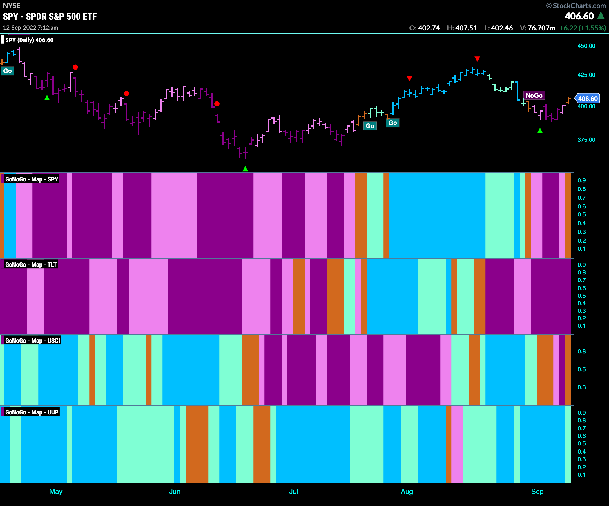
Good morning and welcome to this week’s Flight Path. Let’s take a look at the GoNoGo Asset map below. Trends are not clear this week as we see equities and commodities paint amber “Go Fish” bars to end the week. This shows uncertainty in the direction of the markets. Treasury bond prices remain in a strong “NoGo” as the dollar holds on to its “Go” trend.
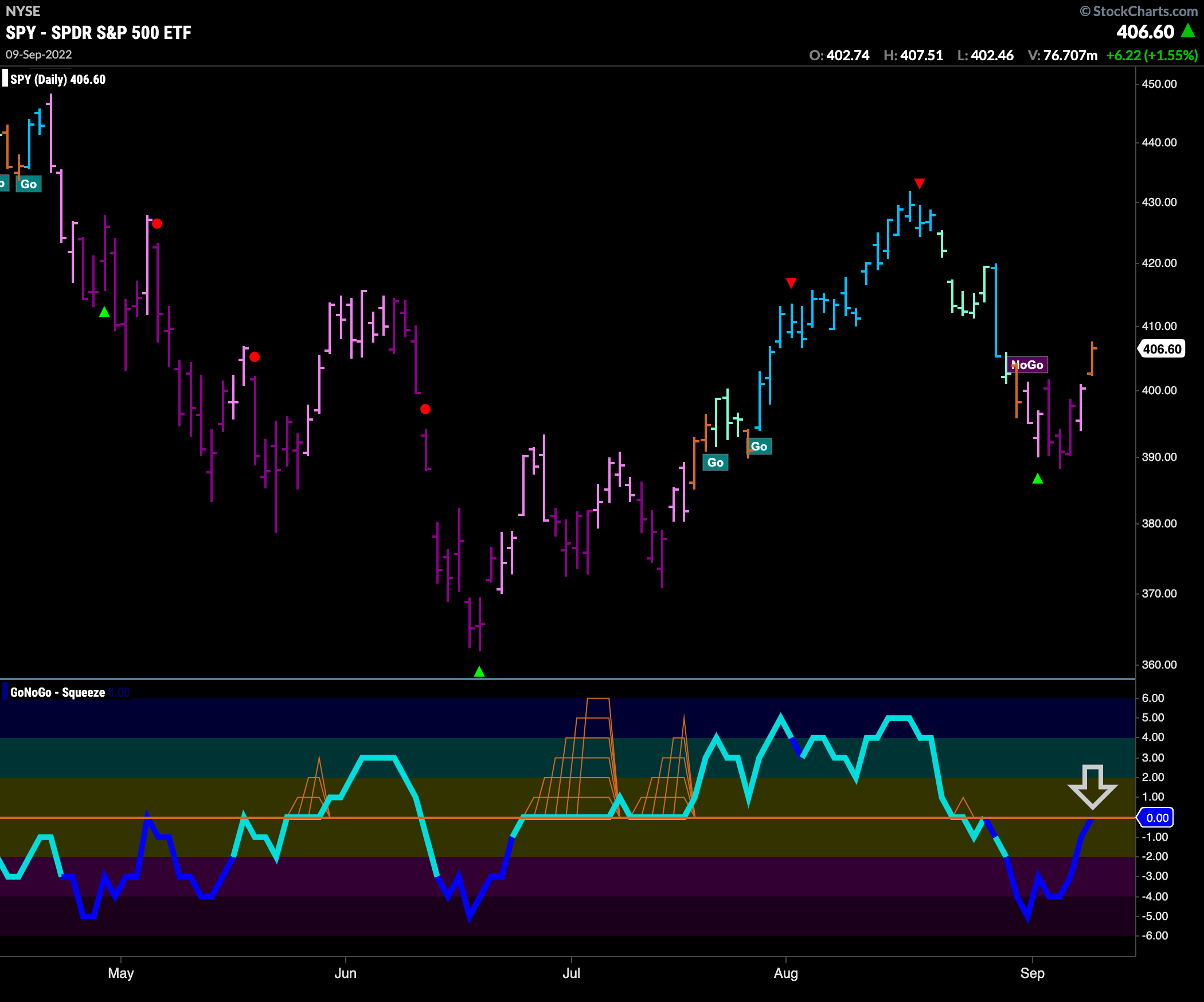
S&P 500 challenges new “NoGo”
Equities rallied at the end of the week. GoNoGo Trend paints an amber “Go Fish” bar as price climbed off the lows from the beginning of the week. This important inflection point sees GoNoGo Oscillator rise to the zero line on heavy volume. We will watch to see if this level acts as resistance.
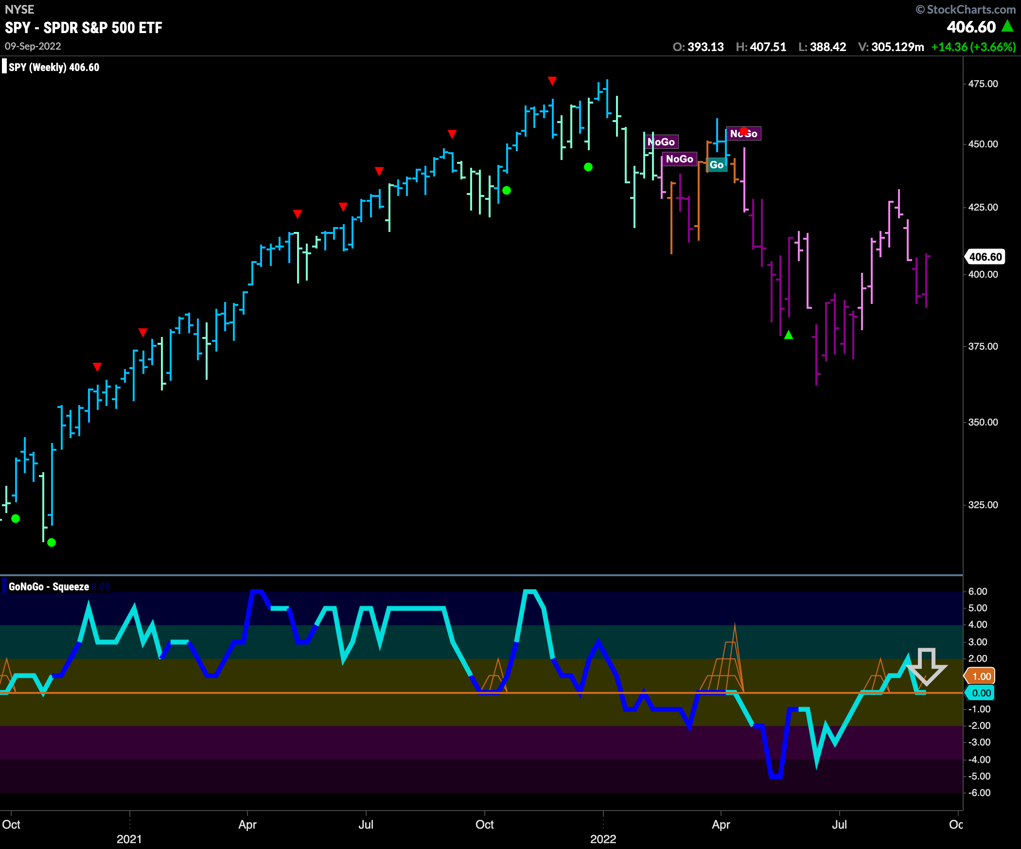
The weekly chart shows that the “NoGo” is firmly in place but there is something interesting happening in the oscillator panel. As GoNoGo Trend continues to paint “NoGo” bars, we see GoNoGo Oscillator testing the zero line from above. We know that in a healthy “NoGo” trend GoNoGo Oscillator will stay below zero and so we will watch closely to see if it reverts back into negative territory of if it can find support at the zero line.
“Go” Trend Weakens Slightly in Rates
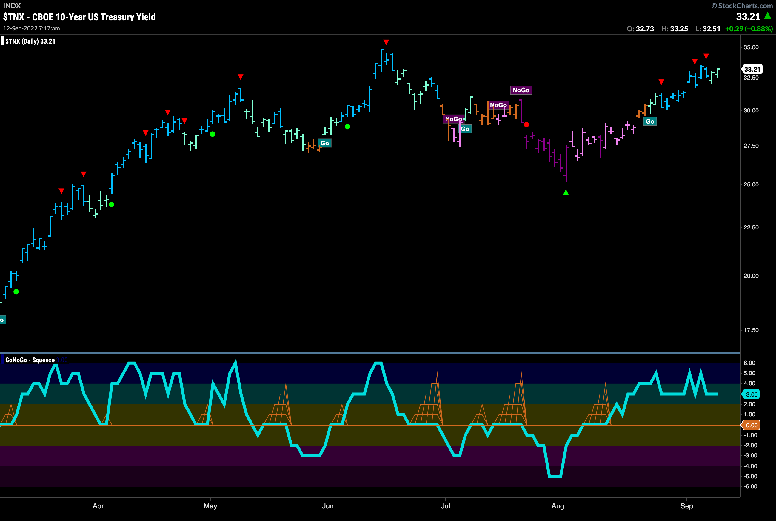
The “Go” trend is still in place for treasury rates, however, we saw two aqua bars to end the week after successive Go Countertrend Correction arrows signaling that price may struggle to go higher in the short term. This comes as price nears prior highs from June. GoNoGo Oscillator is in positive territory but not overbought so we will watch to see if there is enough momentum for an attempt at a new high.
Dollar Retreats in Go Trend
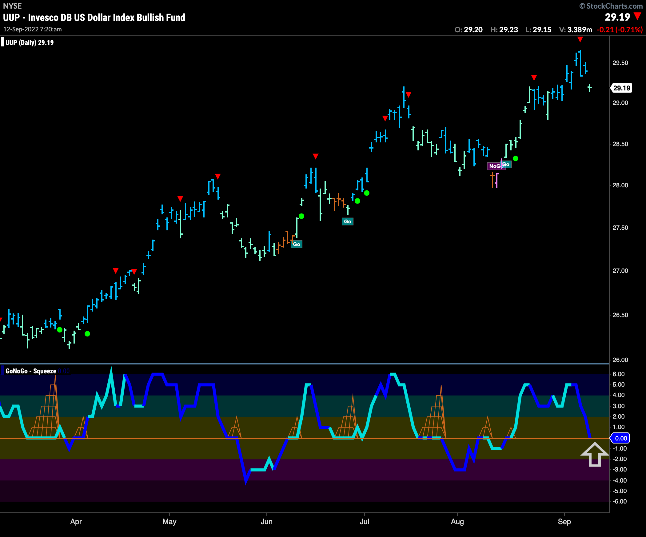
The dollar made another new high this week but fell away sharply after a Go Countertrend Correction red arrow. The drop on Friday was enough to see GoNoGo Trend paint a first weaker aqua bar. At the same time, GoNoGo Oscillator crashed from overbought territory to the zero line where we will watch to see if support is found in the “Go” trend.
Longer Term Charts Shows Signs of Weakness for Oil
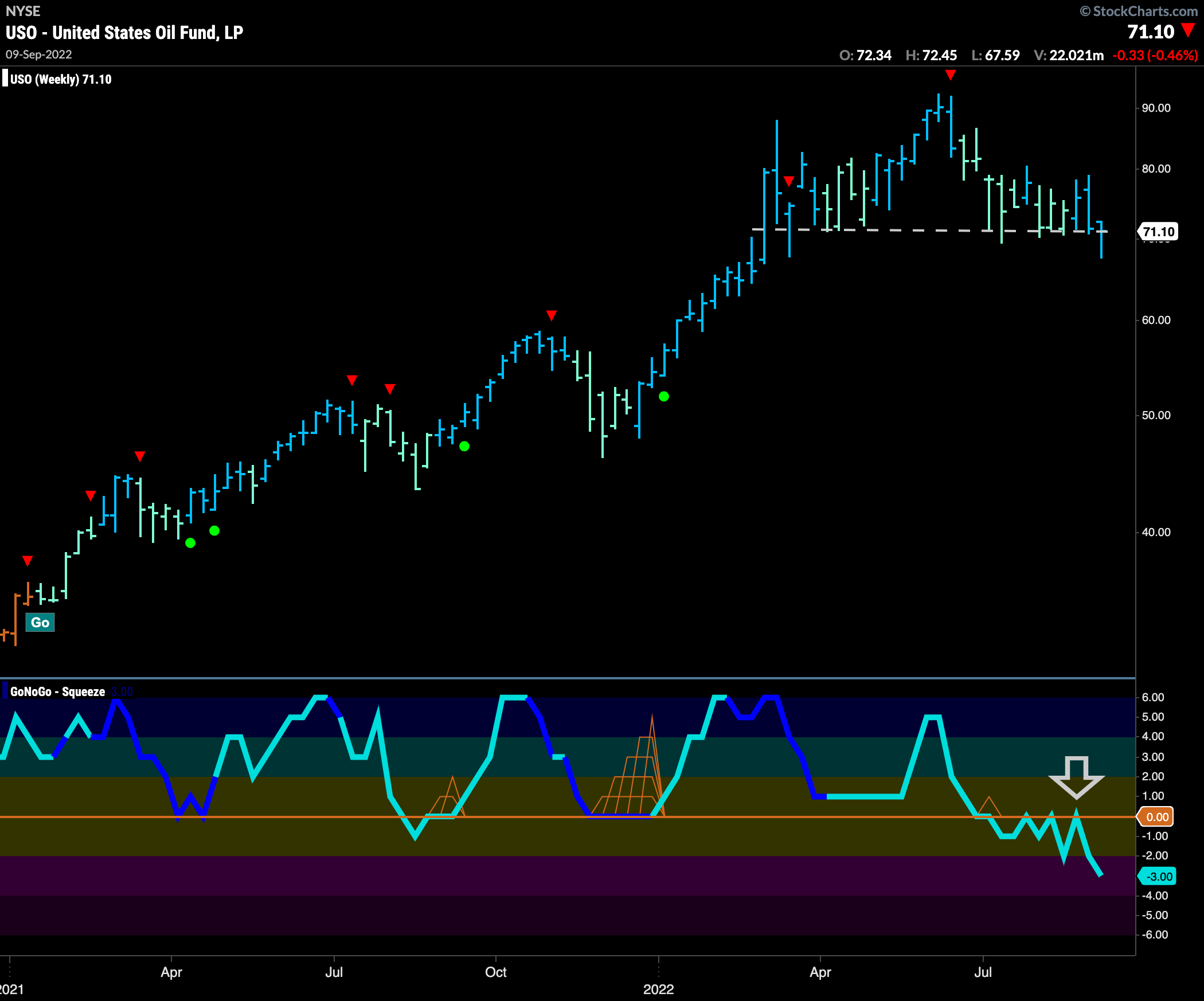
Below is the weekly chart for $USO. For several weeks now we have noted that GoNoGo Oscillator is below zero and finding resistance at that level. The oscillator has fallen away more significantly this last time. Price is still making every effort to hold at horizontal support levels seen in the price panel. If this level gives, we can expect new lows and a potential change in trend.
Sector RelMap
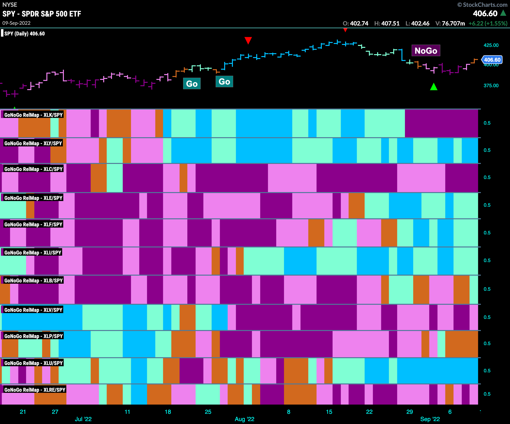
Below is the GoNoGo Sector Relmap. This GoNoGo Relmap applies the GoNoGo Trend to the relative strength ratios of the sectors to the base index. Looking at this map, we can quickly see where the relative outperformance is coming from as well as which sectors are lagging on a relative basis. It is the same sectors leading this week. Energy, financials, industrials and utilities are joined by materials at the end of the week in relative “Go” trends. Surprising many, discretionary has held on to its relative outperformance. In terms of uninterrupted strong “Go” bars, utilities still leads.
Sisco vs Sysco
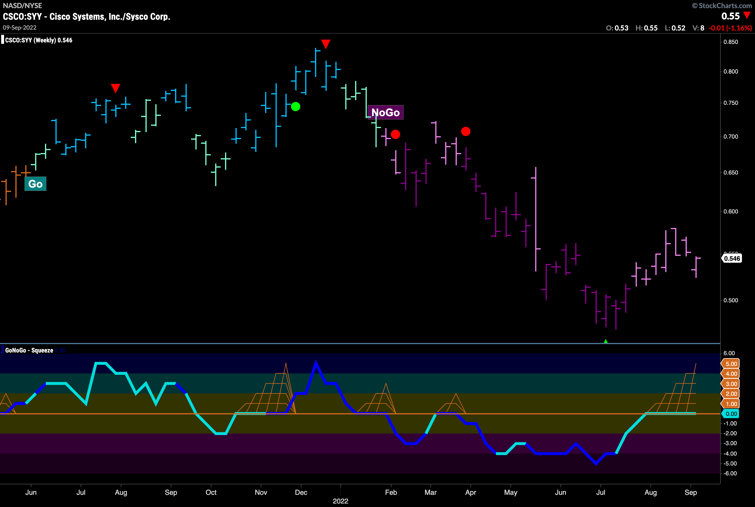
With technology underperforming and utilities outperforming, let’s take a look at the long term relative performance chart of “technology to toilet paper”! The chart below shows weekly prices for the ratio of Sisco Systems to Sysco Corp. One a technology giant the other a utilities company producing toilet paper among other things. We can see that Since the beginning of the year it has been a struggle for technology. We are at an inflection point with GoNoGo Oscillator riding the zero line as a GoNoGo Squeeze builds. It will be interesting to see if this trend continues.
Utilities Sees Trend Continuation
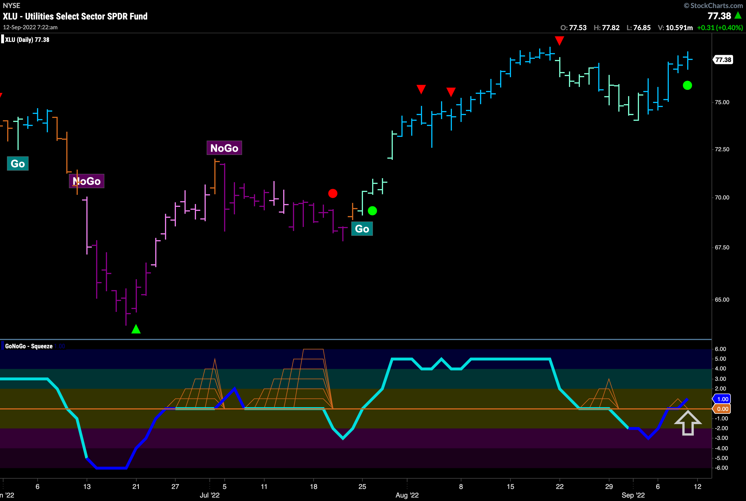
GoNoGo Trend shows that the “Go” trend remains in place and has strengthened painting blue bars this week. GoNoGo Oscillator which dipped into negative territory has regained positive territory on heavy volume. This has triggered a Go Trend Continuation Icon, green circle, that tells us momentum has resumed in the direction of the “Go” trend. Will this be enough to see price make a new high?
$NRG Breaks Out of Bull Flag
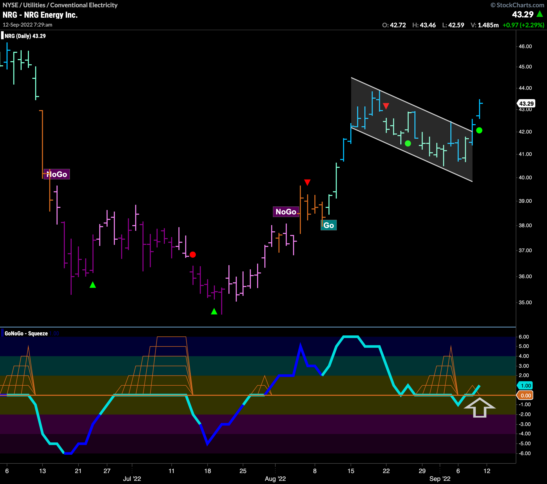
With Utilities out performing on a relative basis, let’s take a look at some individual stocks that may be in line for more gains within that sector. Below is the chart of $NRG and we can see that after establishing a “Go” trend in August price has corrected against the trend (see the Go Countertrend Correction red arrow) and caused GoNoGo Oscillator to fall to the zero line where it has mostly stayed. Now, GoNoGo Oscillator has rallied into positive territory and we see price break out of the flag pattern on strong blue “Go” bars as a Go Trend Continuation icon (green circle) appears under price. We can look for price to attempt to set a new high.
NextEra Energy Sees Momentum in “Go” Trend
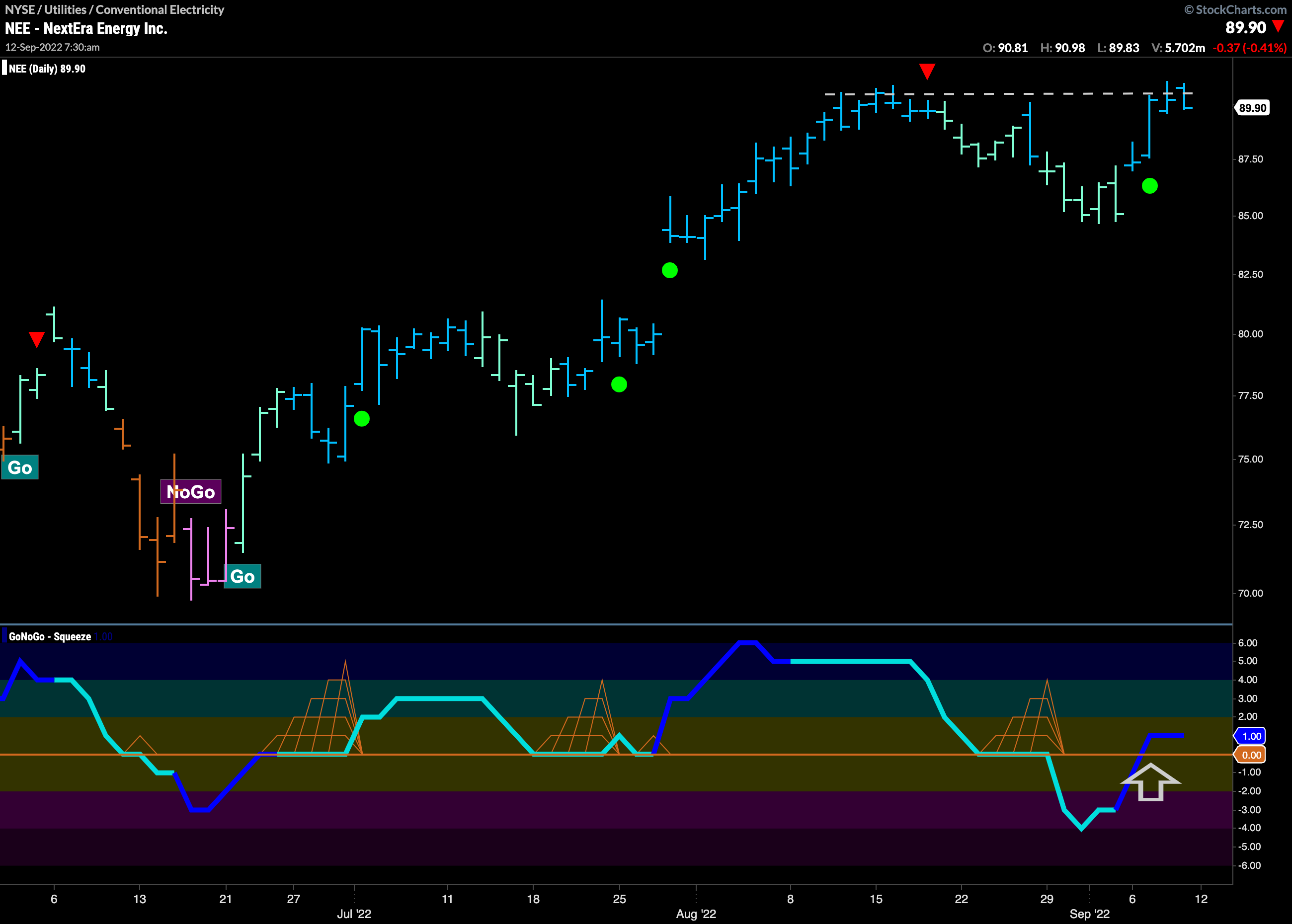
Another energy stock that is looking for more price gains is $NEE. After a counter trend correction which was enough to see GoNoGo Oscillator break into negative territory we see that price was able to return to strong blue bars this week. With that, GoNoGo Oscillator has been able to regain positive territory on heavy volume. A Go Trend Continuation icon (green circle) tells us that momentum is in the direction of the trend and suggests price will try to break above horizontal resistance from prior highs.
