Good morning and welcome to this week’s Flight Path. It was another strong week for U.S. equities as we saw S&P hit new highs on a week of strong blue “Go” bars. Treasury bond prices had a good weeks as well with a string of blue “Go” bars and the U.S. commodity index was able to remain in a “Go” trend although we did see some weakness with aqua bars as the week came to a close. The dollar was the only asset this week that fell out of its “Go” trend. We saw some uncertainty as price dropped and GoNoGo Trend painted a couple of amber “Go Fish” bars.
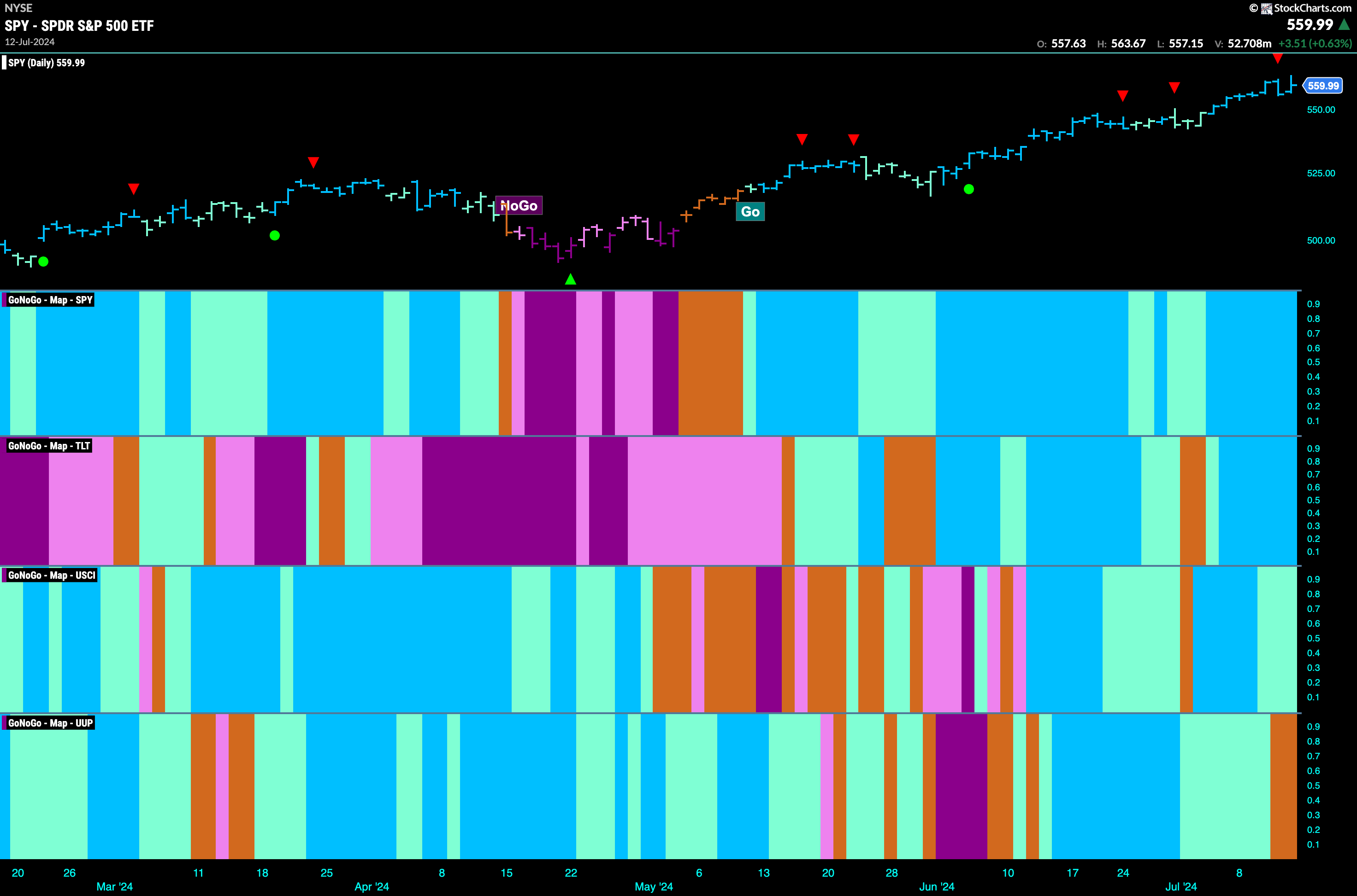
$SPY Paints Countertrend Correction Icon at New Highs
Equity prices continued higher this week and GoNoGo Trend painted uninterrupted strong blue “Go” bars. Late in the week we saw a Go Countertrend Correction Icon (red arrow) at the high indicating that price may struggle to go higher in the short term. When we look at the oscillator panel we can see that it fell out of overbought levels but has quickly returned showing sustained market enthusiasm. We will watch to see if momentum wanes this week and will look for price to consolidate at these new higher levels.

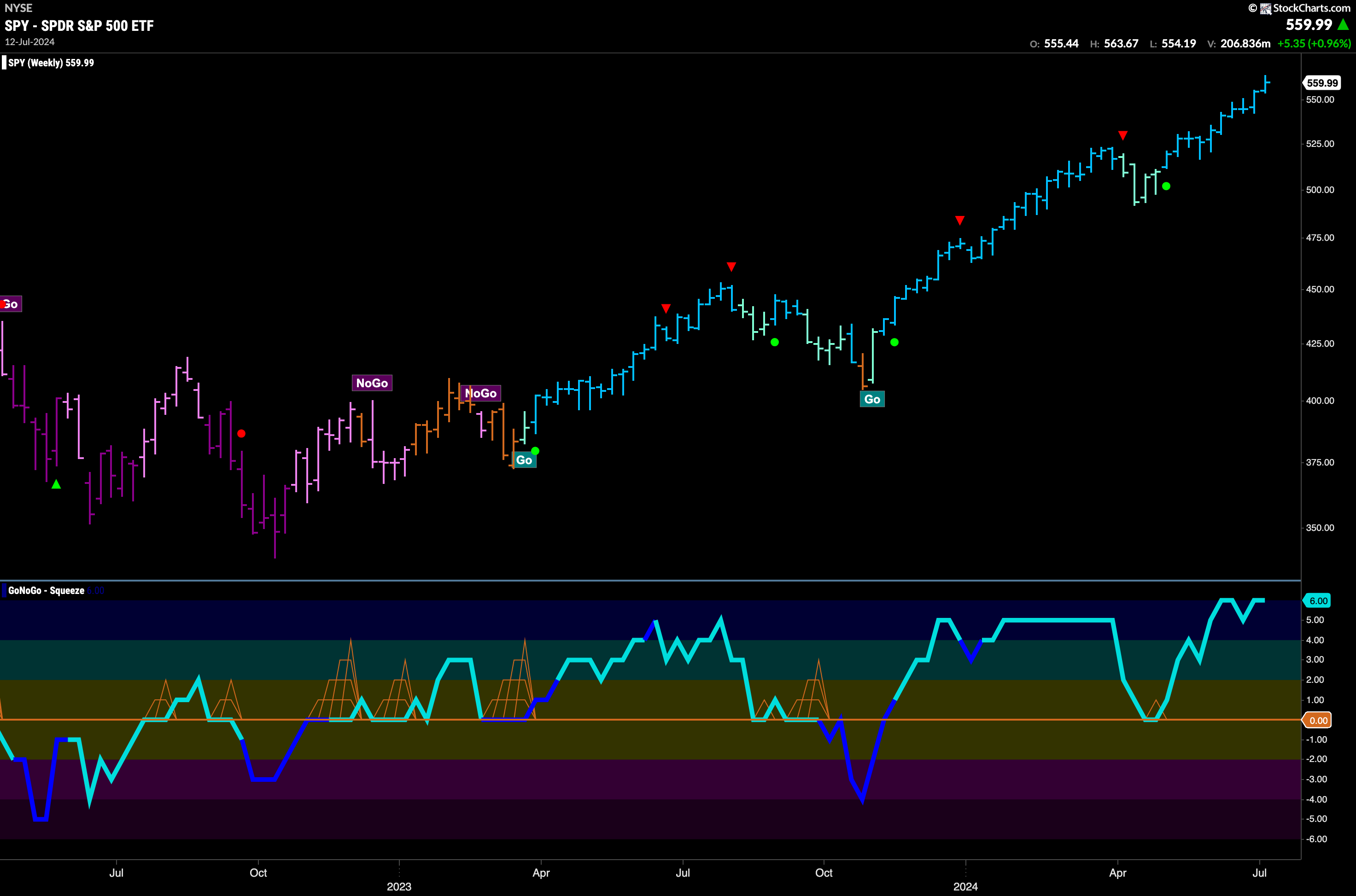
Strong “Go” trend. That is the reading from the weekly chart. Another higher weekly close on a strong blue “Go” bar is what we are seeing here. If we look at the oscillator panel we see that we are staying in overbought territory and so we do not see momentum falling off enough to trigger a countertrend correction icon (red arrow) on the price chart.
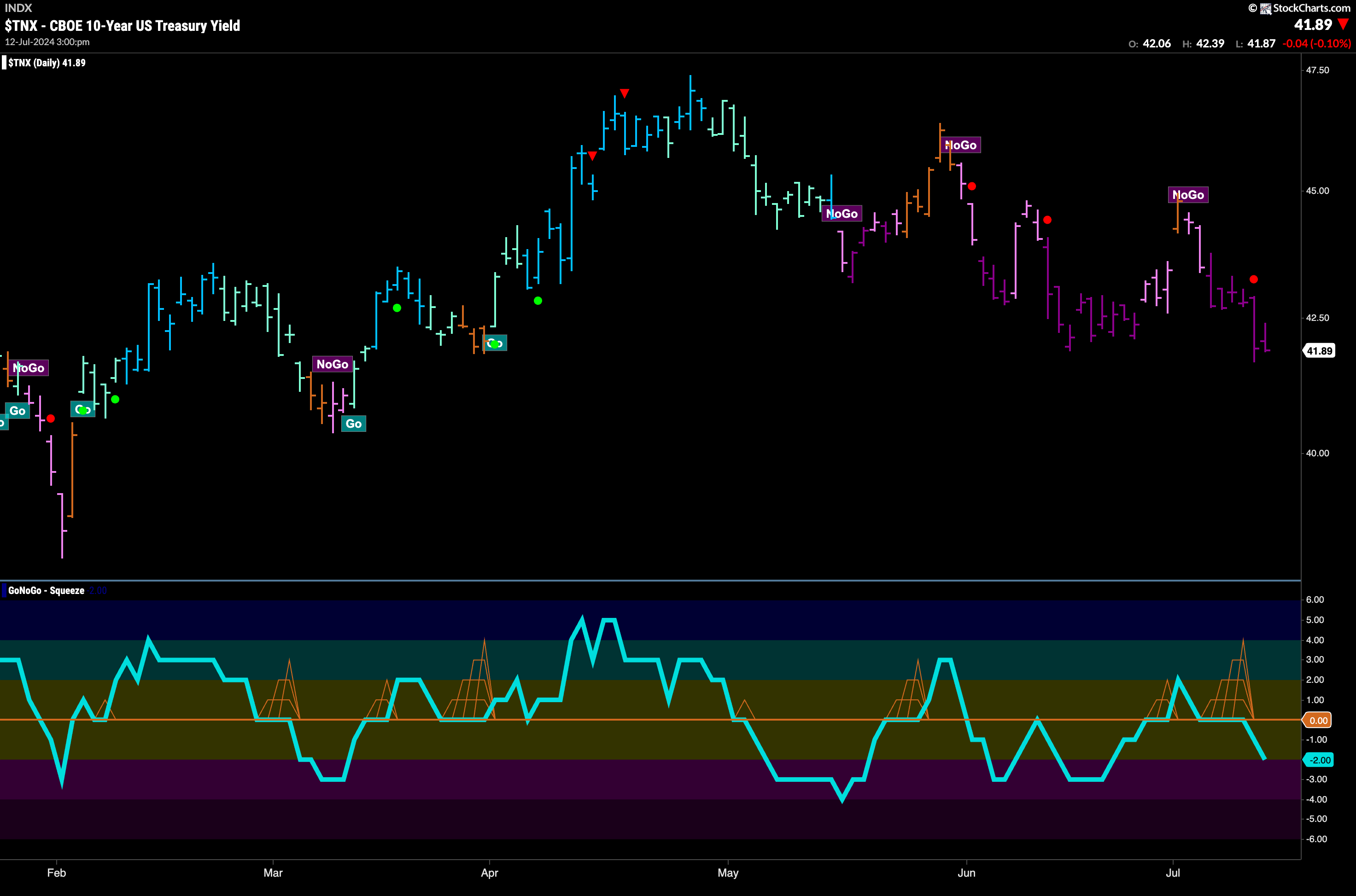
Treasury Rates in Strong “NoGo” Trend
This week confirmed the “NoGo” picture that had emerged. GoNoGo Trend painted a whole week of strong purple “NoGo” bars and price made a new lower low. When we look to the oscillator panel we can see that GoNoGo Oscillator fell back through the zero line after a few bars in a GoNoGo Squeeze and is now in negative territory at a value of -2. This tells us that momentum is resurgent in the direction of the “NoGo” trend and so we see a NoGo Trend Continuation Icon (red circle) on the price chart.
Dollar Displays Uncertainty
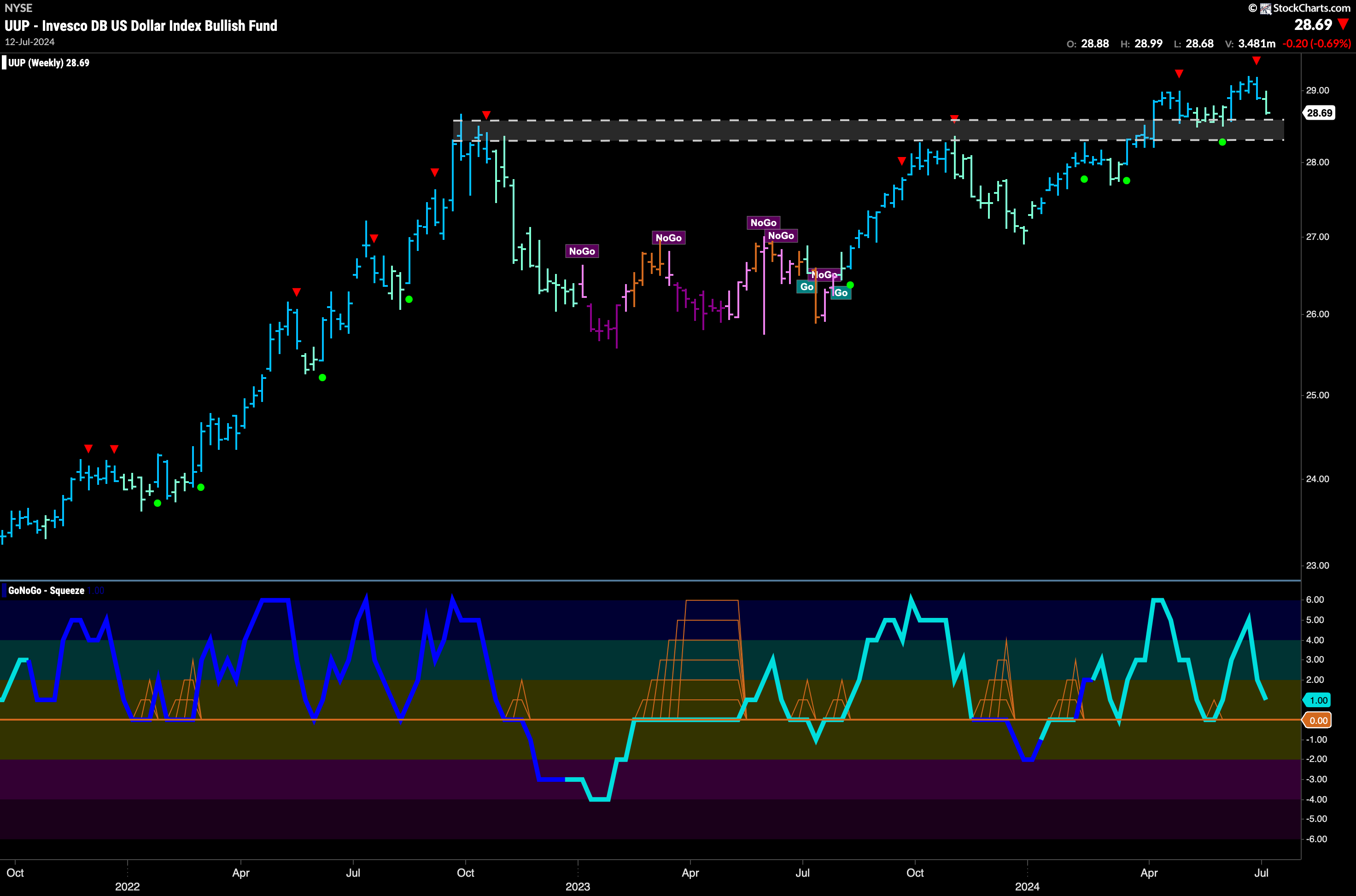
Last week GoNoGo Trend informed us that the “Go” trend was weak after it fell away from its most recent high and painted a number of weaker aqua “Go” bars. This week we saw price fall further, gapping lower mid week. This led to GoNoGo Trend painting a couple of amber “Go Fish” bars telling us that not enough of the GoNoGo criteria are being met to determine a trend in either direction. If we look to the GoNoGo Oscillator for clues, we can see that it has failed at zero, and is dropping fast toward oversold territory. There is negative momentum here.

The weekly chart still tells us that we are hanging on to the longer term “Go” trend. After a destructive week, we are trading close to levels that could well suggest support. As GoNoGo Oscillator falls toward the zero line, we will watch to see if it finds support at that level. If it does, we will expect the “Go” trend to continue.
USO Remains in Trend but Failed at Resistance
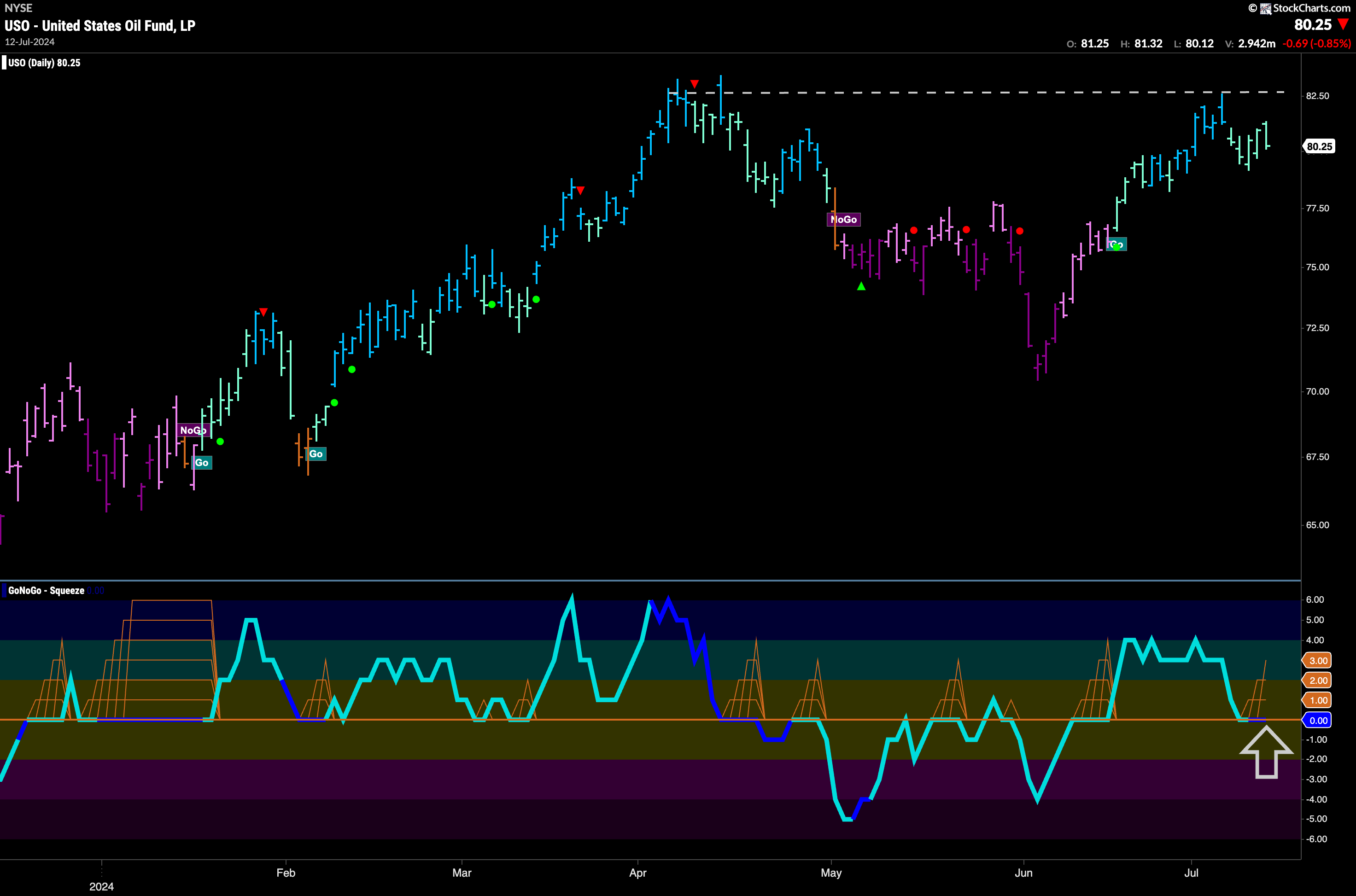
GoNoGo Trend painted a full week of weaker aqua “Go” bars after failing at levels of resistance from prior highs. The “Go” trend remains in place however as the weight of the evidence combines behind the scenes to allow GoNoGo Trend to paint aqua bars. We turn our eye to the GoNoGo Oscillator and we see that it has fallen to test the zero line and volume has increased (dark blue color of oscillator line). It will be important to see whether this level offers support. Currently we see the start of a GoNoGo Squeeze as the oscillator remains at zero. If it can break out of the GoNoGo Squeeze back into positive territory then we will expect price to mount another attack on those highs.
Gold Tests Top of Range on Weekly Timeframe
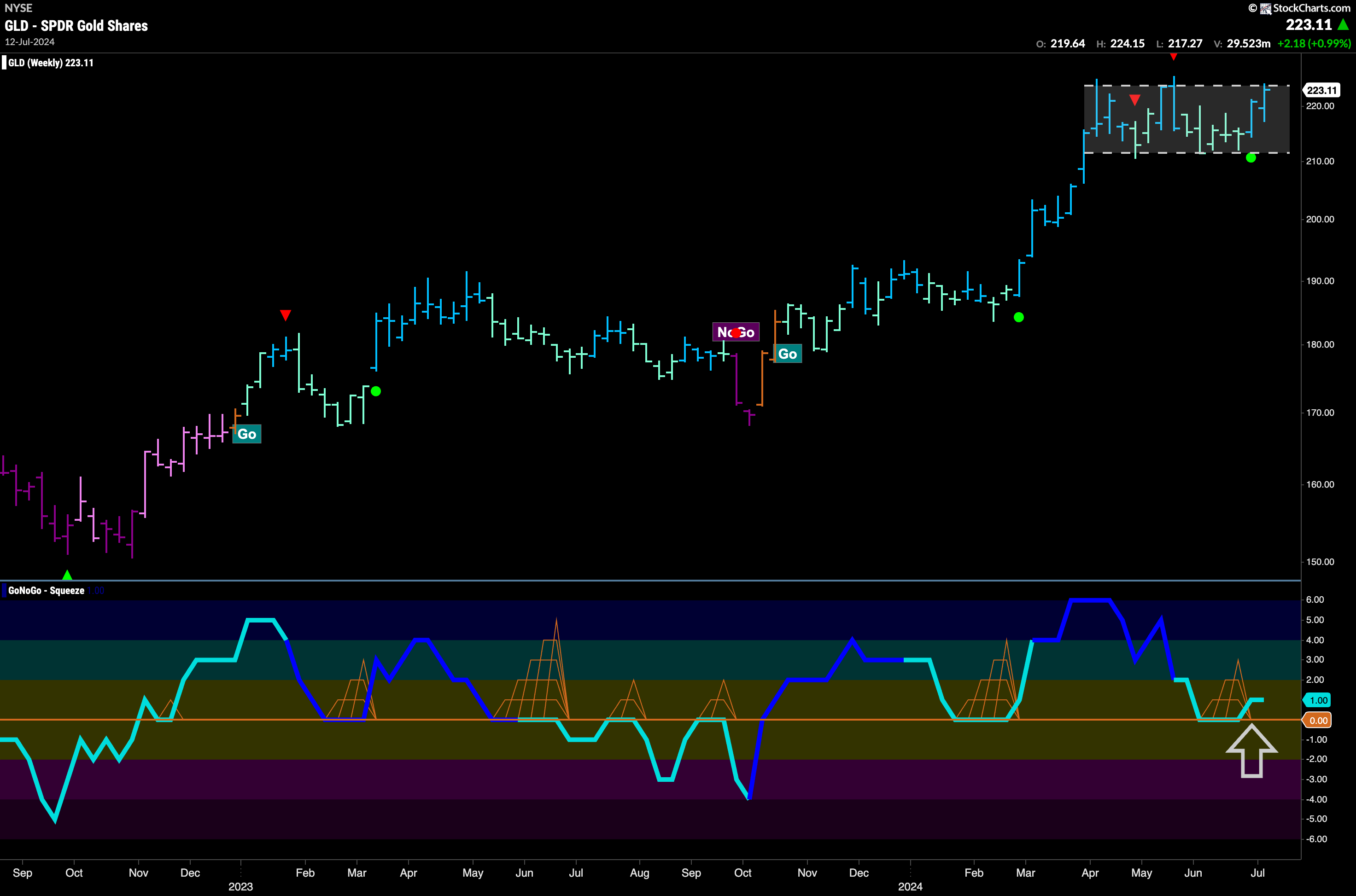
Last week we noted that Gold had been trading in a range on the daily chart and we saw some uncertainty and chop. This week prices rallied, and we can zoom out to see that once again price is threatening the top of the range. GoNoGo Trend is painting strong blue bars and GoNoGo Oscillator has found support at the zero level. This tells us that momentum is resurgent in the direction of the “Go” trend and the trend is likely to continue (green circle). We will look to see if this will give price the push it needs to climb to higher highs.
Sector RelMap
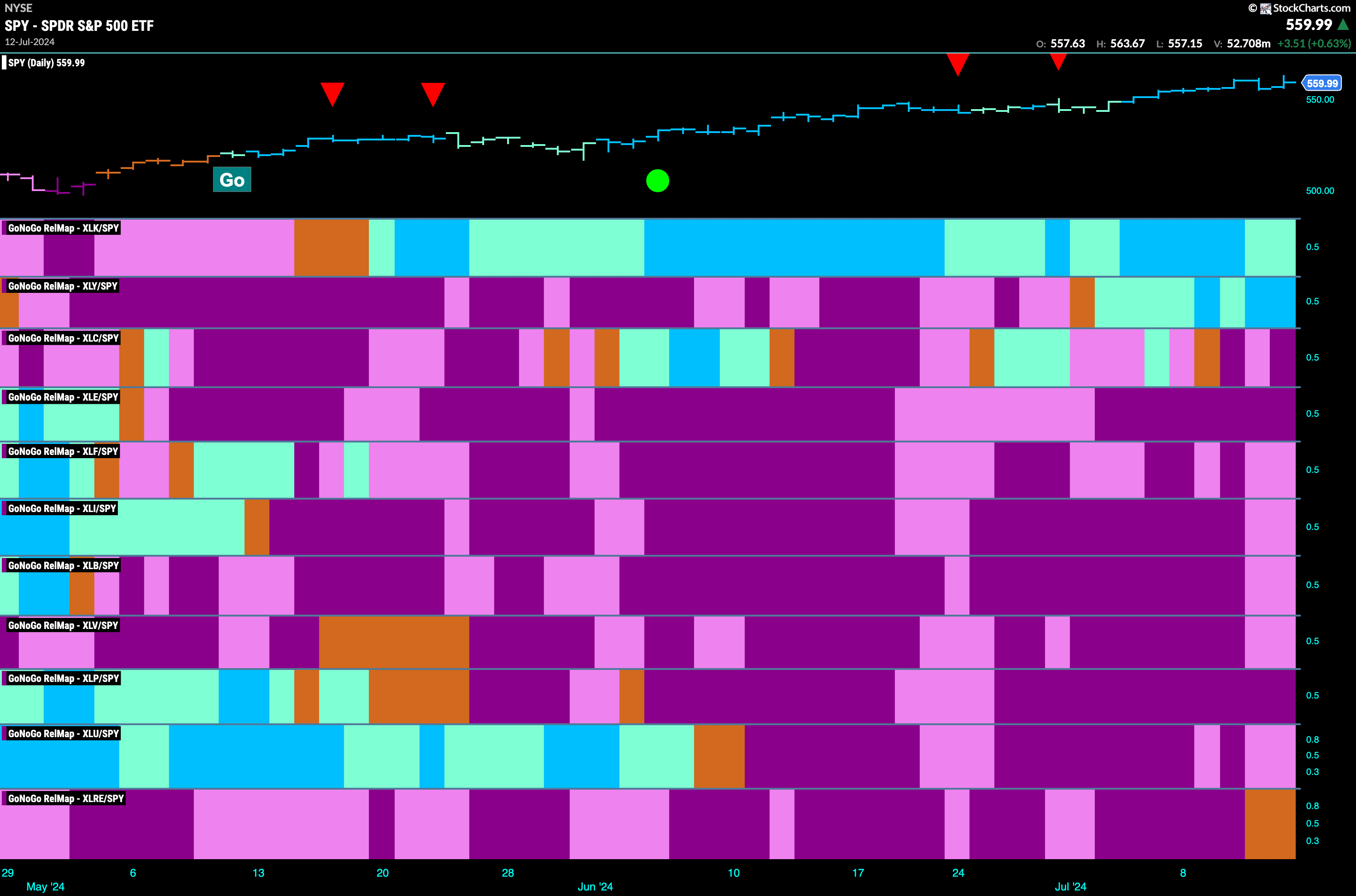
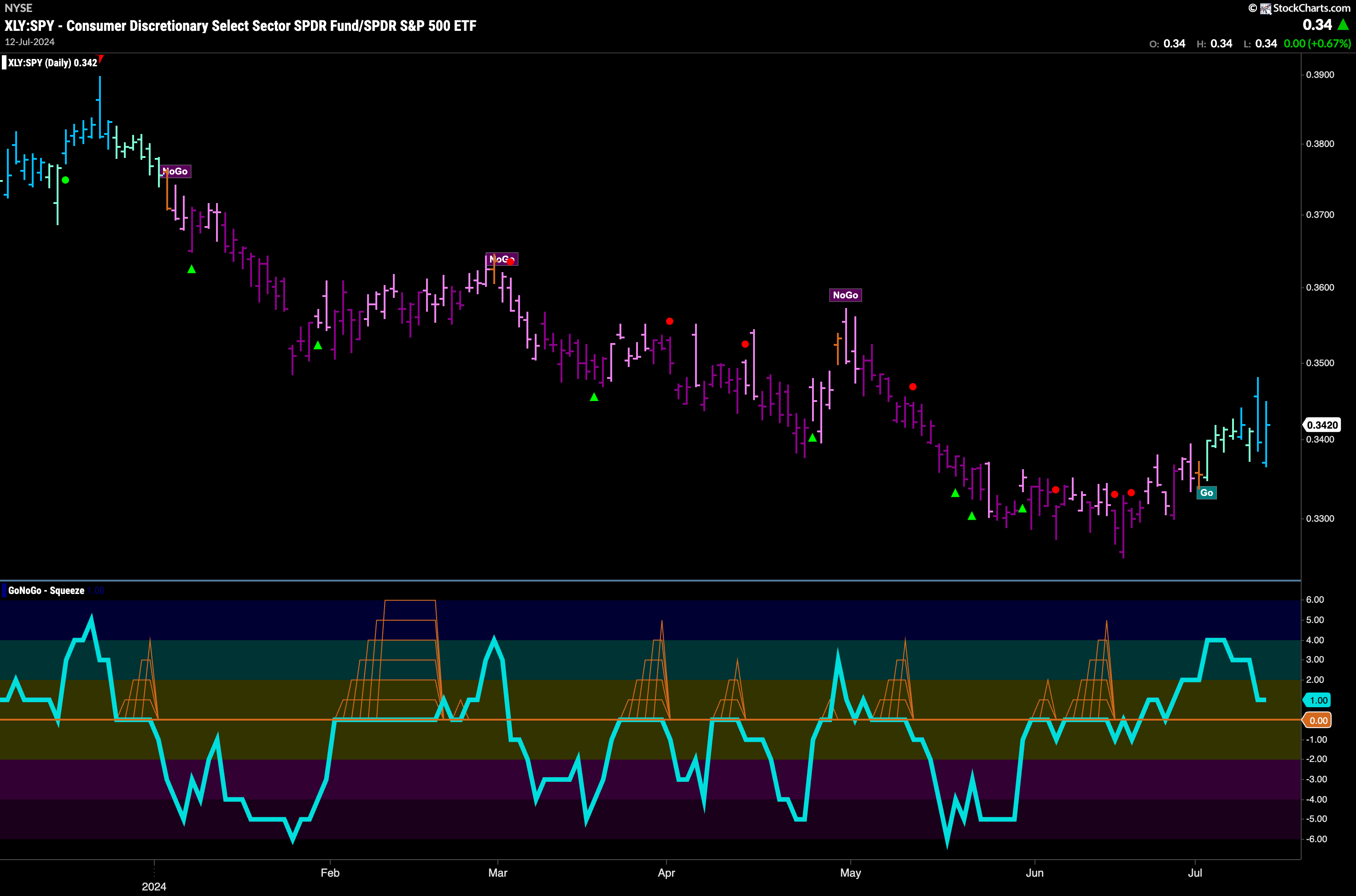
Below is the GoNoGo Sector RelMap. This GoNoGo RelMap applies the GoNoGo Trend to the relative strength ratios of the sectors to the base index. Looking at the map, we can see that 2 sectors are outperforming the base index this week. $XLK, and $XLY are painting relative “Go” bars.
Discretionary Sector in Relative “Go” Trend
As we saw above, the discretionary sector has joined technology as one of the driving forces of equity higher prices. The chart below shows the complete suite of GoNoGo tools applied to the ratio of XLY:SPY. We can see that after a sustained “NoGo” trend, the discretionary sector has turned a corner on a relative basis. GoNoGo Trend is painting strong blue “Go” bars and momentum is positive. We will look to see if this relative trend can continue.
$ANF Looks for Momentum in Weak Trend
$ANF has rallied sharply since May. However, after hitting highs over a month ago has struggled and has moved sideways with consistent lows and slightly lower highs. This has caused a descending triangle to form on the chart. Given the relative strength of the discretionary sector, we will look for GoNoGo Oscillator to break back above the zero line in the lower panel. If this happens, it may give price the momentum it needs to break out of the pattern to new highs.

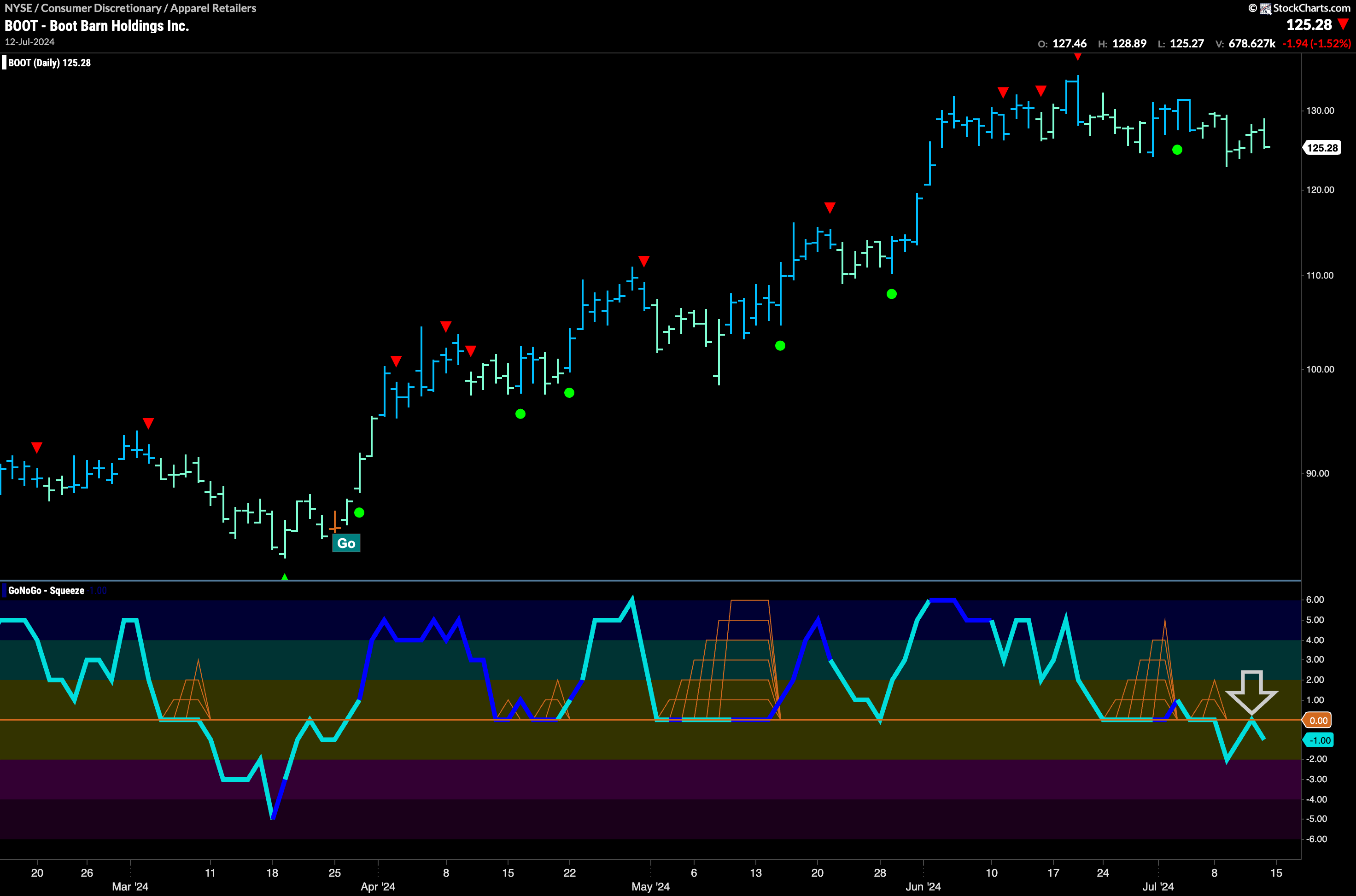
$BOOT Consolidates Gains
$BOOT is another security in the discretionary sector. We are seeing something similar here. After a strong run and new highs in to June, price has moved mostly sideways after the cluster of Go Countertrend Correction Icons we saw on the chart. Momentum is flirting with negative territory and it will be important for GoNoGo Oscillator to regain positive territory if this trend is to continue. We will watch closely. If the oscillator can recover we will see another Go Trend Continuation Icon (green circle) on the chart and will look for new highs.
