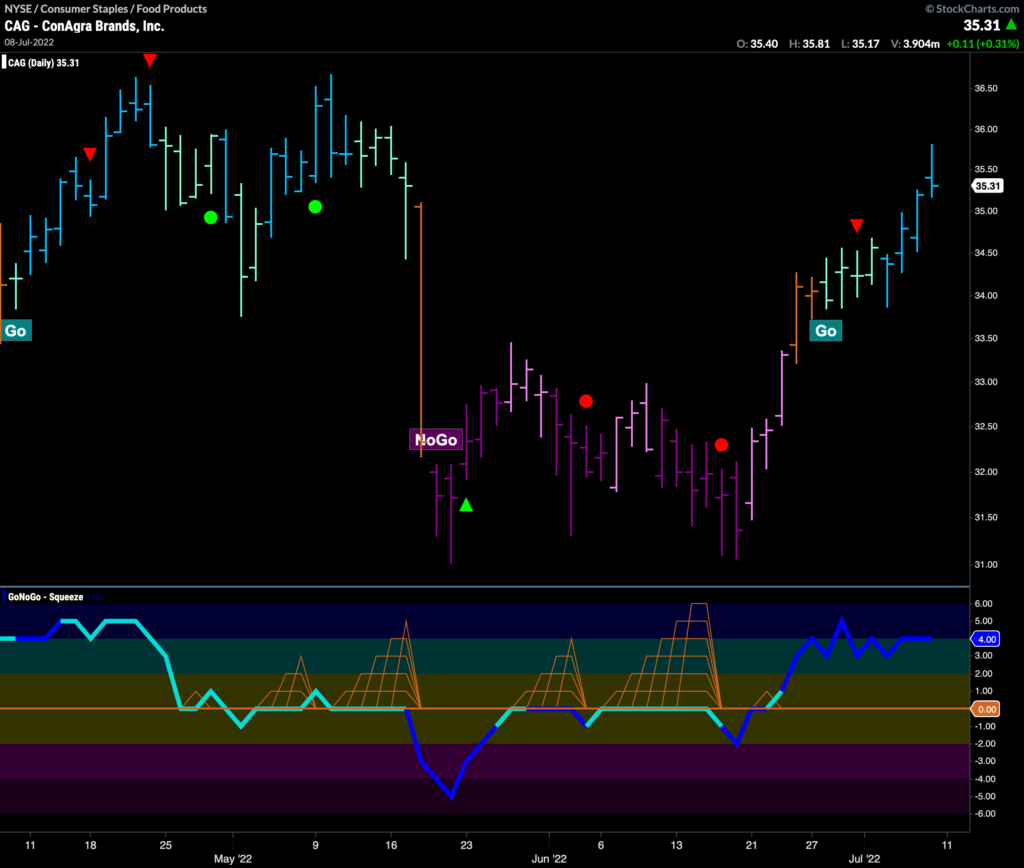
Good morning and welcome to this week’s Flight Path. Let’s take a look at the GoNoGo Asset map below. We don’t see much changing this week. The GoNoGo Asset Map remains very defensive with equities in a “NoGo” along with treasury bond prices, commodities and bitcoin. The dollar goes from strength to strength this week as price hits new highs.
Gold Continues to Confound
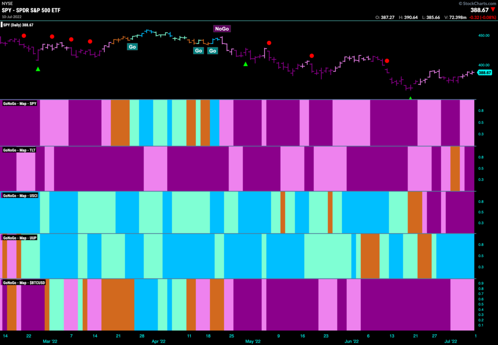
Many expected gold to continue its rally this year as many investors look for safe havens to ride out market volatility. The traditional flight to safety asset has performed terribly since April however, with a strong “NoGo” trend still very much in place as price hits new lows. GoNoGo Oscillator is oversold on heavy volume so we will look to see if there is some temporary correction against the down trend in the short term.
Dollar Defiant!
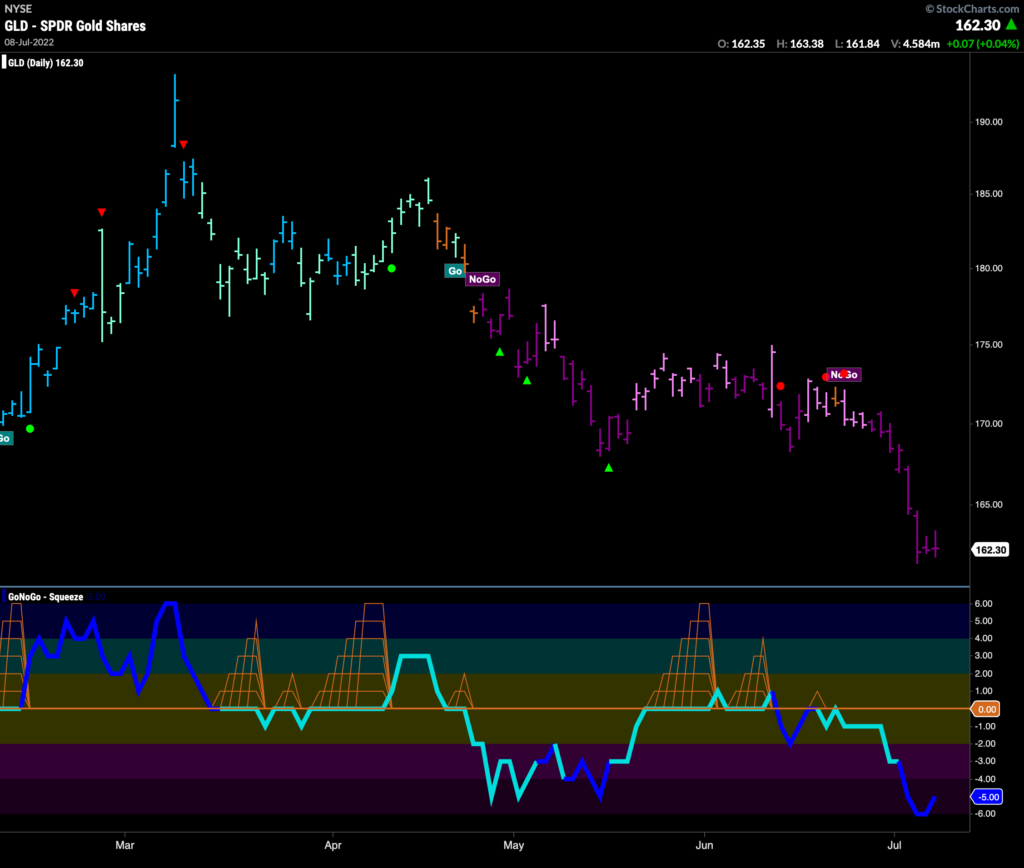
The weekly chart below shows the Invesco Dollar Index fund with GoNoGo Indicators applied. we can see that for a year, the trend has been a “Go” with no interruption of “Go” colors during that time. GoNoGo Oscillator has also found support throughout the move each time it has tested the zero line. With price now at a new high, we will look to see if $UUP can maintain its momentum.
$UUP, $UUP and away, again!
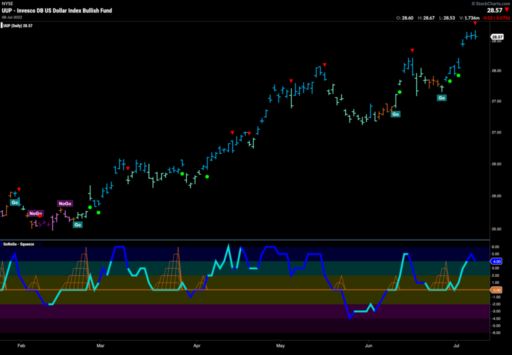
Below is the daily chart, and we see the “Go” trend resume in earnest after a few amber “Go Fish” bars a couple of weeks ago. This most recent correction pushed GoNoGo Oscillator to the zero line where it found support. As it rallied again into positive territory and then to overbought levels price was able to reach new highs on bright blue “Go” bars. Now, we see a Go Countertrend Correction red arrow above price indicating that perhaps in the short term price may struggle to go higher.
Yields Recapture “Go” bars
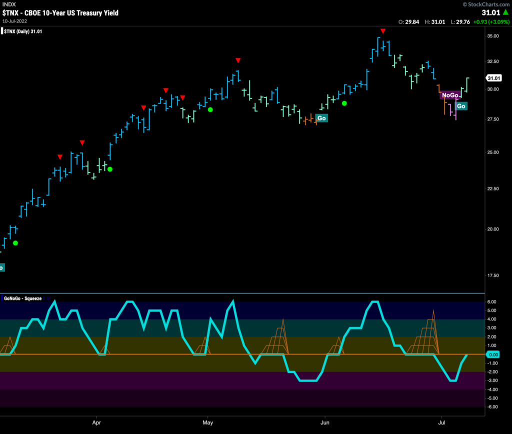
Treasury yields corrected further than some expected last week as amber “Go Fish” bars were followed by a couple of pink “NoGo” bars. This correction was enough to push GoNoGo Oscillator into negative territory. Quickly, GoNoGo Trend has been able to paint “Go” bars again, albeit weaker aqua colors as price rallied to end last week. GoNoGo Oscillator returned to test the zero line from below. We will look to see if the oscillator can regain positive territory to support the renewed “Go” trend in price.
Emerging Markets Struggle
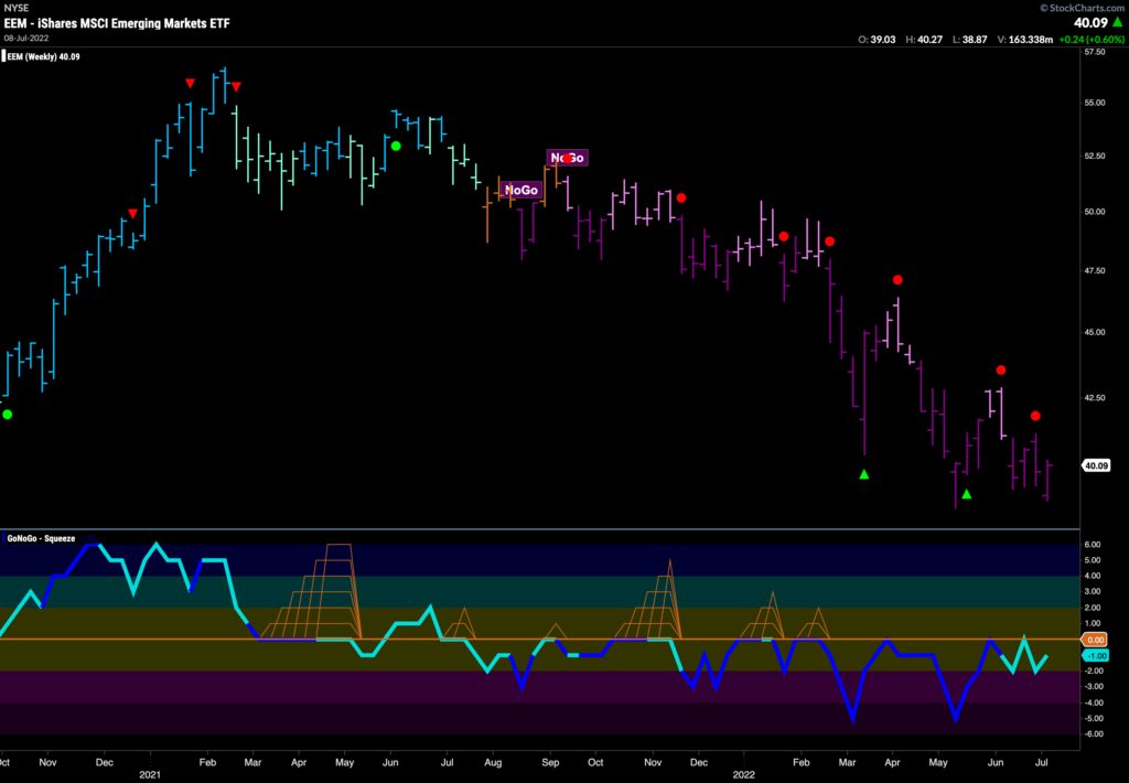
With the dollar strength we saw above, it makes sense that emerging market equities will have a hard time moving higher. The weekly chart below shows that a strong “NoGo” trend has been in place for a year as we see a series of lower highs and lower lows. Throughout this period, GoNoGo Oscillator has been at or below zero finding resistance at that level each time it rises to test it.
$EEM to Emerge Out of “NoGo”?
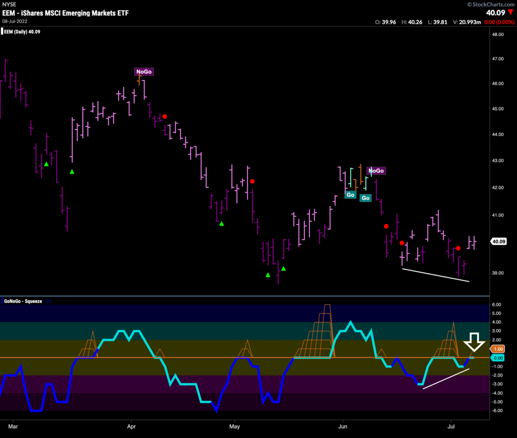
The daily chart below shows that there are the beginnings of some bullish activity for $EEM. Yes, the trend is still a “NoGo”, and yes, GoNoGo Oscillator has not broken into positive territory. We can see bullish divergence though, between GoNoGo Oscillator and price as the oscillator makes a higher low out of step with prices lower low. GoNoGo Oscillator is testing the zero line and we will look to see what happens here. If the oscillator can break above the zero line that make give $EEM enough momentum to make a new higher high. All that being said, the weight of the evidence tells us the trend is still a “NoGo” for now.
Sector RelMap
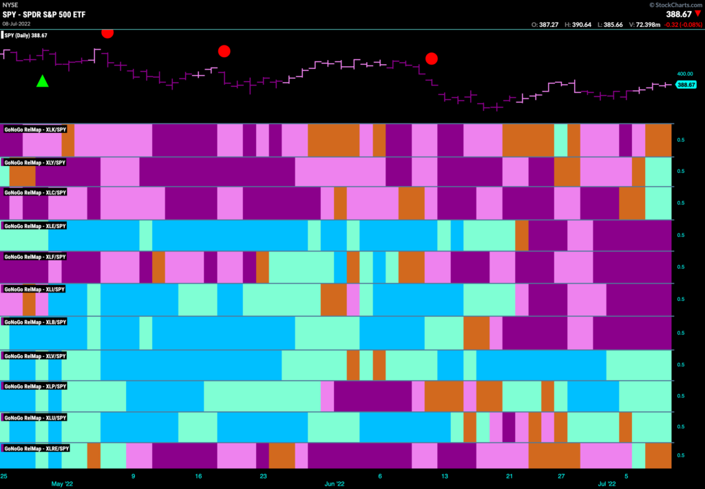
Below is the GoNoGo Sector Relmap. This GoNoGo Relmap applies the GoNoGo Trend to the relative strength ratios of the sectors to the base index. Looking at this map, we can quickly see where the relative outperformance is coming from as well as which sectors are lagging on a relative basis. The GoNoGo Sector Relmap paints a mixed picture this week. The discretionary and communications sectors have been able to paint relative aqua “Go” bars and even technology paints amber bars of uncertainty. On the defensive side, it is healthcare, staples and utilities that continue to be in the most robust “Go” trends.
Communications Relatively Less Weak
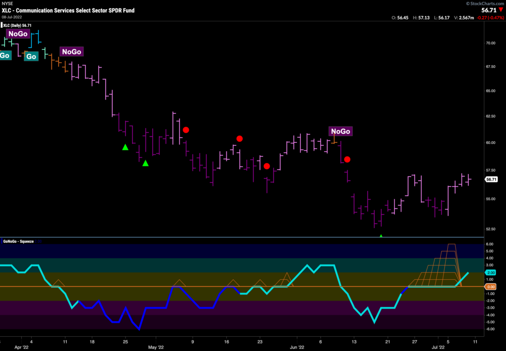
The above GoNoGo Sector RelMap shows us that on a relative basis, applying the GoNoGo Trend to the ratio of $XLC to $SPY, the communications sector has been outperforming for some time. Looking at the GoNoGo Chart below, we can see that the pure GoNoGo Trend is still a “NoGo”, it is just doing less badly than the rest of the market. One thing to note here is the oscillator. GoNoGo Oscillator has been able to break out of a max GoNoGo Squeeze into positive territory. This suggests there is some bullish momentum. We will look to see if this is enough to push price to a new high.
Netflix Base In?
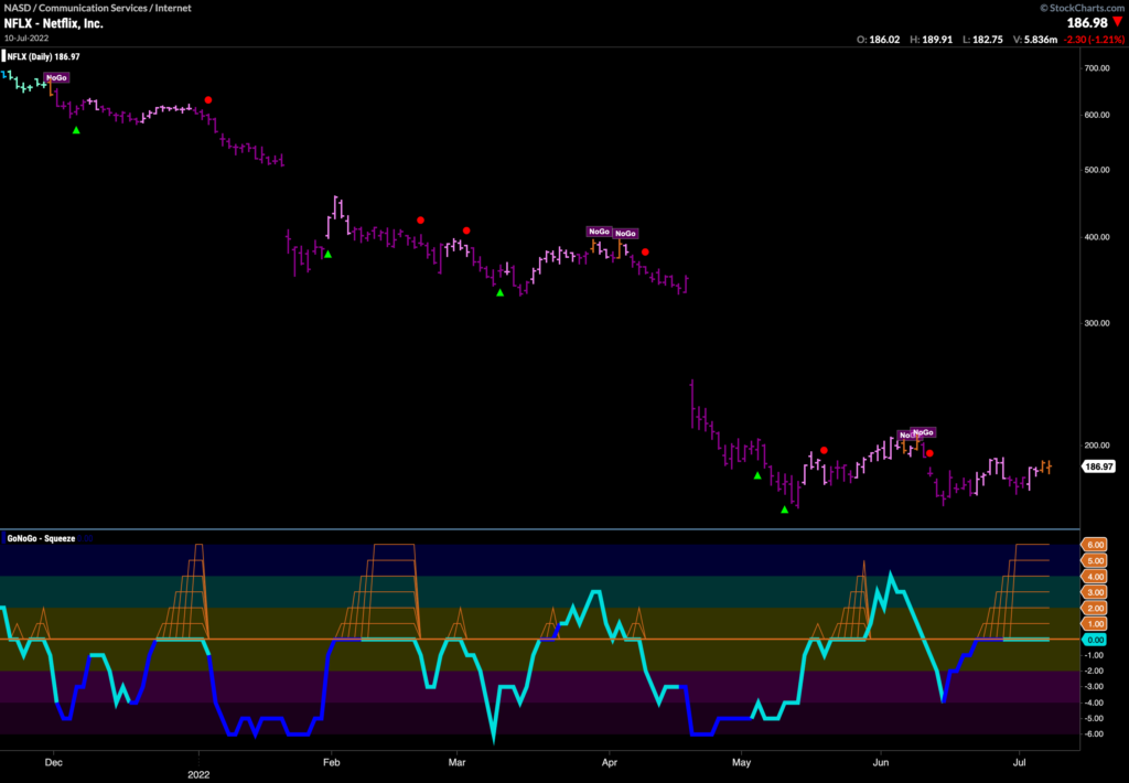
Is it finally time for Netflix to stop dropping like a rock? We have seen the “NoGo” trend do incredible damage to price over the past 6 months. This isn’t the first time that investors have been hopeful that the stock has put in a base.
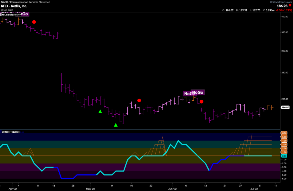
Zooming in we do see some signs of life, however that is not to say that we consider this an opportunity just yet. Price seems to have support around $164 as we’ve moved into the right side of this basing pattern we have seen some amber “Go Fish” bars creep in. Currently, two “Go Fish” bars have been drawn as GoNoGo Oscillator rides the zero line. This has caused the climbing grid of GoNoGo Squeeze to rise to its max. If the oscillator can break out of the squeeze into positive territory that might just give price the push it needs to set a new high. Full disclosure though, I would expect significant resistance from the earlier gap in the chart.
Can ConAgra Continue to Climb?
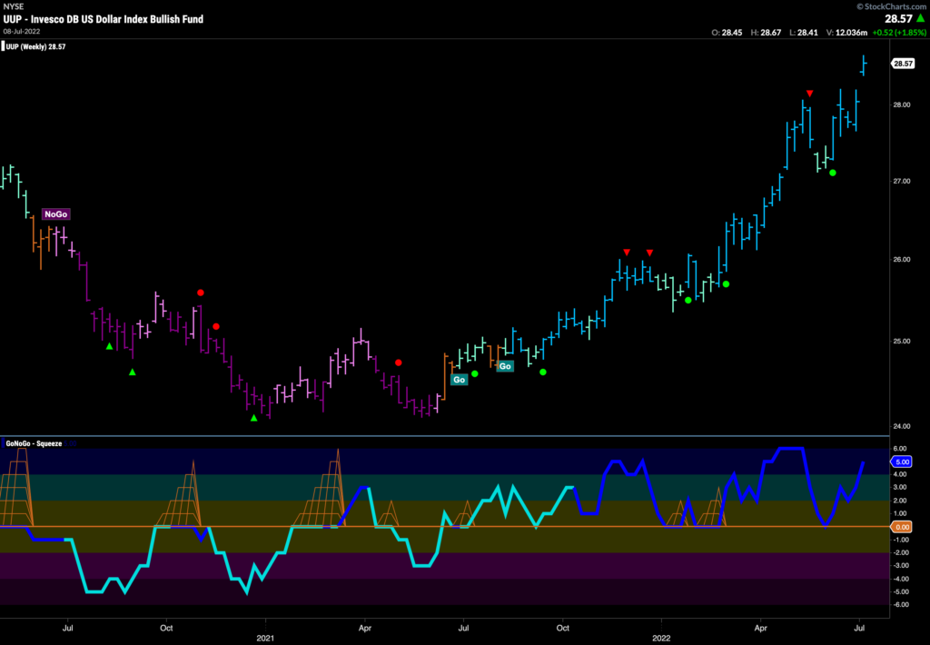
Going back to defense then, $CAG is a stock in the consumer staples sector that has enjoyed some price strength in recent weeks. A “Go” trend is in place and has strengthened to paint strong blue “Go” bars as GoNoGo Oscillator moved into positive territory on heavy volume. The oscillator is in positive territory but not yet overbought. Perhaps price has the legs to challenge prior highs above $36.50.
