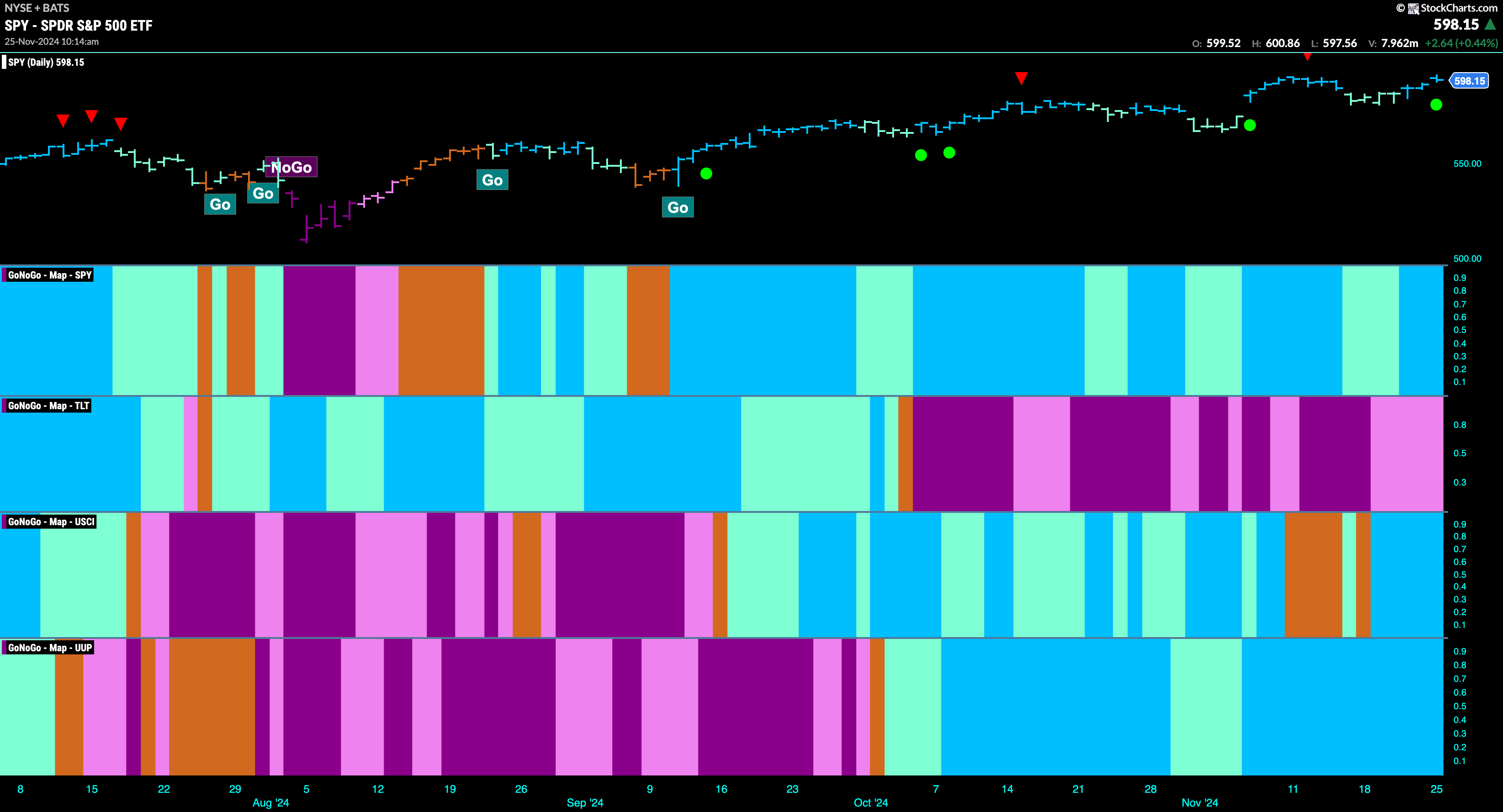
Good morning and welcome to this week’s Flight Path. The “Go” trend in equities has proved to be resilient as we saw strong blue “Go” bars return this week. Treasury bond prices remained in a “NoGo” although this week we did see weaker pink bars as the trend showed weakness. U.S. commodities painted strong blue “Go” bars this entire week as the “Go” trend returned. The dollar has looked strong for some time and we see no signs of this changing as GoNoGo Trend paints another week of uninterrupted strong blue bars.
$SPY Paints Strong Blue “Go” Bars as Strength Returns
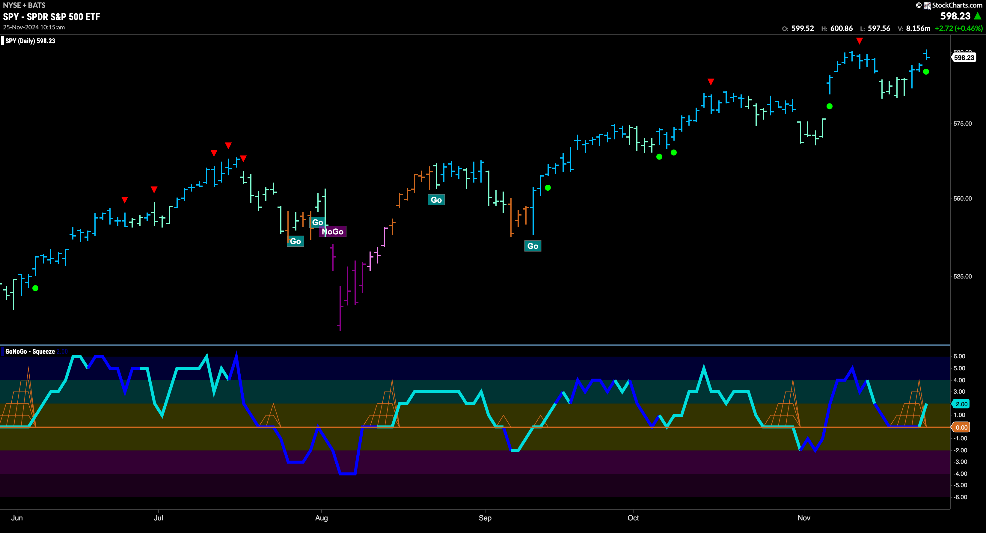
The GoNoGo chart below shows that price rallied nicely after falling from its Go Countertrend Correction Icon (red arrow). Price found support at prior high levels and we looked at the oscillator panel to see if GoNoGo Oscillator would find support at the zero line. It did after a few bars of a GoNoGo Squeeze and is now rebounding into positive territory. With momentum resurgent in the direction of the “Go” trend we will watch for price to make an attempt at new highs.
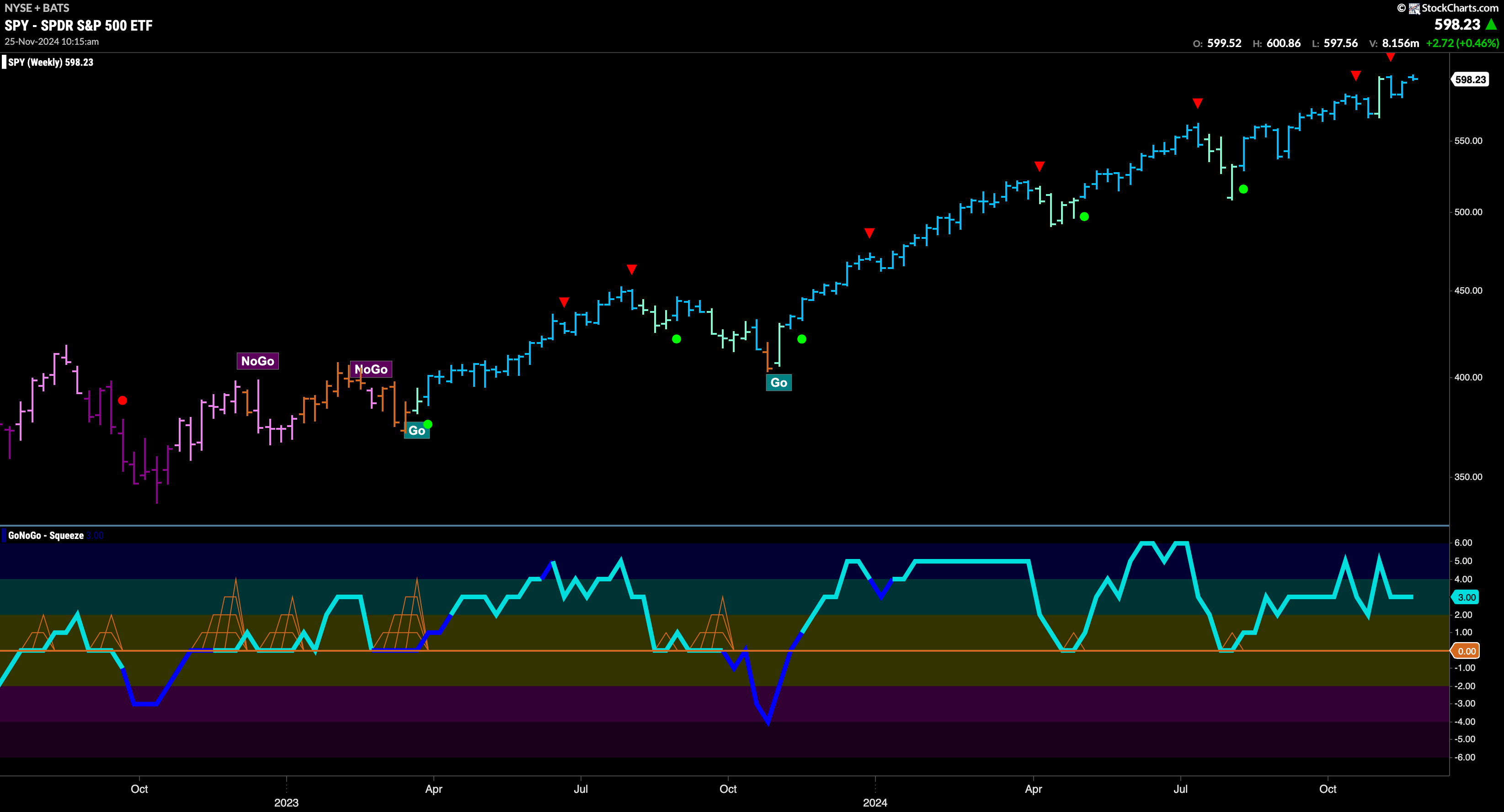
The “Go” trend has remained strong on the longer term chart as we see strong blue bars that followed the Go Countertrend Correction Icon and price has returned to test levels that would be new highs. GoNoGo Oscillator has remained in positive territory and is at a value of 3. With momentum confirming trend direction we will look to see if price can consolidate at these levels and move higher.
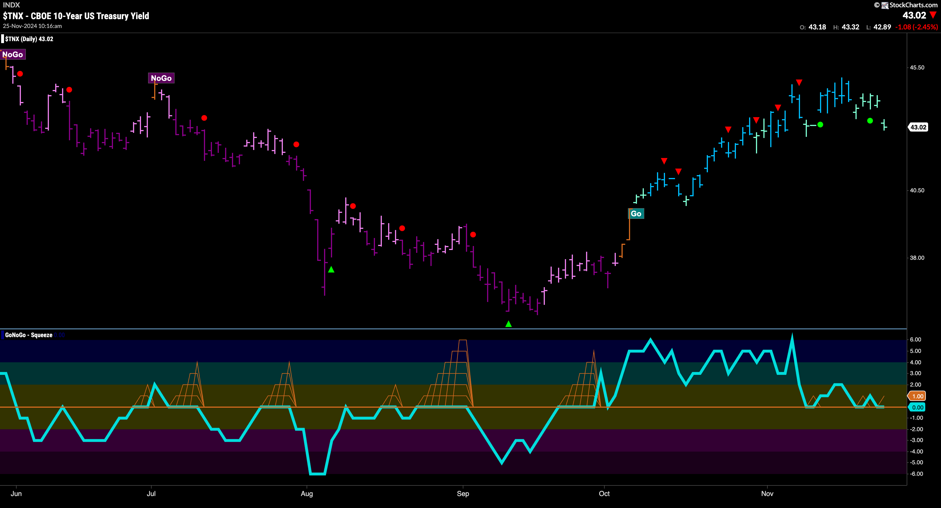
Treasury Rates Show Weakness but Remain in “Go” Trend
Treasury bond yields painted weaker aqua bars this week as price fell from recent highs. The “Go” trend remains in place but this is a show of weakness. We turn our attention to the oscillator panel and note that it is testing the zero line from above. We will watch to see if it finds support at this level which it should if the trend is to remain healthy.
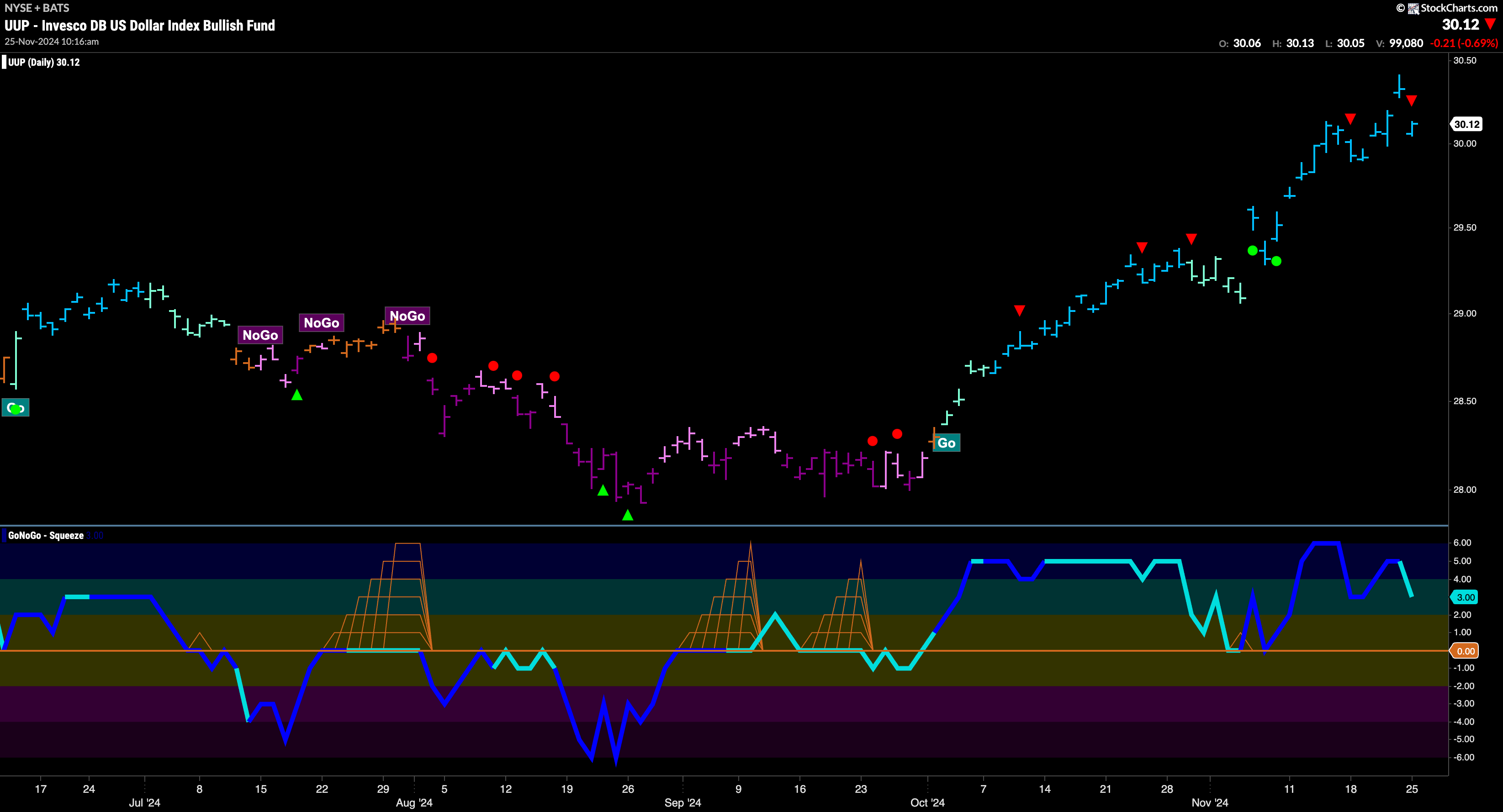
The Dollar Hit New High Again
Another week of strong blue “Go” bars sees the greenback make another higher high. We are now seeing a Go Countertrend Correction Icon (red arrow) as momentum wanes a touch. With momentum falling and at a value of 3, it will be important to watch to see if it finds support at zero if it gets there. We will need to see momentum stay at or above the zero level for the “Go” trend to remain healthy.
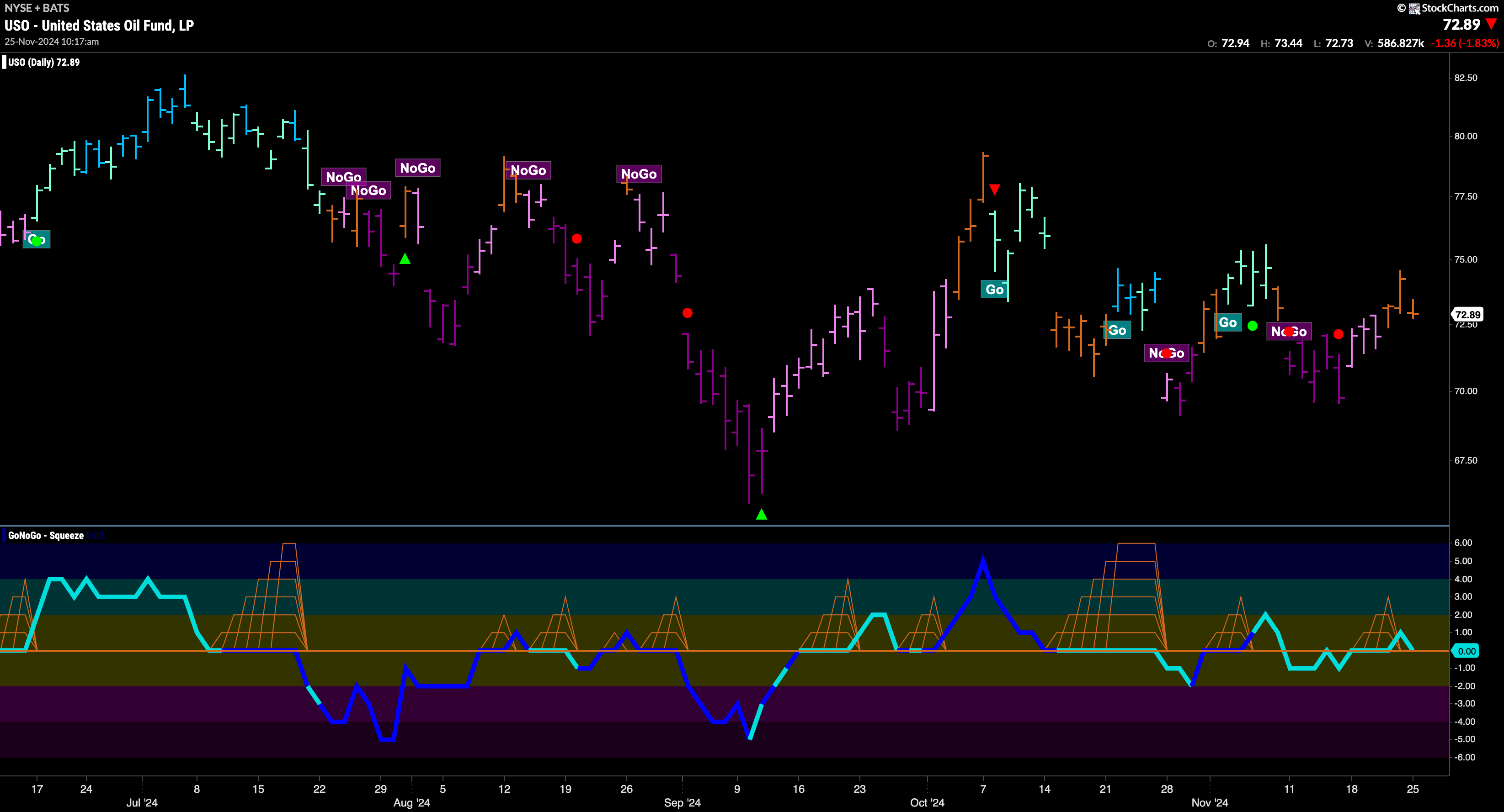
USO Continues with Pattern of Uncertainty
$USO has experienced great difficulty holding on to a trend over the last few months. This past week was no different as we saw the “NoGo” give way to amber “Go Fish” bars of uncertainty. With price range narrowing, it is no surprise that GoNoGo Oscillator is struggling to put any distance between itself and the zero line in either direction. We will watch to see if it moves into positive territory after testing that level from above. If so, a return to “Go” colors may be forthcoming.
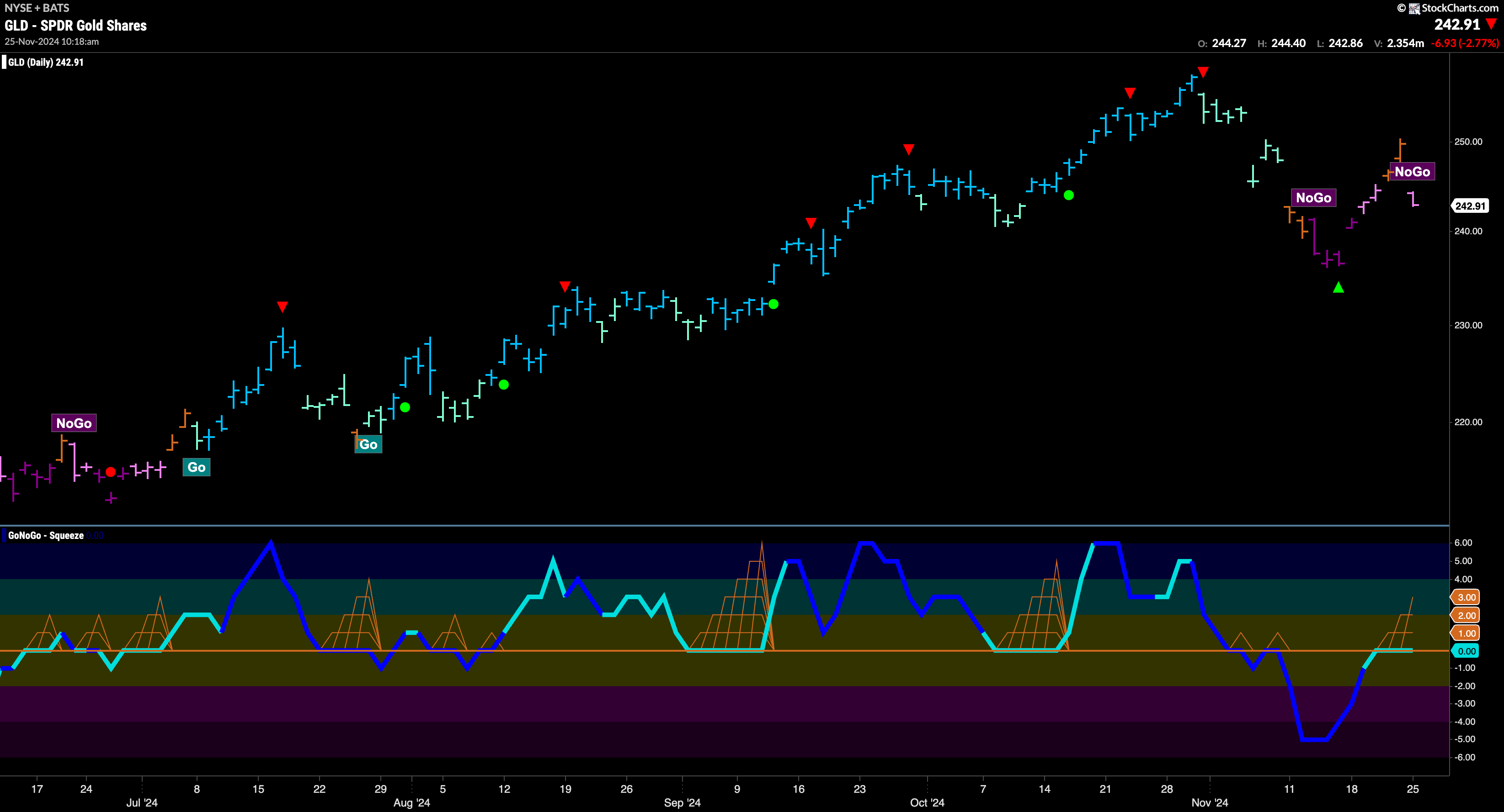
“NoGo” Hangs on For $GLD
After a couple of amber “Go Fish” bars that told us the market was uncertain regarding the “NoGo” trend, we saw price fall sharply and paint a new pink “NoGo” bar. GoNoGo Oscillator is riding the zero line from below where we watch as a virtual tug of war plays out between buyers and sellers in the form of a GoNoGo Squeeze. We will look for the direction of the break to tell us whether the “NoGo” will continue and if price will move to threaten the previous low.
Sector RelMap
Below is the GoNoGo Sector RelMap. This GoNoGo RelMap applies the GoNoGo Trend to the relative strength ratios of the sectors to the base index. With this view we can get a sense of the relative out performance and relative underperformance of the sectors. 5 sectors are in relative “Go” trends. $XLY, $XLC, $XLE, $XLF, and $XLI, are painting relative “Go” bars.

Financials Sub-Group RelMap
The chart below shows a relative trend breakdown of the sub groups within the financials sector. The Sub-Group RelMap plots the GoNoGo Trend of each sub index to the $XLF. We saw in the above GoNoGo Sector RelMap that $XLF is performing strongly relatively to the $SPY, with GoNoGo Trend painting new strong blue “Go” bars. If we look at the breakdown of the groups in the map below we can see where that outperformance is coming from. Painting persistent “Go” bars in the 5th panel and having outperformed for some weeks now is the asset managers sub group. 
$WULF Consolidates in “Go” Trend
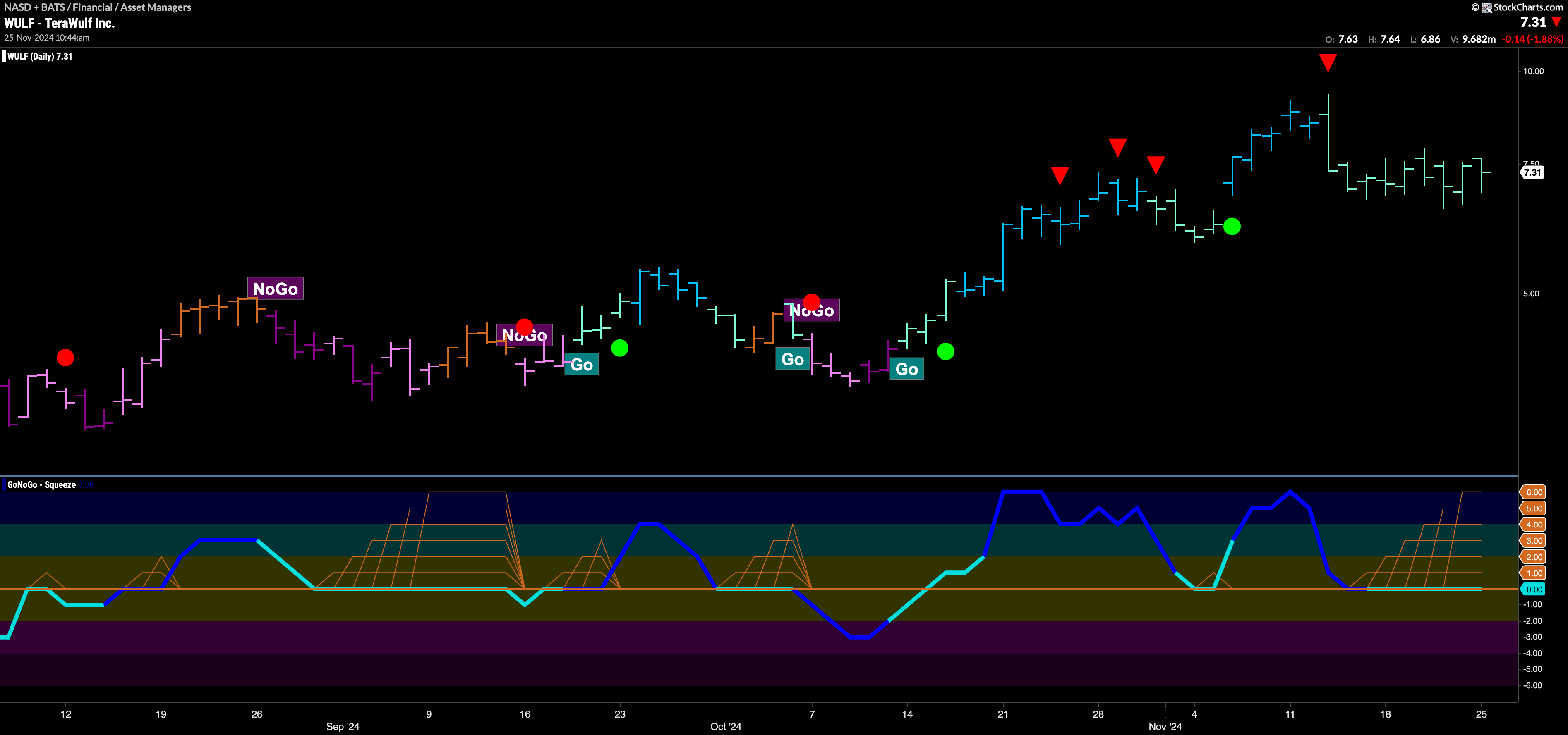
The chart below shows that $WULF has been in a “Go” trend and made a few higher highs and higher lows in the past few months. After the last high two weeks ago, we saw a Go Countertrend Correction Icon (red arrow) telling us that price may struggle to go higher in the short term. Indeed, since then, price has fallen and then meandered sideways as GoNoGo Trend paints nothing but weaker aqua bars. GoNoGo Oscillator fell to test the zero line as well and has been stuck at that level. We see a Max GoNoGo Squeeze as the indicator plots its next move. If it can break out of the Max GoNoGo Squeeze into positive territory we will know that momentum is resurgent in the direction of the “Go” trend and will look for price to make an attempt at a new high.
$JEF Soars to Higher Highs
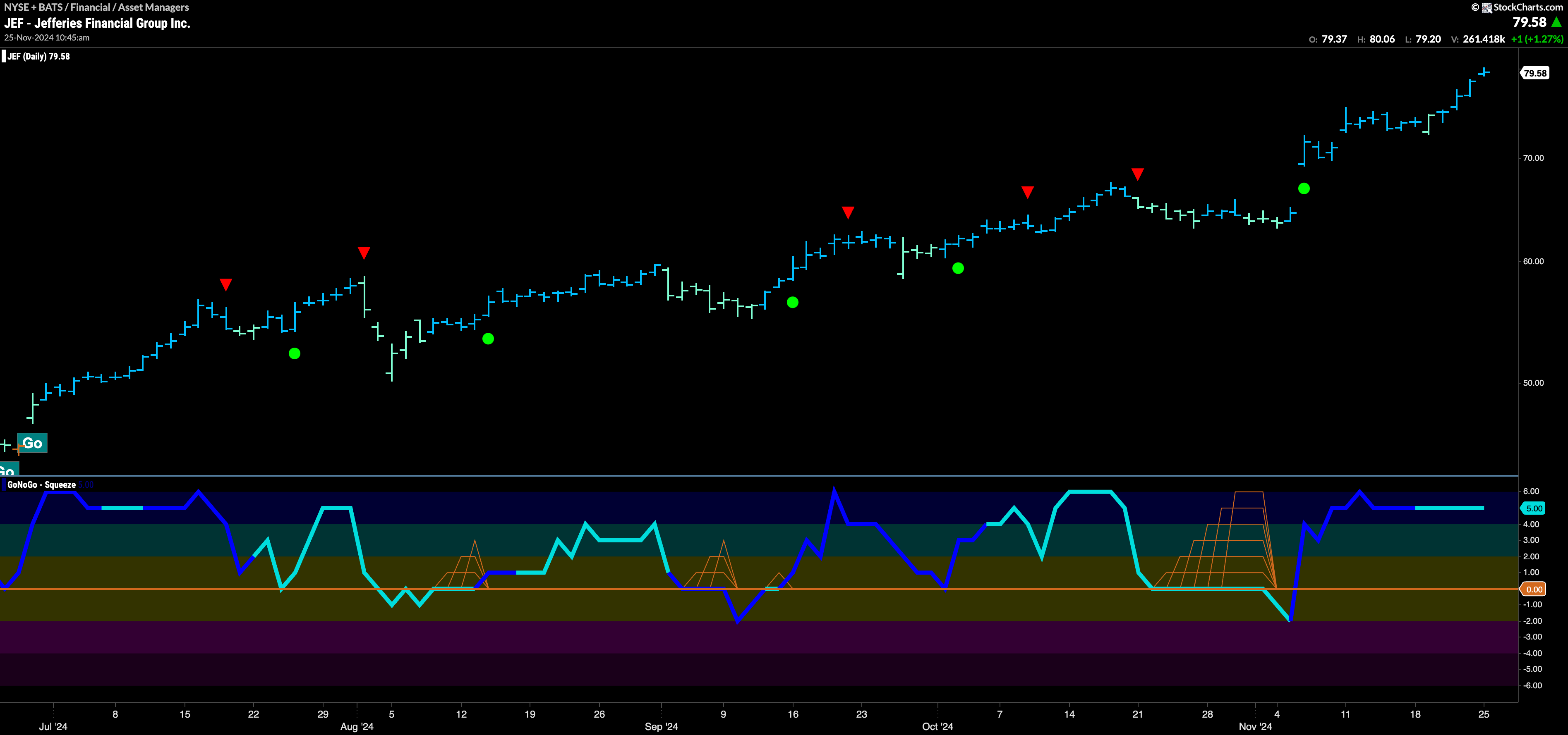
$JEF is in a strong “Go” trend that has been in place since the summer. Price has climbed through ever higher highs and lows and GoNoGo Trend has painted nothing but “Go” colors. GoNoGo Oscillator has primarily been at or above the zero level and recently, after a Max GoNoGo Squeeze burst back into positive territory on heavy volume. This suggested the most recent leg higher. Now, with the oscillator overbought for several bars, we will watch to see if a Go Countertrend Correction Icon appears warning of short term struggles to go higher. If it does, we will watch for oscillator support again at zero.
