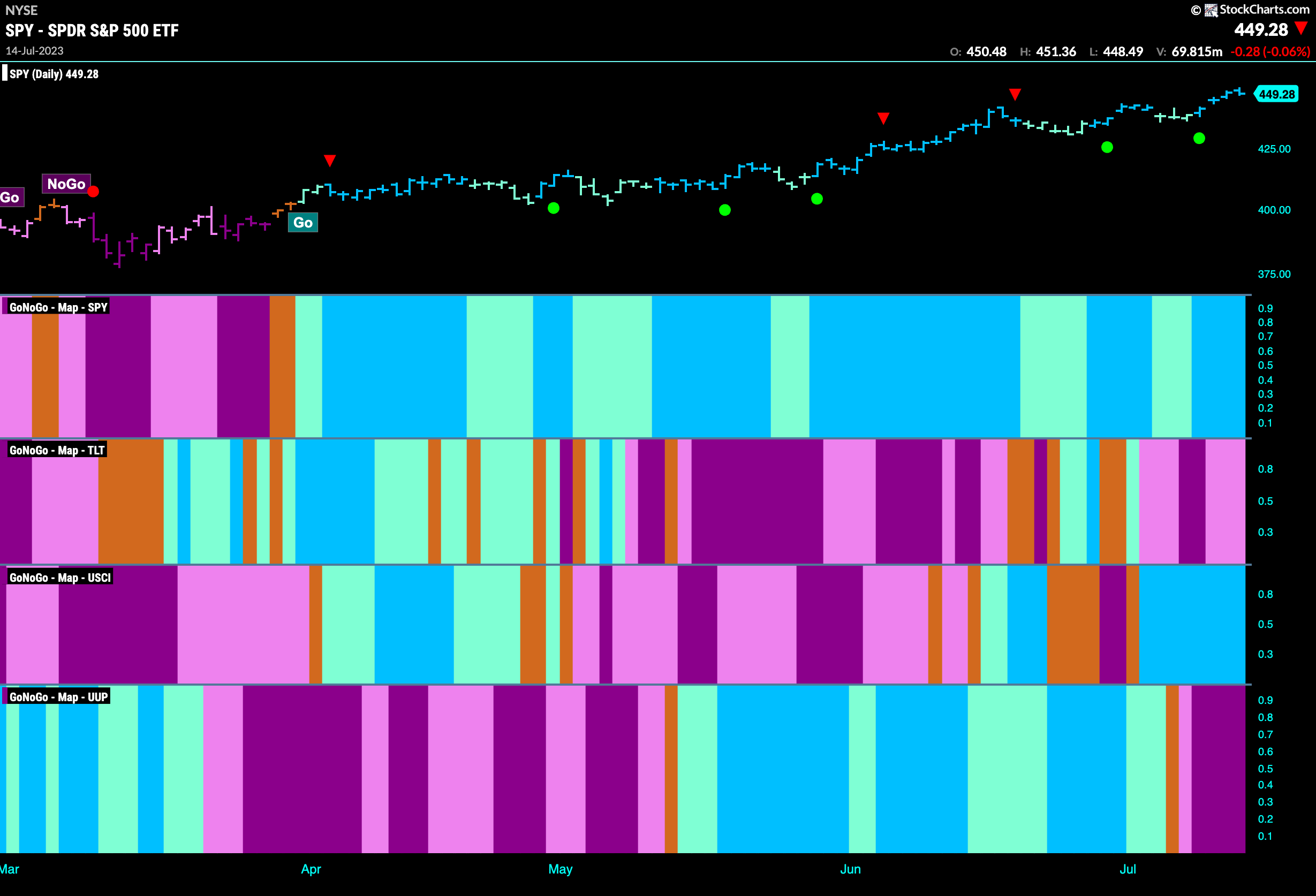
Good morning and welcome to this week’s Flight Path. The heat map shows that the “Go” trend in equities strengthened this week as we saw a new high on strong blue bars. Treasury bond prices remained in a “NoGo” although GoNoGo Trend painted weaker pink bars as the week came to a close. Commodities remained in a strong “Go” trend this week as the dollar suffered a big drop and a move to purple “NoGo” bars.
Equity Burst Through Resistance
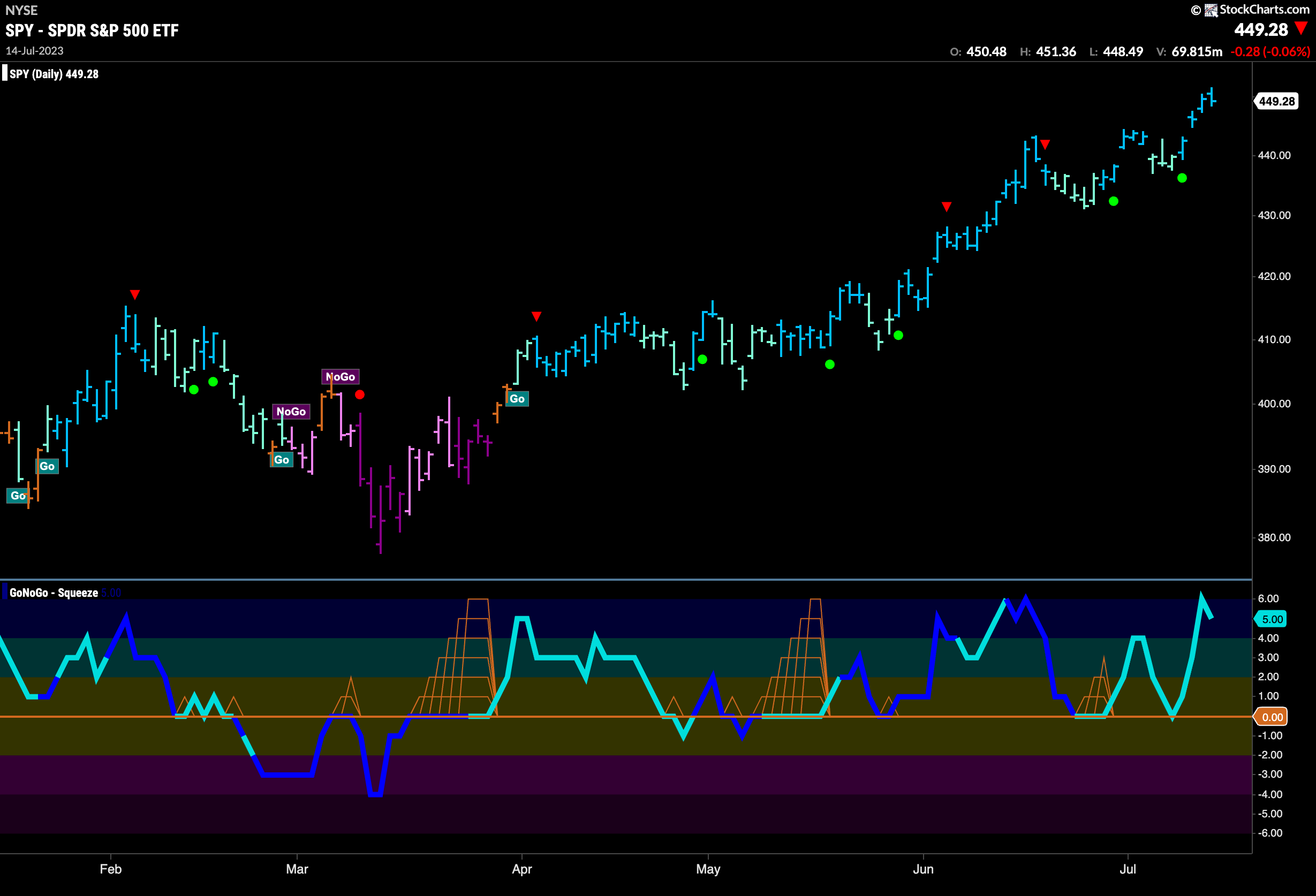
Last week we noted the resistance that price was struggling with but this week was a different story. Price burst through resistance and painted a string of strong blue Go” bars as the trend continued and we set a new high. GoNoGo Oscillator is now in overbought territory as investors pile into the trend.
The longer term weekly chart continues to show strength,. Yet another strong blue “Go” bar this week as price tests the resistance from the prior high from April ’22. We can see from this chart that there is still work to do. The trend is a strong “Go” however, and GoNoGo Oscillator tells us that momentum is on the side of the trend but not yet overbought. 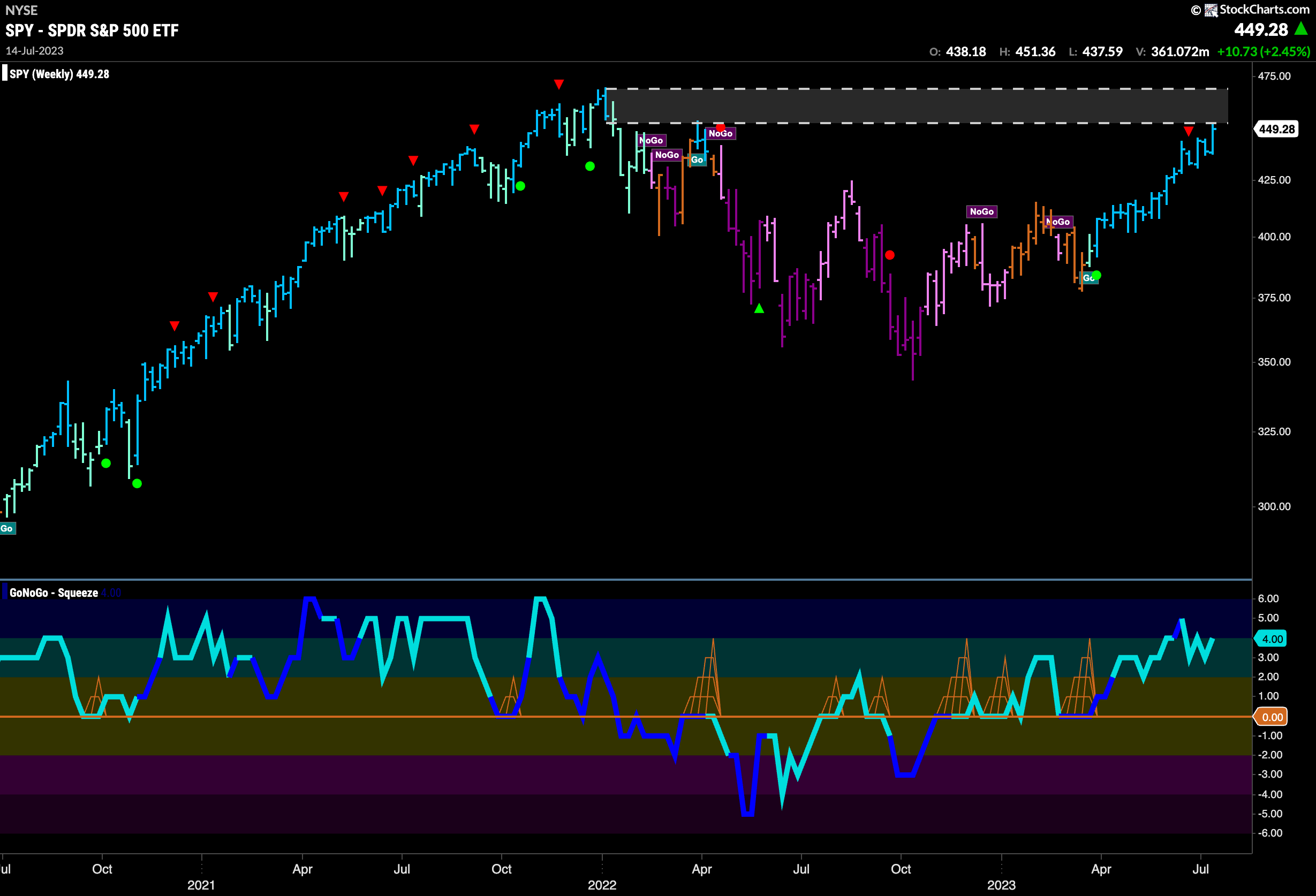
Treasury Bond Rates Retreat
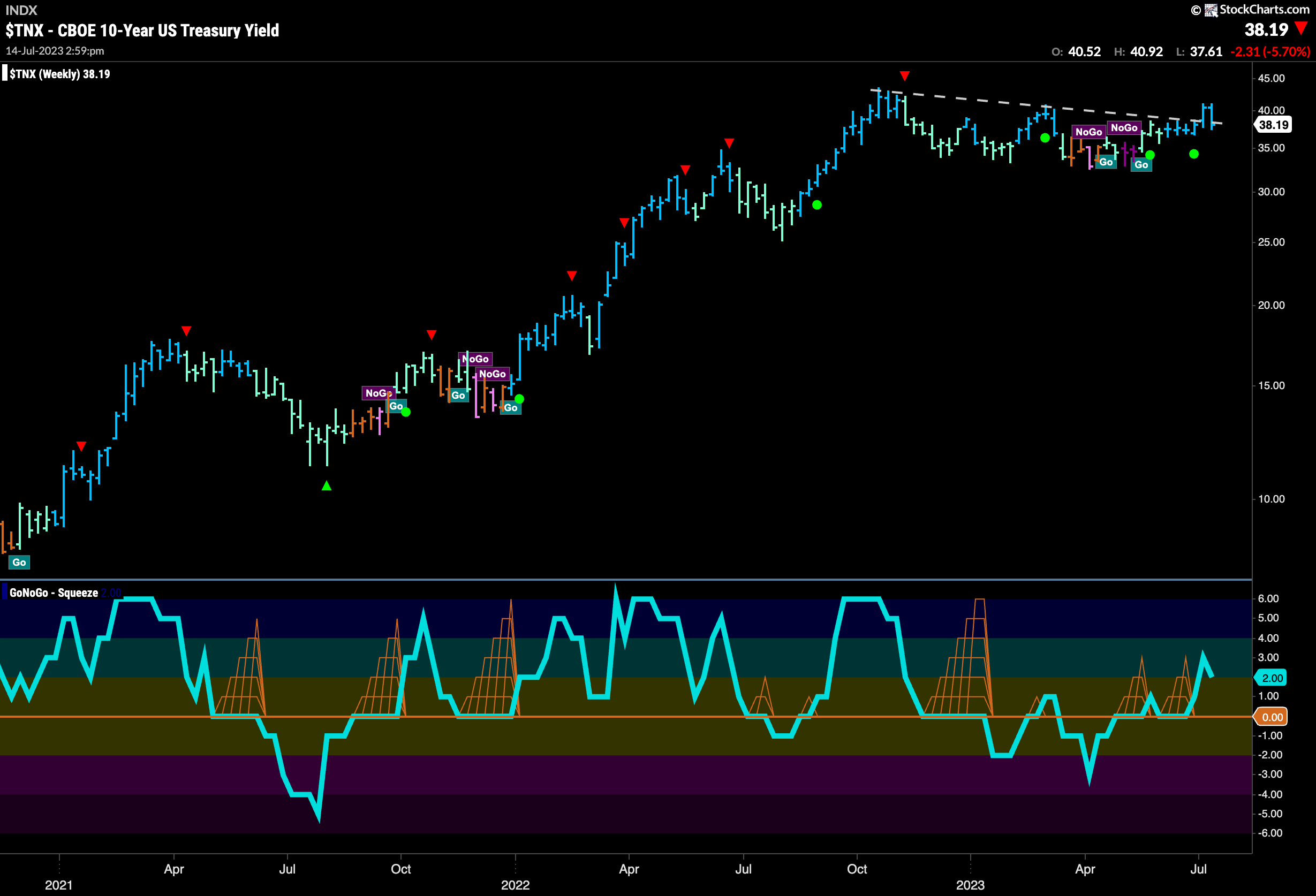
Treasury bond rates reversed course sharply this week after what looked like a break out last week. Retreating quickly, price fell back below the downward sloping trend line and so we will watch carefully to see if this is where it stays going forward. The trend is of course still a “Go” and momentum is positive even if we did not see the follow through from the break higher last week.
Dollar Crumbles
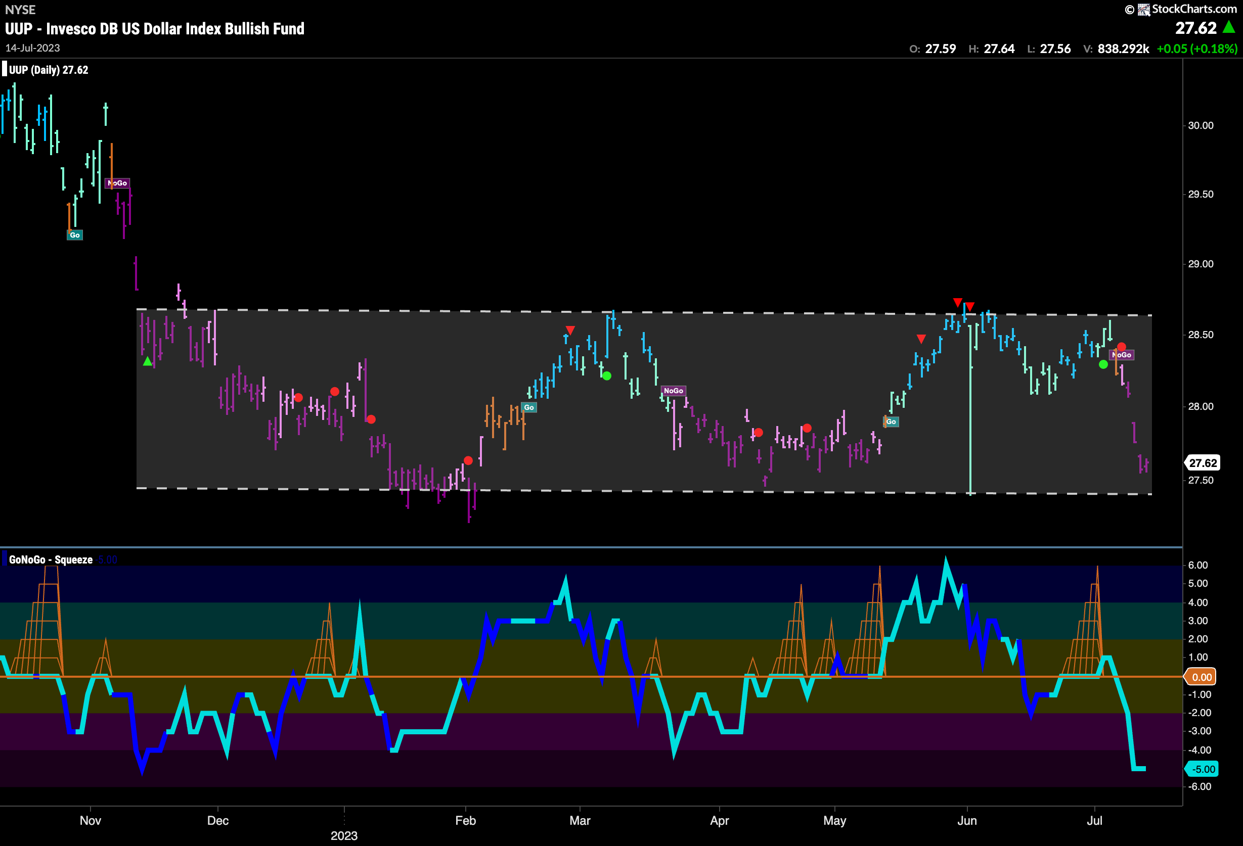
The dollar had a terrible week. We can see that after failing to challenge the horizontal resistance from prior highs the mighty greenback fell off a cliff. GoNoGo Oscillator crashed through the zero line and GoNoGo Trend painted a slew of strong purple “NoGo” bars as price plummeted. This week will be interesting as price will surely look for support.
Oil – “NoGo” Trend Tests Upper Bound
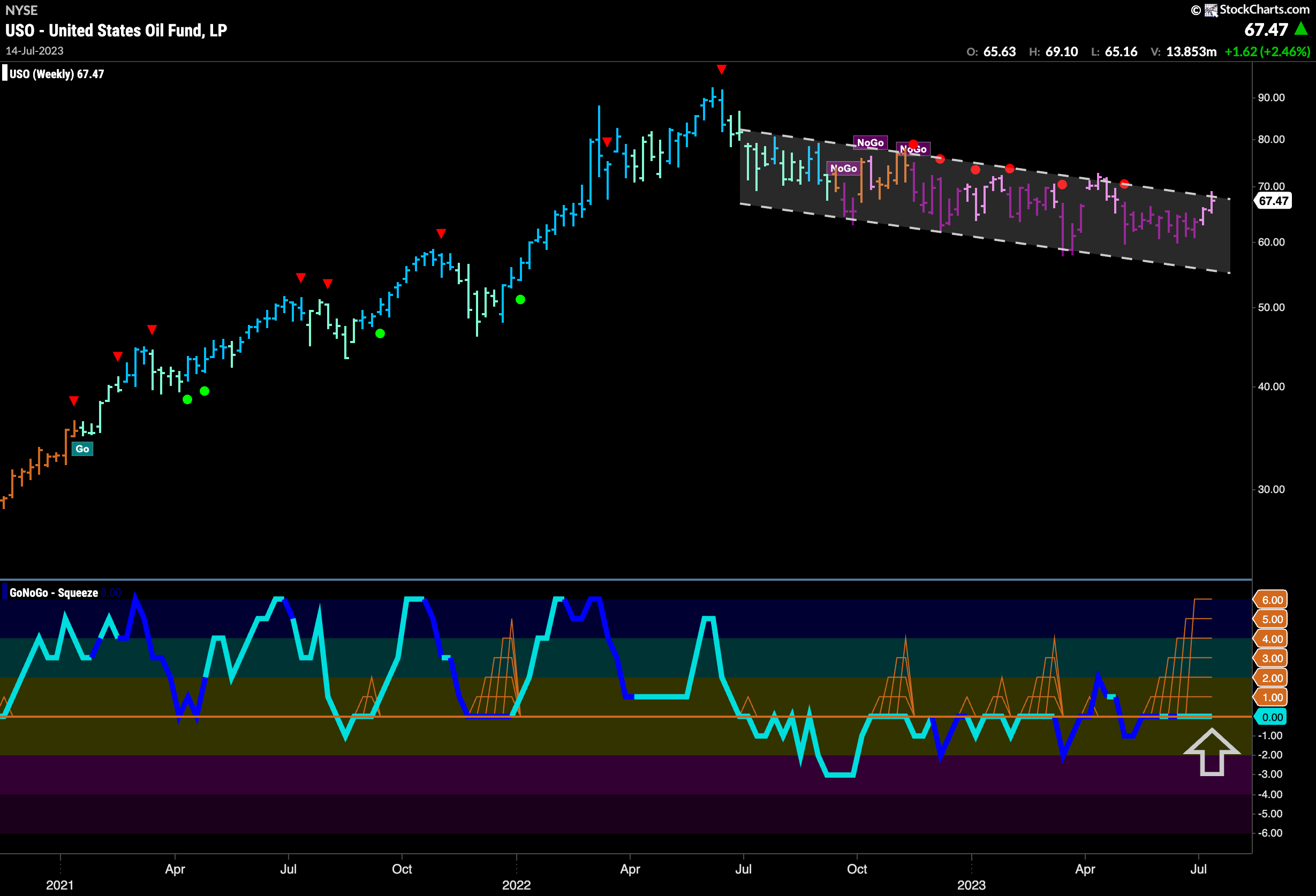
Oil shows some effort to test the upper bound of the persistent downward sloping trend channel. A second weaker pink “NoGo” bar appeared at the very top of the channel. GoNoGo Oscillator is riding the zero line and we see the climbing grid of GoNoGo Squeeze has risen to its max reflecting a tug of war between buyers and sellers. We will watch to see in which direction the Squeeze is broken.
Gold “NoGo” Trend Weakens
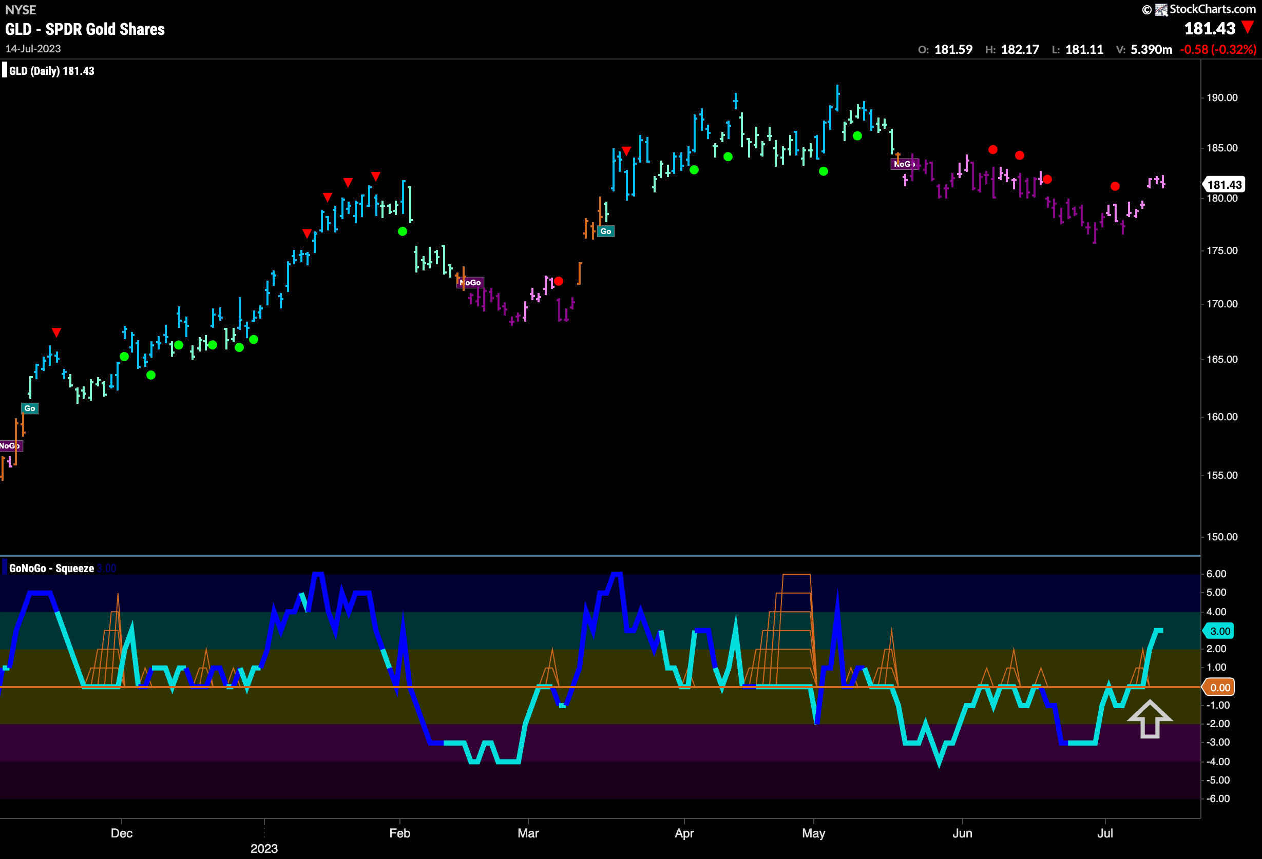
The “NoGo” trend that has been in place for several weeks saw some weakness as price rallied and GoNoGo Trend painted only pink bars this week. Also, GoNoGo Oscillator was able to break above the zero line into positive territory for the first time since the “NoGo” began. This positive momentum saw price gap higher and we will watch to see if the trend reverses,
Sector RelMap
Below is the GoNoGo Sector RelMap. This GoNoGo RelMap applies the GoNoGo Trend to the relative strength ratios of the sectors to the base index. Looking at this map, we can quickly see where the relative outperformance is coming from as well as which sectors are lagging on a relative basis. 4 sectors are outperforming the base index this week. $XLK, $XLY, $XLC and $XLI are painting “Go” bars.
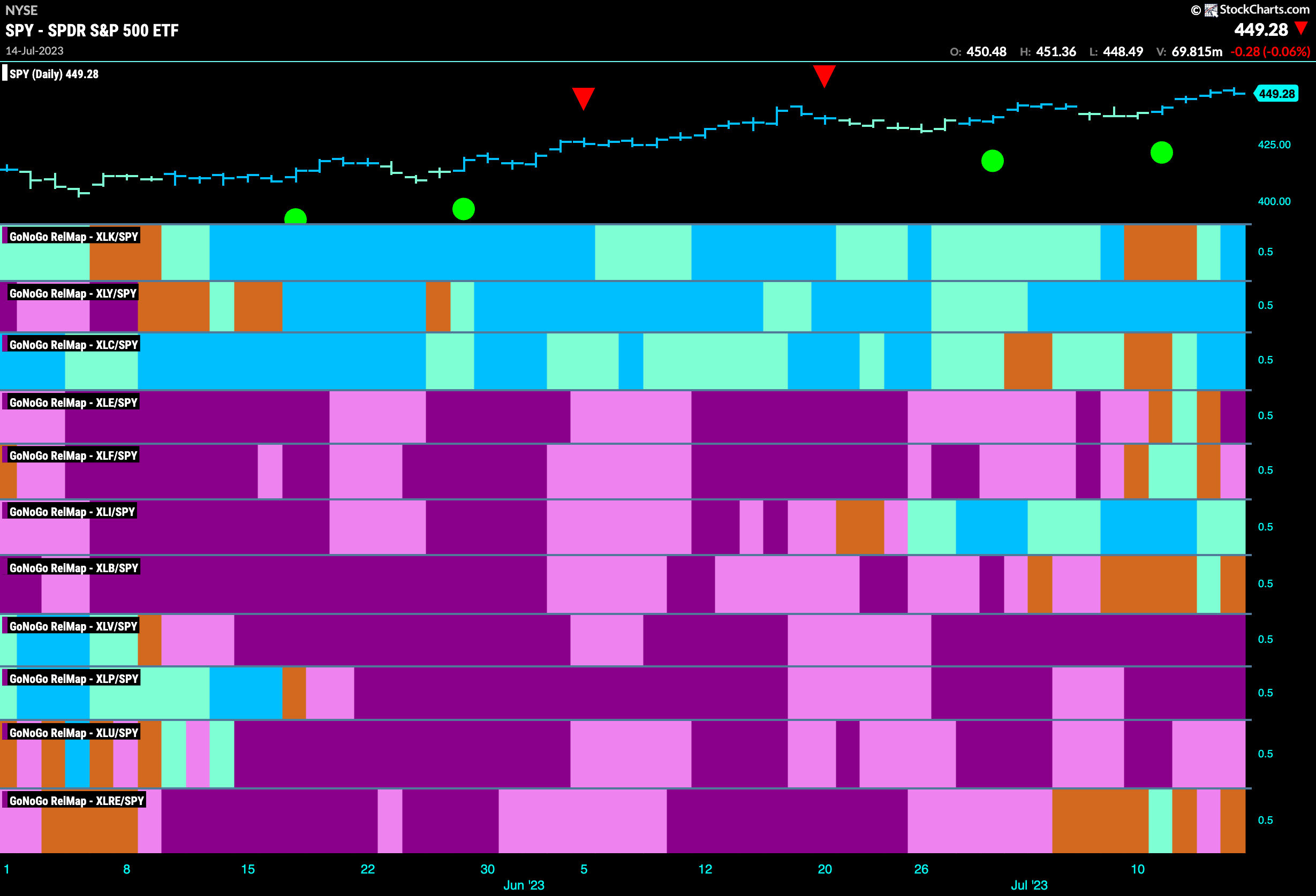
$XLK Resumes Leadership
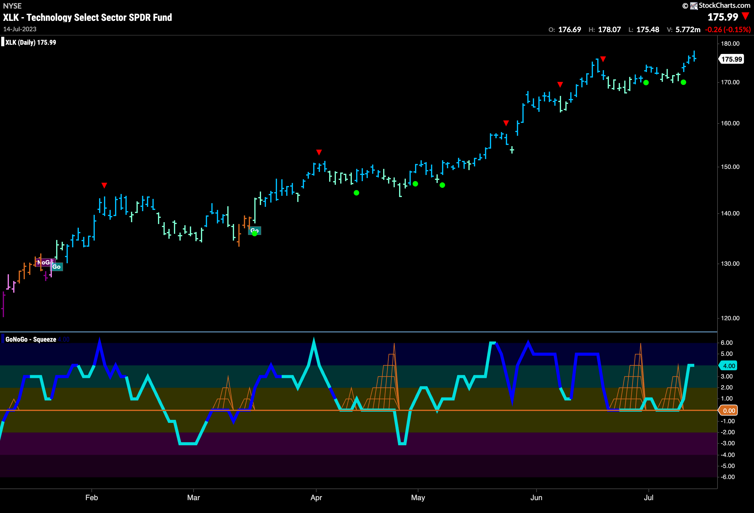
As we saw on the GoNoGo Sector RelMap above, the technology sector resumed its relative “Go” trend after a few amber “Go Fish” bars. The chart below shows just how strong the pure trend has been. GoNoGo Trend paints strong blue “Go” bars as price puts pressure on prior highs. With several Go Trend Continuation Icons (green circles) and GoNoGo Oscillator in positive territory but not overbought, the bulls will be happy with this picture.
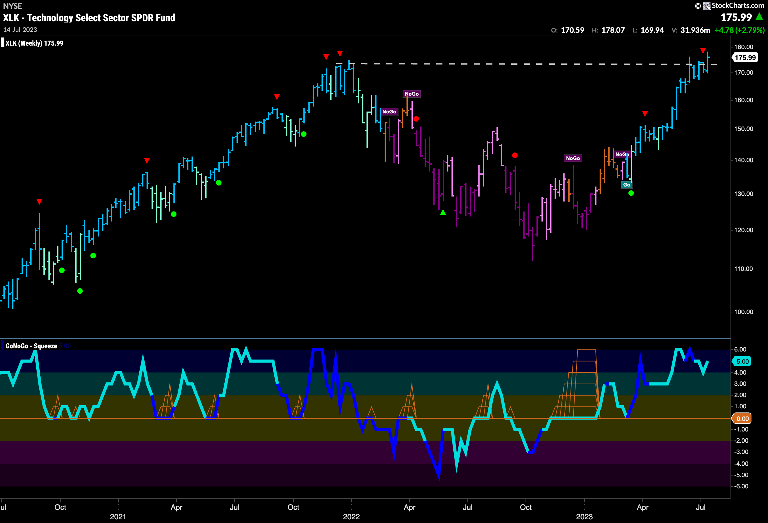
The weekly chart shows just how significant this price action is. We noted that S&P 500 still has overhead resistance to worry about. Not so for $XLK. Last week saw price close higher than prior highs. With a string of strong blue “Go” bars and no resistance to worry about, we could see further gains for the sector.
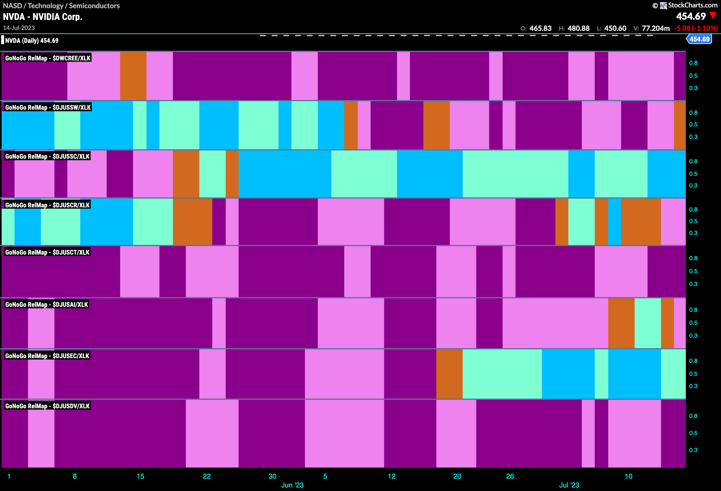
Tech Industry Group RelMap
What’s driving the outperformance in the technology sector? Still semiconductors. The third panel on this chart below represents the semiconductor sub group ($DJUSSC). We can see that this has been the consistent out-performer on a relative basis to the larger index. Painting strong blue “Go” bars again now, it doesn’t look to be slowing down.
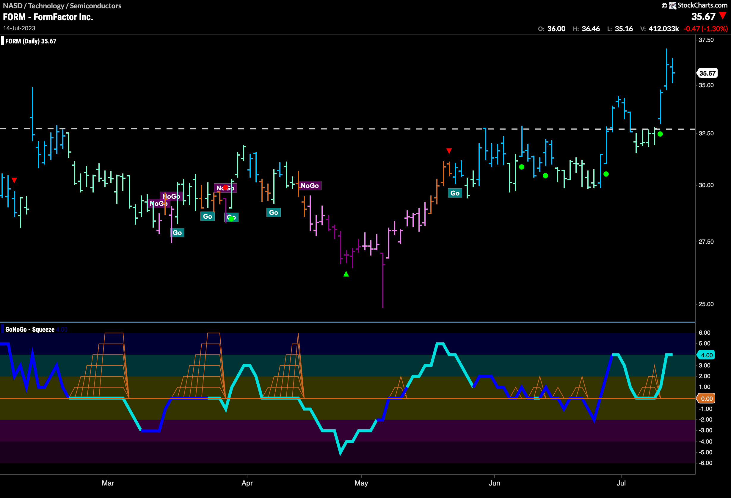
$FORM Making a Break for it
Looking for opportunities in this space we can look at a chart of $FORM. For weeks we have discussed the strength of semi conductors and securities such as $NVDA, but $FORM is one that hasn’t taken off in quite the same way just yet. The daily chart below shows that now may be the time. The “Go” trend is in place, and we have recently seen another Go Trend Continuation Icon (green circle) telling us that momentum is on the side of the trend. We can confirm this by looking in hte lower panel to see how the oscillator recently rallied off the zero line. Price also looks to have finally overcome horizontal resistance.
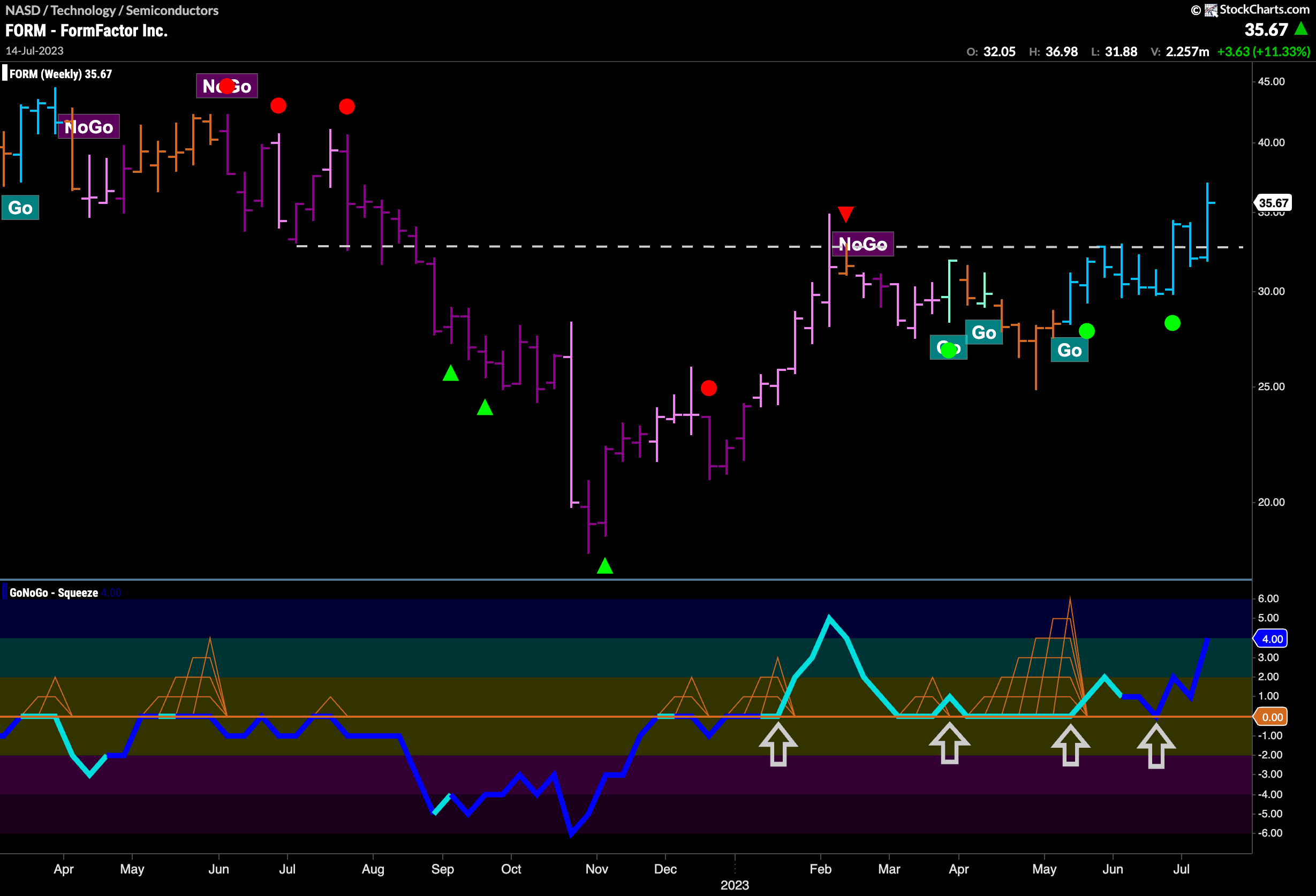
The weekly chart shows this set up well. After GoNoGo Oscillator broke through the zero line for the first time in January, it has repeatedly found support at that level giving price the momentum it needed to change trend and finally break through resistance. GoNoGo Trend is painting strong blue “Go” bars and the oscillator is in positive territory on heavy volume.
