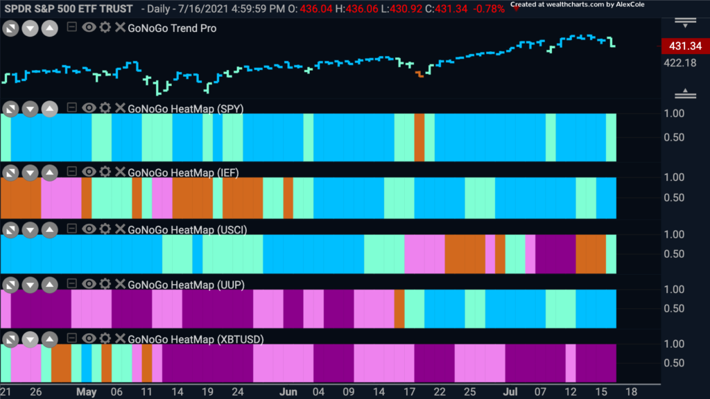
U.S. Domestic stock markets made a new high this week but ended with a day that gave up a lot of those gains. Let’s look at the GoNoGo Asset Class map below to see where the major trends continue to be. As you can see, the “Go” trends remain in place for equities, treasury bonds and the U.S. dollar. Having said that, the sharp drop on Friday caused the GoNoGo Trend indicator to paint a paler aqua bar for the $SPY. Commodities are in flux, trying to break out of the “NoGo” environment as we see a pale aqua “Go” bar creep in. The dollar continues in its “Go” trend painting the strongest blue bars.
Greenback Looks Good
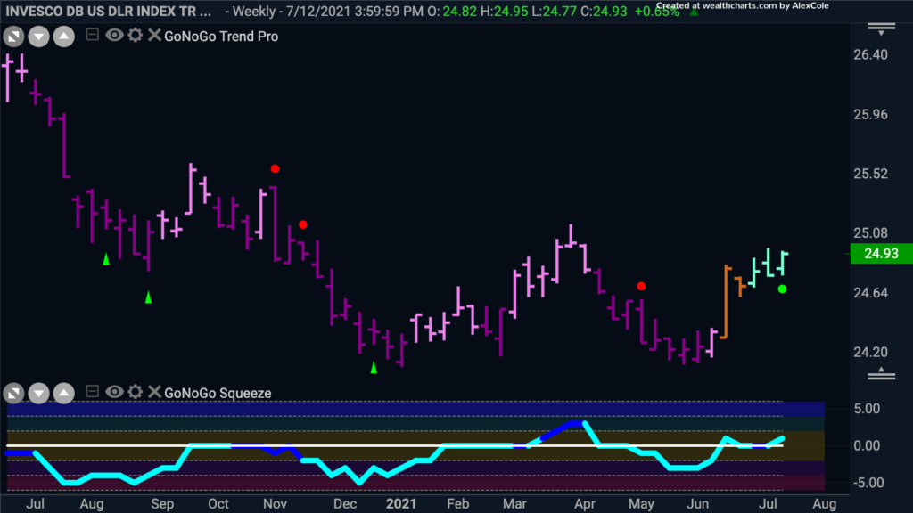
For a long time we have been talking about short term rallies in the dollar against the back drop of a larger down trend. Each bullish signal on the shorter time frame we have taken perhaps with a grain of salt in the context of falling weekly prices. The weekly GoNoGo Chart of $UUP below shows that perhaps things have changed. The GoNoGo Trend indicator was unable to maintain “NoGo” bars after the most recent low. First we saw amber “Go Fish” bars before a succession of pale aqua “Go” bars took hold. Now, we see that the GoNoGo Oscillator has also been able to find support at the zero line confirming the changing trend environment we see in price.
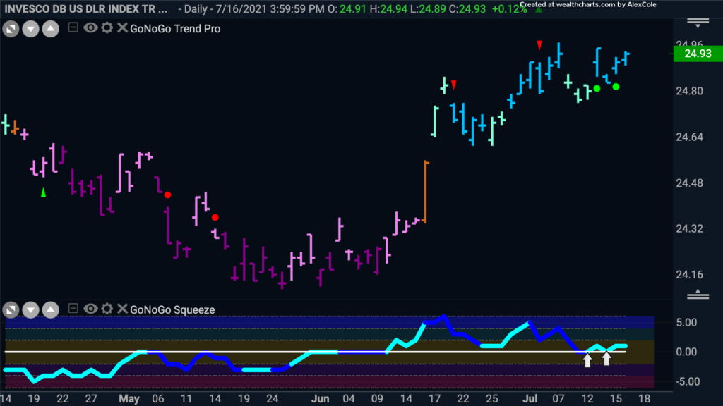
Given that the trend is now a “Go” on the larger time frame, let’s take a close look at the daily GoNoGo chart. Now that the larger trend is in place, we can see that there are opportunities to enter the daily “Go” trend as the GoNoGo Oscillator has found support at the zero line, triggering low risk Go Trend Continuation green circles to appear under price. We expect price to make an attack on recent early July highs.
Is it Over for Oil?
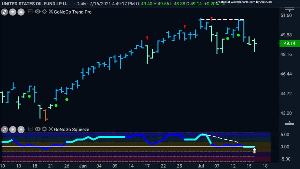
In theory, a rising dollar is bad for commodities. Many are priced in dollars and when the raw price of a resource increases it can cause demand to drop. The chart below shows the GoNoGo Chart of $USO, the United States Oil Fund. If the GoNoGo chart analysis above shows that the trend in the dollar is a “Go” on multiple time frames we can look at the oil chart below with an eye for any weakness that is perhaps around the corner. While the trend is still a “Go”, we see weakness in the pale aqua bars. Also, there is bearish divergence between the price chart and the GoNoGo Oscillator. This sideways consolidation has caused the GoNoGo Oscillator to fall to the zero line where it is now imperative that support is found.
Antero Ready for the Axe?
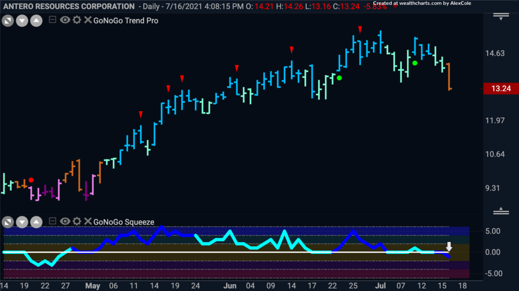
If the strengthening “Go” trend in the dollar is going to provide turbulence for oil prices, we can look at securities that are likely to be sensitive to any drop. Antero resources is a shale and crude oil producer whose costs are greatly dependent on the price of oil. The GoNoGo Chart below shows that price has fallen out of its “Go” trend and is painting its first amber “Go Fish” bar. With that, the GoNoGo Oscillator which was riding the zero line for several bars has failed to find support, falling into negative territory on heavy volume. This could be the start of a more serious correction in the coming weeks.
Capturing Consumer Discretionary Alpha
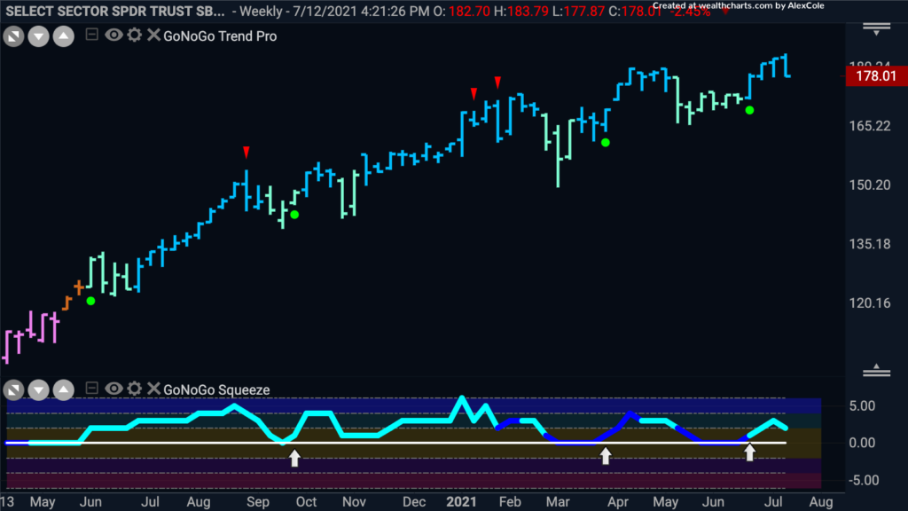
Of course, not all stocks will suffer from a stronger dollar. It can be argued that the American consumer will have more money in their pockets as the dollar strengthens. As large, luxury items, especially those manufactured abroad become cheaper, they will have more money to spend on discretionary items. The GoNoGo Chart below shows weekly prices of $XLY and we can see that the “Go” trend has continued to show strength over the last year. Recently, we see that the GoNoGo Oscillator has found support at the zero line and triggered a Go Trend Continuation green circle to appear under the price bar suggesting that momentum has come back in the direction of the “Go” trend.
Dreaming of Disney
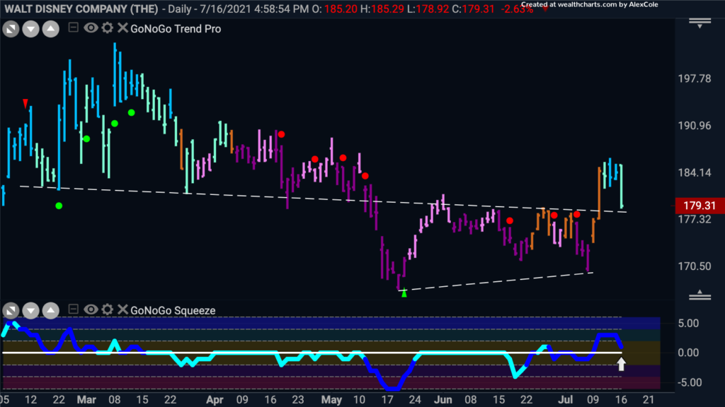
I don”t think I’m alone in having a family that would love a Disney vacation after being pent up for almost a year and a half. Let’s take a look at the GoNoGo chart of the Walt Disney Company to see if there is an opportunity to take advantage of the long term “Go” trend in the consumer discretionary sector. Having suffered a relatively drawn out correction from March highs that has lasted several months, we see that the “Go” trend returned this week as prices broke above resistance. Having also set a new, higher low, we see that the GoNoGo Oscillator was able to break into positive territory on heavy volume. The concept of polarity – support becomes resistance and resistance becomes support – tells us that price has fallen to levels that should be support. As the GoNoGo Oscillator approaches the zero line we will look to see if it can find support there. If it does, we can expect price to rally to a new high.
