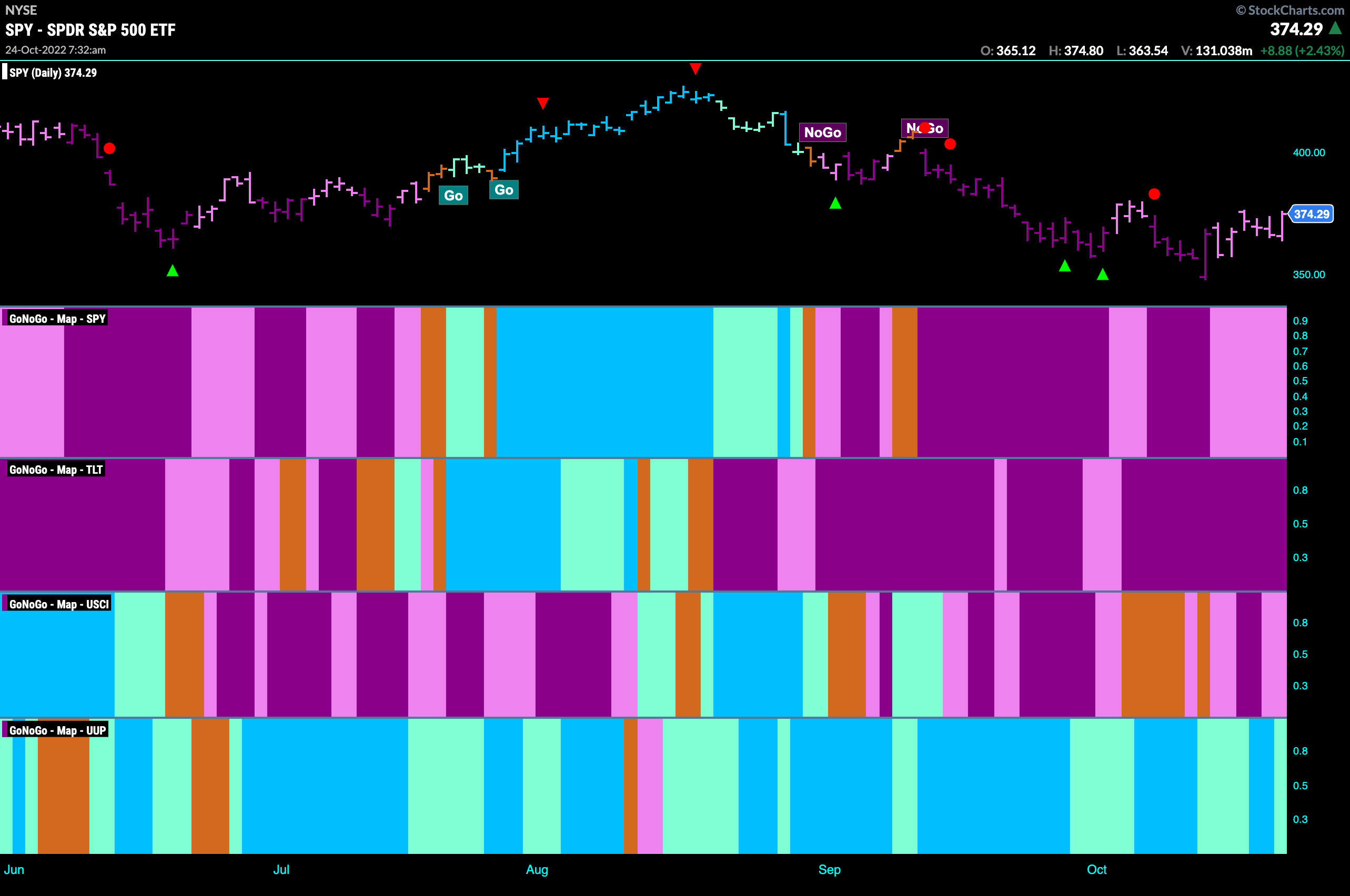
Good morning and welcome to this week’s Flight Path. Let’s take a look at the GoNoGo Asset map below. Volatility seems to be the norm as we saw an incredible swing on Thursday. S&P 500 rallied on Friday but still closed slightly lower than the high from earlier in the week. Treasury bond prices remain in a strong “NoGo” as the dollar fights to hang on to its “Go” trend.
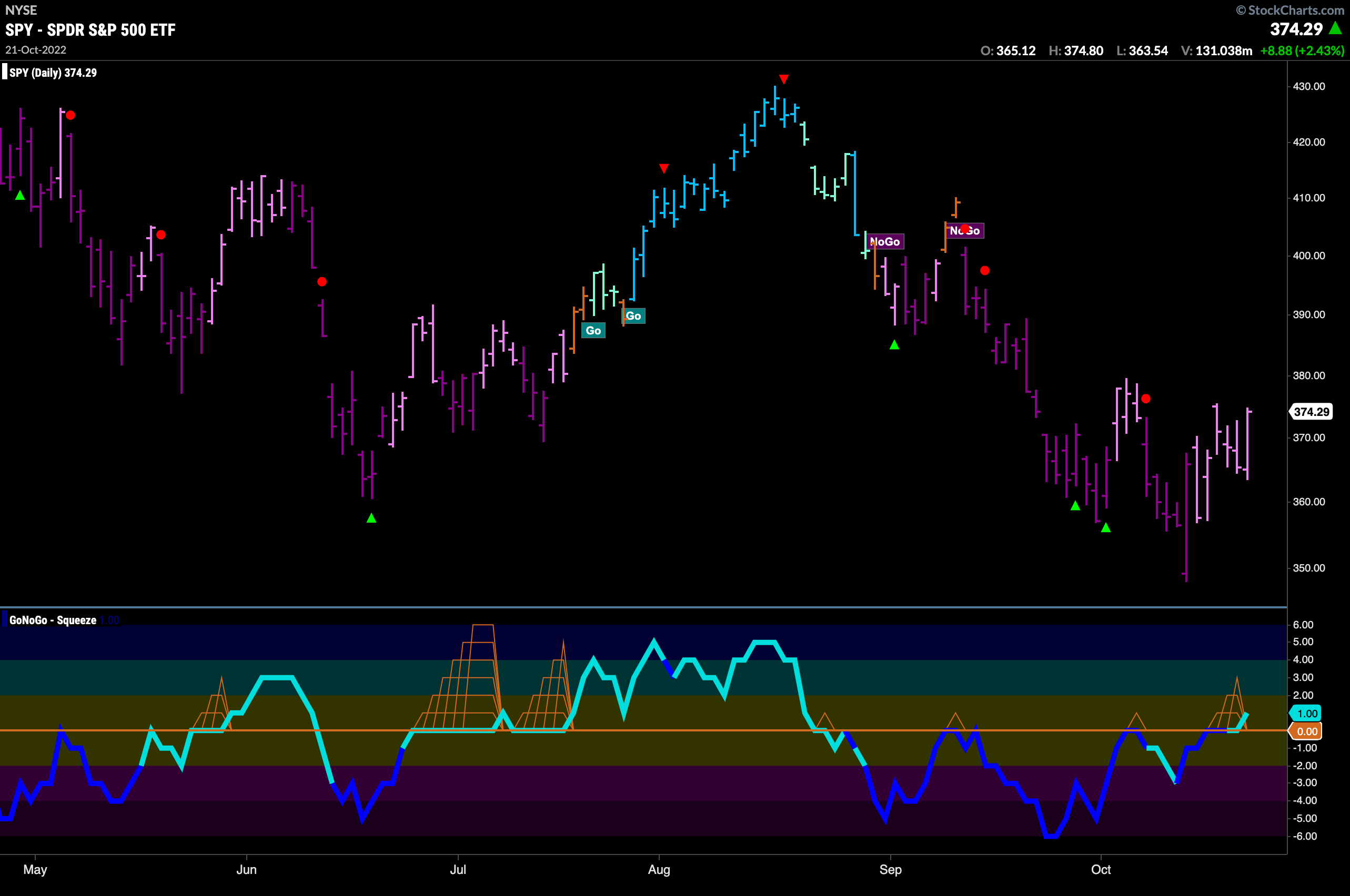
S&P 500 Sets New Low
The “NoGo” trend in the S&P 500 continues this week but we saw all pink bars indicating that there is weakness in the trend. As prices climb from last weeks low we see that GoNoGo Oscillator has been able to dip its nose into positive territory after showing bullish divergence over the last few weeks. We will look to see if this can lead to further price gains this week as investors hope this is “the low”.
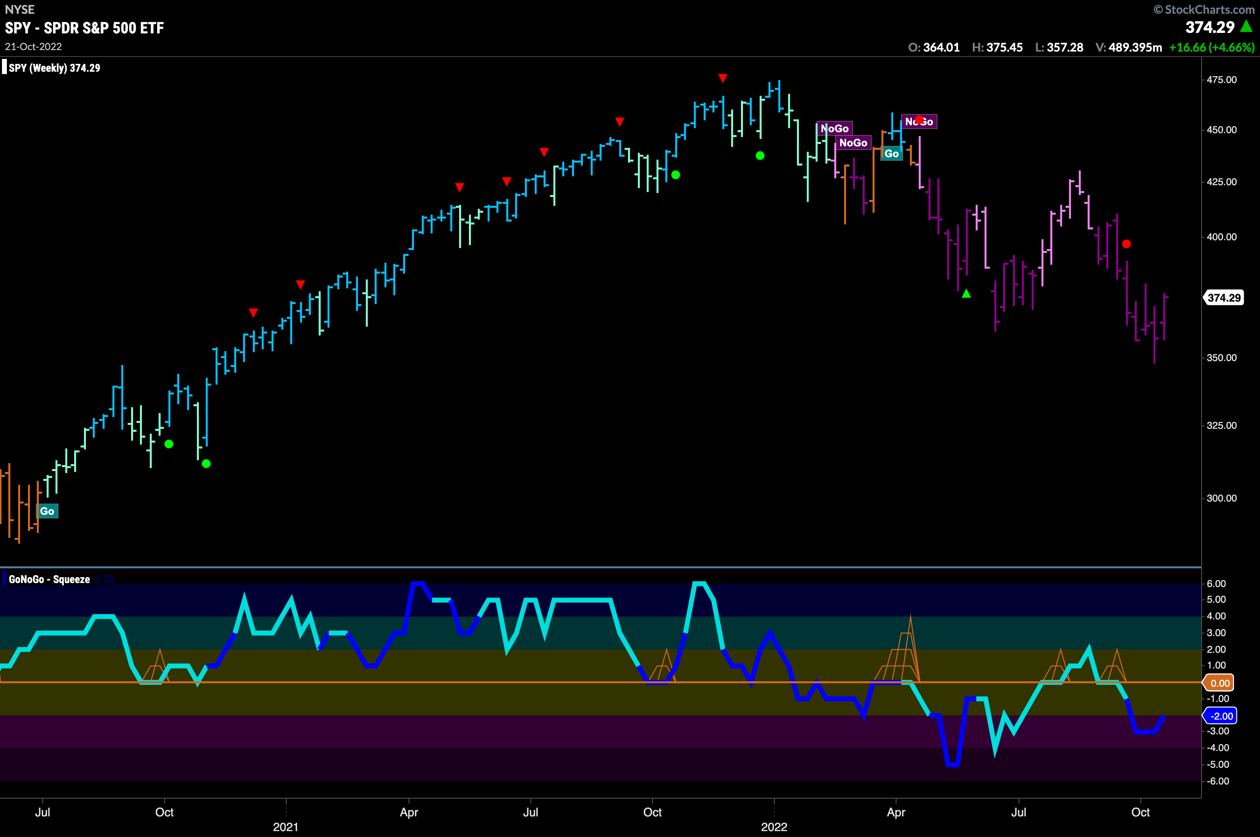
The weekly chart shows that the “NoGo” trend is still strong. We are only a week out from a new lower low and the bars are still purple. If there is anything to suggest that what we are seeing in the daily chart may be more than just a relief a rally it is that there is some bullish divergence appearing now on the weekly chart as well as the daily. Price is making lower lows but GoNoGo Oscillator has made a higher low.
Treasury Keep Moving Higher
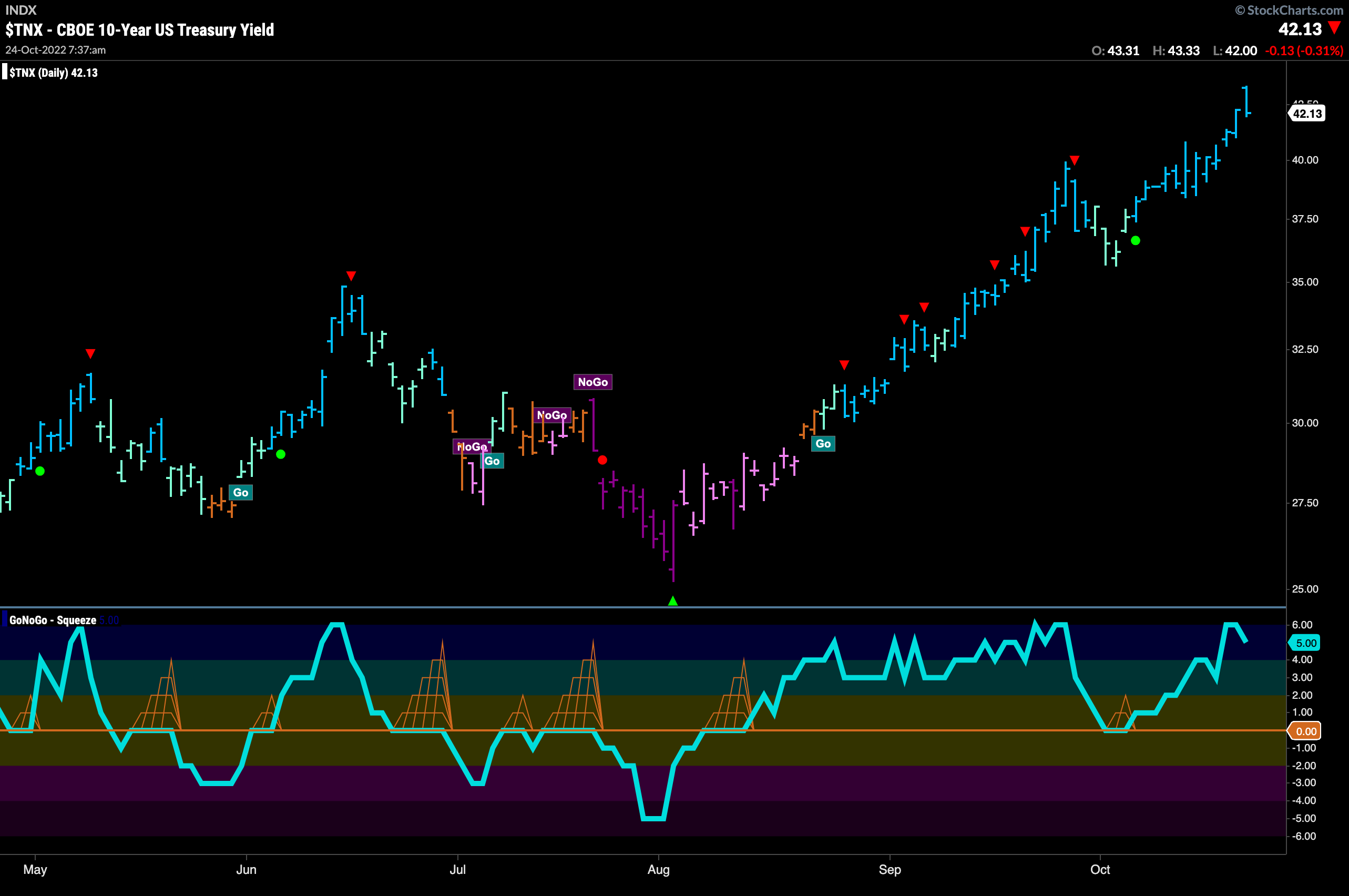
Treasury rates hit consecutive highs last week as we see more uninterrupted blue “Go” bars. GoNoGo Oscillator is in overbought territory as well. Strong rates are historically headwinds for U.S. stocks and so we will see if this has any bearing on the S&P 500’s attempt to move higher.
Dollar in Drawn out Volatility Compression
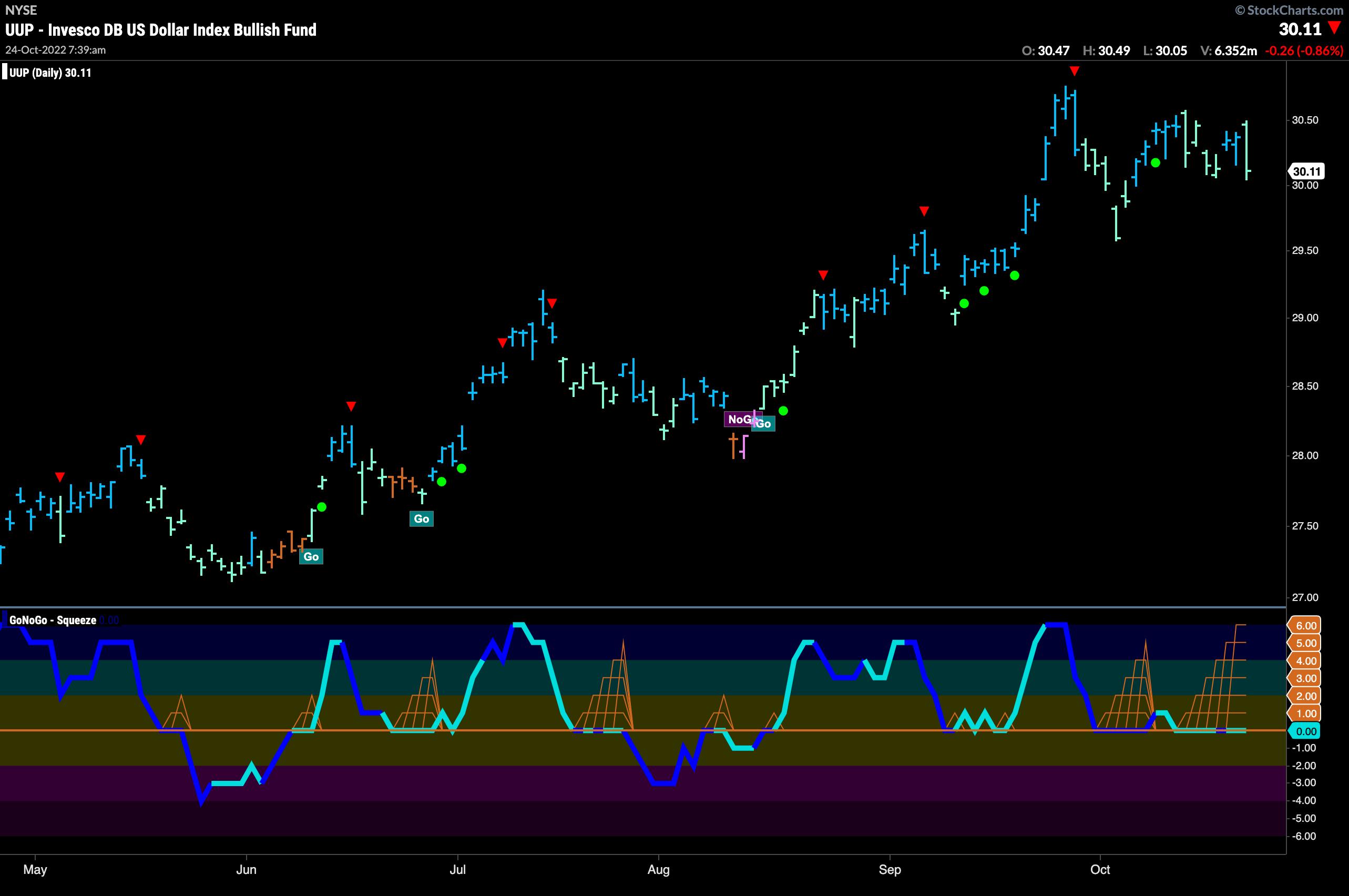
A pattern has emerged on the chart of the dollar. Price has moved sideways with lower highs but higher lows. A keen technical eye may see this as a symmetrical triangle. During this period, GoNoGo Oscillator has been stuck riding the zero line telling us that there is little directional momentum, a real tug of war between the bulls and bears. As we know, a strong dollar can also cause trouble for stocks, so we will be watching the green back to see in which direction it can break out of the squeeze.
Oil Remains in Weak “NoGo” Trend
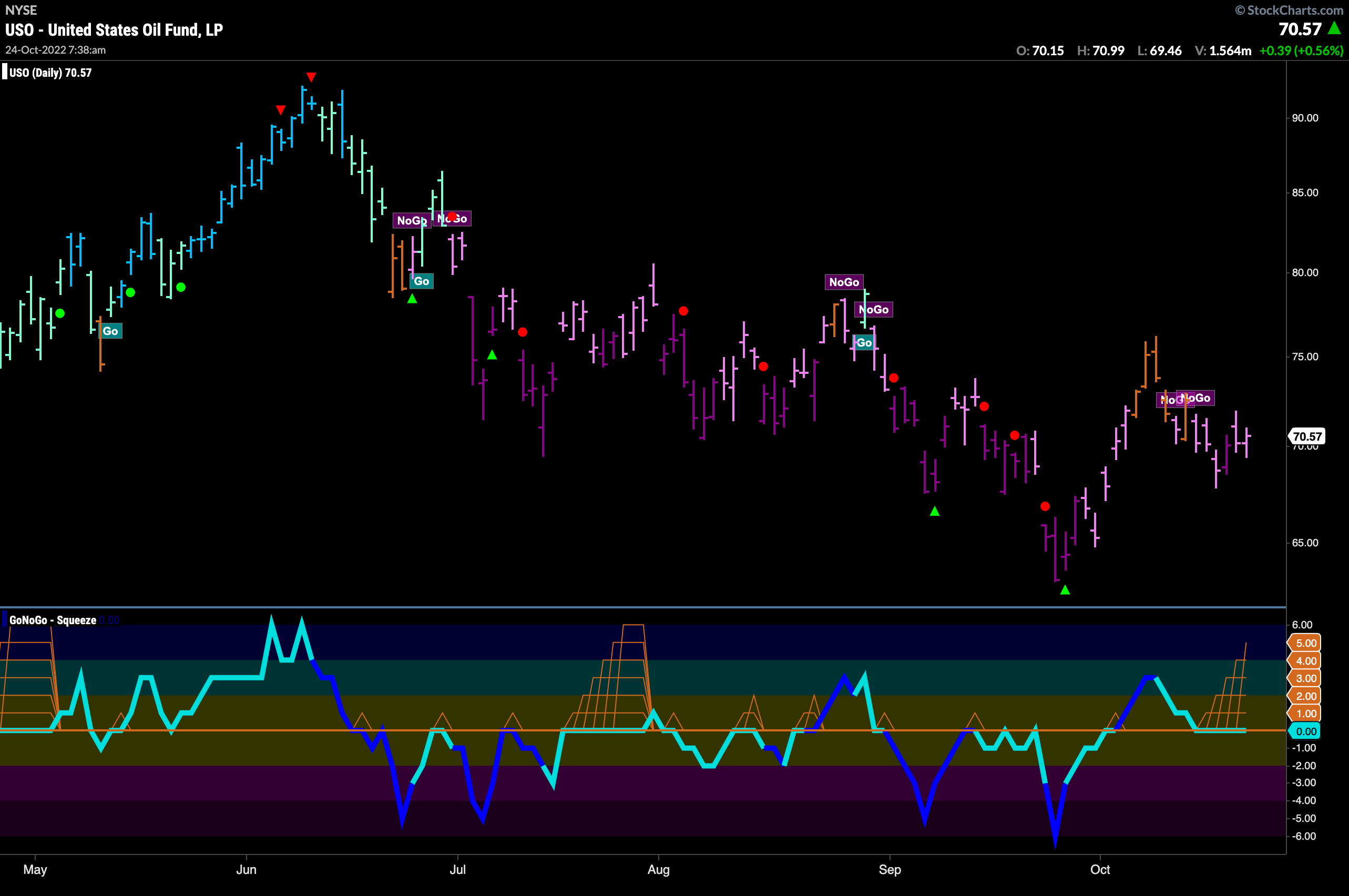
After rallying strongly from the September lows, we saw price move high enough to paint amber “Go Fish” bars. Since then, the “NoGo” trend has resumed and we see a mixture of purple and pink bars. The weak ended with a couple of pink “NoGo” bars as price looks to have set a higher low. As price is struggling for clarity, we can see that GoNoGo Oscillator is riding the zero line. This means that all of the inputs to the blended momentum oscillator are in their respective neutral territories. As it remains stuck at zero, the climbing grid of GoNoGo Squeeze is rising to its max. We will look to see in which direction the Squeeze is broken.
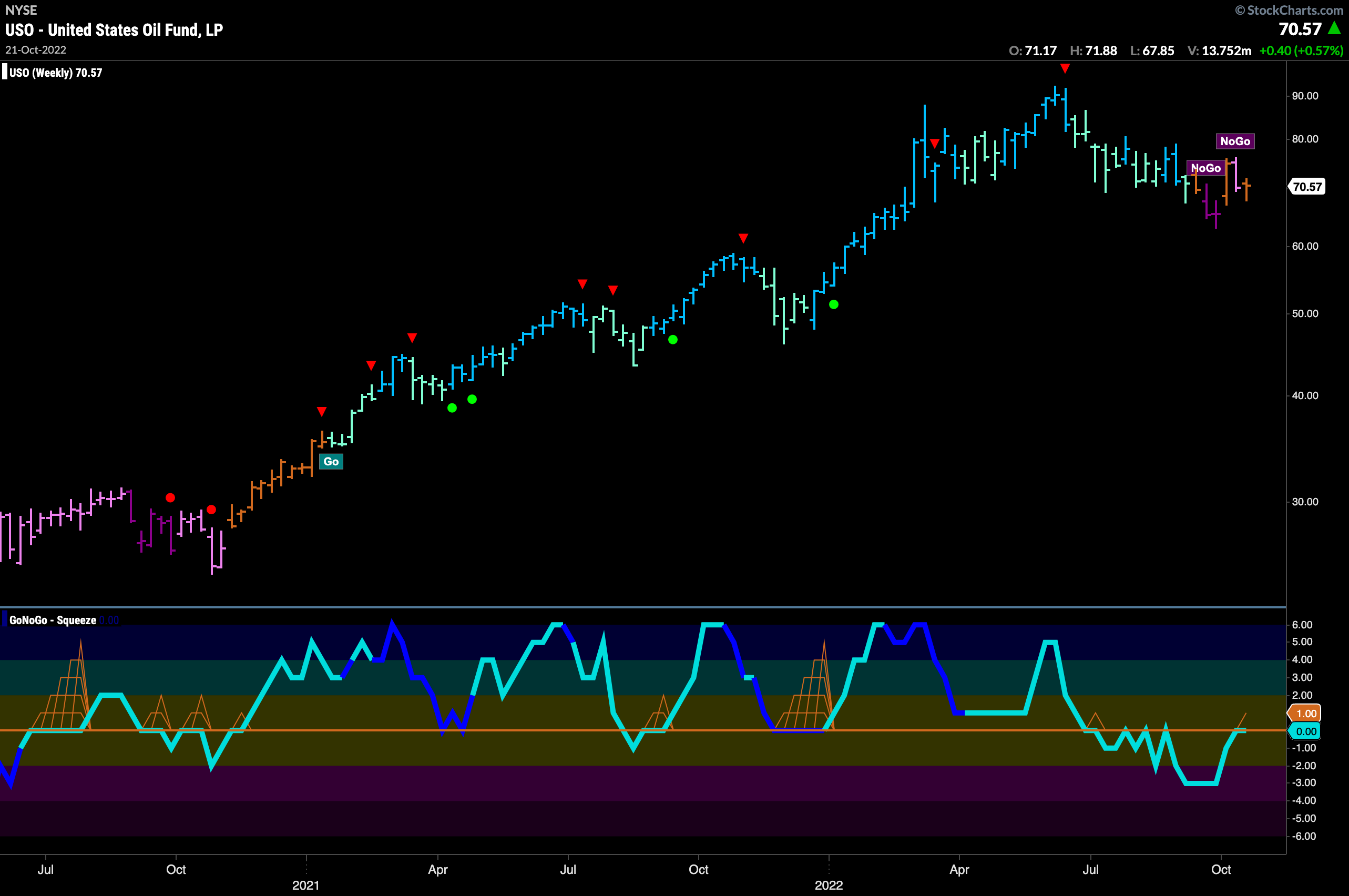
The weekly Oil chart is likewise trying to decide the ultimate direction of price. Last week saw the GoNoGo Trend indicator paint an amber “Go Fish” bar as price failed to make much ground. GoNoGo Oscillator is at an inflection point as we see it rise to test the zero line from below. If the trend is to remain a “NoGo” on the larger timeframe we would expect GoNoGo Oscillator to get rejected here at this level. A break into positive territory would indicate a possible change in trend.
Sector RelMap
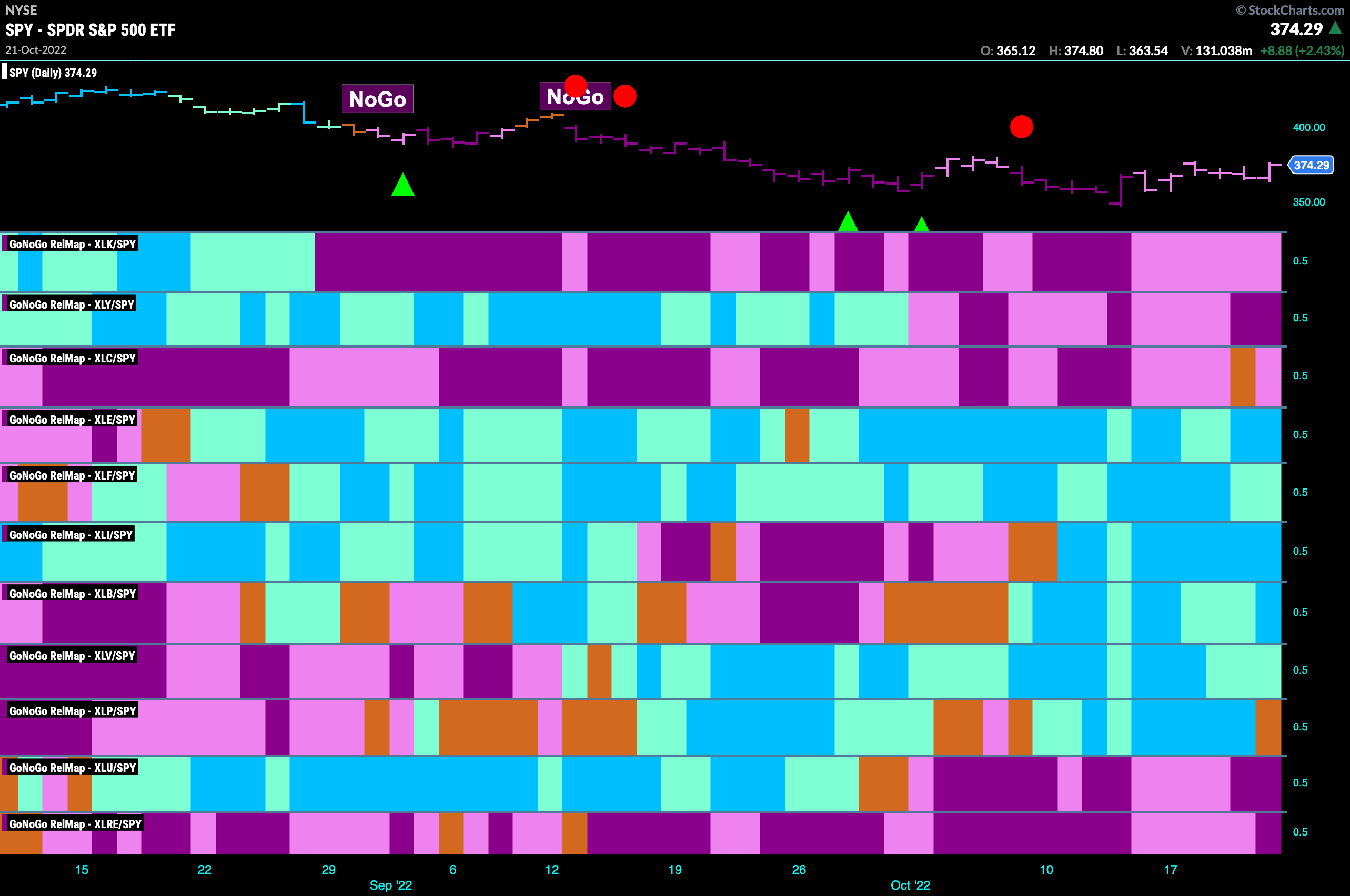
Below is the GoNoGo Sector RelMap. This GoNoGo RelMap applies the GoNoGo Trend to the relative strength ratios of the sectors to the base index. Looking at this map, we can quickly see where the relative outperformance is coming from as well as which sectors are lagging on a relative basis. It remains a “NoGo” for growth. Technology, communications and discretionary are in “NoGo” trends. We see relative outperformance from energy, financials, industrials, materials, healthcare.
Materials to Make Moves?
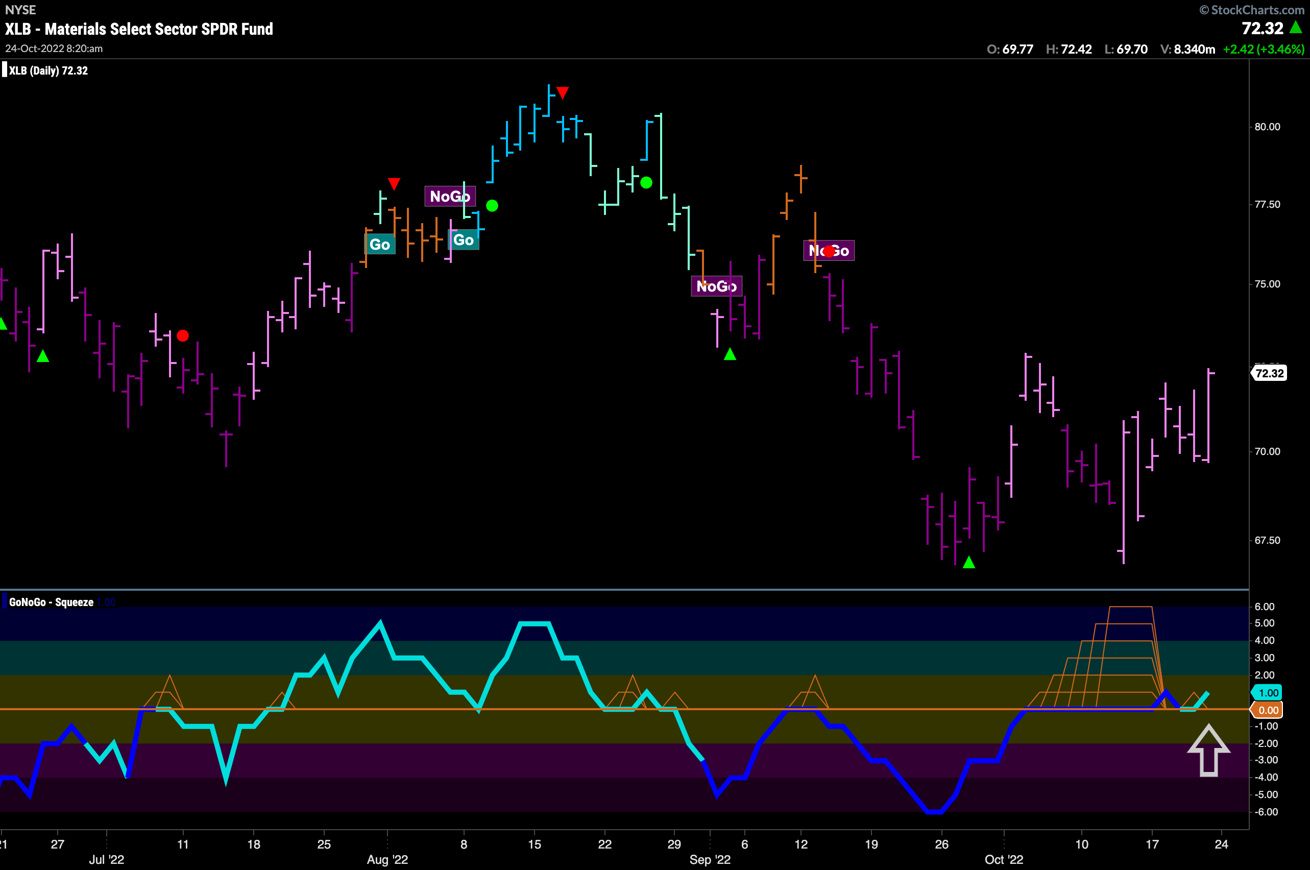
The GoNoGo Sector RelMap above shows that materials is in a relative “Go” trend to the S&P 500. Below is the GoNoGo Chart of $XLB. What is interesting here is that we are seeing a chart that is moving a little quicker than the base index. Like the S&P, price painted pink “NoGo” bars last week as price continues to rally. Where we see a difference is in GoNoGo Oscillator. Having been stuck in a max GoNoGo Squeeze we saw that broken to the upside this week and already have seen a quick rest. GoNoGo Oscillator finding support at the zero level is an indication that price may move higher from here.
DuPont de Nemours Takes Advantage of Relative Sector Strength
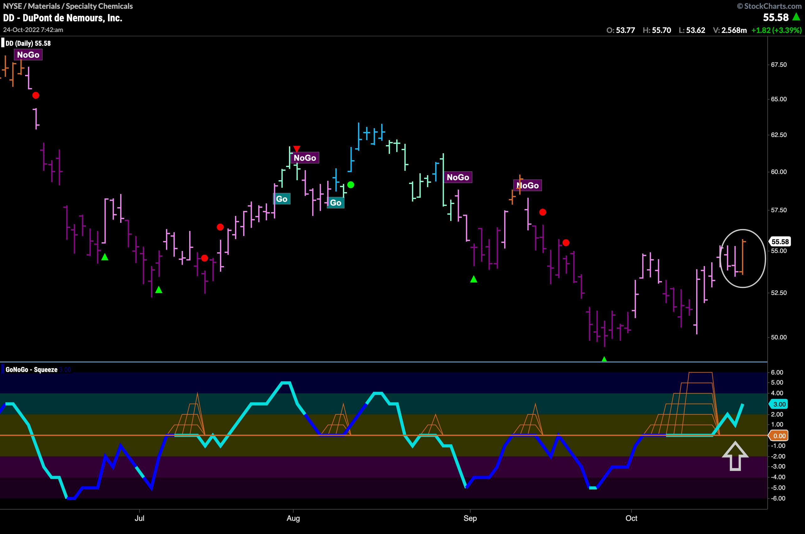
On the daily chart below we can see that $DD has painted an amber “Go Fish” bar as price rallies higher from recent lows. We can also see how after breaking out of a max GoNoGo Squeeze into positive territory it has quickly found support and is moving higher. This confirms the trend change that we are seeing in the price chart.
Energy Hits New Highs in “Go” trend
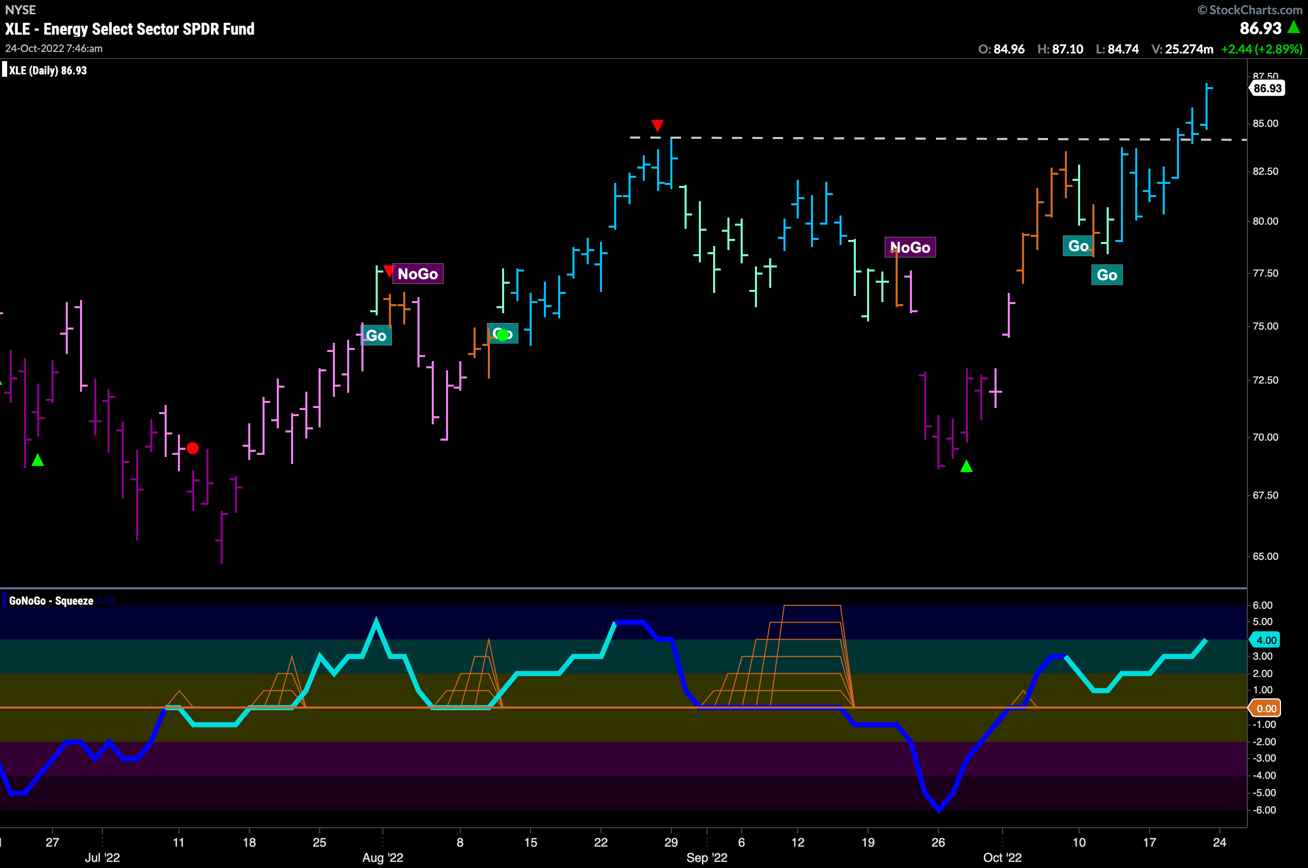
Energy is also a sector that we saw was outperforming on the RelMap. Below is the daily GoNoGo Chart for the sector ETF and we can see that it is not only in a relative “Go” trend but a pure “Go” trend as well. Painting strong blue “Go” bars for over a week we can see how price has moved to a new high this week and GoNoGo Oscillator is in positive territory but not overbought.
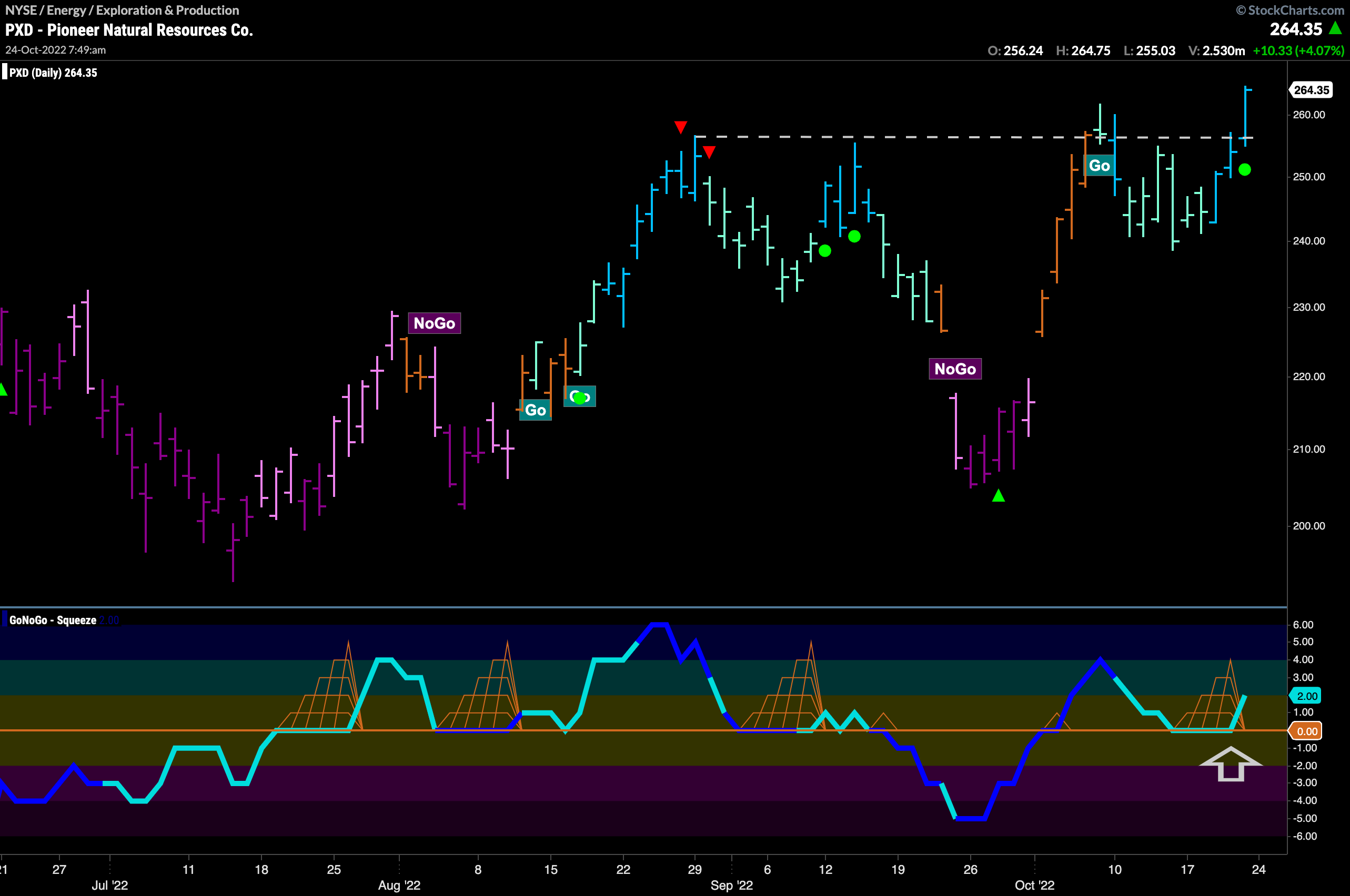
Pioneer Natural Resources Gives Go Trend Continuation Icon
Given that we see relative and actual “Go” trends in the energy sector, let’s look at one of the major players. $PXD shows a strong set up on the GoNoGo Chart below. Some may see this as an inverse Head and Shoulders continuation pattern. What we know from a GoNoGo perspective is that we are painting strong blue “Go” bars and that GoNoGo Oscillator is finding support at the zero line. This support, as the oscillator moves back into positive territory tells us that momentum is in the direction of the “Go” trend and we see a Go Trend Continuation Icon (green circle) under the current price bar. We will look for support going forward at the horizontal neck line.
