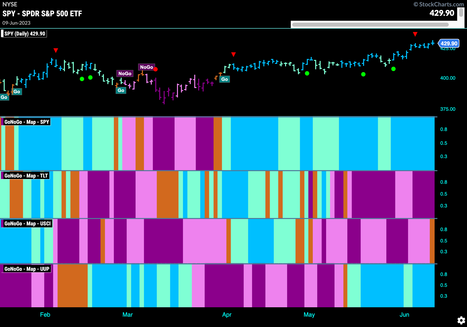
Good morning and welcome to this week’s Flight Path. Equities maintained the “Go” trend from last week painting a string of strong blue bars as prices rose to new highs. Treasury bond prices continued to struggle painting strong purple “NoGo” bars as the week came to a close. Commodity prices slipped into uncertainty as the week ended painting an amber “Go Fish” bar. The dollar continued to paint “Go” bars as well.
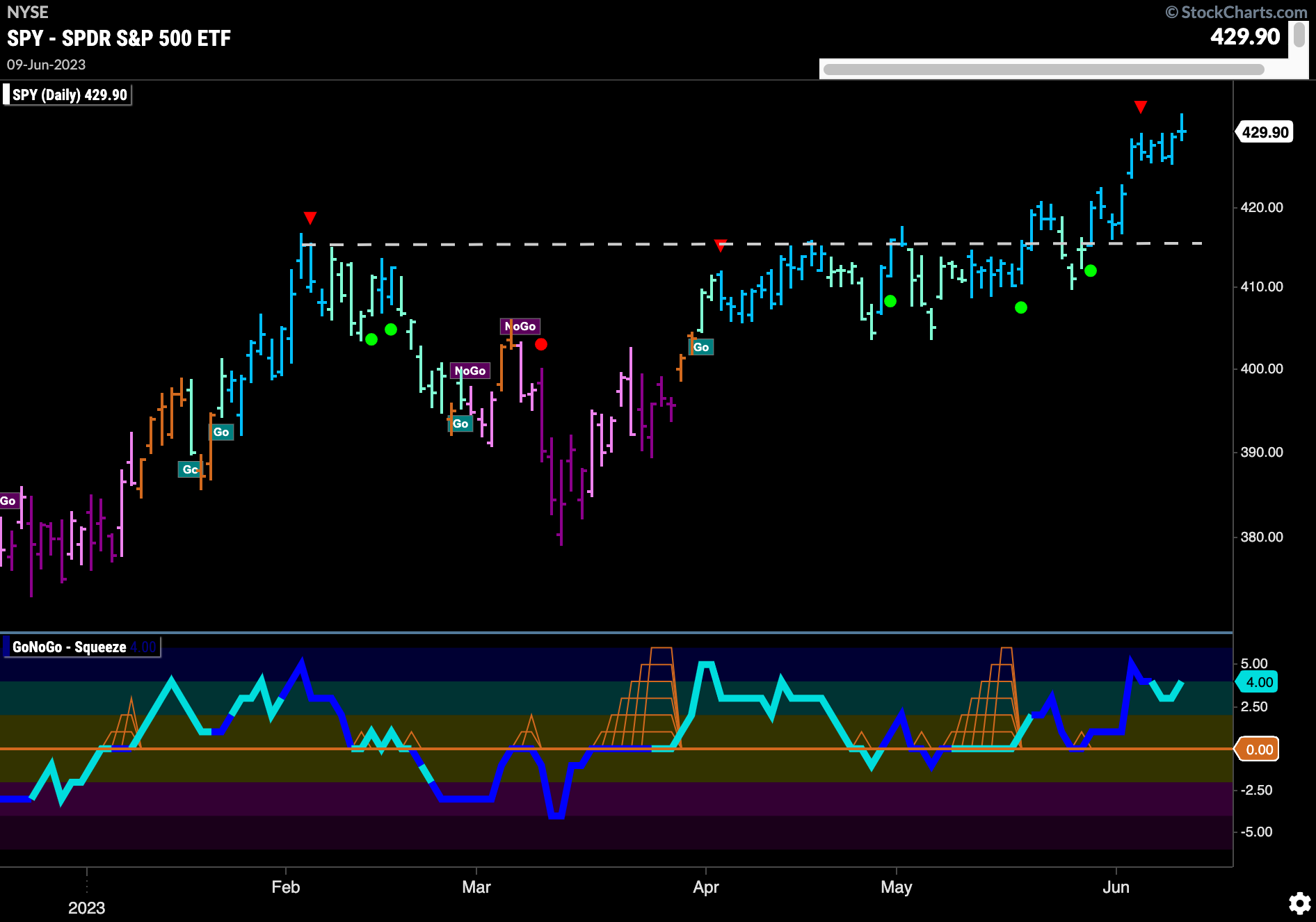
Equity Prices Race Higher
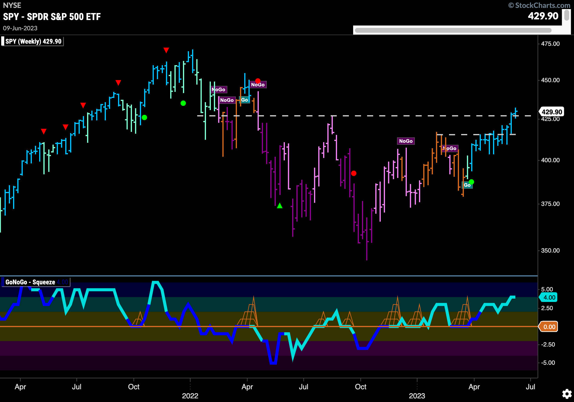
$SPY made fresh gains this week after consolidating above resistance. We saw a string of uninterrupted strong blue bars as price made new highs. GoNoGo Oscillator is in positive territory but not overbought. We will see if price can maintain this pace this week.
The longer term weekly chart shows continued strength. With the longer history, we can see the resistance from the August ’22 high. Price last week closed above the high from last summer, a very good sign. GoNoGo Trend is still painting strong blue “Go” bars and GoNoGo Oscillator is in positive territory but not overbought.
Treasury Remain in “Go” Trend But Obvious Resistance In Play
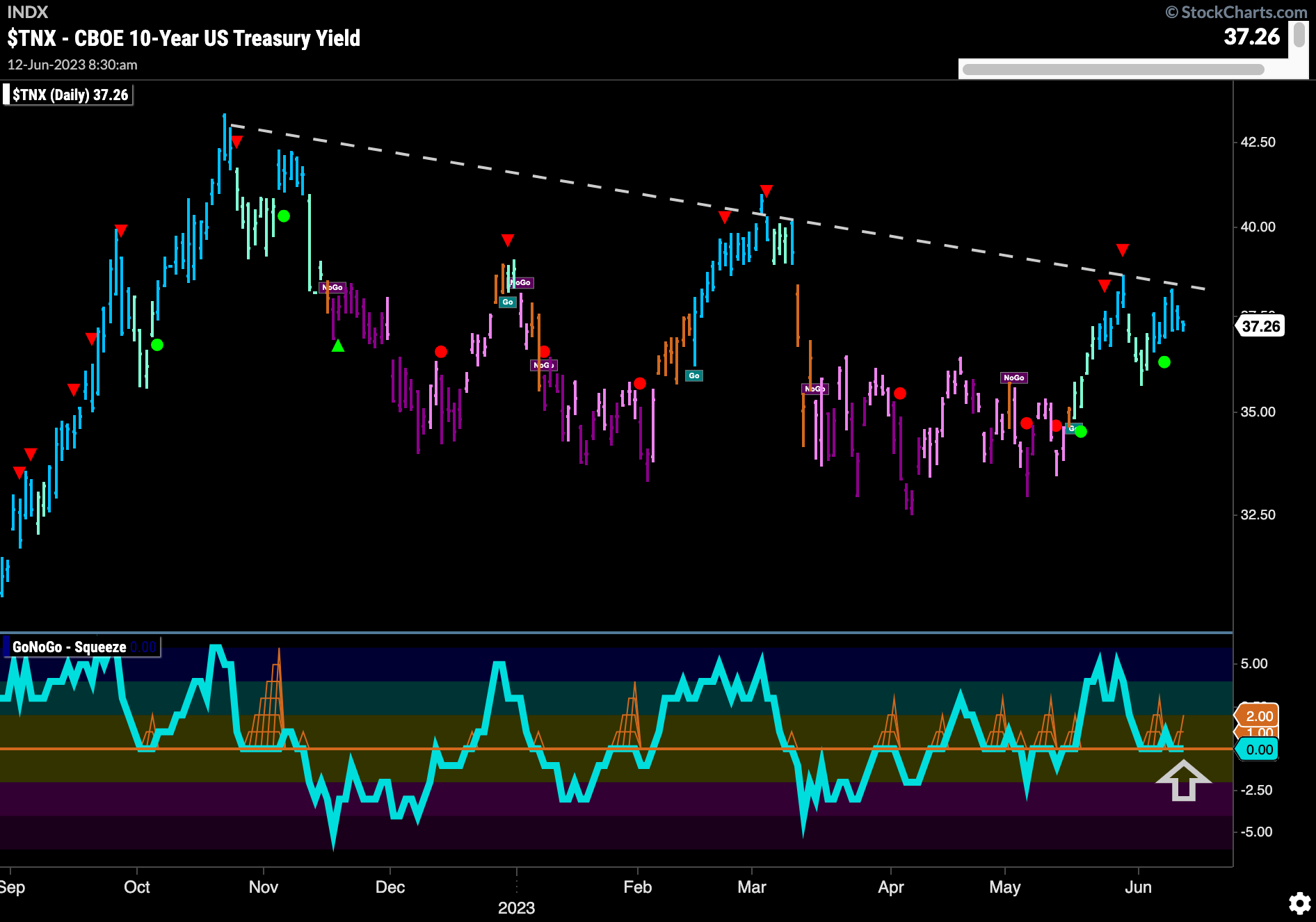
Treasury rates are still in a “Go” trend but once again we saw price fail at downward sloping resistance. While GoNoGo Trend paints strong blue “Go” bars we see that GoNoGo Oscillator is testing the zero line again from above. We will watch to see if it can find support again here which it needs to do if it is to have the momentum it needs to get above resistance.
Dollar Looking For Support
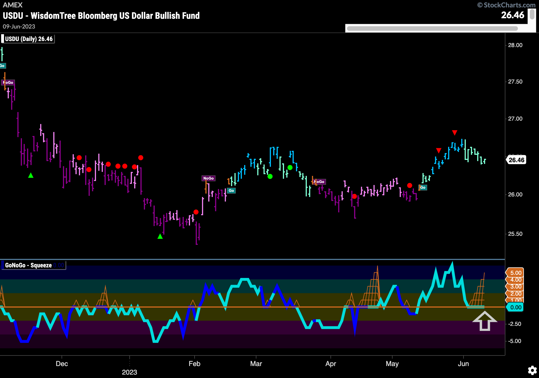
Using the Bloomberg Dollar fund ticker we can see that the trend has weakened with GoNoGo Trend painting aqua “Go” bars as price falls from its recent high. This followed a Go Countertrend Correction Icon (red triangle) that signaled the short term high. GoNoGo Oscillator is riding the zero line where we see a GoNoGo Squeeze building. It will be important to watch in which direction the GoNoGo Oscillator breaks out of the Squeeze. Back into positive territory may allow price to go higher.
Oil a Broken Record
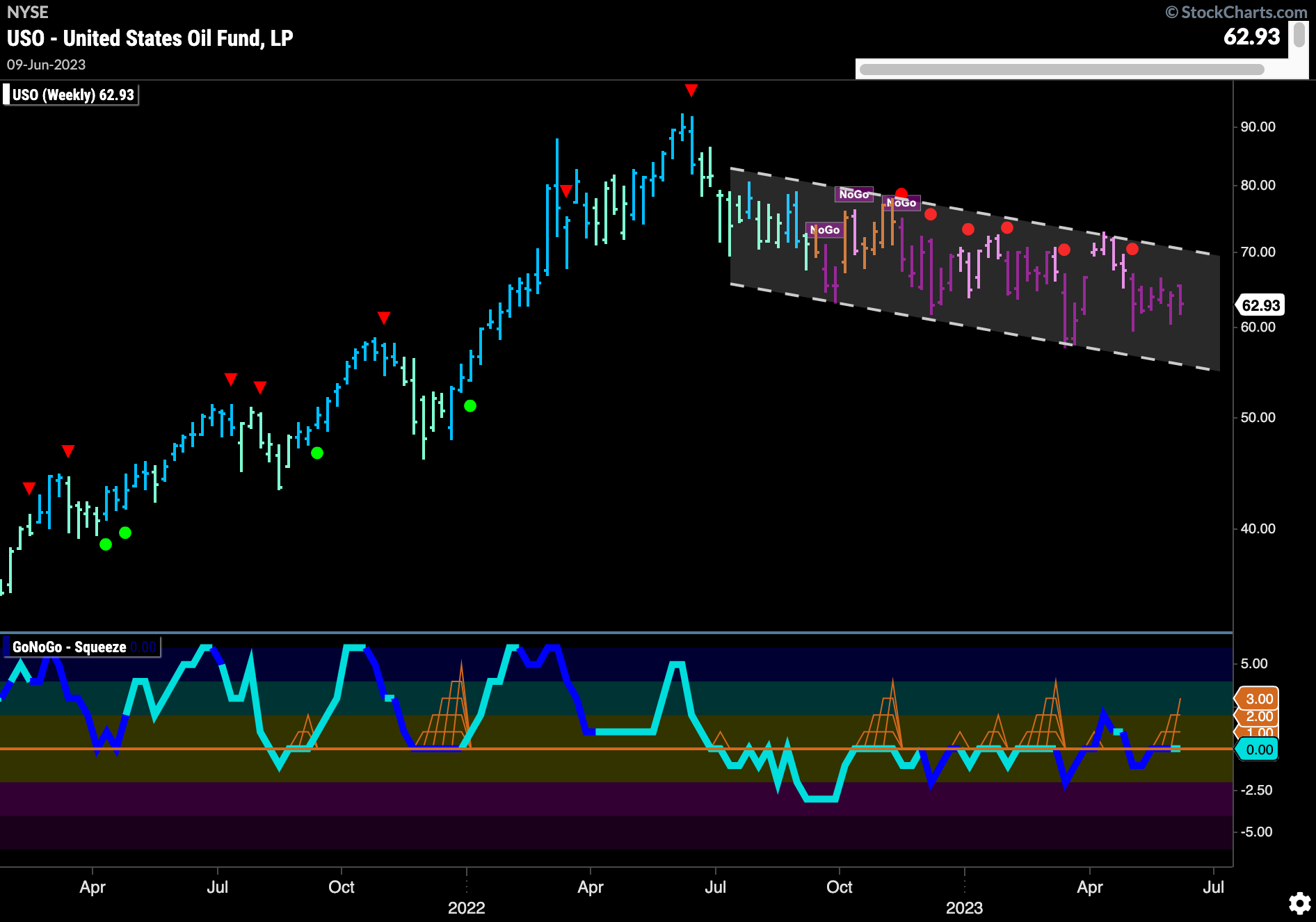
Price is still stuck in the middle of its downward sloping trend channel. GoNoGo Trend is painting strong purple “NoGo” bars indicating that the weight of the evidence suggests the “NoGo” is strong. GoNoGo Oscillator remains unable to distance itself from the zero line. Again stuck at zero, we see the beginnings of the climbing grid of GoNoGo Squeeze. We will watch to see in which direction the oscillator breaks this newest squeeze. This will give us an idea of whether price will test the upper or lower bound of the channel next.
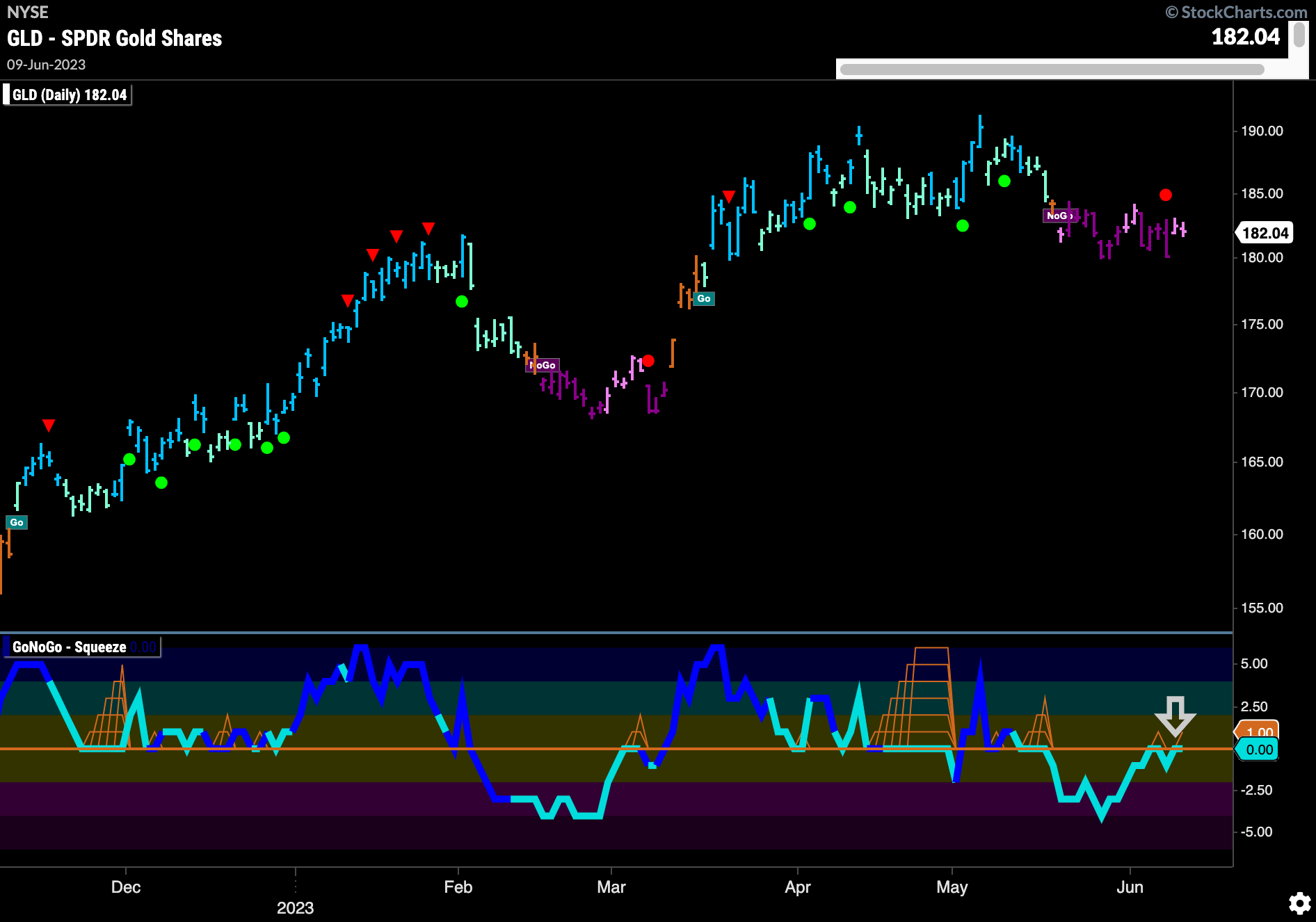
Gold at Inflection Point
We can see from the below chart that we are at an important point for Gold prices. In a “NoGo” trend we see that GoNoGo Trend is painting weaker pink bars. GoNoGo Oscillator is testing the zero line from below. If GoNoGo Oscillator gets rejected by the zero line and falls back into negative territory we would likely see the trend in price strengthen and the “NoGo” continue. A break above zero would of course represent positive momentum which is counter to the trend.
Style boxes
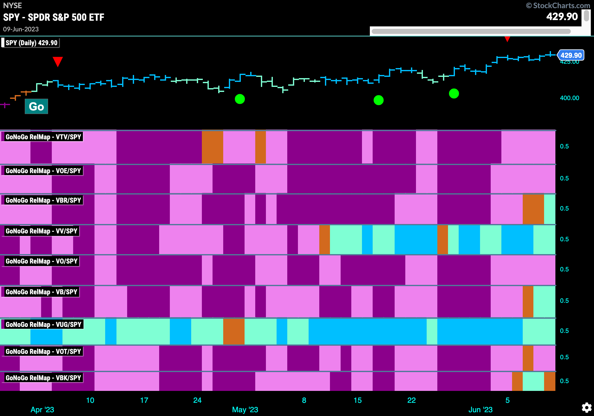
Below is the GoNoGo 9 Style Box RelMap. This paints a very interesting picture. Of course, the 9 style boxes help us understand the combinations of growth vs value and large vs small and mid cap. The map below shows that the lone outperformer for some time was large cap growth. However, what is getting analysts talking is the emergence of smaller cap stocks in this rally in equity prices. This can be seen in this GoNoGo Style RelMap. The most recent additions to outperformance are the small cap panels. The 3rd panel just entering a “Go” trend relative to the $SPY is small cap value ($VBR). The 6th panel is simply small cap ($VB) and also has entered a relative “Go” trend. The last panel is small cap growth ($VBK). You can see that this style is fluctuating between amber and “Go” bars.
Relative Strength of Small Cap
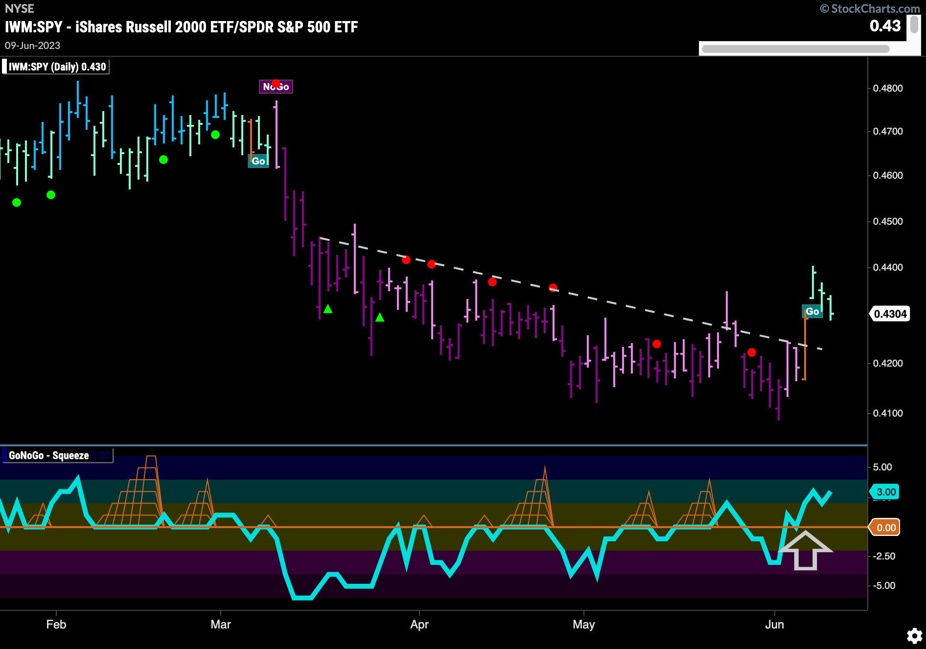
The chart below shows the ratio of $IWM:$SPY. We can see that last week the trend changed. After GoNoGo Oscillator broke above the zero line and into positive territory we see the ratio move above downward sloping resistance and into “Go” bars.
$IWM Breaks Above Resistance
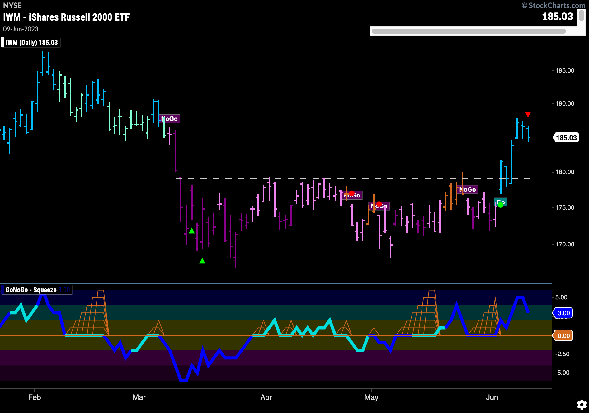
Looking at $IWM on its own, we can see how strong the recent move has been. GoNoGo Trend shows that as price broke above horizontal resistance the weight of the evidence identified a new trend. Painting strong blue “Go” bars the entire last week the indicator showed price moving higher. GoNoGo Oscillator has been finding support at the zero line for several weeks and it is now in positive territory on heavy volume.
Sector RelMap
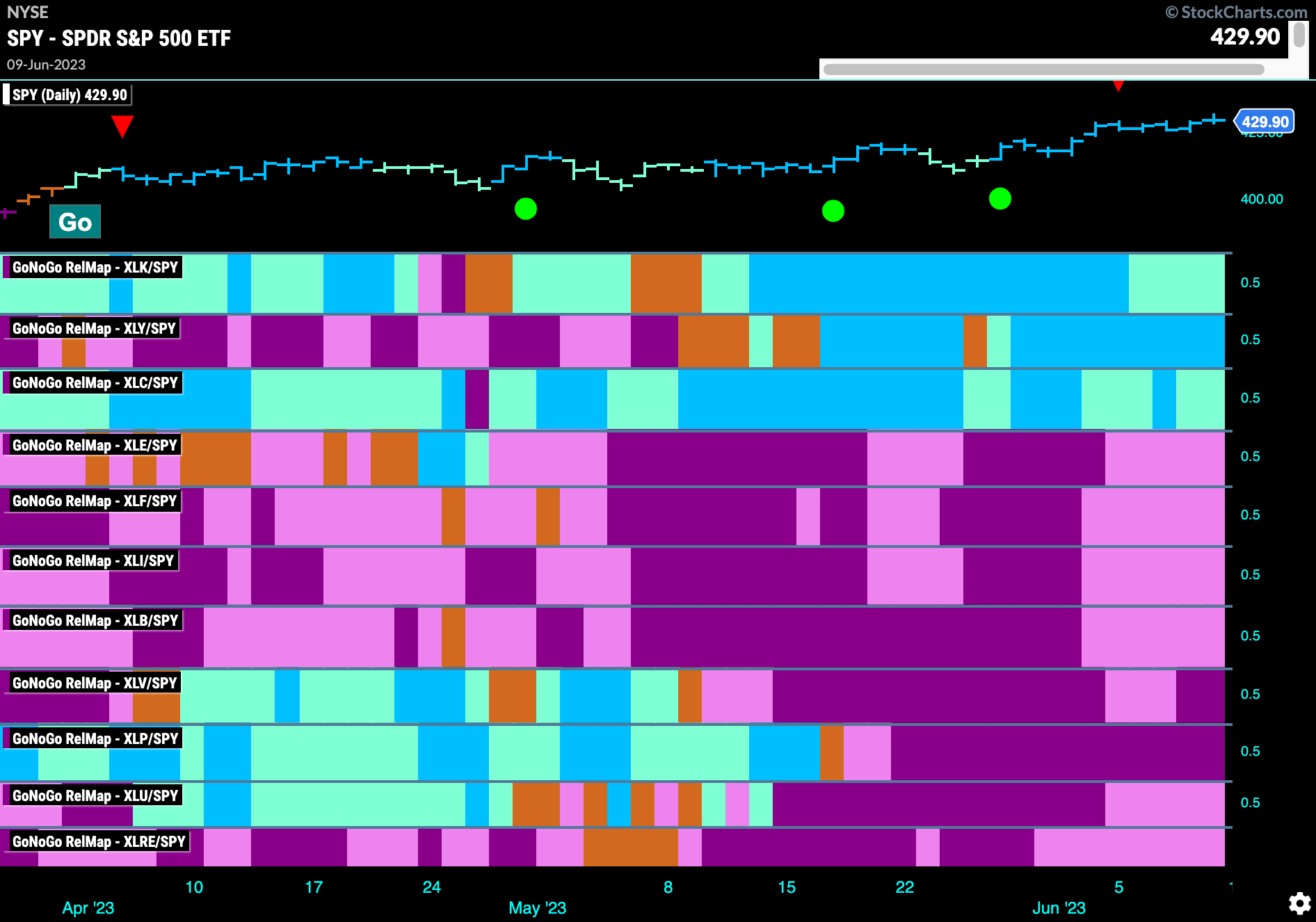
Below is the GoNoGo Sector RelMap. This GoNoGo RelMap applies the GoNoGo Trend to the relative strength ratios of the sectors to the base index. Looking at this map, we can quickly see where the relative outperformance is coming from as well as which sectors are lagging on a relative basis. 3 sectors are outperforming the base index this week. $XLK, $XLY, and $XLC are painting “Go” bars.
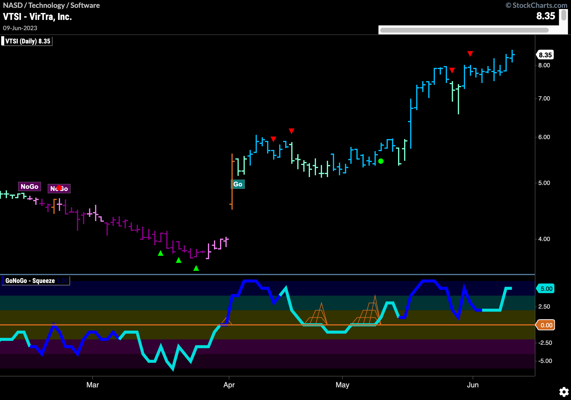
$VSTI Looking Unstoppable
The technology sector is outperforming and we know that there is a style shift toward smaller cap stocks. The below chart shows how strong the trend has been for such a stock, $VTSI. Having stepped higher a couple of times we saw price move higher again at the end of the week after a period of consolidation. GoNoGo Oscillator is now overbought as price makes a new higher high.
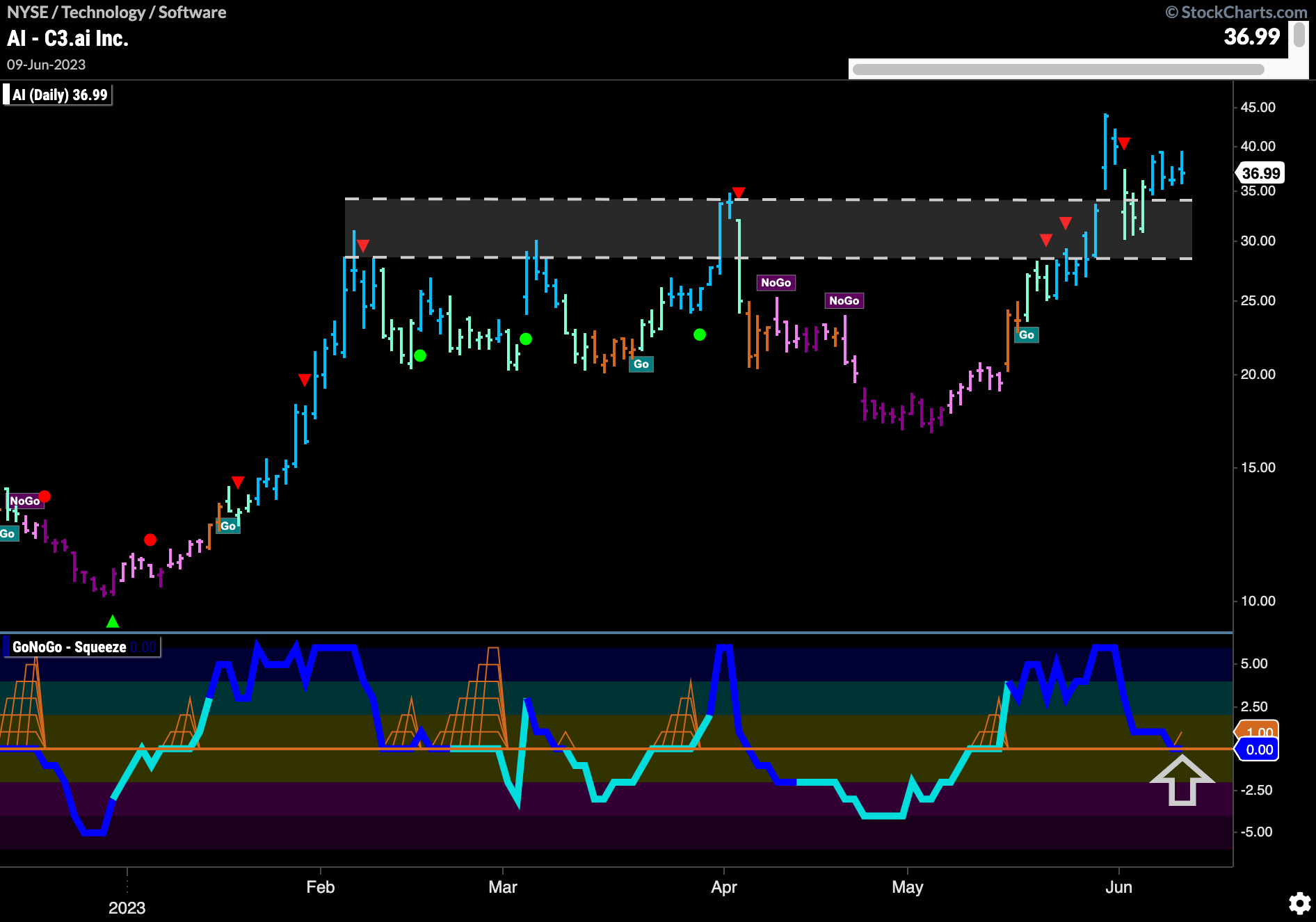
$AI Looking for Price Gains
If looking for an opportunity to participate in a newer move but still capitalize on the strength of small cap and technology stocks, we can turn to the chart of $AI below. Having recently broken out of resistance from prior highs and looking to have consolidated above those levels, now could be a time to enter. GoNoGo Trend is painting strong blue “Go” bars as GoNoGo Oscillator tests the zero line on heavy volume. If the oscillator finds support here, we would see Go Trend Continuation Icon (green circle) under the price bar, telling us that momentum is resurgent in the direction of the “Go” trend. We would then look for price to make a new higher high.
