Risk ON, but for how long? And does this fly in the face of the larger picture?
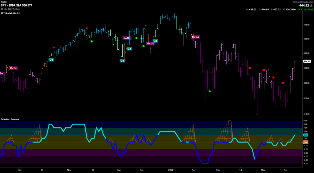
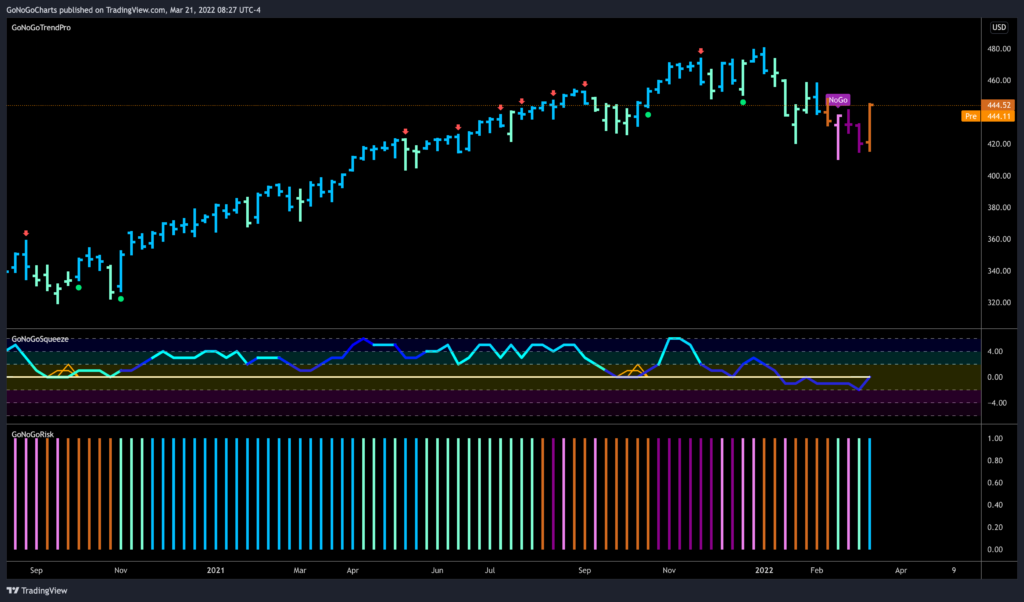
The S&P 500 rallied 6.2% this week on the back of a four-day winning streak, as the market preferred to look at things from a positive perspective. The Dow Jones Industrial Average (+5.5%) and Russell 2000 (+5.4%) each rose over 5.0% while the Nasdaq Composite surged ahead with an 8.2% gain. The chart below shows the $SPY and the amber “Go Fish” bar that was painted at the end of the week after GoNoGo Oscillator crossed above the zero line.
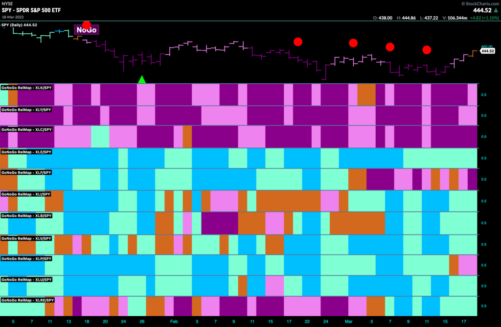
Ten of the 11 S&P 500 sectors closed higher with nine sectors rising between 2.7% (real estate) and 9.3% (consumer discretionary). The energy sector (-3.6%) was the only sector that closed lower. But from a relative perspective we still see that the relative trends remain in place. Technology, discretionary and communications at the top of this GoNoGo Sector RelMap showing “NoGo” trends.
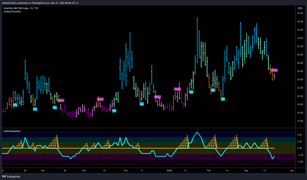
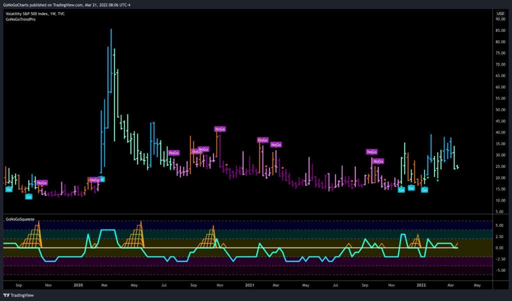
VIX settled lower, and has entered into a weak “NoGo” on the daily chart. Is this a sign of reduced volatility and a calmer period ahead?
On the weekly chart, we can see that volatility remains elevated as the chart below shows a “Go” trend and GoNoGo Oscillator finding support at the zero level. A story within a volatility story.
Credit spreads have been a helpful risk proxy. Looking at the ratio of high yield to treasuries, using the GoNoGo Risk indicator we see a “Go” trend re-emerging in the last few bars of the lower panel. In the price chart above of $SPY, GoNoGo Trend is painting an amber “Go Fish” bar, and GoNoGo Oscillator is testing the zero line from below.
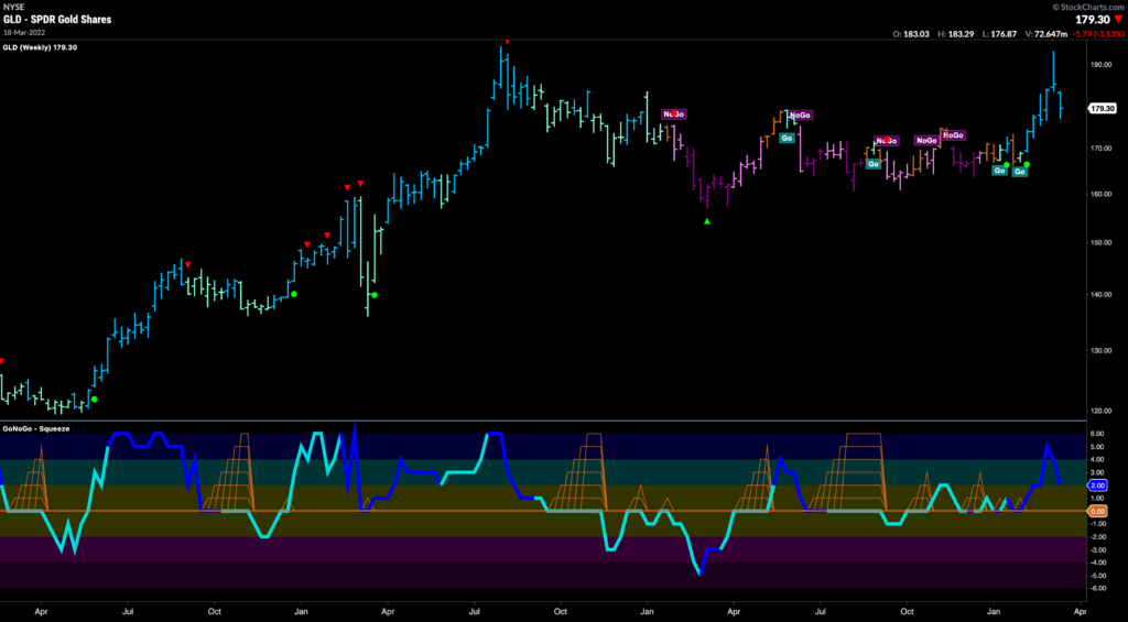
So was all of that safe haven trading for naught? Did pessimistic sentiment get overplayed?
Gold is down nearly 6.5% off March 8 High, still a “Go” on weekly (and daily) basis, but backing off the move just as it looked ready to break out above 2020 highs!
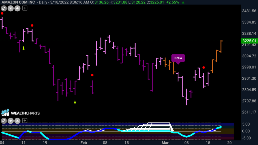
So, if we have hit a base, then is the trade is to load up on the strong players from the most beaten down sectors by looking for early signs of strength from a GoNoGo perspective.
Players like Amazon. Look at the GoNoGo Chart below. GoNoGo Trend has painted a series of amber “Go Fish” bars as price rallies off the lows. GoNoGo Oscillator has broken through resistance at the zero line into positive territory. Early positive signs that might lead to a “Go” trend in price?
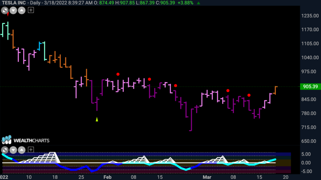
A company like Tesla perhaps finding a bottom? GoNoGo Trend shows an amber “Go Fish” bar as price set a higher low. GoNoGo Oscillator responded by breaking above the zero line into positive territory.
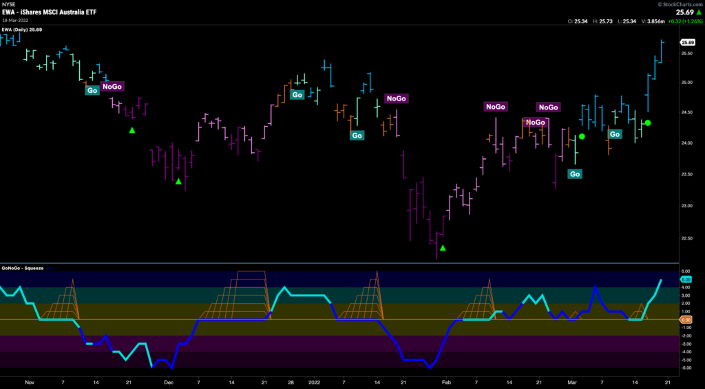
So that’s all good and well, but are we certain that the value trade is no more? If the mining, materials, inflation trade was over, would Australia still be ripping? The GoNoGo Chart below shows the Trend, Oscillator and Squeeze applied to prices of the Australia ETF $EWA. GoNoGo Trend shows strong blue “Go” bars after a fresh Go Trend Continuation green circle indicated that momentum was back on the side of the trend. GoNoGo Oscillator has been finding support above zero since the beginning of the year.
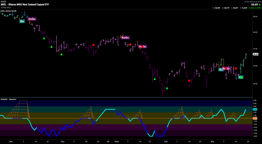
Even New Zealand catching the bid. GoNoGo Trend shows a run of “Go” bars as GoNoGo Oscillator manages to get back into positive territory as price sets a series of higher highs and higher lows.
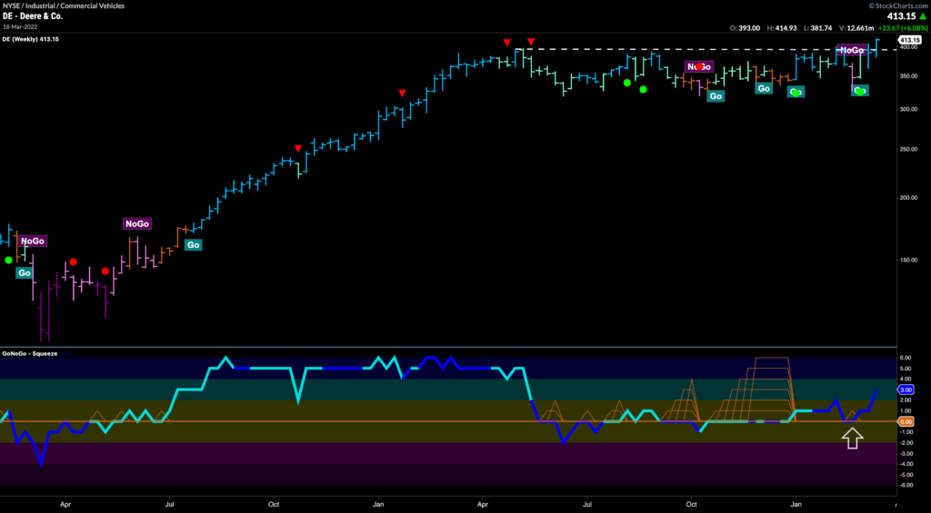
Look at the weekly GoNoGo chart of John Deere & Co as a security that could benefit if the value trade is not over just yet. We see strong continuation out of a 10-month base. GoNoGo Trend is painting strong blue “Go” bars as price edges higher than pattern resistance. GoNoGo Oscillator is finding support at zero on heavy volume.
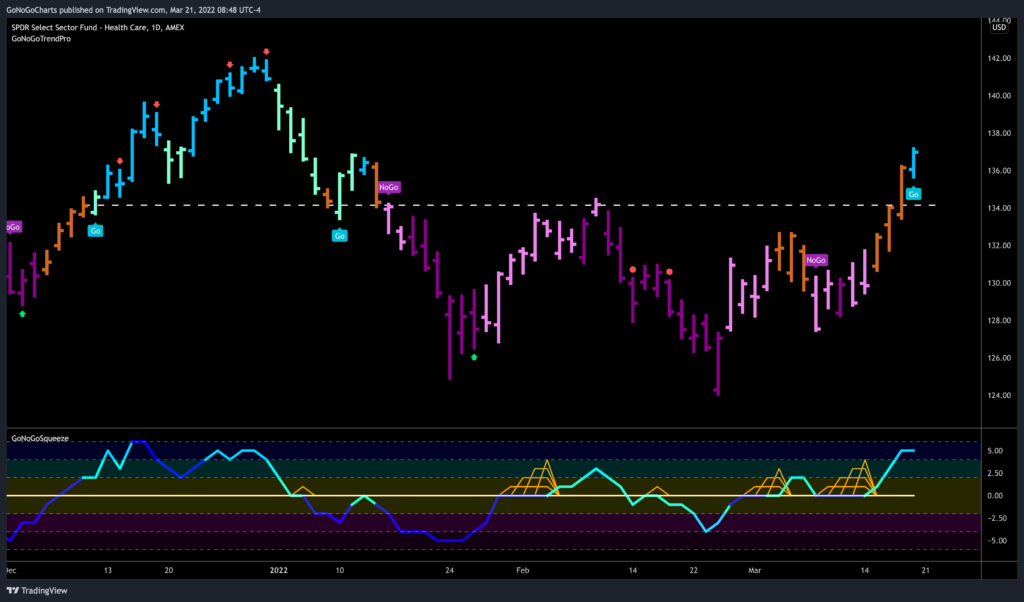
Also, Healthcare reaching a fresh “GO” on Friday. GoNoGo Trend paints a new “Go” bar after a run of amber “Go Fish” bars saw price break above resistance. GoNoGo Oscillator is overbought and has been finding support above zero over the right side of the basing pattern that was predominantly “NoGo”.
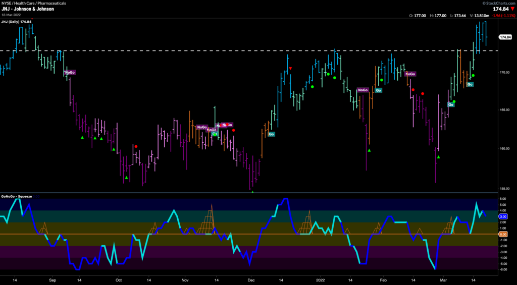
In the healthcare sector, take a look at $JNJ, moving higher with GoNoGo Trend painting “Go” bars and breaking above resistance. Price now needs to get higher than prior highs but the chart looks strong.
