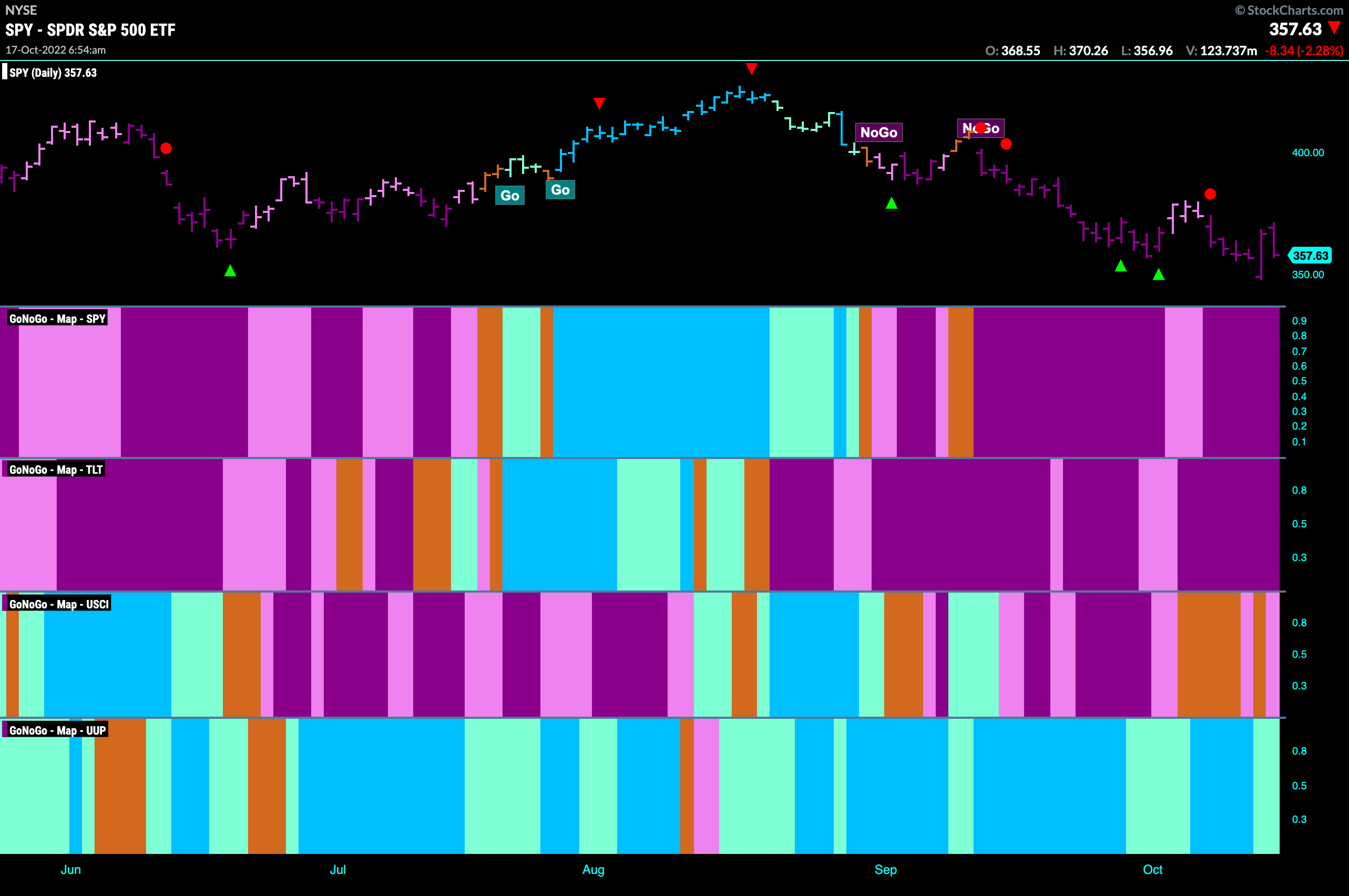
Good morning and welcome to this week’s Flight Path. Let’s take a look at the GoNoGo Asset map below. Volatility seems to be the norm as we saw an incredible swing on Thursday. S&P 500 opened down almost 2% but closed up almost 3. Friday though saw a return to form as we gave back most of the gains from the day before. And so, the dollar remains the lone “Go” trend for another week.
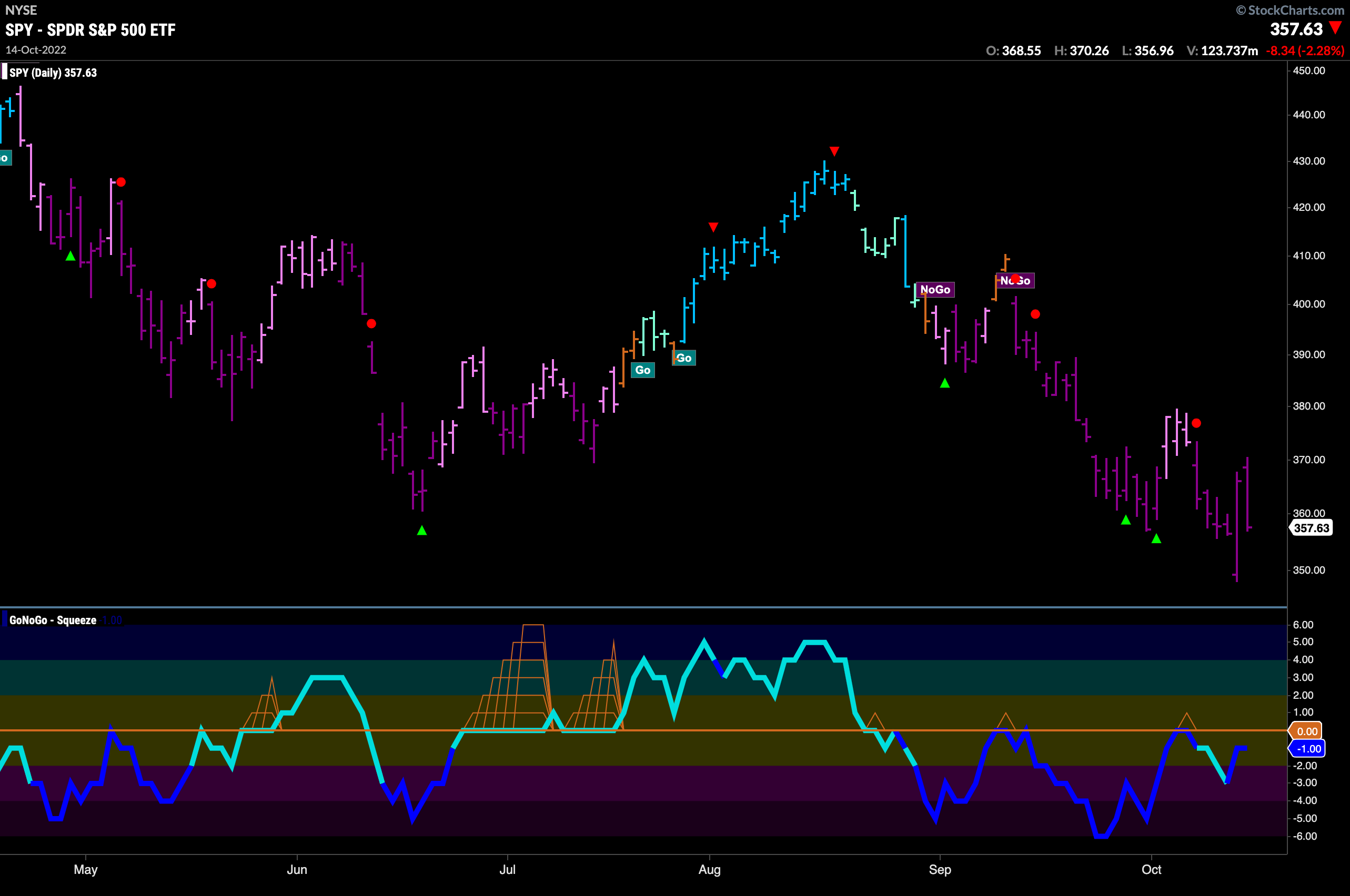
S&P 500 Sets New Low
The “NoGo” trend in the S&P 500 is strong with price painting purple bars this week. Even as Thursday provided some relief for market participants it could simple stand as a new low in the trend. If looking for a short term reason to expect a rally we are seeing bullish divergence between price and the oscillator. Price making lower lows while the oscillator makes higher lows.
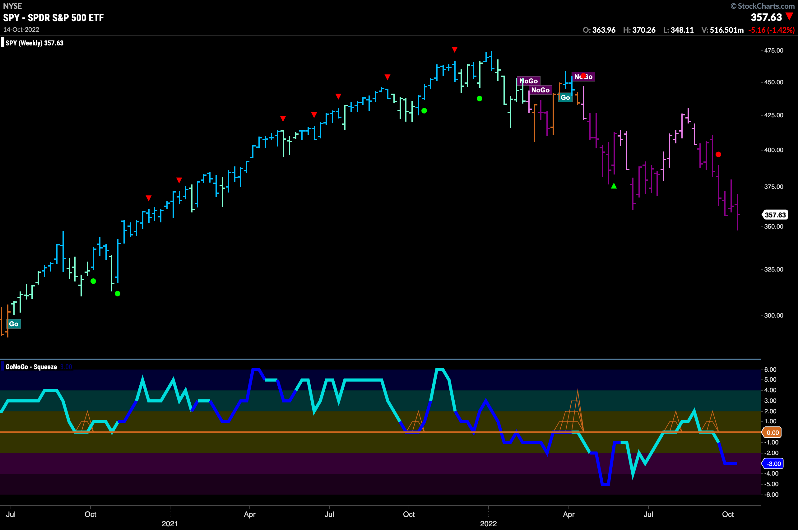
The weekly chart paints a bleak picture. GoNoGo Trend shows a string of strong purple bars as we put in a new lower low on the longer time frame. We are also at new lows and GoNoGo Oscillator is back in negative territory on heavy volume. Nothing to get excited about from the larger perspective.
Treasury Rates Hit New Highs on Strong Blue “Go” Bars
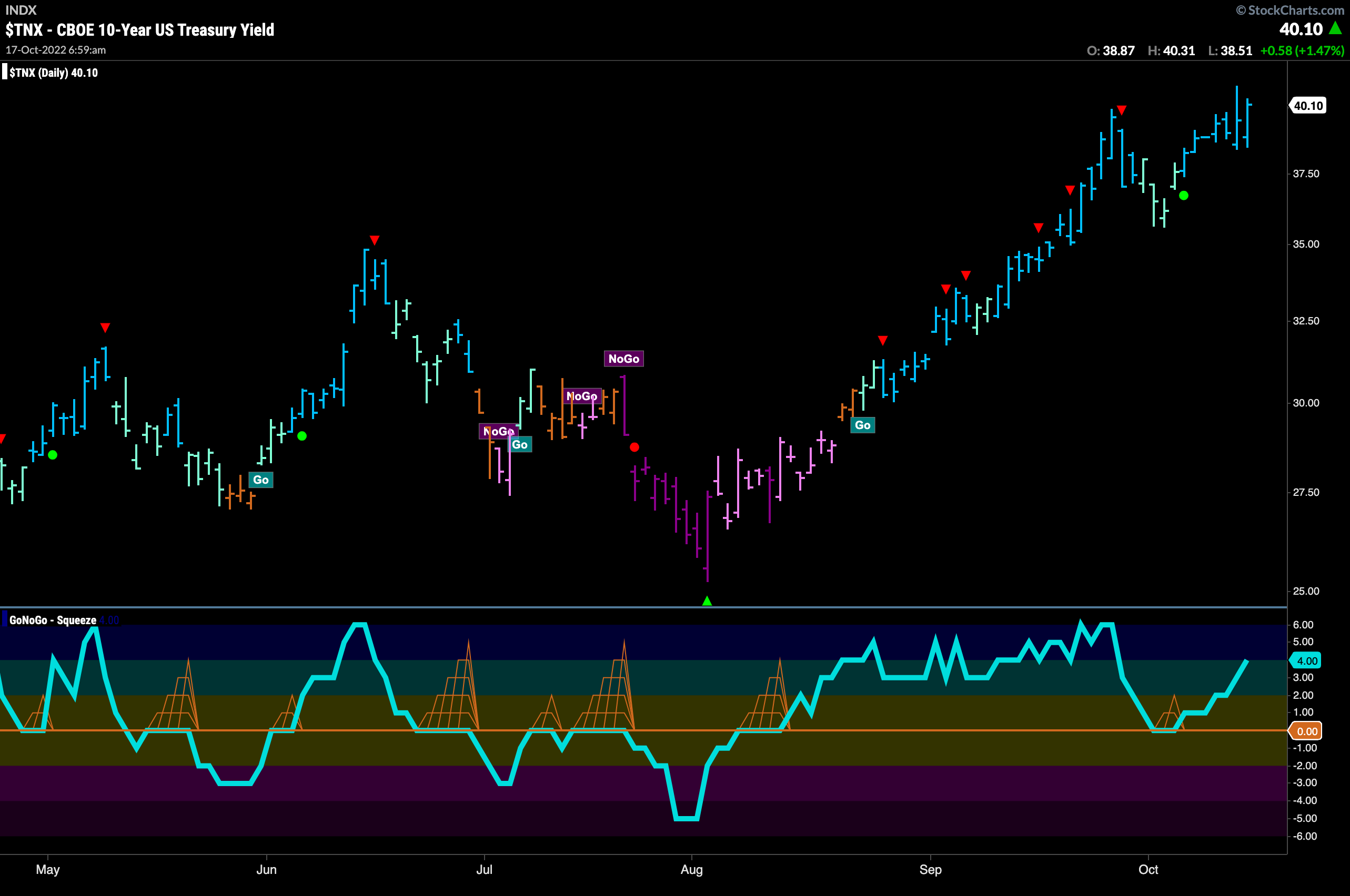
Treasury rates hit another high last week as we see the “Go” trend continue with strong blue “Go” bars. GoNoGo Oscillator is rising steadily after finding support at the zero line but is still not yet overbought.
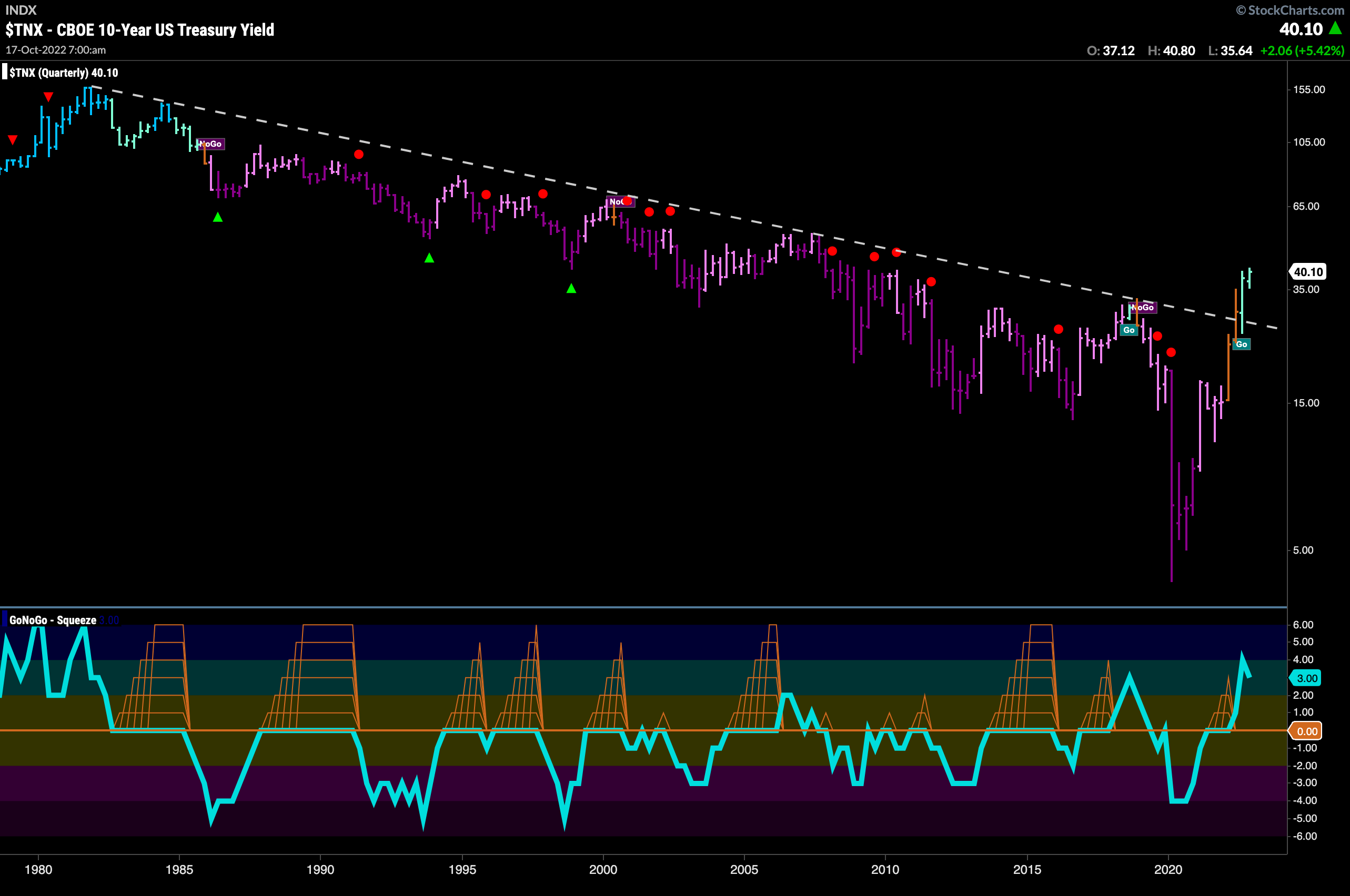
Every now and then, we like to step out really far to view the yield chart over the last 50 years. This allows us to see the historical perspective. Decades of falling rates were the norm since the 1980s. Over the last few years though, we have seen an incredibly fast rising rate environment which leaves no doubt that the trend has been broken. We are into our second “Go” bar on a quarterly basis and 3rd that has closed above the downward sloping trend line.
Dollar Still Searches for Support
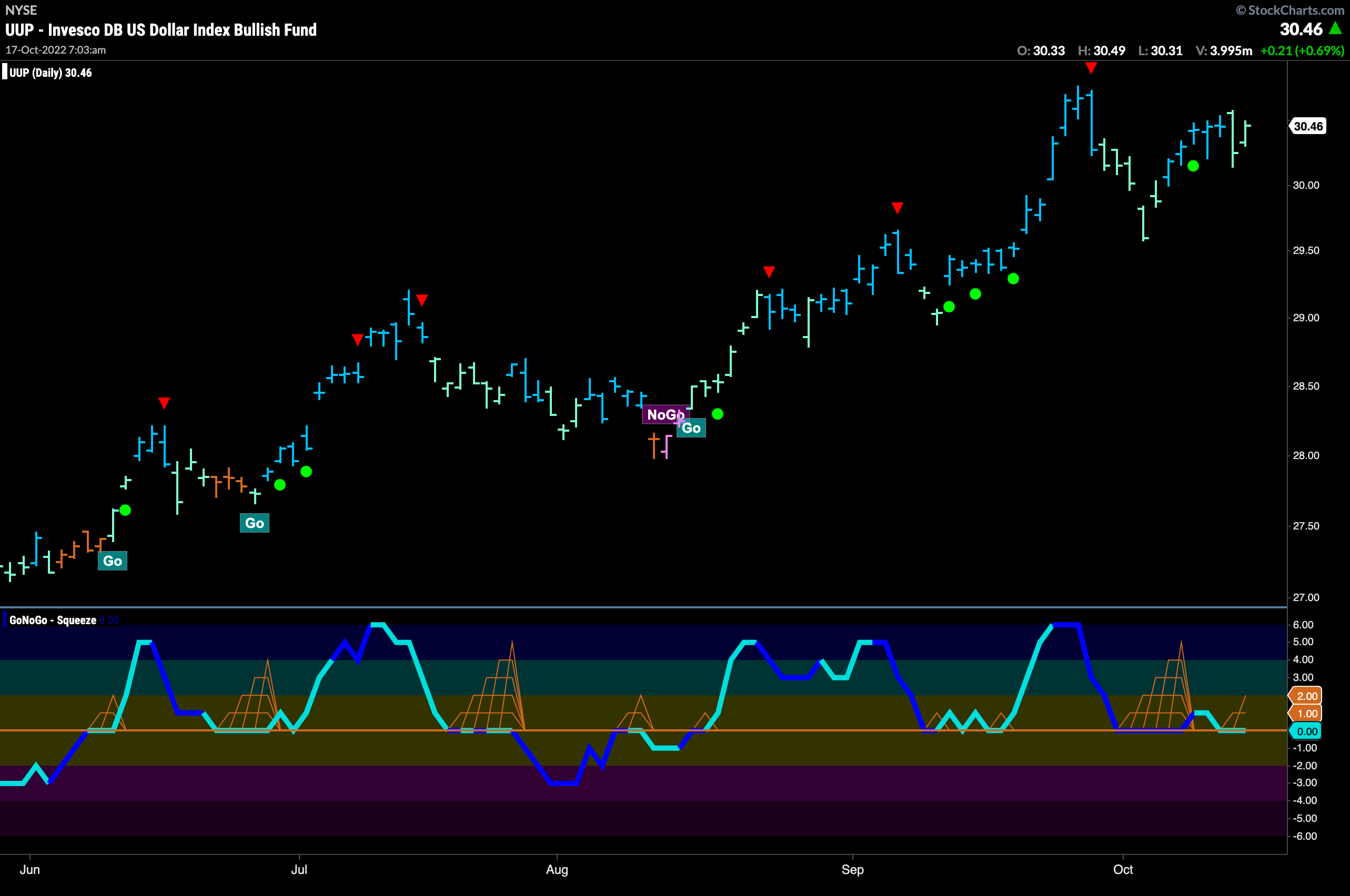
Last week we noted that the mighty greenback was looking for support as GoNoGo Oscillator rode the zero line. It appeared to get it, as we see a Go Trend Continuation early last week telling us that momentum is back in the direction of the “Go” trend. however, we see that the oscillator has quickly returned to test the zero line once more. We will continue to watch. If it rallies again, perhaps that will give price the momentum it needs to attack the prior high.
Oil Fails in Attempt at Trend Change
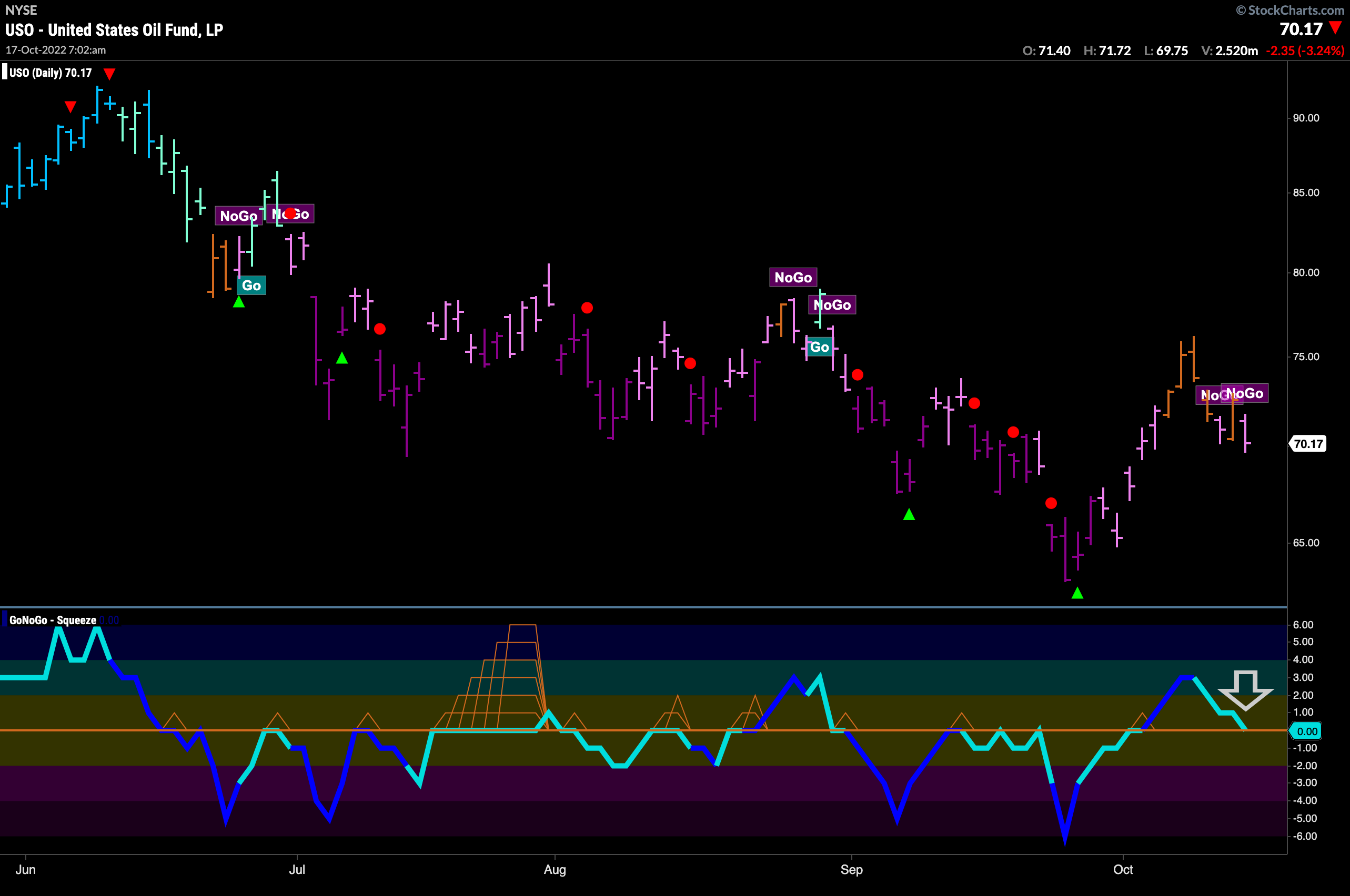
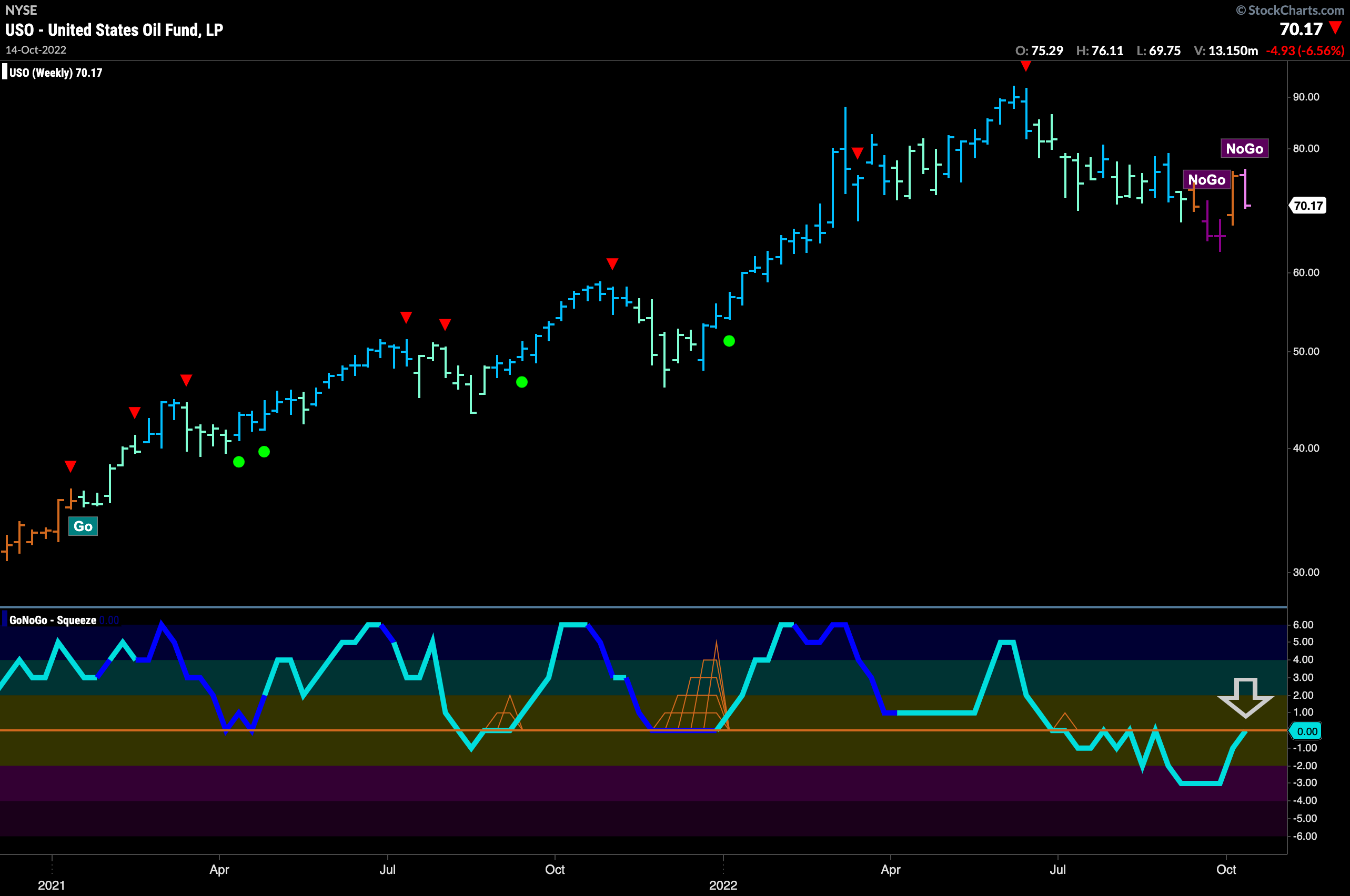
Below is the daily GoNoGo Chart for $USO. Although we have seen a strong rally off the lows, Oil is still struggling to get out of the “NoGo” as we saw amber bars give way to weak “NoGo” bars at the end of the week. GoNoGo Oscillator having burst into positive territory. We will look to see if it can now find support at the zero line which would be telling.
The weekly Oil chart tells a similar story as the amber “Go Fish” bar gives way to a weak “NoGo” pink bar. On the weekly chart, we see momentum testing the zero level from below instead of above. We will need to see this level hold as resistance if the “NoGo” is to really take hold.
Sector RelMap
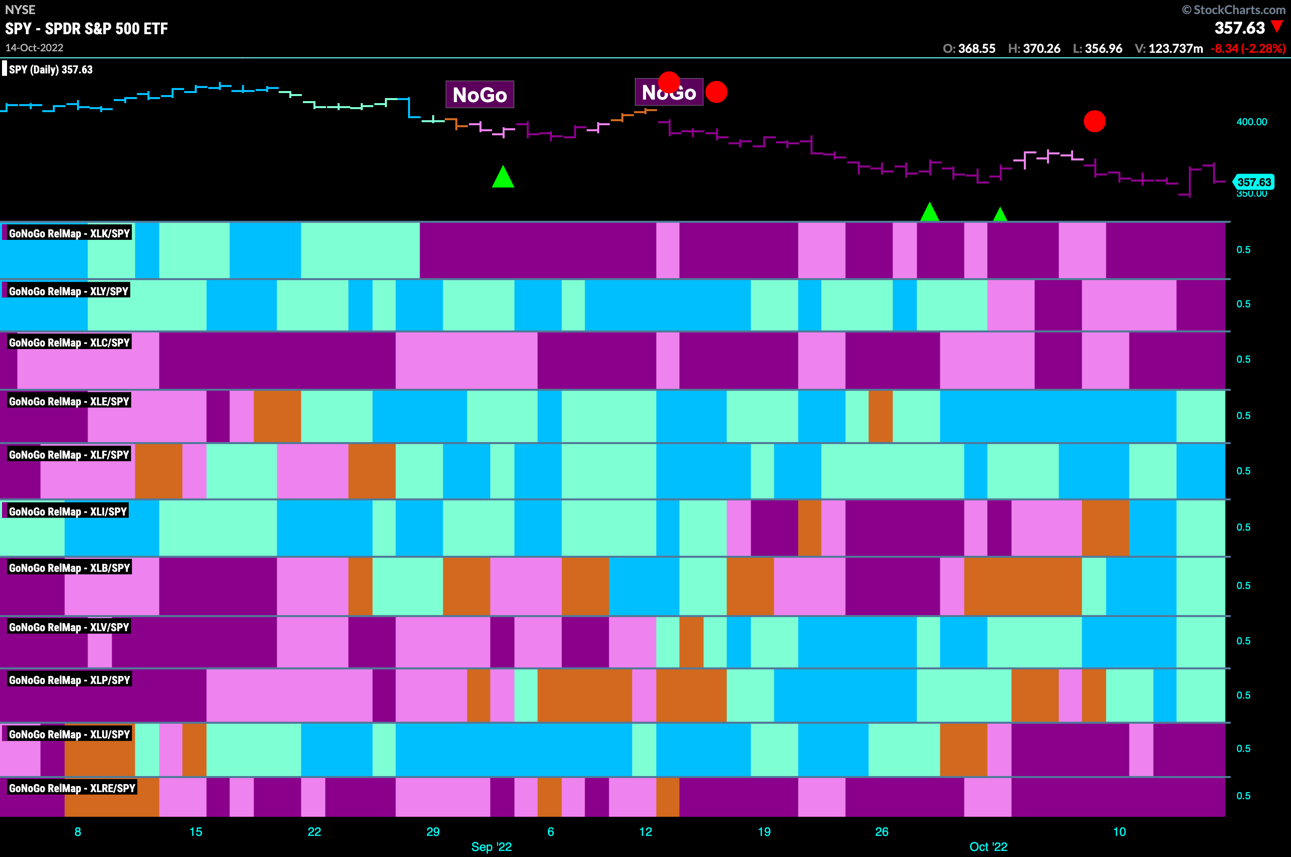
Below is the GoNoGo Sector RelMap. This GoNoGo RelMap applies the GoNoGo Trend to the relative strength ratios of the sectors to the base index. Looking at this map, we can quickly see where the relative outperformance is coming from as well as which sectors are lagging on a relative basis. It really is a “NoGo” for growth. Technology, communications and discretionary are in strong “NoGo” trends. We see relative outperformance from energy, financials, industrials, materials, healthcare and staples.
Energy Sector Strength
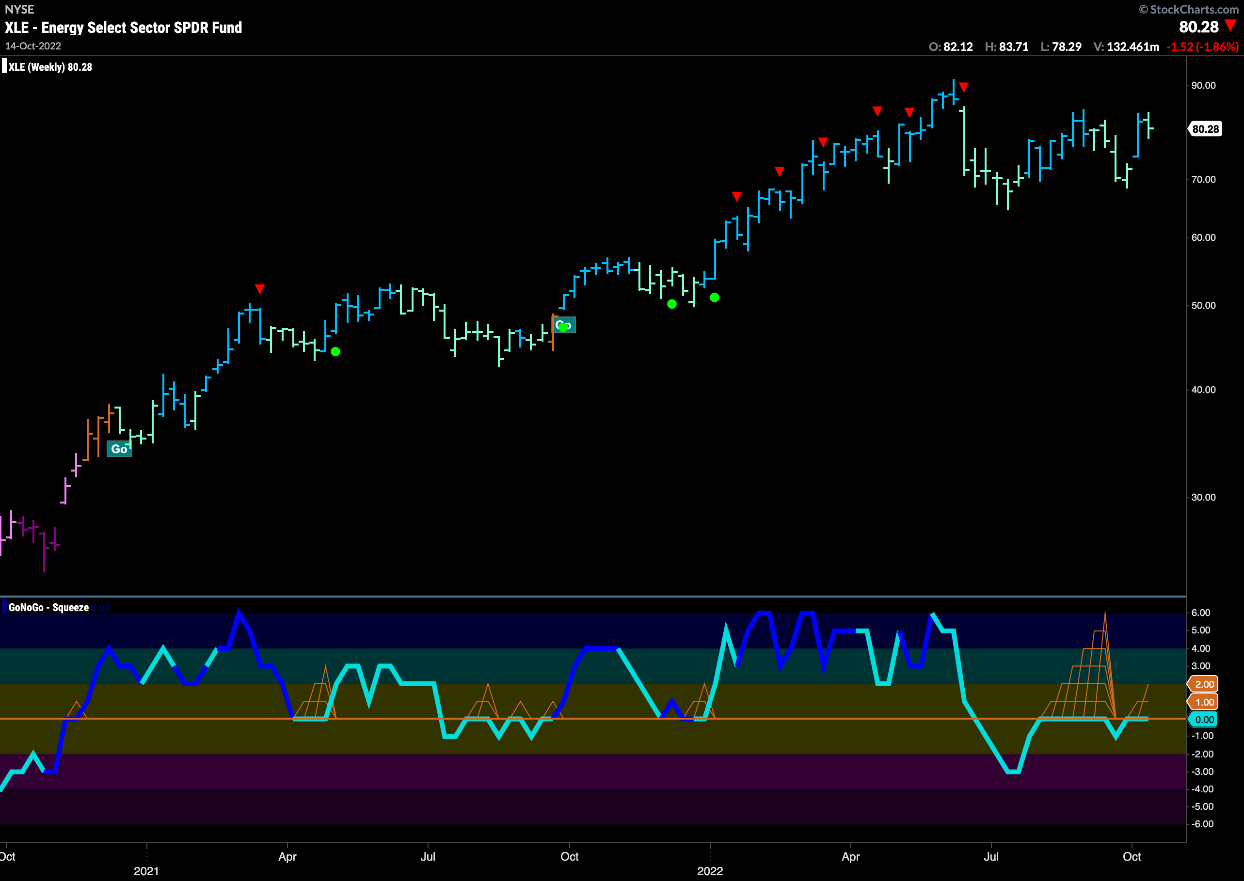
The GoNoGo Sector RelMap above shows that energy is in a relative “Go” trend to the S&P 500 and so let’s take a look at the GoNoGo Chart of $XLE. The weekly chart below shows that the sector has not suffered any where near the deterioration that we have seen from the index as a whole. We can see that the recent low was actually higher than the low from earlier in the summer. GoNoGo Oscillator is stuck at zero and has been for a couple of months now. The next significant move of the oscillator whether into positive or negative territory could be very important.
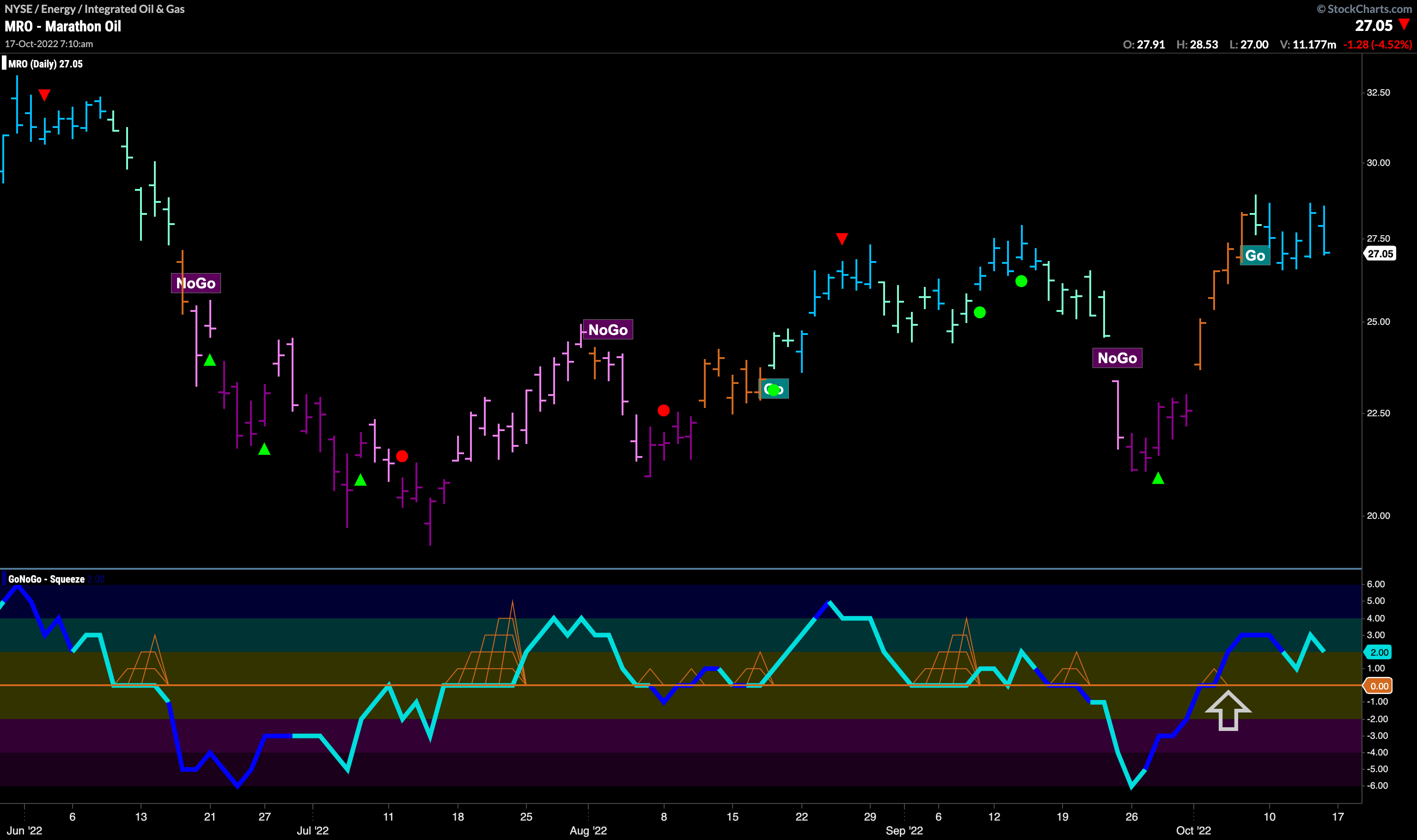
After Hitting the “Wall” Keep Running the Marathon ($MRO)?
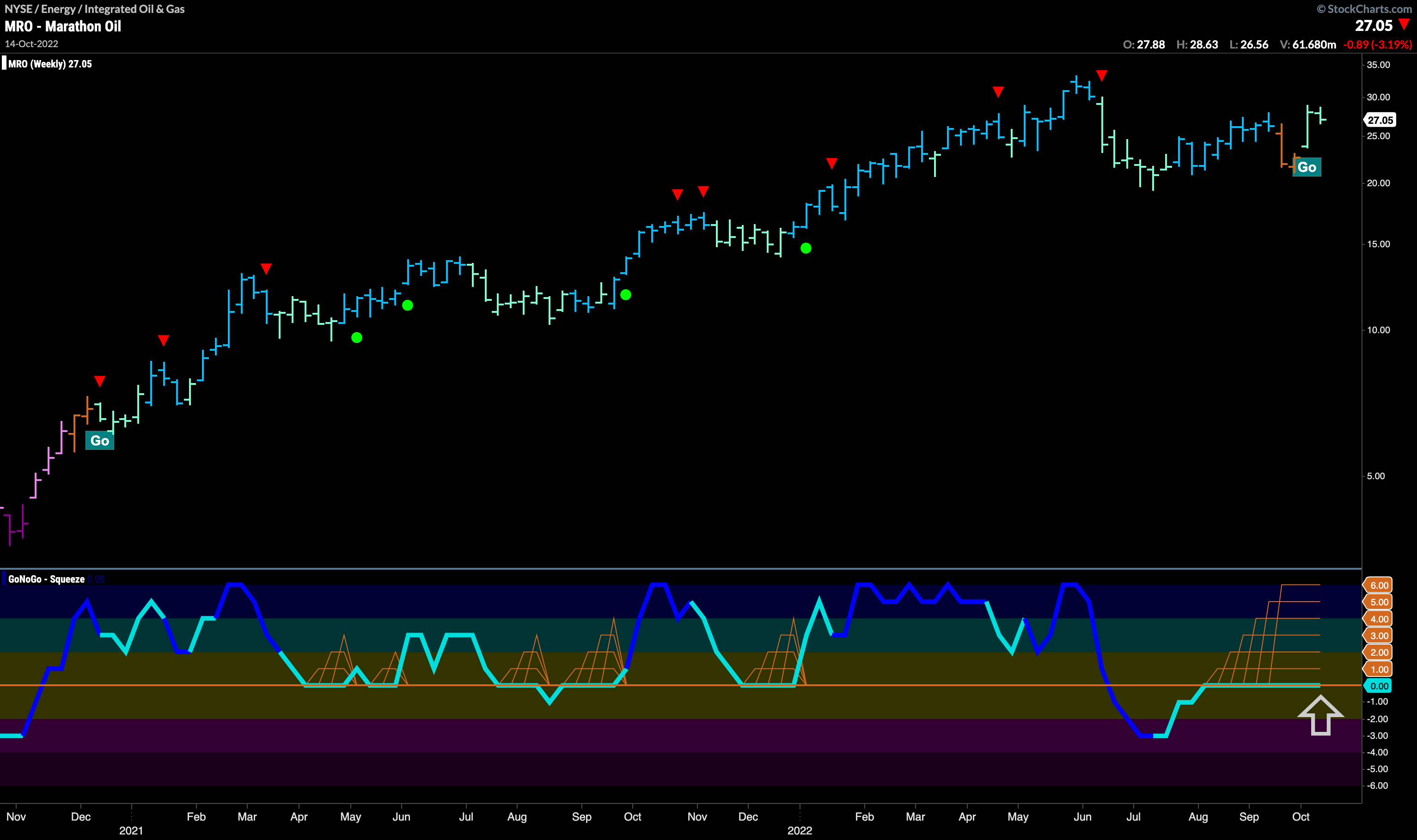
After painting a couple of amber “Go Fish” bars on a weekly chart we have seen a return to form as aqua “Go” bars return. GoNoGo Oscillator is stuck at zero causing a max GoNoGo Squeeze to build. We will look to the break of the Squeeze to gives us directional clues on this weekly chart.
Given that the larger time frame shows the return of the “Go” trend and GoNoGo Oscillator riding the zero line, we can step down in time frame to perhaps look for an opportunity. All else being equal, the weight of the evidence that shows the trend is still a “Go” on the weekly chart suggests that the oscillator may break into positive territory. The daily chart will give us earlier information. Indeed, we can see that on the daily chart GoNoGo Oscillator moved into positive territory on heavy volume over a week ago. Price is now consolidating at or above prior highs in a strong “Go” trend.
