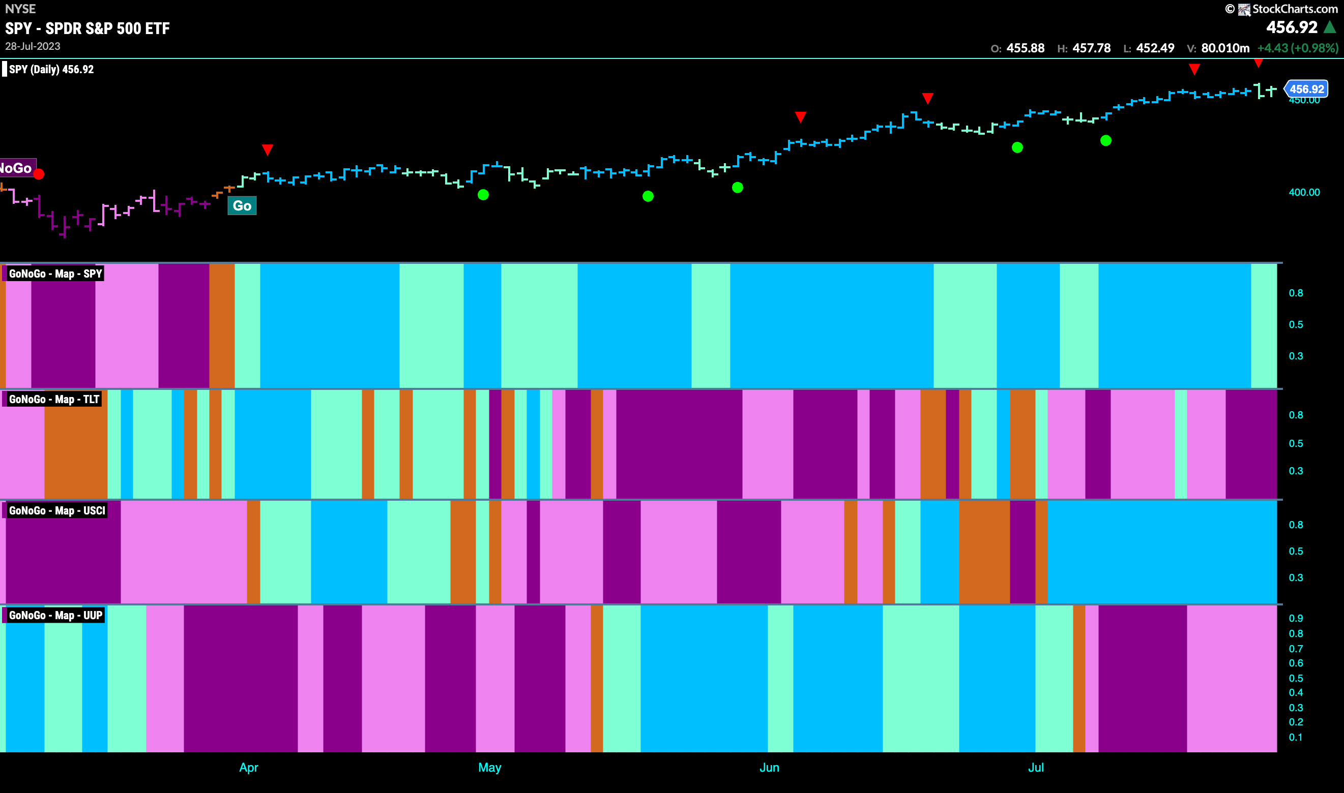
Good morning and welcome to this week’s Flight Path. The heat map shows that the “Go” trend in equities remained in place this week but we did see a couple of weaker aqua bars as price action cooled even as the temperature in the New York area heated up! Treasury bond prices fell into a stronger “NoGo” with purple bars. The commodity index saw continued strength and the dollar remained in a weaker “NoGo” trend painting pink bars.
Equities Hint at Weakness After Hitting High
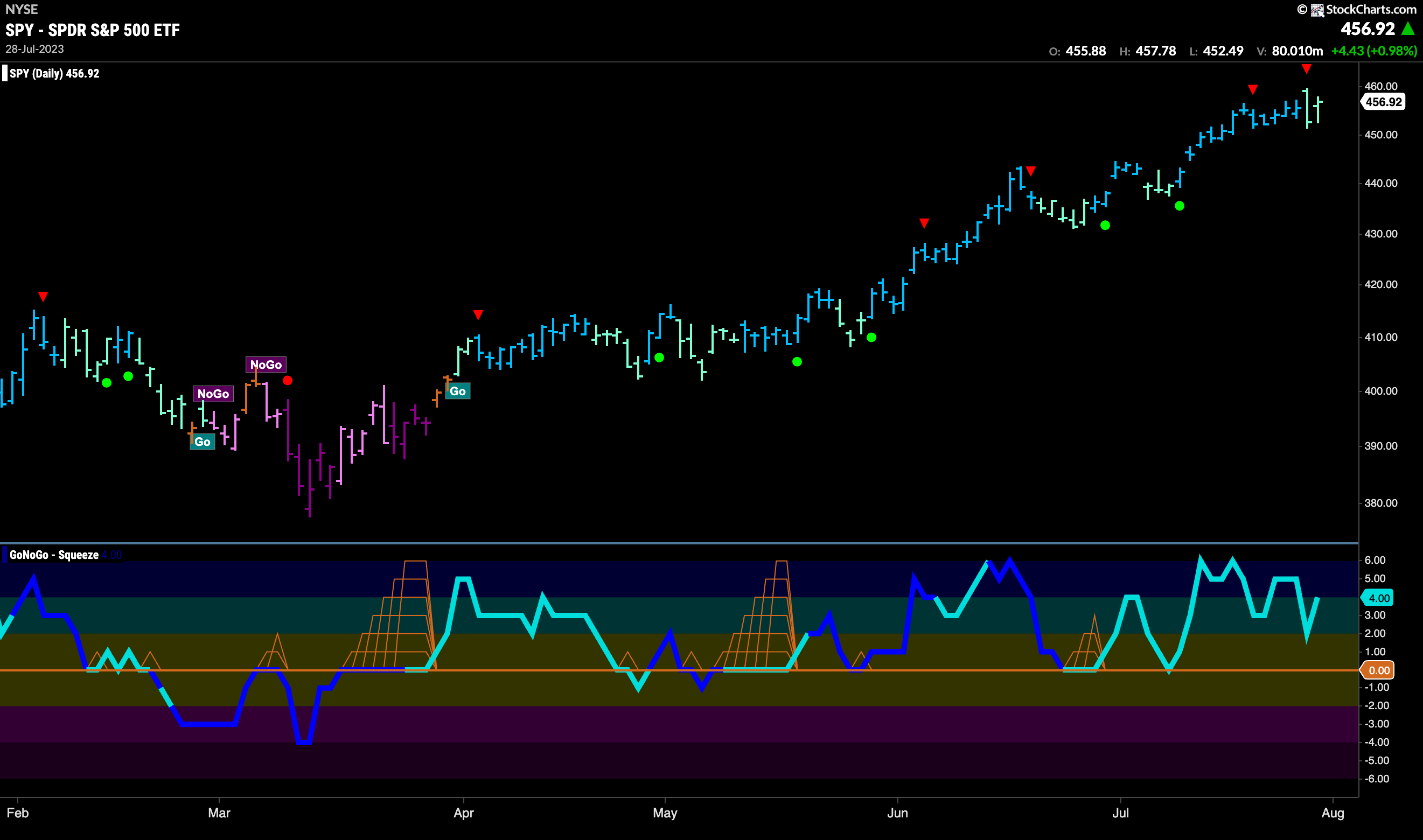
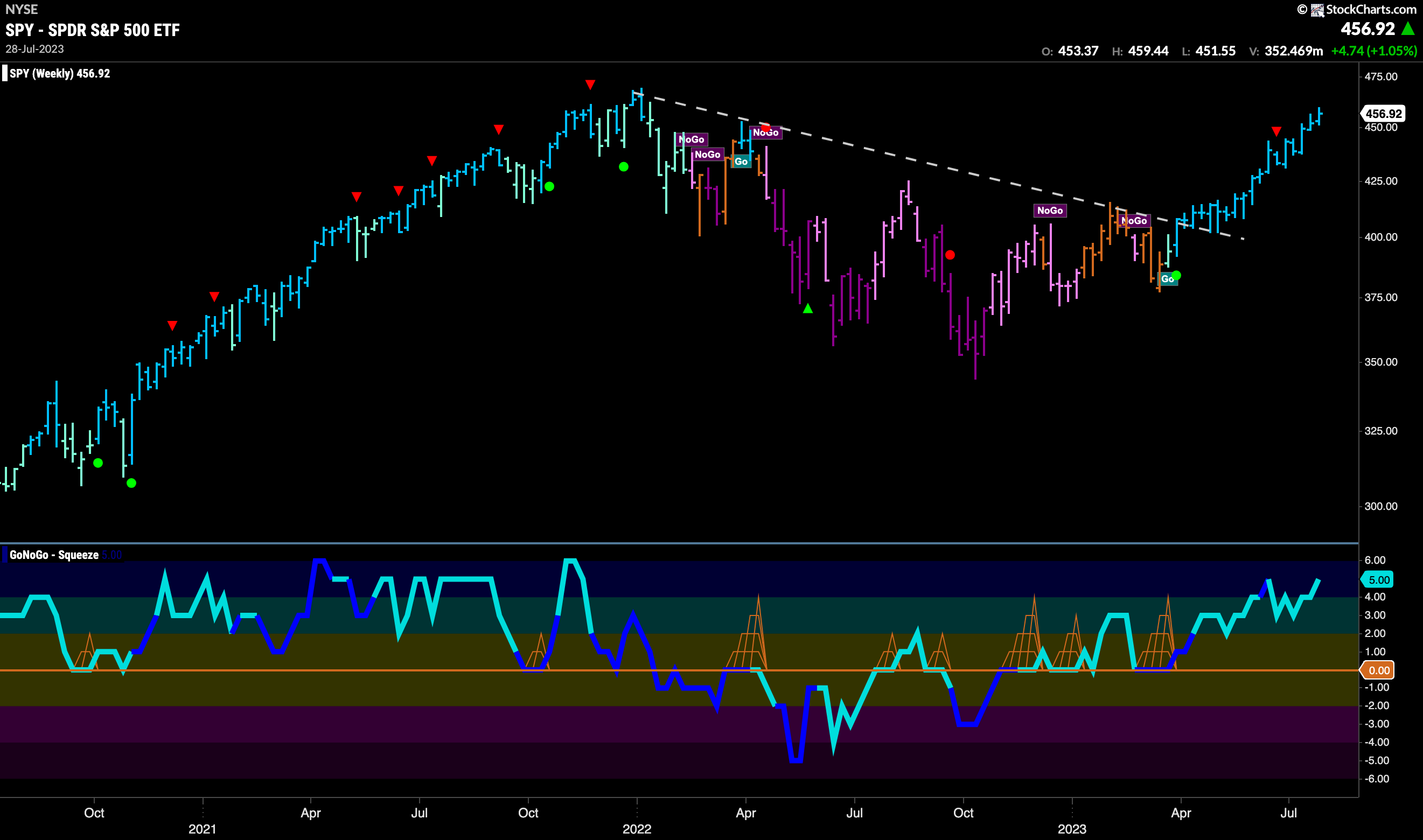
GoNoGo Trend painted more “Go” bars this week and indeed hit another new high. As that happened we saw a Go Countertrend Correction Icon (red arrow) indicating that price may struggle to go higher in the short term. Immediately we saw price pull back and GoNoGo Trend paint a couple of weaker aqua bars. GoNoGo Oscillator has stayed in positive territory though and so the weight of the evidence stays in favor of the “Go” trend.
The longer term weekly chart shows nothing but strength. Another strong blue “Go” bar as price inches higher once again this week. We can see that we are closing in on the all time high which could act as resistance coming up. GoNoGo Oscillator has wandered into overbought territory and is lighter than its average.
Treasury Remain Rangebound in “Go” trend
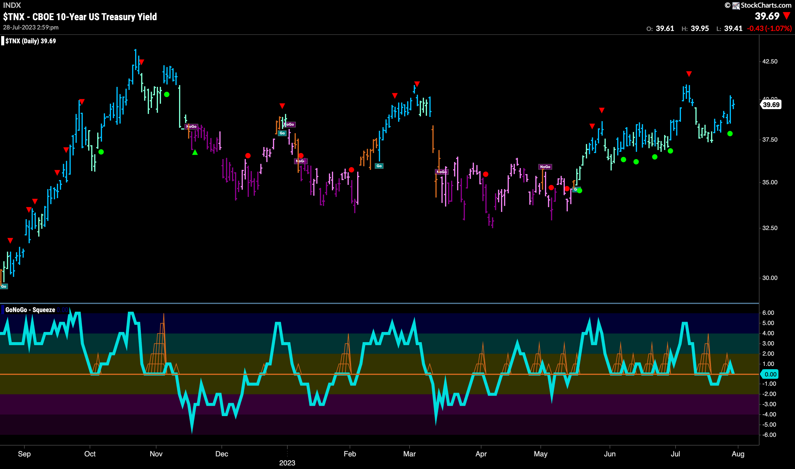
Treasury bond rates painted more blue “Go” bars this week as prices remained elevated. Still lower than prior highs and GoNoGo Oscillator is testing the zero line for support. We will watch to see if the oscillator can hold above the zero line which would suggest the “Go” trend could remain.
Dollar Stays in Middle of Channel
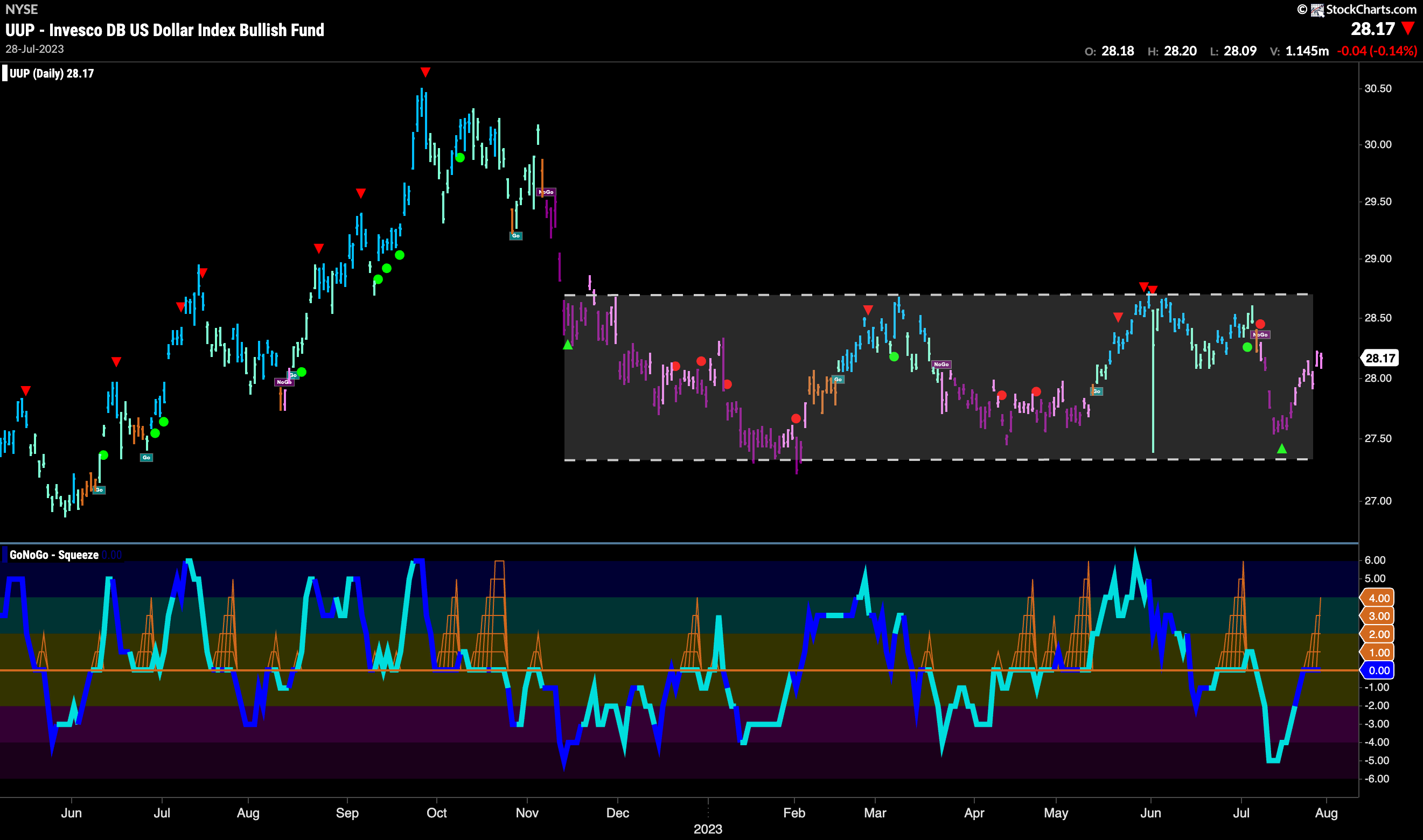
The dollar continued to rally off the lows this week and GoNoGo Trend painted a week of pink “NoGo” bars. Price has pushed up to the very middle of the channel that we see on the chart. GoNoGo Oscillator has risen to test the zero line from below and volume is heavy. We will watch to see if this level acts as resistance or if there is enough positive momentum to send it into positive territory. This will likely determine the next direction of price.
Is Oil Breaking Out?
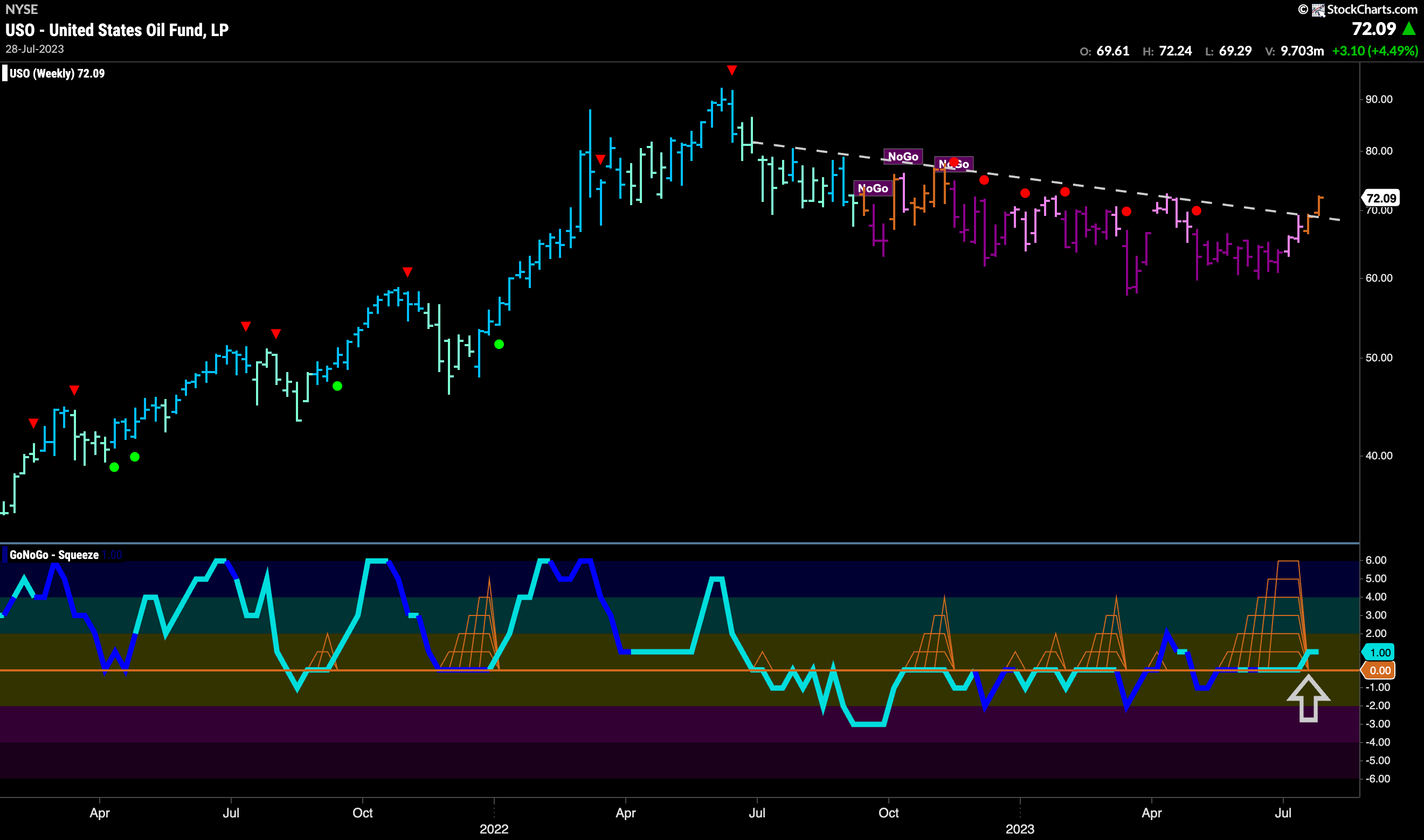
This past week saw price finally climb above the resistance from the downward sloping trend line. We note that this happened on a second consecutive “Go Fish” amber bar. This tells us that for now the “NoGo” has lost its grip on oil prices and we are in a period of uncertainty as to the direction of trend. GoNoGo Oscillator is breaking out of a Max GoNoGo Squeeze into positive territory and so that is a good sign for those looking for higher prices.
Gold Wobbles in New Trend
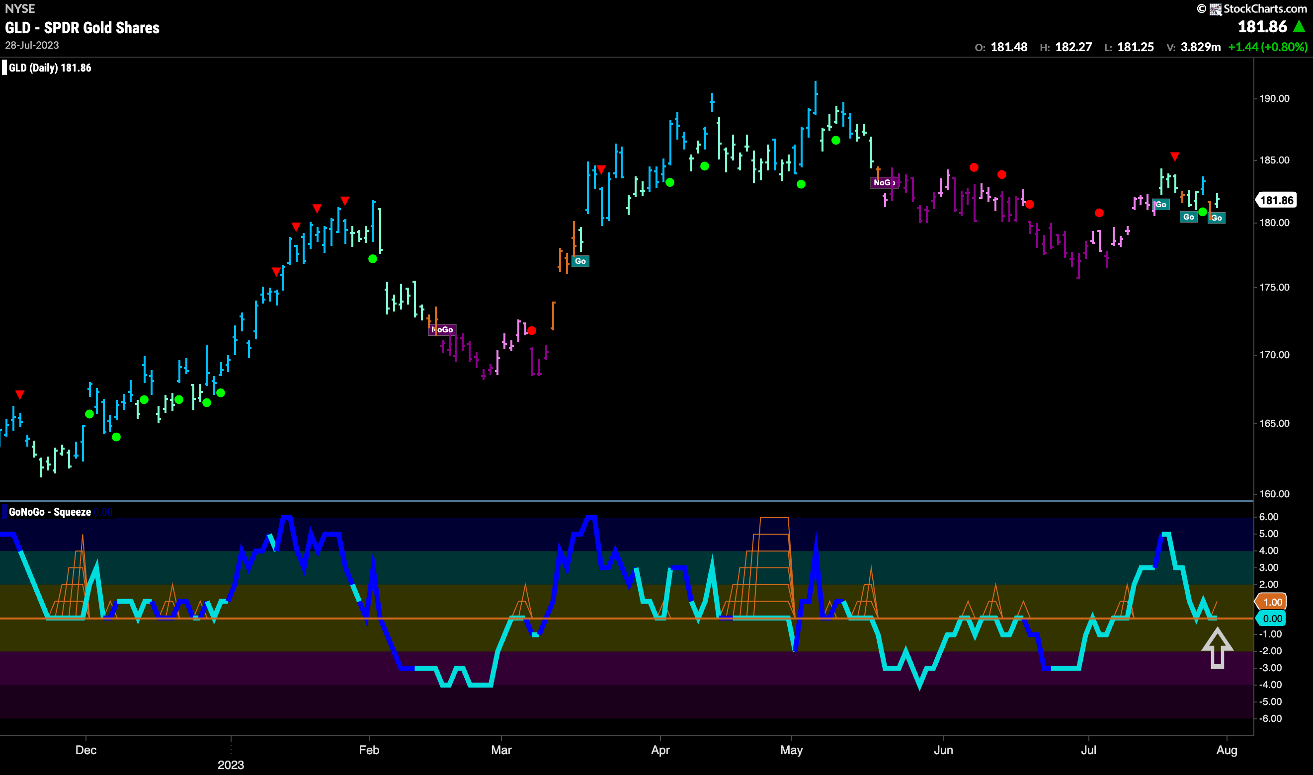
GoNoGo Trend painted more aqua “Go” bars this week but not without some amber “Go Fish” bars of uncertainty sprinkled in. GoNoGo Oscillator has fallen quickly to test the zero line from above and so we will watch to see if it finds support here. If the oscillator can bounce back into positive territory we will see trend continuation and GoNoGo Trend start to paint consistent “Go” bars.
Sector RelMap
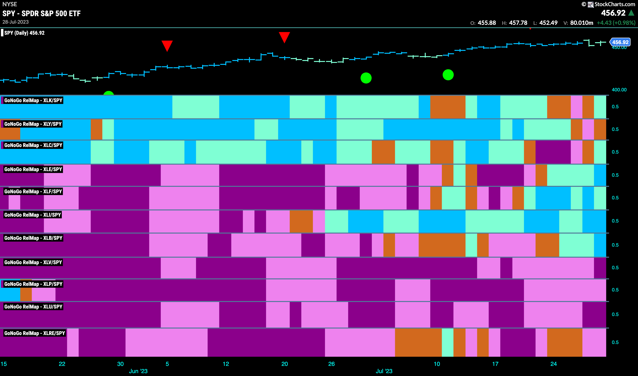
Below is the GoNoGo Sector RelMap. This GoNoGo RelMap applies the GoNoGo Trend to the relative strength ratios of the sectors to the base index. Looking at this map, we can quickly see where the relative outperformance is coming from as well as which sectors are lagging on a relative basis. 6 sectors are outperforming the base index this week. $XLK, $XLC, $XLE, $XLF, $XLI, and $XLB are painting “Go” bars.
Long Term Industrials Breakout
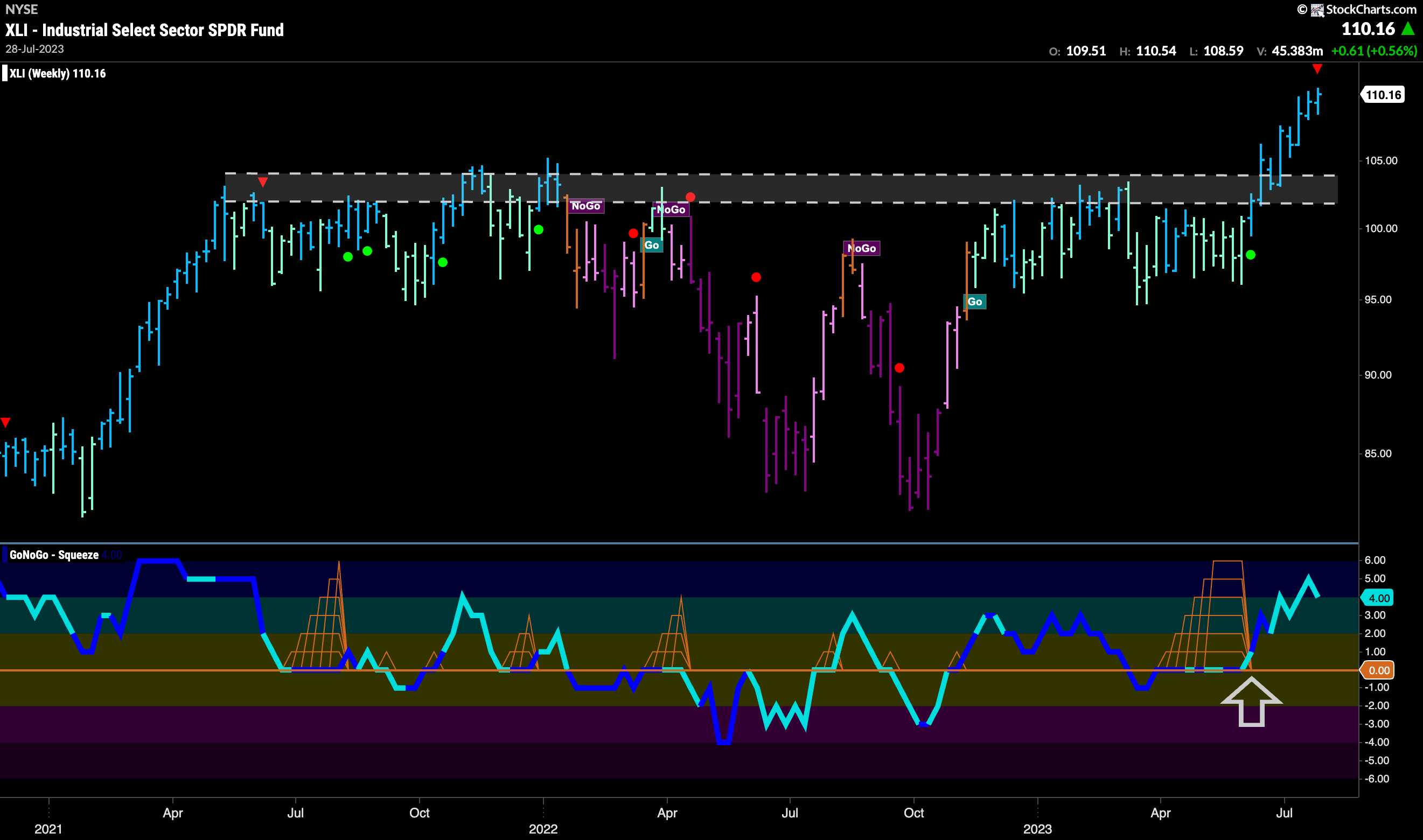
The GoNoGo Sector RelMap above showed that the industrials sector has been outperforming on a relative basis to the S&P 500. The weekly chart below shows just how strong that trend is for $XLI using weekly bars. Since GoNoGo Oscillator broke out of the Max GoNoGo Squeeze into positive territory price has gone from strength to strength, itself breaking out of severe resistance.
Inflection Point for Industrials Relative Strength
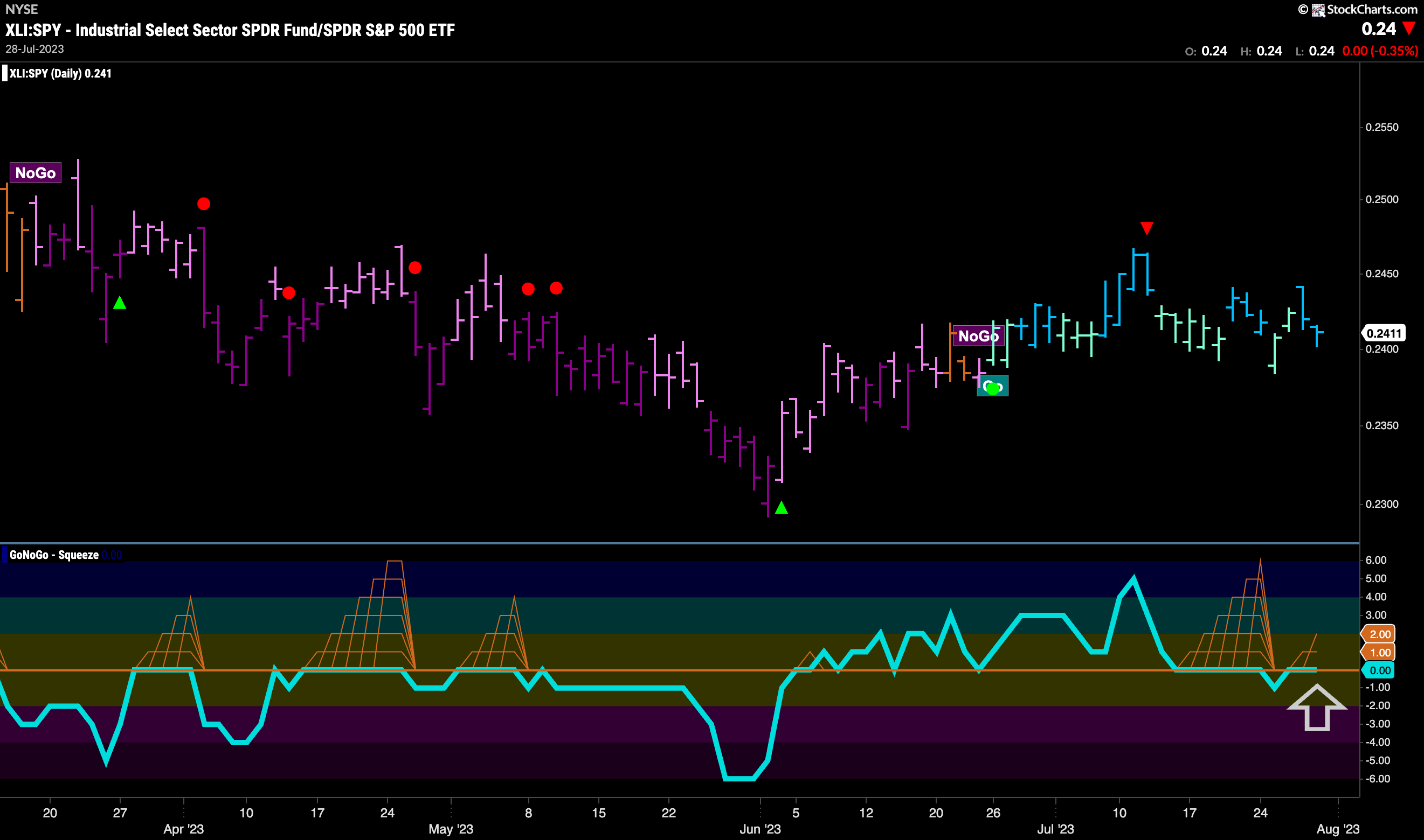
On a daily chart, we can plot the relative ratio of $XLI:SPY and apply the full suite of GoNoGo tools to understand the technical analysis. What we see is that the ratio entered a “Go” trend in late June but has gone mostly sideways albeit making a high earlier this month. GoNoGo Oscillator has been riding the zero line with one small blip into negative territory last week. Back at zero now, we will watch to see if the oscillator finds support at this level. If it does, we will see trend continuation for the relative strength of Industrials which could set it up for a new high.
CAT to Claw its Way Higher?
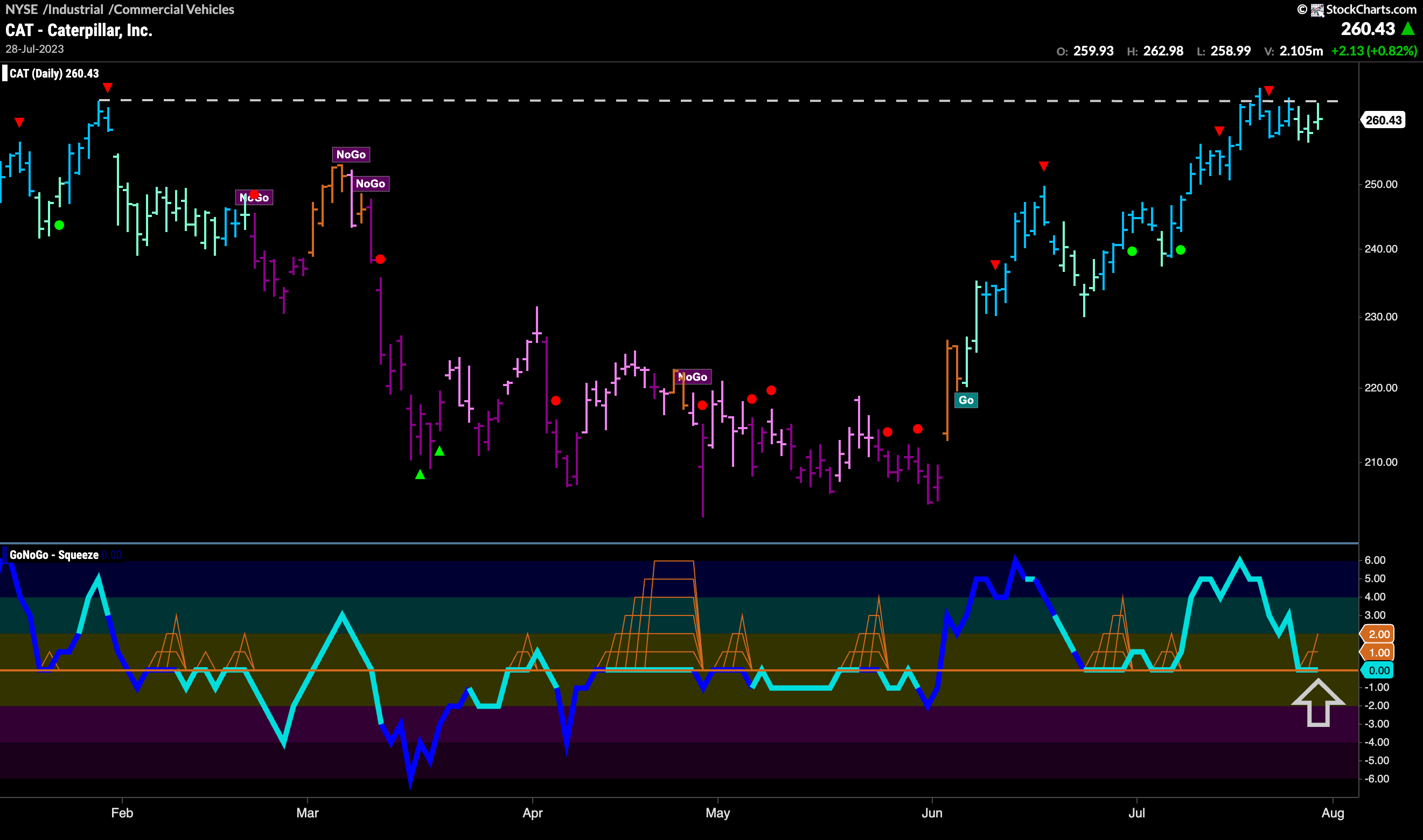
If the industrials sector is in a larger timeframe “Go” trend as we saw above, and relative strength is looking for trend continuation, we can turn to some individual securities in that sector to look for opportunities. $CAT is in a “Go” trend but we have seen price move sideways since hitting a high that corresponded with prior high resistance. The Go Countertrend Correction Icon (red arrow) suggested that this would happen. GoNoGo Oscillator has fallen to the zero line where we will look to see if it finds support. If it does, then we would expect the “Go” trend to continue and price to make an attack on those prior highs.
$MMM Breaks out of Big Base
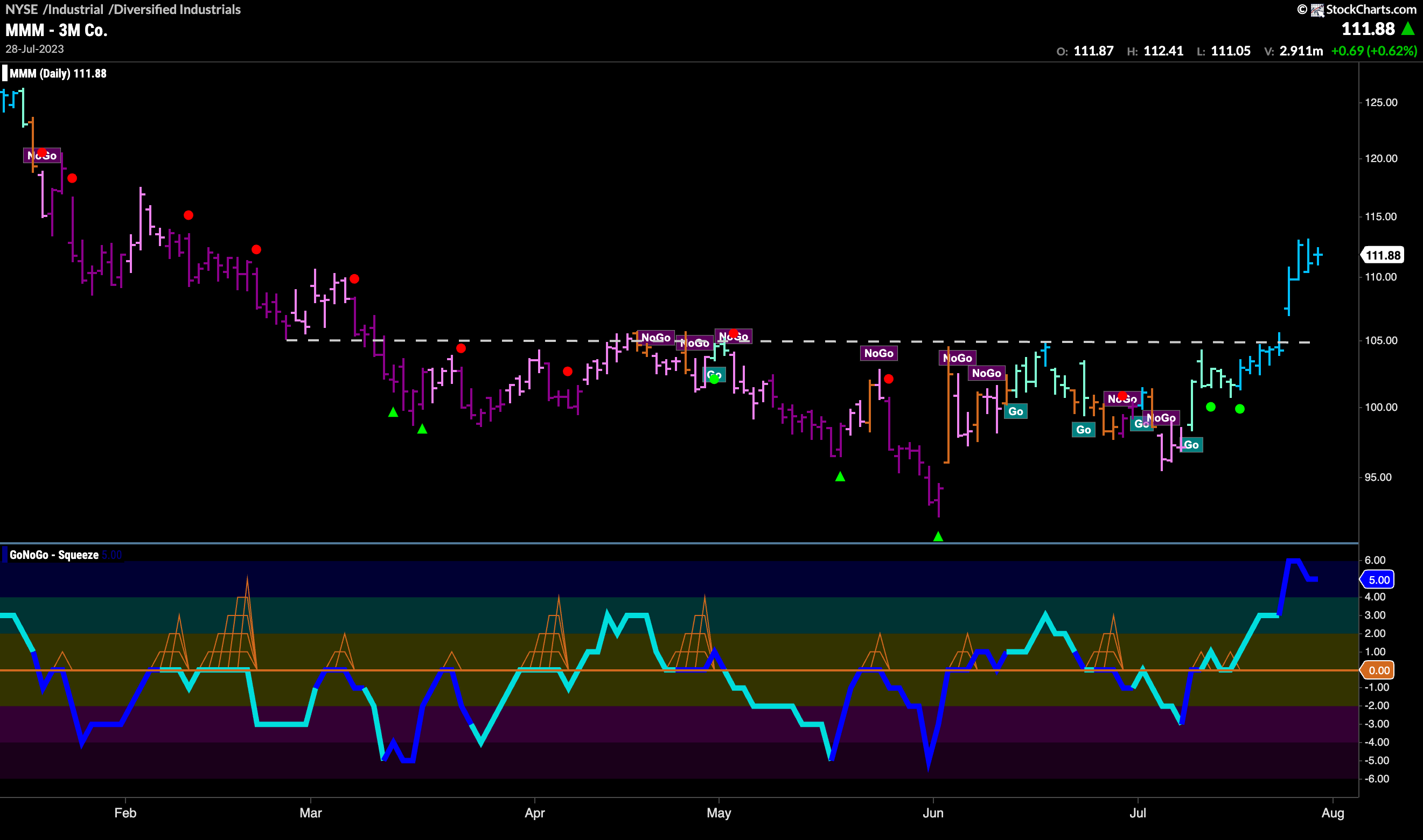
The chart below shows the price chart of $MMM, also in the industrials sector. We can see from this chart that the “Go” trend is much younger and that it took a while to get going. Finally breaking above horizontal resistance this week, it did so on a gap which is always a strong sign. With very strong momentum and heavy volume, the “Go” trend is painting bright blue bars as price looks to go higher still.
