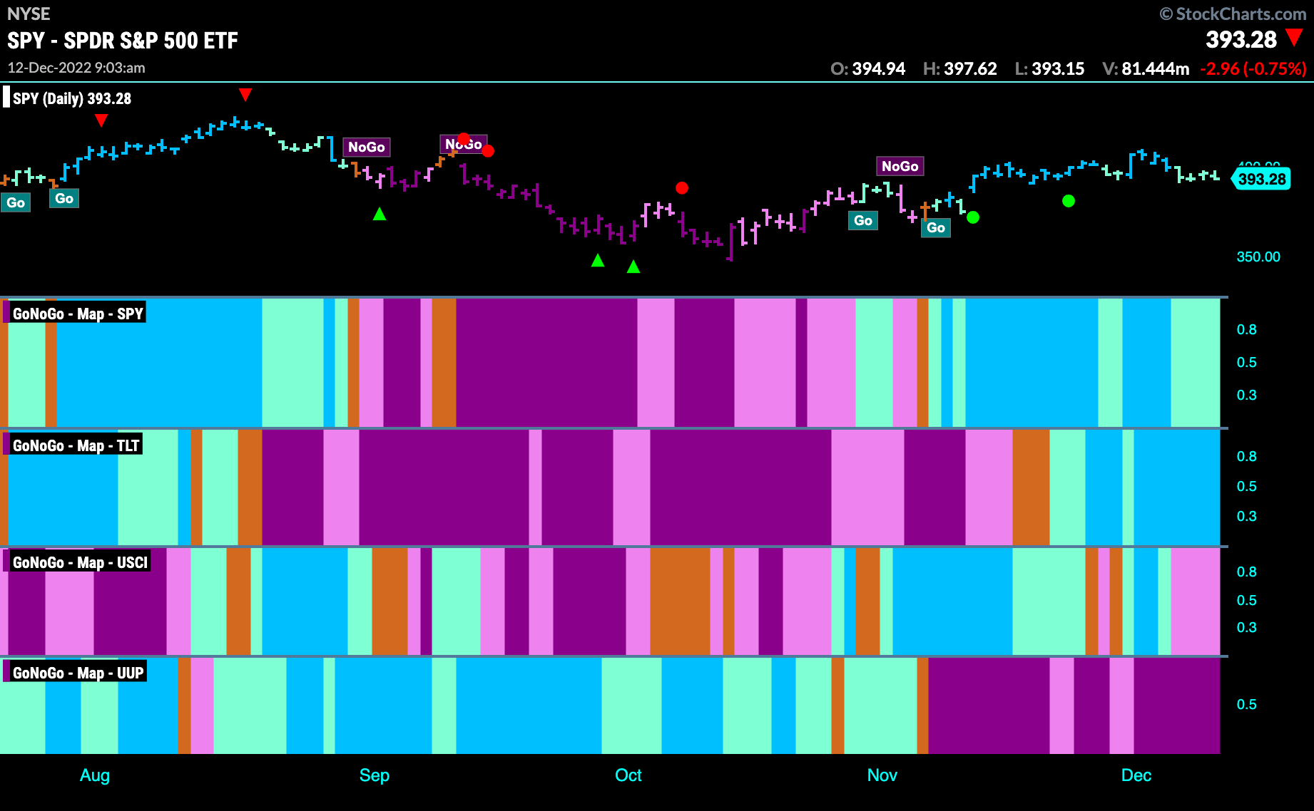
Good morning and welcome to this week’s Flight Path. Let’s take a look at the GoNoGo Asset map below. We don’t see too much change this week as “Go” trends remain in place for U.S. equities (albeit weakening with paler aqua bars) and treasury bond prices. Commodities have started to struggle and the dollar remains in a strong “NoGo” trend.
S&P 500 Sees Weakness in “Go” trend
The “Go” trend retreated this week back to support levels that we have noted in the past. The level outlined by the dotted line has provided both support and resistance for most of the year. Worryingly for the bulls, GoNoGo Oscillator has not found support this time at the zero line and is moving into negative territory. This is not a healthy sign for the “Go” trend as we know that momentum should remain on the side of the trend when the trend is strong. 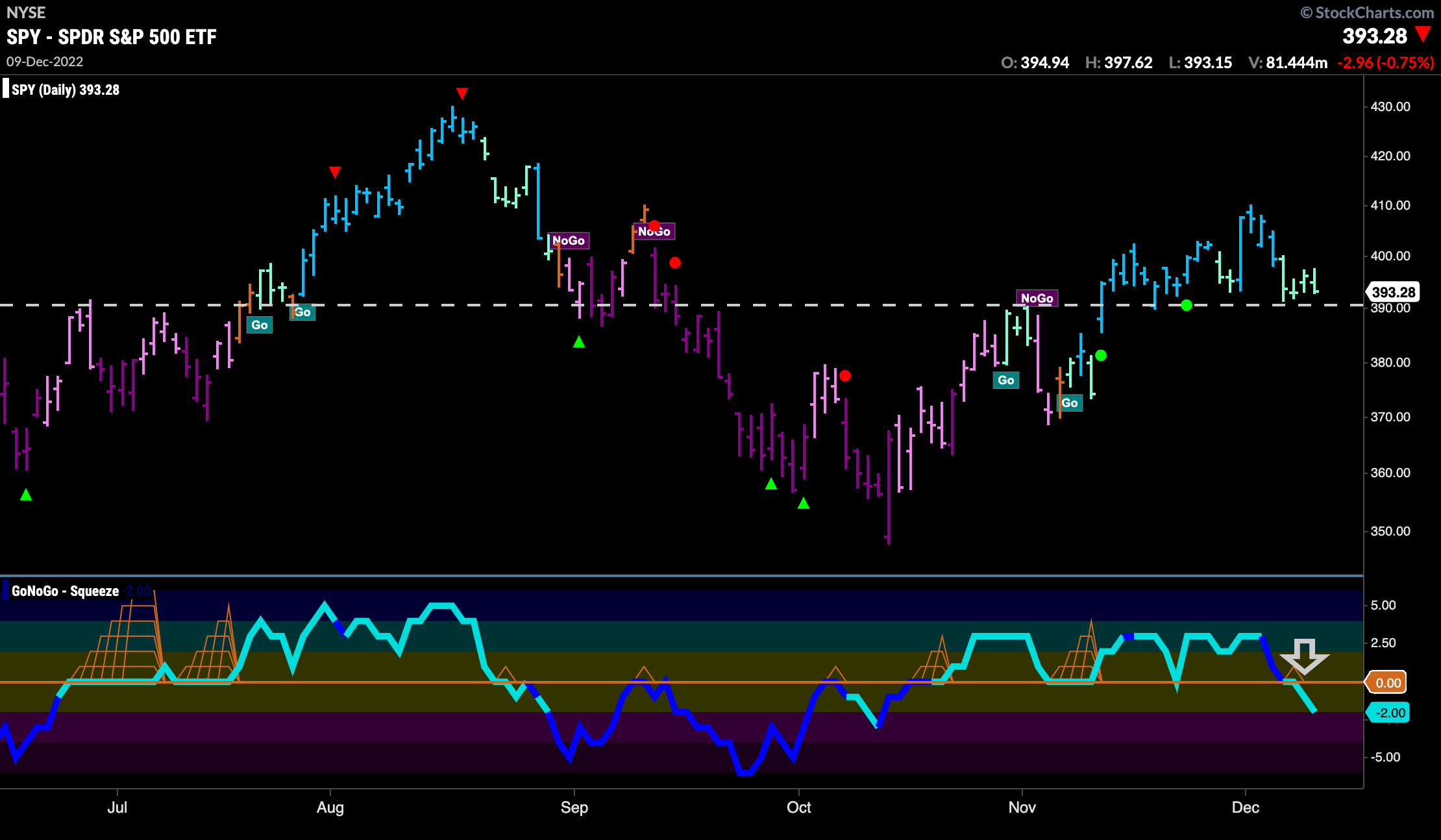
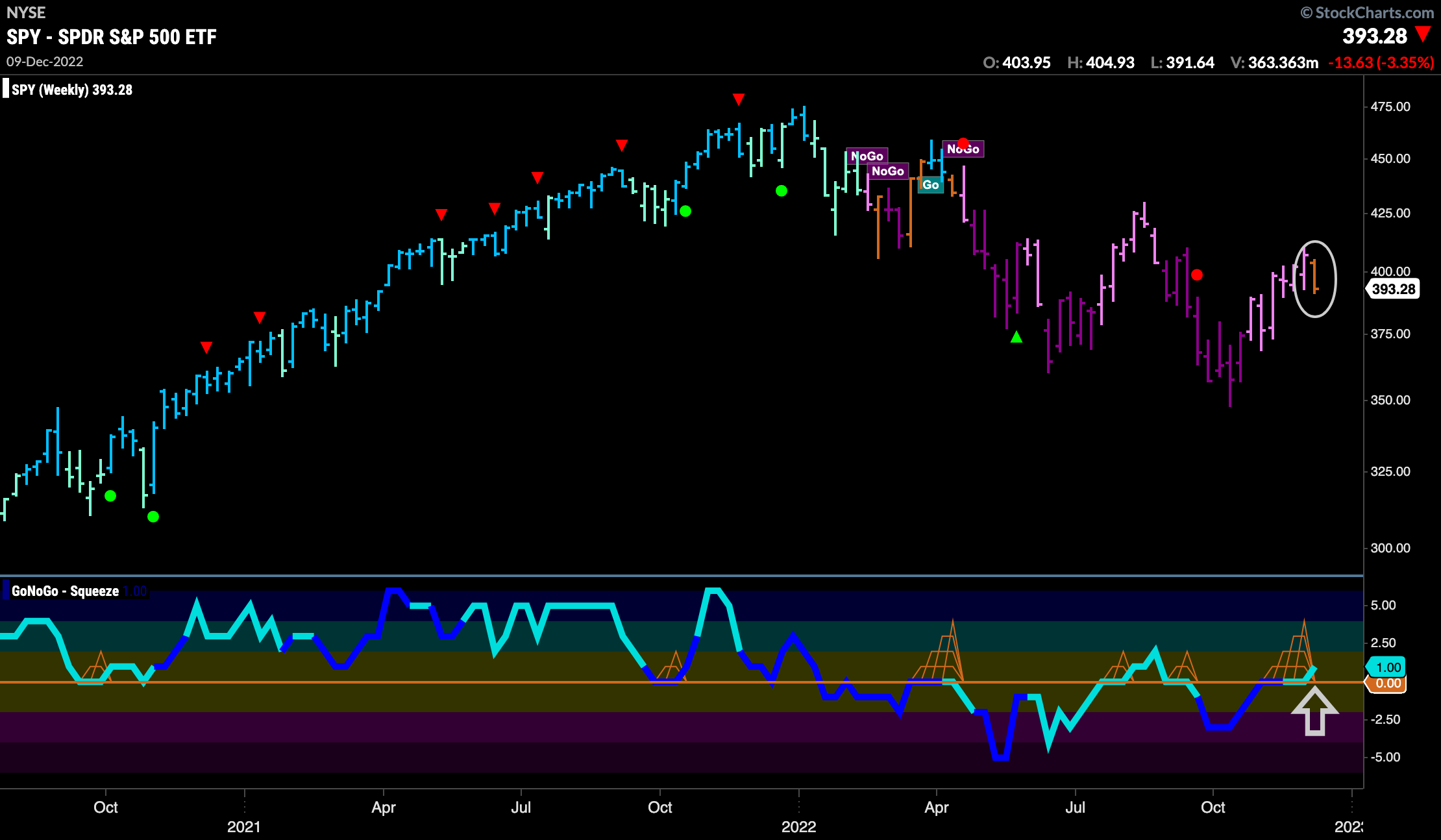
However, on the weekly chart we can see that for the first time in over 6 months we have left the “NoGo” trend and painted an amber “Go Fish” bar. This represents uncertainty and often is present in transitionary periods. Of course, it is possible to have more “NoGo” bars first before any change in trend. There is another positive sign however, and that is the fact that GoNoGo Oscillator is creeping into positive territory after having been stuck at that level for 4 weeks. We will watch to see how this plays out.
Treasury Rates Remain in “NoGo” on Daily Chart
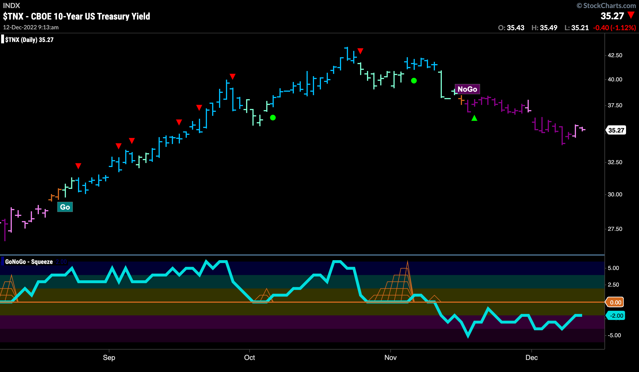
Nothing exciting on this chart this week. The “NoGo” is in place and prices have rallied slightly off the lows from the beginning of the week. GoNoGo Oscillator remains in negative territory but is not yet oversold. If price moves lower from here then it will be clear that a new lower low has been set.
The Dollar Settles at New Lows
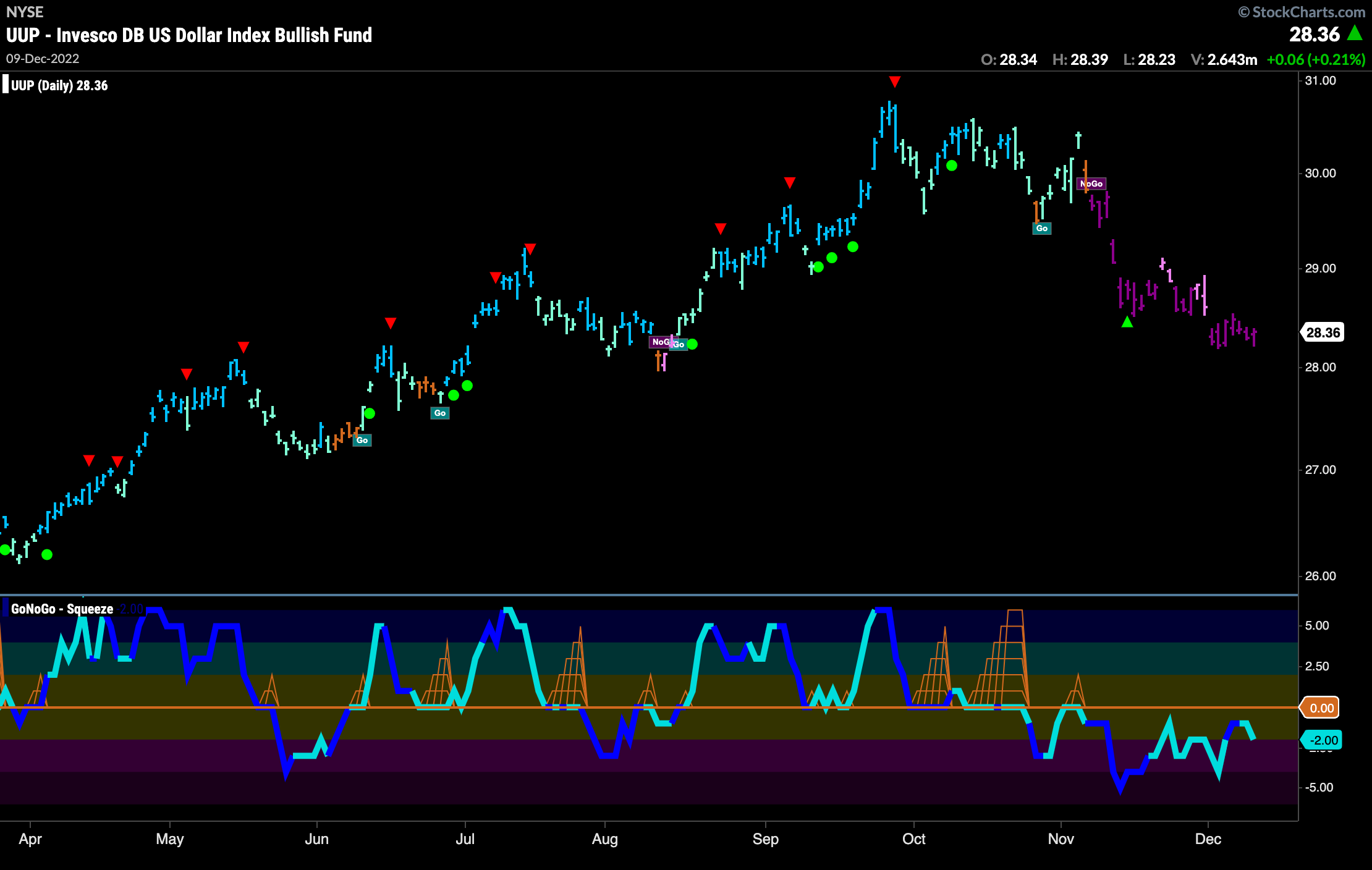
The dollar has seen price remain at lows from just over a week ago. Being unable to recover from the small gap down we see price in strong purple “NoGo” bars for the entire week and the week ends with prices lower. GoNoGo Oscillator was approaching the zero line from below but never made it there and rolled over. The picture is clear for the U.S. dollar.
“NoGo” in Oil Flirting with New Lows
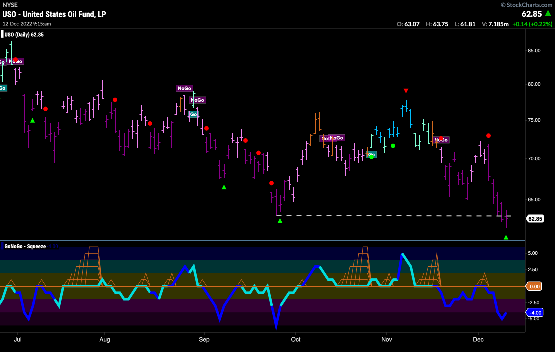
Oil struggled this week falling lower almost every day of the week. Thursday and Friday saw closing prices slightly lower than the prior low from late September. GoNoGo Oscillator got rejected by the zero line early in the week and fell sharply since on heavy volume. We will look to see if this increased momentum will allow price to consolidate at new lows.
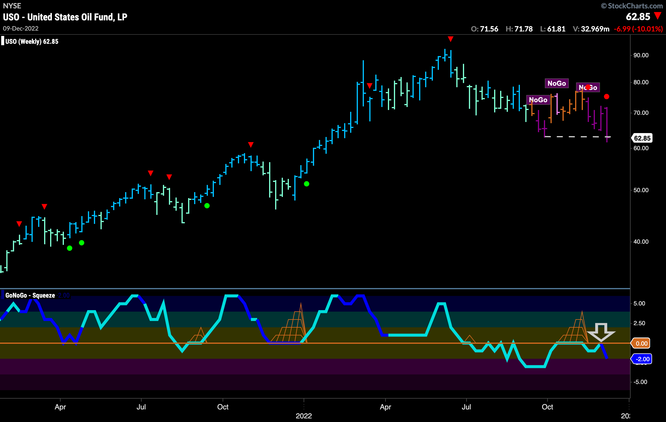
The long term chart looks bearish also. Strong purple “NoGo” bars again this week. We can see that same horizontal level on this weekly chart and it is obvious that there is a lot of black space below this level. If broken, we could see further price deterioration. GoNoGo Oscillator has been rejected by the zero line on heavy volume and we can now say that momentum is resurgent in the direction of the “NoGo” trend.
Sector RelMap
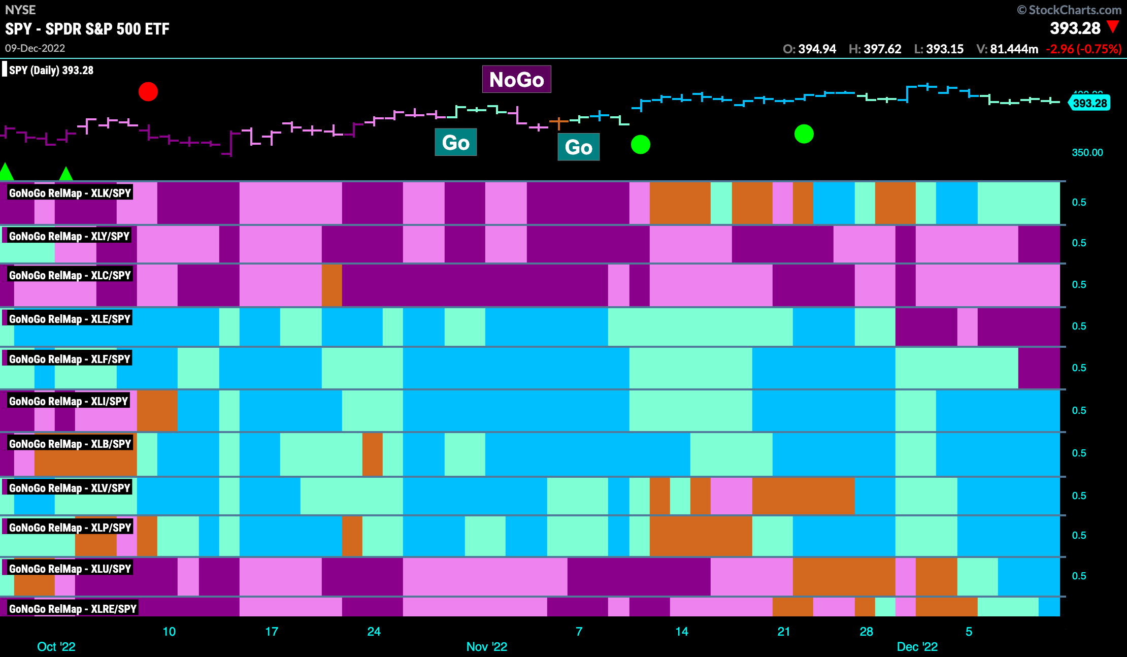
Below is the GoNoGo Sector RelMap. This GoNoGo RelMap applies the GoNoGo Trend to the relative strength ratios of the sectors to the base index. Looking at this map, we can quickly see where the relative outperformance is coming from as well as which sectors are lagging on a relative basis. 7 sectors are outperforming the base this week. $XLI, $XLB, $XLV, $XLP, $XLU, $XLRE, and $XLK are painting “Go” bars. In a shift, we see XLU and XLRE relatively outperforming while XLE and XLF move into strong “NoGo” trends.
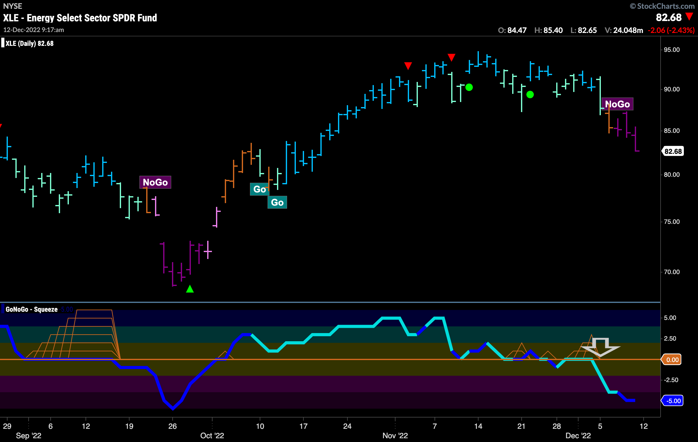
$XLE Paints Strong “NoGo” Bars This Week
After falling below horizontal support levels we saw an amber “Go Fish” bar on Tuesday of this week as GoNoGo Oscillator rode the zero line. This directional uncertainty was resolved when GoNoGo Oscillator broke free of the zero line into negative territory and GoNoGo Trend established a “NoGo” trend on strong purple bars. Volume has also increased on this move lower.
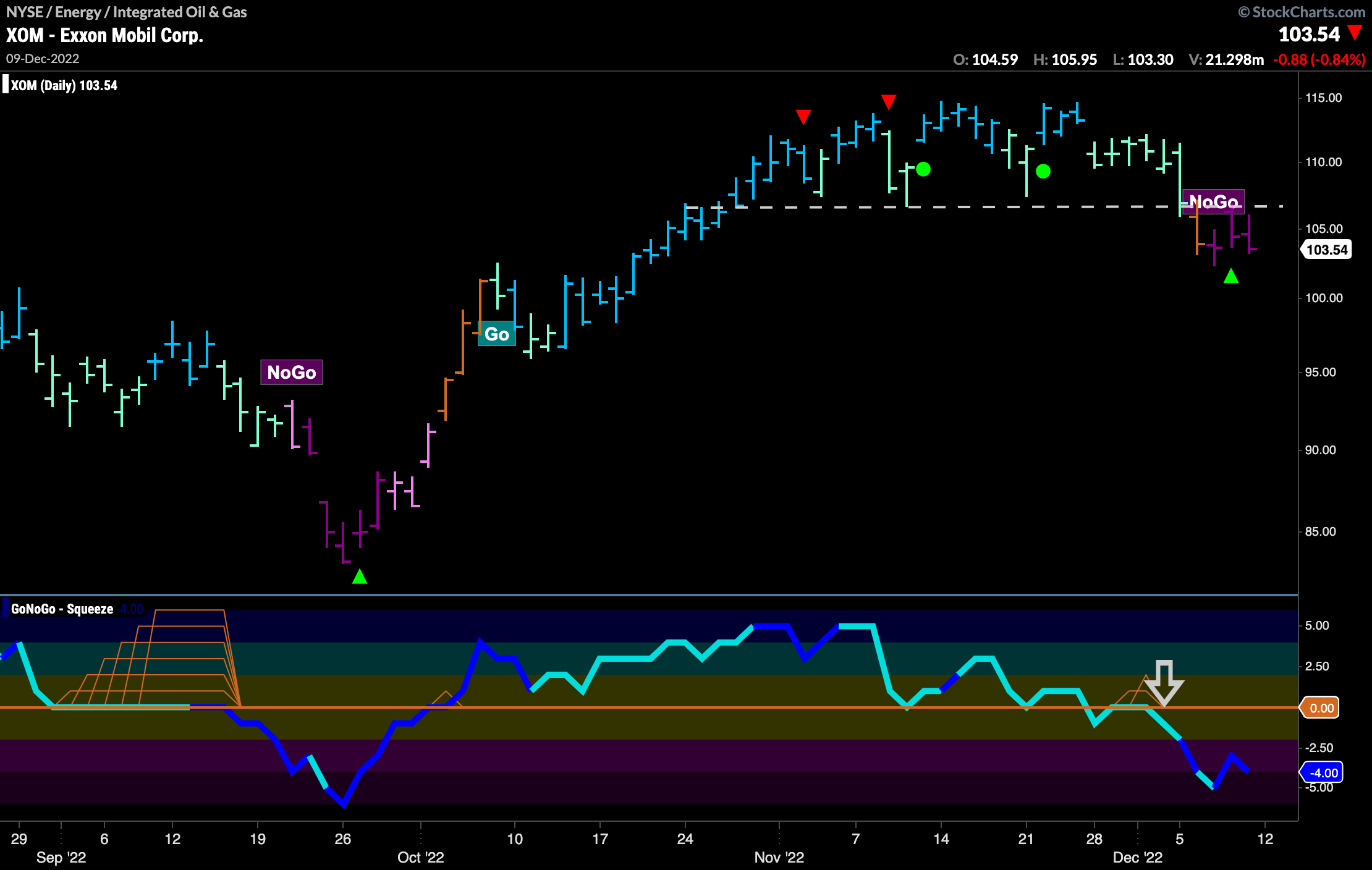
$XOM Poised to Drop Lower?
We can see the above scenario played out clearly on the single security chart of $XOM. The Energy giant saw price on Monday drop sharply to horizontal support as it has several times over the past few weeks as price consolidated sideways. Watching GoNoGo Oscillator during this time period gave us an early indication when it failed to hold the zero line after bearish divergence throughout the pattern. Now, GoNoGo Oscillator is clearly in negative territory on heavy volume as price settles at new lows. Look for price to move lower from here.
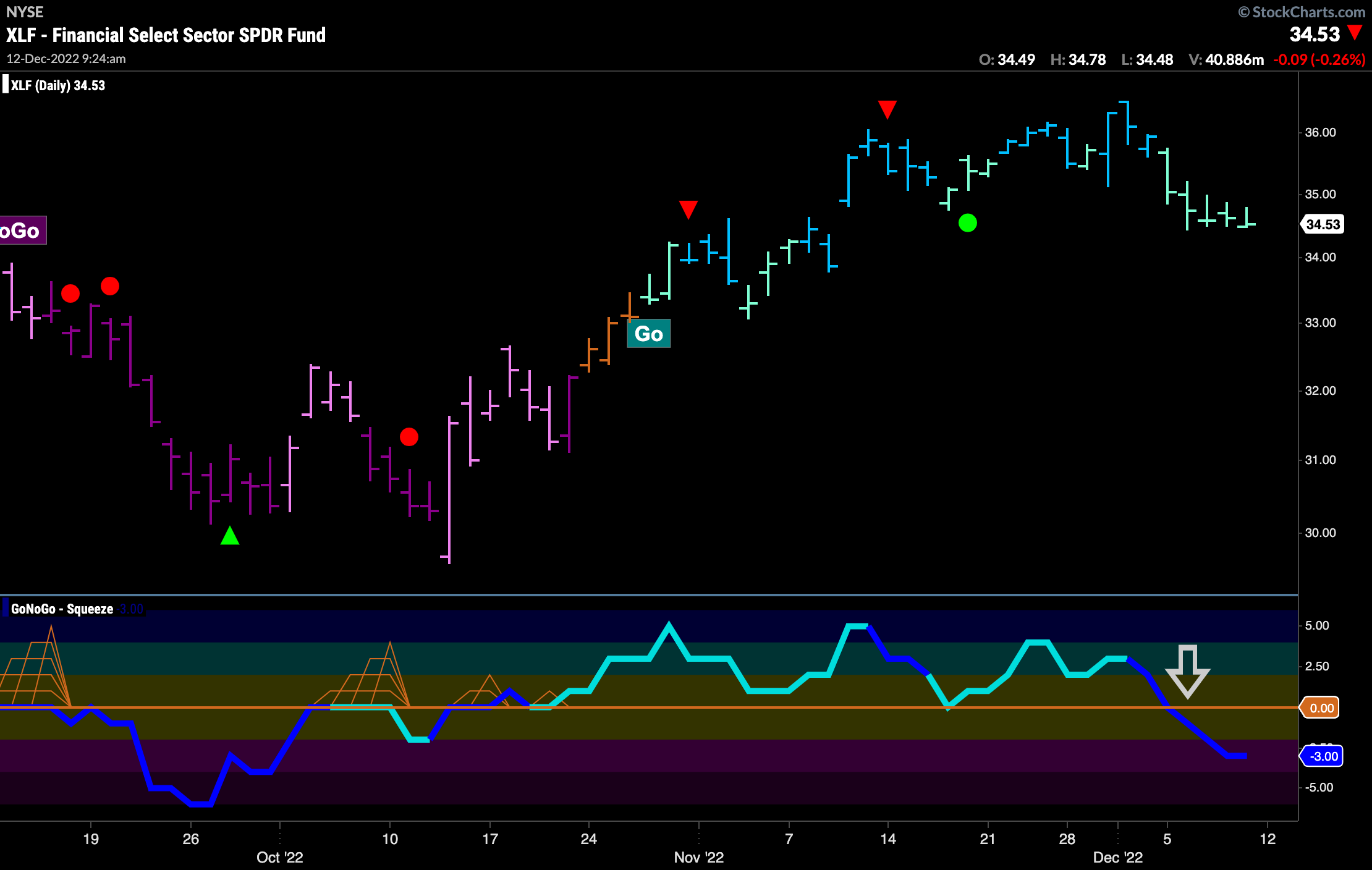
$XLF Sees “Go” Trend Weaken
We saw in the GoNoGo Sector RelMap that $XLF had moved into a relative “NoGo”. The pure GoNoGo Chart below of the financial sector ETF shows that the “Go” trend is still in place but we are seeing much weakness as GoNoGo Trend paints a string of aqua bars. What is of some concern to the GoNoGo analyst is that the GoNoGo Oscillator was unable to find support at the zero line and broke through it with no hesitation on heavy volume.
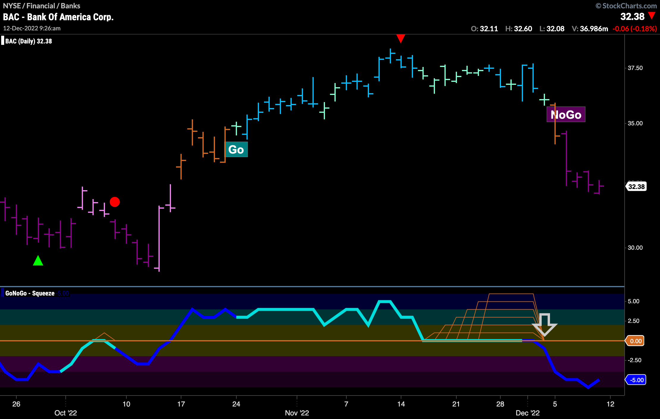
$BAC Already in “NoGo” after Max GoNoGo Squeeze Break
If the financial sector is to continue to struggle let’s take a look at the chart below of one of the industry giants. The GoNoGo chart shows that Bank of America saw price move mostly sideways after a Go Countertrend Correction Icon (red arrow) pulled out the most recent high price. GoNoGo Oscillator then entered a Max GoNoGo Squeeze as the oscillator rode the zero line showing an extended period of reduced volatility. The max Squeeze was broken on the last aqua bar (also a doji candle pattern, representing even more uncertainty). As the oscillator moved into negative territory on heavy volume we saw an amber “Go Fish” bar followed by a string of strong purple “NoGo” bars. We could be looking at future trend continuation signals to participate as well as step down in timeframe perhaps to assess entry.
