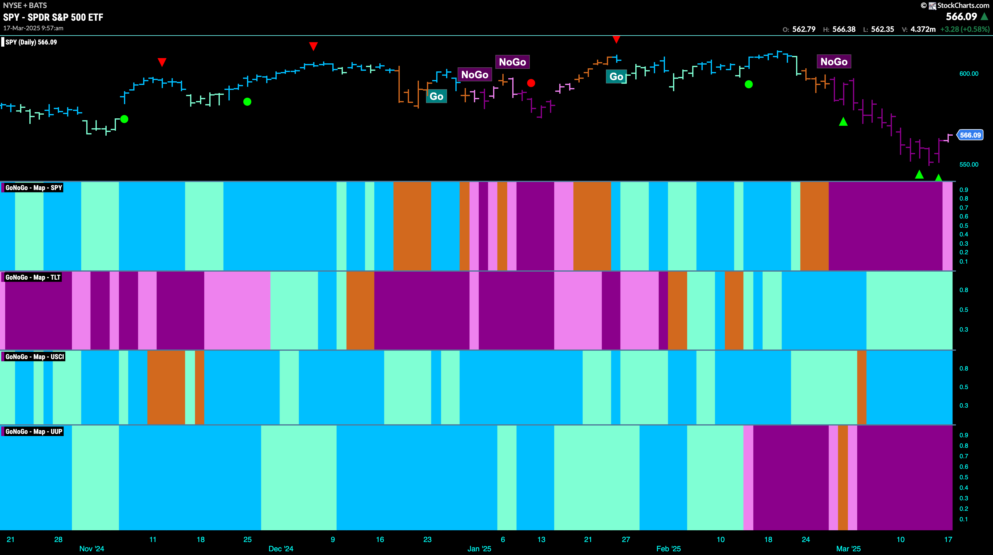
Good morning and welcome to this week’s Flight Path. The equity trend remained a “NoGo” this week although after hitting a new lower low we are seeing price rally and a weaker pink bar. Treasury bond prices saw the “Go” trend continue but it was another week of uninterrupted weaker aqua bars this week. U.S. commodities painted an entire week of uninterrupted strong blue “Go” bars this week. The dollar saw the “NoGo” trend remain strong and GoNoGo Trend painted an entire week of purple bars.
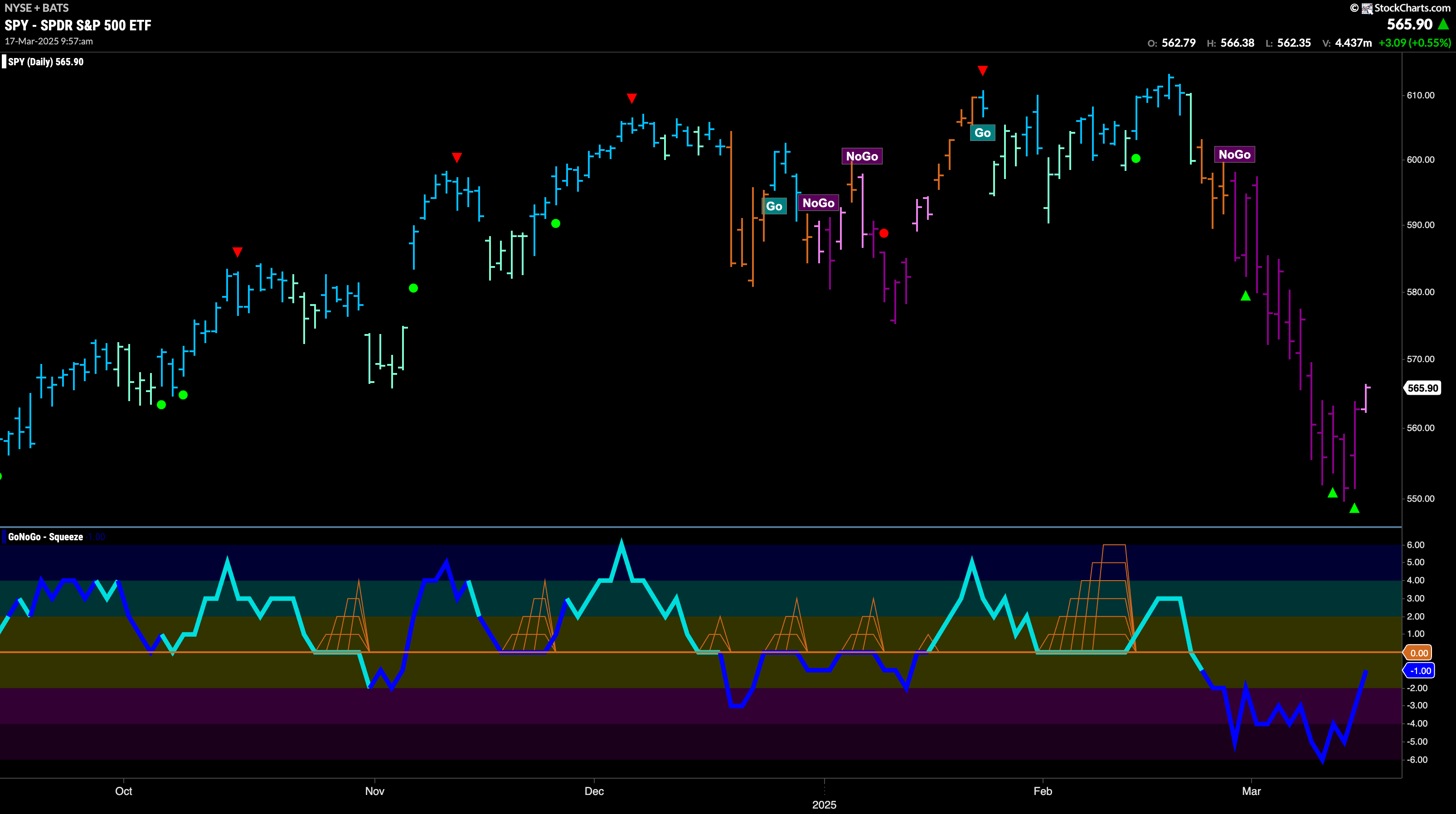
$SPY Shows a Little Weakness in the “NoGo” Trend
The GoNoGo chart below shows that the trend has remained a “NoGo” this week as price fell quickly to a new lower low. However, with GoNoGo Oscillator coming out of oversold territory we saw a couple of NoGo Countertrend Correction Icons (green arrows) suggesting that price may struggle to go lower in the short term. Indeed, we have since seen price rally and GoNoGo Trend paint a weaker pink bar. Volume remains heavy and we will watch to see what happens as the oscillator approaches the zero line. If it is rejected, we will expect continued downside pressure on price. If GoNoGo Oscillator is able to break back into positive territory that would be bullish.
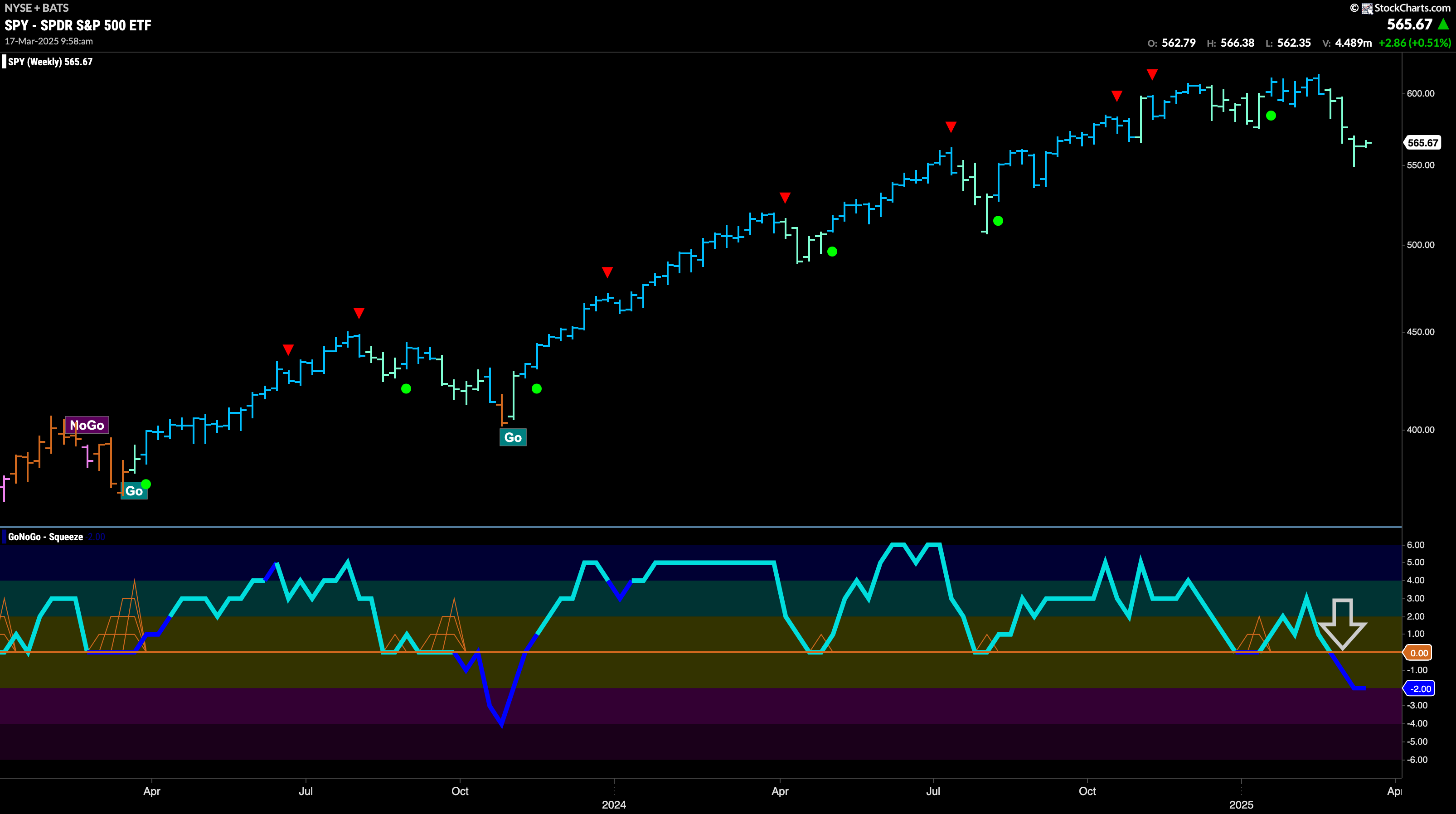
The “Go” trend on the weekly chart has survived again but we see that price has now closed at a new intermediate low. We are seeing consecutive weeks of pale aqua bars as the trend remains weak. If we turn our eye to the oscillator panel we see that after breaking below the zero level it is now resting at a value of -2 and volume is heavy. This is telling us that momentum is out of line with the “Go” trend.
Treasury Rates Continue Sideways in “NoGo”
GoNoGo Trend shows that the “NoGo” trend remains in place again this week but we saw mostly weaker pink bars again as rates float sideways after recovering from the low. GoNoGo Oscillator has risen to test the zero line from below and it remains there as a GoNoGo Squeeze builds reflecting the tug of war between buyers and sellers at this level. We will watch closely for the break of the Squeeze.

$UUP “NoGo” Stays Strong at Lows
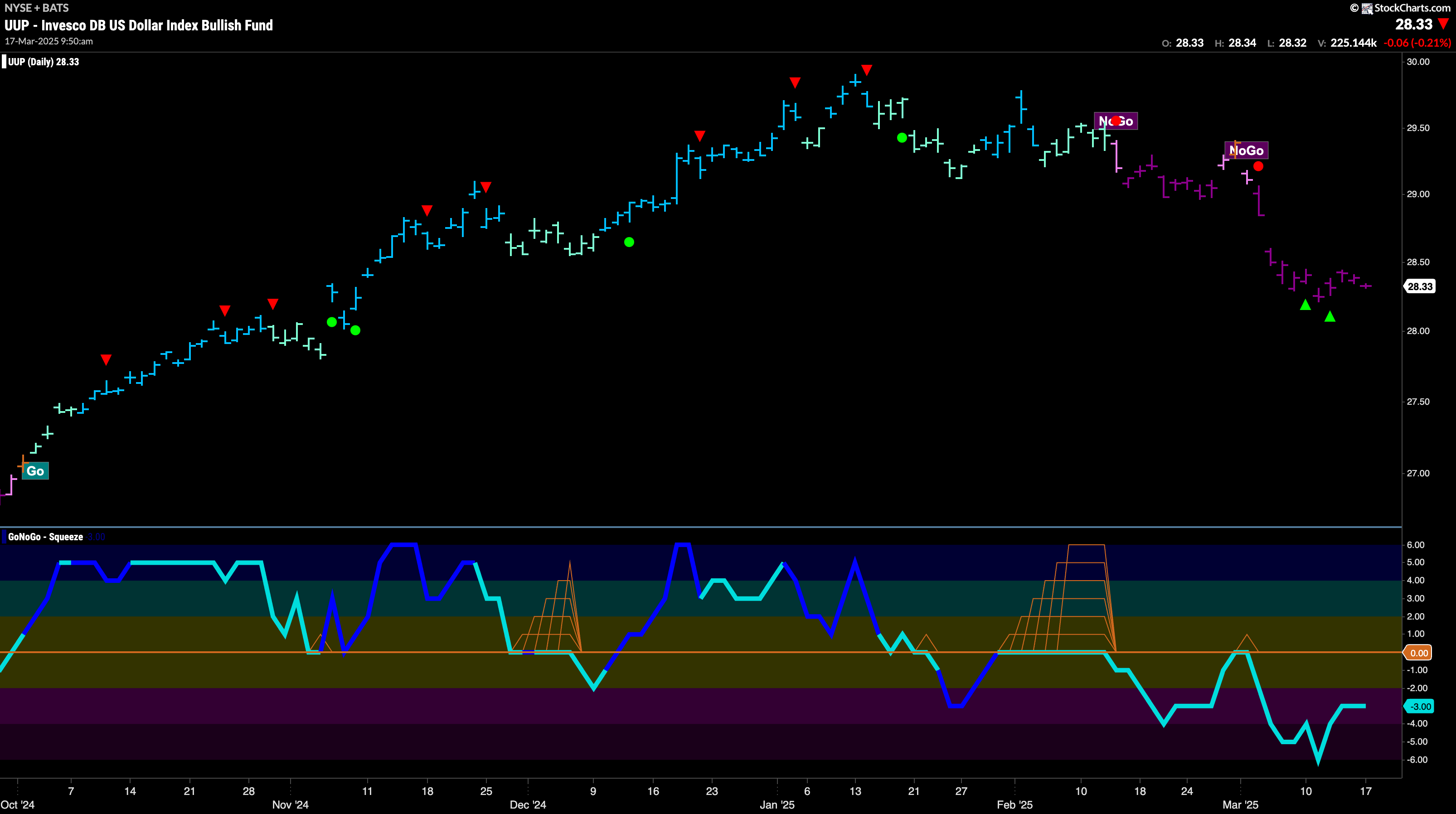
A strong “NoGo” trend remains in place this week as we saw price consolidate at the lows and there was no let up of purple bars. We saw price temporarily take a pause after the two NoGo Countertrend Correction Icons (green arrows) but the trend remains strong. GoNoGo Oscillator is in negative territory but no longer oversold and so momentum is still confirming the “NoGo” trend.
$USO Stays in “NoGo” Trend but Paints Weakness
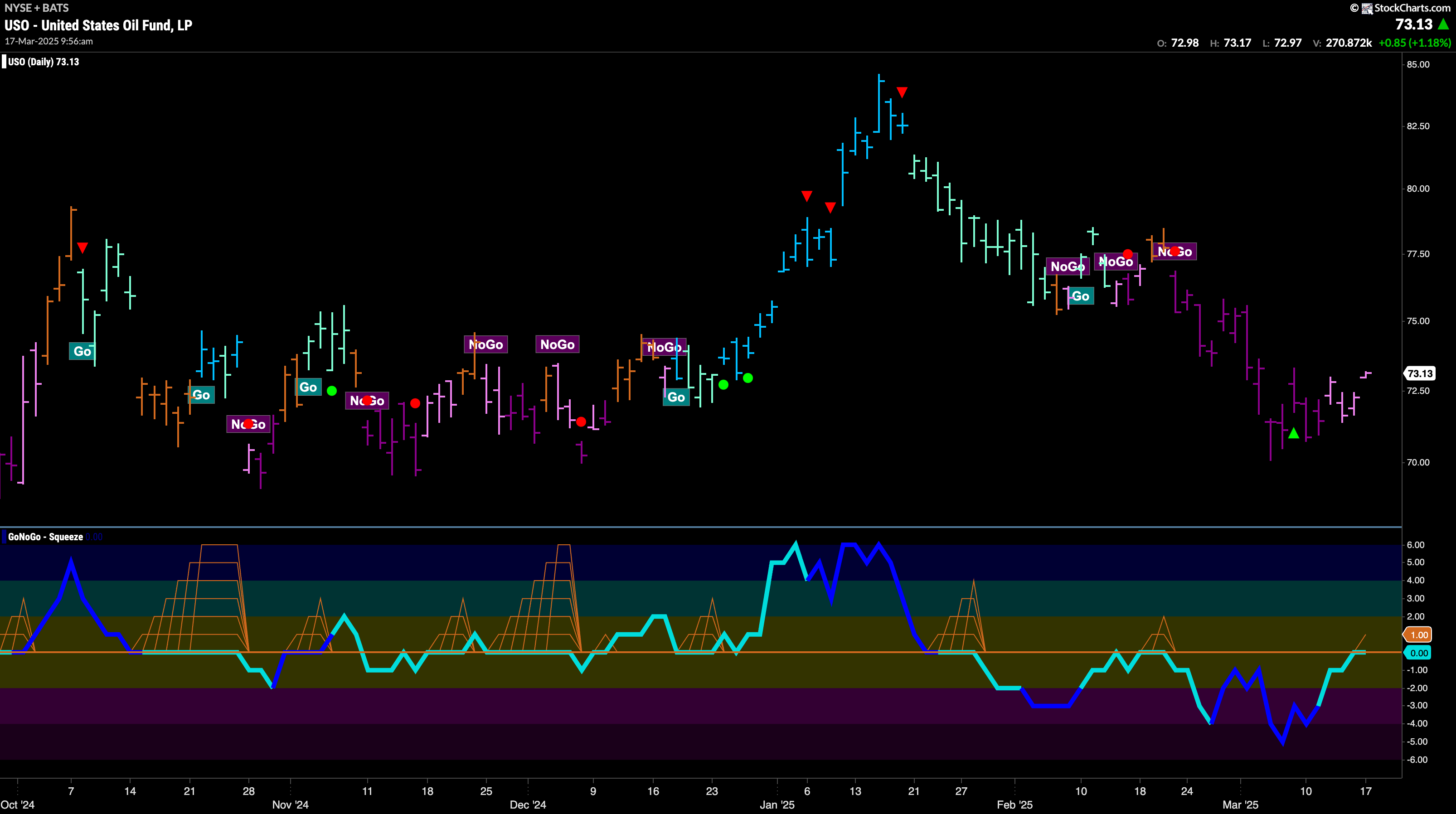
The “NoGo” trend weakened this past week as we saw pink bars come after the NoGo Countertrend Correction Icon (green arrow). If we turn our attention to the oscillator panel we see that GoNoGo Oscillator has risen to test the zero line from below. It will be important to watch to see if it gets turned lower from this level. If it does, then we would see signs of NoGo Trend Continuation and expect price to make an attempt to go lower. If it breaks into positive territory that would threaten the “NoGo” trend.
Gold Slingshots to New Higher High
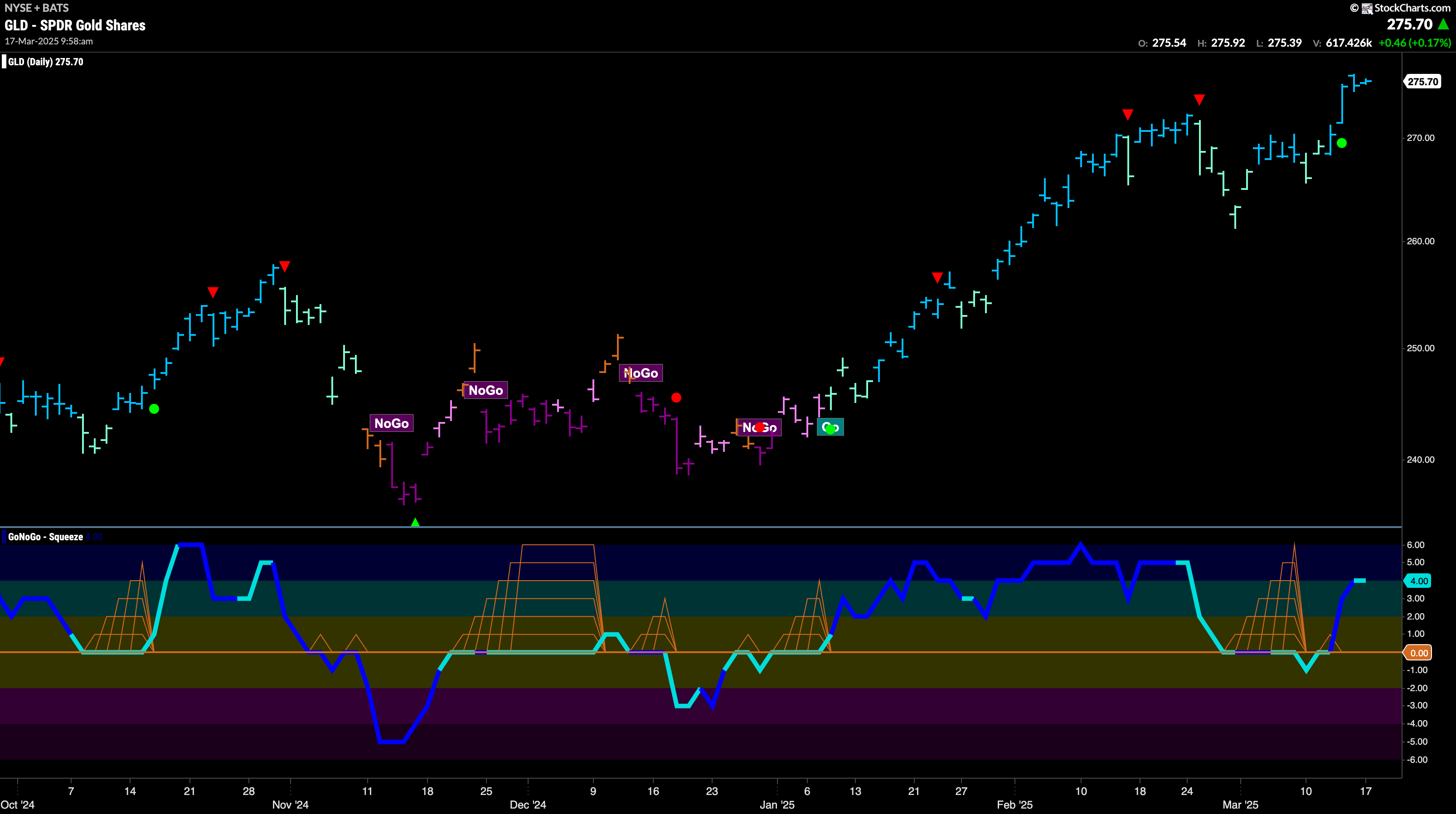
We saw the “Go” trend surge to new highs last week as a burst of momentum powered price higher. After having been in a Max GoNoGo Squeeze we saw GoNoGo Oscillator resolve to the upside and volume increase. This gave price the push it needed and as GoNoGo Trend regained strong blue “Go” bars it soared higher. We will look for price to consolidate at these elevated levels this week.
Sector RelMap
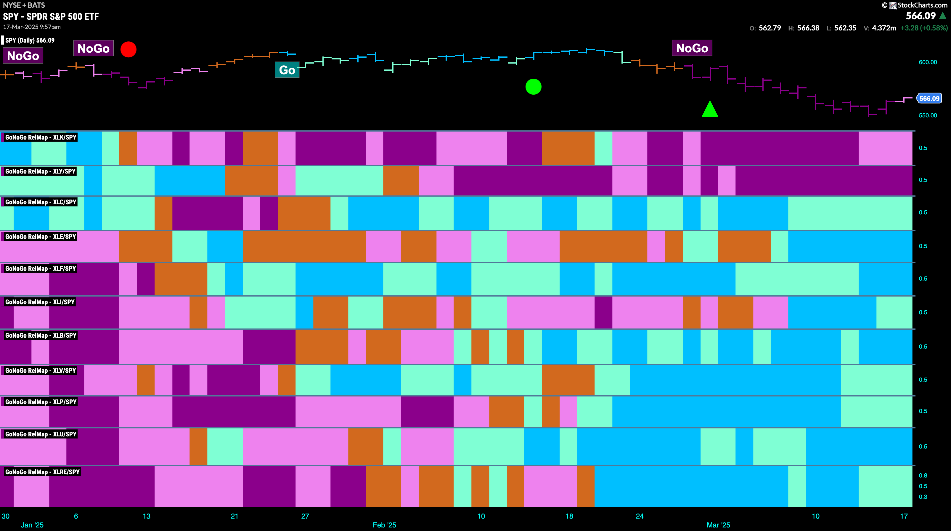
Below is the GoNoGo Sector RelMap. This GoNoGo RelMap applies the GoNoGo Trend to the relative strength ratios of the sectors to the base index. With this view we can get a sense of the relative out performance and relative underperformance of the sectors. 9 sectors are in relative “Go” trends. $XLC, $XLE, $XLF, $XLI, $XLB, $XLV, $XLP, $XLU, and $XLRE are painting relative “Go” bars.
Utilities Sub-Group RelMap
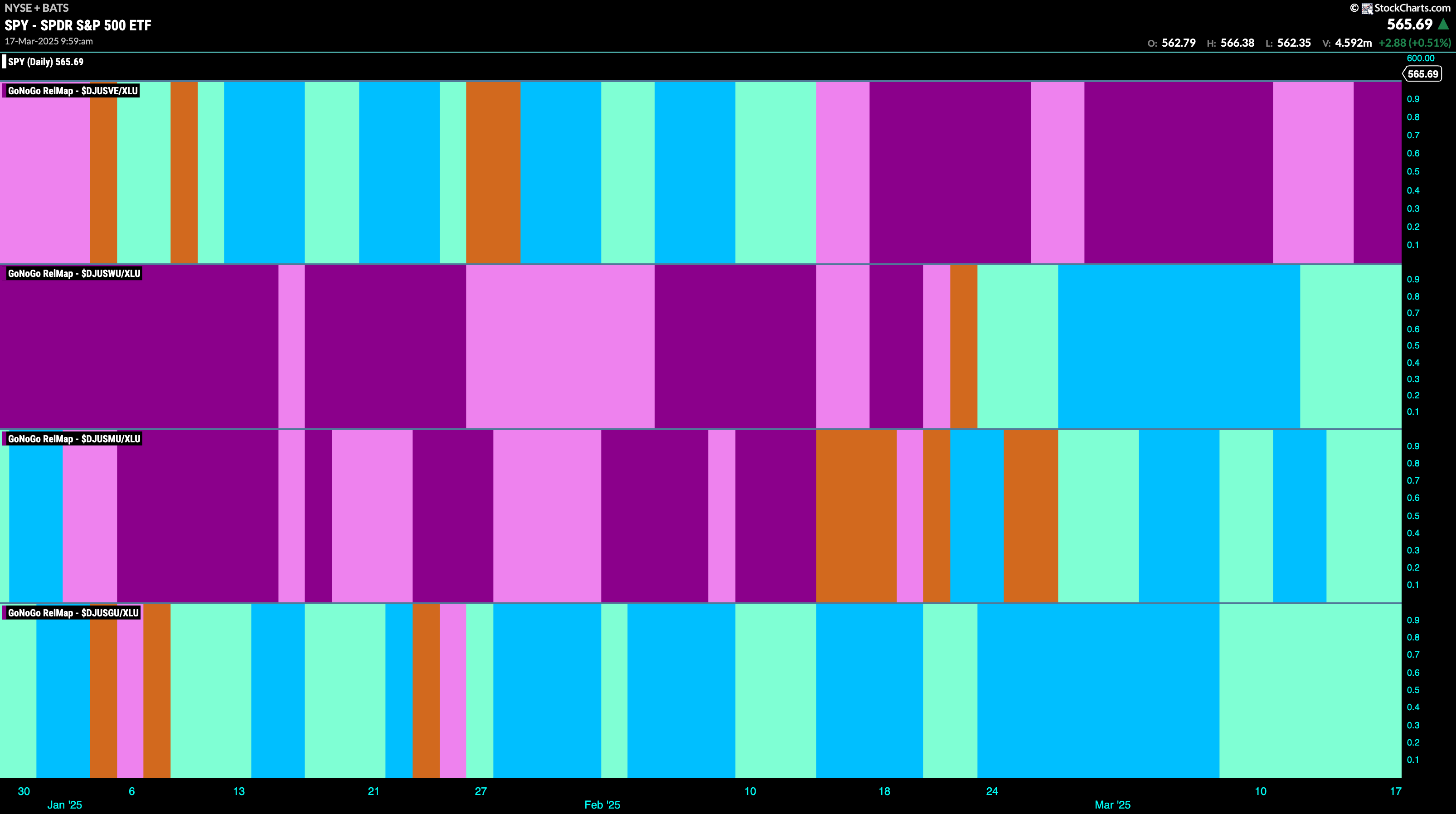
The chart below shows a relative trend breakdown of the sub groups within the utilities sector this week. The Sub-Group RelMap plots the GoNoGo Trend of each sub index to the $XLE. We saw in the above GoNoGo Sector RelMap that $XLU is strong relatively speaking as it paints bright blue relative “Go” bars to the S&P 500. If we look at the breakdown of the groups in the map below we can see where that outperformance is coming from. We see in the second panel the water index is relatively outperforming as it paints aqua “Go” bars.
$MSEX Looks for Support in New “Go” Trend
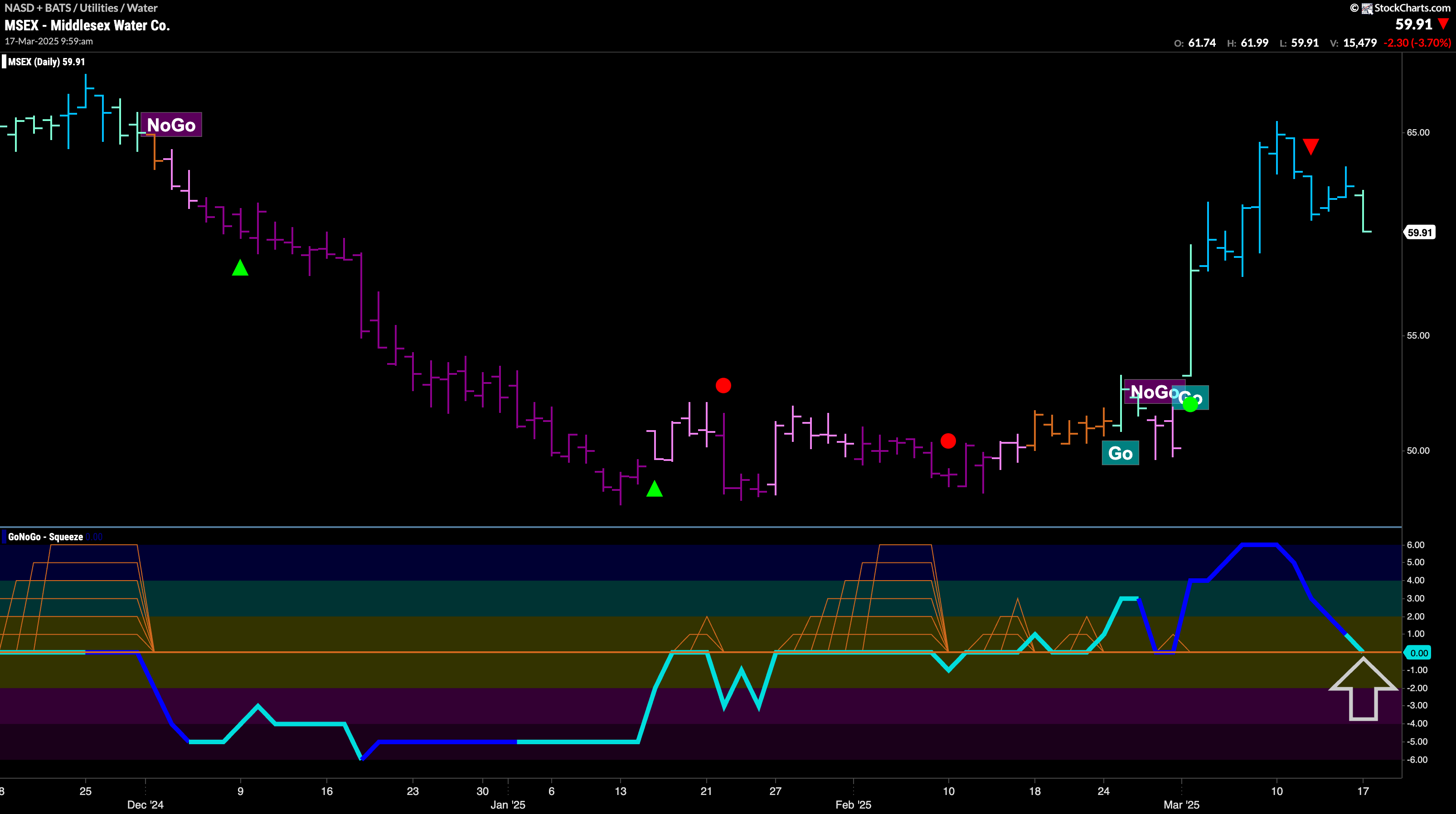
GoNoGo Trend a weaker aqua bar this week as price falls from its recent high. This comes after momentum waned and we saw a Go Countertrend Correction Icon (red arrow). We will now watch the oscillator panel and look to see if GoNoGo Oscillator finds support at the zero line. This will be important to determine the health of this new “Go” trend. If the oscillator bounces back into positive territory we will know that momentum is resurgent in the direction of the “Go” Trend and can expect price to make an attempt to mover higher.
$SBS Looks Poised to Attack Prior High
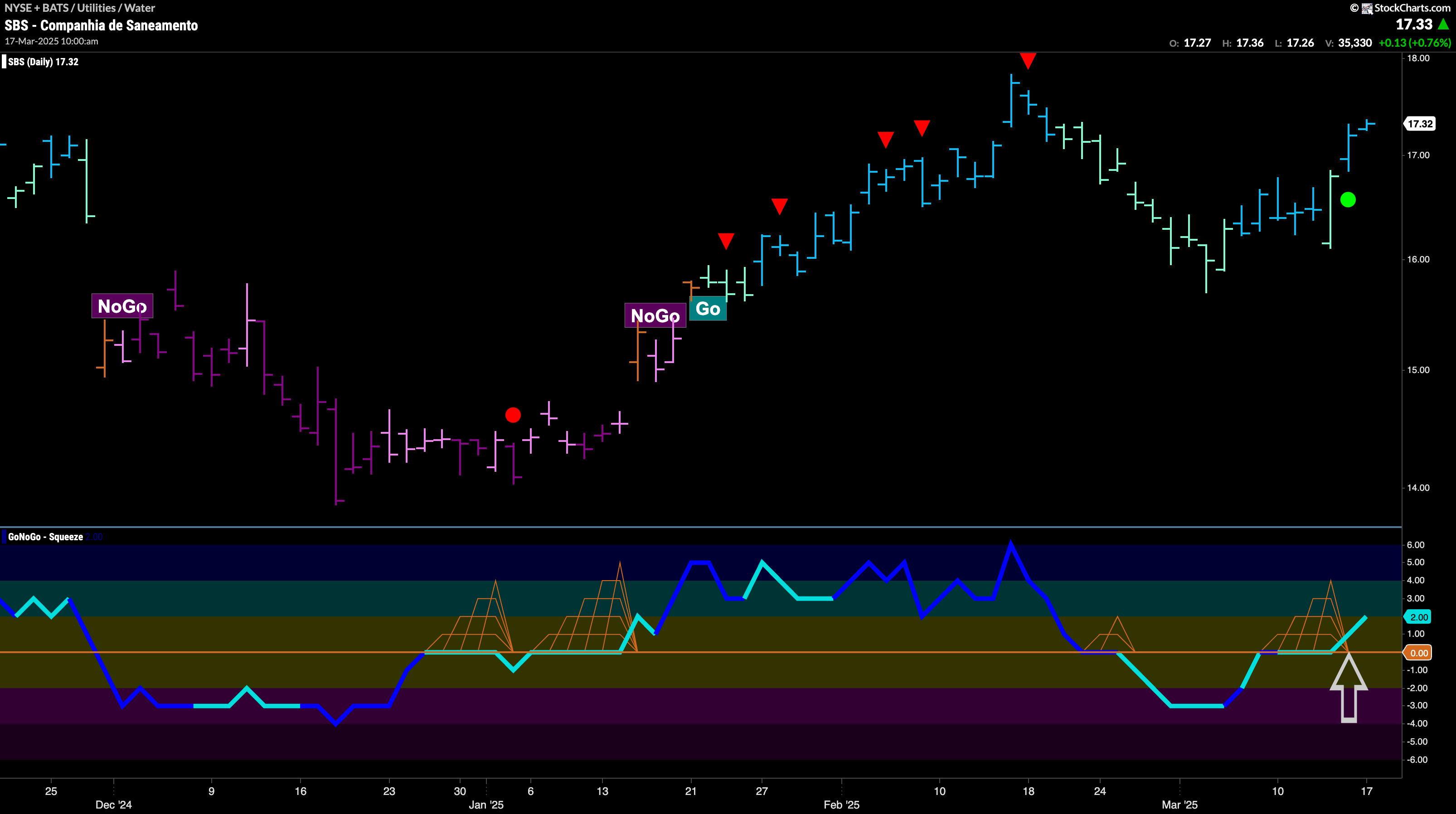
$SBS has been in a “Go” trend since late January. After the last high, we saw a Go Countertrend Correction Icon (red arrow) indicating that price may struggle to go higher in the short term. Indeed, we saw a string of paler aqua bars as price fell and GoNoGo Oscillator fell into negative territory. However, GoNoGo Trend maintained “Go” colors throughout and a few bars ago GoNoGo Oscillator was able to regain positive territory. This told us that momentum was resurgent in the direction of the underlying “Go” trend and we saw a Go Trend Continuation Icon (green arrow) under price. With GoNoGo Trend painting strong blue bars we will watch to see if this gives price the push it needs to make an attempt at a new higher high.
