Good morning and welcome to this week’s Flight Path. Let’s take a look at the GoNoGo Asset map below. Not the best week for equities. We saw the “Go” trend falter and the week ended with an amber “Go Fish” bar. Treasury bond prices remained in a “NoGo” as did commodities. The dollar continued to climb painting strong blue “Go” bars.
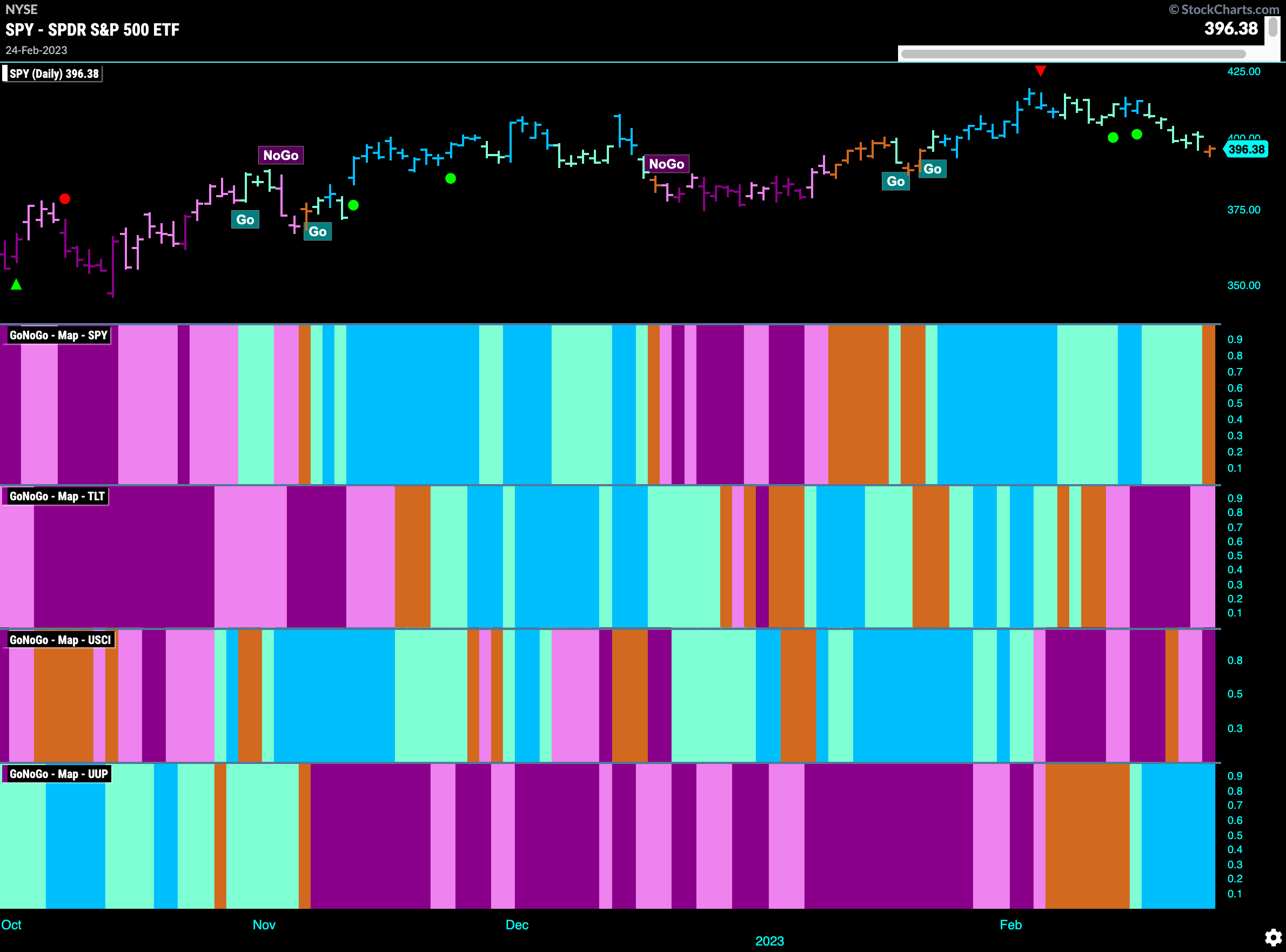
Equities Fail as GoNoGo Trend paints amber “Go Fish” bar
After the early February highs we have seen prices pull back. A Go Countertrend Correction Icon (red arrow) highlighted that perhaps prices would struggle to go higher in the short term and they did. After moving slightly lower we saw GoNoGo Oscillator fail to hold the zero line and then price moved lower quickly and the last bar of last week painted an amber “Go Fish” bar. We will watch to see what happens next. 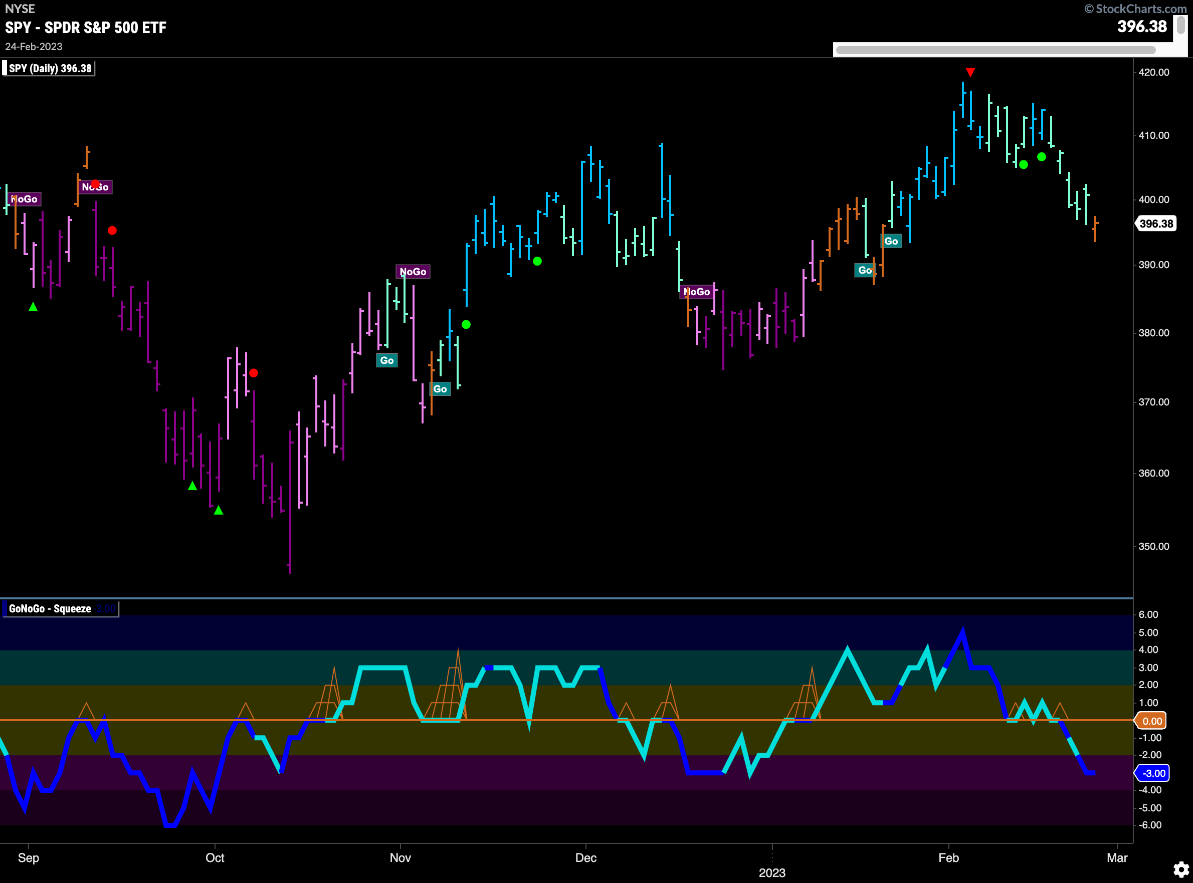
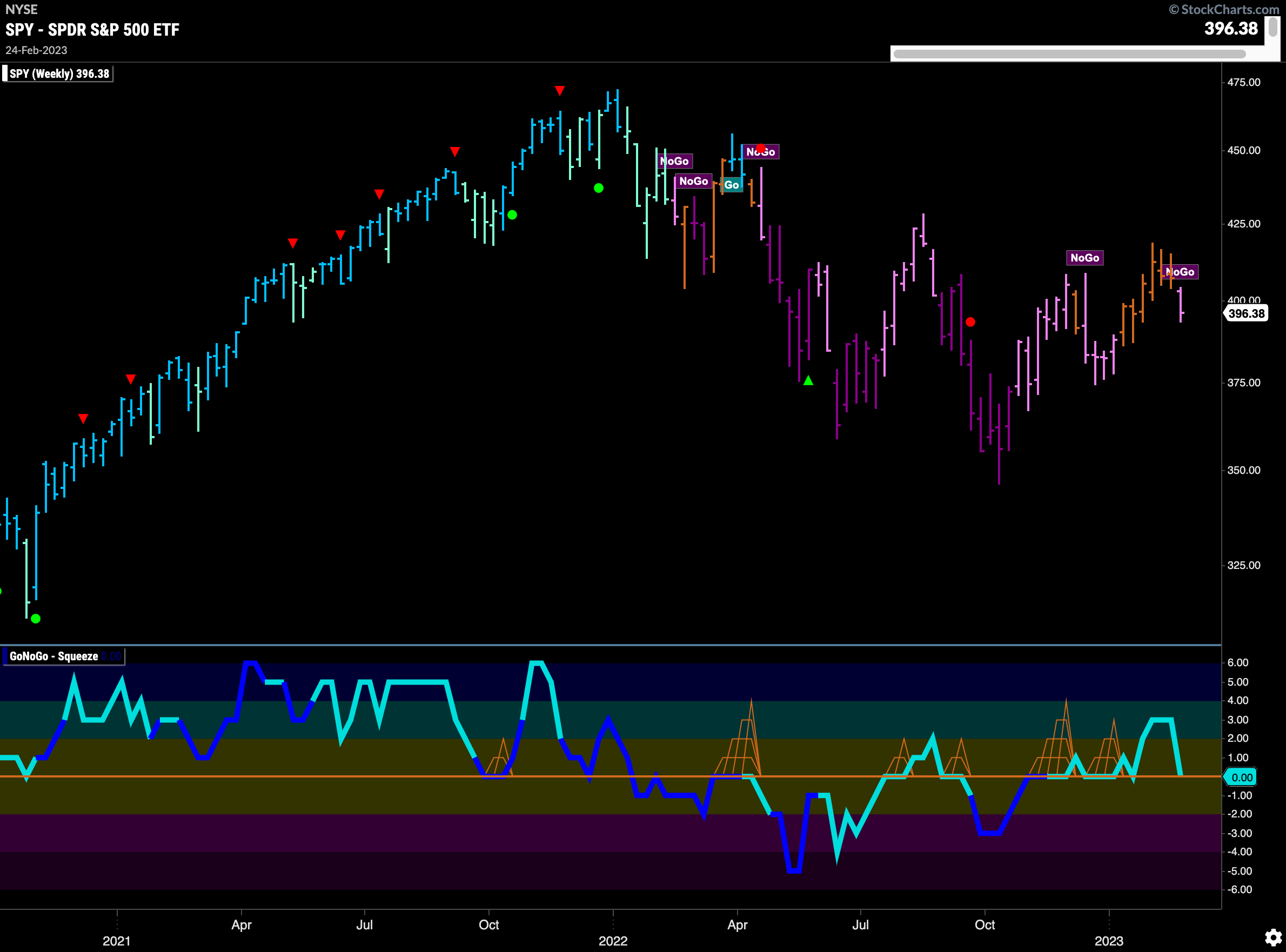
The longer term weekly chart hints at that next direction. The end of the week saw price move low enough for GoNoGo Trend to return to paint a pink “NoGo” bar. The weight of the evidence suggests that the most likely path is further down. With GoNoGo Oscillator back at the zero line after having moved into positive territory that will be an important sign of whats to come. If it can find support there perhaps we’ll see prices stabilize. If the oscillator falls again into negative territory that would be confirming the “NoGo” in the price panel.
Treasury Rates Solidify “Go” Trend
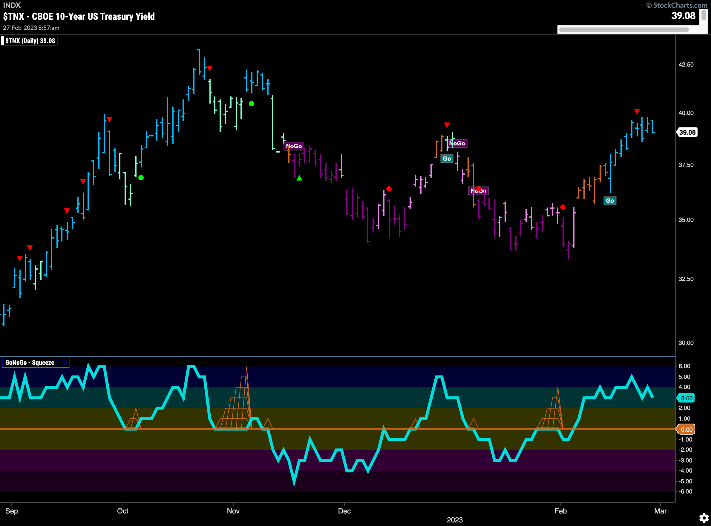
Treasury rates moved sideways after triggering a Go Countertrend Correction Icon (red arrow) earlier in the week. Currently, GoNoGo Trend is painting strong blue “Go” bars and GoNoGo Oscillator is in positive territory but no longer overbought.
The Dollar Jumps Higher to End the Week
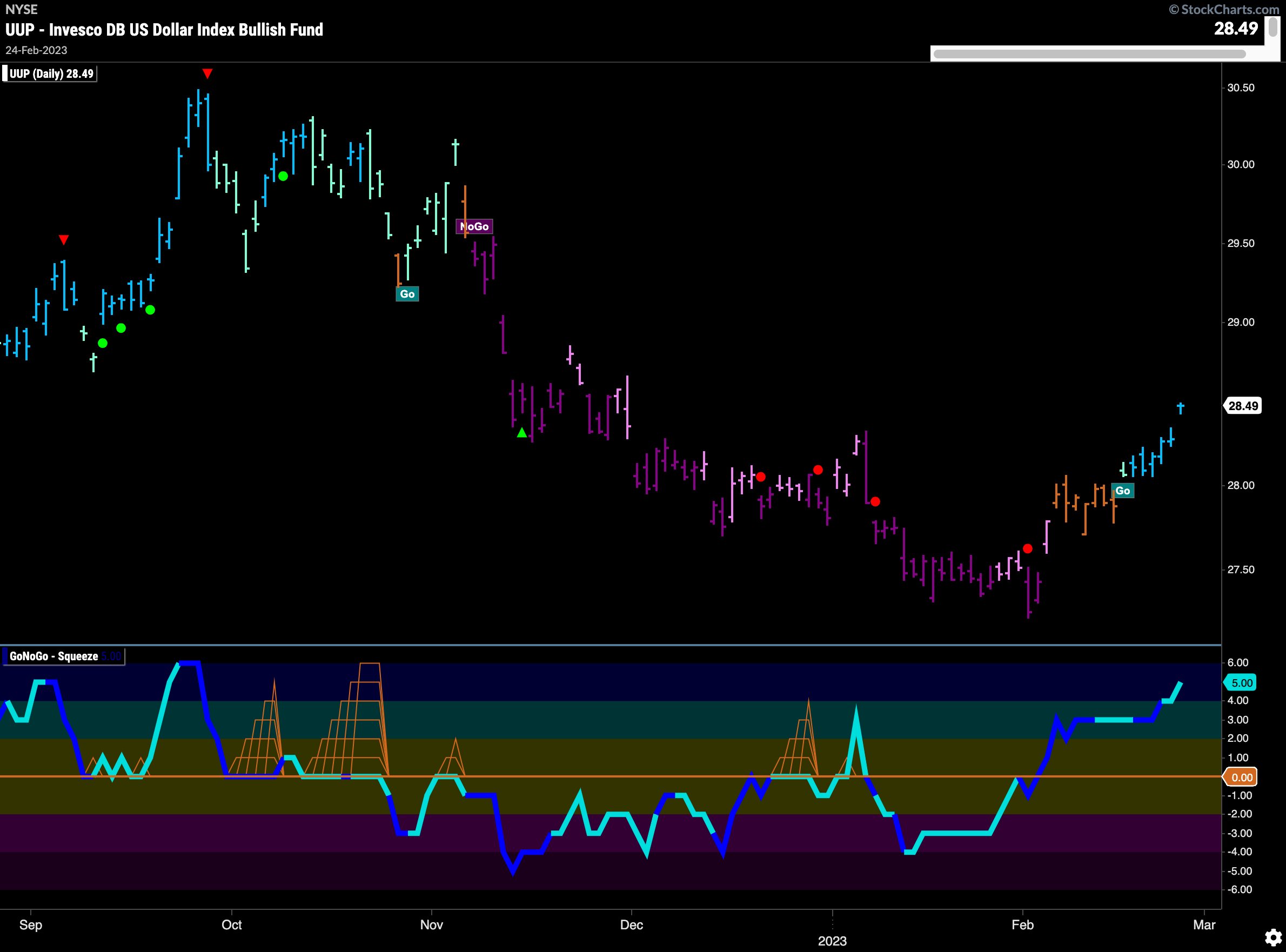
The last day of last week saw the dollar jump higher to set a new higher high in the new “Go” trend. Rallying off the low, we first saw GoNoGo Oscillator move into positive territory on heavy volume (in the ETF $UUP) and that was followed by a string of amber “Go Fish” bars as price made up its mind in which direction to move. The “Go” trend was then identified and all of last week saw stronger blue bars. Friday’s gap higher saw price move higher than the high at the beginning of the year.
Gold Falls Further in Strong “NoGo”
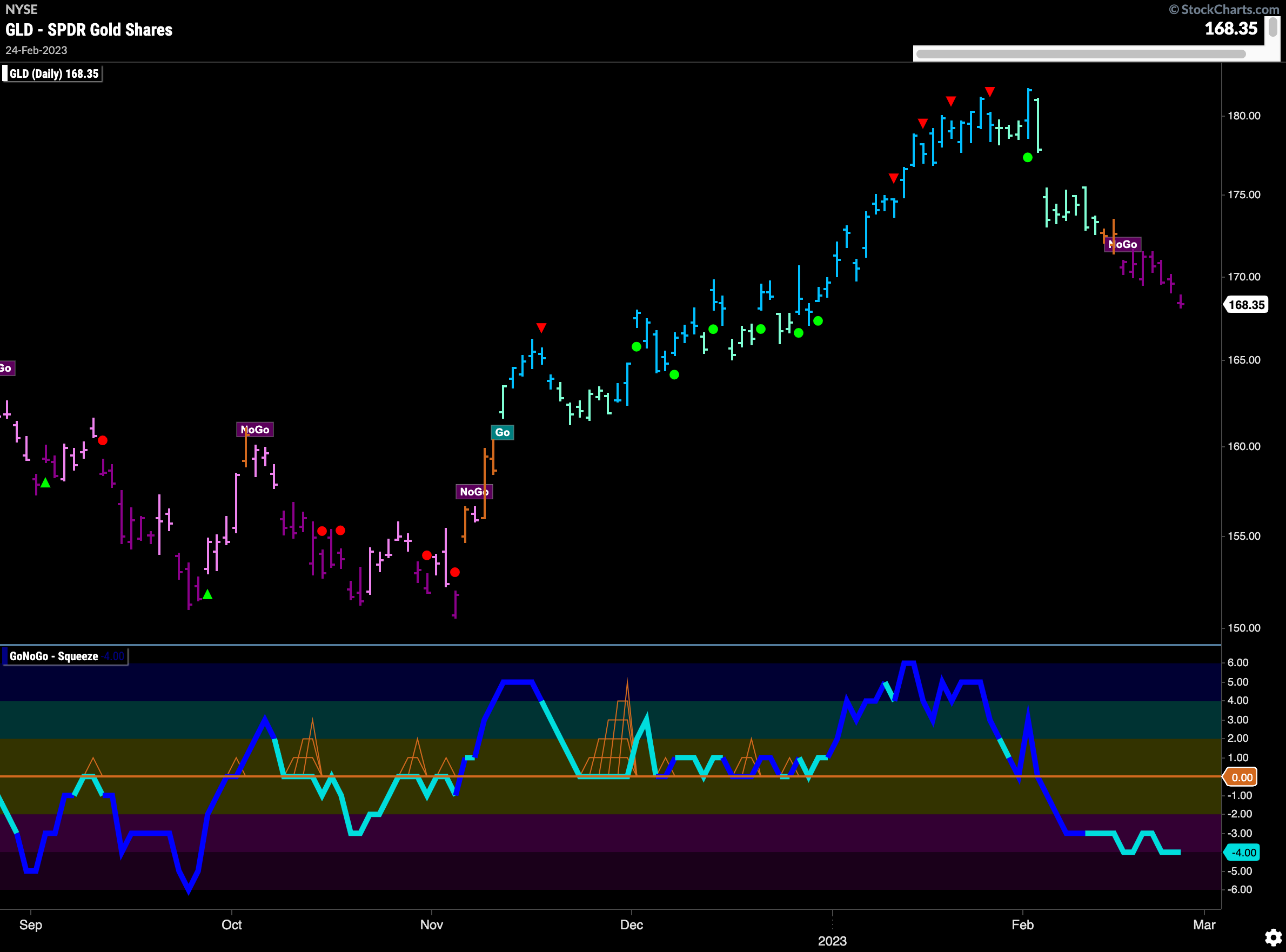
A week of solid purple “NoGo” bars tells you all you need to know about the precious metal. $GLD continues to paint purple bars in a strong “NoGo” trend having fallen again this week. GoNoGo Oscillator remains well and truly ensconced in negative territory confirming the “NoGo” trend in the price panel above.
Oil Faces Continued Downward Pressure
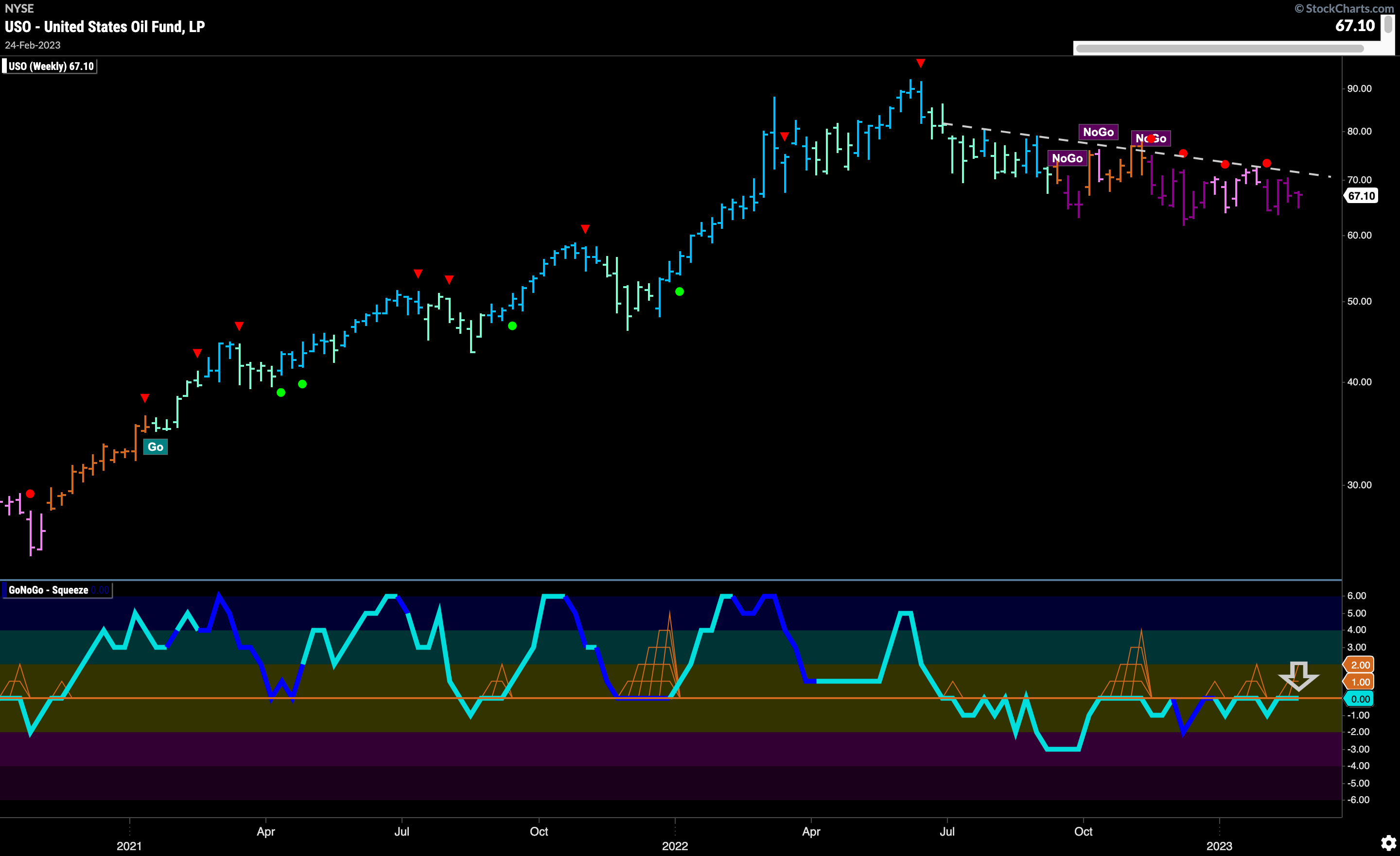
The weekly chart of $USO shows how oil prices have struggled to do anything but move slowly lower. Again prices paint a strong purple “NoGo” bar this week below downward sloping resistance. We can see that GoNoGo Oscillator is once again testing the zero line from below where we will watch to see if it continues to be rejected at that level. No signs just yet, of any change to the prevailing trend.
 Sector RelMap
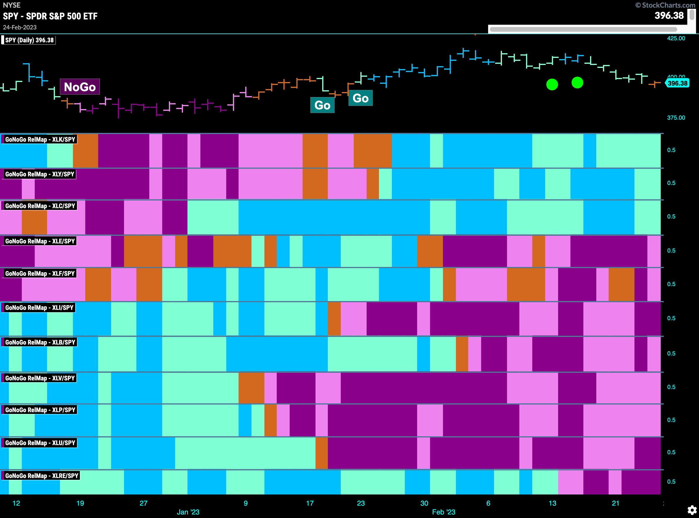
Below is the GoNoGo Sector RelMap. This GoNoGo RelMap applies the GoNoGo Trend to the relative strength ratios of the sectors to the base index. Looking at this map, we can quickly see where the relative outperformance is coming from as well as which sectors are lagging on a relative basis. Only 3 sectors are outperforming the base this week. $XLK, $XLY, $XLC are painting “Go” bars. Relative outperformance is still being driven by the growth sectors.
$CAT Run Out of Lives?
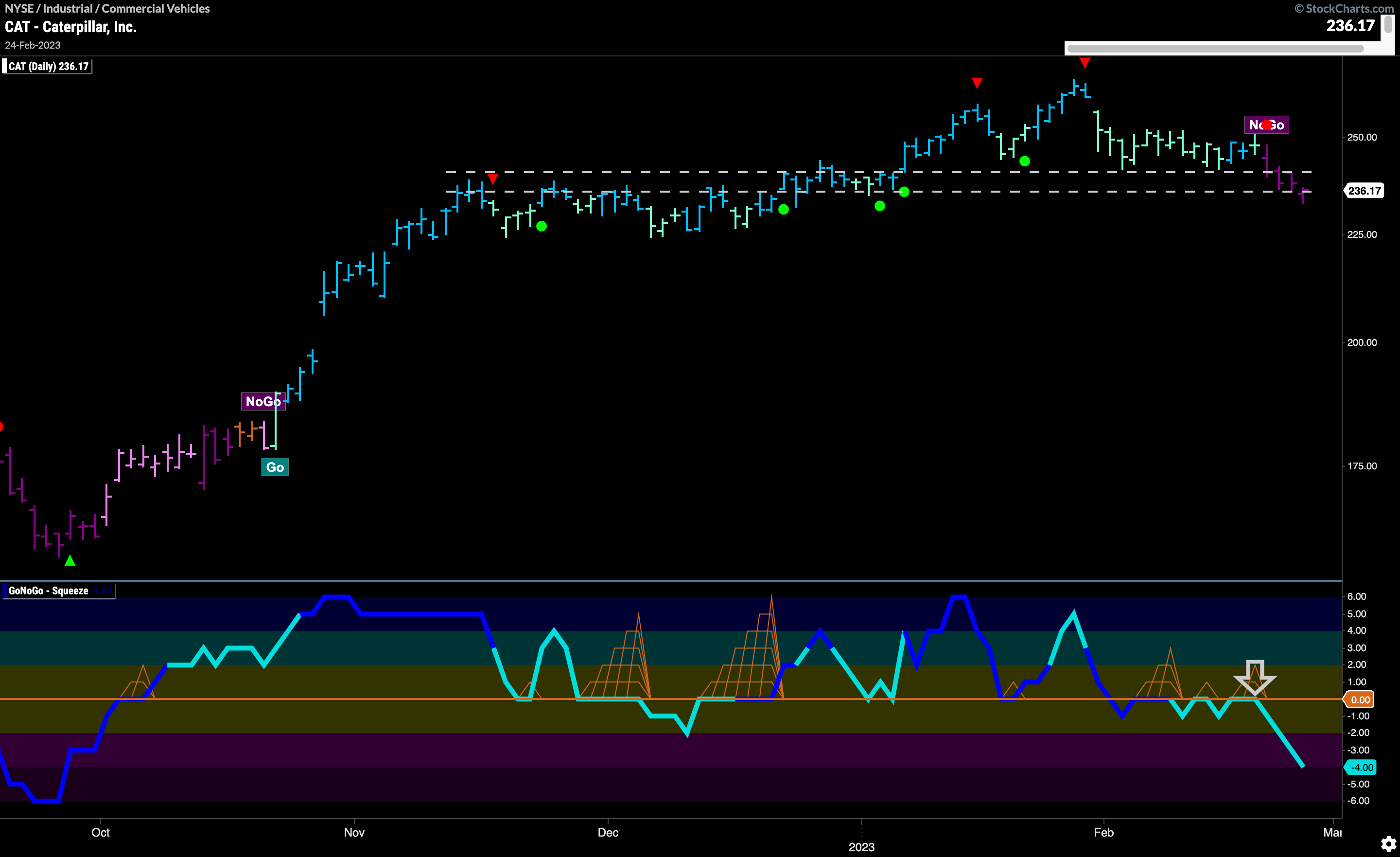
The GoNoGo Sector RelMap above shows how the industrial sector is underperforming on a relative basis to the index as a whole. In fact, we can see that the relative trend has recently strengthened and is painting stronger purple bars in its map panel. (6th panel) Investors looking to play the short side could therefore look within that sector for securities rolling over. Over the last few days we have seen $CAT enter a “NoGo” as it falls through levels that should have provided support. We can see how GoNoGo Oscillator could have tipped us off to this change as it broke through the zero line and started to find resistance at that level some time ago. One could look to a shorter timeframe for entry points into this new “NoGo”.
$TSLA at Important Inflection Point
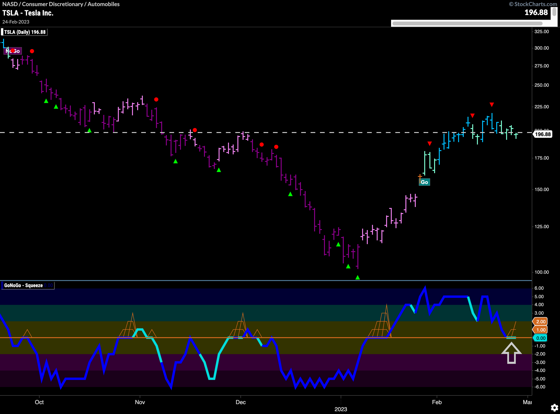
As we saw from the GoNoGo Sector RelMap, the discretionary sector is still hanging on to relative outperformance. Let’s look at the chart of $TSLA below to see what the technical analysis is saying. A “Go” trend is in place but we see the trend painting weaker aqua bars as price settles at levels that have been both support and resistance earlier in the chart. GoNoGo Oscillator has fallen to the zero line as well and we will watch to see if it finds support at this level.
