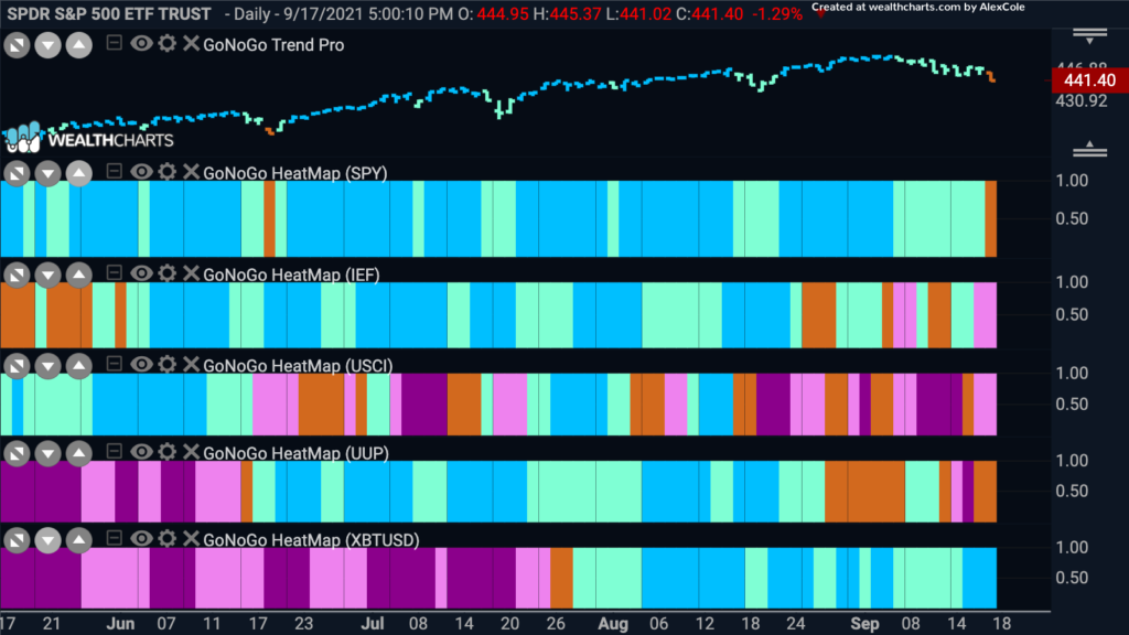
Good morning and welcome to this week’s Flight Path. Let’s take a look at the below GoNoGo Asset Map for this week. As we can see, the trend is threatened in U.S. equities. A strong down day on Friday pushed the GoNoGo Trend indicator out of a “Go” trend for the first time in several months. We ended the week with an amber “Go Fish” bar. Treasuries slipped back again this week ending with pink “NoGo” bars and commodities continue to trend down. The dollar, after flirting with its prior “Go” trend seems to be struggling again painting “Go Fish” and “NoGo” bars. Bitcoin, so far has been able to maintain its “Go” trend.
S&P 500 in Trouble?
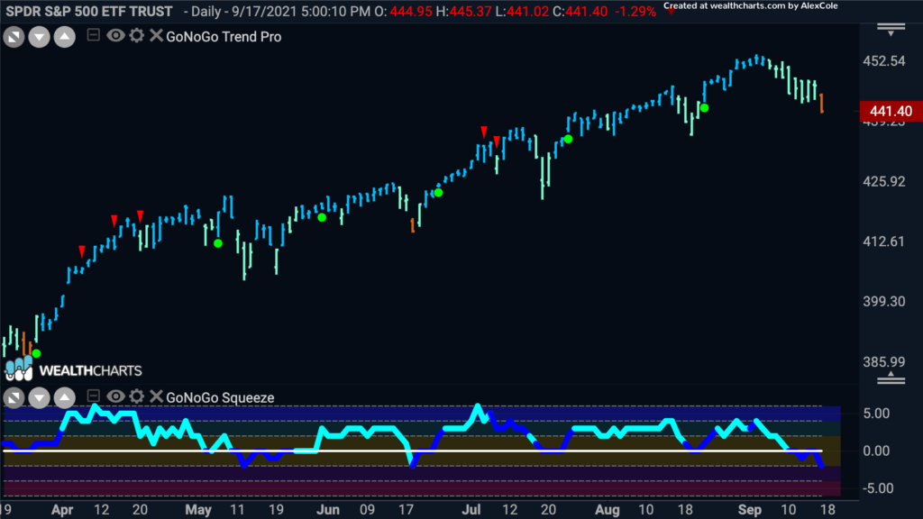
Below is the chart of the $SPY with GoNoGo Trend and GoNoGo Oscillator applied. The largely uninterrupted “Go” trend is currently showing signs of trouble. As we have noted over the last few days the GoNoGo Oscillator was unable to hold the zero line as support and dipped below on heavy volume before quickly retesting and getting turned away into negative territory. This suggests that there are some oversold conditions being met in the unique blend of calculations that make up the GoNoGo Oscillator and this cannot be a good sign for the bulls. On Friday’s price bar, the GoNoGo Trend was unable paint “Go” colors and so we ended the week with an amber “Go Fish” bar. The week ahead could be a struggle for the U.S. domestic markets.
Pandemic Leaders Return
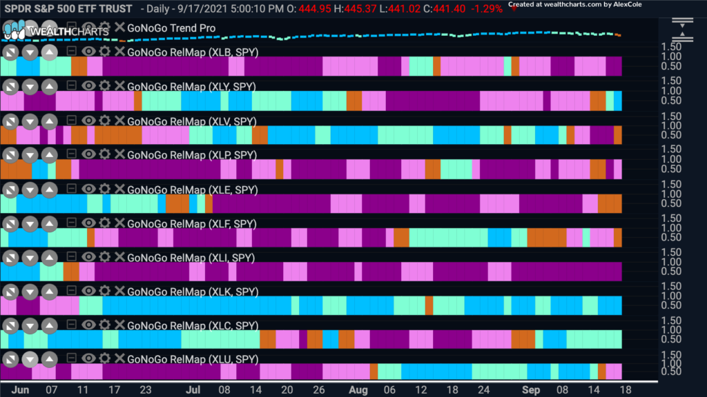
Below is a GoNoGo Sector RelMap. The chart applies the GoNoGo Trend to the relative ratio of each sector ETF to the base ETF, the $SPY. There are three sectors that are showing relative “Go” trends to end the week. Consumer discretionary ($XLY), technology ($XLK) and communications ($XLC). Interestingly, this marks the return to leadership of the same sectors that powered the stock markets through most of 2020 when much economic and financial data suggested that the economy should struggle more than it did. Perhaps the wave of the delta variant and the innovations made in technology and communications that allowed the stay at home economy to flourish will come back to the fore.
Interpublic Group Cos Inc Pauses in Trend
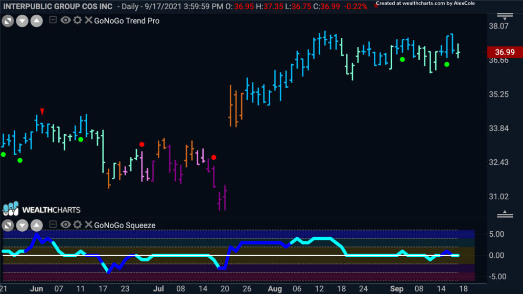
The Interpublic Group of Companies is a group of advertising and marketing service companies that specializes in consumer advertising, digital marketing, communications, public relations and more. The GoNoGo Chart below shows the GoNoGo Trend and GoNoGo Oscillator applied to daily OHLC prices. After gapping higher in July and then moving into a “Go” trend prices have moved sideways since an early August high. The GoNoGo Oscillator has mostly ridden the zero line as price swings have lessened. We will look to see if the oscillator can hold the zero line and find support which could propel prices higher to take advantage of the communications outperformance.
Nvidia also Resting
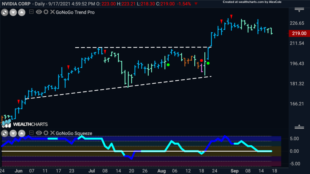
In the technology sector we can take a look at Nvidia. The last time we discussed Nvidia it was testing the upper bound of the below ascending triangle. We saw the break above zero on heavy volume in the oscillator panel and then the price break above resistance followed. After moving higher, price has consolidated sideways. The short term high was indicated by the red counter trend correction arrows that were seen at the end of August. Now, with the oscillator riding the zero line, we will need to wait to see if it finds support there for the “Go” trend to continue.
Gamestop Again?
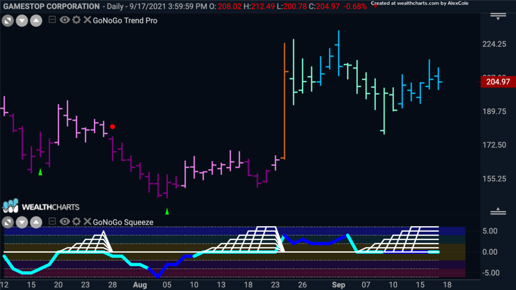
The below chart is the daily GoNoGo Chart of $GME. While its been a while since the meme stock explosion, Gamestop once again has an interesting chart. We see that a “Go” trend was identified toward the end of August after a very strong amber bar. Since then, as price momentum cooled, the GoNoGo Squeeze has spent several bars riding the zero line, causing the grid of the GoNoGo Squeeze to climb to extremes. We know that after periods of reduced volatility a break in either direction can be significant. we will watch to see if the GoNoGo Oscillator can break out of the squeeze into positive territory or if momentum turns down into negative territory.
Severe Slide in Silver
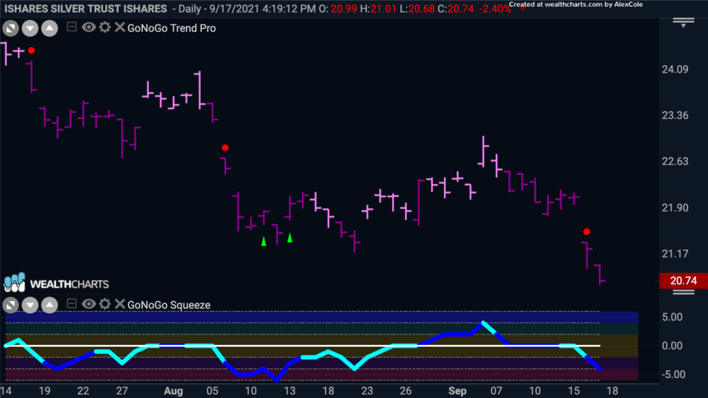
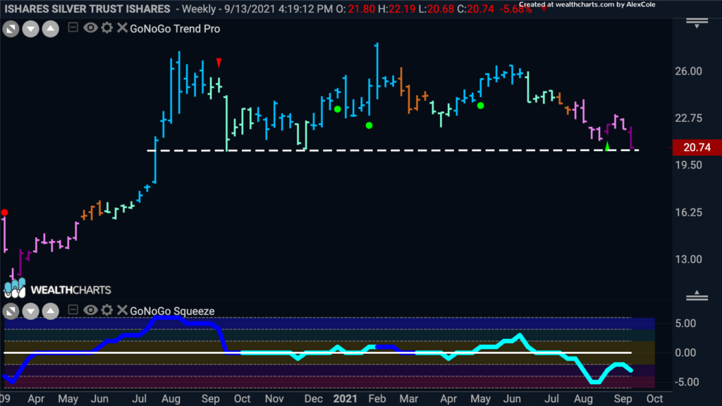
As we move away from equities to end this Flight Path, we’ll look at the technical picture for silver. Below is the GoNoGo chart of $SLV showing weekly prices. Things are not looking good, to put it plainly. After moving sideways for the past year, the GoNoGo Trend has fallen out of “Go” colors over the last two months and has painted a string of “NoGo” colors. Last week, the GoNoGo Trend painted a strong purple “NoGo” bar as price hit lows that haven’t been seen since November of last year. The GoNoGo Oscillator confirmed the price woes as it has broken below and stayed below zero as GoNoGo Trend moved into a “NoGo”. We are now at a significant level of support on this chart, as you can see from the lows that stretch back to the fall of 2020. We will watch to see what happens here as any move lower could set up silver for a serious slide.
If we zoom in, and look at the daily chart we can see that there is not much to convince the technician that a rally out of the “NoGo” is imminent. GoNoGo Oscillator has just crashed through the zero line once more causing a red NoGo Trend continuation circle to appear above the price bar, signaling the potential for further price movement to the downside. GoNoGo Oscillator is in negative territory but not yet oversold, we will need to see it test and ultimately break back above the zero line before we can suggest that this current “NoGo” trend is in trouble. Perhaps the equity market concerns can temporarily cause a rally in precious metals, but the charts will need a lot of convincing before they change their tune.
