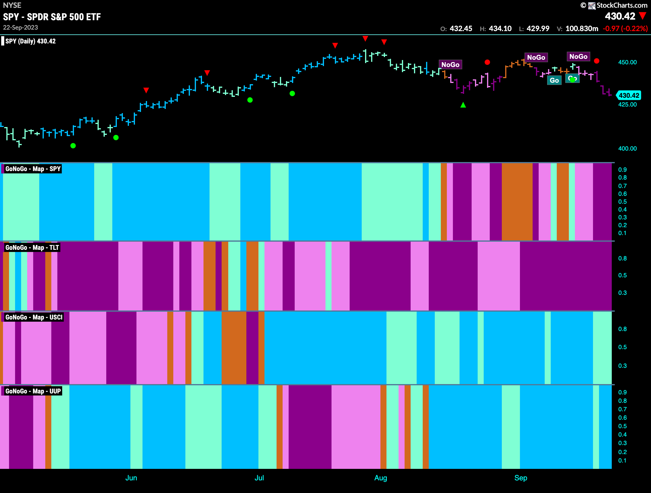
Good morning and welcome to this week’s Flight Path. After last week’s chop the market made up its mind and a “NoGo” took hold. The week ended with strong purple “NoGo” bars as price fell to new lows. Elsewhere the prevailing trends held. Treasury bond prices remain embroiled in a strong “NoGo” as commodities and the dollar continue to paint “Go” bars.
Bears Win Battle for Equities
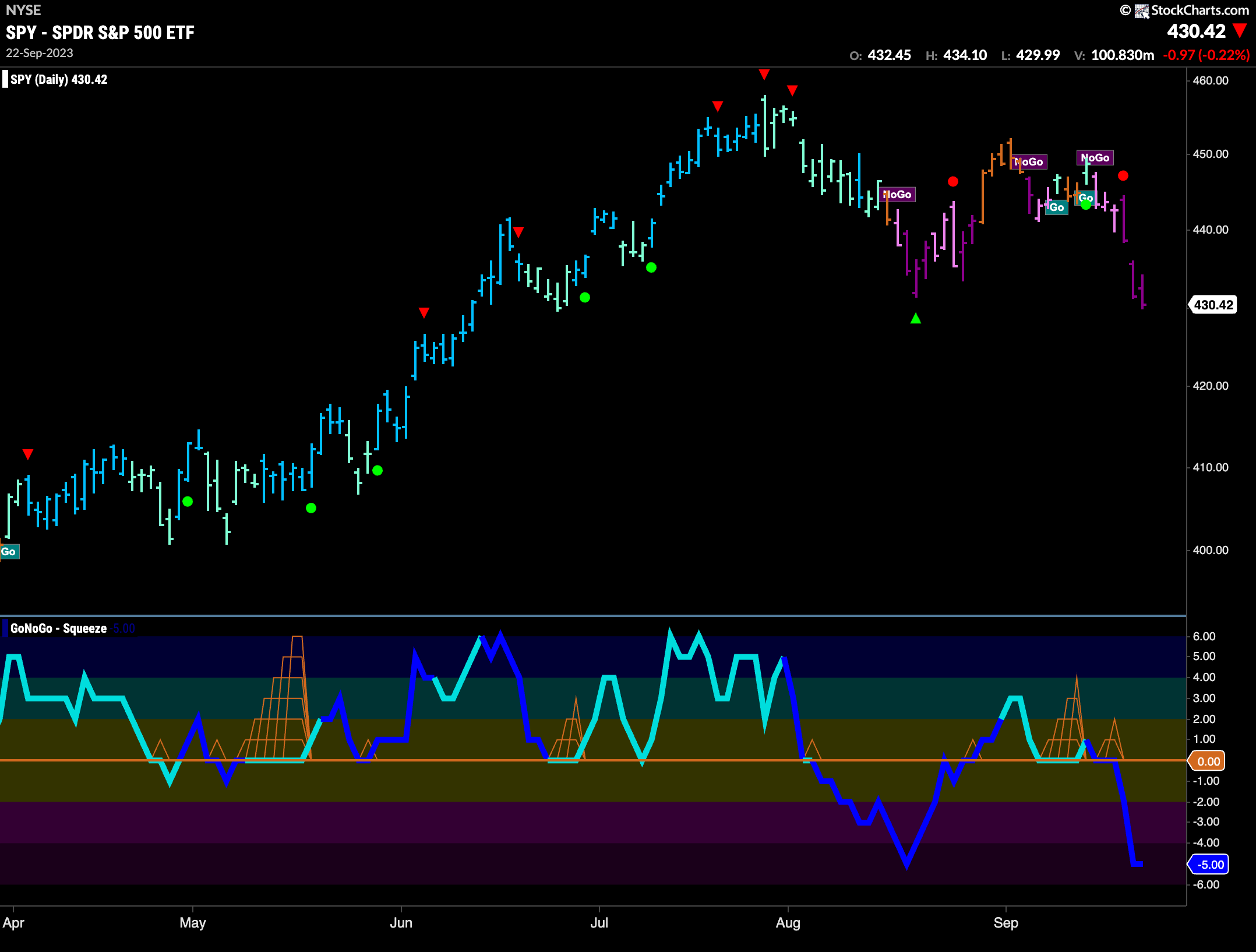
This week we saw GoNoGo Trend paint “NoGo” bars. The week began with weaker pink bars which quickly gave way to stronger purple as momentum surged in the same direction. Looking at the oscillator panel we can see that GoNoGo Oscillator failed to rally at zero and fell sharply into negative territory on heavy volume. This shows resurgent momentum in the direction of the “NoGo”.
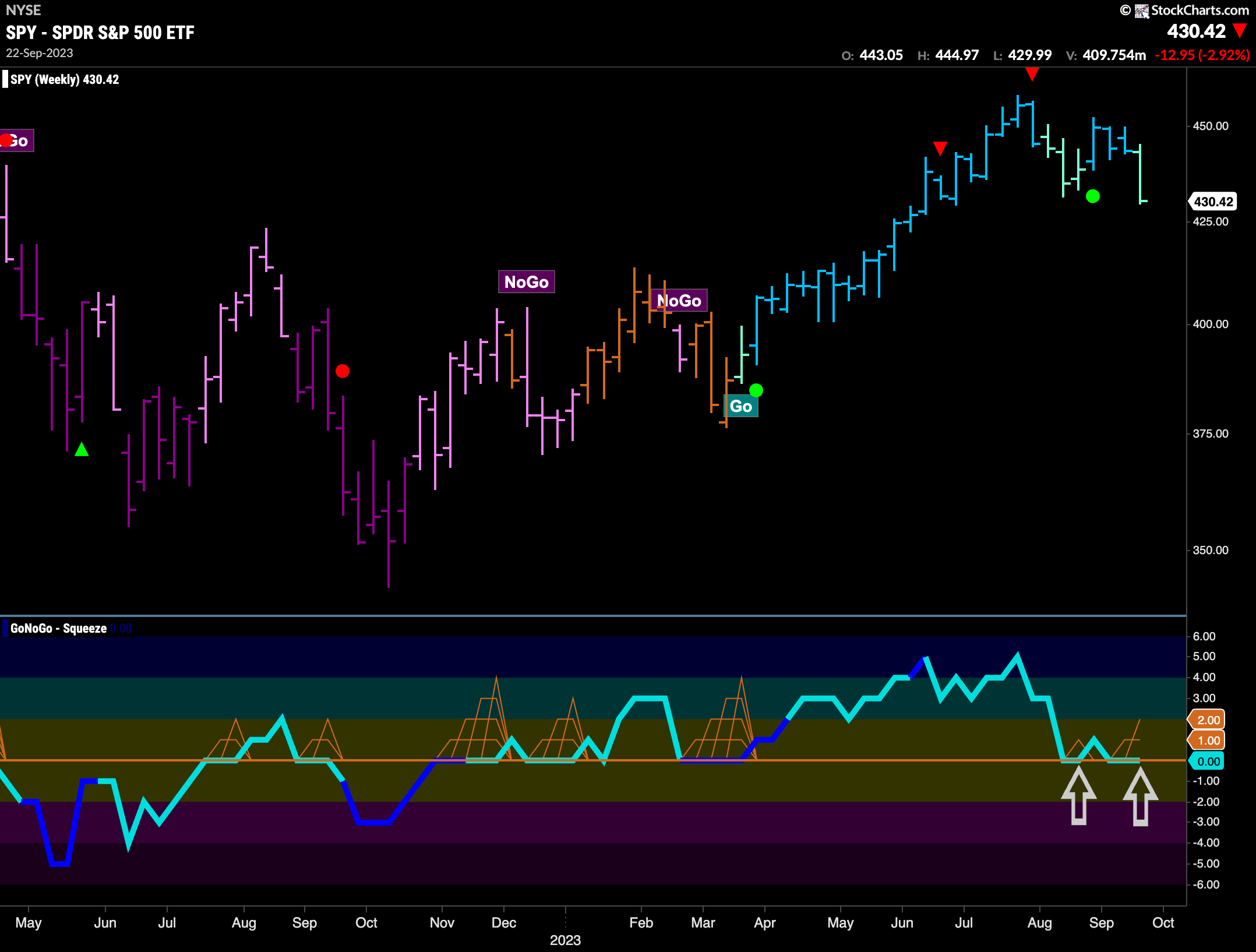
The longer term weekly chart remains in a “Go” trend. However, we saw a great deal of weakness last week. GoNoGo Trend painted a weaker aqua bar as price fell sharply to test support from last month’s lows. GoNoGo Oscillator is testing the zero line from above as it fights to find support at this level. This is an important moment as we will look for momentum to remain on the side of the “Go” trend on this weekly chart.
Treasury Rates Break Higher
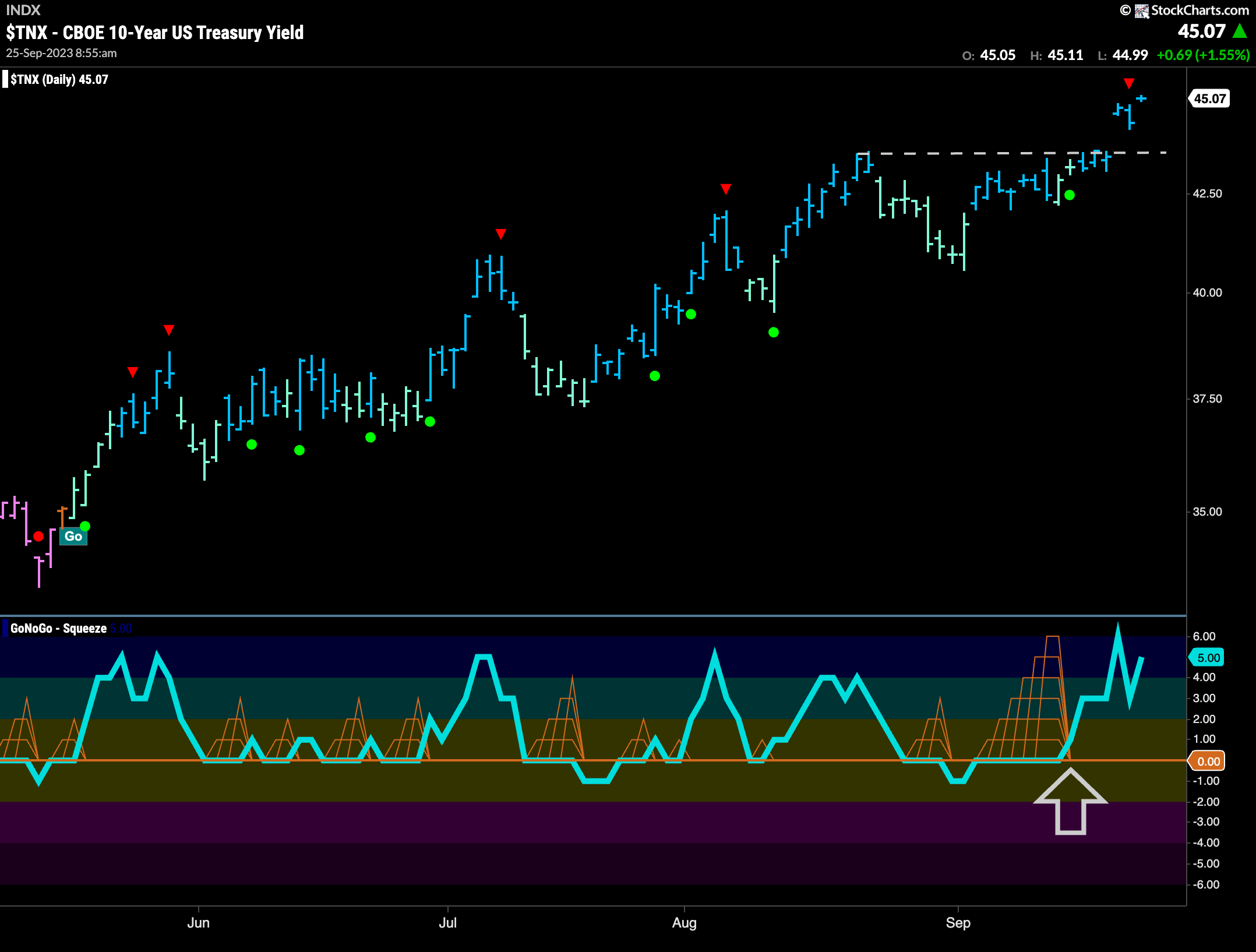
Treasury rates jumped higher this week as price climbed above horizontal resistance on the daily chart. GoNoGo Trend shows strong blue “Go” bars as price gaps to a new high. GoNoGo Oscillator tipped us off to this likelihood last week as it broke out of a Max GoNoGo Squeeze into positive territory. Now, with the oscillator falling out of overbought territory we see a Go Countertrend Correction Icon (red arrow) which indicates price may struggle to go higher in the short term, perhaps offering stocks some reprieve.
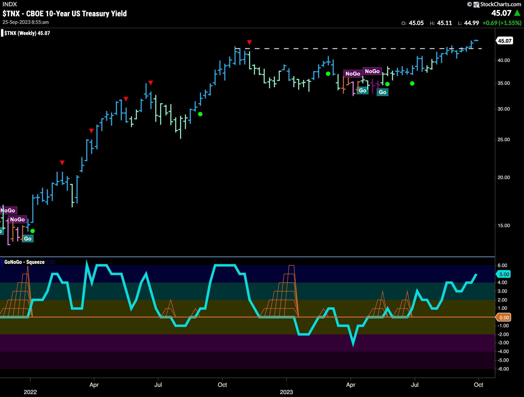
The weekly chart shows how important this price action really is. We are at new highs, with the prior price high from last year now below us. Going forward, it would make sense to look at the horizontal level that was resistance as support. That is the concept of polarity. GoNoGo Oscillator is overbought, and so if momentum wanes we will watch to see if price falls back to this horizontal level.
Dollar Trend Stays Strong
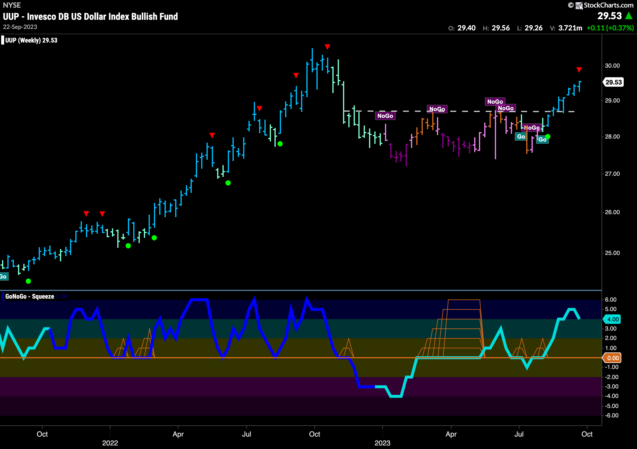
Looking at the weekly chart of the dollar shows that the “Go” trend remains strong for another week. A bright blue bar on another weekly higher close suggests a robust trend is in place. GoNoGo Oscillator is moving from overbought territory back below 5, this has triggered a Go Countertrend Correction Icon (red arrow) above the price bar. This suggests price may struggle in the short term.
Oil Sets Another Higher High
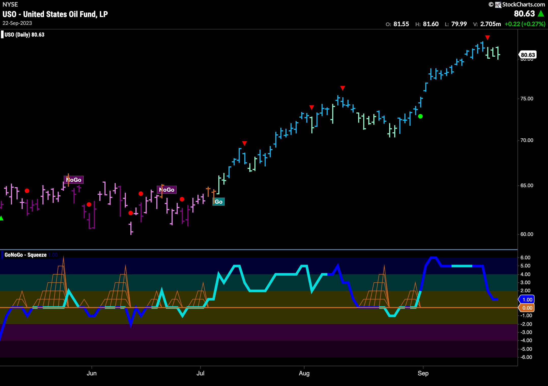
The chart below shows daily prices for $USO. Last week price hit another higher high as the trend in oil continues. GoNoGo Oscillator fell out of overbought territory and that caused a Go Countertrend Correction Icon (red arrow) to appear mid week. GoNoGo Trend showed a little weakness following, painting aqua bars as GoNoGo Oscillator fell toward the zero line. We will watch to see if the oscillator can stay in positive territory to support this “Go” trend for longer.
Gold is Choppy but “NoGo” Remains
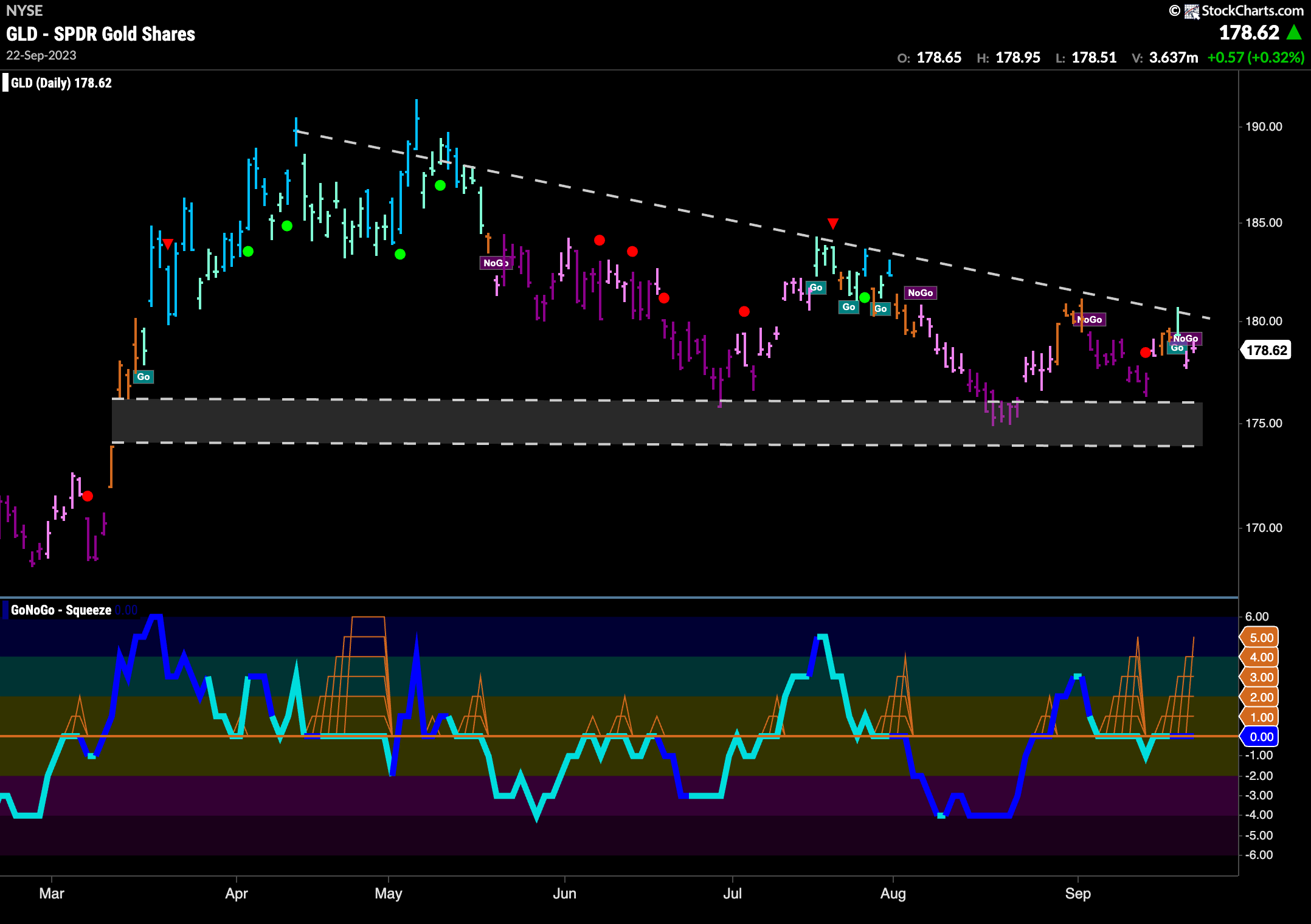
$GLD sees GoNoGo Trend return to paint pink “NoGo” bars at the end of the week. Looking at the chart below we can see that we are experiencing a series of lower highs and lower lows that are now testing the support from the gap in late March. This descending triangle pattern we resolve in one direction at some point. We will watch GoNoGo Oscillator in the lower panel to see in which direction it breaks out of the Max GoNoGo Squeeze. This will suggest future direction.
Sector RelMap
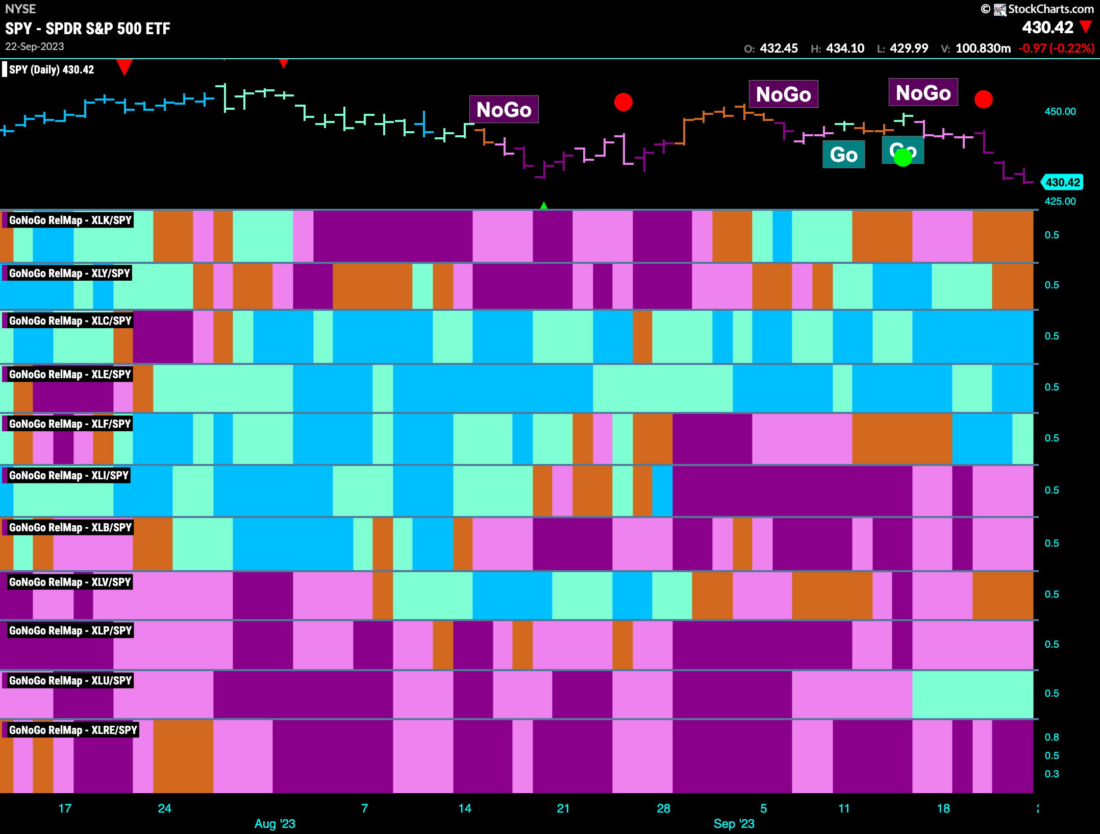
Below is the GoNoGo Sector RelMap. This GoNoGo RelMap applies the GoNoGo Trend to the relative strength ratios of the sectors to the base index. Looking at this map, we can quickly see where the relative outperformance is coming from as well as which sectors are lagging on a relative basis. 4 sectors are outperforming the base index this week. $XLC, $XLE, $XLF, and $XLU are painting “Go” bars.
Breaking Down Energy
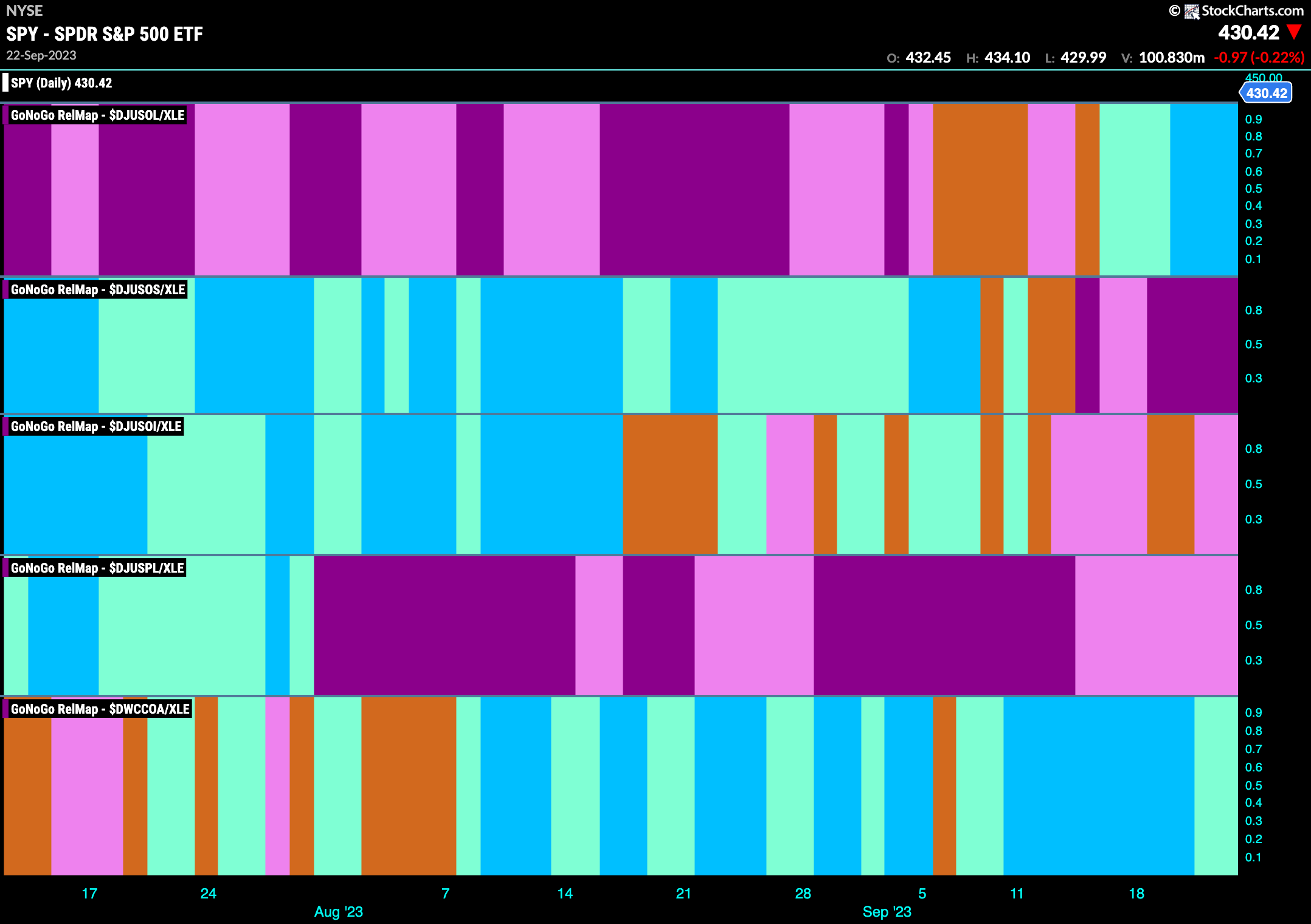
The GoNoGo Sector RelMap below shows each of the industry groups within the outperforming energy sector and their relative performance from a GoNoGo perspective to the sector itself. In this way, we can get a sense of what is driving the strength we are seeing in energy vs the S&P 500. Looking at the map below we can see that the past few weeks we have seen a “Go” trend in the top panel. $DJUSOL, the ticker for Integrated Oil and Gas, is in a relative “Go” trend which has strengthened to paint strong blue bars.
Integrated Oil and Gas Testing Support
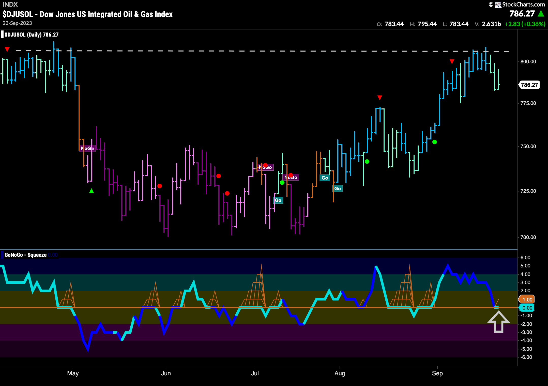
In the GoNoGo SubGroup RelMap above, we saw that it was integrated oil and gas that is driving gains. The chart below shows that group with the full suite of GoNoGo Tools applied. We can see that a “Go” trend is indeed in place, yet weakness is creeping in as GoNoGo Trend paints weaker aqua bars. This comes after price failed at horizontal resistance. In the panel below, we can see that GoNoGo Oscillator is testing the zero line from above, where we will watch to see if it finds support. If it does, and rallies back into positive territory, this might give price the push it needs to make another attack on a new high.
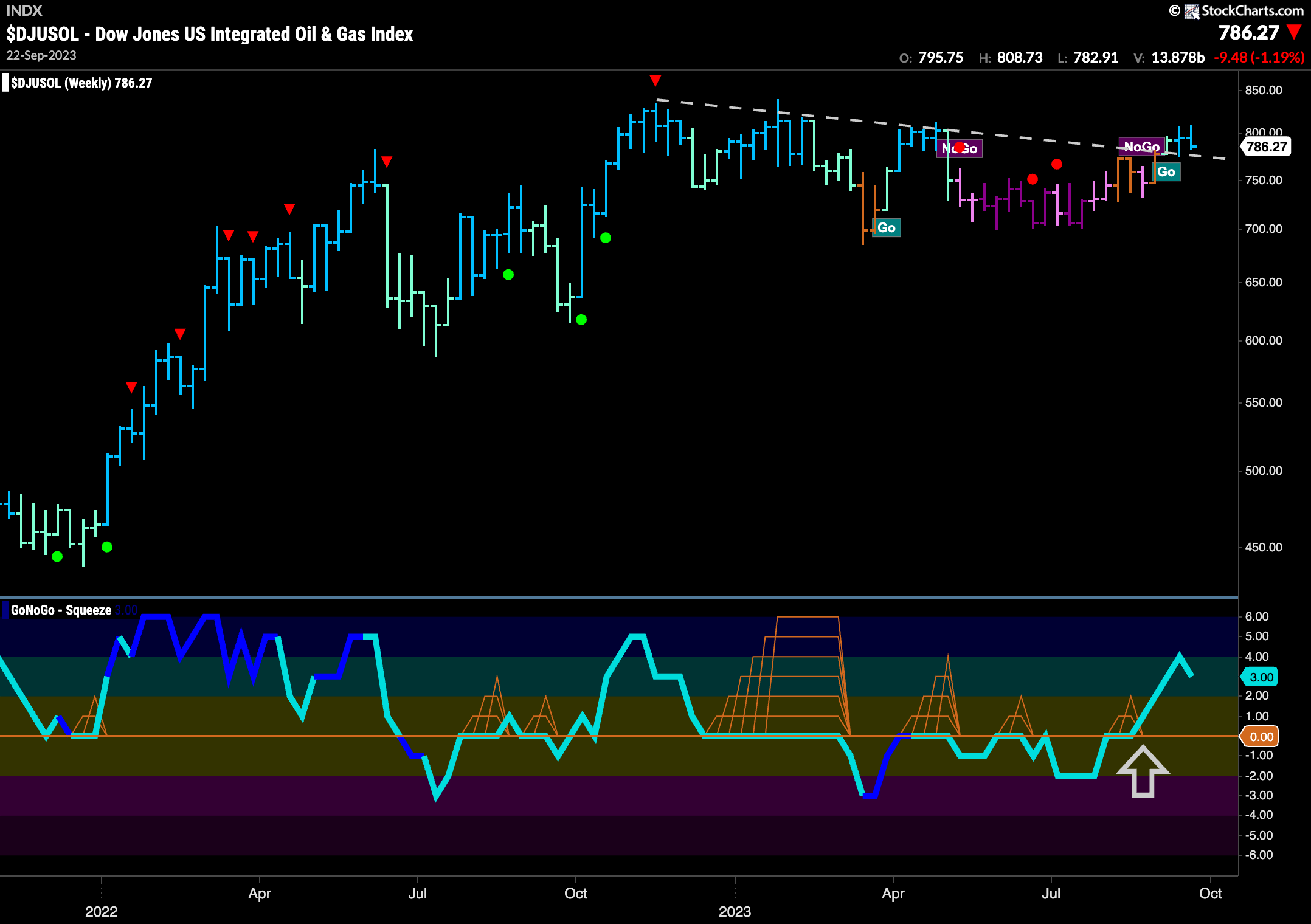
A look at the weekly chart below shows that the trend may perhaps be in its infancy from a larger time frame perspective. Having experienced a “NoGo” correction that was mostly sideways and caused GoNoGo Oscillator to spend several at or below the zero line, we now see a new “Go” trend in place. We saw GoNoGo Oscillator burst back into positive territory which helped GoNoGo Trend move through amber “Go Fish” bars back into “Go” colors.
$CVX Moving in Line with Subgroup
The single security chart of $CVX shows a similar picture and so perhaps represents an opportunity to take advantage of any renewed strength in the integrated oil and gas space. The daily chart below shows the “Go” trend in place and struggling with overhead supply at resistance levels. GoNoGo Oscillator is looking for support at the zero line and so we will watch closely to see if it rallies into positive territory. This would help support any further price gains as it attempts to make a new higher high.
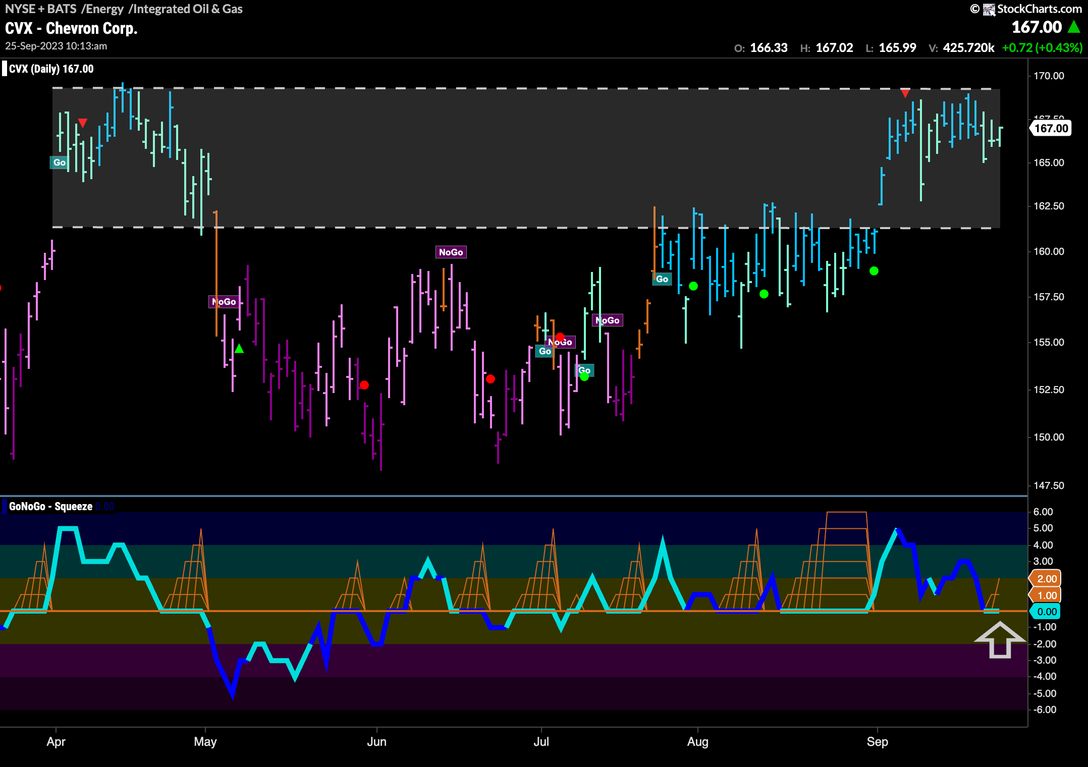
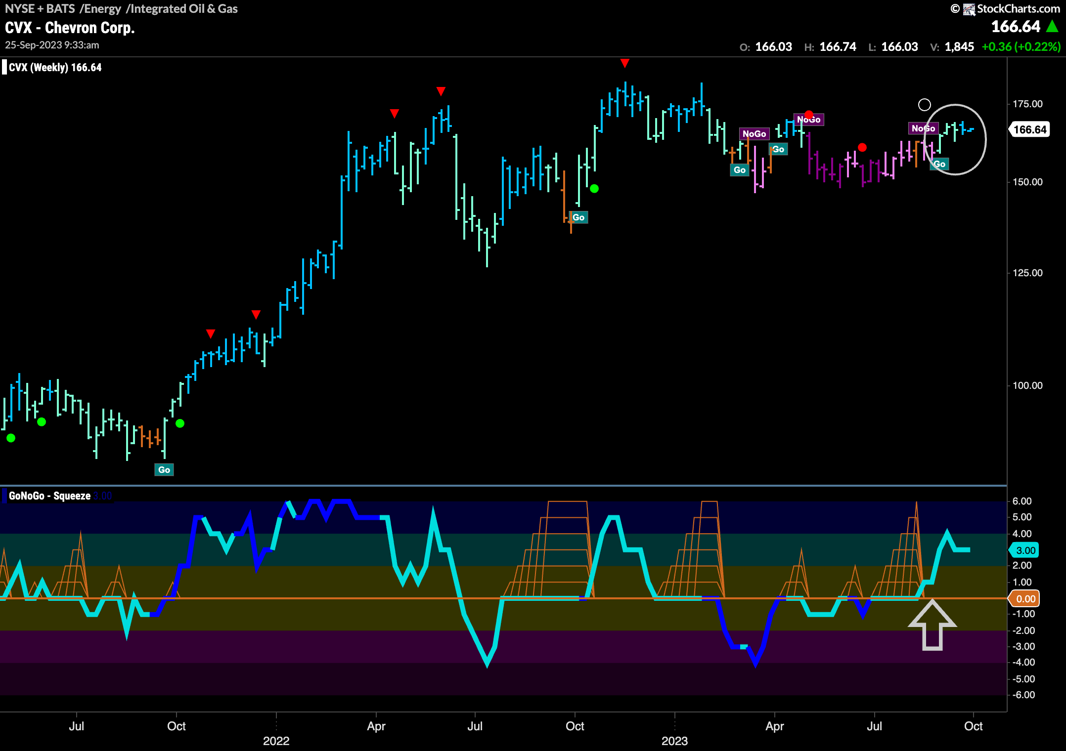
The longer term chart shows the early days of the return to a “Go” trend. After a few weaker aqua bars we can see that the trend has strengthened and is now painting strong blue bars. GoNoGo Oscillator broke out of a Max GoNoGo Squeeze prior to the trend change and now with resurgent positive momentum on the side of the “Go” trend we will look for price to move higher.
