Good morning and welcome to this week’s Flight Path. Equities continue their path out of the “NoGo” correction. The “Go” trend has returned for U.S. equities as we see first an aqua and then a blue “Go” bar. This came after a string of uncertain amber “Go Fish” bars. Treasury bond prices remained in a “Go” trend albeit painting weaker aqua bars at the end of the week. U.S. commodities stayed in a “NoGo” painting weaker pink bars and the dollar showed strong purple “NoGo” bars.

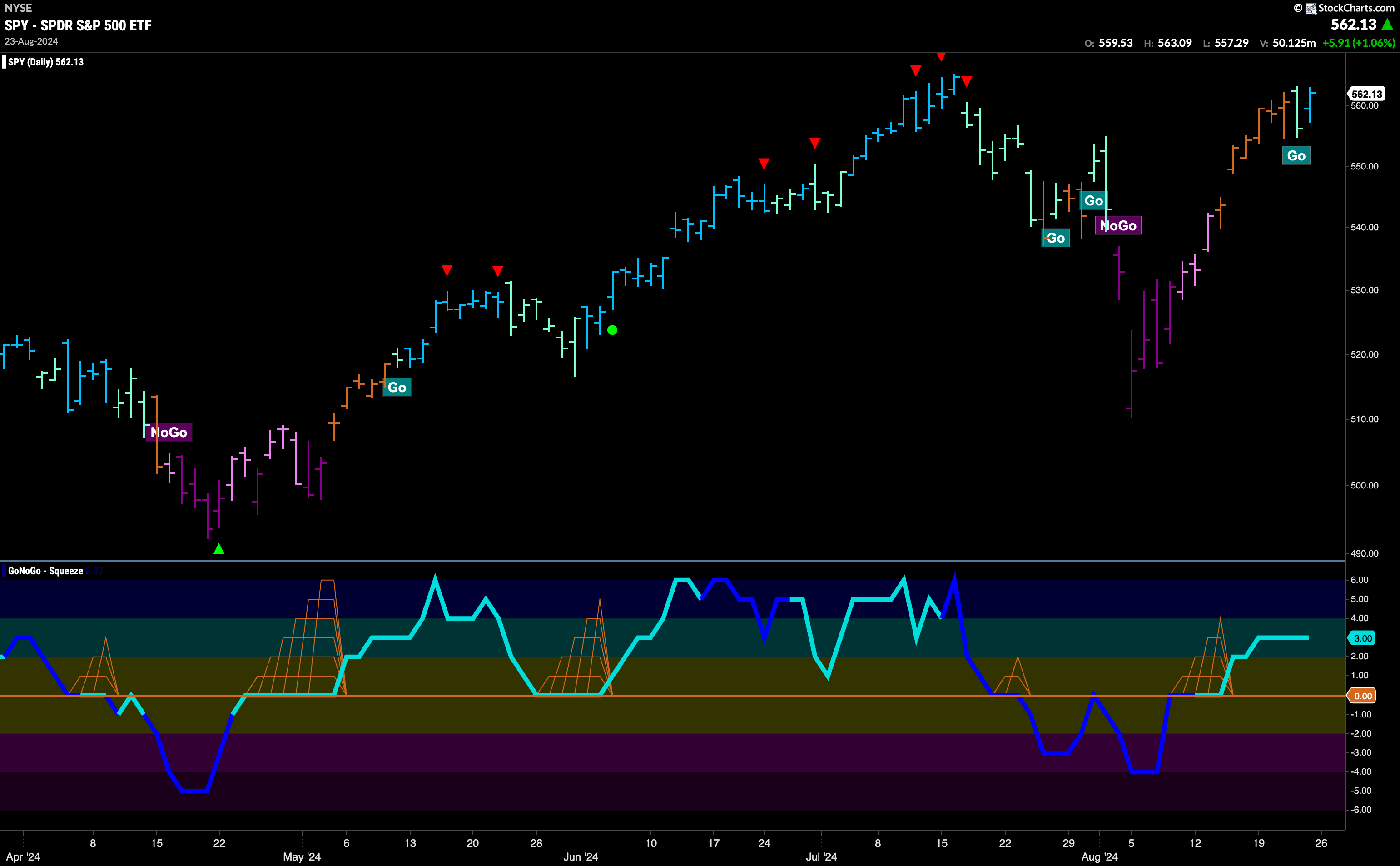
$SPY Continues to Rally and Flags “Go” Trend
The week finished strongly as we saw GoNoGo Trend paint a bright blue “Go” bar as prices rallied after a challenging Thursday. We now see that momentum is in positive territory but not yet overbought and we will watch to see if price can mount an attack on a new high over the coming days and weeks.
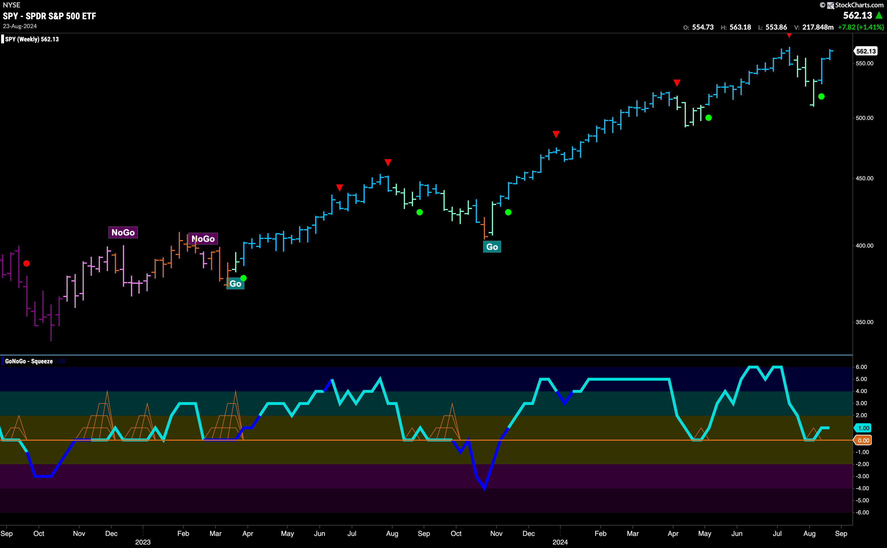
The longer time frame chart shows that the trend is strong. At the last high we saw a Go Countertrend Correction Icon (red arrow) that indicated prices may struggle to go higher in the short term. Indeed, we then saw consecutive lower weekly closes on pale aqua bars. During this time, GoNoGo Oscillator fell to test the zero line from above and it became important to see if it could find support at that level. It did, and as it bounced back into positive territory we saw a Go Trend Continuation Icon (green circle) under the price bar.
Treasury Yields Remain in Strong “NoGo”
Treasury bond yields remained in a “NoGo” trend this week with the indicator painting strong purple bars. We see that although we haven’t seen a new low we have seen consecutive lower highs in the last few weeks. GoNoGo Oscillator is testing the zero line from below once again and we will watch to see if gets rejected here or if it is able to break through into positive territory.

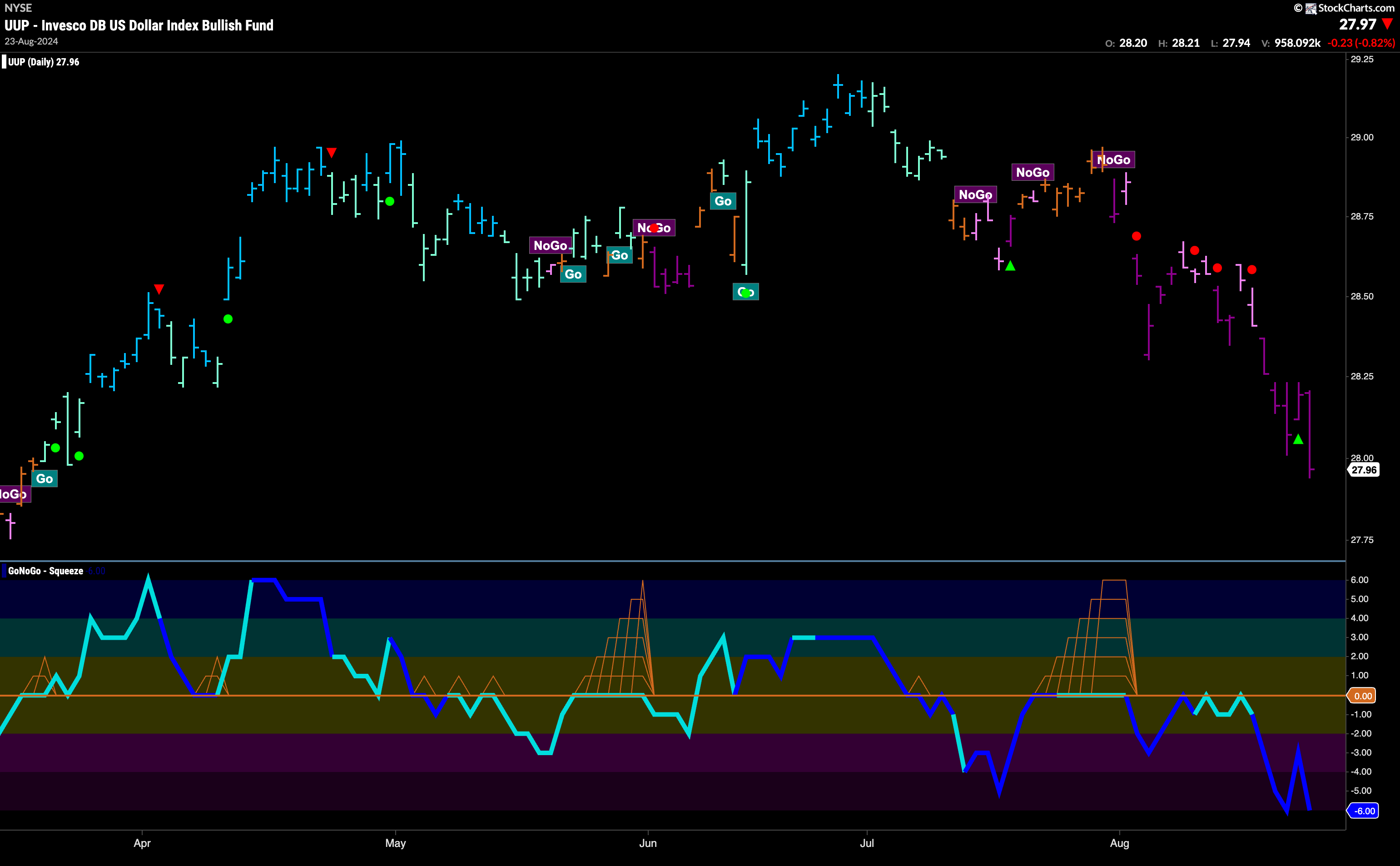
The Dollar’s “NoGo” Shows Renewed Strength
A strong message sent this week for the U.S. dollar. A string of purple “NoGo” bars took prices to new lows. GoNoGo Oscillator is back in oversold territory after briefly trying to move back toward neutral territory. Volume is heavy, showing strong market participation in this most recent move lower.
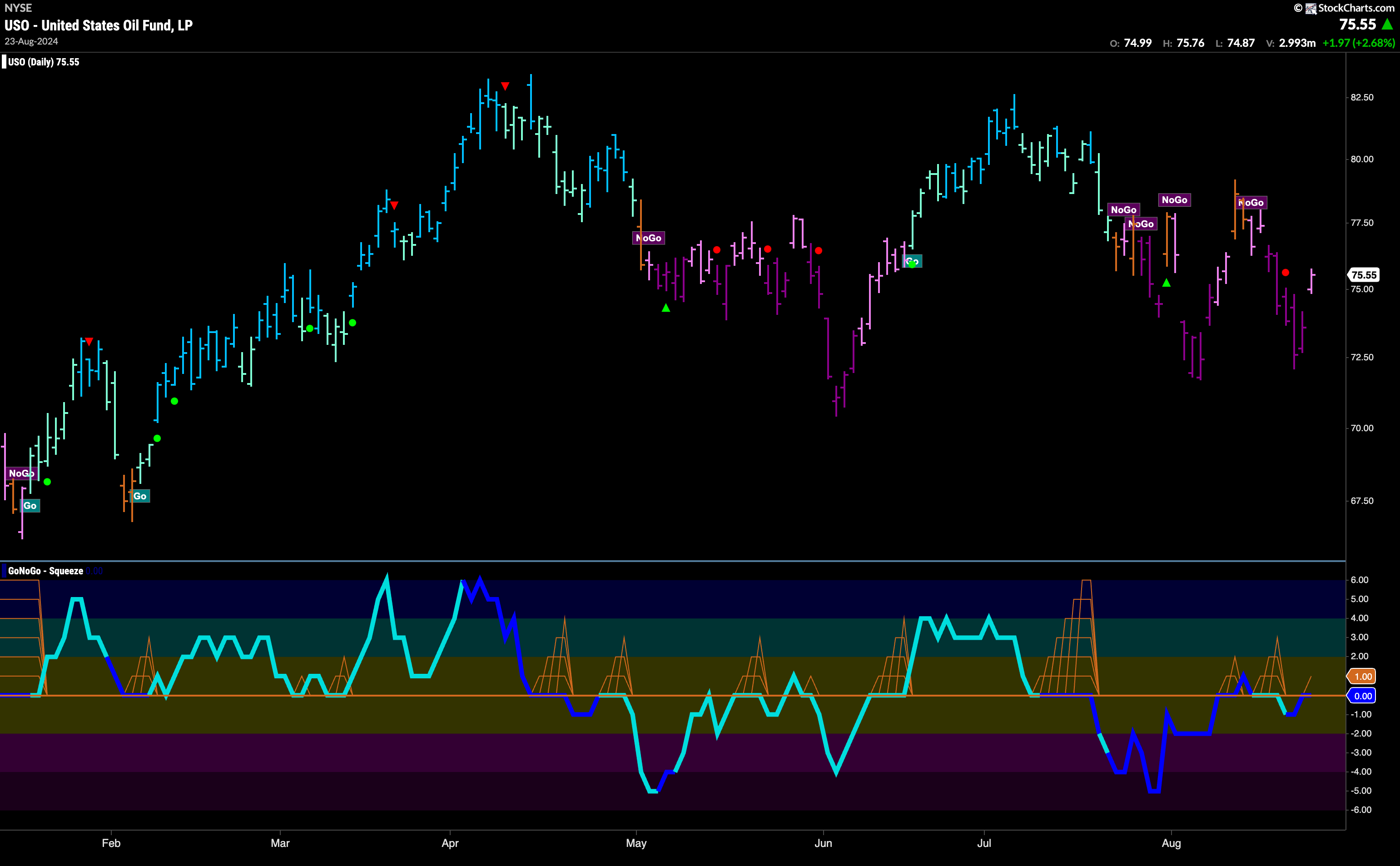
USO Stays in “NoGo” Trend
Price moved lower all week on strong purple bars. We didn’t see a new low though and on Friday price gapped higher and GoNoGo Trend painted a weaker pink bar. GoNoGo Oscillator is back testing the zero level from below where we will watch to see if it finds resistance. If it does, we can expect further downside pressure on price. If it is able to regain positive territory we may well see price try to rally out of the “NoGo”.
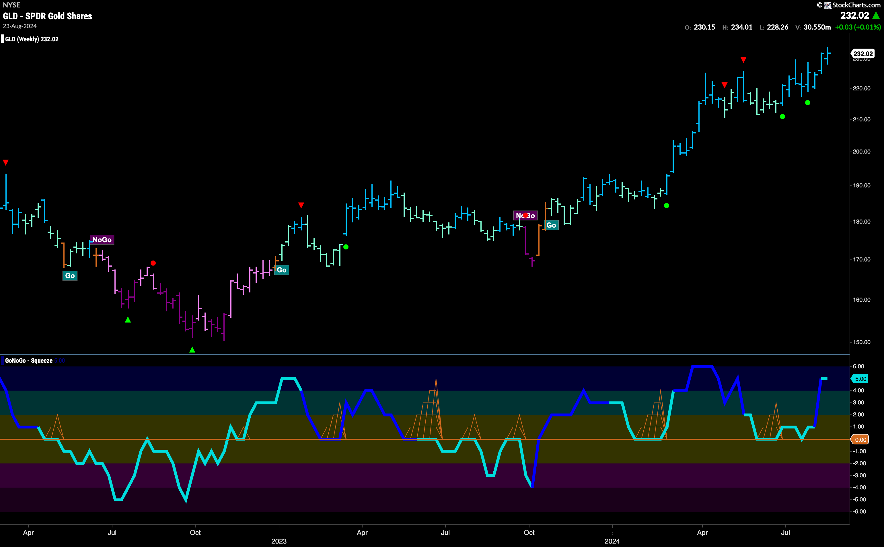
Gold Looks Good at These Levels
The weekly chart of Gold shows GoNoGo Trend painting yet another strong blue “Go” bar. With price at a new higher high the trend looks strong as it inches higher. GoNoGo Oscillator is now in overbought territory and so we will watch to see if it can sustain this momentum or if it wanes in the short term. Going forward we will look for support at the prior high levels it has just surpassed.
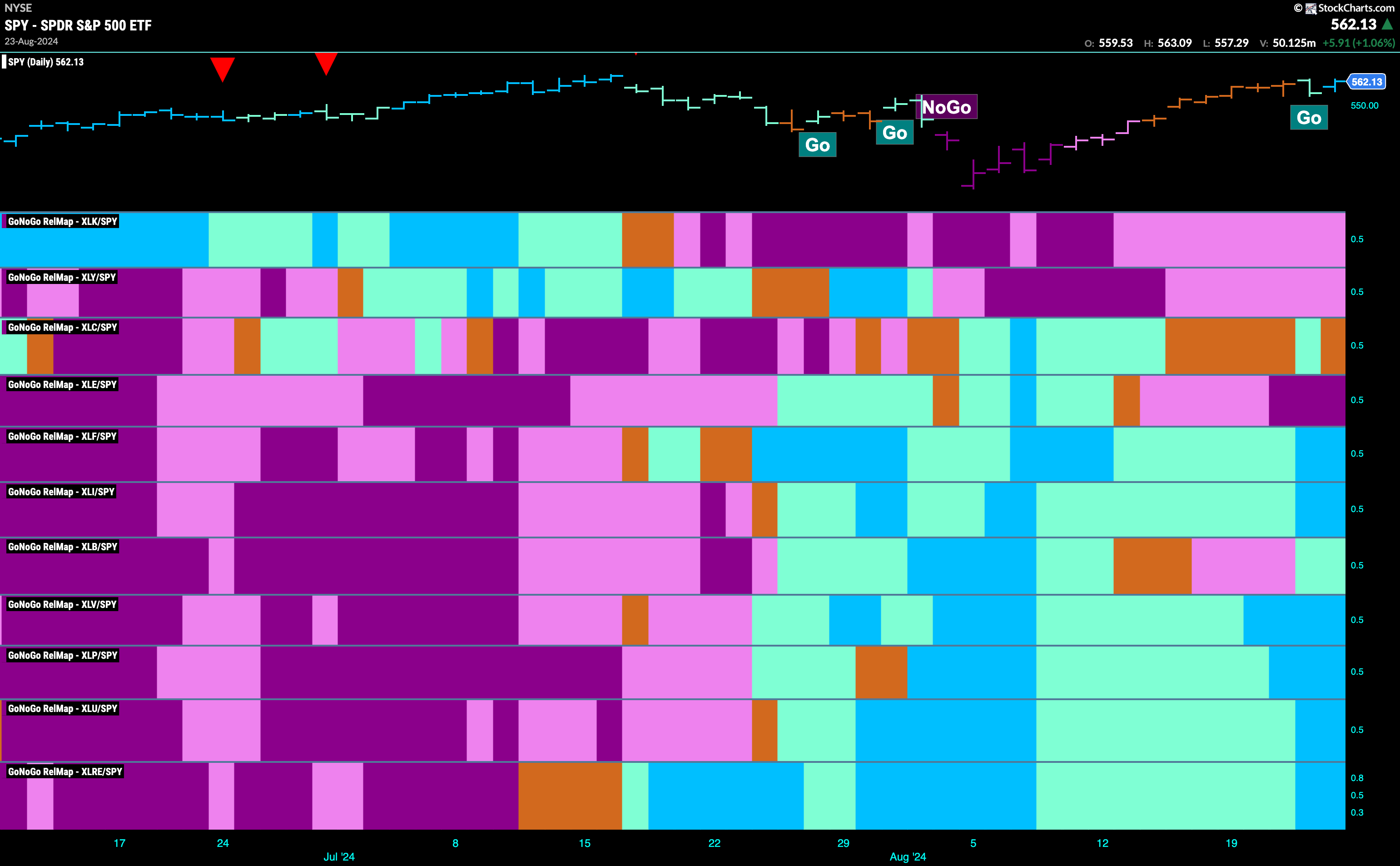
Sector RelMap
Below is the GoNoGo Sector RelMap. This GoNoGo RelMap applies the GoNoGo Trend to the relative strength ratios of the sectors to the base index. We can see that there is a lot of relative outperformance on this map. 7 sectors are in relative “Go” trends. $XLF, $XLI, $XLB, $XLV, $XLP, $XLU, $XLRE are painting strong blue bars.
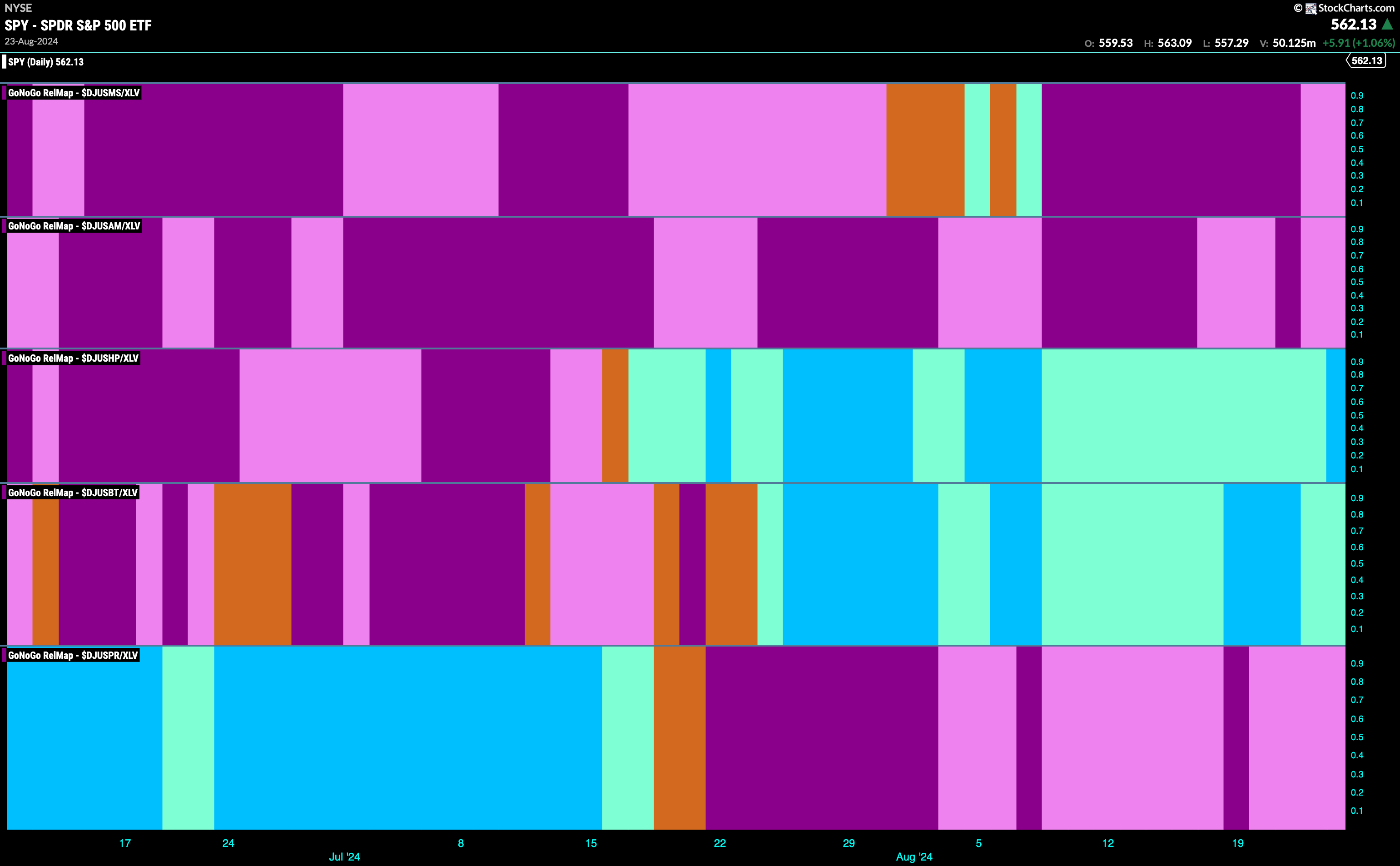
Healthcare Sub-Group RelMap
The chart below shows breakdown of the sub groups within the healthcare sector. The Sub-Group RelMap plots the GoNoGo Trend of each sub index to the $XLV. We can see from the below map that the Healthcare Providers Index (3rd panel) is beginning to paint strong relative “Go” bars.
$CYH Looks for Momentum in “Go” Trend
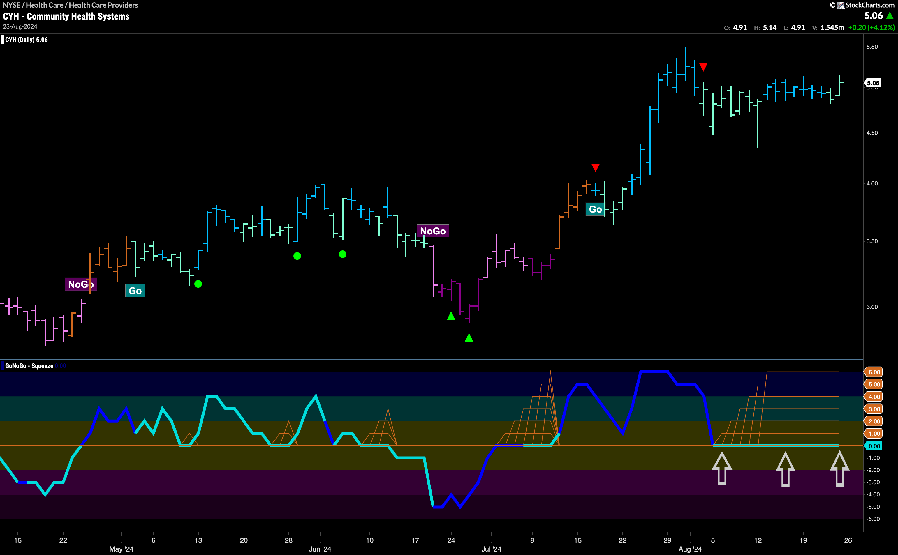
The chart of $CYH below shows that we are in a “Go” trend and have made a higher high a few weeks ago. However, after that high we saw a Go Countertrend Correction Icon (red arrow) that told us price may struggle to go higher in the short term. Indeed, since then we have seen price move mostly sideway and volatility has been reduced. We see a Max GoNoGo Squeeze in the lower panel as the oscillator has been stuck at the zero line, reflecting a tug of war between buyers and sellers at this level. We will watch to see if the oscillator can break out of the Squeeze into positive territory. If it does, we would look for trend continuation and an attempt at a new higher high.
$ENSG Capitalizes on Momentum Surge
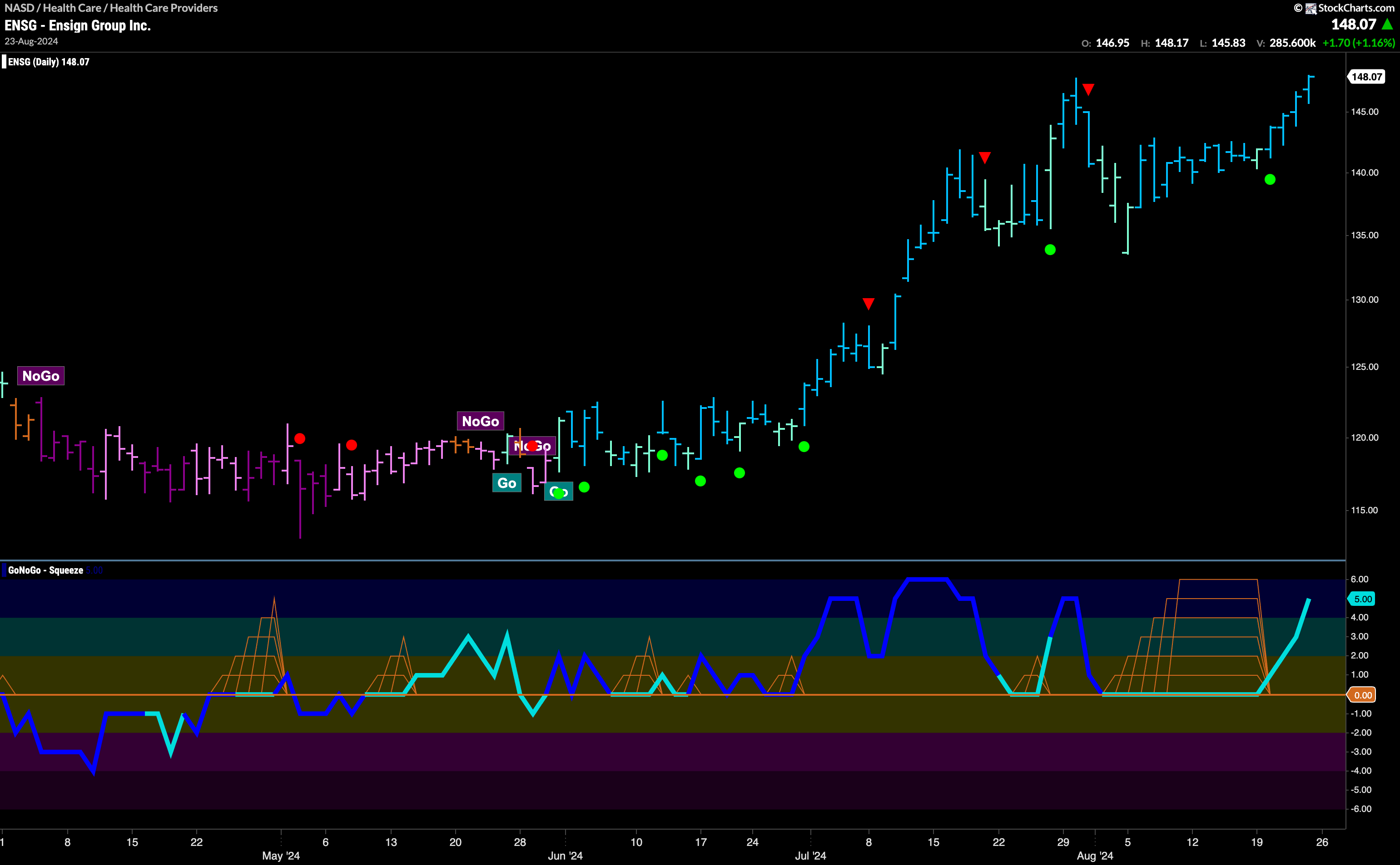
$ENSG is in a strong “Go” trend as it edges to a new high. After hitting a high a few weeks ago we saw a Go Countertrend Correction Icon (red arrow) indicating that price may struggle to go higher in the short term. As price fell from that high, GoNoGo Oscillator fell to the zero line and remained there, causing the climbing grid of GoNoGo Squeeze to hit an extended Max. The bulls won the battle, and GoNoGo Oscillator broke out of the Max GoNoGo Squeeze into positive territory. This tells us that momentum is resurgent in the direction of the “Go” trend and we saw a Go Trend Continuation under price. We will look to see if price can consolidate at or above these levels in the coming weeks.
