Good morning and welcome to this week’s Flight Path. Let’s take a look at the GoNoGo Asset map below. A clear trend has emerged in equities as we see strong purple “NoGo” bars at new price lows. Treasury bond prices remain in a strong “NoGo” trend as commodities join the fray. Only the dollar remains in a “Go” trend this week and it is a strong one.
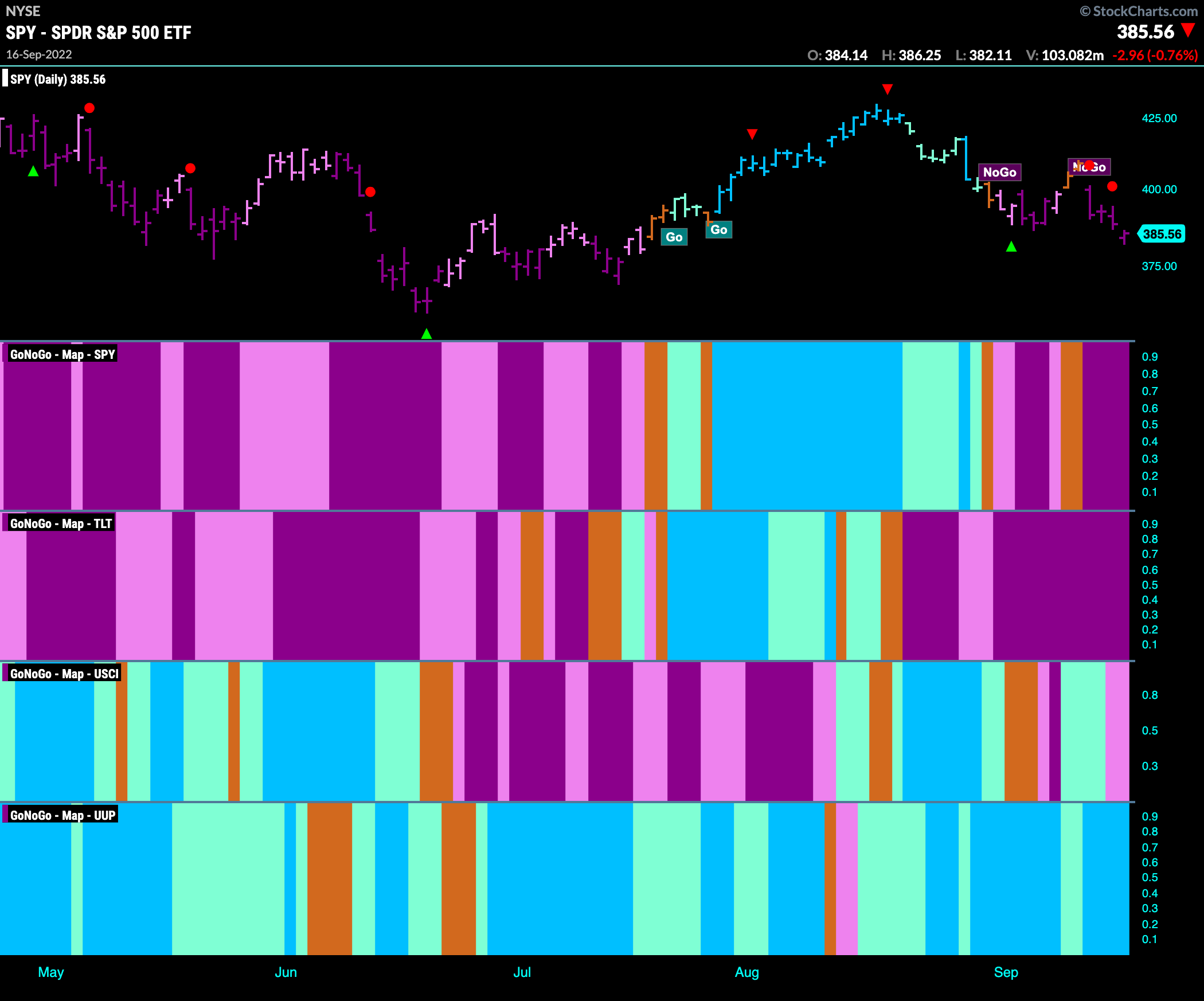
S&P 500 Sees “NoGo” Resume in Full Force
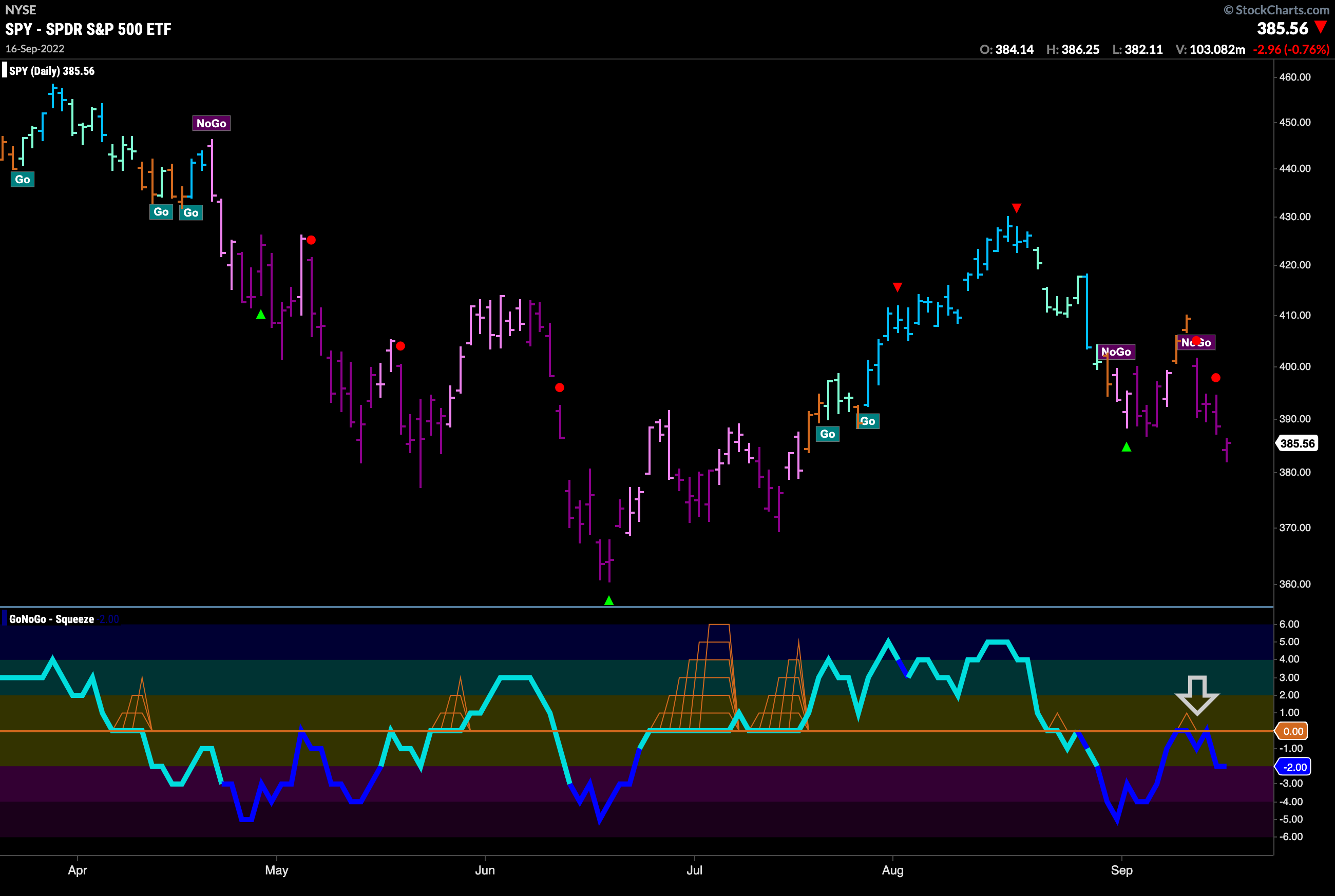
There was a lot of trading this week as we see GoNoGo Oscillator in dark blue. Also, GoNoGo Oscillator was emphatically rejected by the zero line and is falling back into negative territory. Along with that we see price spend most of the week painting strong purple “NoGo” bars as price fell lower.
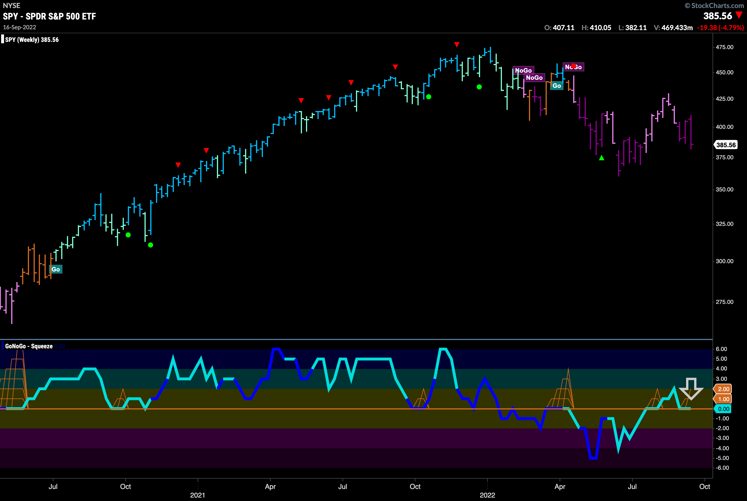
The weekly chart shows that the “NoGo” is firmly in place. We have been watching GoNoGo Oscillator for several weeks now as it was able to dip into positive territory. Now, it has returned quickly to the zero line and spends a second week there. If GoNoGo Oscillator falls back into negative territory that will be strong confirmation that the “NoGo” is not going anywhere.
“Go” Trend in Rates Tests Prior Highs
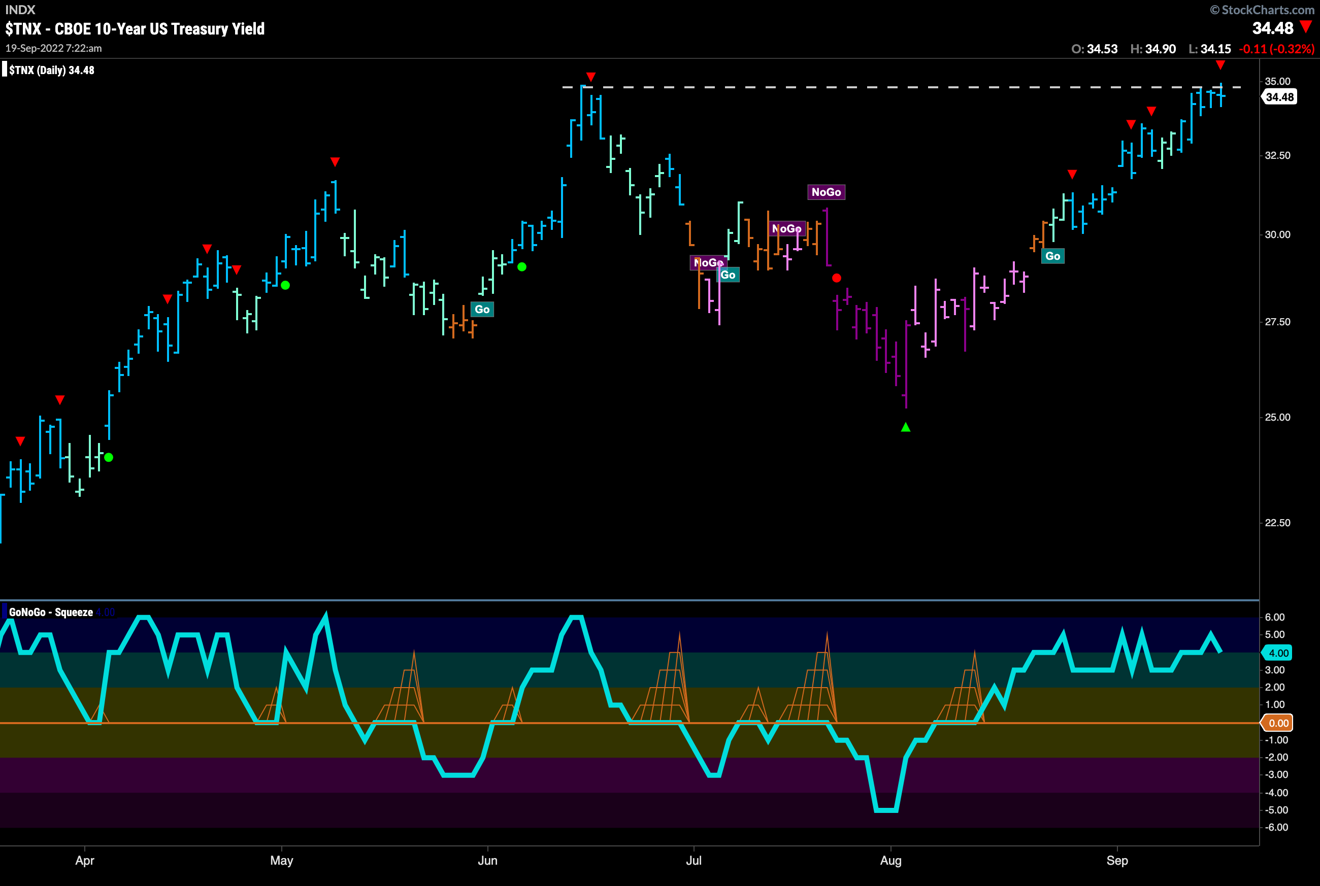
The “Go” trend in treasury rates remains as we see strong blue “Go” bars this week. As we run up against resistance from prior highs we note that we have seen a Go Countertrend Correction arrow triggered which indicates price may struggle in the short term to go quickly higher. However, the trend remains strong here.
Dollar Looks to Find Support in “Go” trend
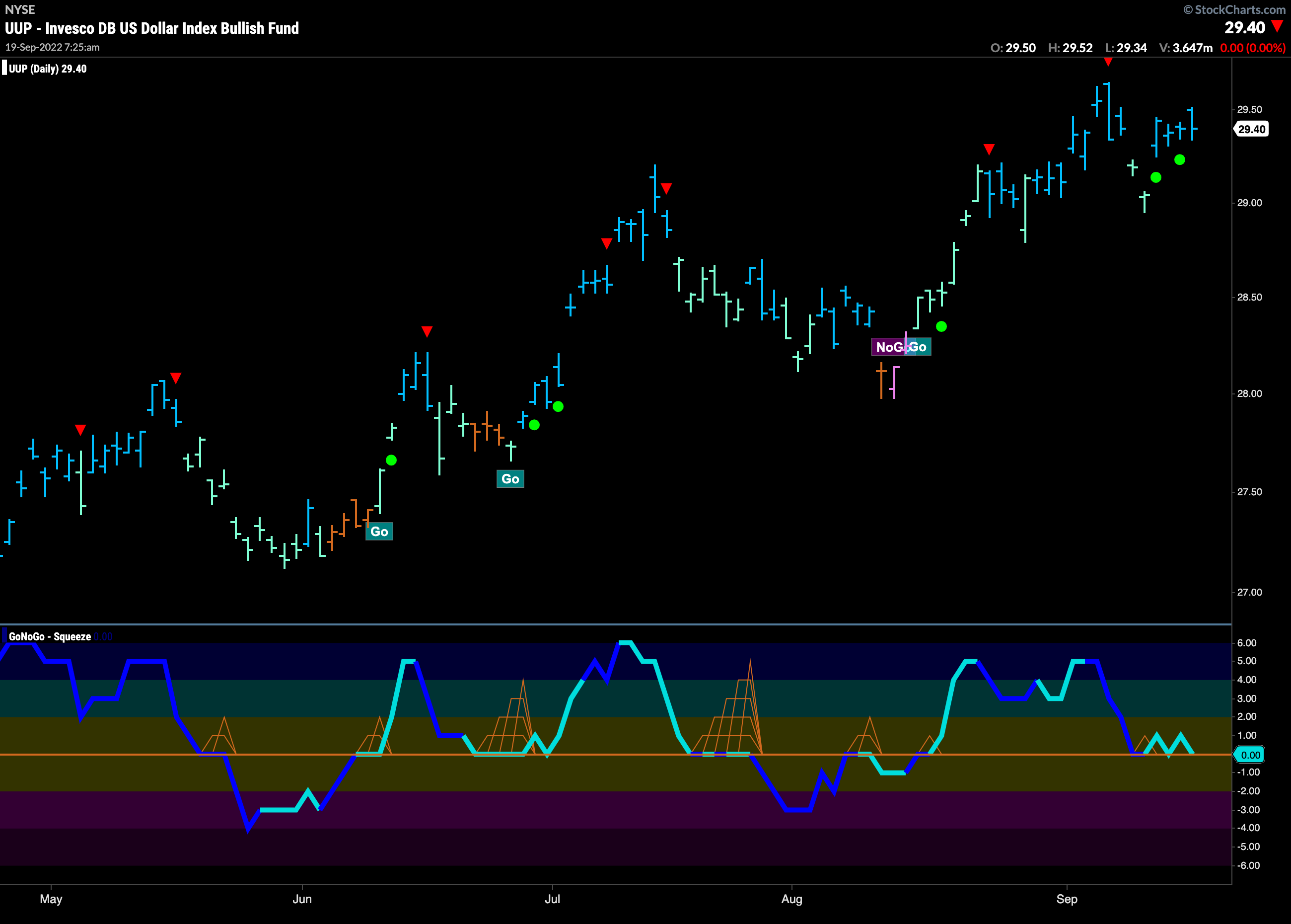
The dollar rallied this week after correcting against the “Go” trend last week. GoNoGo Oscillator so far has found support at the zero line but we will want to see it move clearly into positive territory in order to be confident that momentum is on the side of the “Go” trend. With multiple Go Trend Continuation green circles the most likely scenario seems for price to test prior highs.
Longer Term Oil Chart Shows “Go” Trend Gives Way
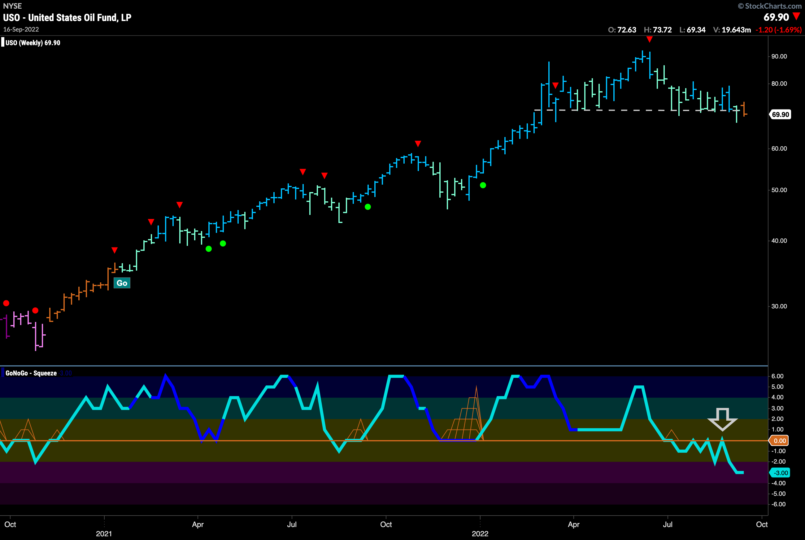
Below is the weekly chart for $USO. For several weeks now we have noted that GoNoGo Oscillator is below zero and finding resistance at that level. The oscillator continued to fall away this week and price moved low enough to close at a level that caused GoNoGo Trend to be unable to paint Go colors. The indicator is painting an amber “Go Fish” bar right as price struggles to hold horizontal support.
Daily Chart Shows the Oil Struggle
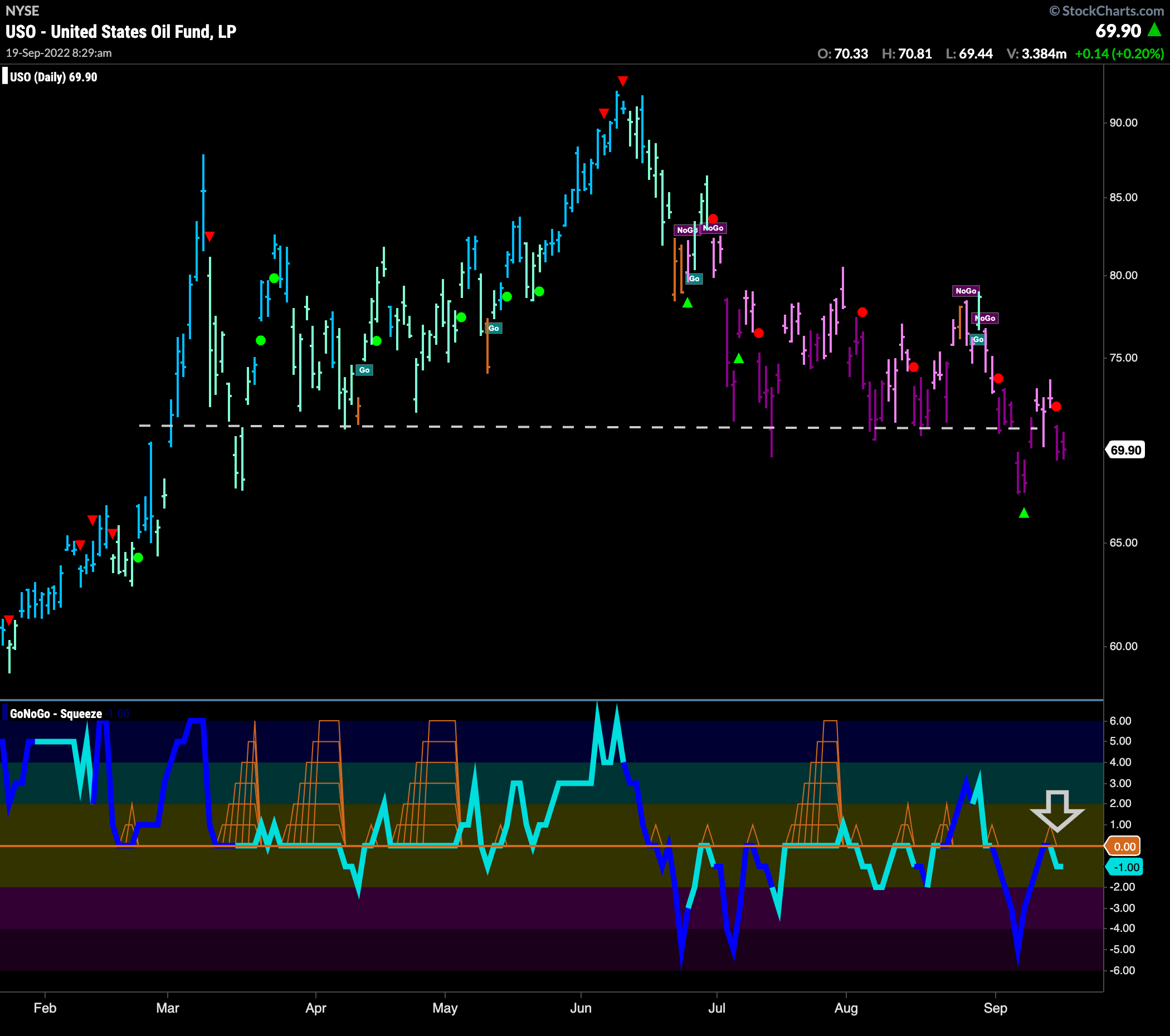
Below is the daily GoNoGo Chart for $USO. We can see the price movements that have caused uncertainty on the weekly chart in more detail here. The “NoGo” trend has prevailed for several weeks now and last week set a new lower low below support. After rallying to try to regain support, price fell away at the end of the week as GoNoGo Oscillator was rejected by the zero line.
Sector RelMap
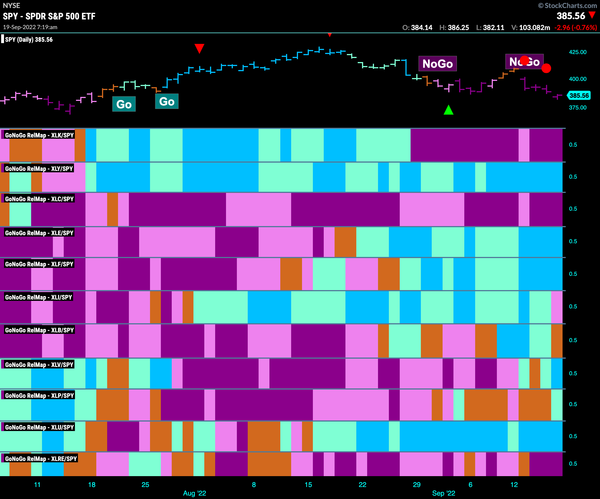
Below is the GoNoGo Sector Relmap. This GoNoGo Relmap applies the GoNoGo Trend to the relative strength ratios of the sectors to the base index. Looking at this map, we can quickly see where the relative outperformance is coming from as well as which sectors are lagging on a relative basis. A little change this week, and primarily a defensive change. Industrials paint a weak pink “NoGo” bar and materials slip into an amber “Go Fish”. The two sectors to take their place in “Go” trends are healthcare and consumer staples. These join utilities as defensive sectors lead.
$GASO Reflects Oil Struggles
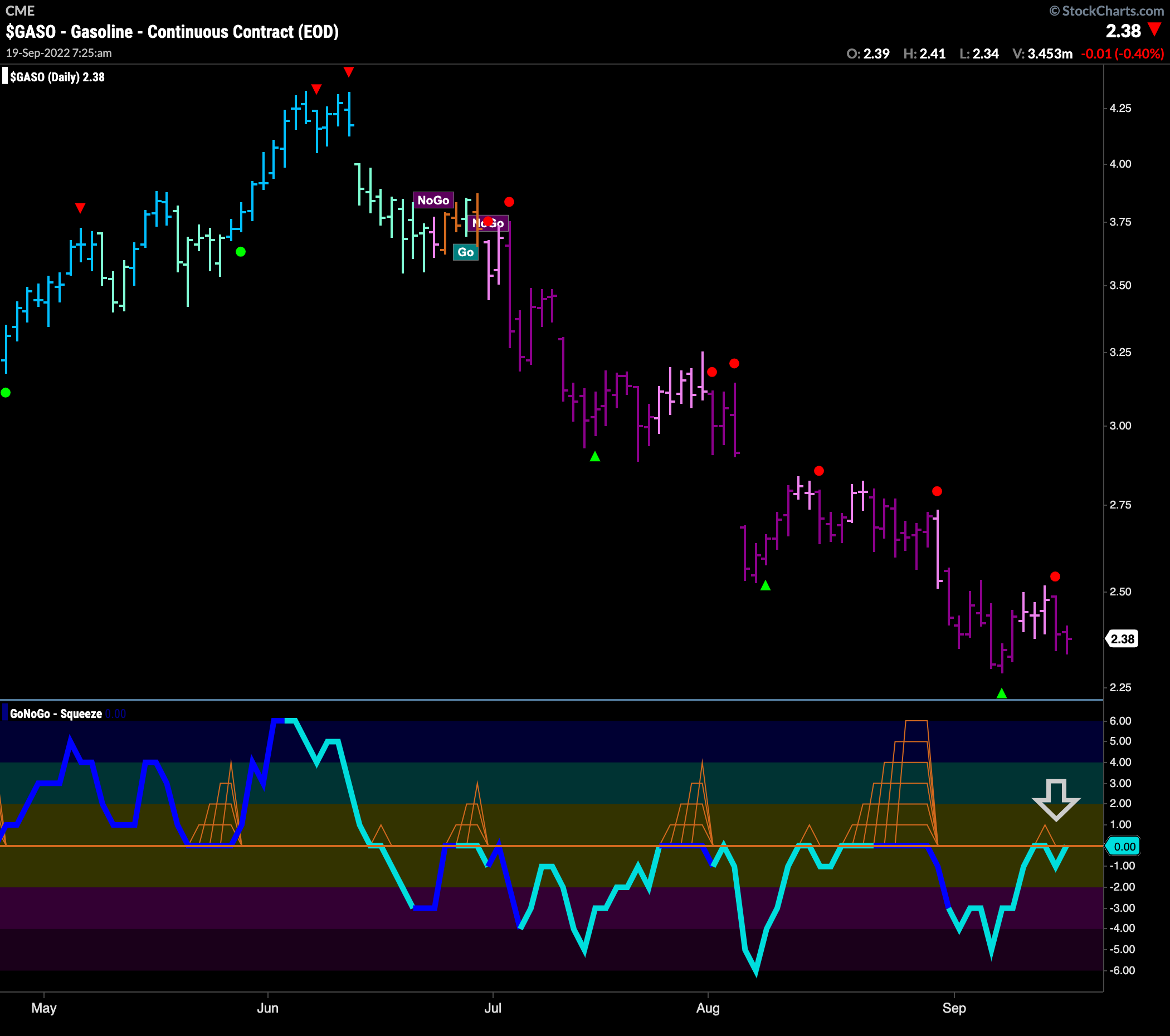
Have we been feeling better at the pump? Absolutely. Since early summer, prices have been falling for gasoline futures. $GASO saw a “NoGo” trend emerge and has made a series of lower highs and lower lows since. During this time GoNoGo Oscillator has been below zero and finding resistance at that level. We are watching closely again now as GoNoGo Oscillator rises to test the zero line again. A rejection here would likely lead to price making an attempt at another new low.
First Solar Looking Strong
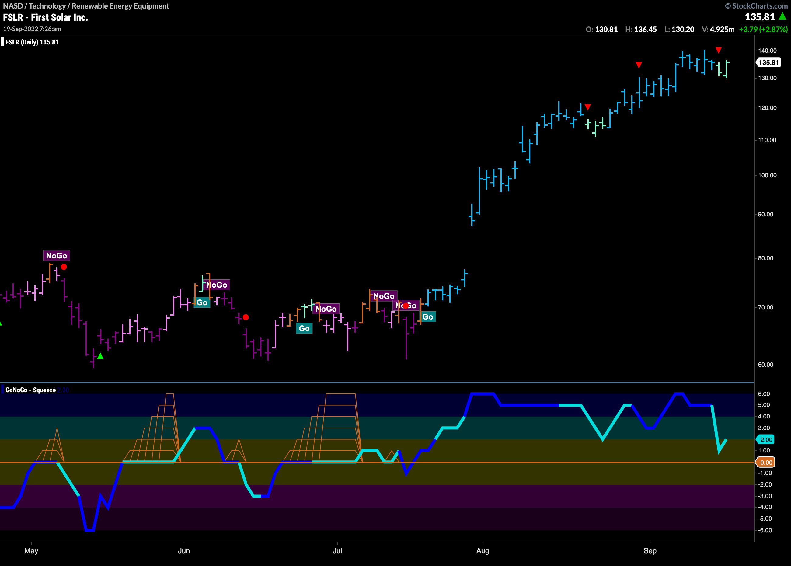
Perhaps we can look to alternative energy as oil and gas prices continue to tumble. Below is the daily chart for $FSLR. We can see that as oil has fallen so $FSLR has risen. In a “Go” trend since July, GoNoGo Oscillator has been in positive territory the entire time. Currently we see price dealing with a Go Countertrend correction arrow and so in the short term price may struggle to make gains but we will look for opportunities as the trend stays strong.
Solar Outperforms Gasoline
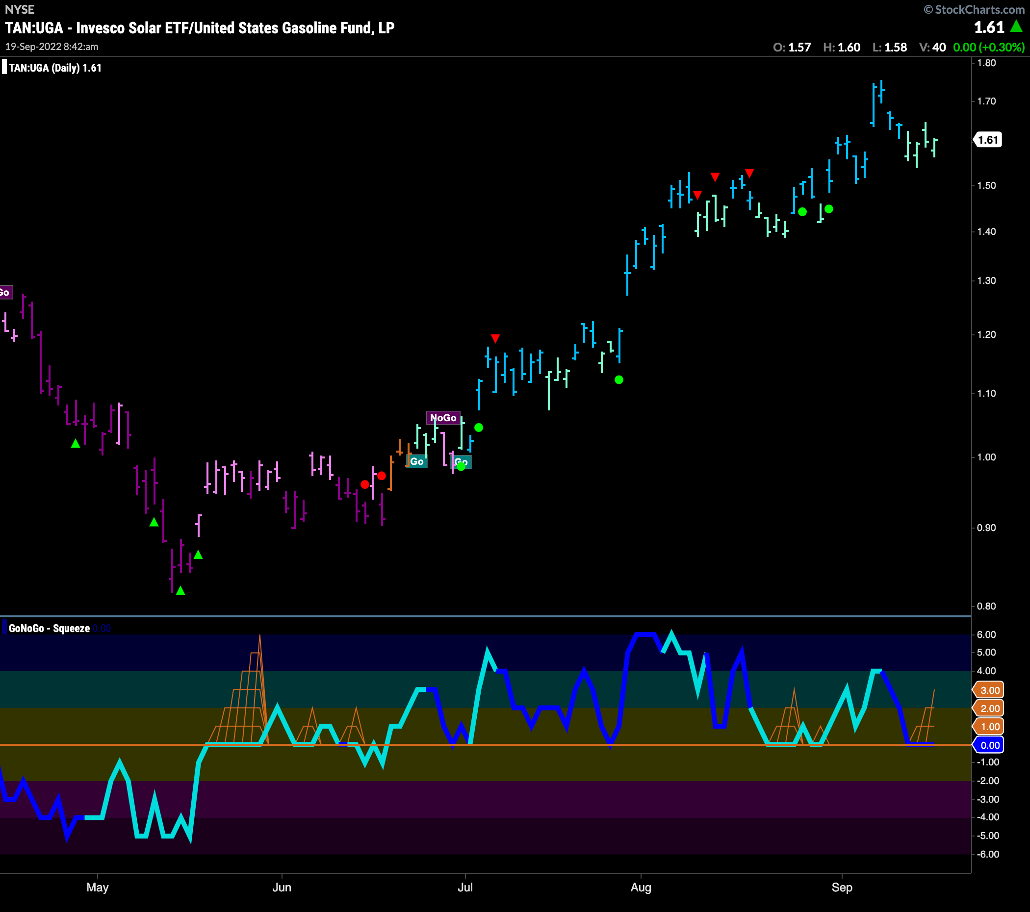
On a relative basis, we see that it is no surprise that $FSLR is outperforming while oil struggles. The chart below shows the GoNoGo Suite of tools applied to a relative performance chart of a Solar ETF to Gasoline. $TAN:UGA. We can see that the trend has been strong since the end of June. All this time, GoNoGo Oscillator has found support at the zero line and currently we see the oscillator testing that level. If this relative outperformance is to continue, we will look for support at zero once more.
Too Late in the Summer to Get a Good $TAN?
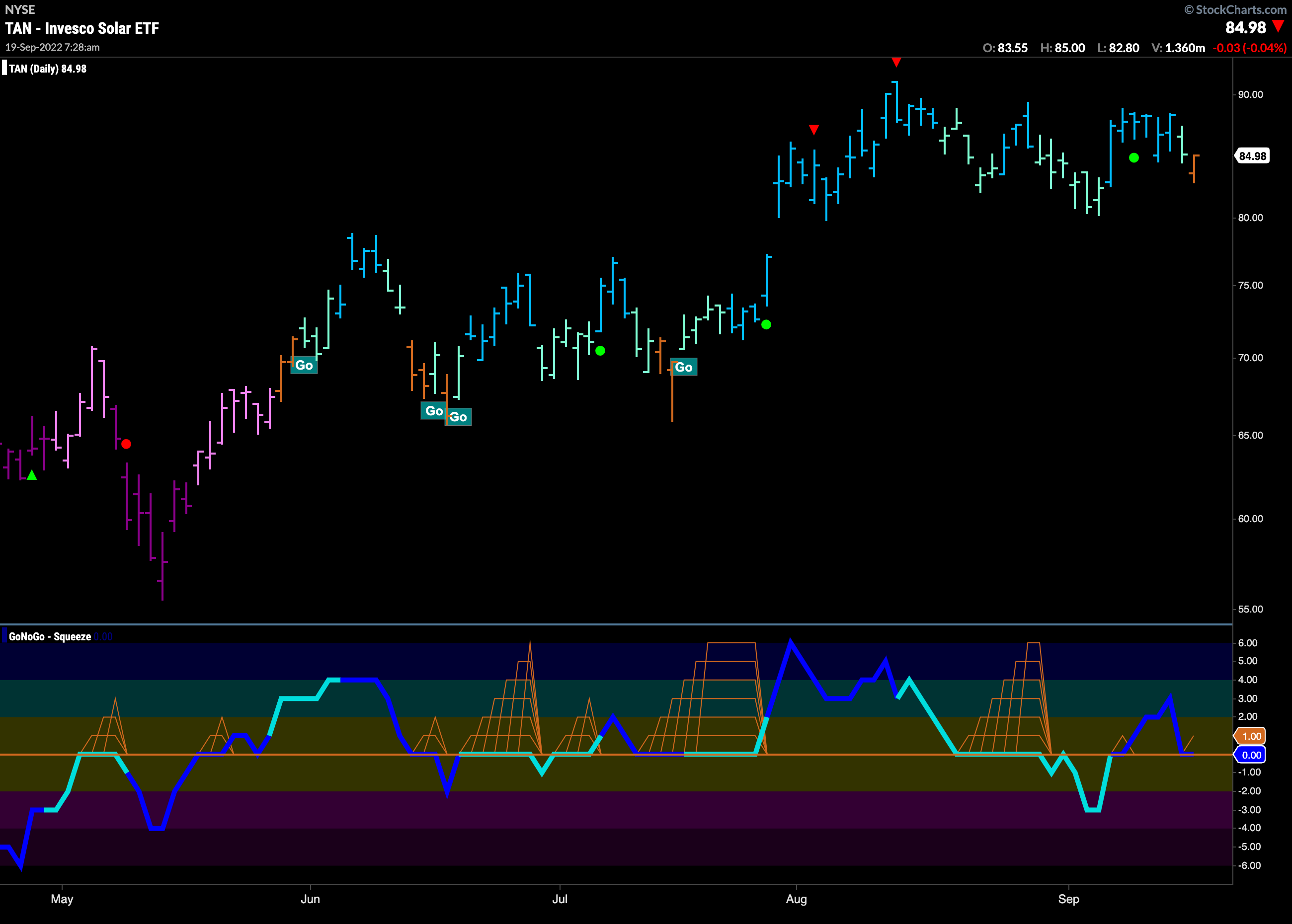
If oil continues to struggle, and alternative energy remains relatively strong, the chart below might be showing us a nice potential set up in the $TAN ETF itself. While GoNoGo Trend shows an amber “Go Fish” bar representing uncertainty, GoNoGo Oscillator is testing zero from above. If GoNoGo Oscillator finds support here, the next “Go” signal in price would come with the confirmation from GoNoGo Oscillator rising into positive territory.
