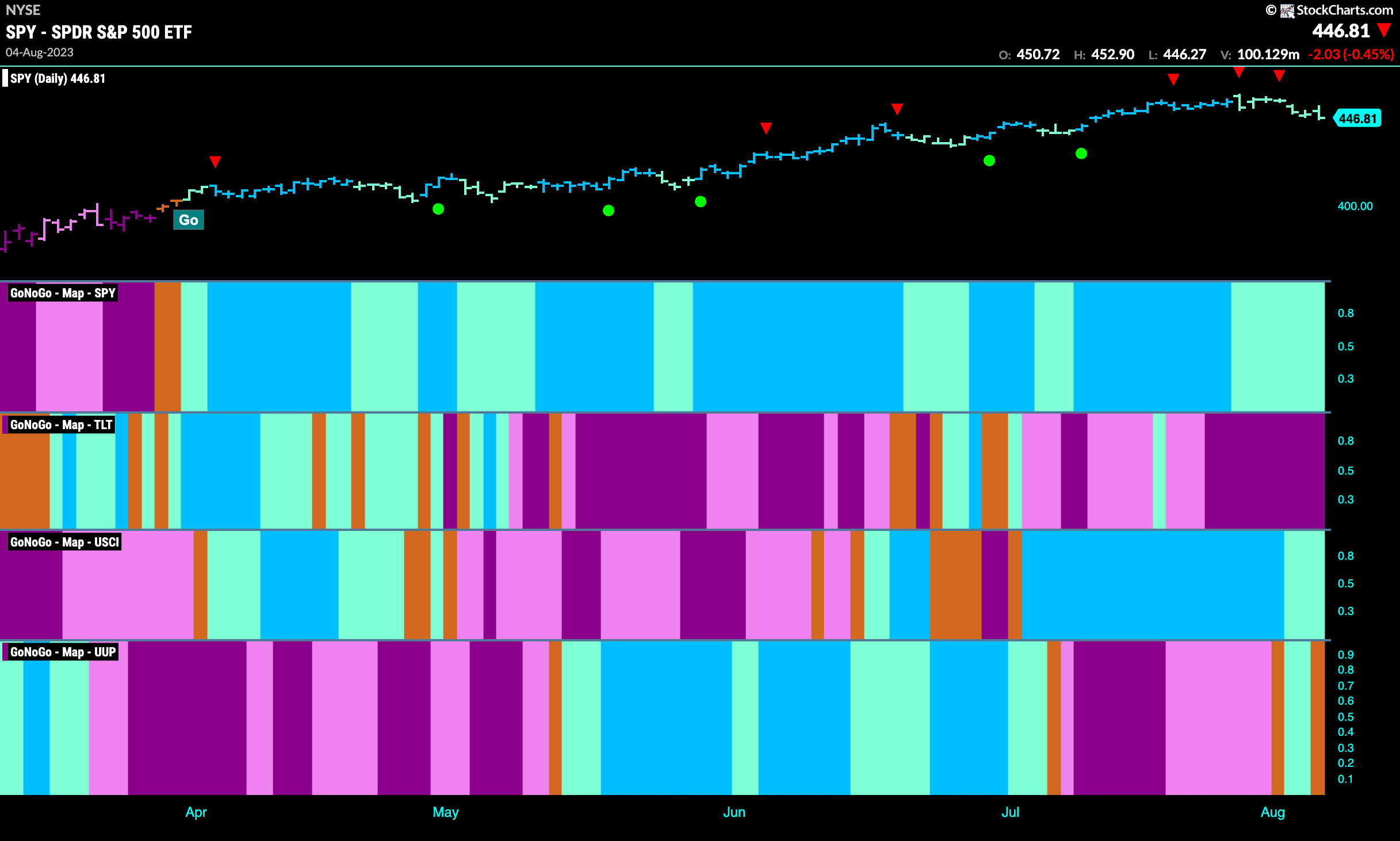
Good morning and welcome to this week’s Flight Path. The heat map shows that the “Go” trend in equities remained in place this week but the whole week painted weaker aqua bars as price continued to correct from the high. Treasury bond prices stayed put in the strong “NoGo” as commodities saw the “Go” trend weaken to aqua bars. The dollar saw a brief foray into a “Go” trend but almost immediately the market displayed some uncertainty as the week closed with an amber “Go Fish” bar.
Equities Correct From High
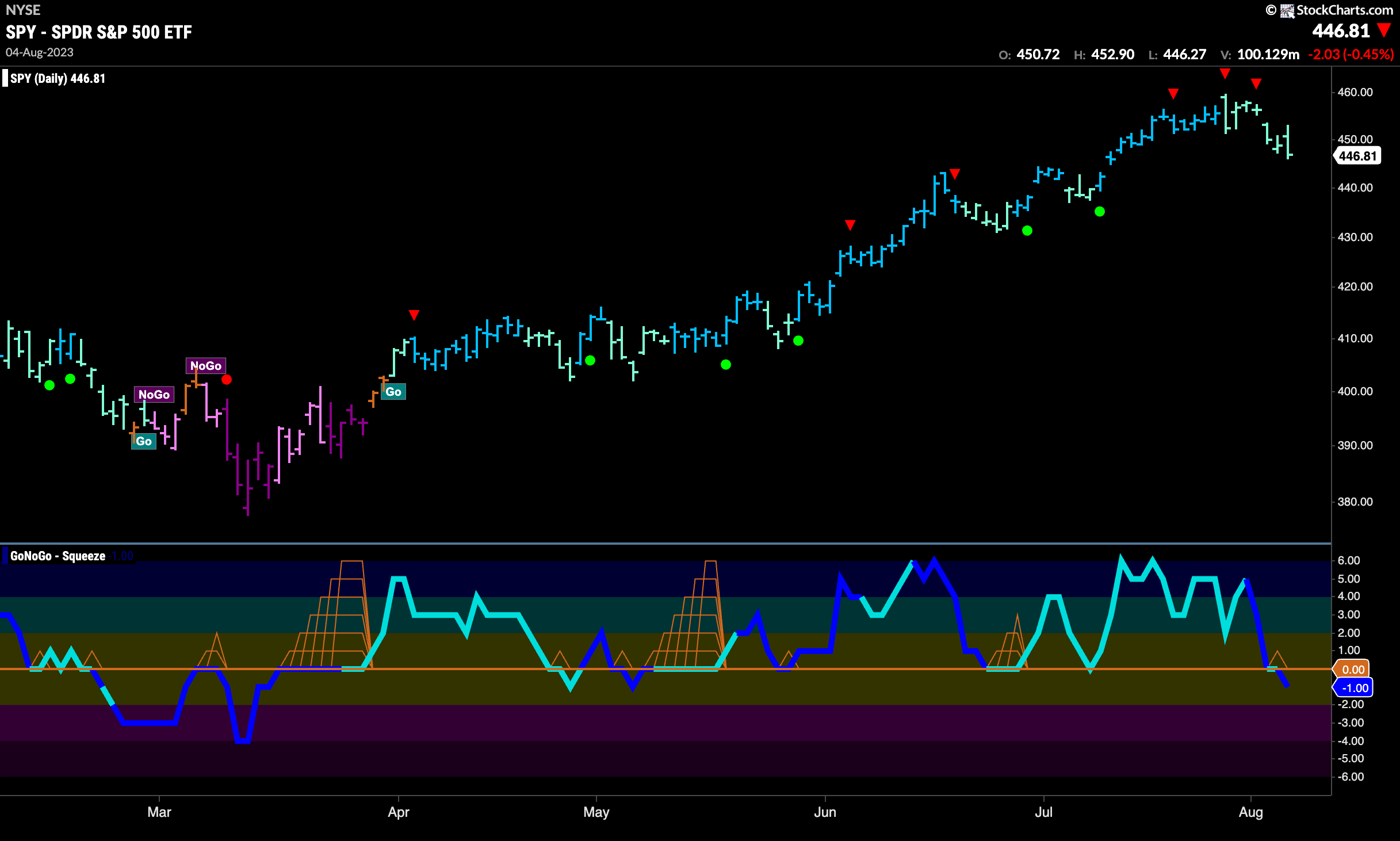
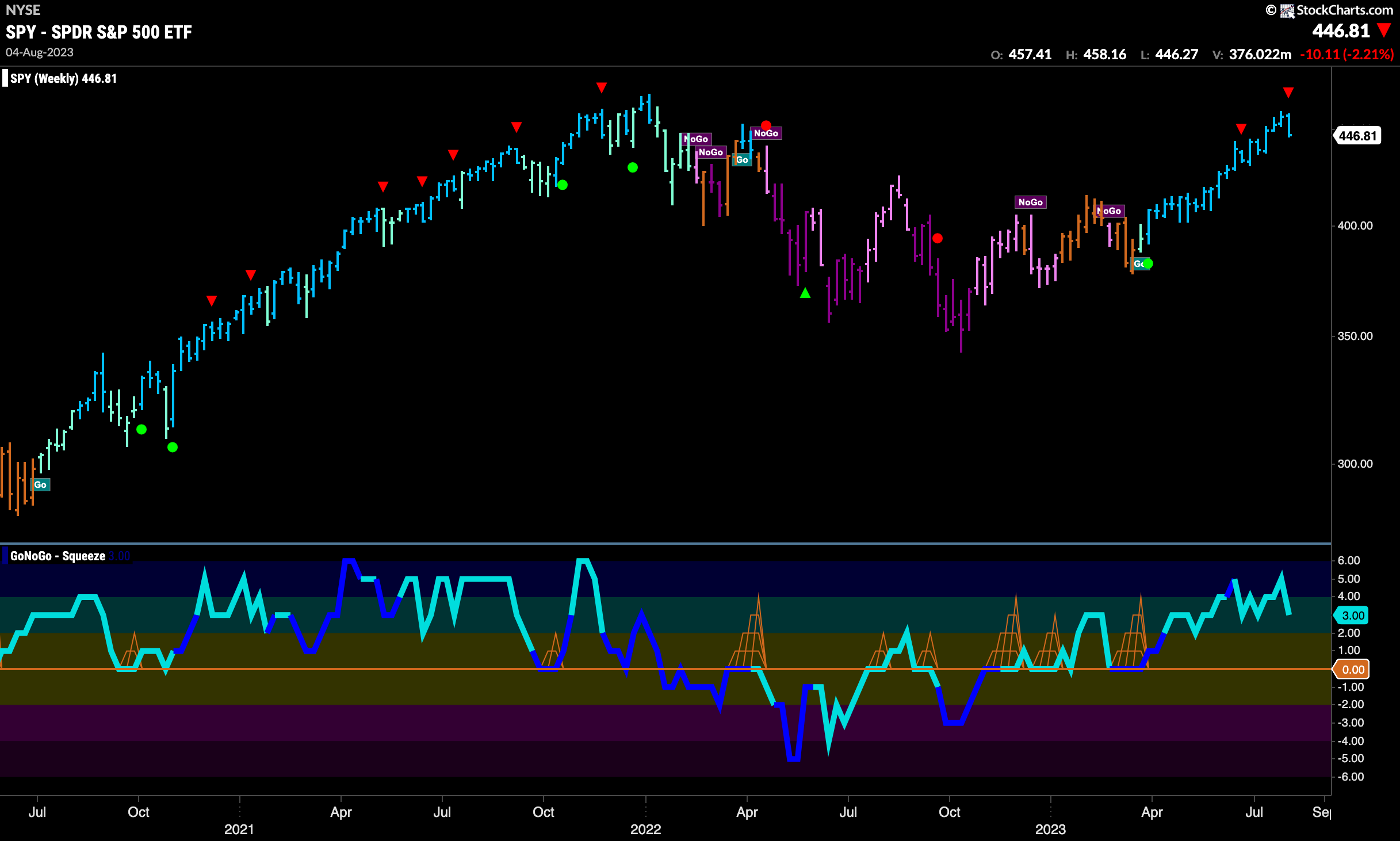
Last week we noted that equities were “hinting at weakness” and that was the case this week as price fell further from the high and we saw a string of uninterrupted weaker aqua “Go” bars. GoNoGo Oscillator also gave us cause for concern as it dipped into negative territory on the final day of the week and volume was heavy. We would like to see the oscillator move back into positive territory quickly to provide support to the “Go” trend.
The longer term weekly chart remains in a strong “Go” trend. Although last week’s bar was not good, it maintains the bright blue color of the strongest trend. GoNoGo Oscillator has come out of overbought territory now and is falling closer to the zero line.
Treasury Rates Fall on Final Day of Week
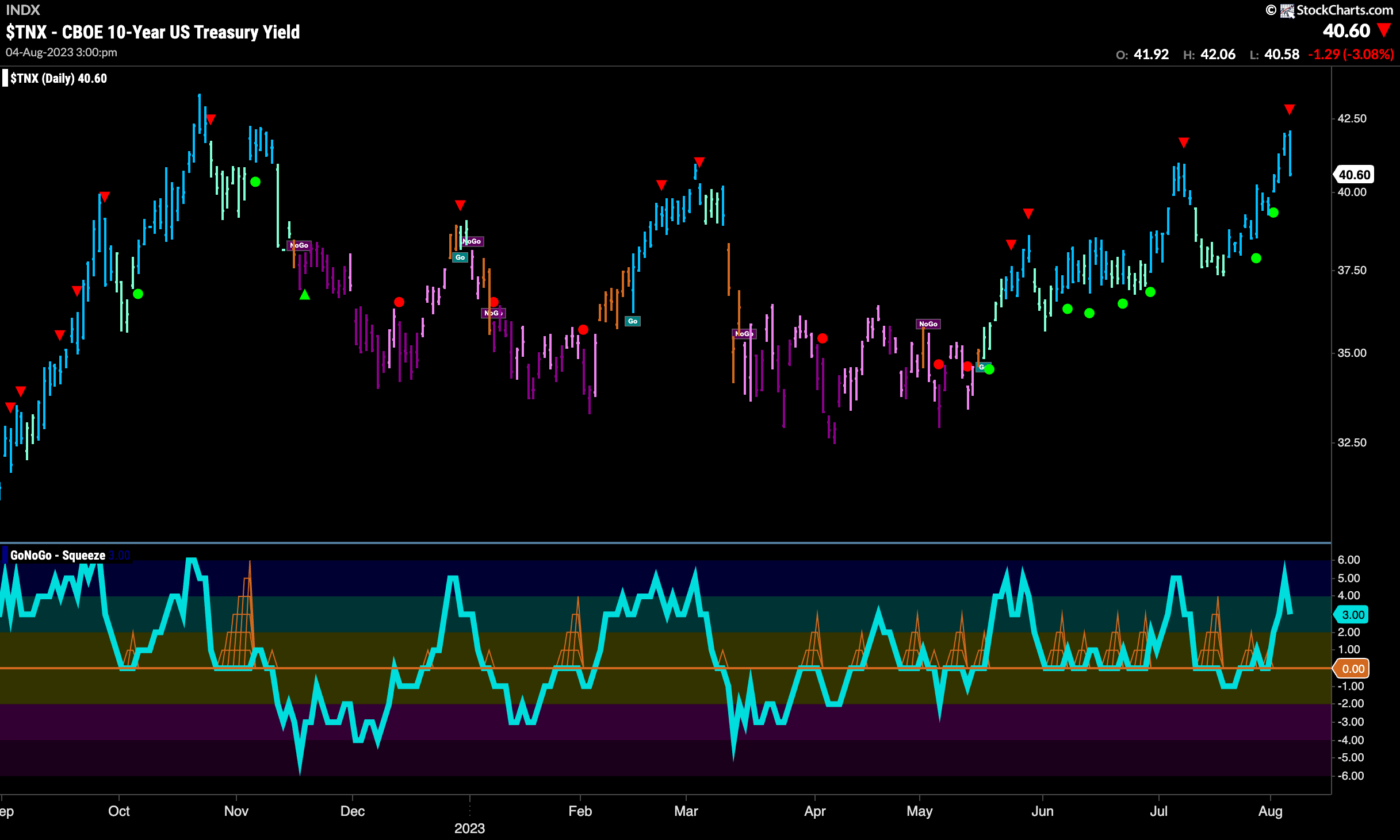
Treasury bond rates rose again this week hitting a new intermediate high but fell back on the last day of the week and we saw a Go Countertrend Correction Icon (red arrow) suggesting that price may struggle to go higher in the short term. GoNoGo Oscillator has moved out of overbought territory.
Dollar Fails as New “Go” Stumbles
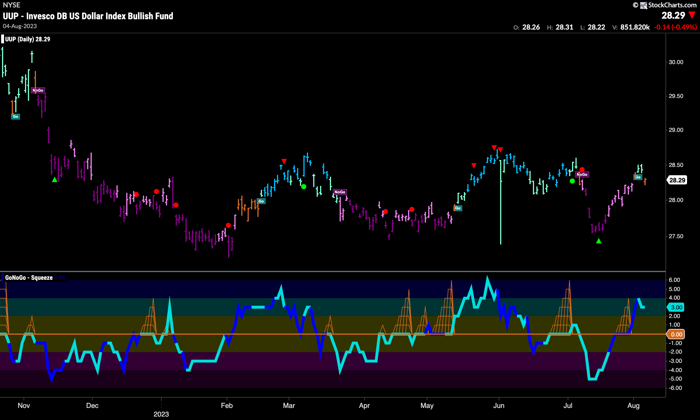
The dollar saw “Go” bars this week as it continued to rally from the lows it hit in July. At the end of the week however, we saw price gap lower and GoNoGo Trend painted an amber “Go Fish” bar. GoNoGo Oscillator is in positive territory still but not overbought and we will look to see if this new trend will survive.
Oil is On The Move
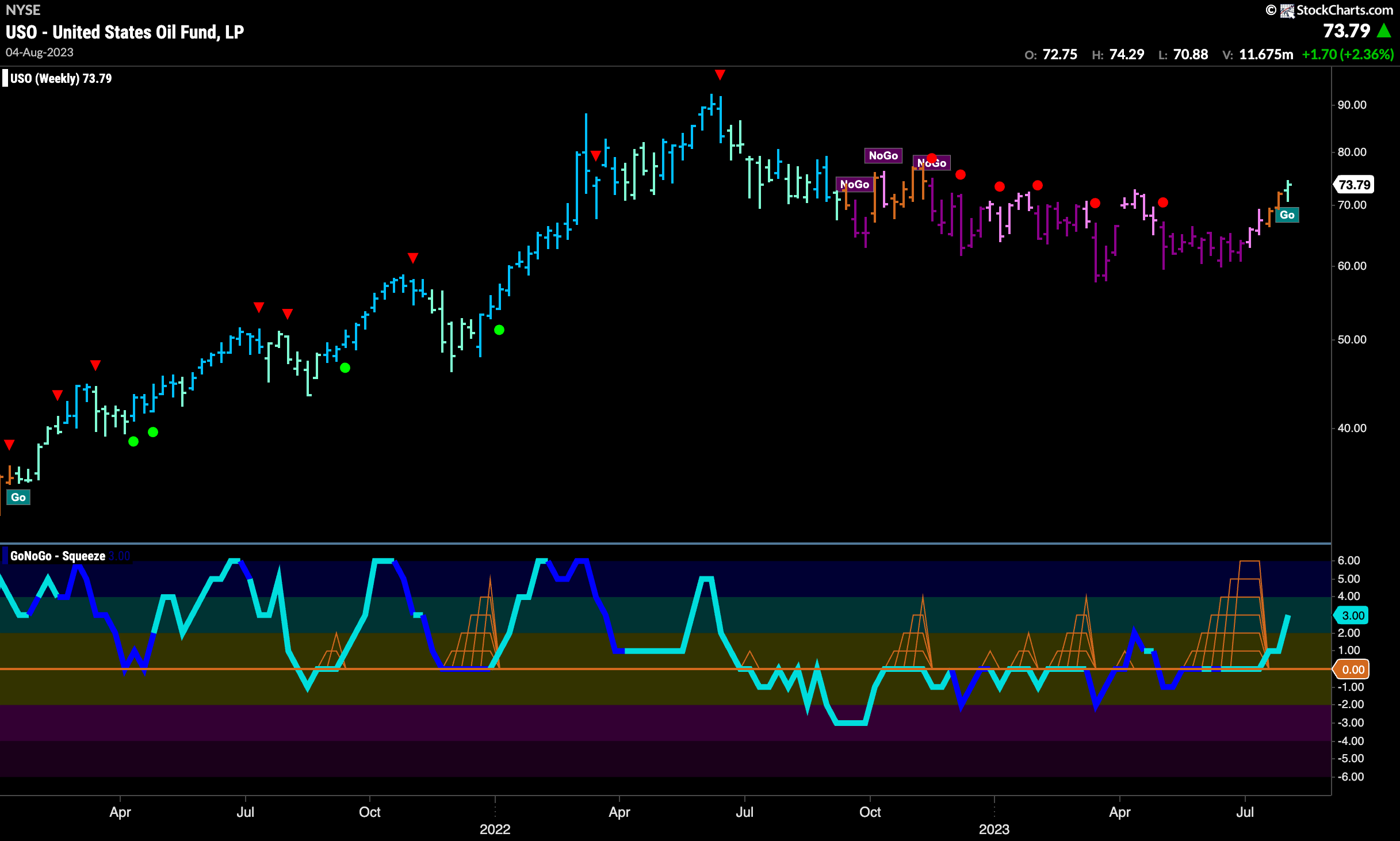
Oil prices continued to move higher this week and GoNoGo Trend was able to paint a “Go” bar, albeit the weaker aqua color. This comes after two weeks of amber bars as price tried to climb above downward sloping resistance. As we saw last week, GoNoGo Oscillator has broken out of a Max GoNoGo Squeeze and is moving further into positive territory. With momentum on the side of the new “Go” trend we will look for price to go higher.
Gold “Go” Trend Gives Way
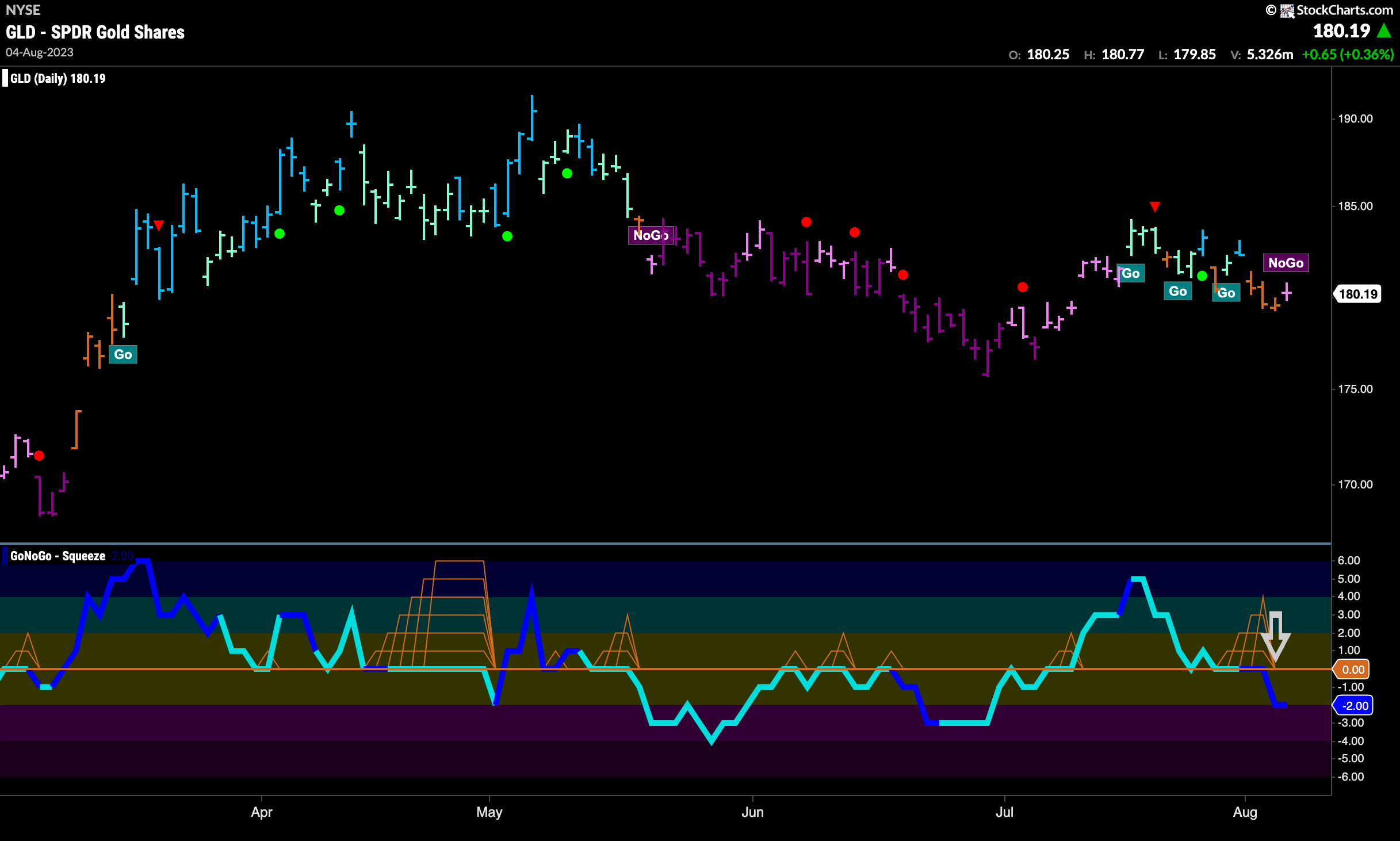
GoNoGo Trend painted several amber “Go Fish” bars this week and then ended with a pink “NoGo” bar. This was after GoNoGo Oscillator crashed below the zero line failing to find support at that level after days of trying. With GoNoGo Oscillator now in negative territory and volume heavy, we will look to see if the precious metal moves lower from here.
Sector RelMap
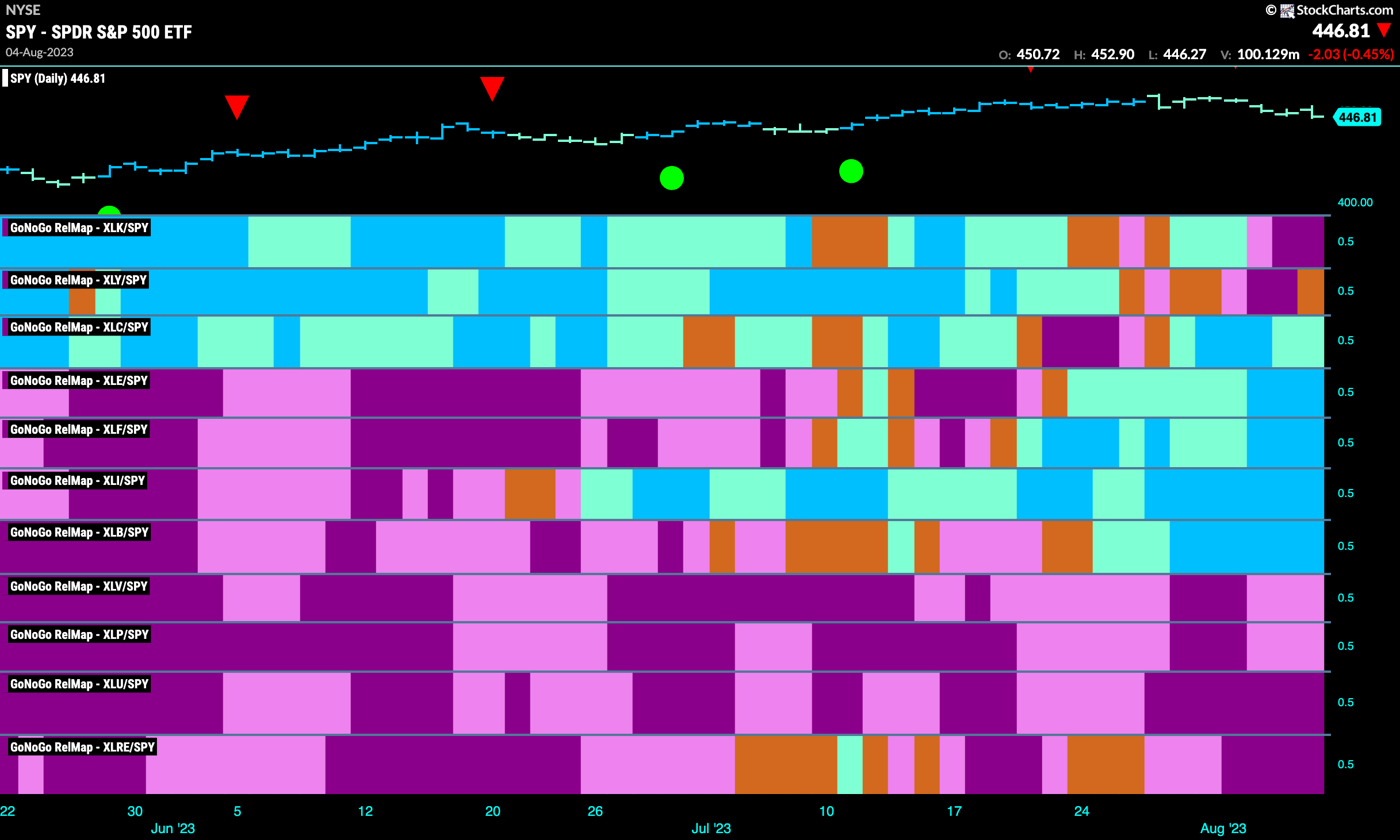
Below is the GoNoGo Sector RelMap. This GoNoGo RelMap applies the GoNoGo Trend to the relative strength ratios of the sectors to the base index. Looking at this map, we can quickly see where the relative outperformance is coming from as well as which sectors are lagging on a relative basis. 5 sectors are outperforming the base index this week. $XLC, $XLE, $XLF, $XLI, and $XLB are painting “Go” bars.
Energy Trying to Break Higher
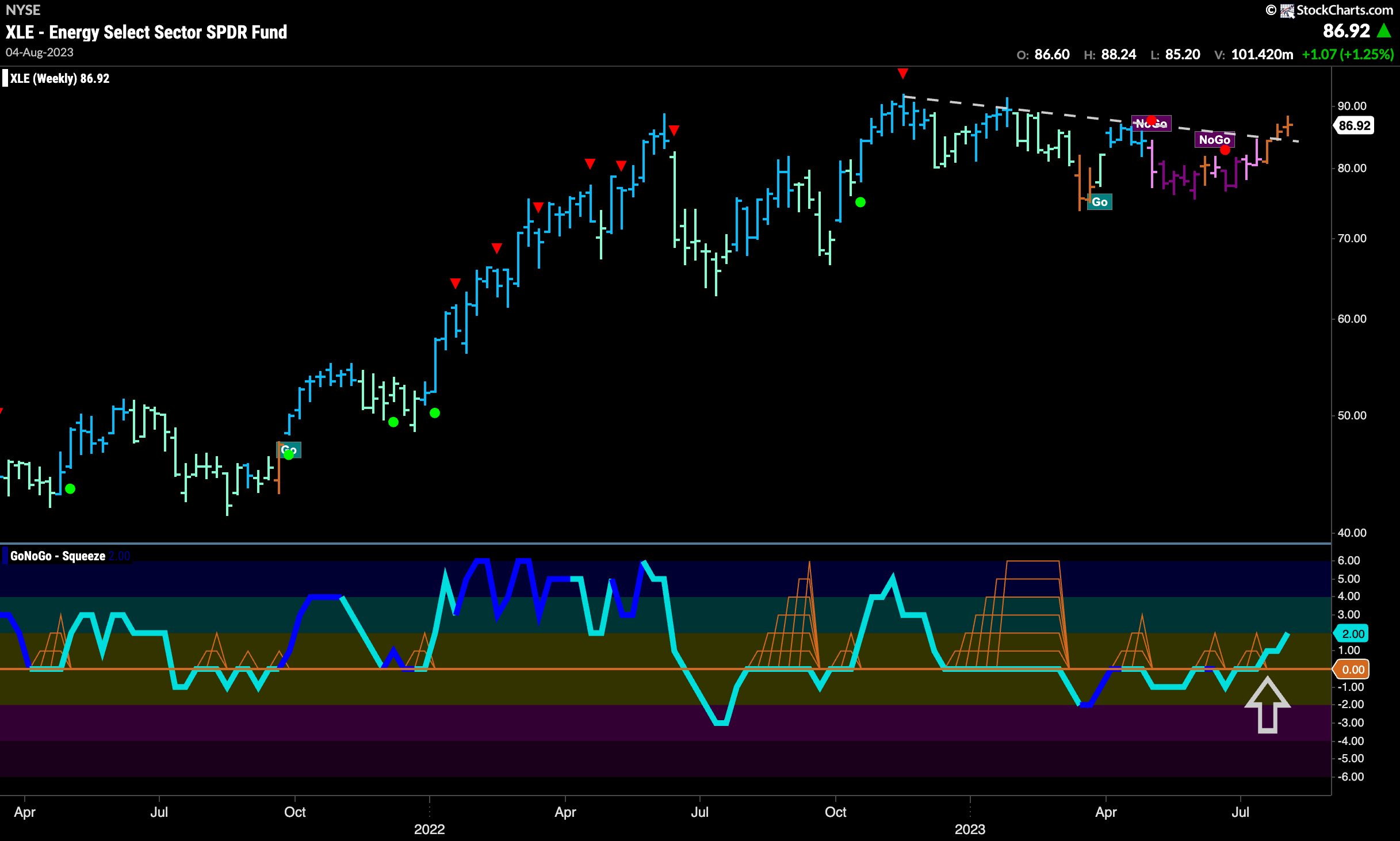
The GoNoGo Sector RelMap above showed that the energy sector is outperforming the S&P 500. Below is the weekly chart of the $XLE and we can see that price is trying to climb above downward sloping resistance. A lot like the $USO chart we looked at earlier, it hasn’t yet painted a “Go” bar but GoNoGo Oscillator is now in positive territory after overcoming resistance at the zero line.
Early Days for Energy Outperformance?
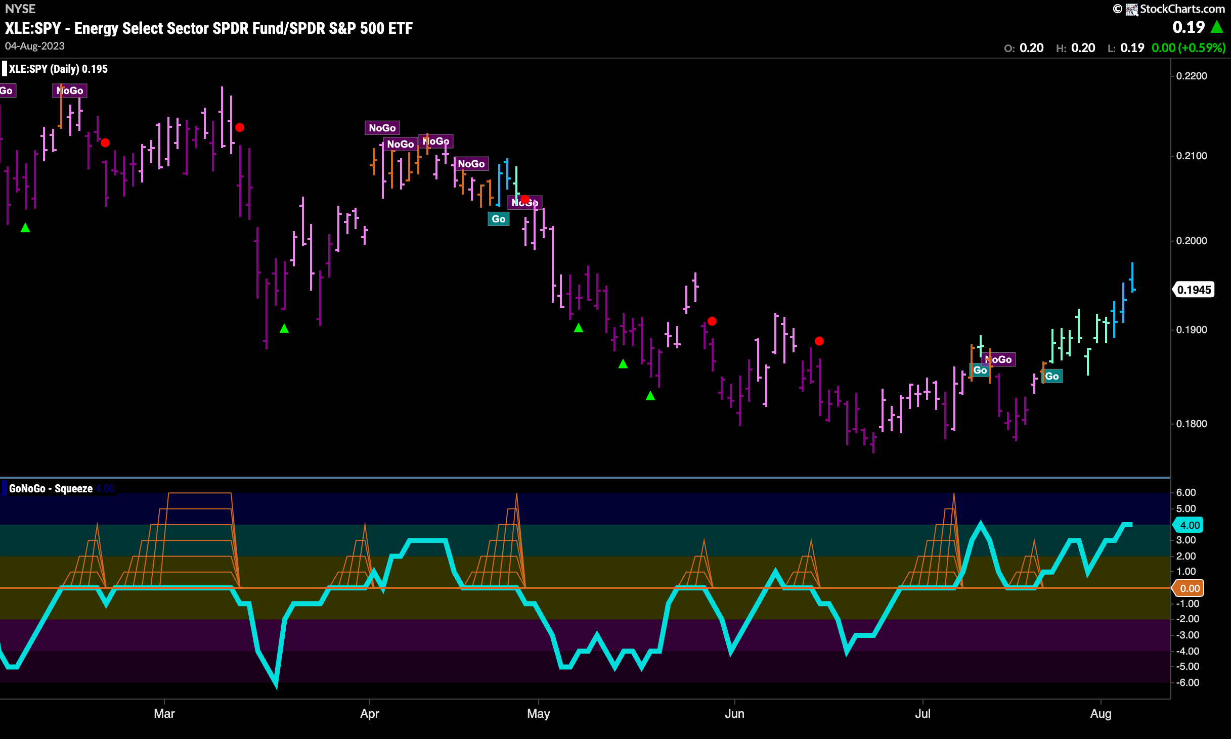
The GoNoGo Chart of the relative strength ratio between $XLE and $SPY shows that this “Go” trend may have some room to run. In early July we saw GoNoGo Oscillator move above the zero line and then has found support at that level since. GoNoGo Trend after painting several weaker aqua bars has now painted bright blue “Go” bars for 3 days in a row.
Energy Industry Group RelMap
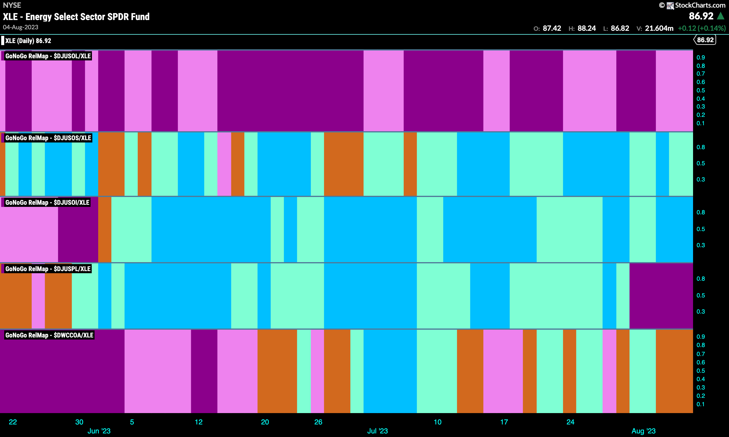
Within the energy sector, we can use a GoNoGo Industry Group RelMap to understand where the relative strength is coming from. Below we can see that the strongest sub group looks to be the oil and equipment services group (third panel). The trend has remained unbroken since late June and has recently strengthened once again to paint strong blue bars “Go” bars on a relative basis to $XLE. We can say that the oil and equipment services sub group is out performing within the outperforming energy sector.
Pump it Up!
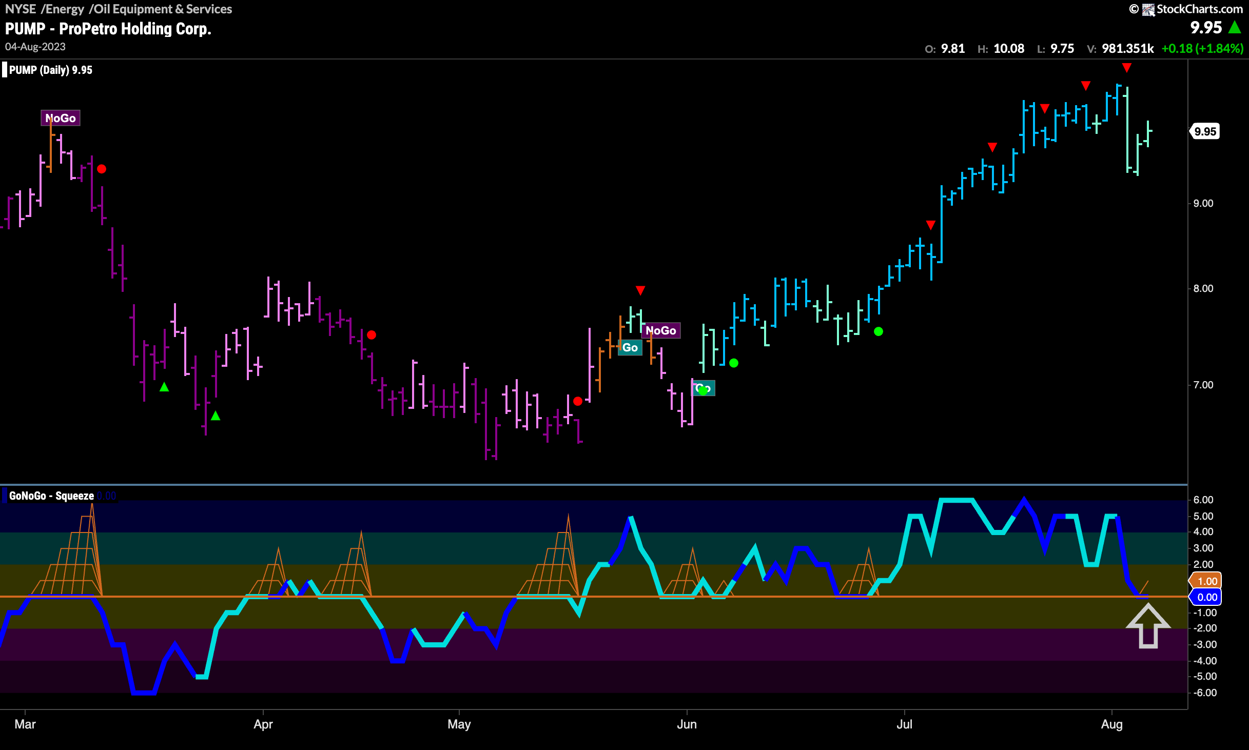
Within the oil and equipment services group there are several strong securities. Below is the chart of $PUMP and we can see that it is at an inflection point that may offer investors a buy the dip opportunity if the trend continues. GoNoGo Trend is painting aqua “Go” bars but has fallen from the recent high. GoNoGo Oscillator is testing the zero line from above and volume is heavy. If the oscillator finds support at this level we will be able to say that momentum is resurgent in the direction of the “Go” trend and will look for price to make an attempt at a new high.
$TUSK Trends Higher
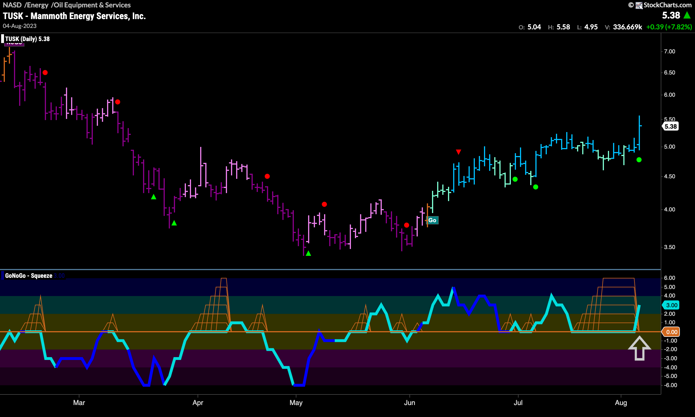
The chart below shows the price chart of $TUSK and we can see that it has found the surging momentum we were looking for with $PUMP. A “Go” trend has been in place since early June, but price had been moving mostly sideways more recently. This had caused GoNoGo Oscillator to fall to the the zero line where it stayed allowing the climbing grid of GoNoGo Squeeze to rise to its Max. This reduced volatility situation makes us look for a breakout. The breakout has happened into positive territory which tells us that momentum is back in the direction of the “Go” trend.
