Good morning and welcome to this week’s Flight Path. As we can see from the Asset Map below, equities held on to the “Go” trend but we saw price fall lower and GoNoGo Trend paint weaker aqua bars as the index failed to go higher. Treasury bond prices returned to a strong “Go” trend as the week came to a close and commodities rolled over into a “NoGo”. No change for the U.S. dollar as we saw more strong “NoGo” bars this week.
Equities Failed to Make a New High
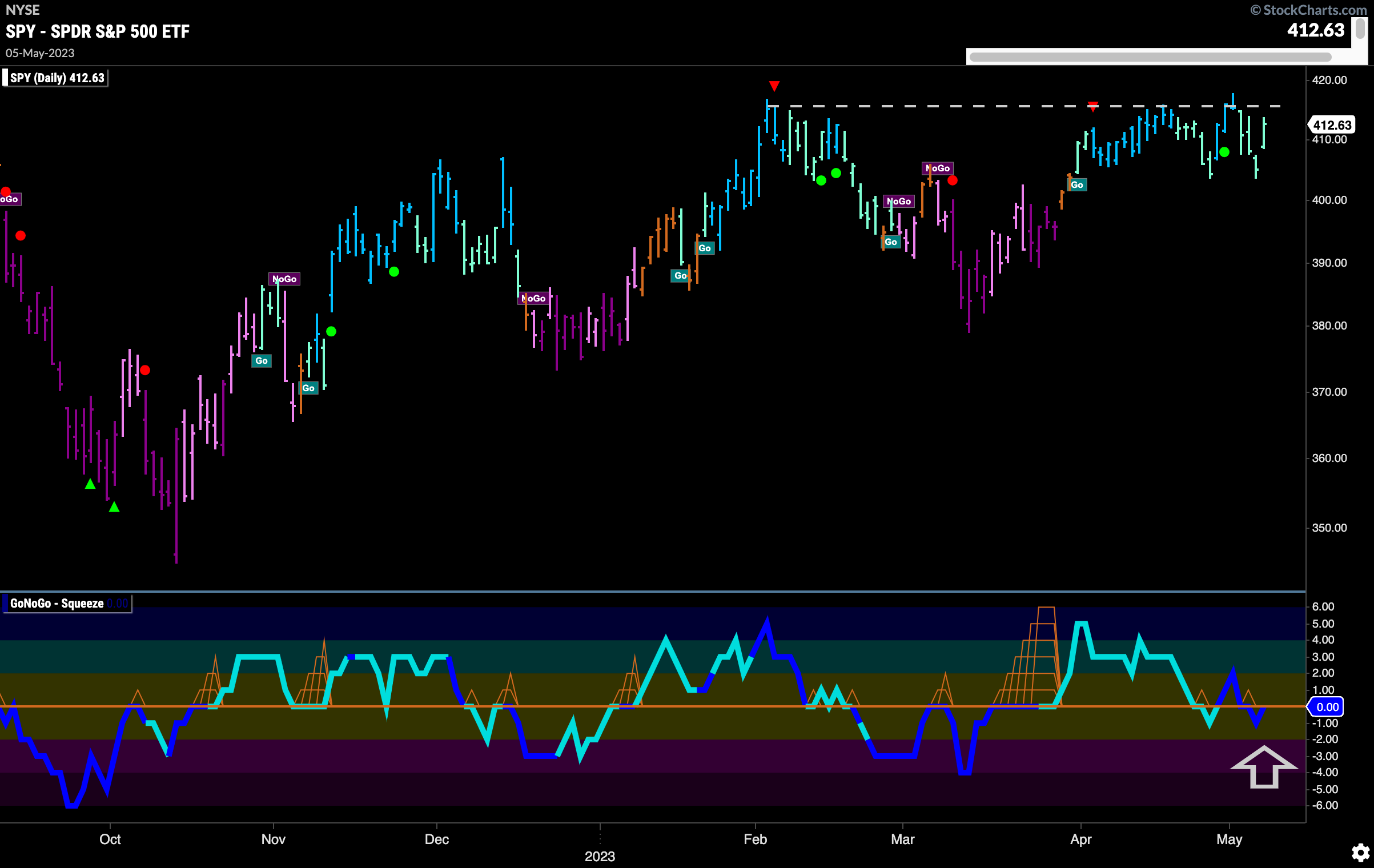
Horizontal resistance that we see on the chart is proving to be a hard level for price to climb past. After failing again at that level this week, we saw GoNoGo Oscillator fall back and quickly dip into negative territory on heavy volume. The last trading day of the week saw strength and so the oscillator is right back at zero once again. We will watch to see if it gets rejected here or if it can break back into positive territory.
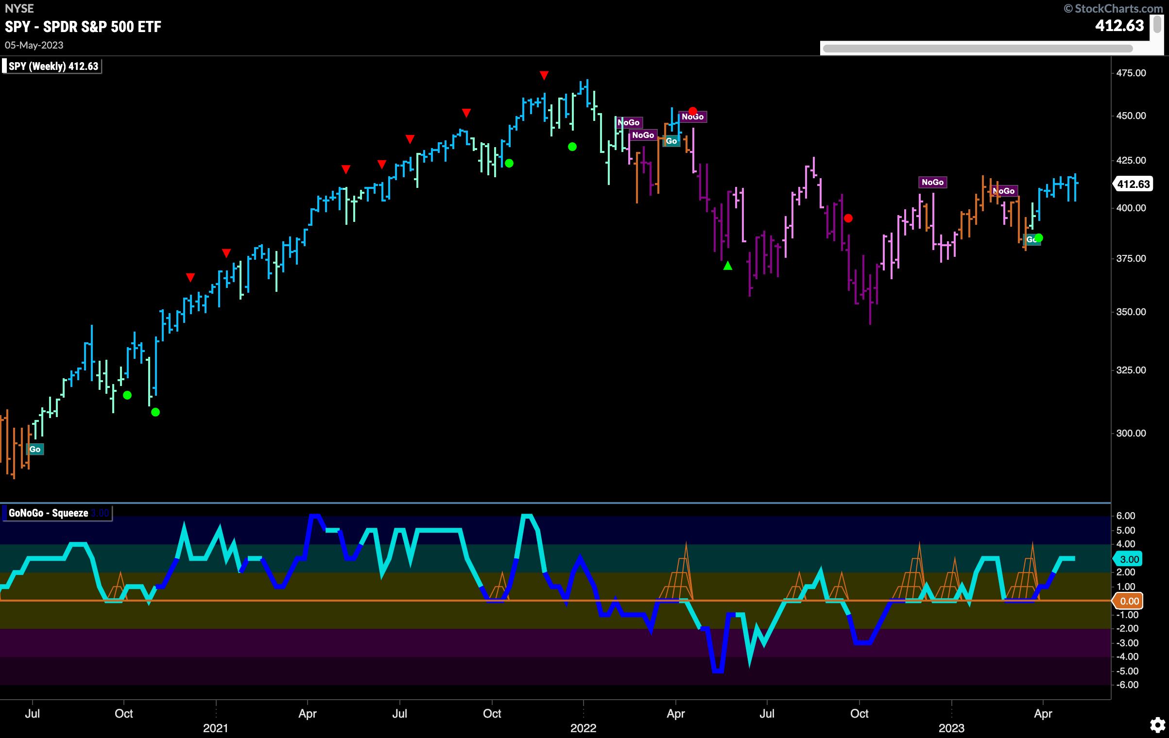
The longer term weekly chart continues to be bullish. We see GoNoGo Trend paint another strong blue “Go” bar as price continues to test prior levels of resistance. We are seeing a series of higher lows and would like to see price break higher to set a new higher high as well. GoNoGo Oscillator is well into positive territory but not yet overbought. With momentum on its side, we will watch to see if the “Go” trend can continue to move forward.
Treasury Prices Continue to look Bearish
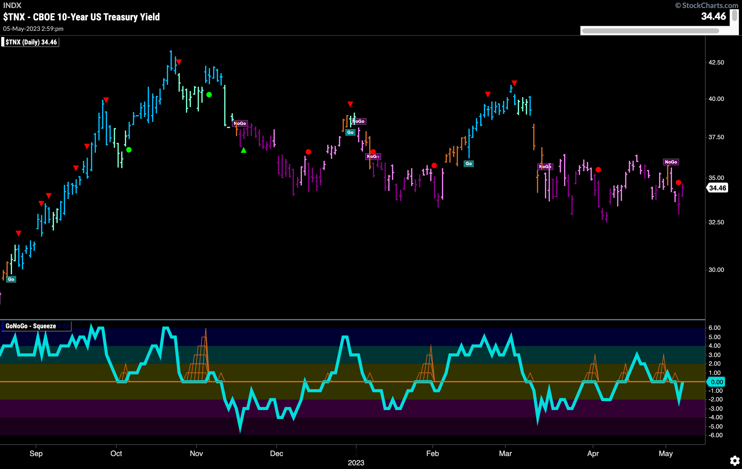
Treasury rates fell away from the lone amber “Go Fish” bar we saw to start the week and so returned to paint bearish pink and purple “NoGo” bars. GoNoGo Oscillator which had moved into positive territory reverted back to negative territory and is now testing the zero line from below where we will watch to see if it finds resistance or can break back into positive territory.
Dollar “NoGo” Trend Remains as Momentum Neutral
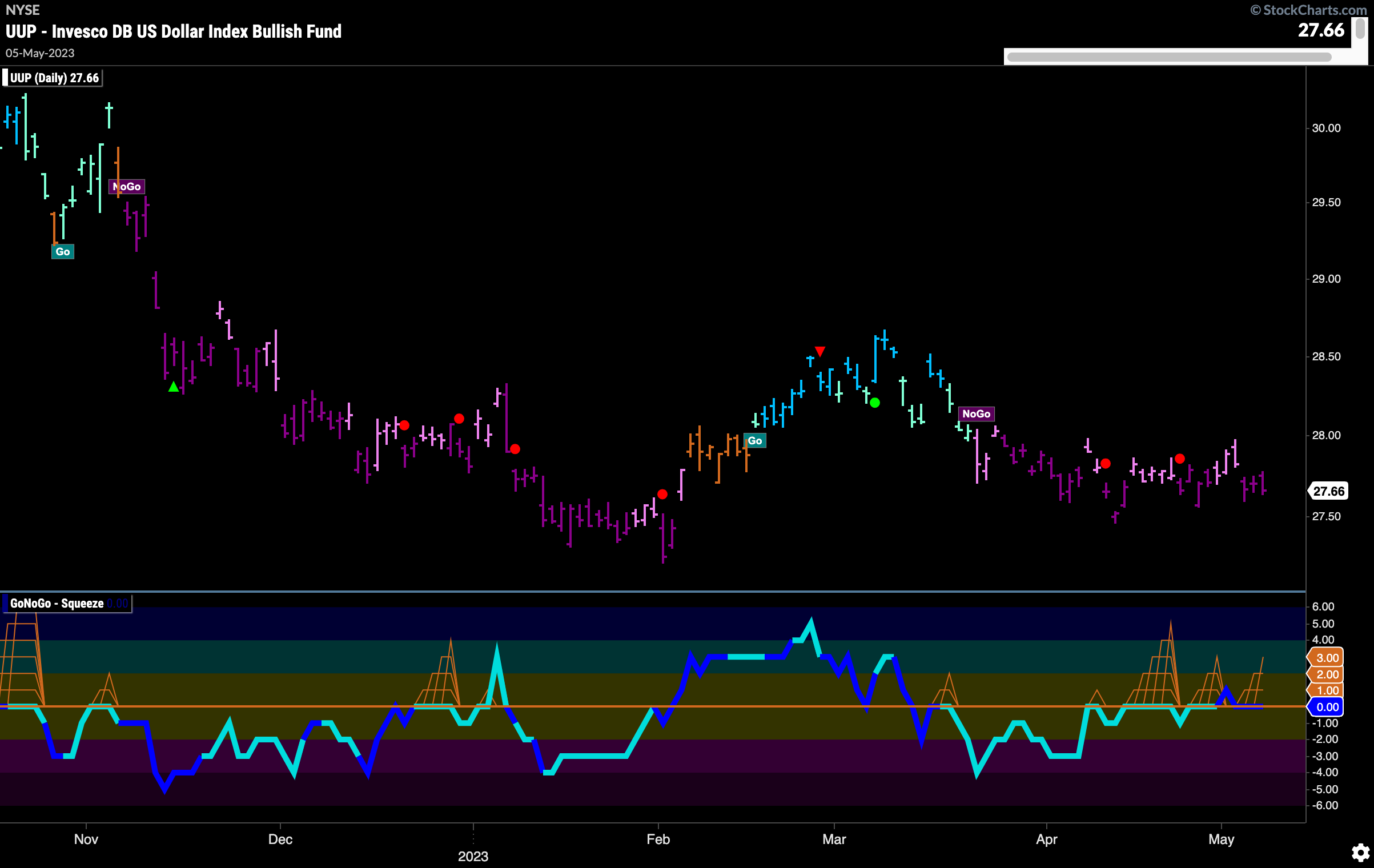
GoNoGo Trend finishes the week painting more strong purple bars. While the trend remains clearly a “NoGo”, price has not made new lows for some time and is moving mostly sideways. GoNoGO Oscillator shows this tug of war as it is spending much of the time at or around the zero line. We have seen several GoNoGo Squeeze builds but fail to reach a Max. Currently, the oscillator is back at zero and has been for a couple of bars. We will watch closely to see in which direction momentum shifts.
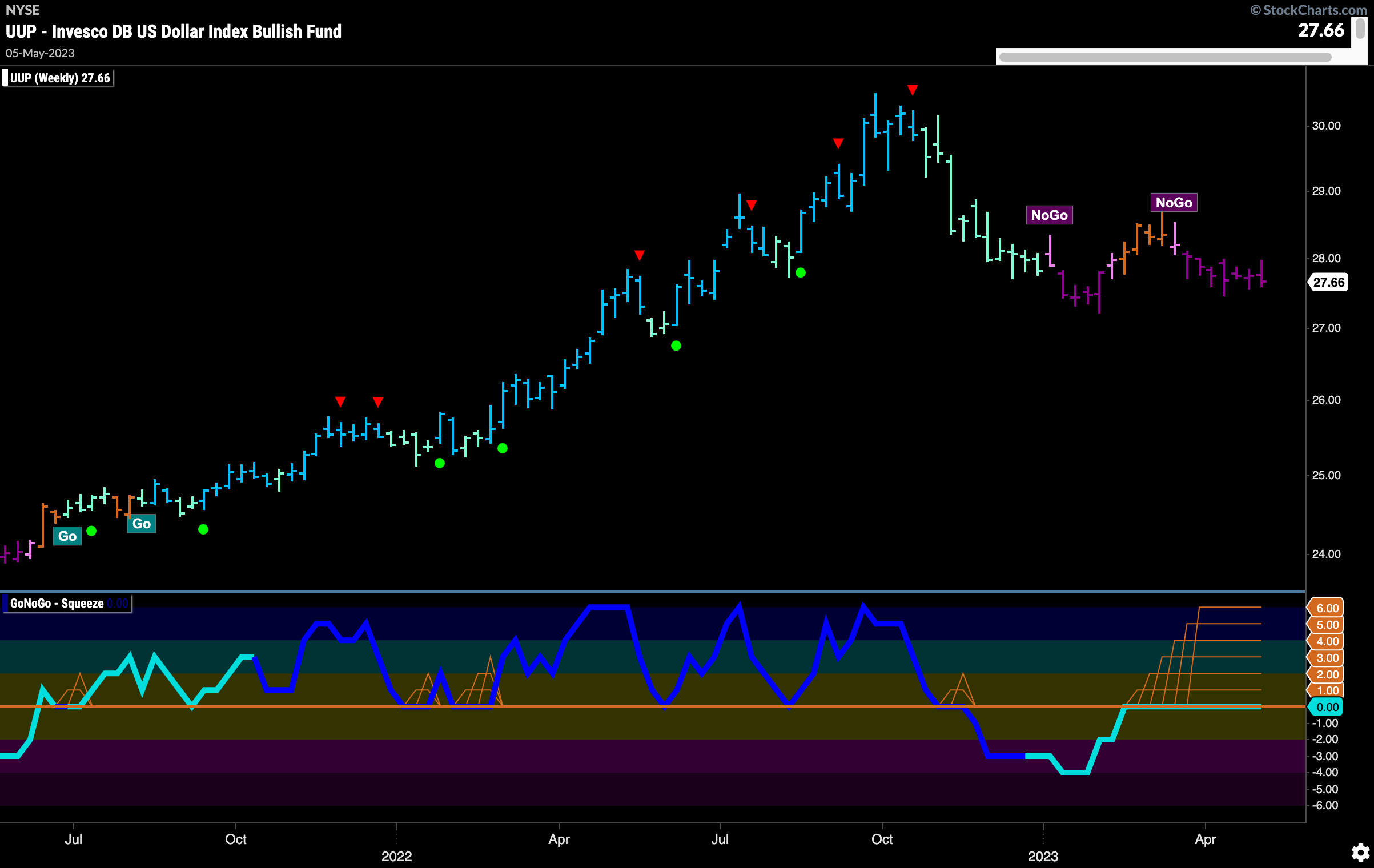
The weekly chart tells us the battle between buyers and sellers rages on. Another week with the GoNoGo Oscillator stuck at the zero line as we see an extended Max GoNoGo Squeeze. If and when this Squeeze is broken it will surely have consequences for price action. A break out of the Squeeze to the downside would suggest an attempt at a new low in the current “NoGo” trend.
Oil Prices Move Lower
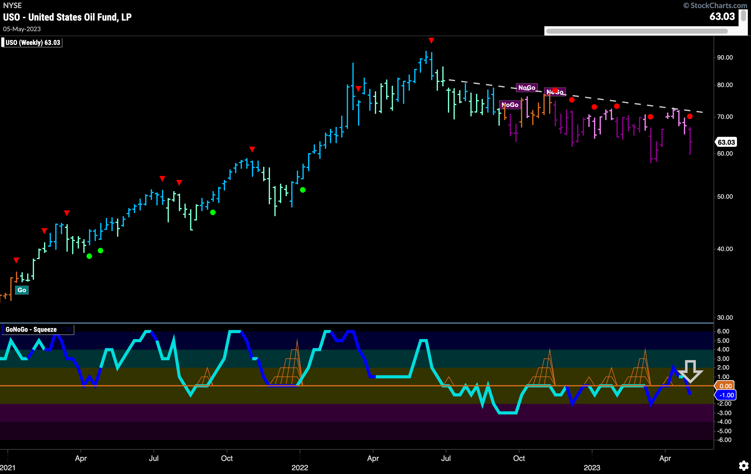
$USO sees the “NoGo” strengthen as the week paints a strong purple bar. As GoNoGo Oscillator breaks back below the zero line we can see a NoGo Trend Continuation Icon (red circle) above price indicating renewed momentum in the direction of the “NoGo” trend. GoNoGo Oscillator is also dark blue telling us that volume is heavy, representing market participation in the move lower.
Gold Makes Valiant Effort
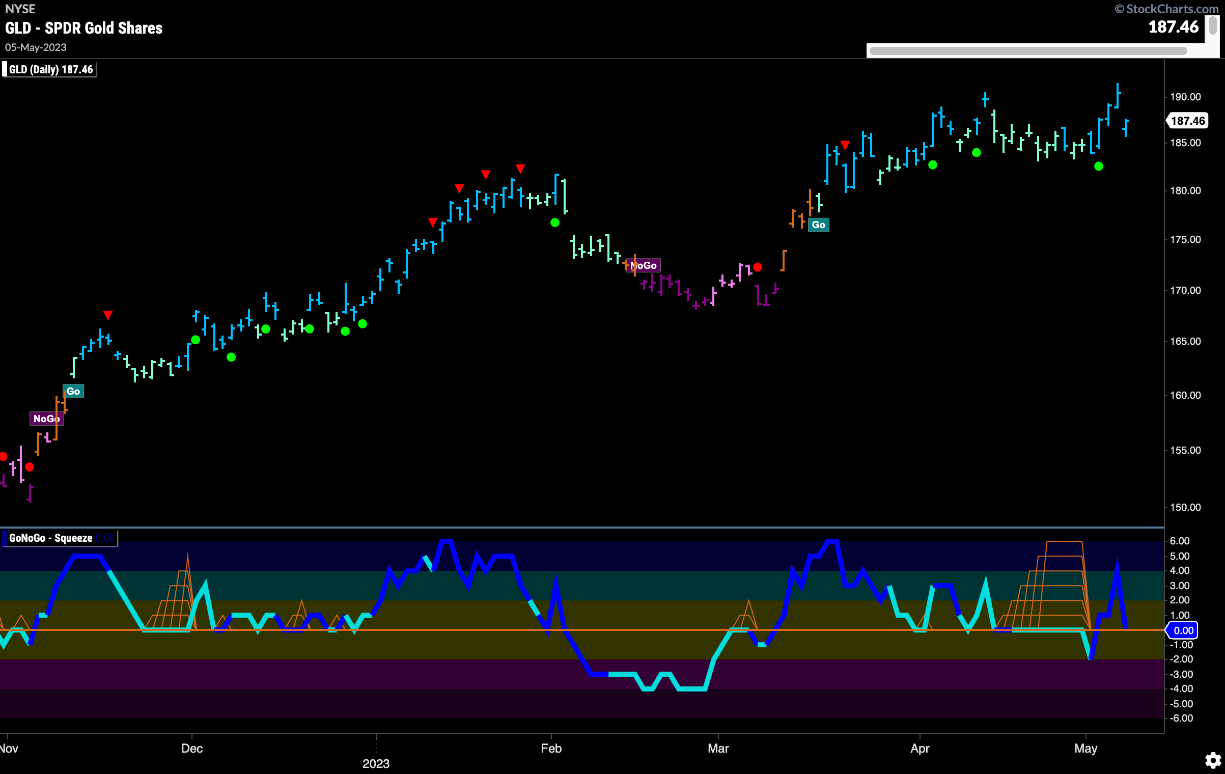
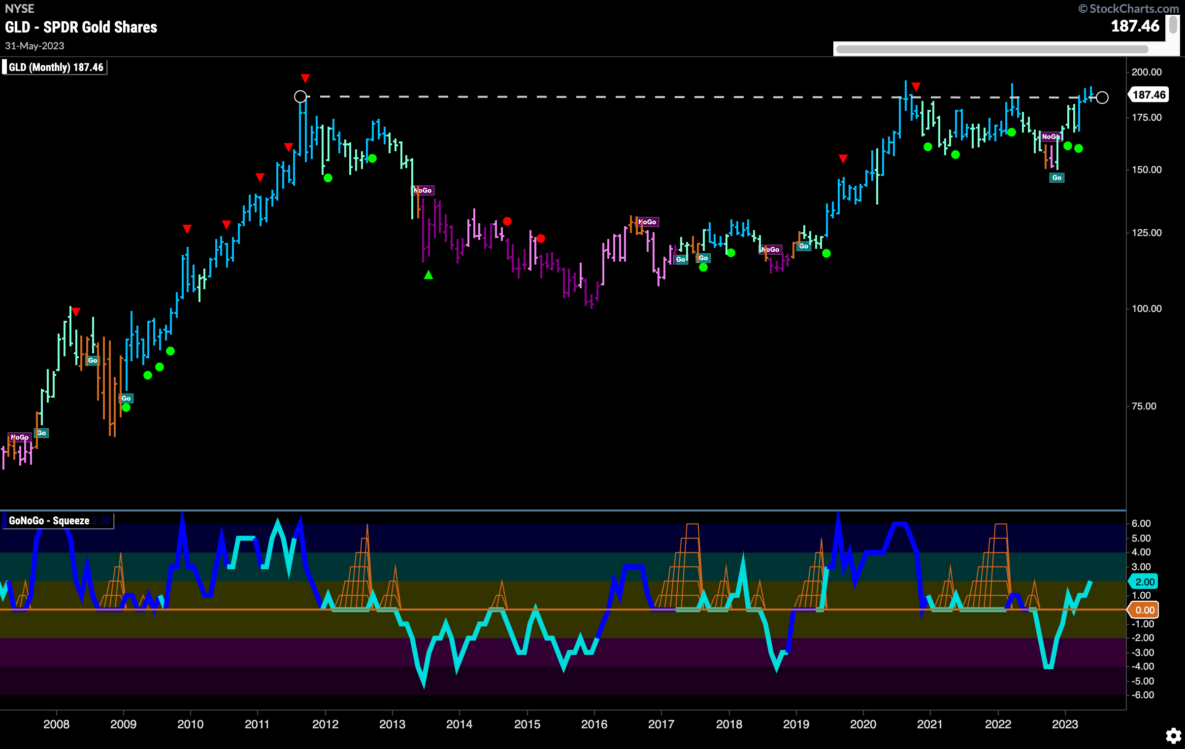
$GLD boldly attempted to move higher again this week and did make a slightly higher high on a daily closing basis. Friday saw price quickly retreat though as if the effort was just too much. Still painting strong blue “Go” bars, and with the GoNoGo Oscillator testing the zero line from above on heavy volume, we will watch to see if price can consolidate and make another go of it this week.
The monthly chart below shows just how close price is to a break out. Again, flirting with all time highs, we will keep an eye on this long term chart to see if it happens. GoNoGo oscillator broke through the zero lien several months ago and then tested that level the very next month. Now, up to a value of 2, it suggests that momentum is behind price’s effort to go higher. We will watch to see where the month of May closes with great interest.
Sector RelMap
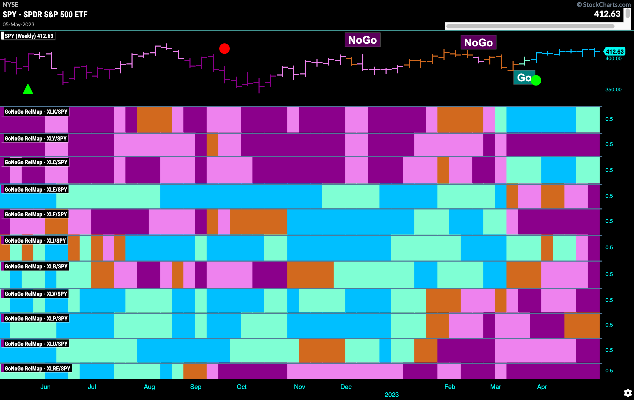
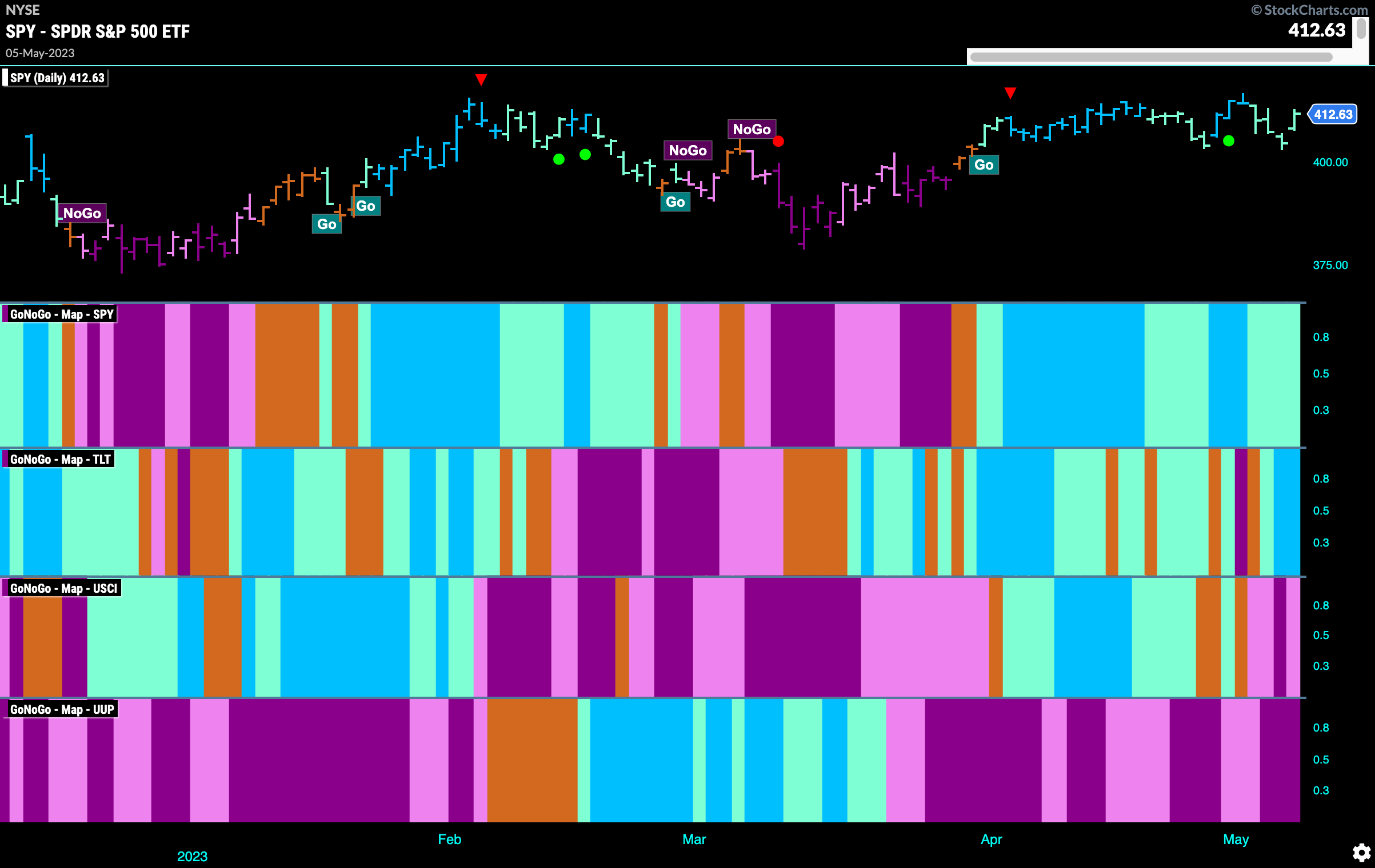
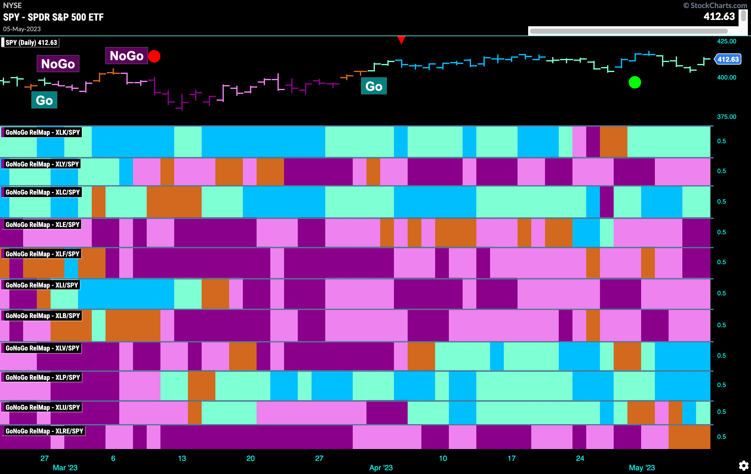
Below is the GoNoGo Sector RelMap. This GoNoGo RelMap applies the GoNoGo Trend to the relative strength ratios of the sectors to the base index. Looking at this map, we can quickly see where the relative outperformance is coming from as well as which sectors are lagging on a relative basis. 5 sectors are outperforming the base index this week. $XLK, $XLC, $XLV, $XLP, and $XLU are painting “Go” bars.
Weekly Sector RelMap
As we learned at the CMT Symposium in New York at the end of last month, there is reason to believe that markets may be choppy and slide sideways for some months. Therefore, let’s back out and look at a longer term GoNoGo Sector RelMap to save ourselves the messy details of a daily chart. We can see a clear picture below. It is technology and communications that have emerged over the last several months as the leaders of this market. On a relative basis, these two sectors are in “Go” trends.
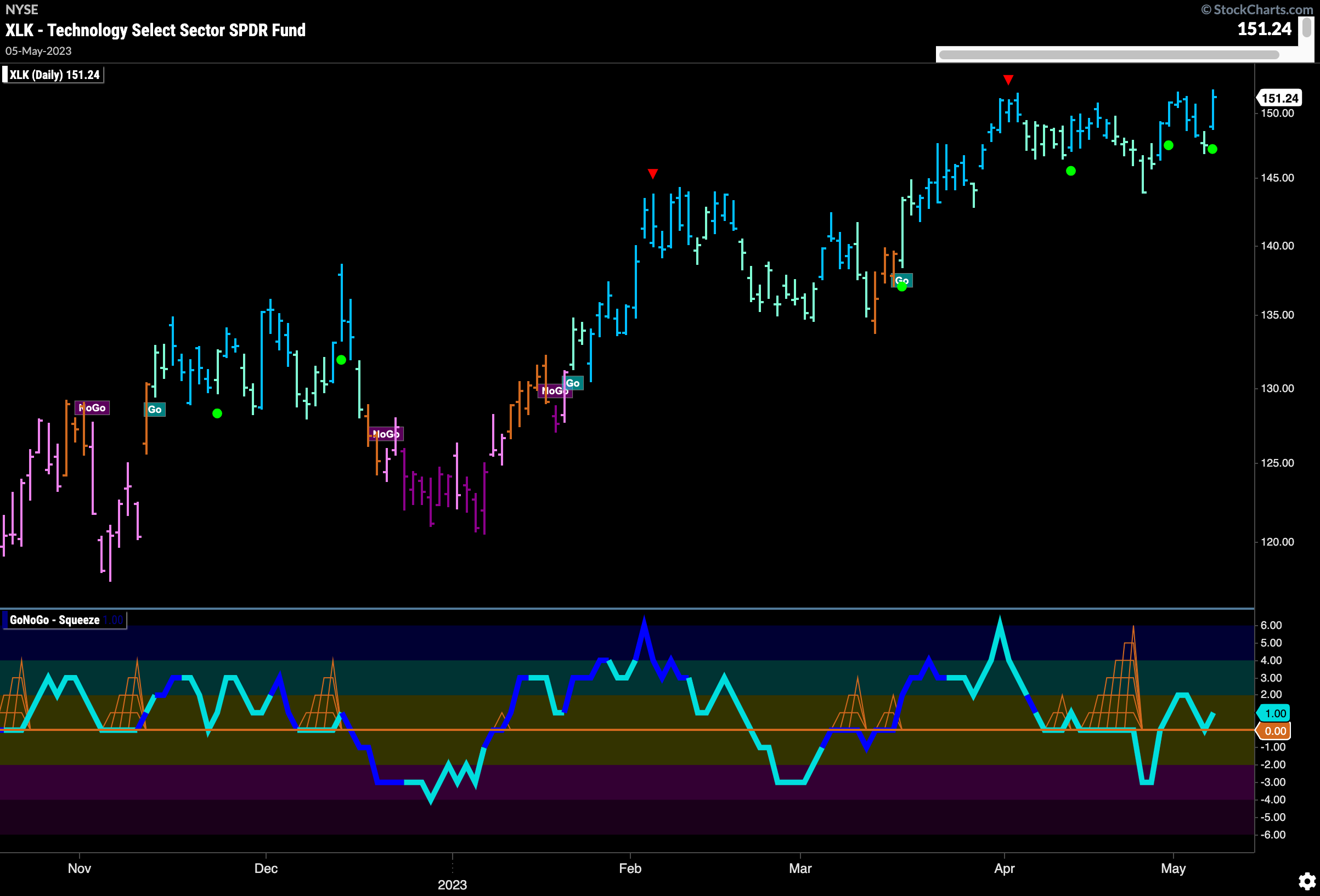
Jumping into the technology sector’s GoNoGo chart we can see this “Go” trend on a daily basis. As price tries to move to new highs we can see that GoNoGo Trend is painting strong blue bars. GoNoGo Oscillator has burst back into positive territory and has quickly retested that level and has found support. This has triggered a Go Trend Continuation Icon (green circle) to appear under the price bar informing us that momentum is returning in the direction of the “Go” trend. We will watch to see if this gives price the push it needs to make new higher highs.
Technology Sub-Industry Group RelMap
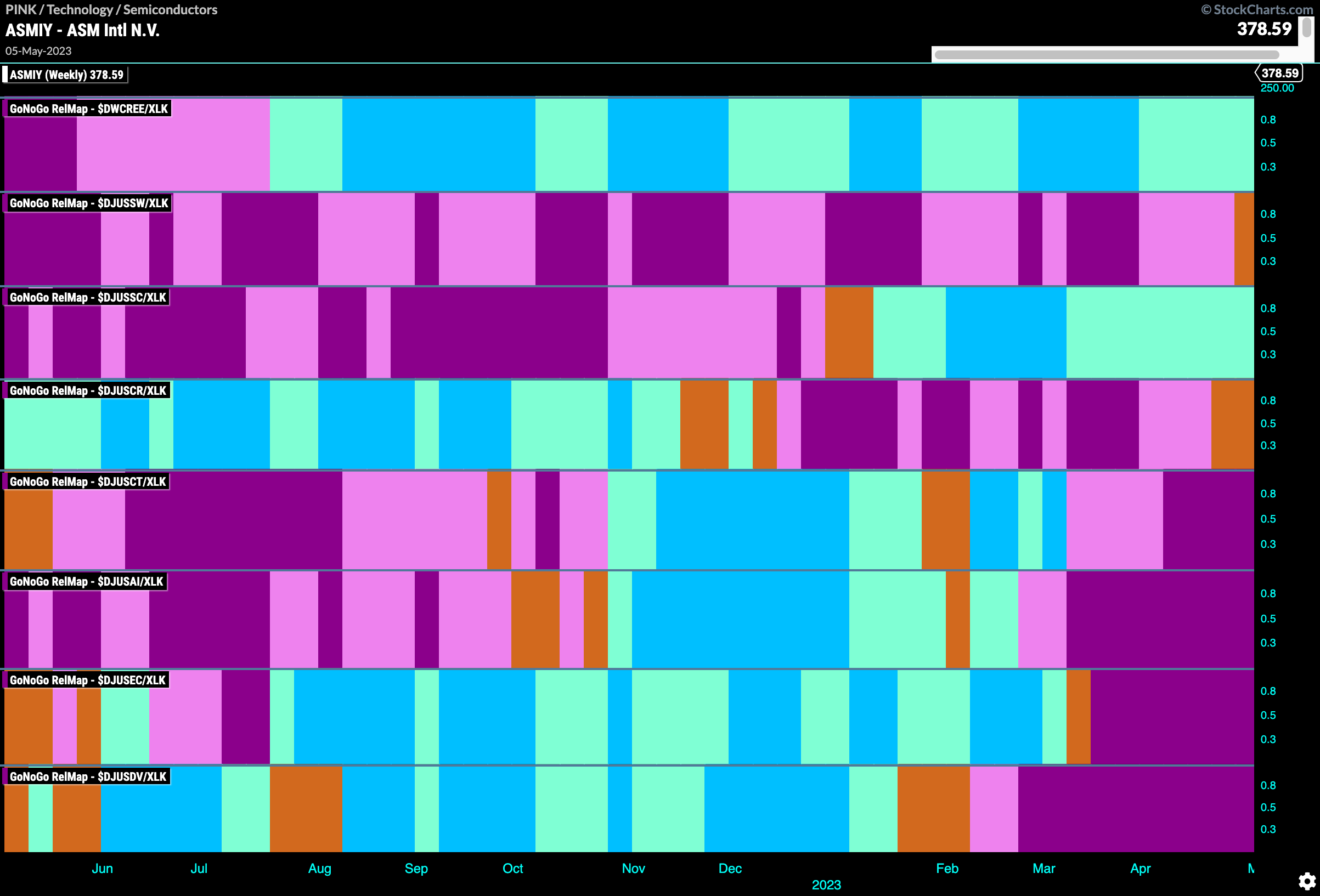
If we break down the technology sector in terms of sub group relative performance also on a weekly basis we can see that the outperformance is currently being driven by two groups. Renewable technology and semiconductors (third panel).
$ASMIY Showing Uncertainty in Larger Trend
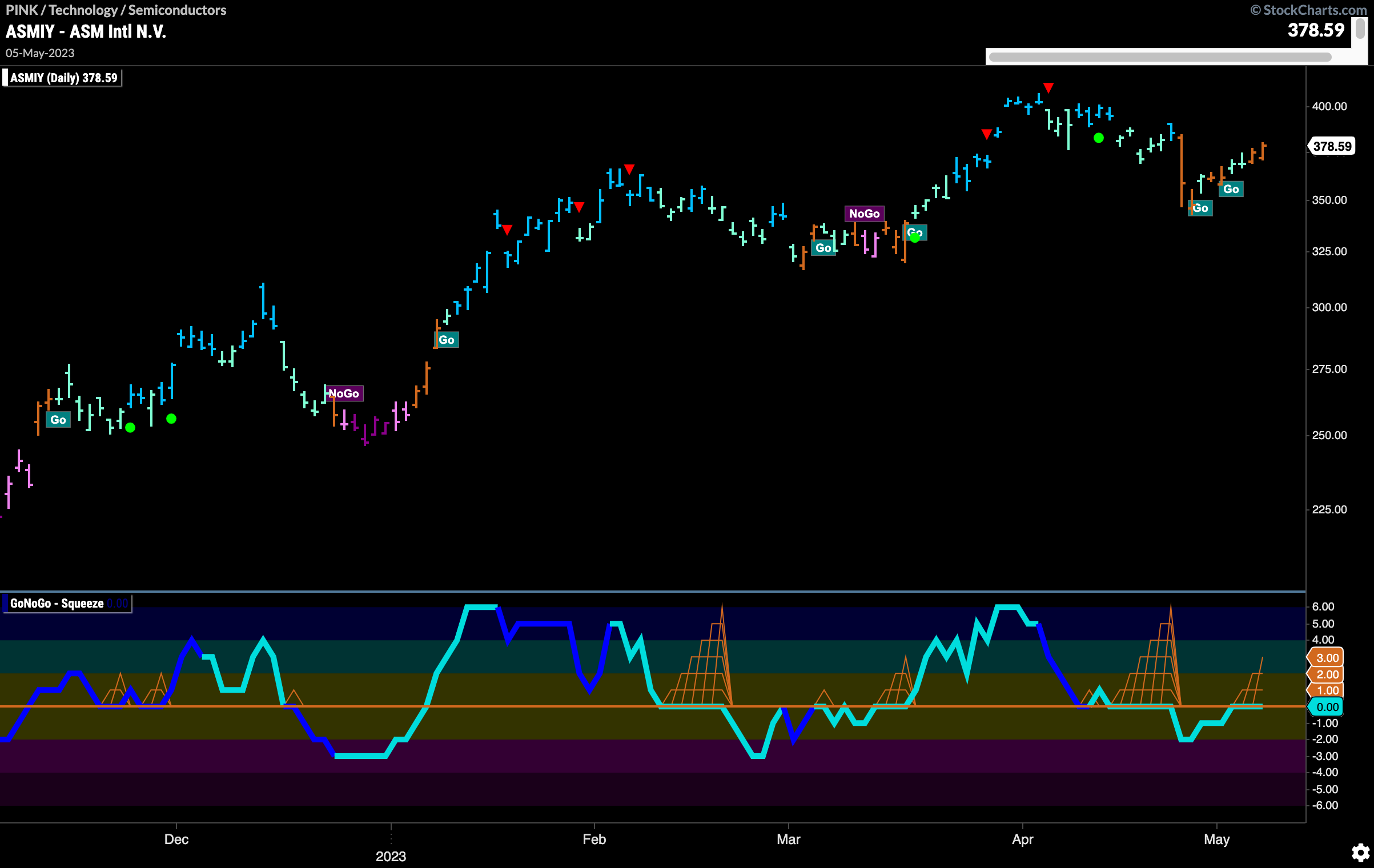
Looking at a stock in the semi conductor space that has an interesting GoNoGo Setup we have the chart below of $ASMIY. We can see that after hitting a higher high earlier in April we saw a Go Countertrend Correction Icon (red arrow) which suggested prices may struggle to go higher in the short term. As price corrected, we have even seen several amber “Go Fish” bars. Now, after a brief foray into negative territory, GoNoGo Oscillator is back testing the zero line from below. A move back into positive territory would suggest positive momentum and may allow price to challenge recent highs.
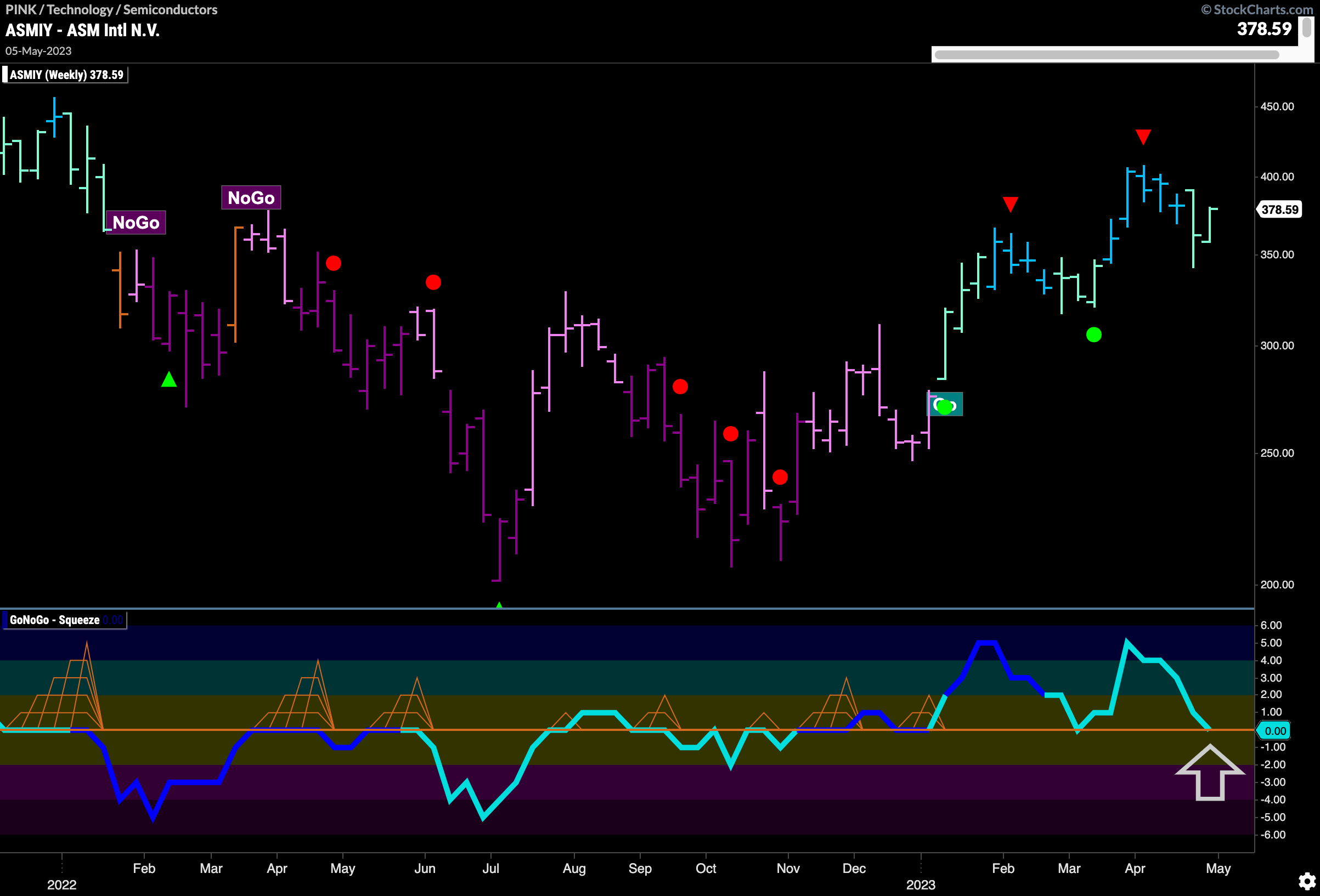
The weekly chart below shows that we are in a pull back of a “Go” trend. After consecutive higher highs and higher lows, price has fallen away from a Go Countertrend Correction Icon (red arrow) and GoNoGo Trend is painting weaker aqua bars. Along with this, GoNoGo Oscillator has fallen to test the zero line from above. We will watch to see if it finds support at this level. If it does, we would be able to say that momentum is resurgent in the direction of the “Go” trend.
