
Good morning and welcome to this week’s Flight Path. The equity trend was decided this week after three consecutive amber “Go Fish” bars of uncertainty. We are now in a “NoGo” trend with the indicator painting strong purple bars. GoNoGo Trend shows that treasury bond prices remained in a strong “Go” trend with a week of bright blue bars. U.S. commodity prices painted weaker aqua bars this whole week while the dollar also saw its trend weaken with the “NoGo” painting pink bars around a lone amber “Go Fish” bar.

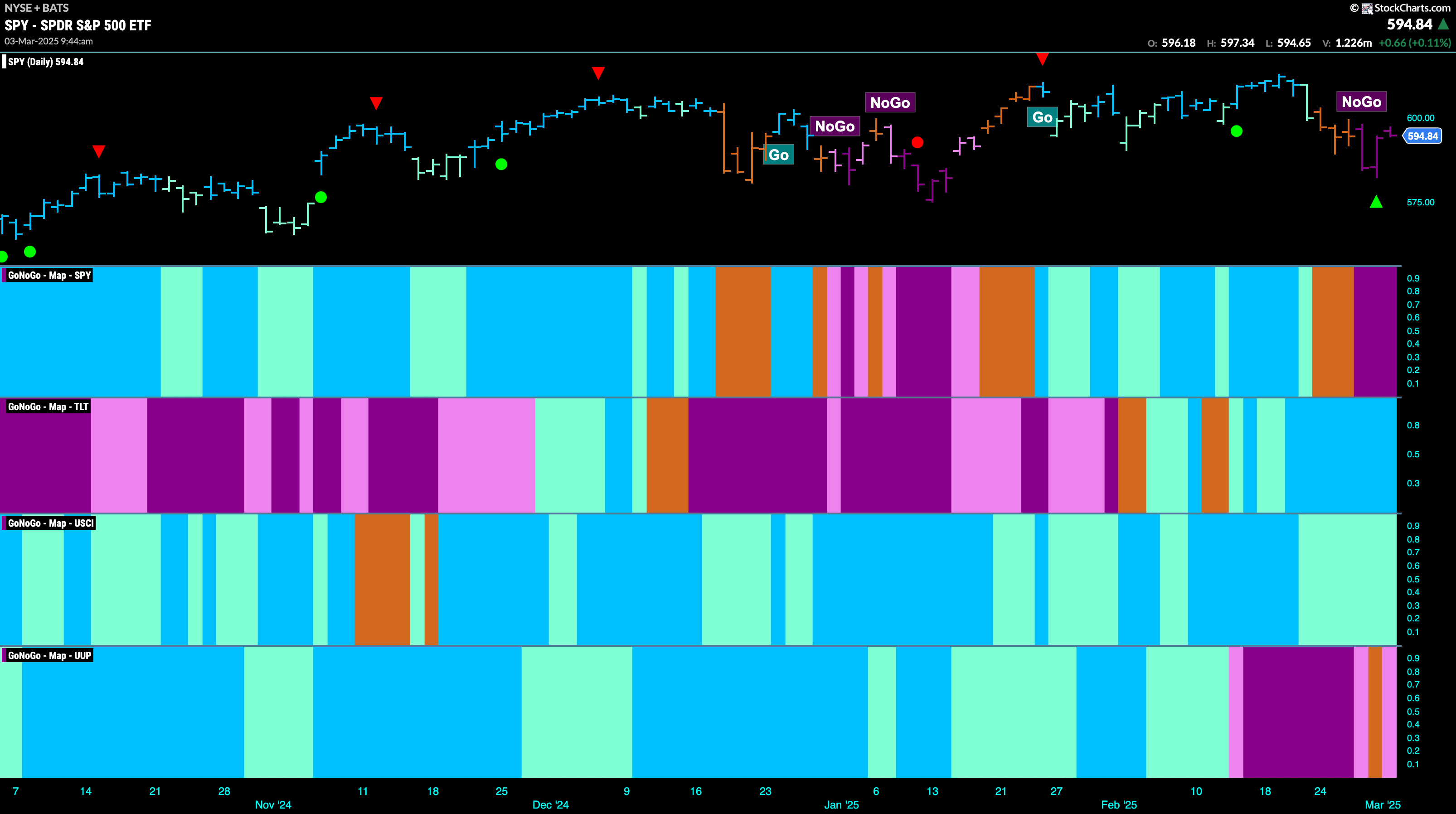
$SPY Enters “NoGo” Trend with Strong Purple Bars
The GoNoGo chart below shows that after a few days of uncertainty, represented by amber “Go Fish” bars, GoNoGo Trend recognized a “NoGo” and we are now seeing strong purple “NoGo” bars as price threatens new lows. If we turn our attention to the GoNoGo Oscillator in the lower panel we can see that it is testing the zero line from below where we will watch to see if it finds resistance. Volume is heavy, and if it falls back into negative territory we will know that momentum is resurgent in the direction of the “NoGo” trend and we can expect an attempt at lower lows.

The “Go” trend survives another week but we see weakness as the GoNoGo Trend indicator is now painting weaker aqua bars. This comes after price barely crept higher a few weeks ago. We will now watch the oscillator panel closely. Once again, GoNoGo Oscillator is testing the zero line from above where it has found support several times before during this “Go” trend. We will watch for that again. If it does rally back into positive territory that would be a strong sign for the “Go” trend. If it doesn’t, that could lead to a larger correction.

Treasury Rates Continue Their Fall
GoNoGo Trend shows that this week saw continued downward pressure on treasury rates. A week of uninterrupted “NoGo” strong purple bars saw price fall lower again. We do see NoGo Countertrend Correction Icons (green arrows) indicating that price may struggle to go lower in the short term as momentum is rising out of oversold territory. We will watch closely as momentum rises. There is a natural level of support on the chart as we approach prior lows from December.

“NoGo” Hanging On After “Go Fish” Bar
Dollar prices have not moved a great deal after entering the “NoGo” trend a few weeks ago. After an initial move lower we saw a rally at the end of last week that even caused GoNoGo Trend to paint an amber “Go Fish” bar as the market weighed the possibility of a trend change. However, we are now seeing another “NoGo” pink bar and GoNoGo Oscillator is testing the zero line from below. If it gets rejected here, we will see signs of trend continuation and will expect the dollar to make an attempt at a new low

$USO in “NoGo” after New Lows
$USO shows in the chart below that it has stayed in the “NoGo” trend for the entirety of last week and the indicator has painted nothing but strong purple bars. We have also seen a lower low as oil prices continued to tumble

Gold Lost a Little Shimmer This Week
After a Go Countertrend Correction Icon (red arrow) that indicated prices may struggle to go higher in the short term, we saw price fall lower quickly this week and GoNoGo Trend painted weaker aqua bars. We look at the GoNoGo Oscillator and we see that it has so far found support at the zero line. We will watch closely as the beginnings of a GoNoGo Squeeze forms. If we see the oscillator rally into positive territory then we will expect the “Go” trend to continue and for price to make a run at new highs.

Sector RelMap
Below is the GoNoGo Sector RelMap. This GoNoGo RelMap applies the GoNoGo Trend to the relative strength ratios of the sectors to the base index. With this view we can get a sense of the relative out performance and relative underperformance of the sectors. 8 sectors are in relative “Go” trends. $XLC, $XLE, $XLF, $XLB, $XLV, $XLP, $XLU, and $XLRE are painting relative “Go” bars.

Financials Sub-Group RelMap
The chart below shows a relative trend breakdown of the sub groups within the financials sector this week. The Sub-Group RelMap plots the GoNoGo Trend of each sub index to the $XLF. We saw in the above GoNoGo Sector RelMap that $XLF is strong relatively speaking as it paints bright blue relative “Go” bars to the S&P 500. If we look at the breakdown of the groups in the map below we can see where that outperformance is coming from. We see strong blue “Go” bars in the 8th panel which represents the relative trend of the mortgage finance sub group.

$ITIC Enters New “Go” Trend
GoNoGo Trend paints new aqua “Go” bars as price continues its slow and steady climb from the low in January. We saw GoNoGo Oscillator break into positive territory and stay there a few weeks ago and it has since found support at that level. Now, with a new “Go” trend in place and GoNoGo Oscillator in positive territory but not overbought, we will look to see if price can break significantly higher and consolidate the new trend.

$STC Entered a “Go” Trend as Price Climbs
$STC has seen a steady climb since entering the new “Go” trend a few weeks ago. This came after GoNoGo Oscillator broke out of a Max GoNoGo Squeeze and GoNoGo Trend cycle through the colors from purple to pink, then “Go Fish” before finally entering the “Go” trend with aqua bars. Since then, the oscillator has remained in positive territory. We will watch closely this week to see if price can consolidate at prices higher than the resistance level it looks to have broken above. GoNoGo Oscillator will need to stay at or above zero in order to confirm the “Go” trend.