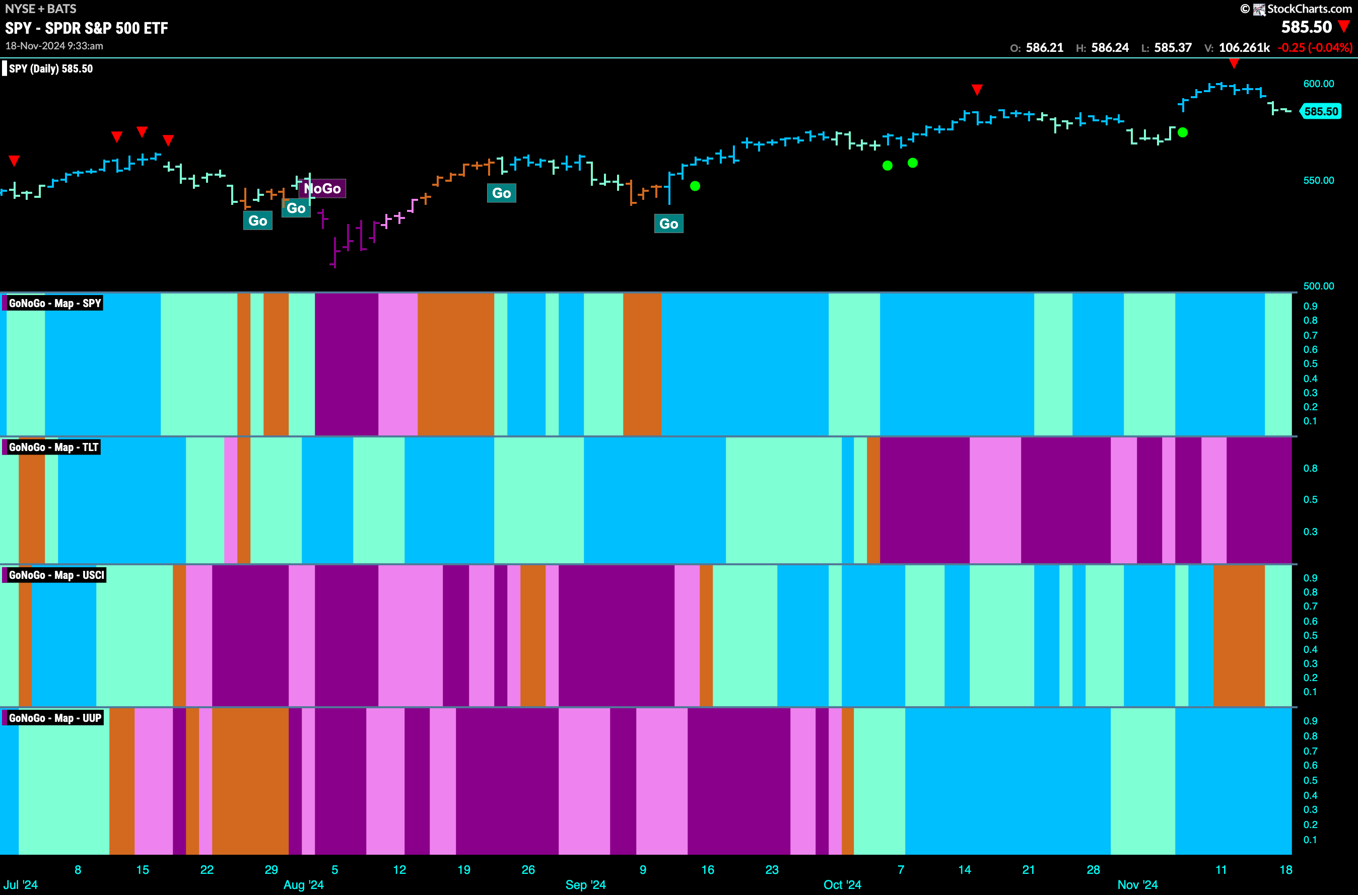
Good morning and welcome to this week’s Flight Path. Equities saw the “Go” trend continue this week but we saw weaker aqua bars at the end of the week. Treasury bond prices painted strong purple “NoGo” bars as the weight of the evidence suggested the “NoGo” will continue. U.S. commodities painted aqua “Go” bars after flirting with amber “Go Fish” bars of uncertainty last week. The dollar showed no weakness this week with an uninterrupted string of bright blue “Go” bars.

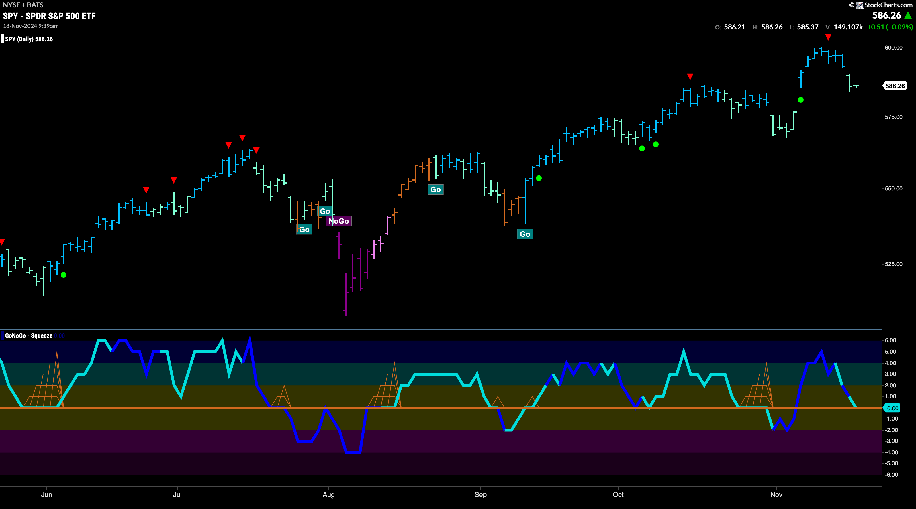
$SPY Paints Weaker “Go” Bars after High
The GoNoGo chart below shows that after hitting a new higher high on strong blue “Go” bars we saw a Go Countertrend Correction Icon (red arrow) signaling that price may struggle to go higher in the short term. Indeed, price fell in the following days, and GoNoGo Trend has painted weaker aqua bars. We will watch to see if price finds support at last month’s high. GoNoGo Oscillator also has fallen to test the zero line from above and we will watch to see if it finds support here as well. If the oscillator rallies back into positive territory we will look for price to make an attempt at another higher high.
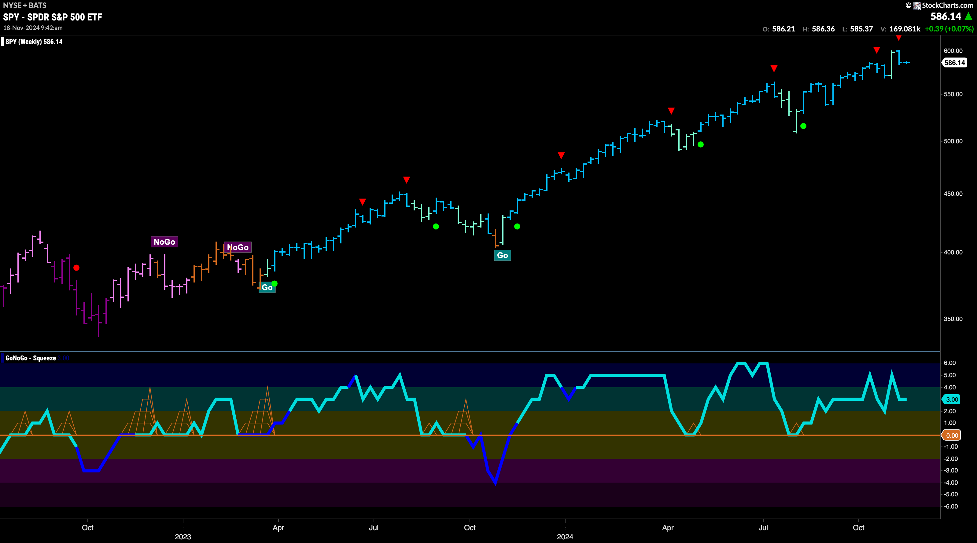
A Go Countertrend Correction Icon (red arrow) has showed itself on the weekly chart after last week saw price fall into the end of the week. GoNoGo oscillator is in positive territory at a value of 3 and so no longer overbought. We will watch to see if it falls toward the zero line from here and if it does we will monitor for signs of support. GoNoGo Trend is painting strong blue “Go” bars as momentum remains positive confirming the direction of the trend.
Treasury Rates See Continued Strength
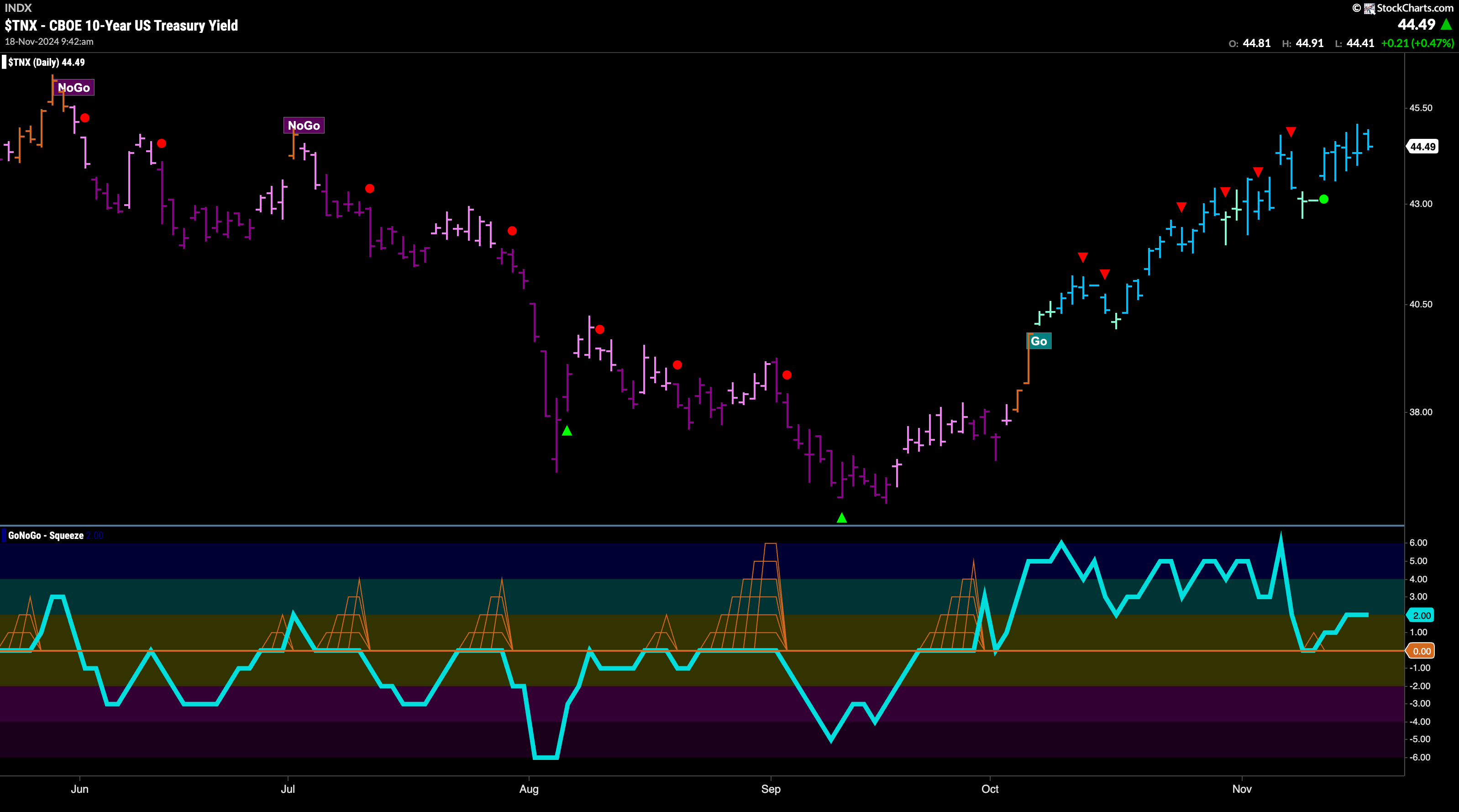
Treasury bond yields saw the “Go” trend continue this week and after a couple of weaker aqua bars the indicator showed a return to strength with bright blue bars all week as price rallied to challenge for new highs. GoNoGo Oscillator was perhaps responsible for the rally as we saw it bounce of the zero line into positive territory at the beginning of the week. Now, with GoNoGo Trend painting strong blue bars the oscillator is in positive territory at a value of 2.
The Dollar Remains at Elevated Levels
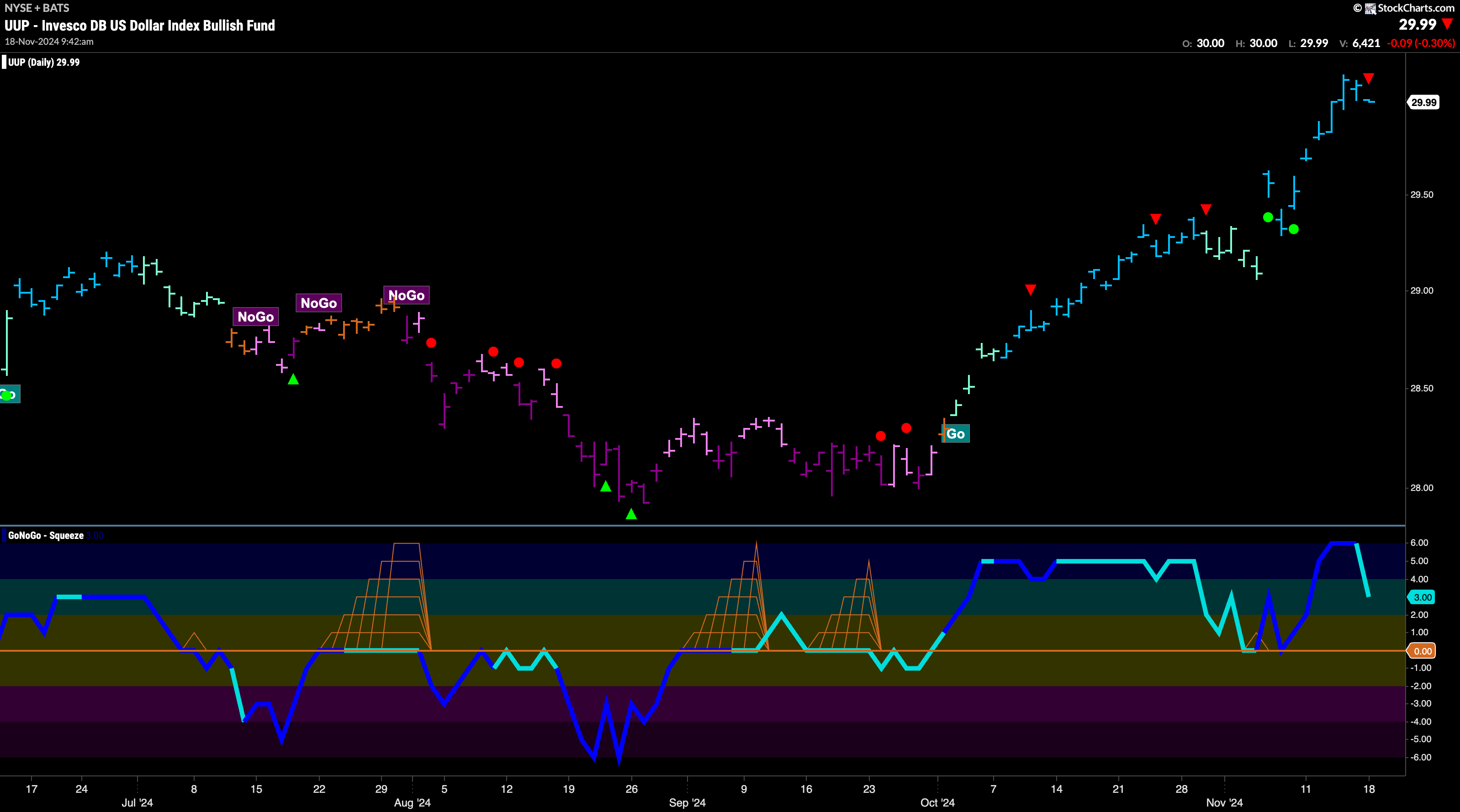
A week of strength propelled price to new highs again this week as GoNoGo Trend painted a string of unbroken bright blue “Go” bars. We are seeing a Go Countertrend Correction icon (red arrow) on the current bar as there is some waning momentum finally. GoNoGo Oscillator has fallen out of overbought territory and is approaching the zero line. We will watch to see if it finds support as and when it gets there. If it rallies quickly back into positive territory we will see that as a sign of trend continuation for the greenback.
USO Meanders Sideways
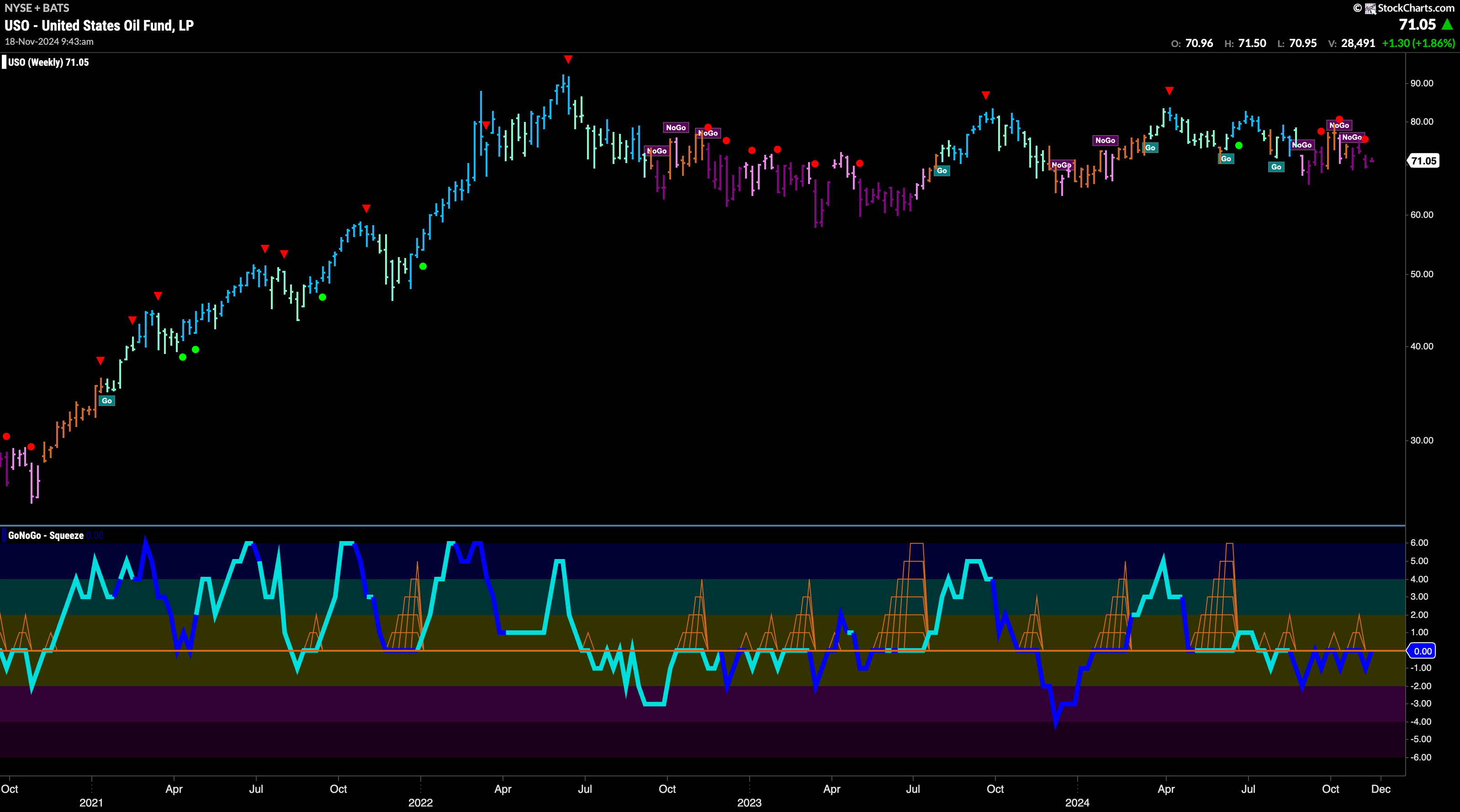
We have zoomed out to weekly bars on the chart below of the $USO. We can see that since hitting summer highs in 2022 price has made no progress and has moved mostly sideways ever since. On this weekly time frame, we see that GoNoGo Trend is painting strong purple “NoGo” bars and price is within the range of the past 2 years. In fact, the range of price has decreased also of late and we can see that reflected in GoNoGo Oscillator’s inability to separate itself from the zero line in the lower panel.
“Go” Trend Changes to “NoGo”
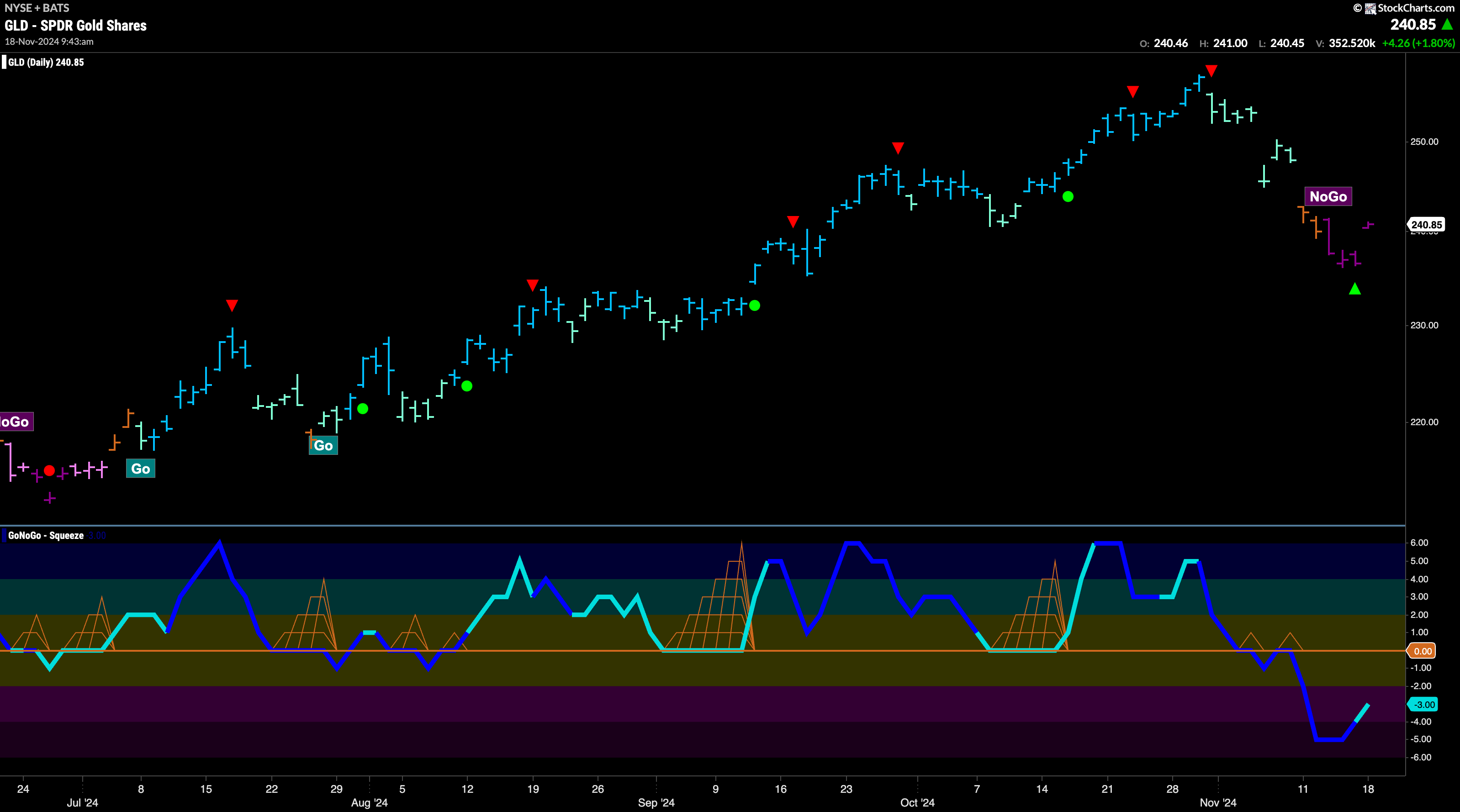
GoNoGo Trend started last week with amber “Go Fish” bars as price fell out of its “Go” trend. “Go Fish” was quickly followed by “NoGo” as price fell sharply. This fall into a new “NoGo” trend was hinted at when GoNoGo Oscillator first failed to find support at the zero line. Now, as GoNoGo Oscillator rallies out of oversold territory we see a NoGo Countertrend Correction Icon (green arrow) indicating that price may struggle to go lower in the short term.
Sector RelMap
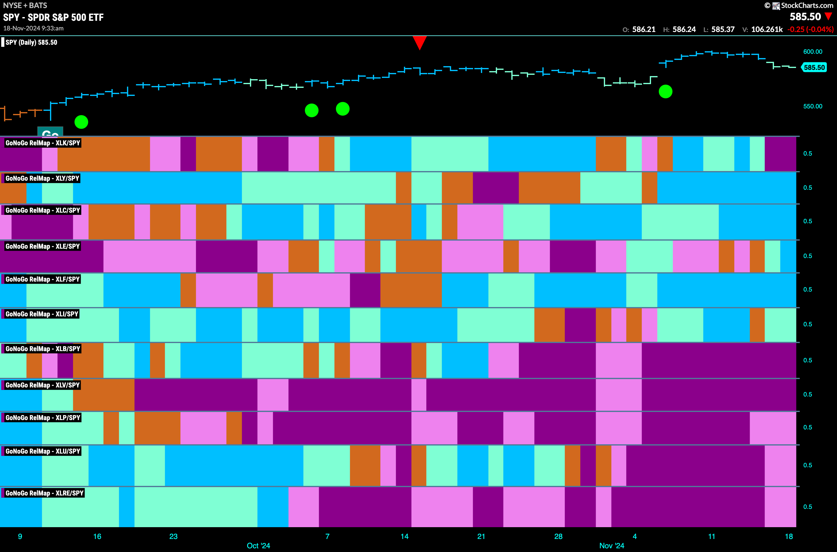
Below is the GoNoGo Sector RelMap. This GoNoGo RelMap applies the GoNoGo Trend to the relative strength ratios of the sectors to the base index. With this view we can get a sense of the relative out performance and relative underperformance of the sectors. 5 sectors are in relative “Go” trends. $XLY, $XLC, $XLE, $XLF, and $XLI, are painting relative “Go” bars.
Energy Sub-Group RelMap
The chart below shows a relative trend breakdown of the sub groups within the energy sector. The Sub-Group RelMap plots the GoNoGo Trend of each sub index to the $XLE. We saw in the above GoNoGo Sector RelMap that $XLE is performing strongly relatively to the $SPY, with GoNoGo Trend painting new strong blue “Go” bars. If we look at the breakdown of the groups in the map below we can see where that outperformance is coming from. Painting persistent “Go” bars in the 4th panel and having outperformed for some weeks now is the pipelines sub index. 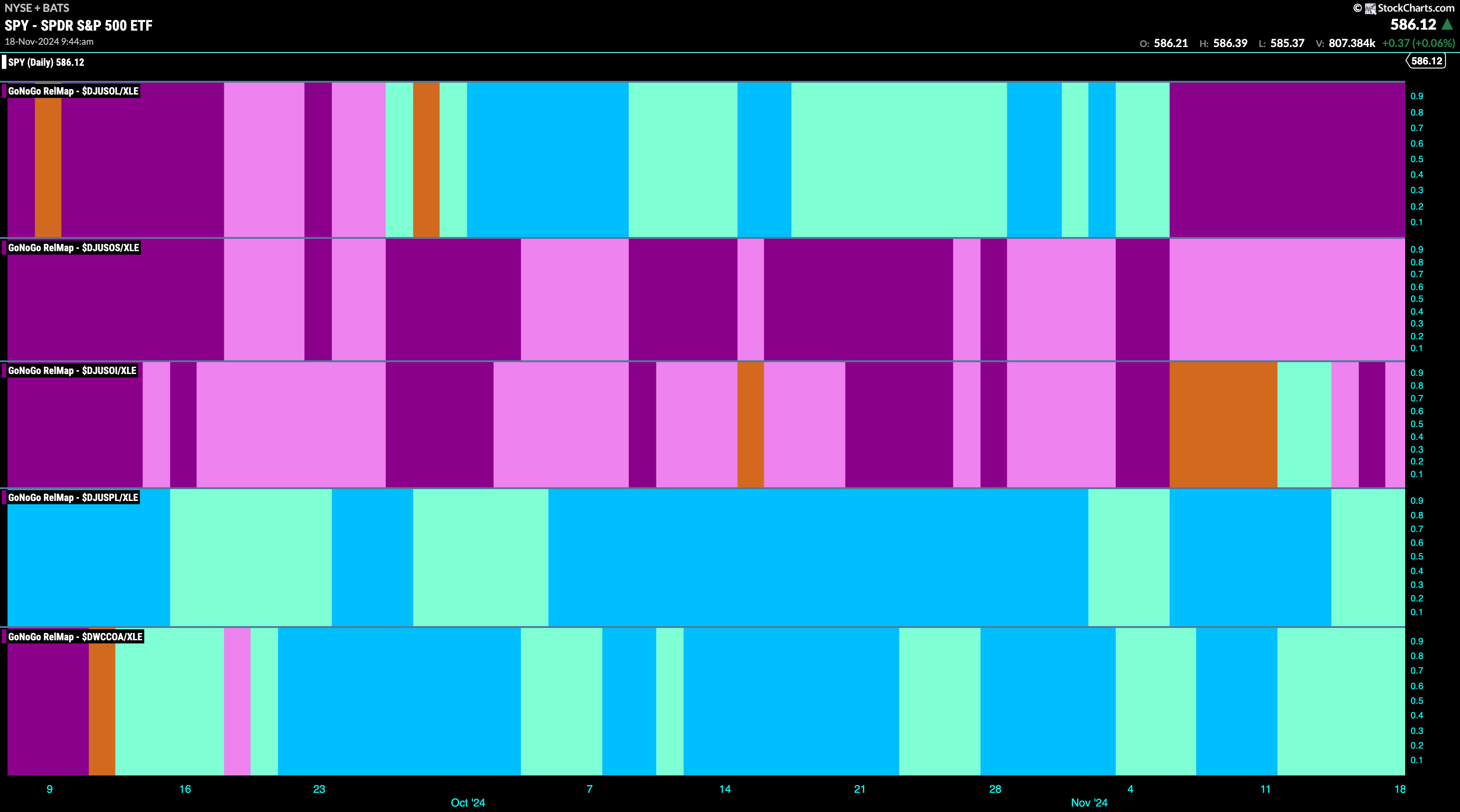
$WMB Looks for New Higher Highs
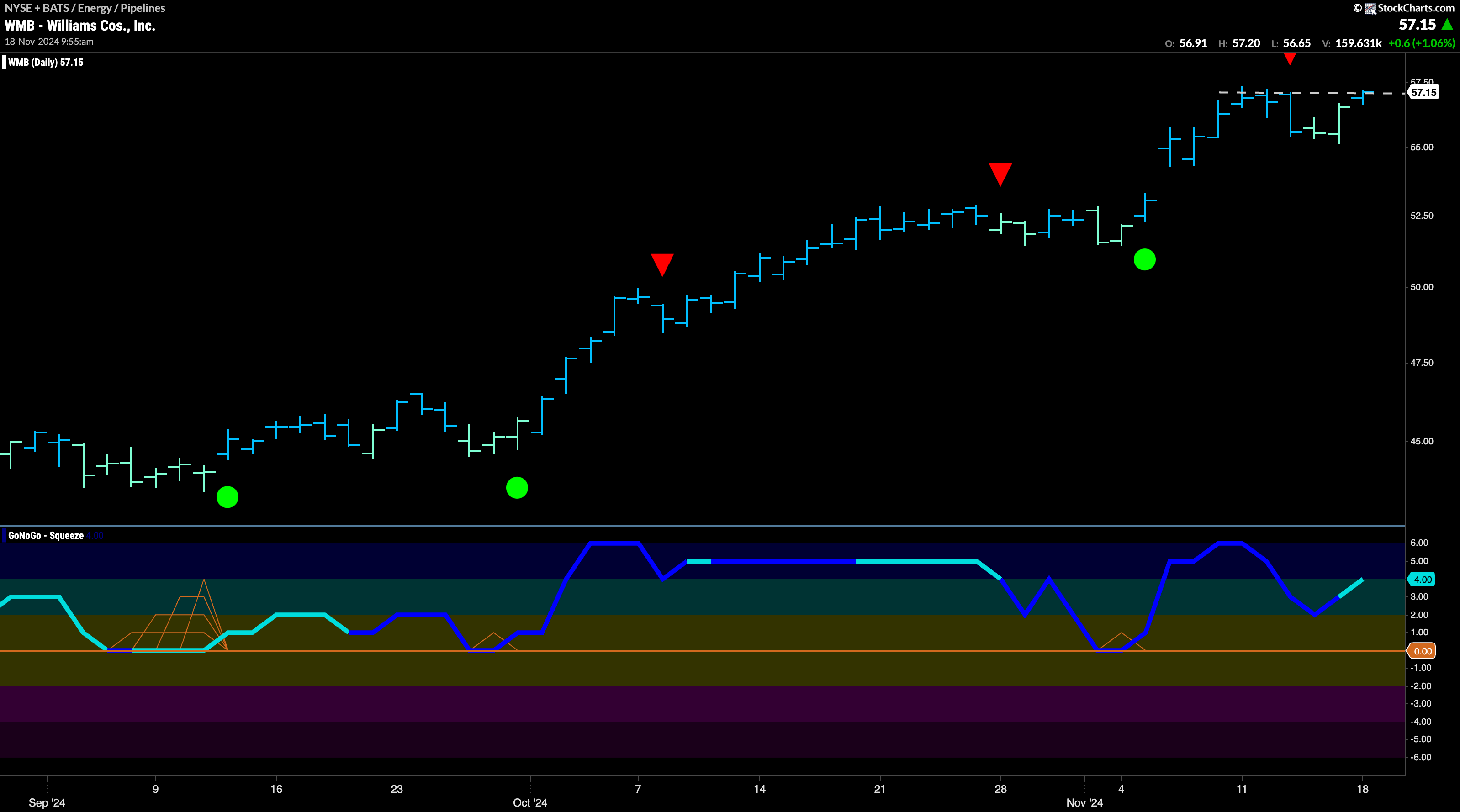
The chart below shows that $WMB has been in a “Go” trend for some time and that last week we saw a new high that was followed by a Go Countertrend Correction Icon (red arrow). Indeed, price fell from that high for a few days and we saw GoNoGo Trend paint weaker aqua bars. However, without reaching zero GoNoGo Oscillator has turned around and is rising at a value of 4. GoNoGo Trend is painting a strong blue bar again as price challenges for a new high.
$PBA Fights to Clear Resistance
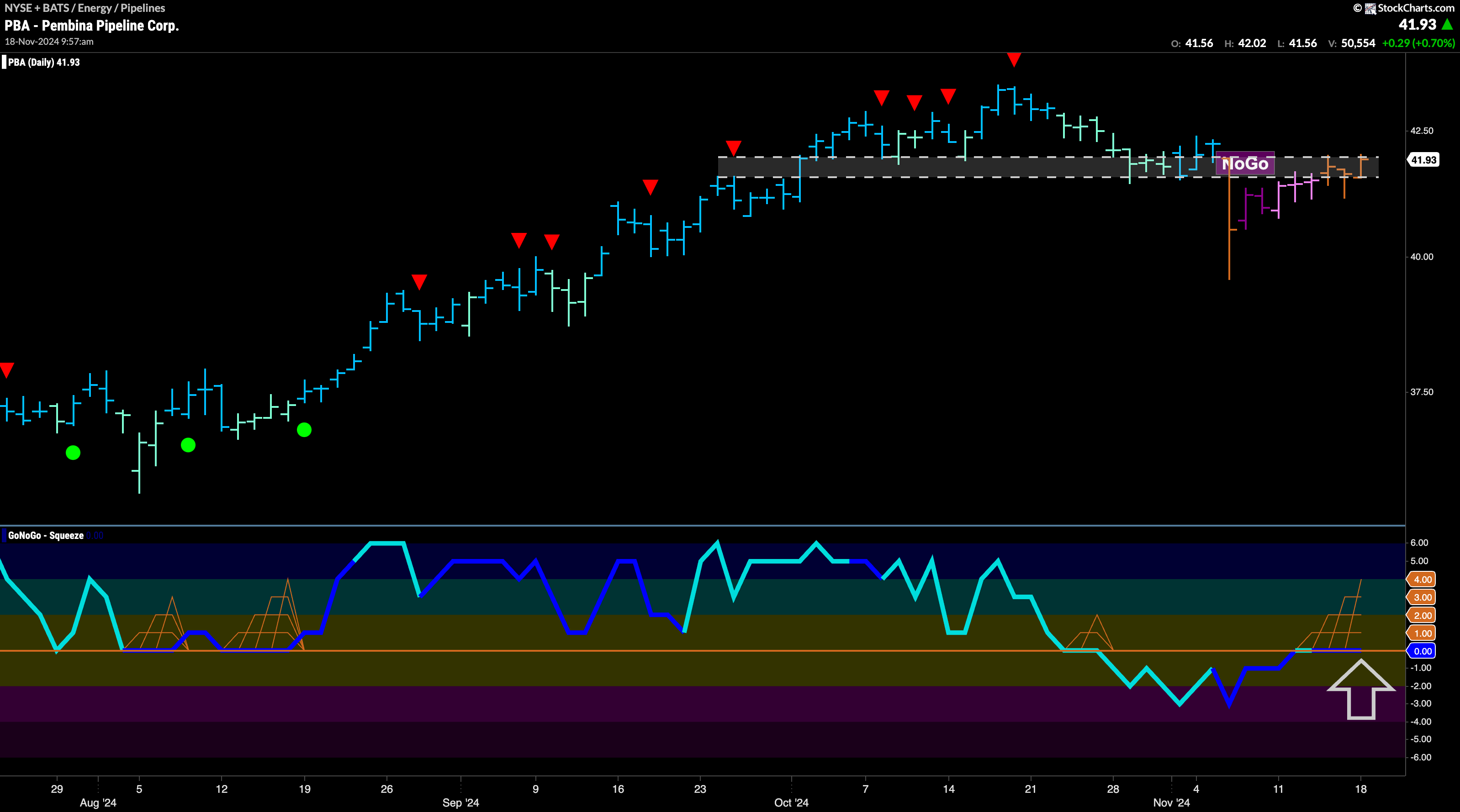
$PBA is painting amber “Go Fish” bars as price climbs from recent lows. If price is to rally back into “Go” colors, it will need to rise above the resistance that we see on the chart. GoNoGo Oscillator is riding the zero line and we see a GoNoGo Squeeze grid climbing. We will pay close attention to the break of this squeeze. If the oscillator breaks out of the GoNoGo Squeeze into positive territory then we will look for price to climb from here, and enter a new “Go” trend as it tries to challenge prior highs.
