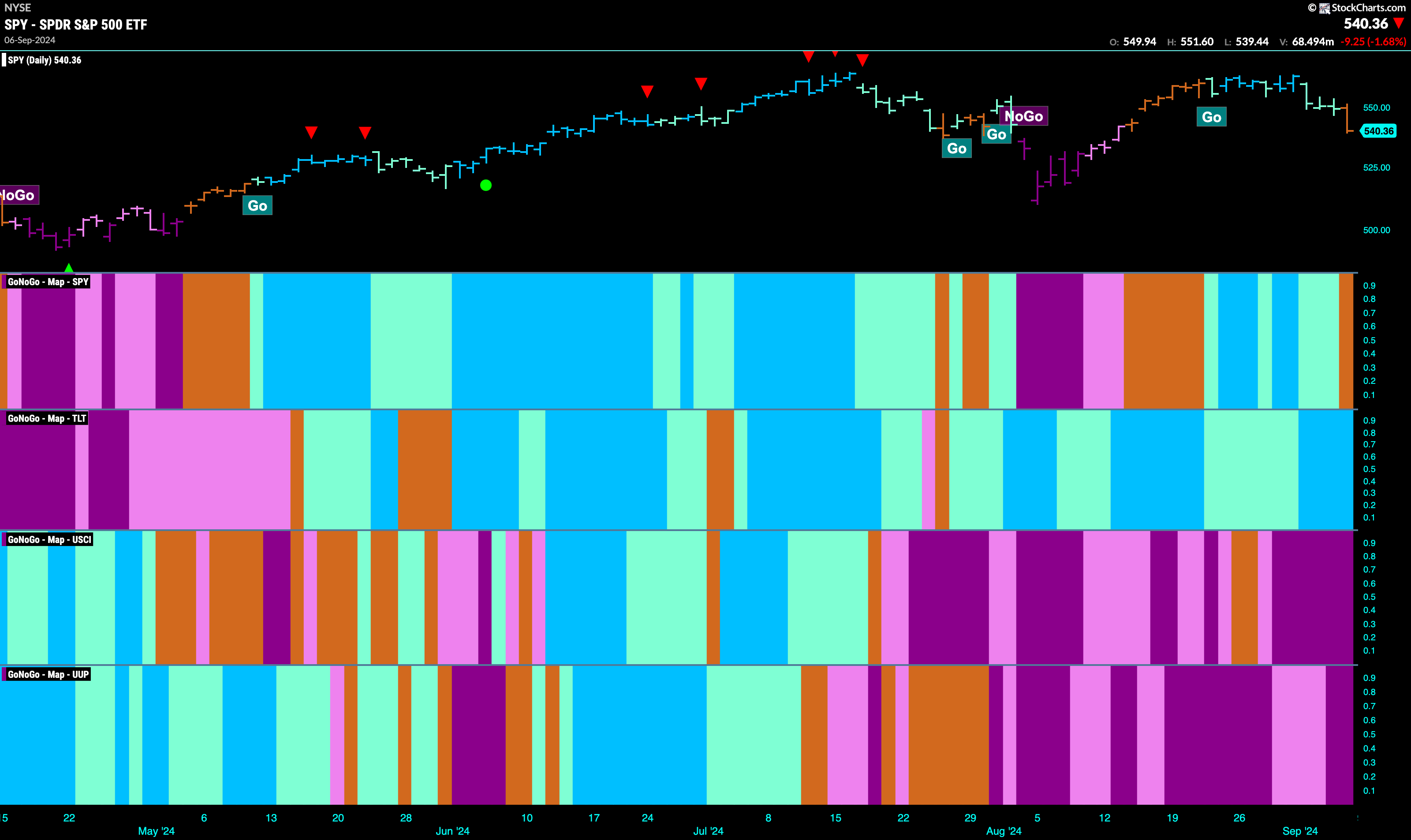
Good morning and welcome to this week’s Flight Path. Equities flashed an uncertain “Go Fish” bar at the end of the week as the markets became even more unsettled. Treasury bond prices remained in a “Go” trend and saw that trend was strong for almost all of last week. U.S. commodity index remained in a “NoGo” painting strong purple bars the entire week and it was no picnic for the dollar either. The greenback saw the “NoGo” continue and the week ended with a couple of purple bars.
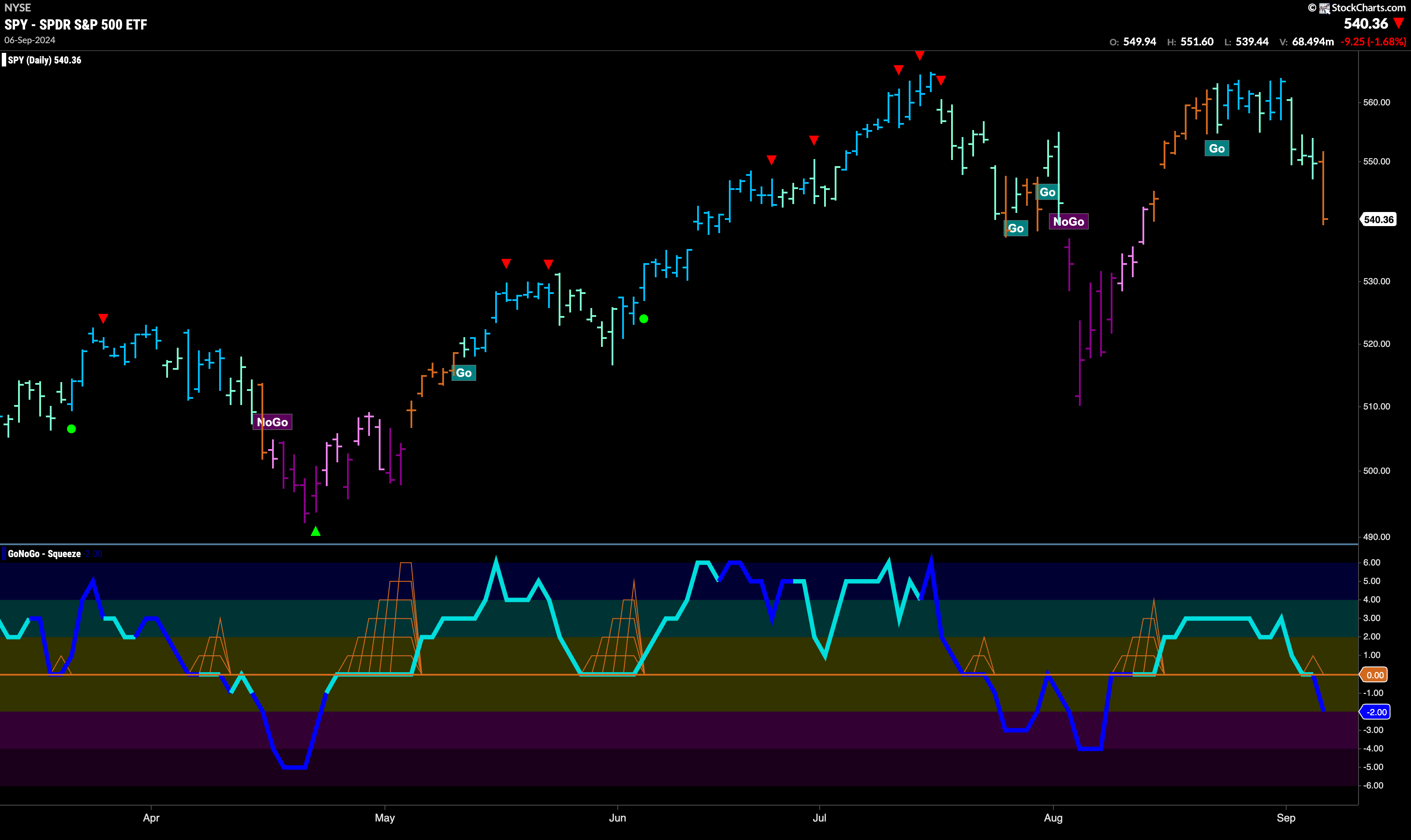
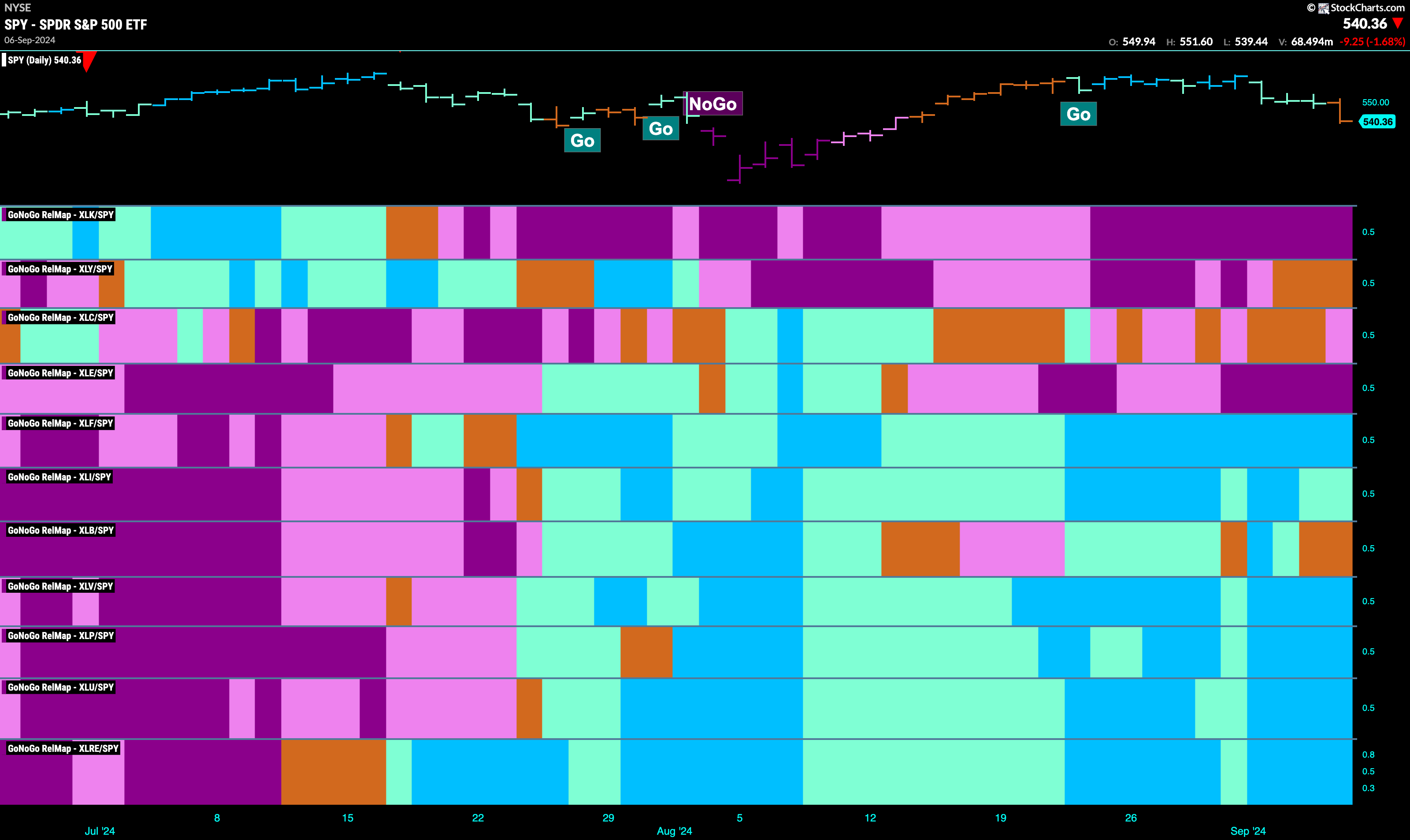
$SPY Falls Out of “Go” Trend
The GoNoGo chart below shows that after seeing trend weakness with aqua bars the week ended with an amber “Go Fish” bar. This most recent “Go” move was unable to set a new higher high before the GoNoGo Trend indicator painted a “Go Fish” bar of uncertainty. We look at the oscillator panel and see that after briefly testing the zero level from above GoNoGo Oscillator fell into negative territory on heavy volume. This inability to find support at zero was a concern for the “Go” trend.
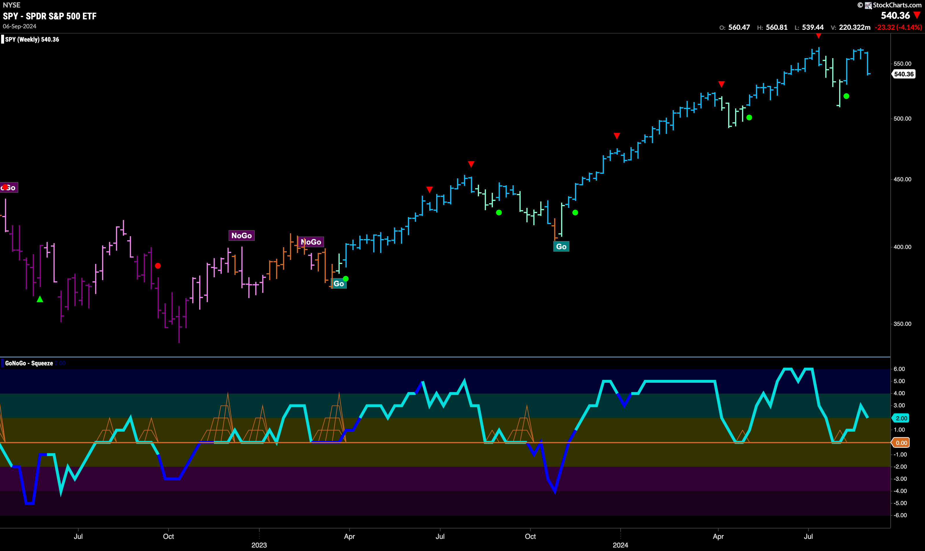
The longer time frame chart shows that last week was a bad one. However, we still see that the trend is a “Go” painting blue bars. We can see that price hasn’t made a new higher high but the trend remains and GoNoGo Oscillator is in positive territory at a value of 2. We will watch to see as the oscillator gets closer to zero if it finds support at that level.
Treasury Yields Stay in “NoGo” Trend
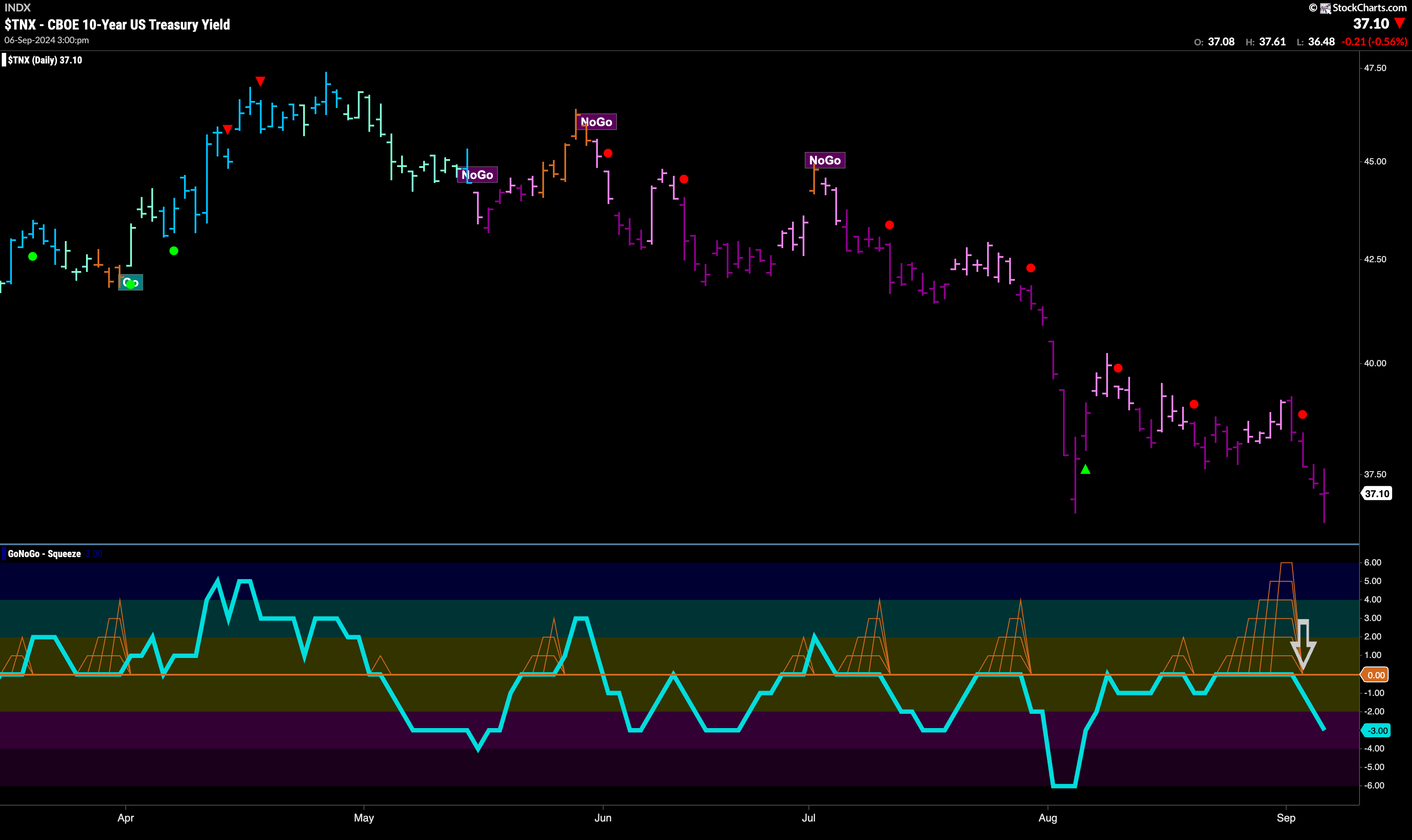
Treasury bond yields painted strong purple “NoGo” bars this week and we saw a sharp fall that saw a challenge of recent lows. In the oscillator panel we see that a Max GoNoGo Squeeze was broken to the downside, with GoNoGo Oscillator falling into negative territory. This tells us that momentum is surging in the direction of the underlying “NoGo” trend and so we see a NoGo Trend Continuation Icon (red circle) in the above panel.
The Dollar’s “NoGo” Remains
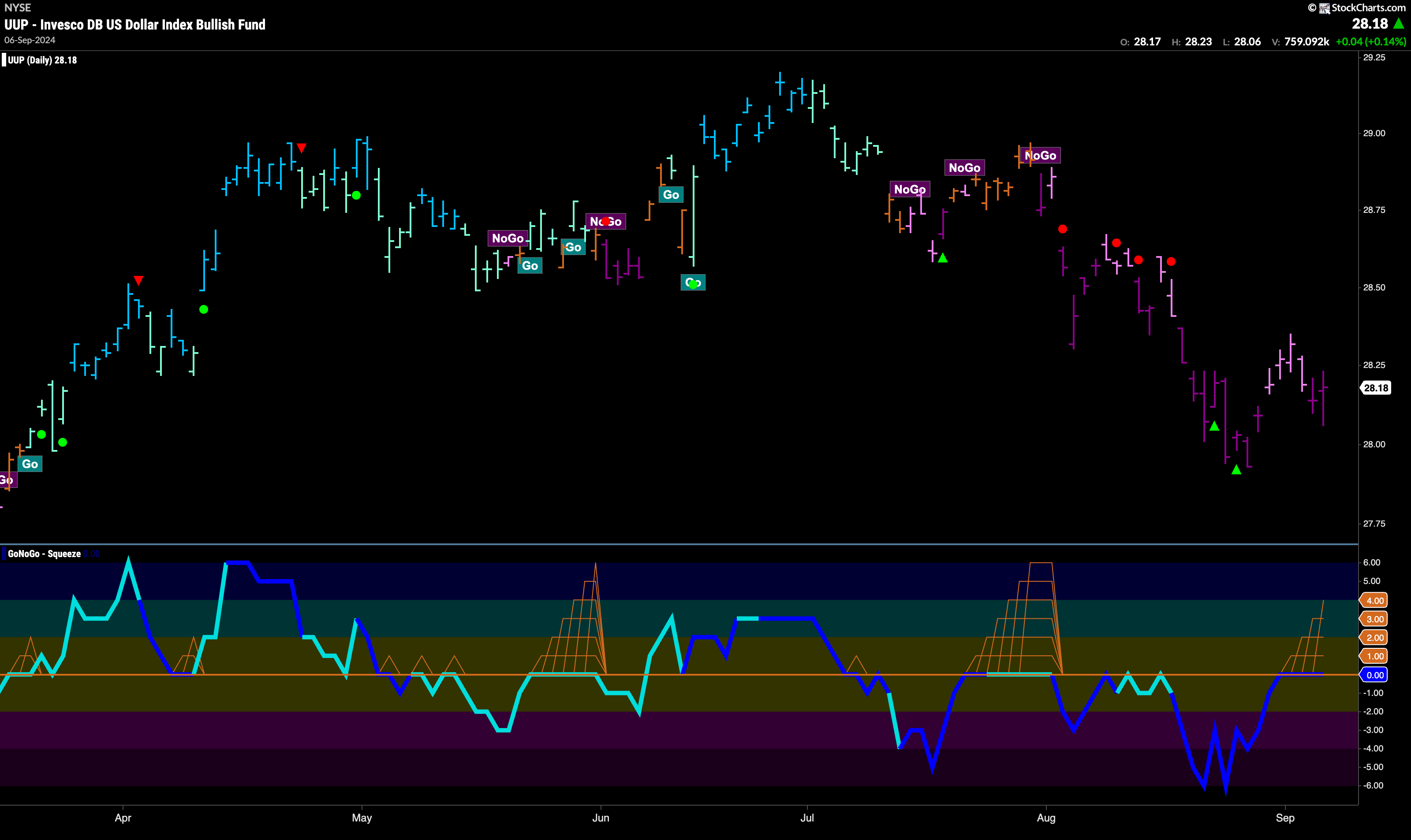
As strong purple bars return we see that the U.S. dollar has made a new lower low. GoNoGo Trend shows that trend strength returned at the end of the week and so the weight of the evidence tells us that the “NoGo” trend is in full force. If we look at the oscillator panel, we see that GoNoGo Oscillator has rallied to test the zero line from below. It has remained stuck at that level for several bars and so we see a GoNoGo Squeeze building. As we see heavy volume, it will be important to watch for the direction of the break of the GoNoGo Squeeze.
USO Falls to New Lows in “NoGo” Trend
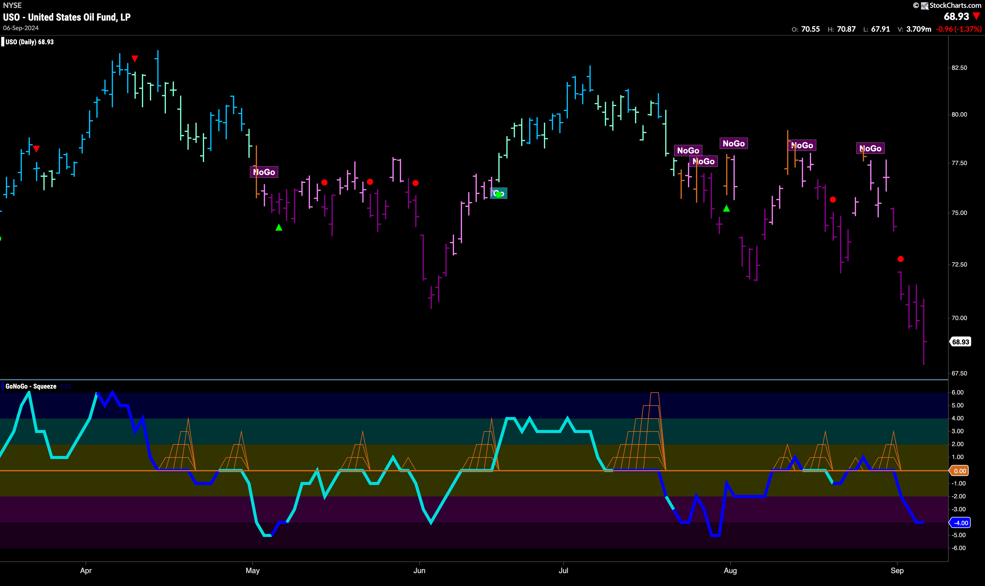
After failing at resistance with the last “Go Fish” bar, we saw the trend return and now for the second week “NoGo” bars prevailed. This past week we saw only strong purple “NoGo” bars and a new lower low was hit. The beginning of the week saw NoGo Trend Continuation as GoNoGo Oscillator broke out of a small GoNoGo Squeeze into negative territory on heavy volume.
Gold Trend Remains Strong but Struggles for New Highs
The daily chart of $GLD below shows that for another week price remained elevated. We did not see a successful attempt at a new higher high but we did not see a lower low either. In fact, the week ended with strong blue bars again. We would like to see price break to new highs in this “Go” trend. GoNoGo Oscillator has fallen to test the zero line from above and is currently riding that level. As a small GoNoGo Squeeze begins, we will watch to see in which direction the Squeeze is broken.

Sector RelMap
Below is the GoNoGo Sector RelMap. This GoNoGo RelMap applies the GoNoGo Trend to the relative strength ratios of the sectors to the base index. With this view we can get a sense of the relative out performance and relative underperformance of the sectors. 6 sectors are in relative “Go” trends. $XLF, $XLI, $XLV, $XLP, $XLU, $XLRE are painting strong blue bars.
Healthcare Sub-Group RelMap
The chart below shows a relative trend breakdown of the sub groups within the healthcare sector. The Sub-Group RelMap plots the GoNoGo Trend of each sub index to the $XLV. We saw in the above GoNoGo Sector RelMap that $XLV was performing strongly and if we look at the breakdown of the groups in the map below we can see where that outperformance is coming from. Painting strong blue bars, in the second panel, the medical equipment sub group is in a strong relative “Go” trend. 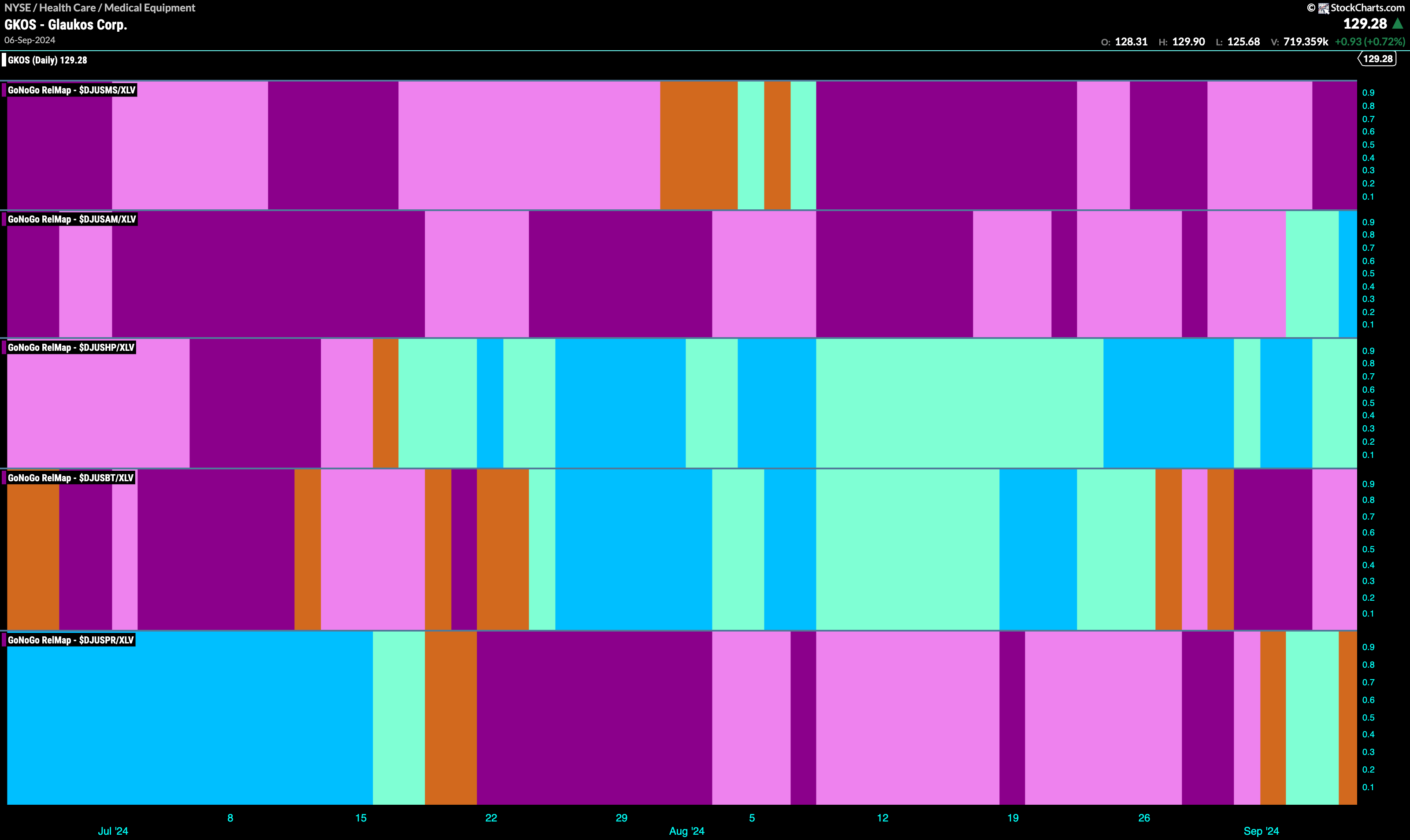
$OMCL Sets up for Attack on New High
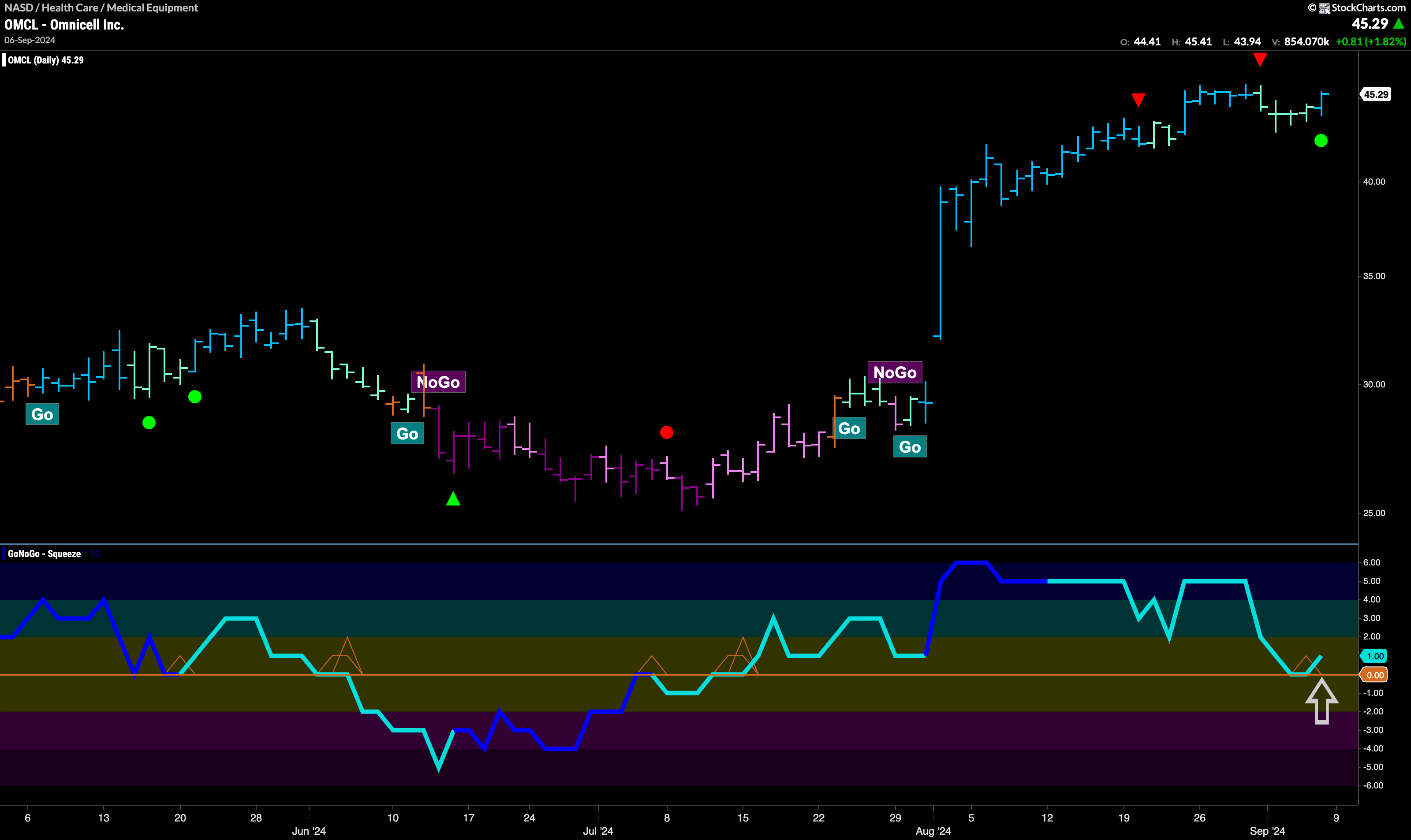
The chart below shows that there is a “Go” trend in place for $OMCL but that it has consolidated recently after hitting a high that was accompanied by a Go Countertrend Correction Icon (red arrow). Indeed we saw a string of weaker aqua “Go” bars following this icon. On the most recent bar we see a return to a strong blue “Go” bar. If we look at the oscillator panel, we can see that it has recently found support at the zero line. This tells that momentum is resurgent in the direction of the underlying “Go” trend and so we will look for price to make an attempt at a new higher high.
$GKOS at Inflection Point in “Go” Trend
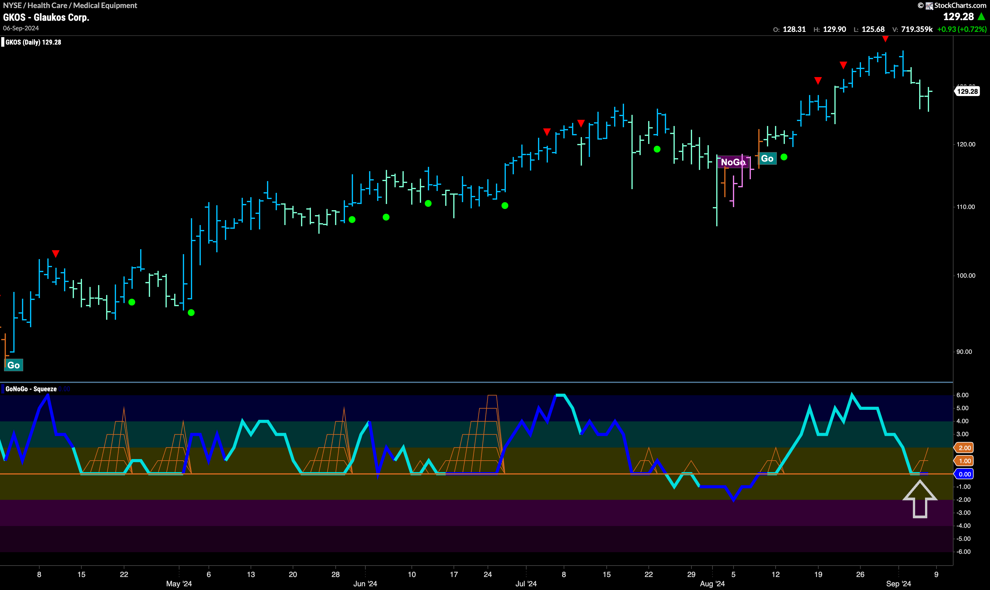
$GKOS has been in a “Go” trend and indeed made a strong higher high on bright blue bars just a week ago. This high was accompanied by another Go Countertrend Correction Icon (red arrow) that suggested price may struggle to go higher in the short term. We then saw GoNoGo Trend paint weaker aqua bars as price fell from that high. During that time, GoNoGo Oscillator fell to test the zero line from above and we will watch to see if it can find support at this level. If it does, then we will be able to say that momentum is resurgent in the direction of the price trend and will look for an attack on a new high. 