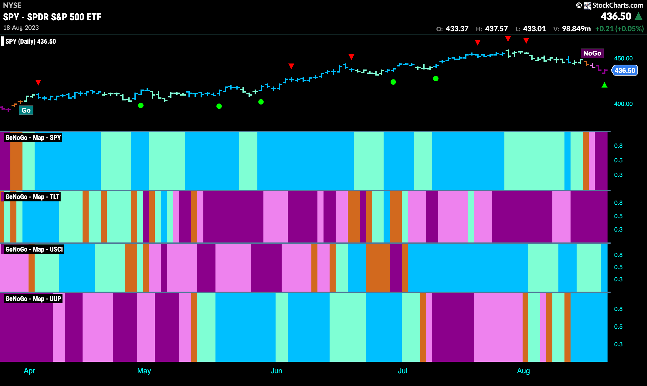
Good morning and welcome to this week’s Flight Path. The heat map shows that equities have rolled over. The “Go” trend has given way to a “NoGo” trend and the week ended with strong purple bars. Treasury bond prices continue to paint strong purple bars and commodities maintain the “Go” trend. The dollar sees its “Go” trend strengthen this week with uninterrupted “Go” bars.
Equities Correction Deepens as “NoGo” Takes Hold
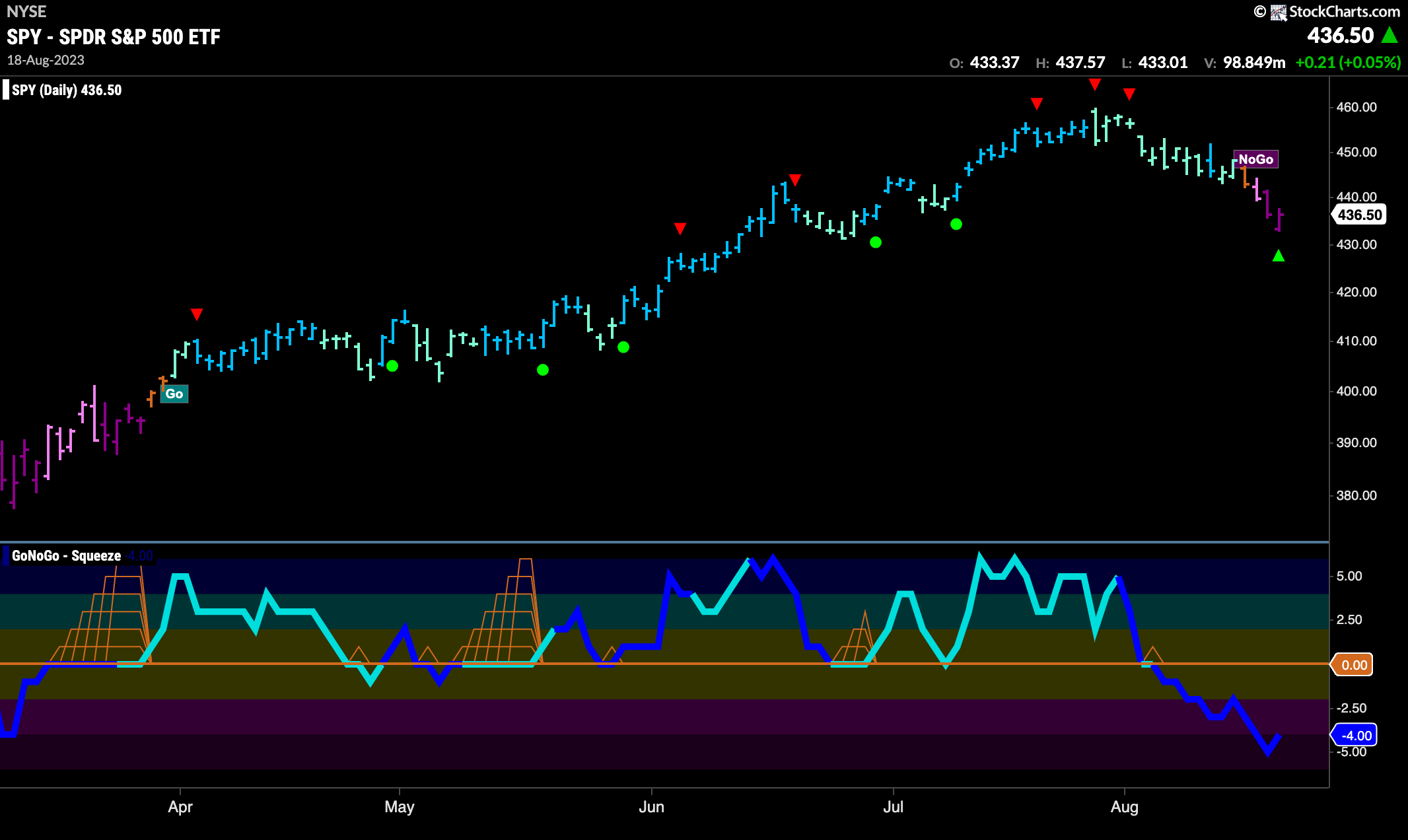
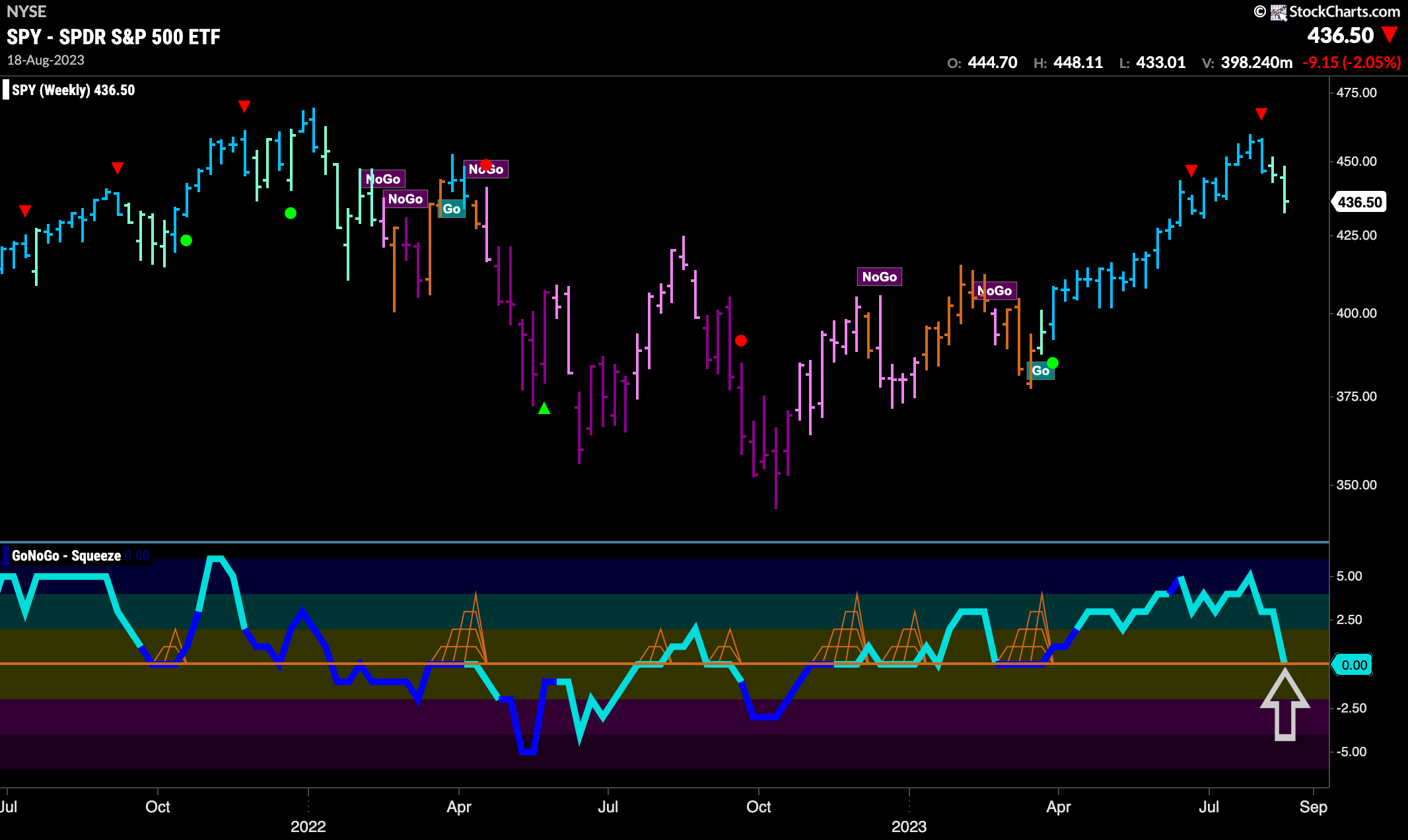
Prices fell further this week as the “Go” trend gave way to a “NoGo”. A few weeks ago we noted the Go Countertrend correction arrows at the highs as well as the GoNoGo Oscillator crashing through the zero line into negative territory on heavy volume. This week the “NoGo” trend took over and we saw strong purple “NoGo” bars follow a pink and amber bar.
The longer term weekly chart remains in a “Go” trend. However, we have seen two weaker aqua bars and GoNoGo Oscillator has fallen to the zero line where we will watch to see if it finds support . If momentum stays positive here we will be able to say that trend continuation is likely.
Treasury Rates Move Higher
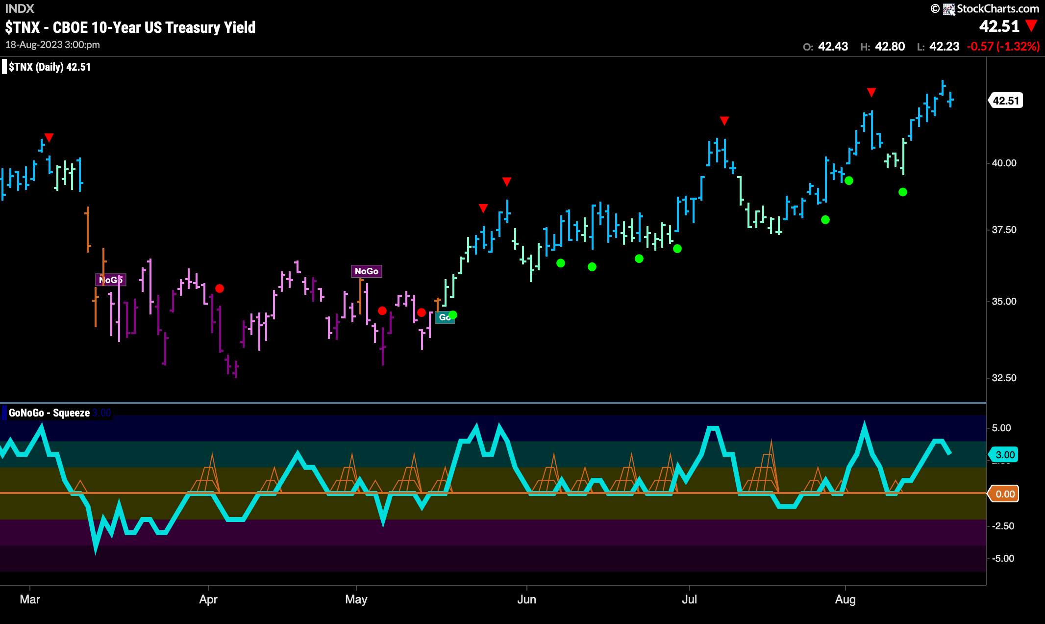
Treasury bond rates continue to rally as we saw a string of strong blue “Go” bars as price hit a new high. GoNoGo Oscillator rallied into positive territory after finding support at zero again. Currently, the oscillator is in positive territory but not overbought.
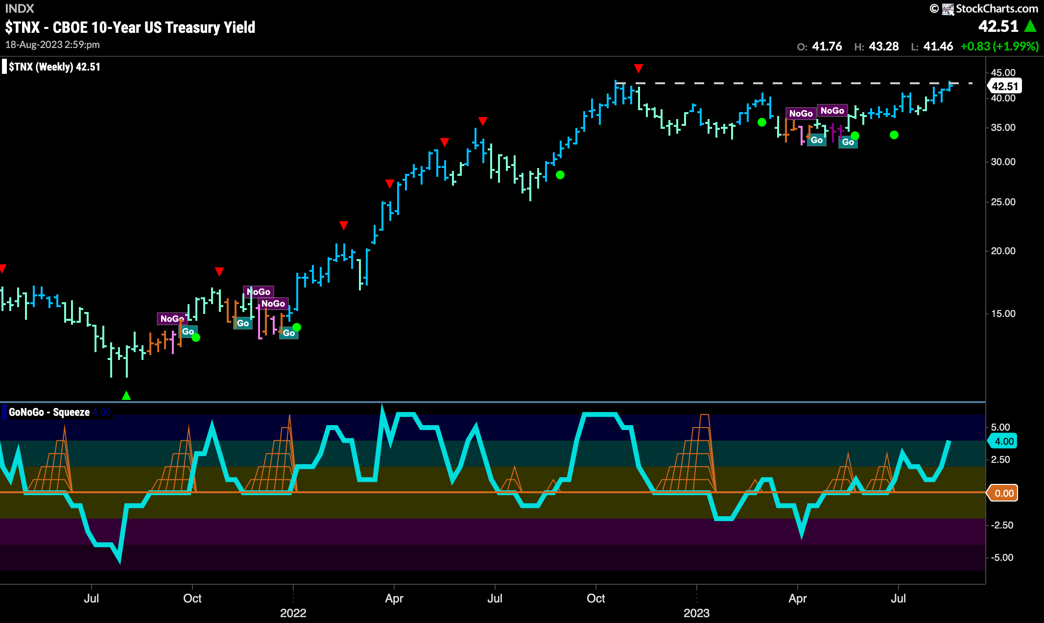
The weekly chart shows that there is significant overhead resistance at this level and so we will watch to see if price gets rejected at these levels this week. GoNoGo Oscillator is in positive territory but not yet overbought.
Dollar in “Go” Trend
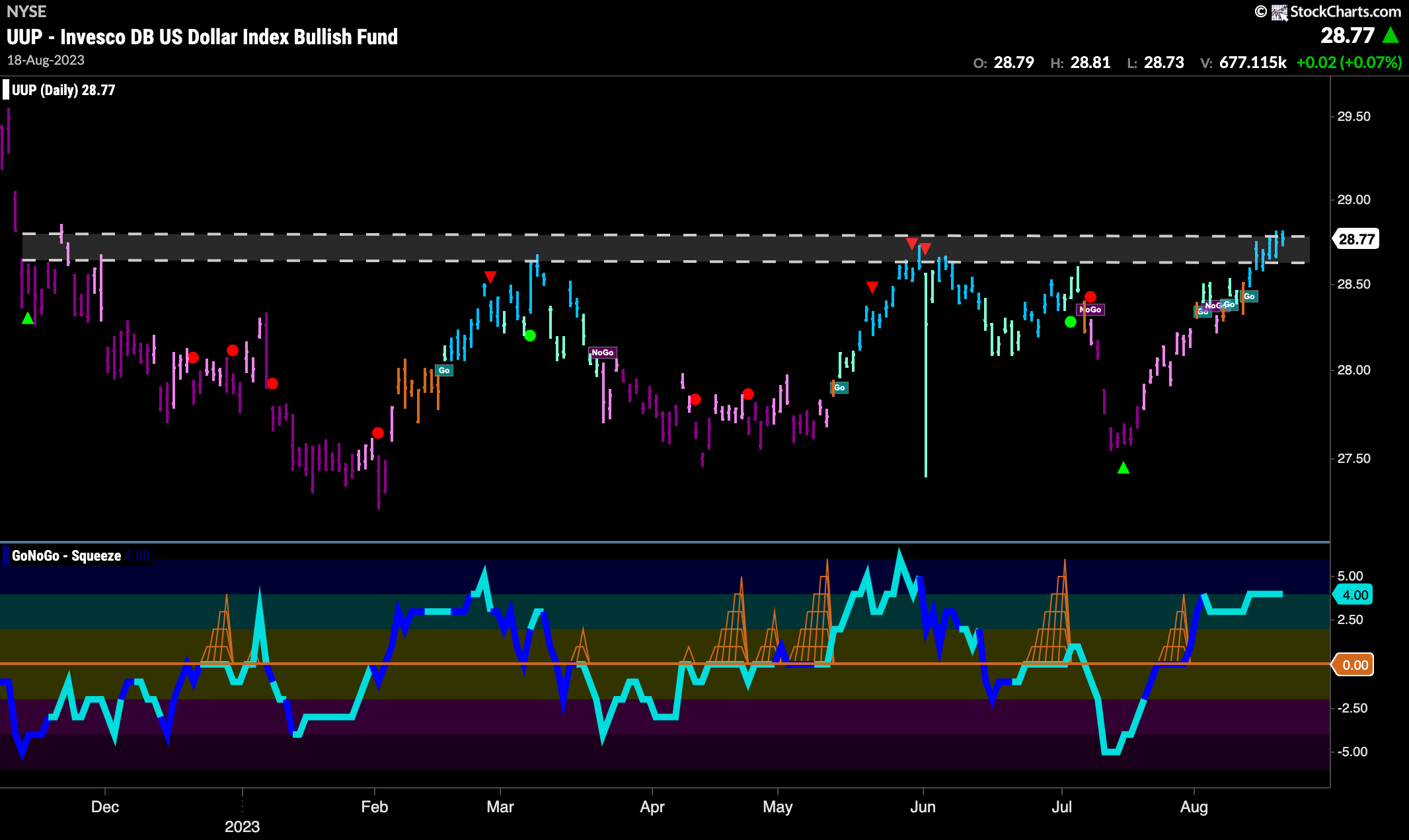
The dollar still has some work ahead of it to get through overhead supply that has provided resistance already several time on the chart. With strong blue “Go” bars and positive momentum this week will be a good test of the strength of the “Go” trend.
Oil Consolidates New “Go” Trend
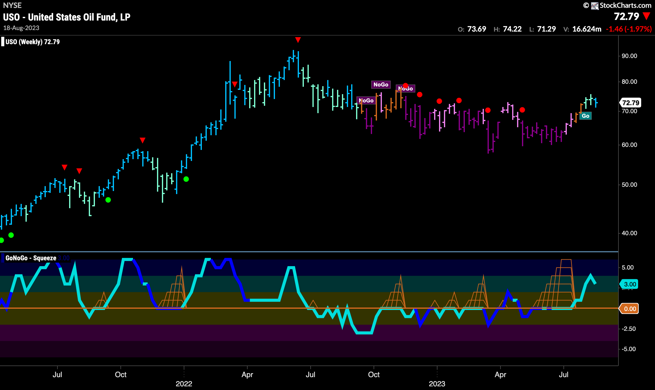
Oil prices continue to show strength and this is a third weekly “Go” bar. We thought this was coming after we noted GoNoGo Oscillator breaking out of a Max GoNoGo Squeeze. This told us that momentum was positive and confirmed the new “Go” trend. We will look for price to continue higher with momentum on its side.
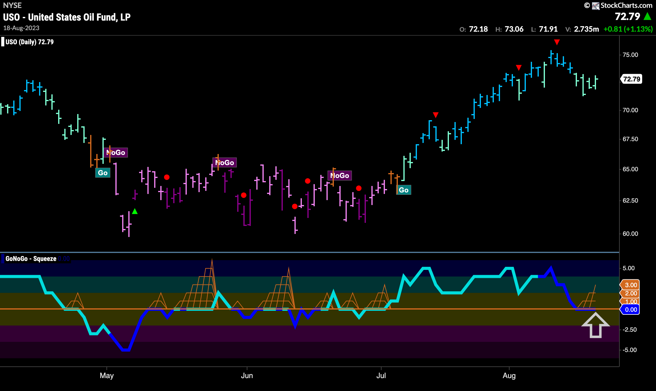
The daily chart of oil shows the fast price moves that have been borne out on the weekly chart. Having said that, price has corrected from a Go Countertrend Correction Icon (red arrow) and we have seen several weaker aqua bars. With strong market participation represented by the dark blue of the oscillator we see it falling to test the zero line. We will watch to see if it finds support at this level and if it does we will expect price to continue in the “Go” trend.
Gold Tests Support
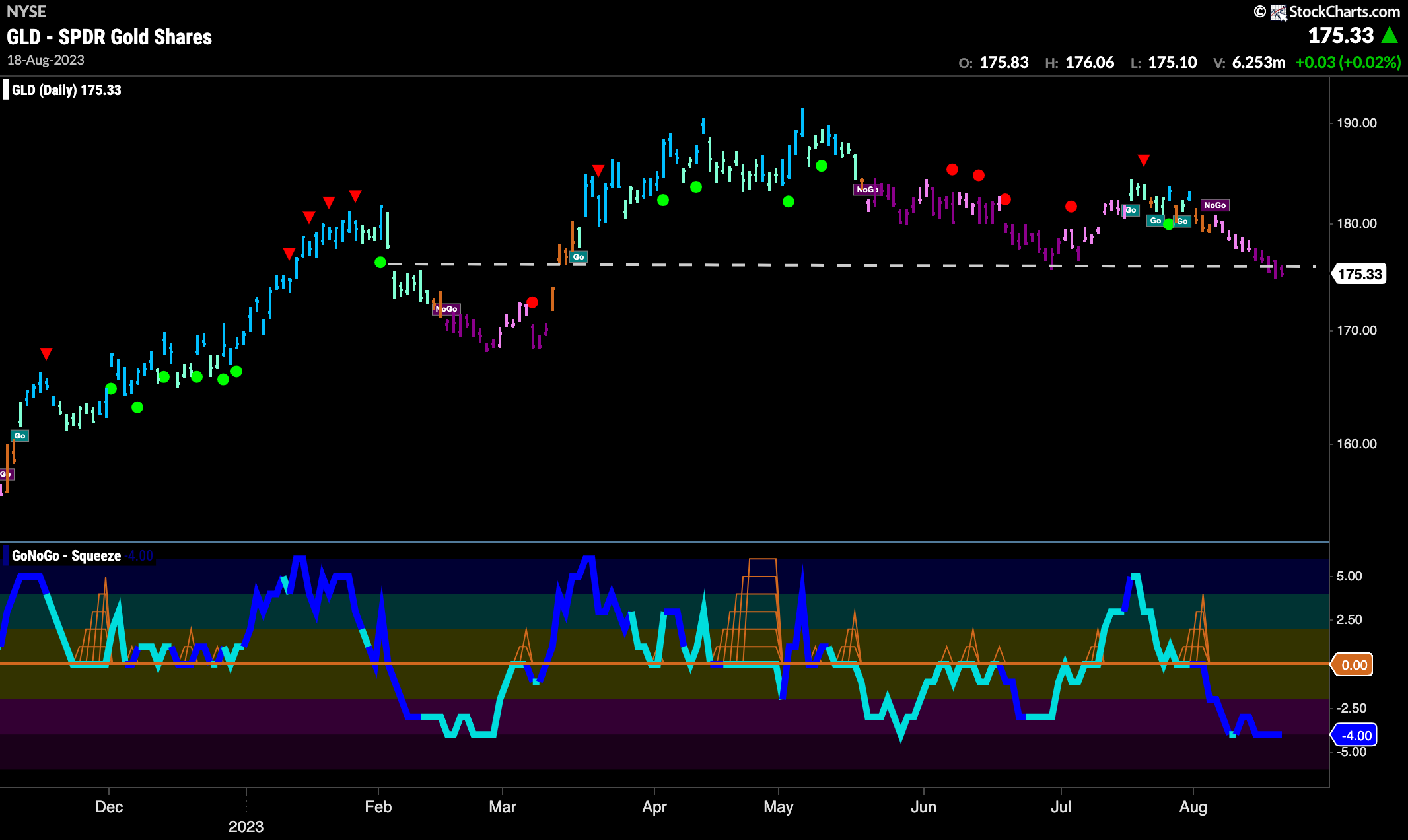
GoNoGo Trend shows the “NoGo” trend strengthen to paint purple bars this week as price falls further and is now testing horizontal support levels. GoNoGo Oscillator is in negative territory on heavy volume which confirms the downward movements of price. We will watch to see if price can break through support and we will look for a new lower low.
Sector RelMap
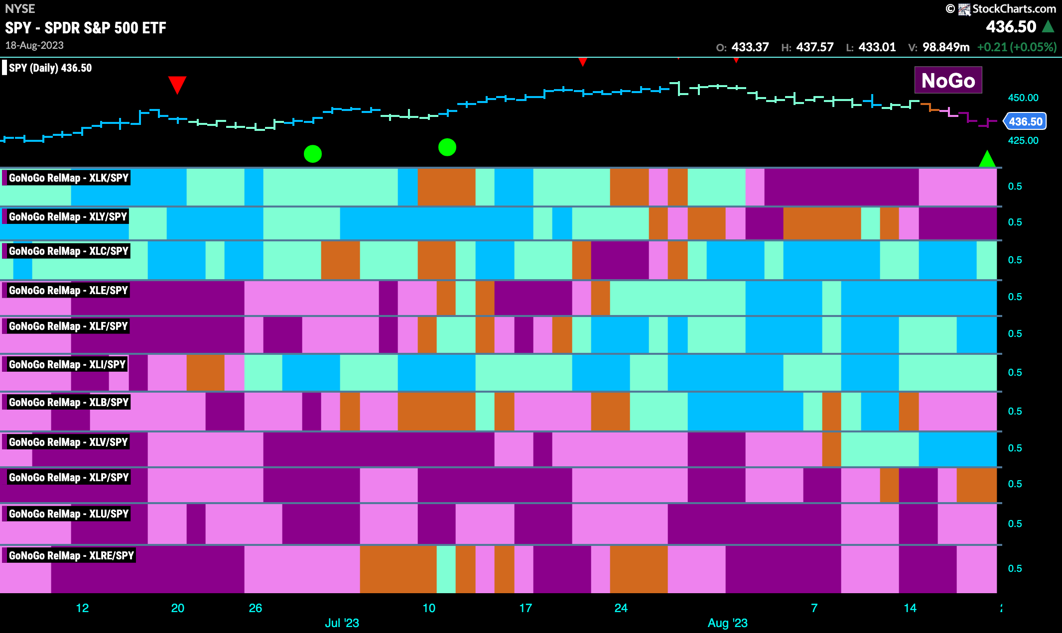
Below is the GoNoGo Sector RelMap. This GoNoGo RelMap applies the GoNoGo Trend to the relative strength ratios of the sectors to the base index. Looking at this map, we can quickly see where the relative outperformance is coming from as well as which sectors are lagging on a relative basis. 5 sectors are outperforming the base index this week. $XLC, $XLE, $XLF, $XLI, and $XLV are painting “Go” bars.
Healthcare Sub Group Map
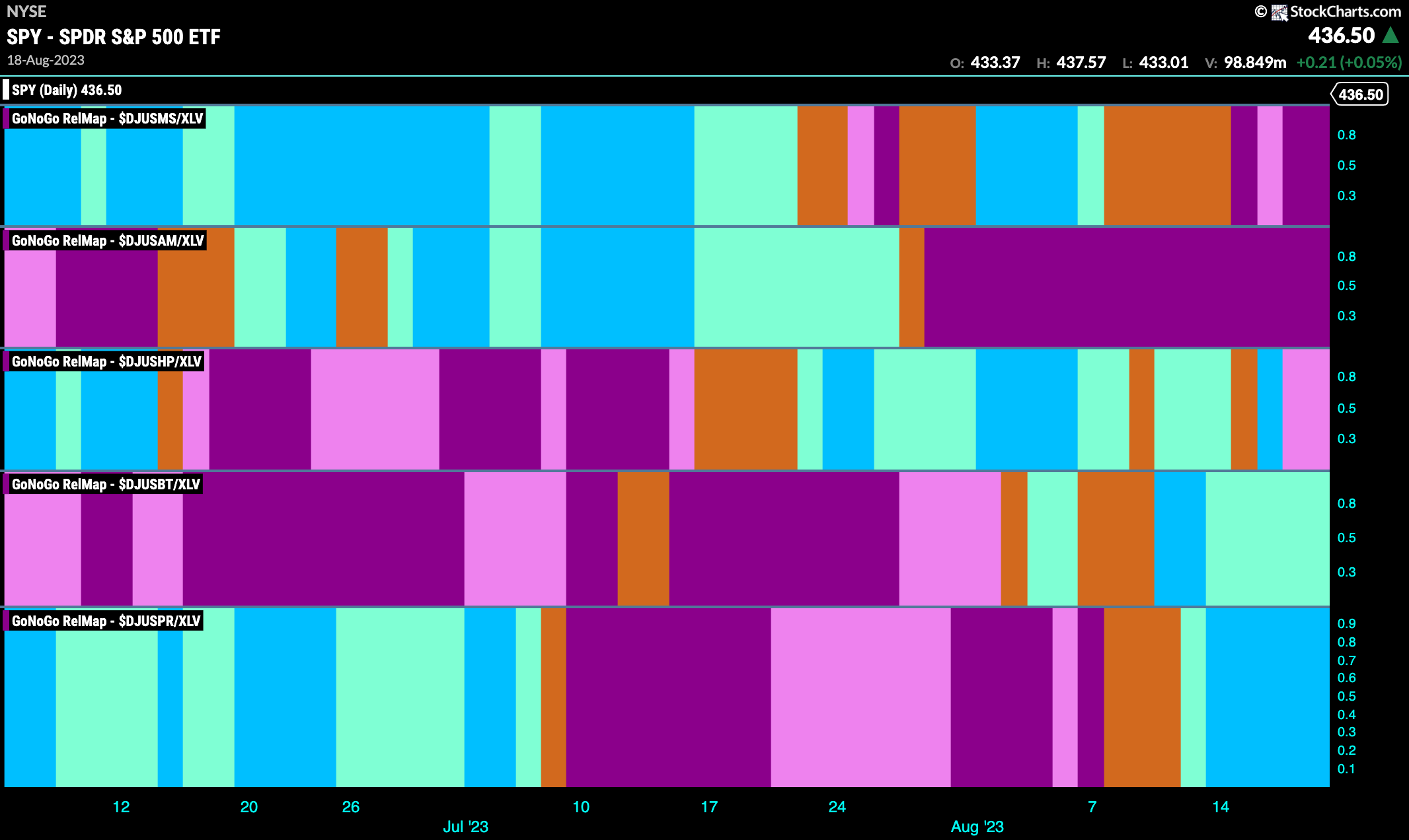
The Sector RelMap above showed that the healthcare sector has been a strong relative out-performer of late. We can use the Sub Industry Group RelMap below to identify out-performing groups within the outperforming healthcare sector. Looking at the map below, we can see that it is the lower two panels, biotech and pharmaceuticals that are leading and in relative “Go” trends.
Pharmaceuticals Outpaces the SPY
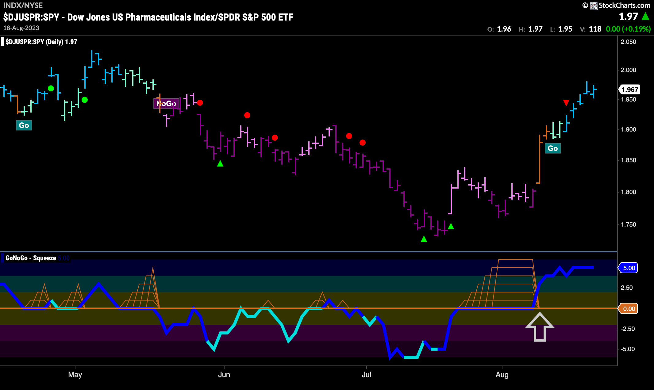
Given the strength of the healthcare sector, and the strength of the pharmaceuticals group, we can use a relative ratio of the pharmaceuticals index to the SPY and apply the full GoNoGo suite of tools to get a sense of that outperformance. We saw a strong break out of a Max GoNoGo Squeeze last week and that was on heavy volume, showing market participation. This led to amber “Go Fish” bars painted by GoNoGo Trend and this ultimately led to a “Go” trend. First the indicator painted weaker aqua bars but last week saw consecutive strong blue bars.
$ANTX Breaks Out
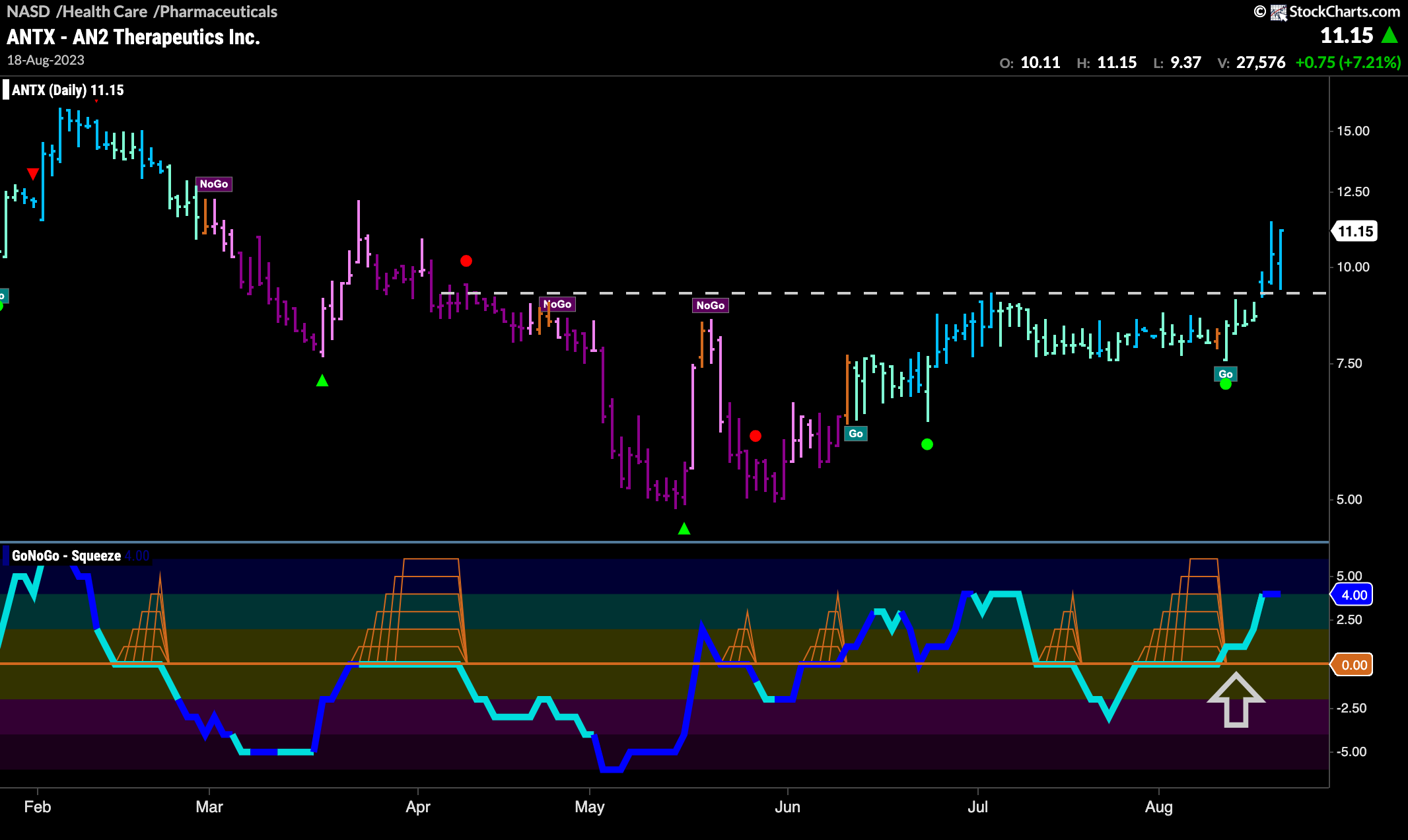
AN2 Therapeutics Inc, is looking strong on the GoNoGo Chart below. Up against strong resistance from prior highs on the chart, we first saw GoNoGo Oscillator ride the zero line in a Max GoNoGo Squeeze as investors fought over direction. Buyers emerged victorious and as the oscillator broke into positive territory that momentum gave price the push it needed to get above resistance. We will look for price to perhaps go higher from here.
