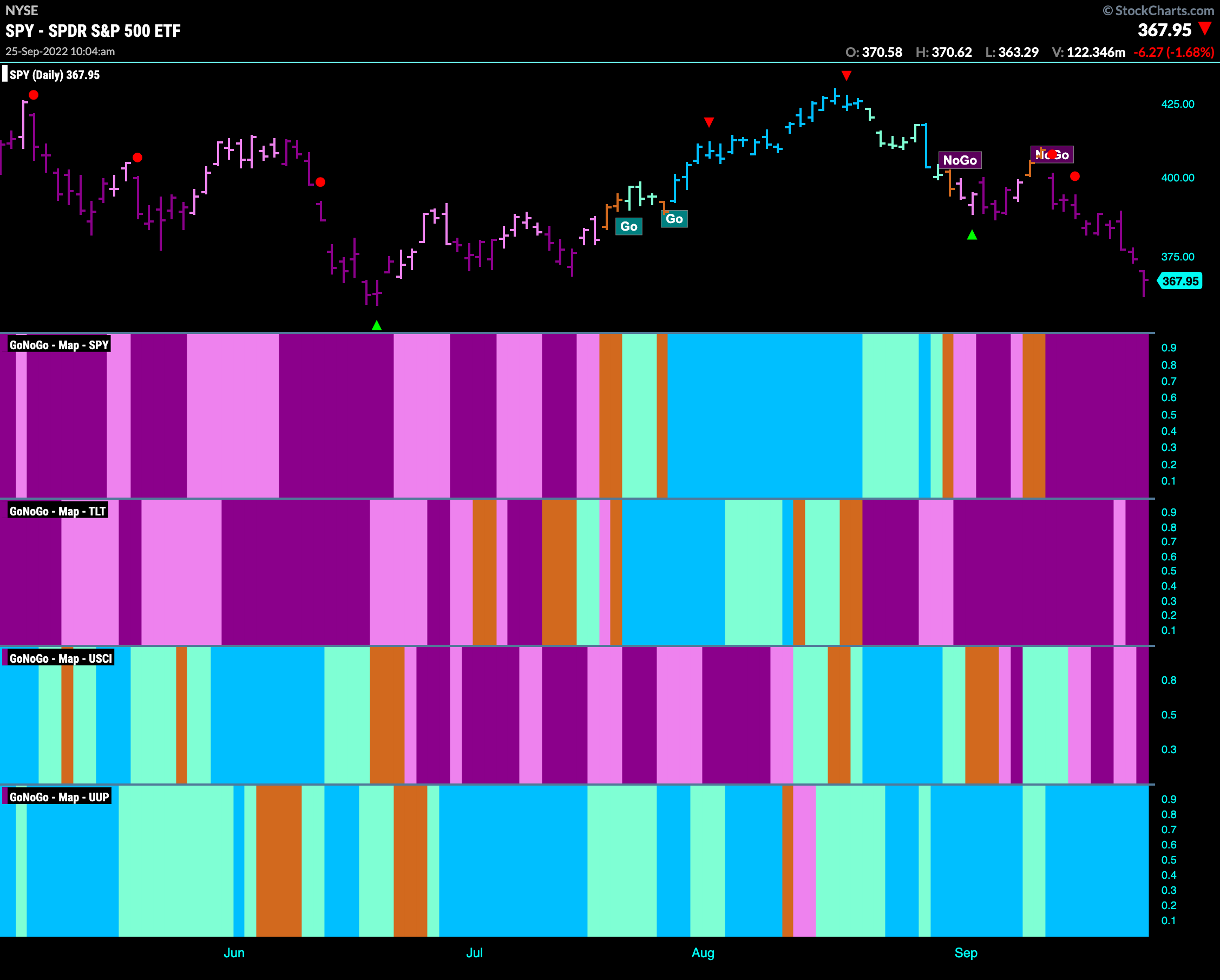
Good morning and welcome to this week’s Flight Path. Let’s take a look at the GoNoGo Asset map below. A bearish picture has emerged across equities, bonds and now commodities. With investors raising cash, the “Go” trend in the dollar continues and in fact strengthens this week. Equities look for support at the June lows. If this level is broken there is some way to fall.
S&P 500 Falls Quickly
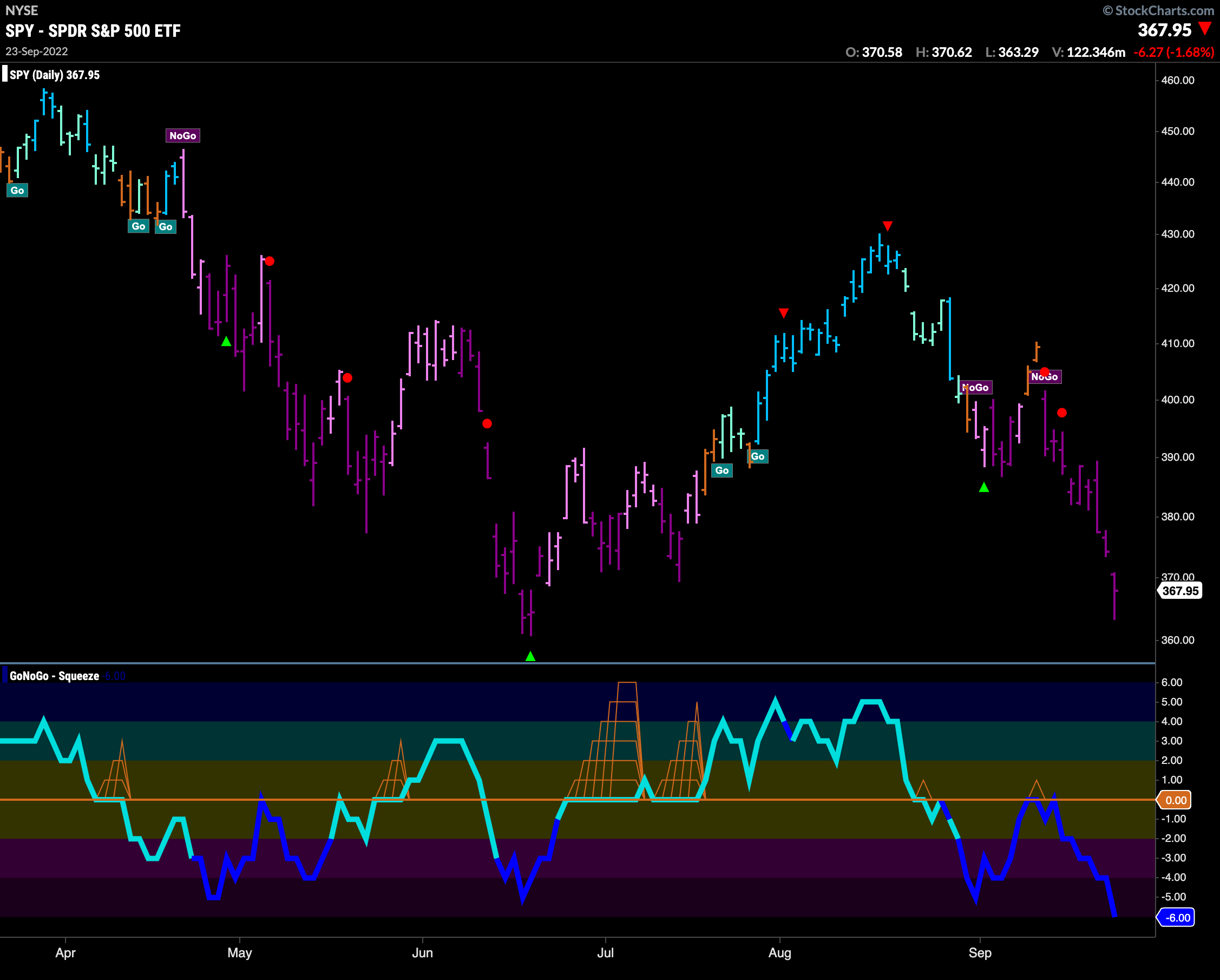
Heavy trading continued in U.S. domestic equities this week as prices fell sharply. GoNoGo Trend continues to paint strong purple “NoGo” bars as price closes in on the June lows. GoNoGo Oscillator remains dark blue in the lower panel indicating heavy volume and has fallen into oversold territory. Last weeks price action has challenged the theory that the low was set in June. We will look to see what happens at these levels.
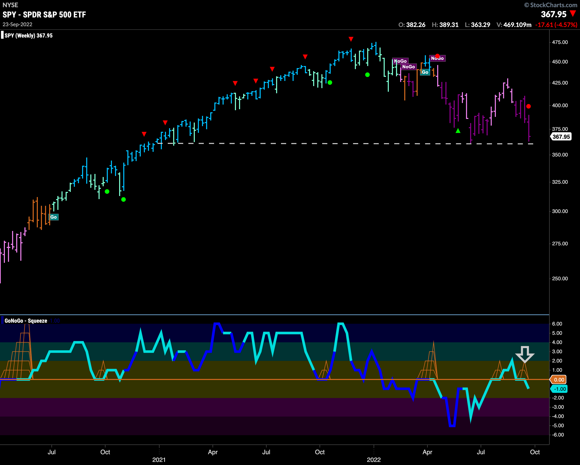
The weekly chart shows that the “NoGo” is firmly in place and that the support we are looking for at June lows stretches back much further to early 2021. Last week’s trading saw GoNoGo Oscillator fall back below the zero line into negative territory telling us that momentum is once again in the direction of the “NoG” trend that we see in the price panel. With GoNoGo Trend painting strong purple bars, we see a NoGo Trend Continuation Icon (red circle) reminding us of the just mentioned momentum situation. With a lot of space below, this is an important level.
“Go” Trend in Rates Soars Through Prior Highs
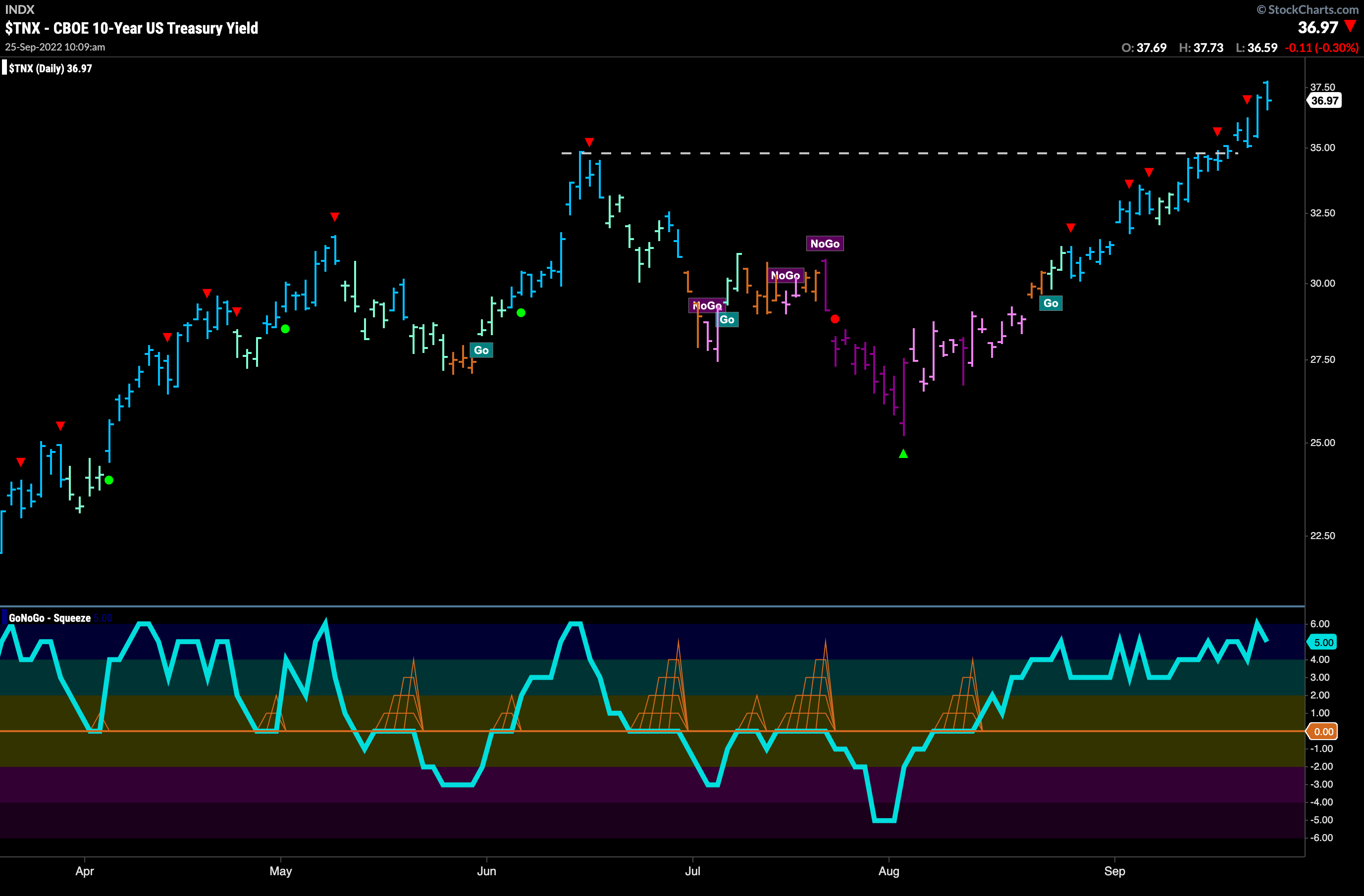
Last week we noted that the “Go” trend in rates was testing highs from June. This week saw price quickly take out those highs and continue higher on a string of uninterrupted blue “Go” bars. GoNoGo Oscillator is overbought but has remained elevated for some time. We have seen how strong this trend is as several Go Countertrend Correction Icons (red arrows) have been ignored.
Dollar Moves Higher in Strong “Go” Trend
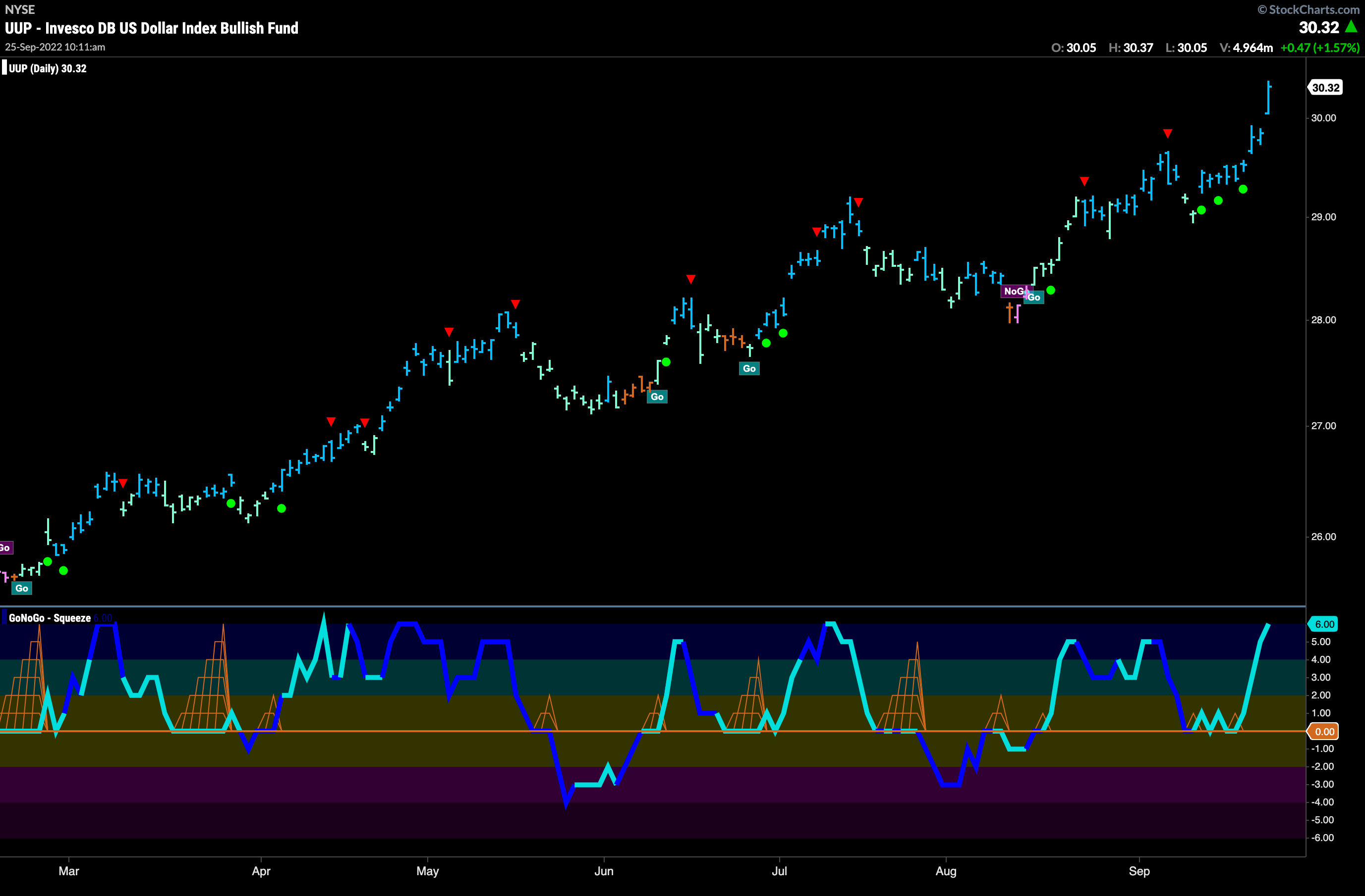
The dollar is making me want to take another European vacation as quickly as possible. The cross rate with the Euro is less than 1, showing the dollar to be stronger than it has been at any point in the last 20 years. The chart below shows the ETF $UUP, making another new high this week. In last weeks Flight Path we noted that the dollar was looking for support. It found it this week. Multiple Go Trend Continuation Icons (green circles) propelled price higher in short order.
Longer Term Oil Chart Shows “Go Fish” Transition to “NoGo”
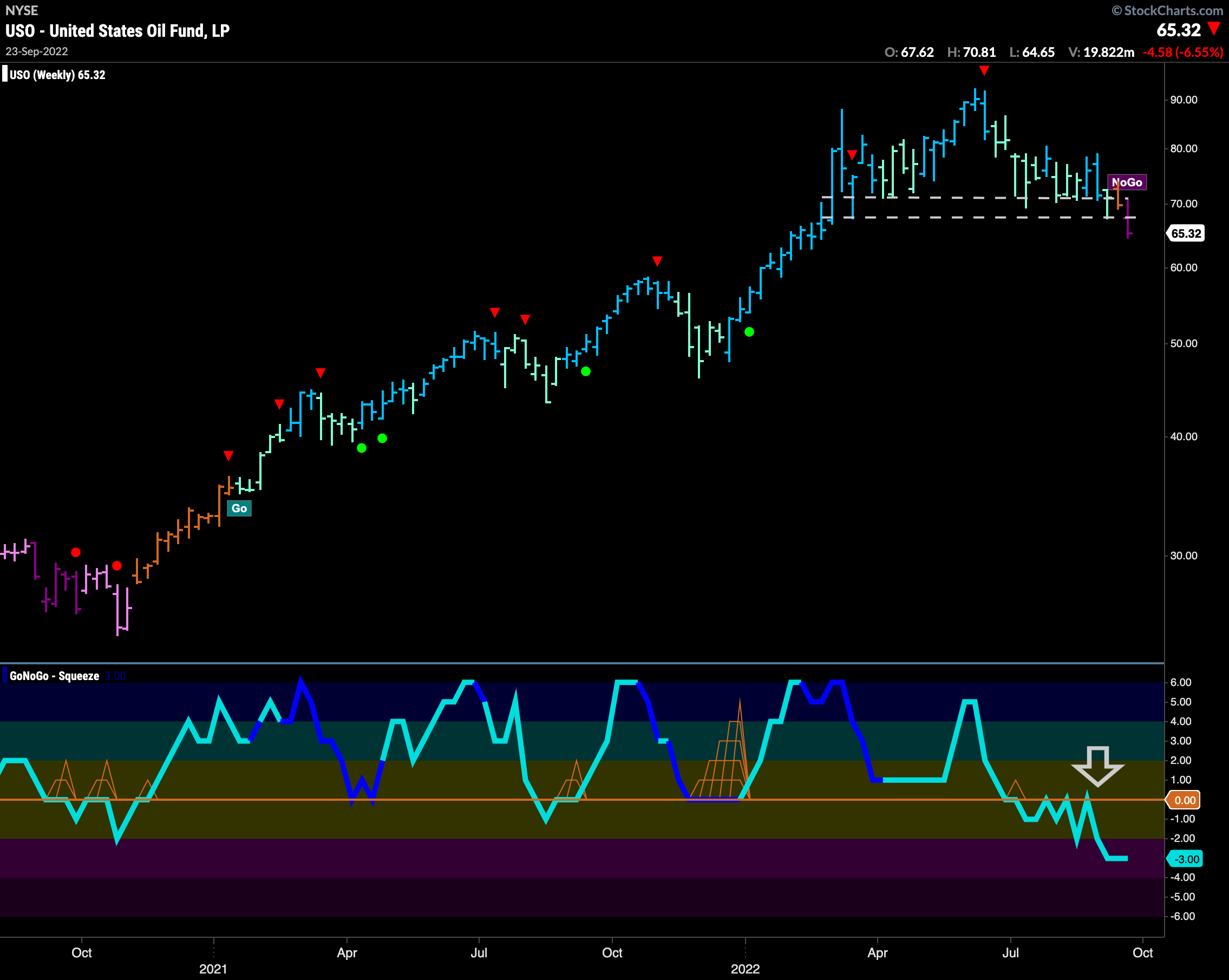
Below is the weekly chart for $USO. For several weeks now we have noted that GoNoGo Oscillator is below zero and finding resistance at that level. We saw the threat made by the GoNoGo Oscillator being rejected by zero and the amber “Go Fish” bar carried out as GoNoGo Trend painted a strong “NoGo” bar below support this week. Price will look for support at the highs from fall 2021 but until then further price deterioration is possible.
Daily Chart Sees Battle Won by NoGo
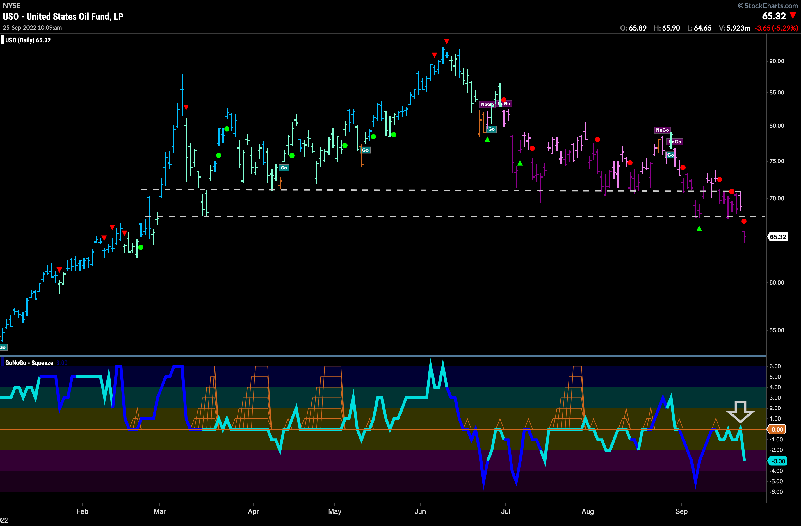
Below is the daily GoNoGo Chart for $USO. In more detail, we can see how price has failed to find support in the range on the chart. The weekly chart above showed that the longer timeframe trend has changed to a “NoGo” and on the daily chart here we see that we are getting a NoGo Trend Continuation Icon (red circle) as GoNoGo Oscillator gets rejected by the zero line telling us momentum remains strong in the direction of the “NoGo”.
Sector RelMap
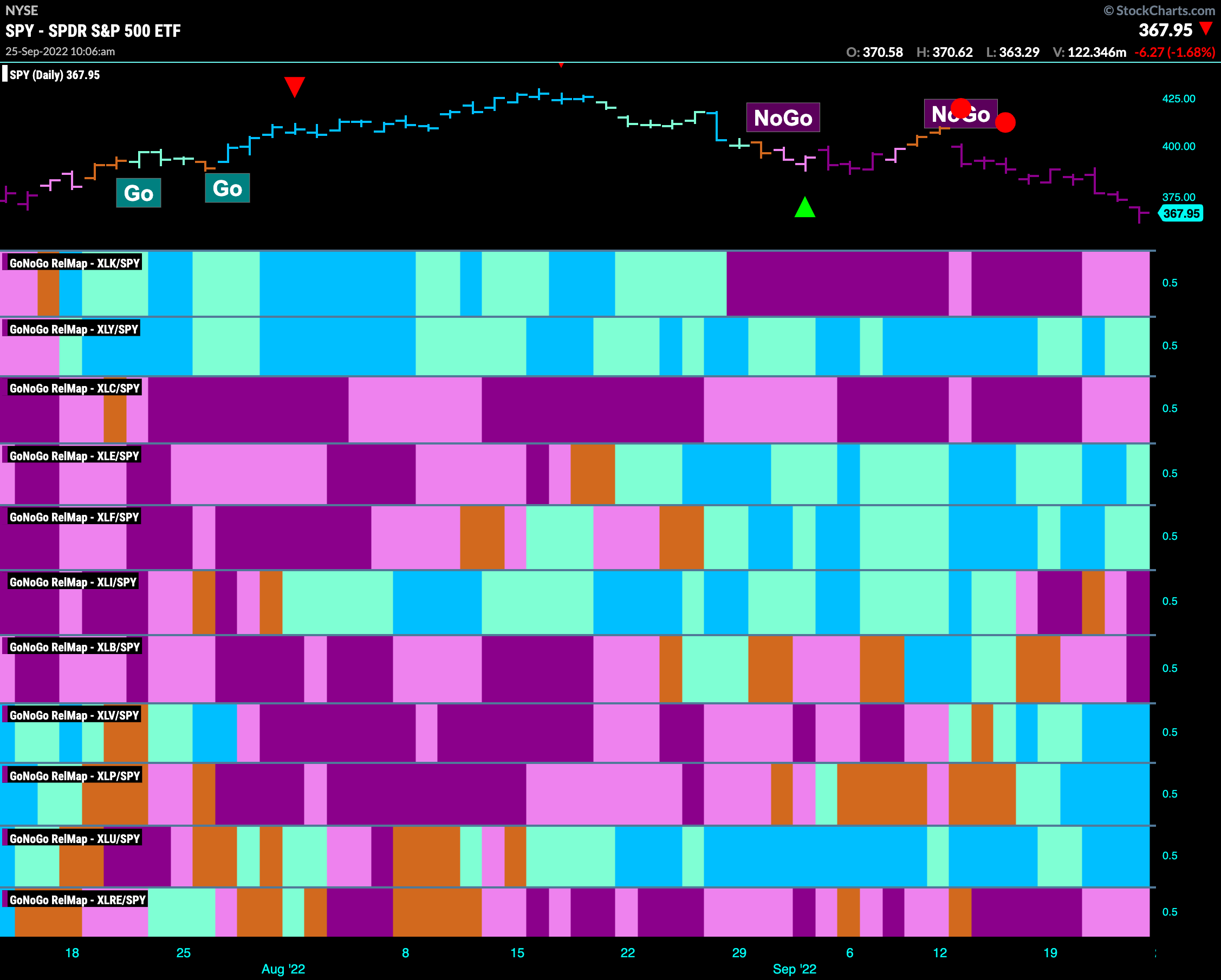
Below is the GoNoGo Sector Relmap. This GoNoGo Relmap applies the GoNoGo Trend to the relative strength ratios of the sectors to the base index. Looking at this map, we can quickly see where the relative outperformance is coming from as well as which sectors are lagging on a relative basis. Industrials and materials both followed through on the NoGo trends that were spotted last week. The Go trend in discretionary weakened to aqua bars. Healthcare, utilities and staples remain in strong relative “Go” trends.
Consumer Discretionary in Pure “NoGo” Trend
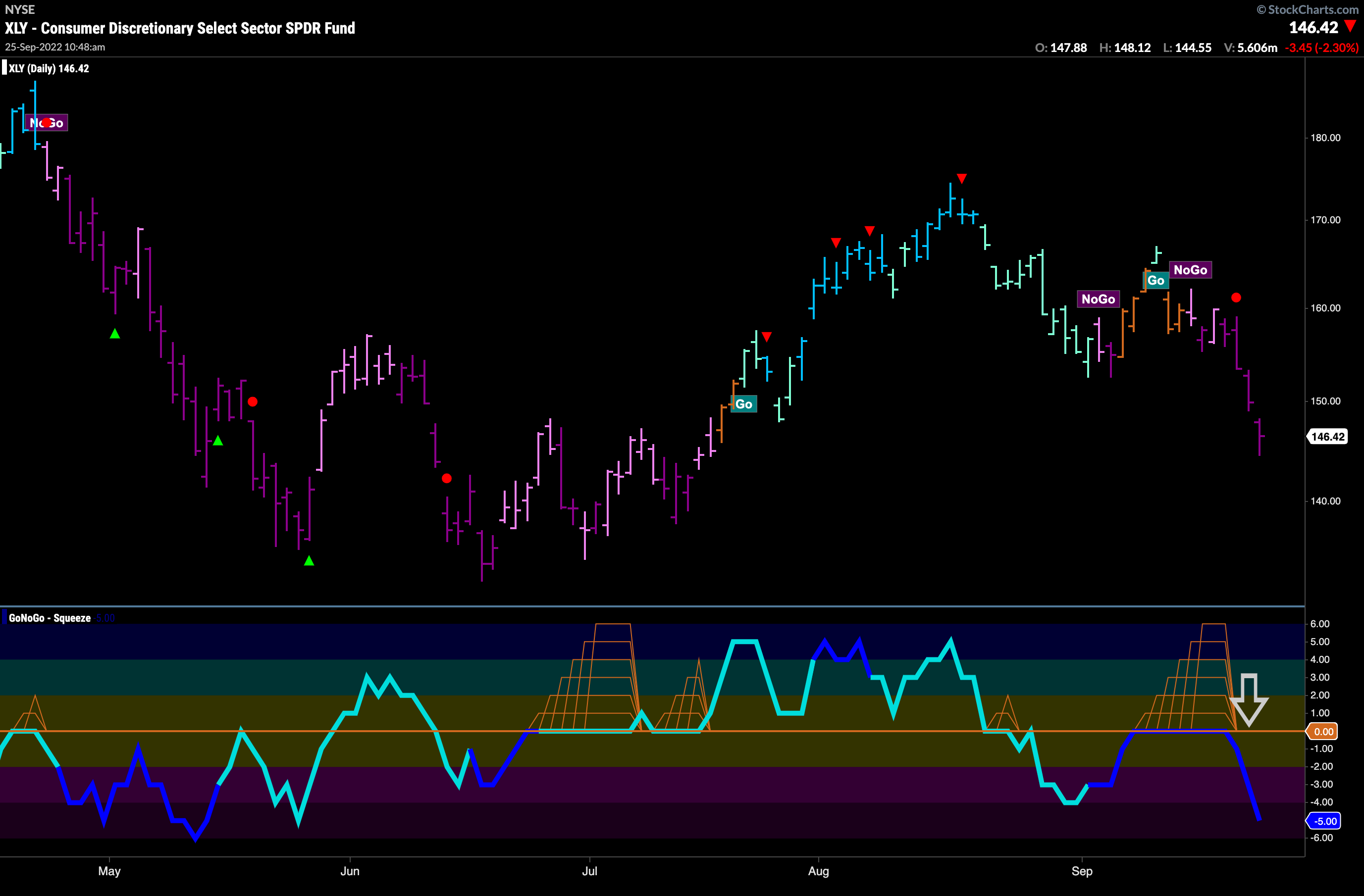
We’ve seen from the GoNoGo Sector Relmap above that consumer discretionary is relatively outperforming. Let’s take this moment to think about whether that means that the price action for $XLY is necessarily bullish. Of course it doesn’t! Below is the GoNoGo chart for $XLY. While we can see that the recent “NoGo” hasn’t pushed price down to test the June lows yet, we still see price dropping fast in a strong “NoGo”. Will it catch up to the rest of the market?
$CAR Breaks Through Support on Heavy Volume
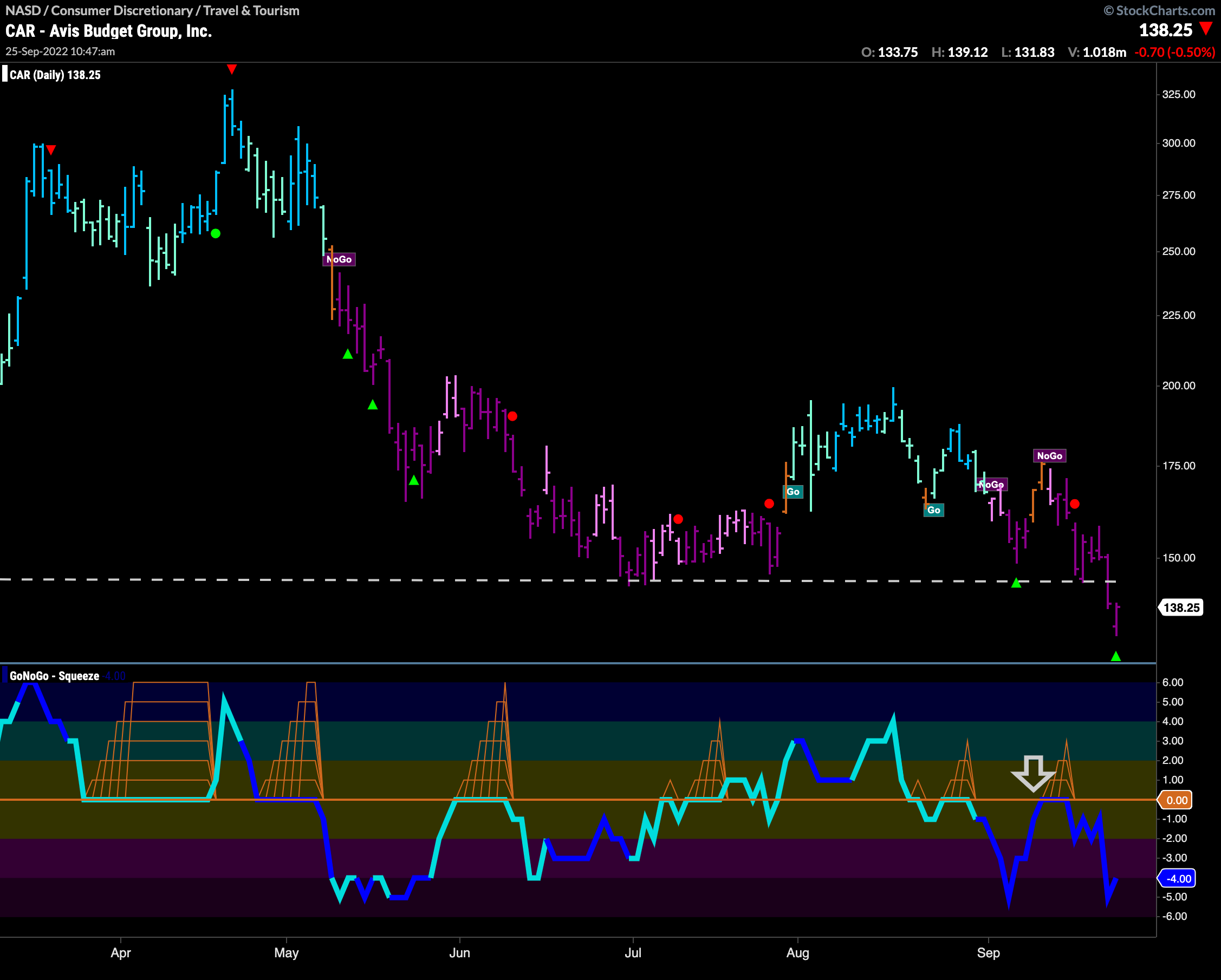
Avis Budget Group is in the consumer discretionary sector. Below is the daily GoNoGo Chart. We can see that price is in a strong “NoGo” and falling fast. It has had little trouble with the horizontal support level from early summer lows. GoNoGo Oscillator has been finding resistance at the zero line and has been turned away again on heavy volume. This resurgence of momentum in the direction of the “NoGo” trend was enough to push price to new lows.
Weekly Chart of $CAR Shows Engine About to Stall?
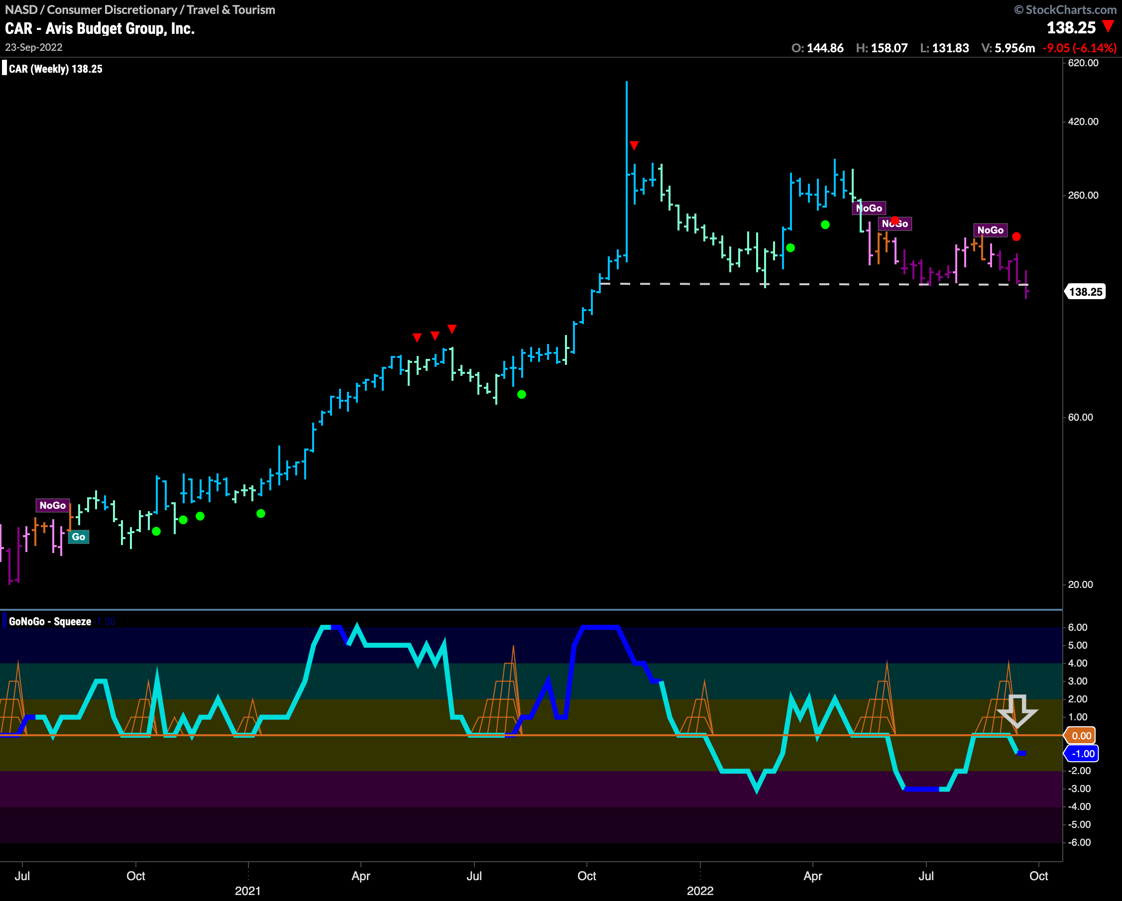
The longer term chart shows how significant the support level we see price breaking below is. Looking at this chart we can see that there was also support earlier in 2022. Price is in a strong “NoGo” trend and GoNoGo Oscillator has just been turned away by the zero line, causing a NoGo Trend Continuation Icon (red circle) to appear on the penultimate price bar. This suggests we may move lower and consolidate below that support level. Looking at the space below, price could move to an initial target of around $95.
