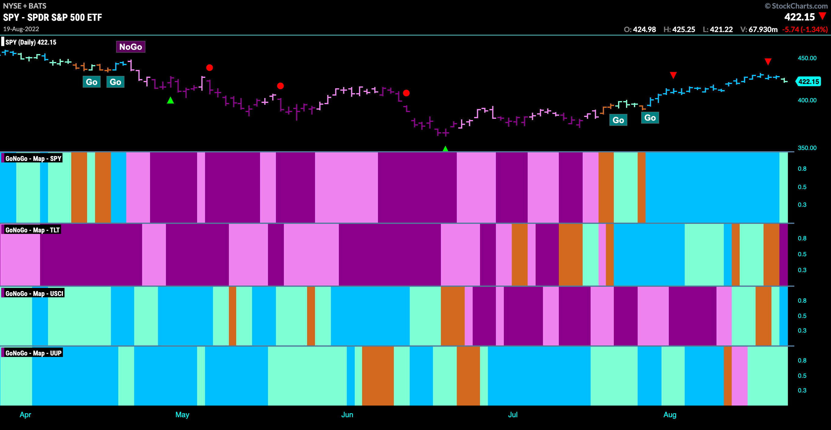
Good morning and welcome to this week’s Flight Path. Let’s take a look at the GoNoGo Asset map below. Equities continue in their “Go” trend although a heavy down day to end the week saw the indicator paint a weaker aqua bar. Treasury bond prices rolled over, moving through aqua “Go” bars to amber “Go Fish” before finally painting a strong purple “NoGo” bar to end the week. Commodities saw a return to a “Go” trend this week as did the U.S. dollar.
S&P 500 Testing Support
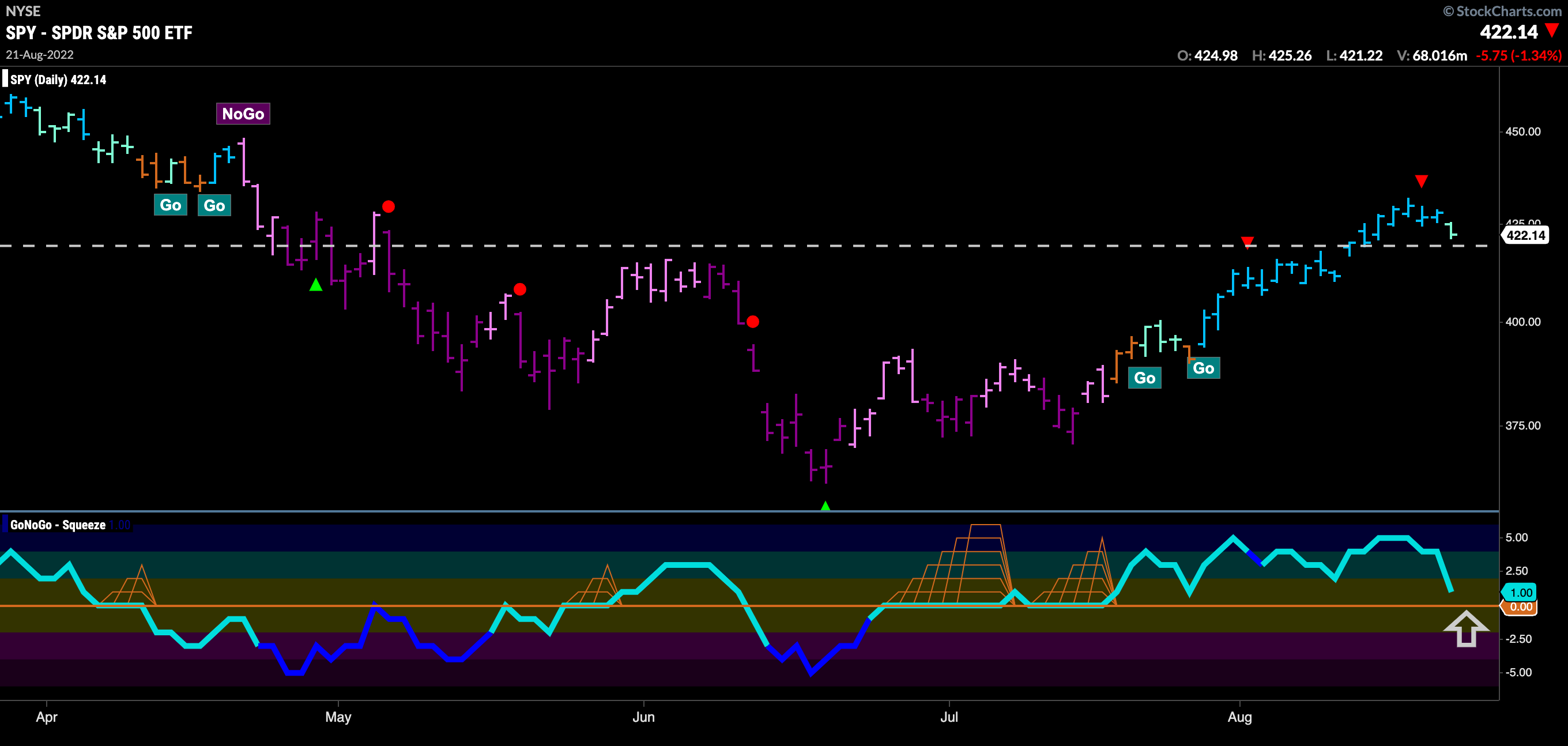
After breaking above resistance last week we saw price cool off from the Go Countertrend Correction red arrow and is now painting a weaker aqua bar as it tests support. This is the concept of polarity where resistance becomes support once broken. We will look to see if that is the case here. GoNoGo Oscillator is approaching the zero line where we will watch closely. The zero line provides an objective level that can be used as support when in a “Go” trend.
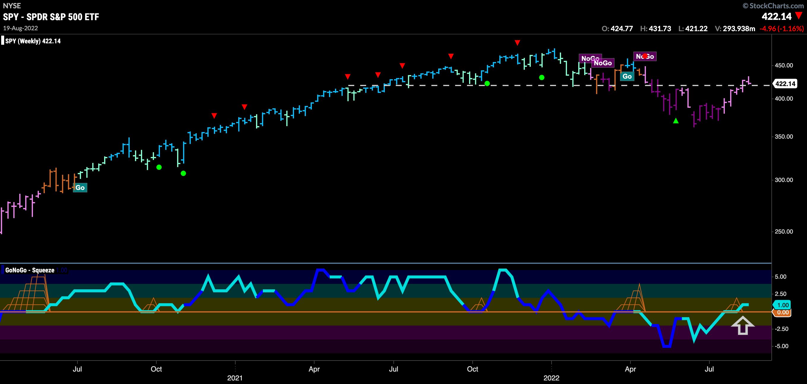
On the longer term chart, we see that the “NoGo” is being threatened. While the weight of the evidence tells us the “NoGo” remains in place, we see that GoNoGo Trend is painting weaker pink bars and that GoNoGo Oscillator has failed to be rejected by the zero line, crossing into positive territory. This tell us that there is some positive momentum as price wrestles with long term support/resistance levels.
A Return to Rising Rates?
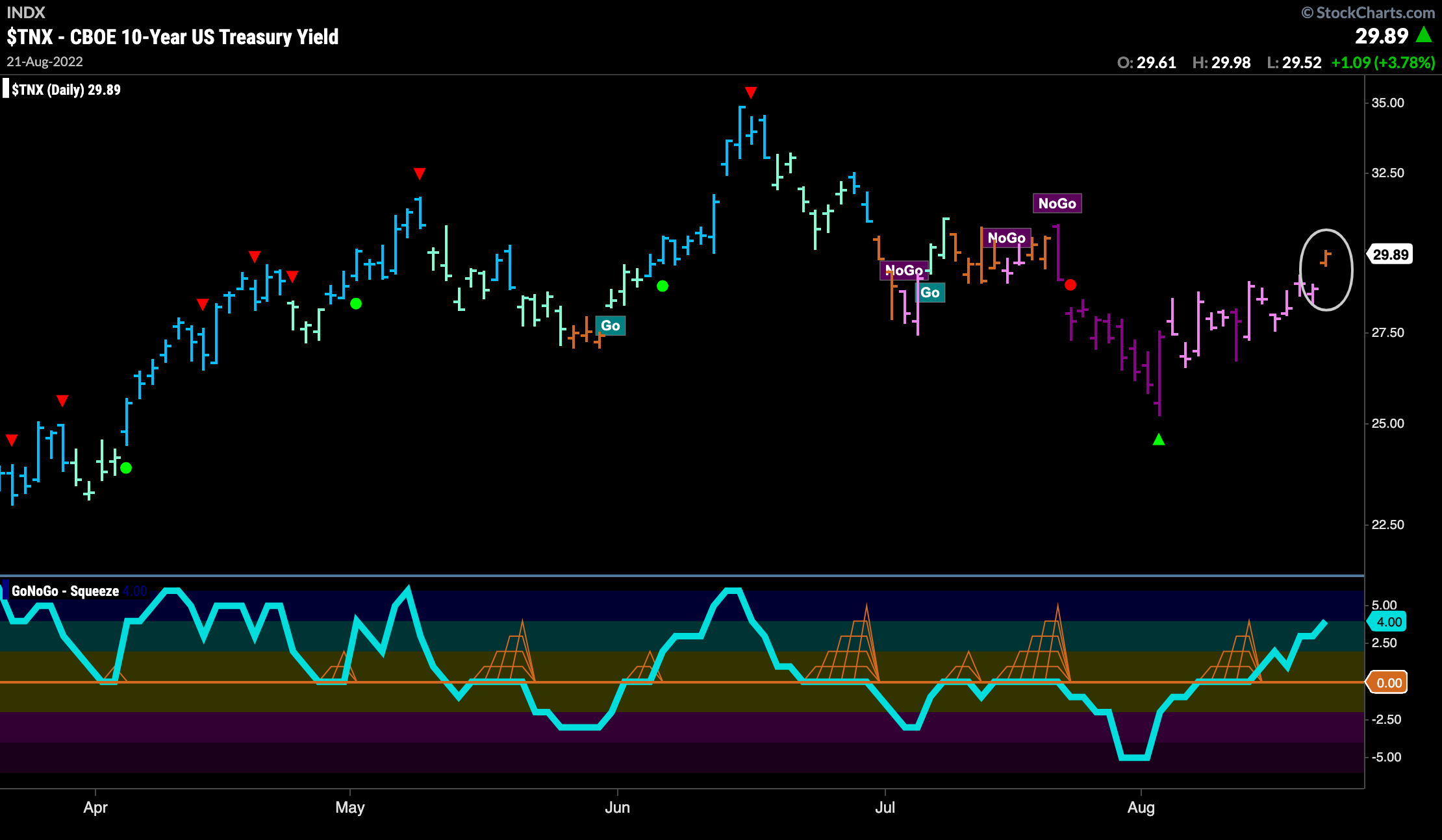
We saw GoNoGo Oscillator break through into positive territory last week, noting that it was a concern for the “NoGo” trend. This week saw more weak pink “NoGo” bars as GoNoGo Oscillator climbed further into positive territory. On the final day of the week, GoNoGo Trend painted an amber “Go Fish” bar indicating uncertainty as to the trend conditions. We will watch to see if this is a transition to more bullish price action.
Dollar Refuses to be Held Down
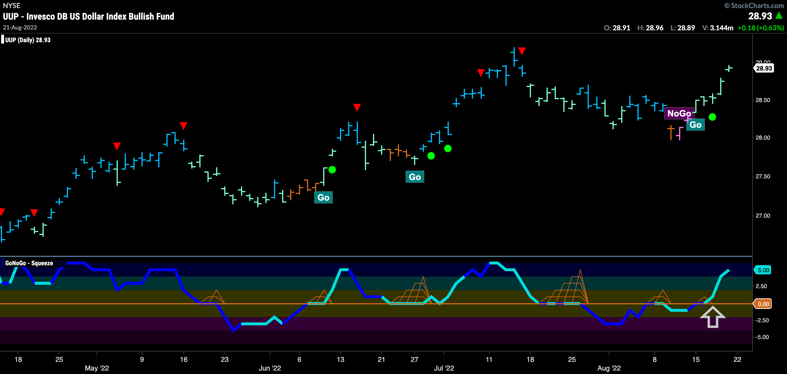
The dollar continues to surprise as it has returned to “Go” bars this week. After a correction that was strong enough to push GoNoGo Oscillator into negative territory and GoNoGo Trend to even paint a “NoGo” bar, we see the oscillator burst back into positive territory confirming the new “Go” trend that has emerged in price.
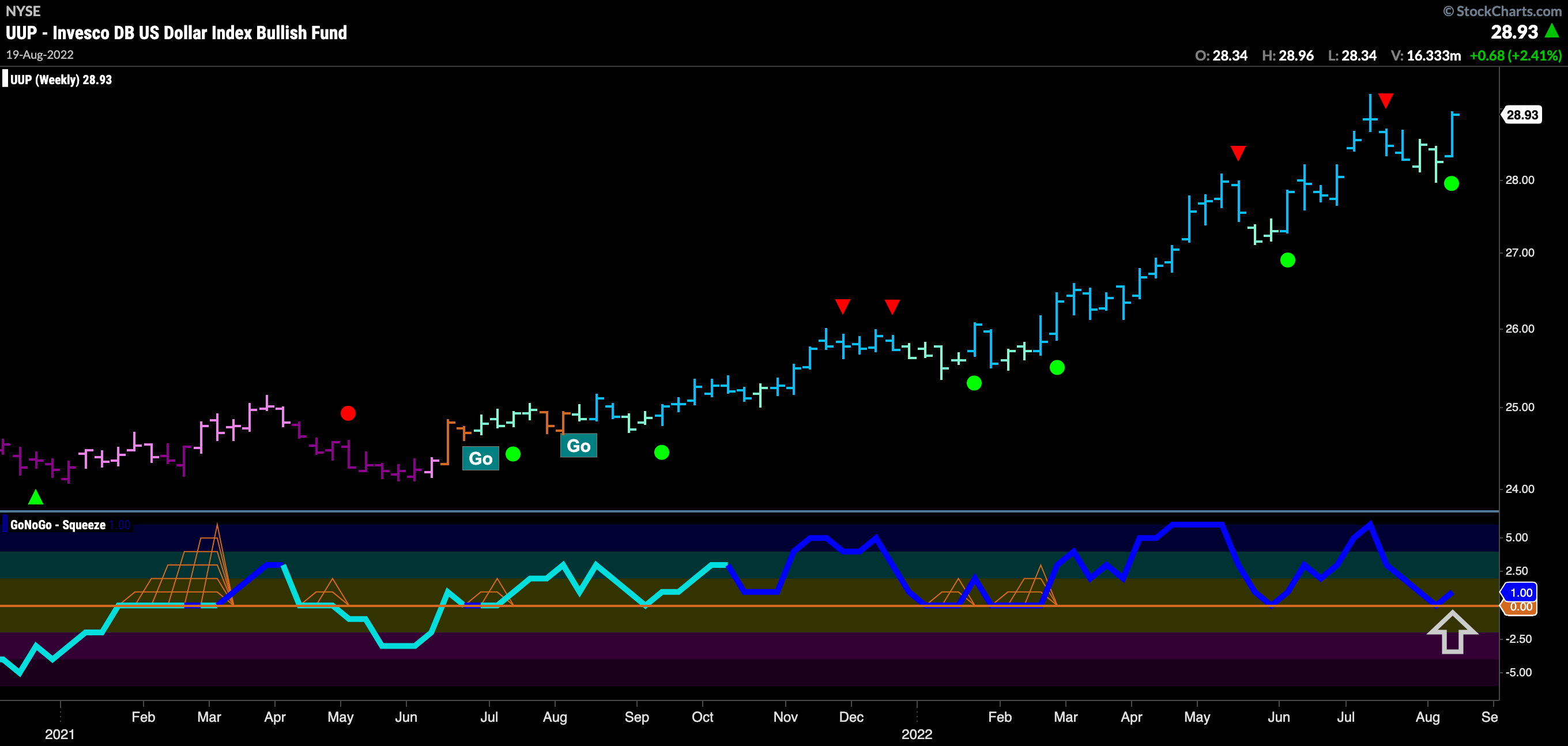
If we look at the price action of the dollar on a longer time frame chart we can see that the picture remains quite bullish. GoNoGo Oscillator has found support at the zero line signaling a Go Trend Continuation Icon (green circle) to appear under the last price bar. We can look for price to make an attempt to surpass recent highs.
Oil at Inflection Point
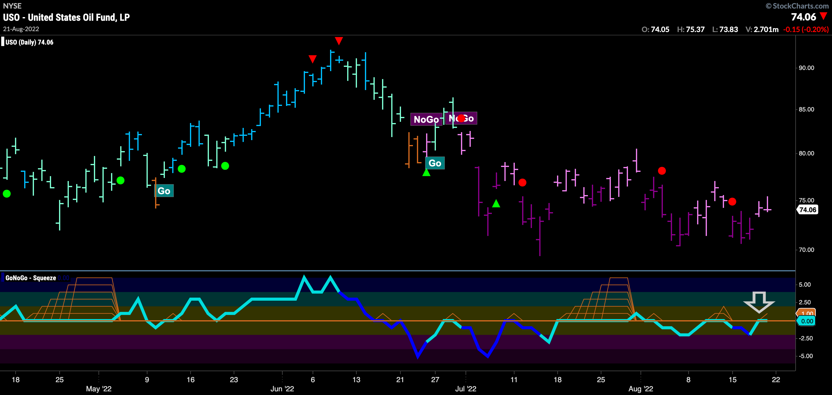
Below is the daily GoNoGo Chart of $USO. We can see that the “NoGo” remains in place as price makes a series of lower lows and lower highs. However, we do see GoNoGo Oscillator making a series of higher lows as it once again rises to test the zero line. For the “NoGo” trend to continue, this zero level should act as resistance and if the oscillator gets turned away we can expect price to move lower once again. If the oscillator breaks into positive territory we might see GoNoGo Trend struggle to continue to paint “NoGo” bars.
Sector RelMap
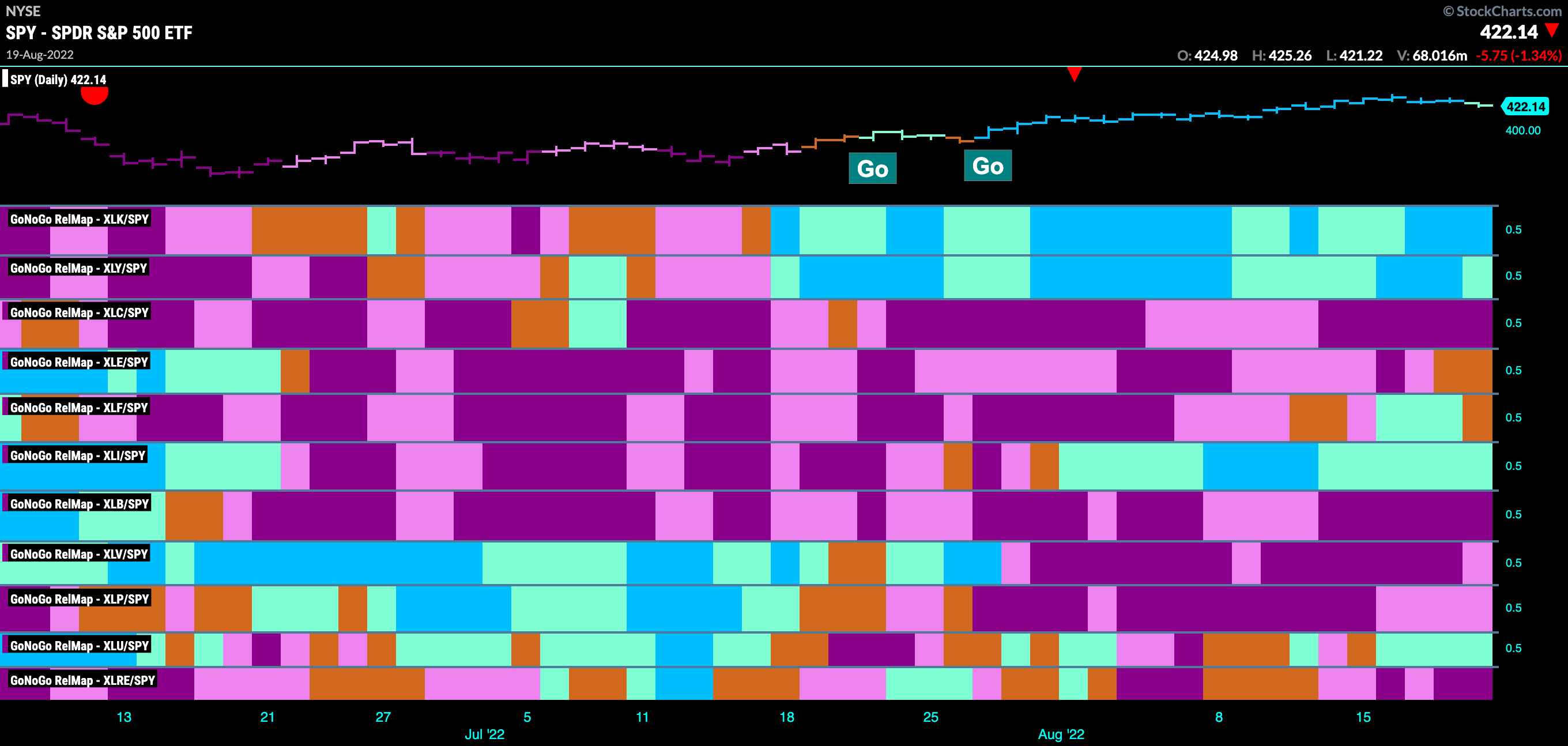
Below is the GoNoGo Sector Relmap. This GoNoGo Relmap applies the GoNoGo Trend to the relative strength ratios of the sectors to the base index. Looking at this map, we can quickly see where the relative outperformance is coming from as well as which sectors are lagging on a relative basis. We see strength continue in the growth sectors, technology and discretionary. Technology in particular saw continued strength this week as GoNoGo Trend paints uninterrupted blue “Go” bars.
An $AAPL a Day Keeps the Dr. Away
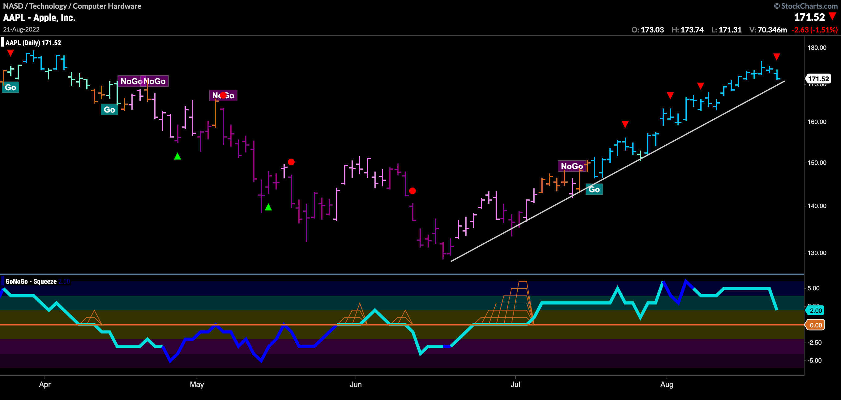
With the strength in Technology evident, the chart below shows the daily GoNoGo Chart of one of the industry giants, Apple, Inc. Apple has been on a strong run of late and we can see that reflected by the GoNoGo Charts. After GoNoGo Oscillator broke out of a max GoNoGo Squeeze into positive territory in July, GoNoGo Trend followed suit by painting some amber “Go Fish” bars before settling into a strong “Go” trend. Price has fallen slightly back to the upward sloping trend line and GoNoGo Oscillator is approaching the zero line.
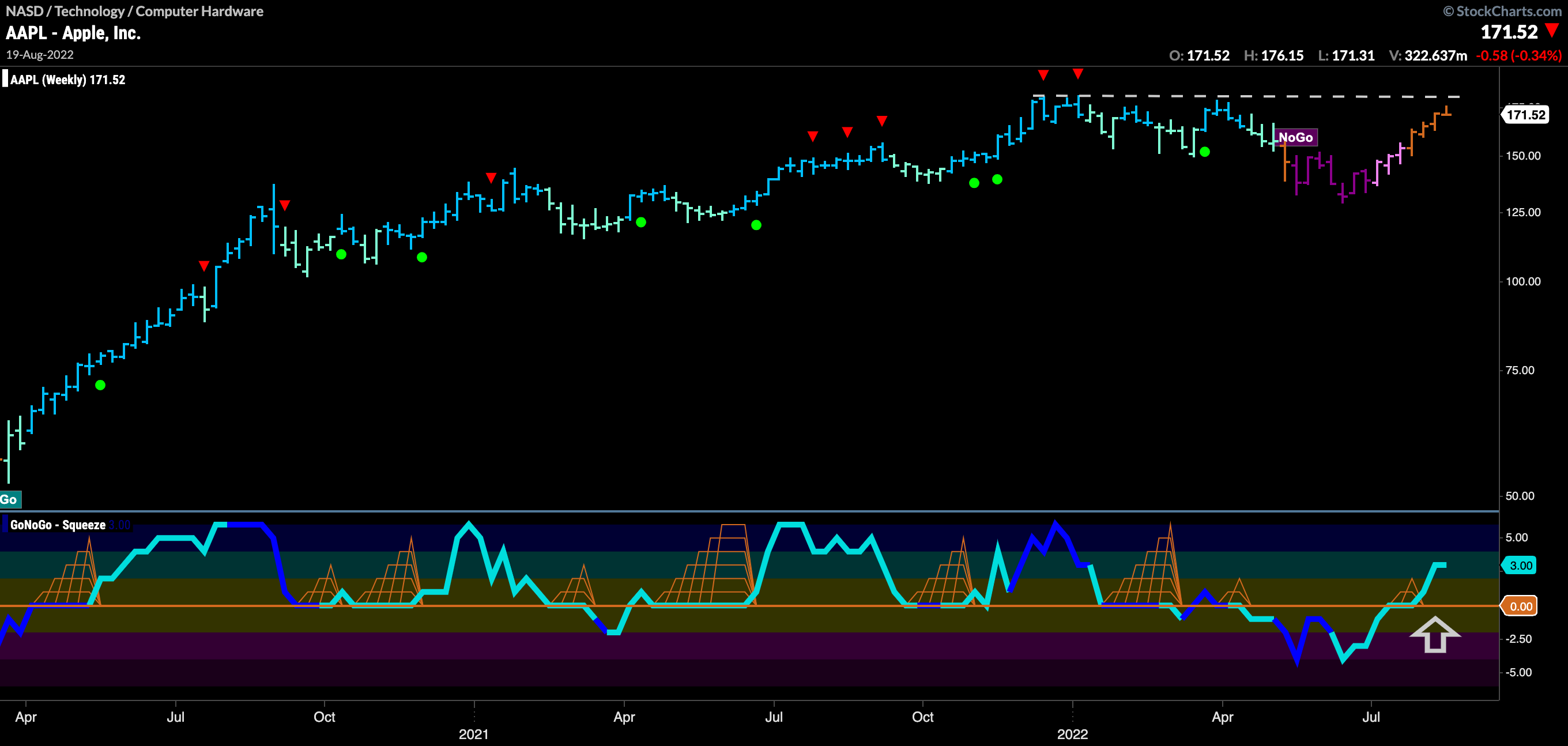
On a longer term chart, we see that this is an important moment. Price has run back up to test the highs from the end of last year/start of this year, and we see GoNoGo Trend paint a string of amber “Go Fish” bars. GoNoGo Oscillator confirms the changing trend environment as it has broken above zero into positive territory. If price can climb above resistance we will likely see GoNoGo Trend begin to paint “Go” bars.
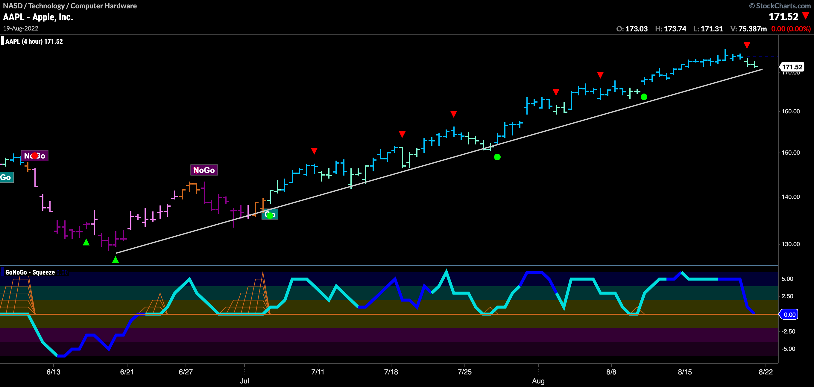
Stepping down a timeframe, we can look at the 4hr chart of $AAPL in order to perhaps get a good entry. As price drops from the recent high, we can see on this chart that GoNoGo Oscillator is testing the zero line on heavy volume. Should it find support here, and rally back into positive territory we will see a Go Trend Continuation Icon (green circle) appear under the price bar, offering a low risk opportunity to enter the trend. We can see how this has been the case twice before in this move. If we see a Go Trend Continuation icon, we can look for price to make a new high.
