
U.S. equities finished a shortened week lower, notching a third-consecutive week of losses, in what has been a volatile start to 2022. As has been the theme over the past several weekly sessions, early gains faded and succumbed to concerns over the economic implications of a potentially more aggressive Fed amid persistent inflation pressures, and the expectations of rising interest rates. The GoNoGo Asset Map below shows we are truly now in a risk off environment. Equities have rolled over into a “NoGo” trend painting strong purple bars to end the week. Treasury bond prices are in a “NoGo”, Bitcoin continues to new lows as its “NoGo” endures and the almighty dollar is in a “NoGo” as well painting pink bars.

Let’s take a look at sector trends on a relative basis against the S&P 500 index to get a sense of leaders and laggards in a week when everything ended in the red.

- GoNoGo RelMap shows 2 sectors underperforming the benchmark index as it fell this week: consumer discretionary $XLY and information technology $XLK in strong purple “NoGo” trends
- The rotation into defensive and cyclical sectors continues as 7 sectors showed relative strength – not falling as sharply as the index
- Materials, healthcare, staples, energy, financials, industrials and utilities are in relative “Go” trends
- Financials $XLF fell to the weaker aqua trend conditions relative to the index, and communications $XLC attempted a relative “Go” trend before slipping back to paint a weak pink “NoGo” bar to end the week
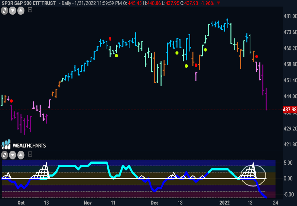
Technology Tumbles
The rebound in the Information Technology sector fell flat, leading in this week’s sharp drop that pulled the Nasdaq into correction territory. The technology heavy index slumped roughly 7.5%, its biggest weekly drop since the start of the pandemic – labeled a market in “correction” after 10% drop in 2 months. The chart below shows the $XLC, the technology sector of the S&P 500.

But of course, it wasn’t just technology that struggled this week. The communications sector after briefly flirting with a weak aqua “Go” trend on a relative basis to the larger index this week slipped back into a “NoGo” on Friday. The sector has been an under-performer for some time now and the below weekly chart shows that the long term view does not paint a rosy picture either. After GoNoGo Oscillator struggled to find support at the zero line, GoNoGo Trend painted amber “Go Fish” bars and weak pink “NoGo” bars before rolling over into strong purple “NoGo” bars the last two weeks.

Netflix to New Lows
We saw a more than 20% decline in Netflix on Friday. Netflix plunged after its stronger-than-expected Q4 results were overshadowed by Q1 guidance that suggested subscriber growth and revenue would be decisively below the Street’s forecast. The GoNoGo Chart below shows that Netflix has been in a strong “NoGo” trend since breaking the trend line with the “Go Fish” bar at the end of November. More recently, the NoGo Trend Continuation red circle gave investors a fresh opportunity to participate in the “NoGo” trend.

Use Your Discretion with Ford and Home Depot
Weakness in automakers and home improvement retailers dragged down the consumer discretionary sector. The chart below shows Ford with the daily GoNoGo Trend and GoNoGo Oscillator applied. Having been a strong performer in an uninterrupted “Go” trend for several months investors will act with caution going forward. An amber “Go Fish” bar tells us that GoNoGo Trend can no longer paint “Go” colors, and GoNoGo Oscillator has dipped below the zero line on heavy volume.

Turning to Home Depot, we can see that traditional technical analysis can be applied on top of the GoNoGo Chart to add weight to our analysis. This is a beautiful chart. The double top jumps off the screen with price making two highs remarkably close to each other. The support (neckline) level can be easily identified as well. With the GoNoGo Chart we like to see deterioration of trend condition over the right side of the pattern. That allows us to see the market dynamics play out perfectly. In this case it is clear. As price fell to the neckline after the first high, GoNoGo Oscillator was unable to hold the zero line. When price rose the second time and failed to go higher, we saw divergence as the oscillator made a lower high. GoNoGo Trend then fell out of “Go” colors first with an amber “Go Fish” bar and then pick “NoGo” bars as price tried to hold the neckline before moving lower and painting strong purple “NoGo” bars as the oscillator went lower on heavy volume.

Interest Rate Worries and the Dollar
Early in the week, interest rates rose on inflation concerns. 10 year yield brushed up against 1.90% and although they retreated a little by Friday investors were spooked. Inflation hikes doesn’t bode well for the dollar as the price of goods and services increase rendering the greenback less valuable. The GoNoGo Chart below shows the technical environment for $UUP. As price consolidated sideways into the end of the year, momentum was telling. GoNoGo Oscillator fell below zero and then started to find resistance at that level as GoNoGo Trend struggled to paint “Go” bars. We saw “Go Fish” colors toward the end of the pattern before pink “NoGo” bars broke below support. Now, price is finding resistance at previous levels of support (polarity) and GoNoGo Oscillator is testing the zero line from below. We will look to see if it gets turned lower again and if so expect a new leg down in price.

Where to Turn for Inflation Winners? Energy and Gold?
While the market tumbles and the fed deliberates, we can look at securities that are poised to perhaps do well in an inflation rising environment. Or, at the very least, suffer less. Below is a chart of Devon Energy. Yes, the end of the week hurt for those holding the energy stock, but let’s take a look at the chart from a GoNoGo perspective. $DVN broke out to new highs at the end of the year as we saw fresh rotation into cyclical sectors and investors searching for value over growth. Last week saw prices fall and the GoNoGo Trend indicator weaken to paint aqua “Go” bars. We now see price at levels that were the highs of the consolidation we saw months back. GoNoGo Oscillator has also fallen to the zero line on heavy volume. We will watch to see if the oscillator finds support here. If it does, we will see a Go Trend Continuation green circle under the price bar and this could be a good low risk opportunity to enter the “Go” trend.

Is it finally time for gold to shine? Traditionally thought of a hedge against market turmoil and a flight to safety; gold has been unkind to investors for the last few years as prices have chopped around. If we zoom out, something interesting is happening. The GoNoGo chart below shows monthly prices for $GLD and we can see that prices have been consolidating in a triangle. As we like to see, GoNoGo Oscillator has fallen to the zero line on light volume during this time and we are in a max GoNoGo Squeeze. We will watch closely to see in which direction the oscillator breaks out of the GoNoGo Squeeze. If it breaks out into positive territory it could be great for the gold bugs.