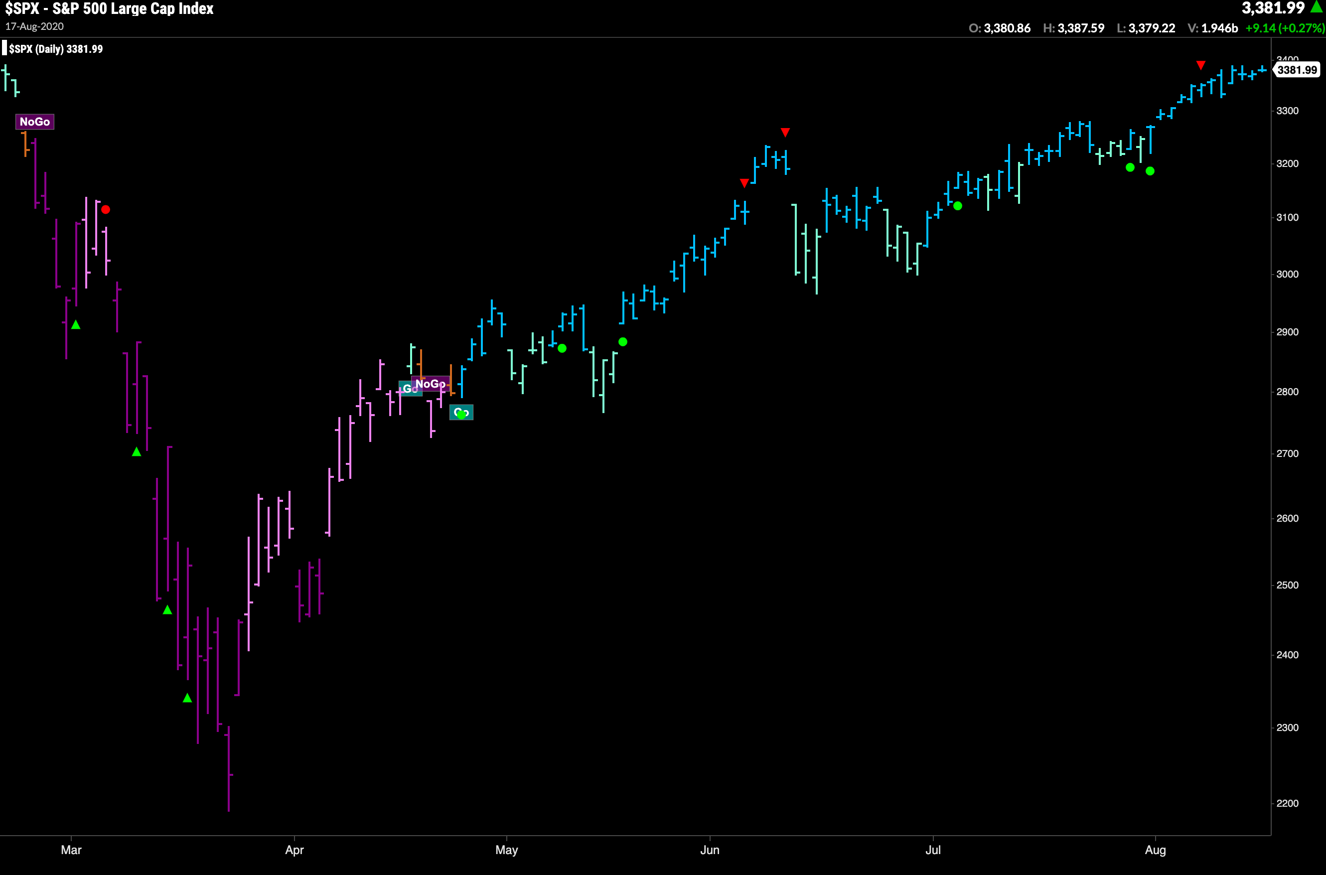
Trend identification is arguably the most important concept in technical analysis. By blending objective, widely proven statistical indicators together with the foundational principles of technical analysis, GoNoGo Trend® colors the price action of any security according to the strength of its trend.
Disciplined investing is simple, but not easy. Many traders and investors are overwhelmed by the often redundant, occasionally contradictory, and ever-complicated battery of indicators. GoNoGo Charts help investors understand the direction and continuity of price trends for any security, any asset class, across any time frame. By blending objective principles of technical analysis and the most widely used statistical measures, GoNoGo Charts remove “indicator overload.” Investors remain focused on what matters most – price – while colors of each bar or candle reflect the strength of the trend.
Financial markets can be complicated, your charts don’t have to be.
Free from the clutter of many technical charts, GoNoGo Trend is easy to interpret. It paints the price bars bright blue when its unique mix of inputs signal the strongest bullish environment. When slightly less bullish, the color turns to aqua. This can happen at the start of a new trend, or after bright blue bars, indicating that the trend may be weakening. The amber bars represent uncertainty, often appearing in the transition from bull trend to bear trend and vice versa. The lower intensity bearish color is pink, and the darker purple appears when the bearish trend intensifies.
For a 5 minute explanation of how the GoNoGo Trend was developed, check out this video from Alex Cole:


